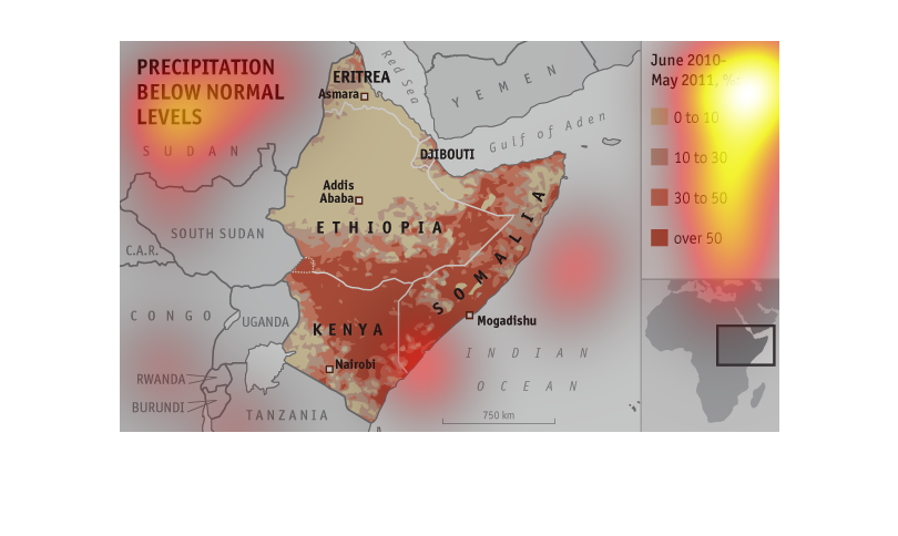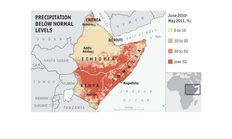
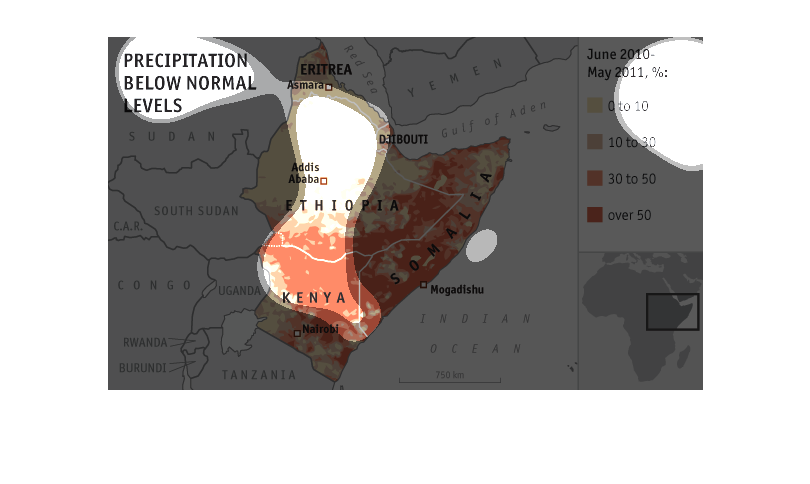
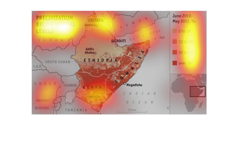
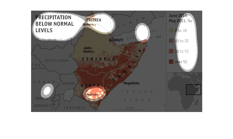
This chart illustrates precipitation below normal levels in parts of Eastern Africa including
Kenya.  It has over half the map at the 50% or more below normal level range.
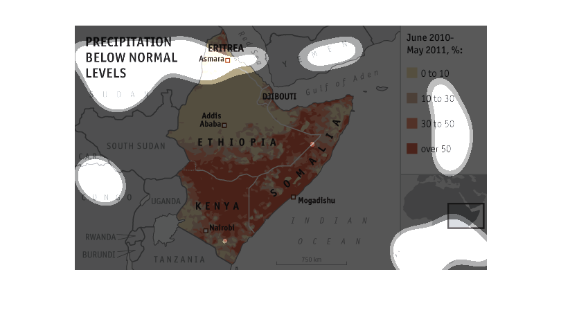
The chart shows the countries of Ethiopia, Somalia, and Kenya. The chart displays how below
average the precipitation is, by percentage, from June 2010 to May 2011. The map shows the
lack of precipitation by region. Southern Ethiopia, most Kenya, and most Somalia had an over
50% decrease in precipitation.
This is a map that shows precipitation levels in East Africa. It shows the countries of Eritrea,
Djibouti, Kenya, Somalia and Kenya. it shows this for the range of June 2010 to May 2011.
This graph shows the low precipitation levels for the country of Ethiopia, The map shows the
time from June 2010 through May 2011 in which it was at an all time low.
This graph shows precipitation below normal levels in a portion of Africa between June 2010
- May 2011. Kenya and Somalia were hit the hardest by the drought. Ethopia received the most
rain in the portion of the map that is shown.
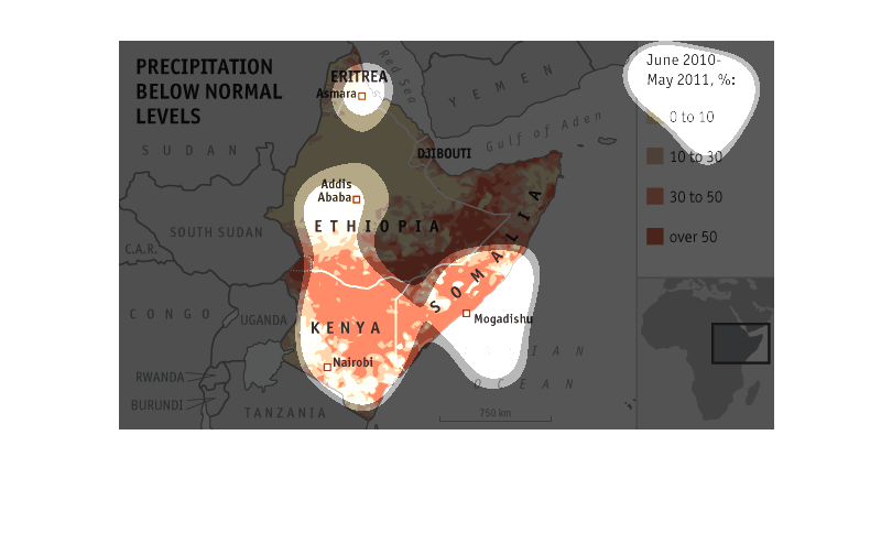
This map shows precipitation below normal levels for the countries of Eritrea, Ethiopia, Somalia,
and Kenya between June 2010 and May 2011. The data is displayed as percentages represented
by different shades of color.
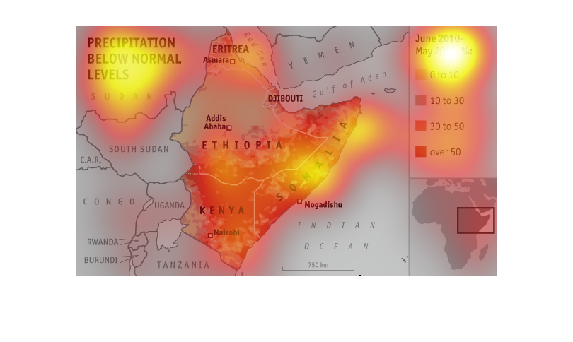
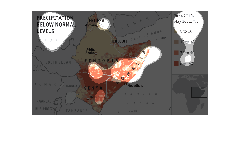
This is a color coded map depicting precipitation below normal levels in the countries of
Ethiopia, Somolia and Kenya from the year of June 2010 to May 2011
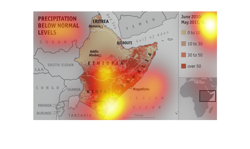
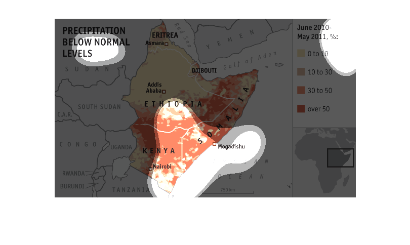
This looks at the recent droughts in western Africa based on how far below normal the rainfall
has been. Kenya is almost entirely 50% below normal Ethiopia is just10%, and Somalia about
30% below average.
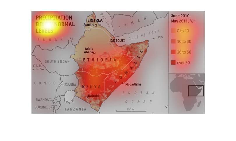
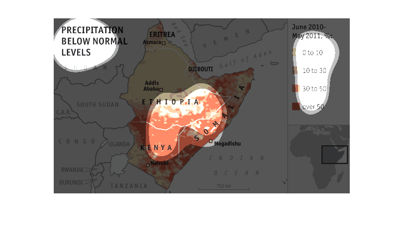
A map of levels of precipitation below normal levels in region of Kenya for the period of
June 2010 to May 2011 with 5 blocks ranging from 0 to 50 percent below
It would appear that the "graph" shown is depicting the degree of rainfall in different areas
of Africa. You want a longer description,I have nothing more to say on the subject. You cannot
see the actual picture,or the details given about said picture,so any more would be pure conjecture
on my part.
This is a chart showing the precipitation below normal levels between June 2010, and May 2011
for various African countries. This chart shows the rain fall and goes from 0 to over 50
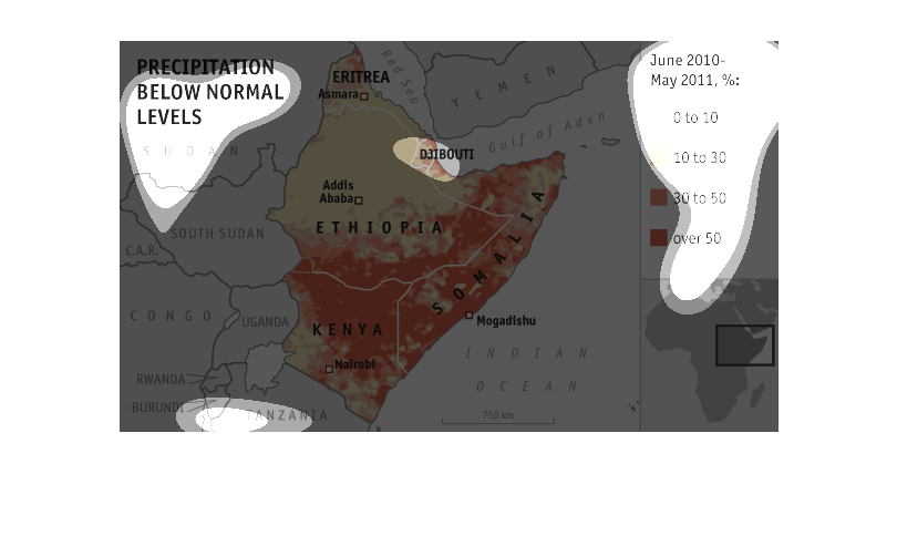
This chart is showing the precipitation levels in the north eastern corner of Africa and how
low the levels are compare to the average amount of precipitation.
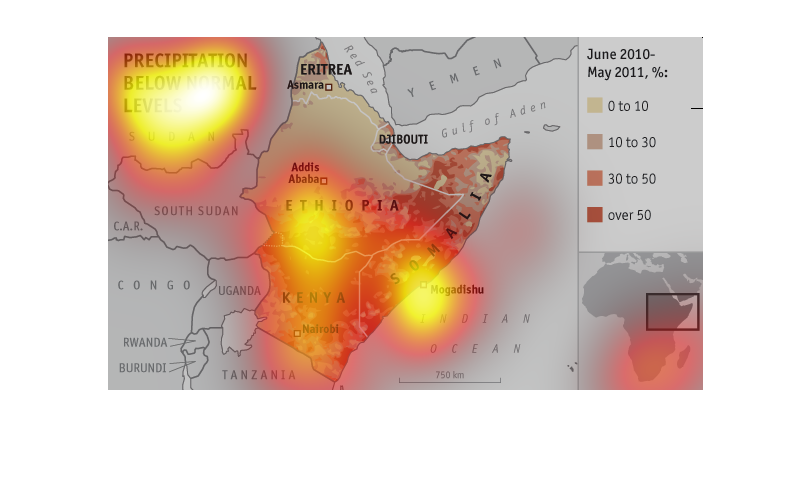
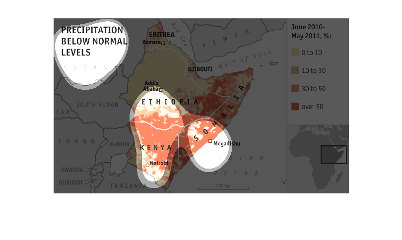
The image shows precipitation below normal levels in East Arfican countries during the time
span of June 2010 to May 2011. The countries include Kenya, Ethiopia, Eritrea, Djibouti and
Somalia.
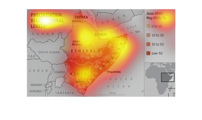
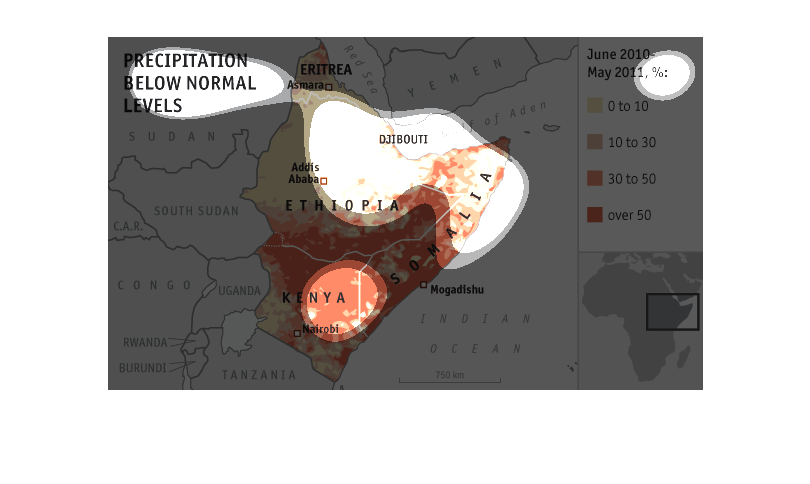
This is a map that shows the precipitation from June 2010 to May 2011 in Sudan. Overall the
maps shows that the southern region has experienced a lot less precipitation than normal.
This is measured in percent change,