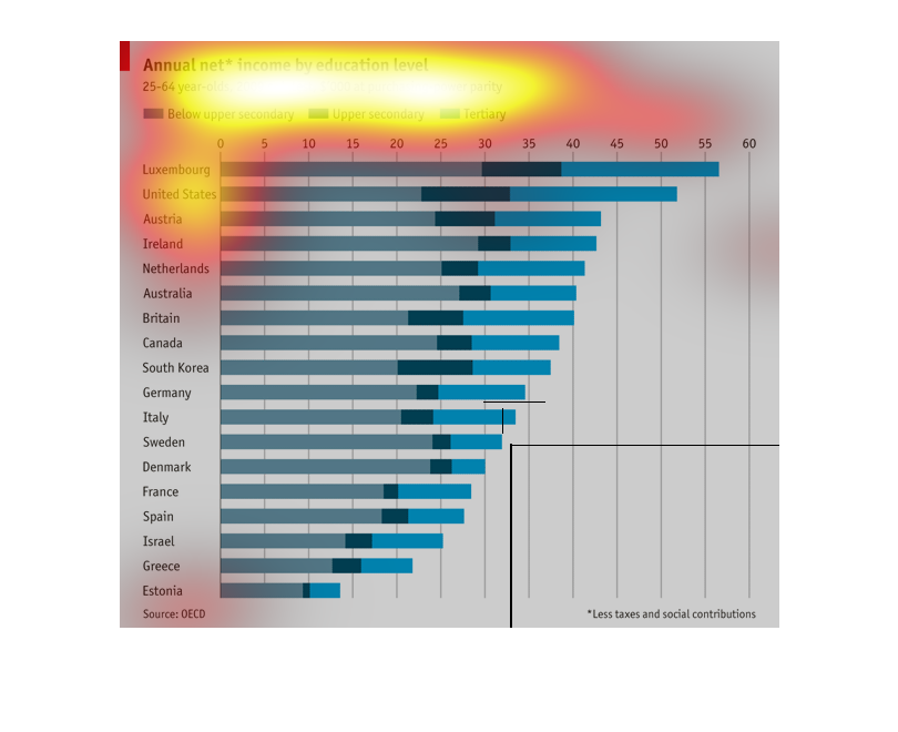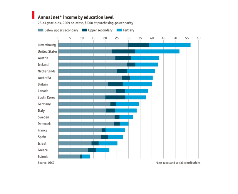
The chart describes net income of 25-64 year olds broken down by education level. Those who
have a  tertiary education make more income, across the board. Souced by OECD
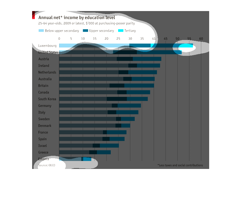
This bar graph shows a comparison of the annual net income by education level for people aged
25-64 years old among several different countries.  The bar graph is organized in a descending
order vertically starting with the country Luxembourg which has the highest annual net income
for this demographic than the other countries listed.
This is a graph describing level of income level by education between 25-64 year olds in varying
countries. Below upper secondary is in blue, upper secondary is in a dark teal, and tertiary
is in a sky blue.
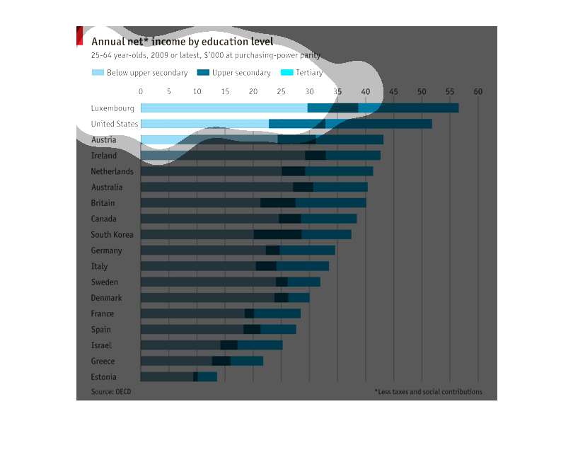
Net Income by Education Level of 25-64 year olds.  1.lexembourg 30,000 below. 18,000 above
 2. united states 22,000 below  3. austria 4. ireland  5.netherlands -
A bar graph showing the annual income for certain education levels within the 25-64 years
old range by countries. Top three: Luxembourg, United States, and Austria.
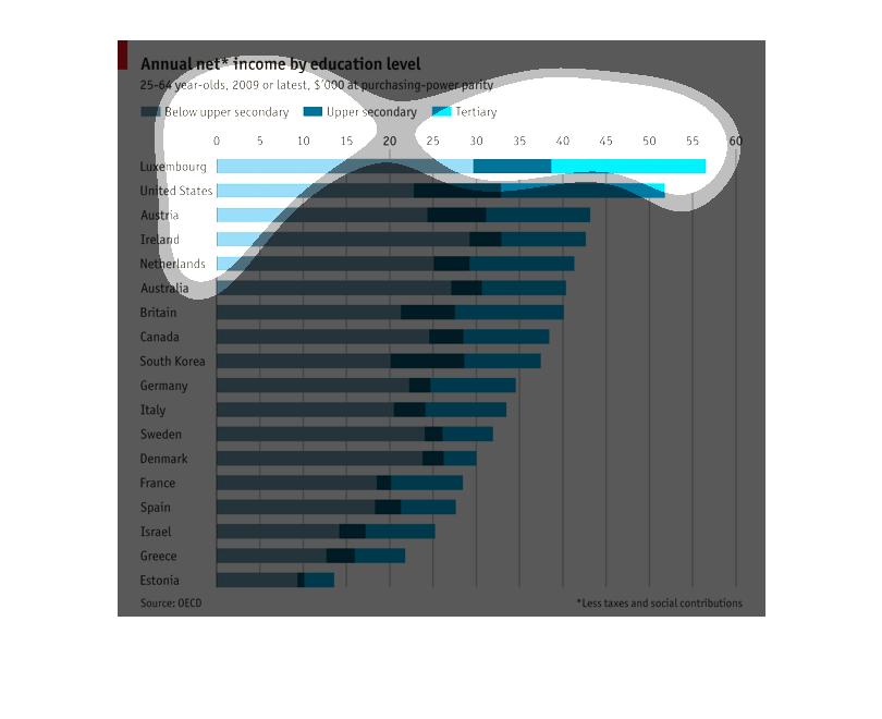
Annual net income by education level showing different countries in relation to each other
studying 25-64 year olds different levels of schooling an education are graphed here
This graph represents Annual Net income by education level.  The statistical data represented
by this graph shows 25 through 64 year olds from the year 2009 and later.
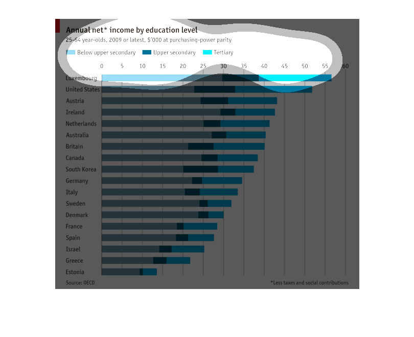
This shows the annual net income per educational level in order to correlate higher education
equaling higher income in an age range of 25-64. By far the biggest difference is in Luxembourg
and the US, but with less impact in eastern Europe and the mediterranean.
This chart shows the annual net income by education level for ages 24 - 64 years old. It id
divided by country, with Luxembourg, the United States, Austria, Ireland, and the Netherlands
leading the way.
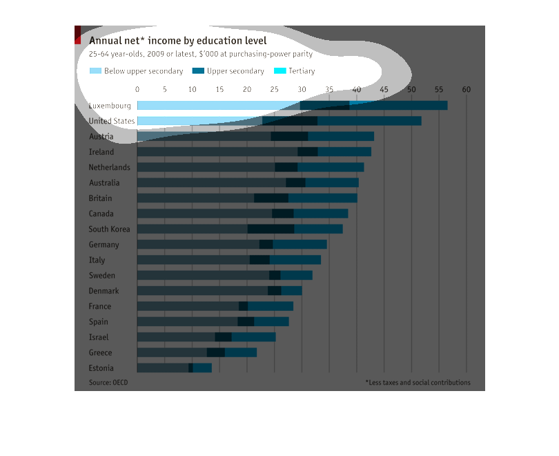
This graph shows annual income based on education levels for 25-64 year olds, from 2009 onwards.
The graph is horizontal, with colored bars indicating purchasing power categories. It is ranked
by world countries.
This chart describes the Annual Net Income by different education levels from 25 to 64 year
olds from 2009 to latest. Luxemburg and the United States are number one and have the most
Tertiary.  and also lots of below secondary people.
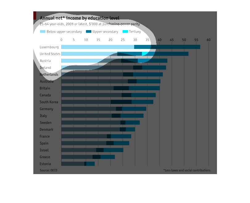
This chart depicts information from various countries about the economic value of education
in terms of net annual income per capita in a nations eligible work force as of 2009.
This is a graph depicting the annual net income by education level in 25 to 64 year old. It
is separated into groups of: Below upper secondary, Upper secondary and Tertiary.
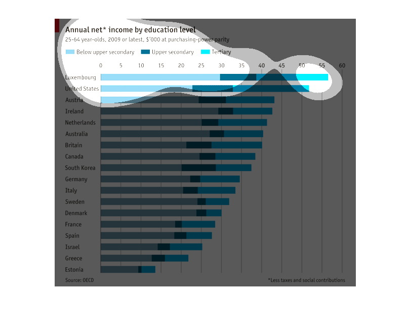
The picture describes in chart form about the annual net income by education level of a whole
bunch of different countries. It also seperates into different income levels.