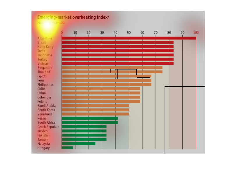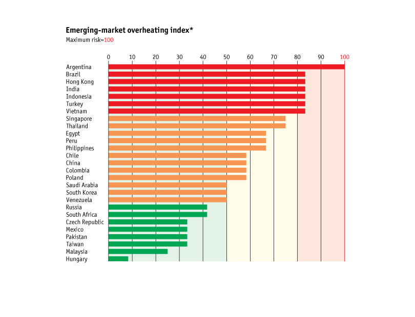
The bar graph describes the emerging market overheating index. Several countries are listed
and the higher risk markets are listed up top in red. It uses a numerical scale from 0-100.
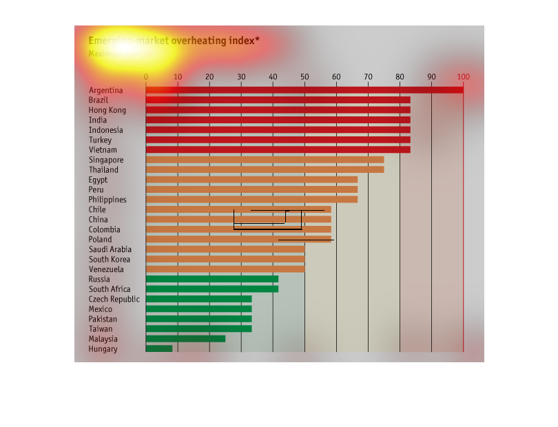
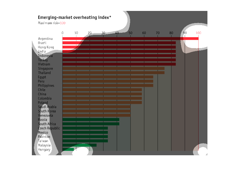
This graph shows the Emerging-market overheating index, with higher indexes representing higher
risk, for countries across the eastern and western hemisphere. Argentina has the highest risk
with an index of 100.
This image shows the emerging-market over heating index. Argentina has the most risk at 100
while Hungary has the best credibility, being that of less than 10.
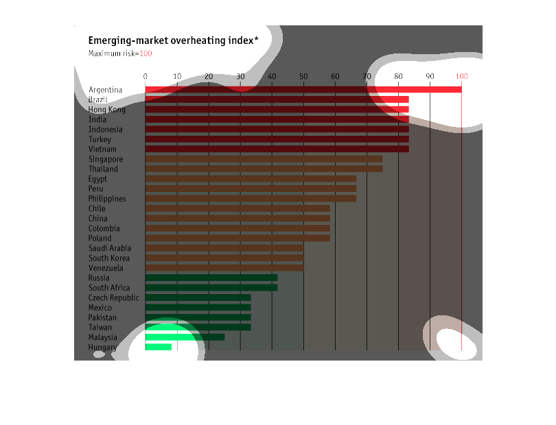
This graph is a relative chart for potential economic overheating for the economies of many
different countries, from Argentina having the most risk, to Hungary having the lowest risk.

The title of this graph is, "Emerging-market overheating index.  Descending the left-hand
column of the graph is a list of many countries.  The graphed information extends to the right
towards the maximum risk at 100.
This graph shows the world wide gradual increase of Emerging Market Overheating from Argentina
to Hungary. The graph also shows that the region with maximum risk is Argentina. The region
with the lesser risk is Hungary.
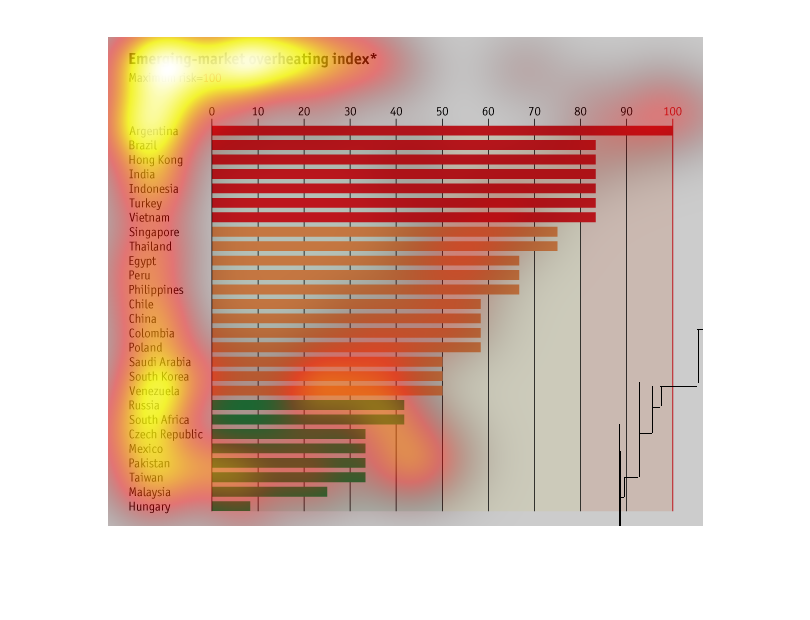
This graph plots the relative risks taken by emerging markets worldwide, plotted as an "overheating"
index. Argentina is the "hottest" new market, with Brazil, Hong Kong, India, Indonesia, Turkey
and Vietnam also rated as risky.
This chart describes the emerging market overheating index. Countries on the chart include
Argentina, Brazil, Hong Kong, India, Indonesia, Turkey, and Thailand.
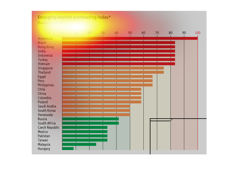
This graph describes the emerging market overheating index around the world. Argentina has
the maximum risk and Hungary has one of the lowest. Around 11 countries have low risk
This is a chart depicting the emerging market overheating index for several countries around
the world. It shows the leader to be Argentina and the lowest to be Hungary.
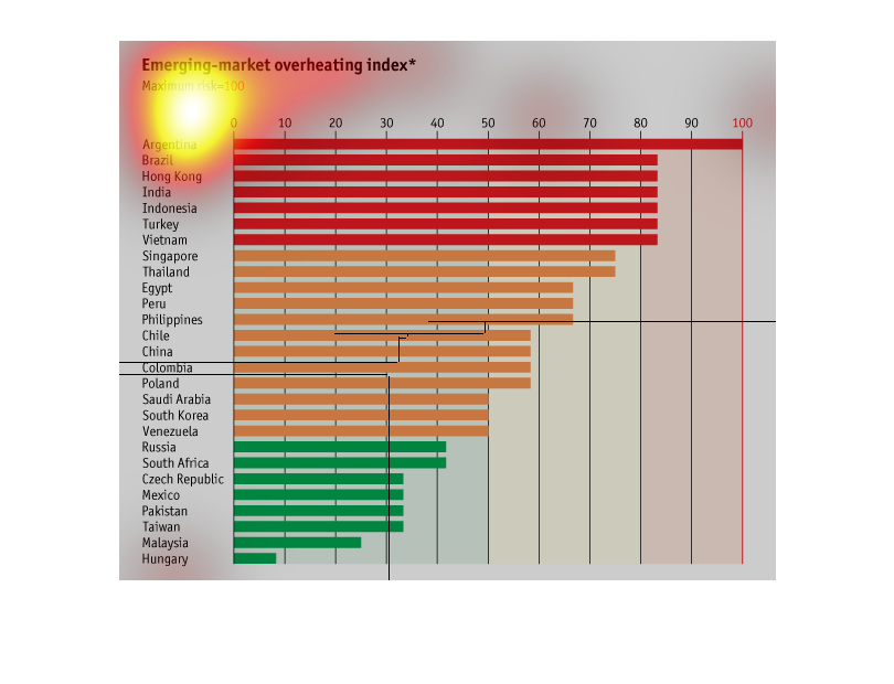
"Emerging market overheating index" and states the maximum risk is -100. The chart shows Argentina
at the top at -100, and Hungary at the bottom at less than 10.
This image is about emerging markets and which have the most risk associated with them.  It
lists the countries with the most risk in order to the least amount of risk.
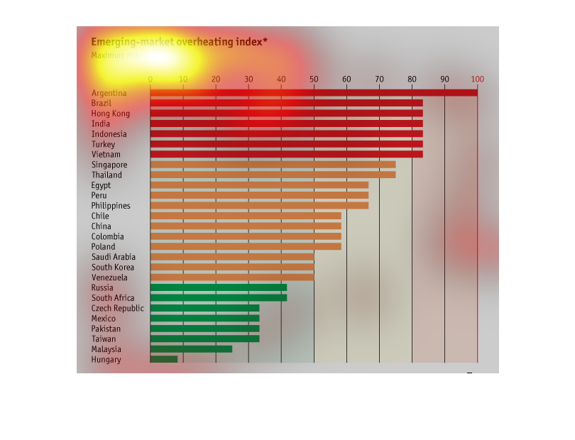
This is an index of the potential collapse of several countries market systems. Currently
several south American countries are near the top at critical mass.