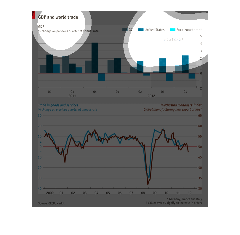
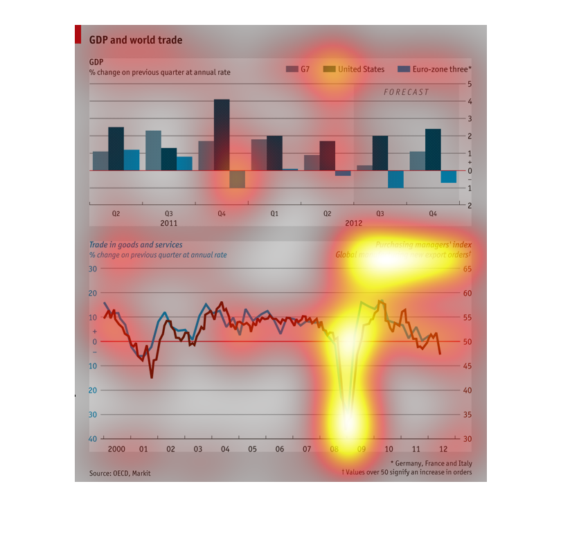
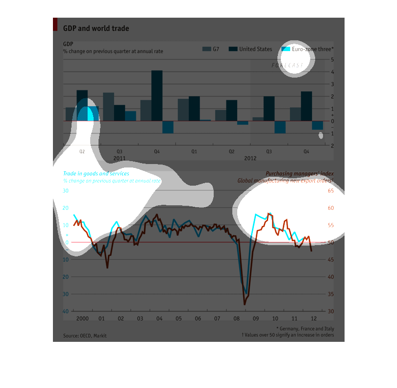
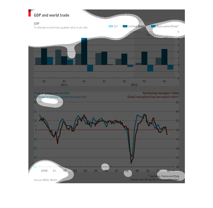
These charts look at GDP and world trade from 2000 to 2012, comparing the G7, The United States
and Europe during each year. Purchasing power dropped relative to the United States, for the
G7 and Europe in 2008.
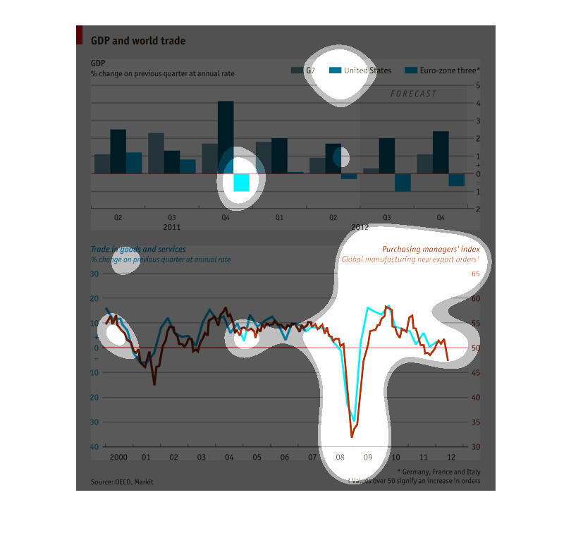
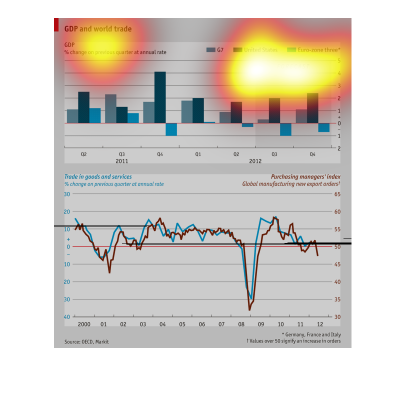
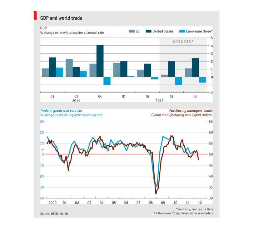
This chart shows GDP and World Trade information by geo-graphic region (G7, United States,
Euro-zone) by quarter in 2011 and 2012.  It shows strength for the US market and struggles
in the Euro-zone.
This image shows the GDP compared to world trade and is broken up into 3 groupings; USA, a
Europe grouping and a G7 grouping. There are two graphs, one bar graph comparing the three
groups and one line graph, comparing goods and services and mangers' indexing.
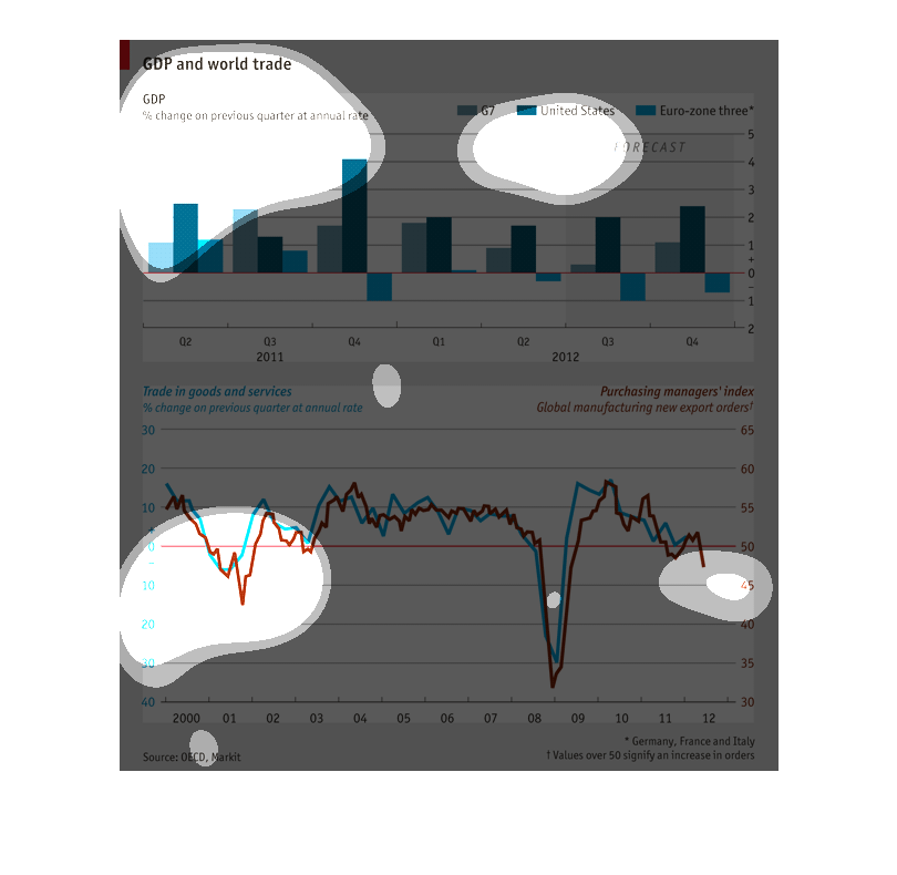
This shows GDP and world trade as a percentage on the previous quarter, with the US, G7, and
Euro-zone. Overall there was a big drop in 2009, with the same or slight increases the other
years.
Gross domestic product on world trade, percent of change from previous quarter at an annual
rate. The top chart shows forecasts for G7, the United States, and Euro-zone three for 2011
and 2012. The bottom chart show the percent in change of trading in goods and services in
2000 with a blue line. And the bottom chart also shows purchasing managers' index global manufacturing
new export orders with a brown line.
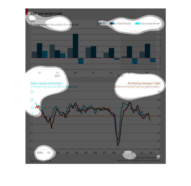
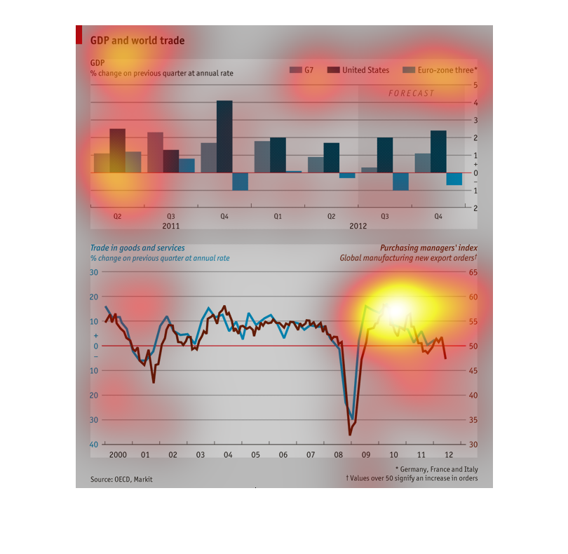
This graph studies GDP through world trade. They use two different European zones and the
United States. Eurozone three seems to be having the most negative impact. The lower graph
shows the trade of goods/food and then the consumption of these goods, which closely follow
each other. This makes sense, a product can only be bought when it is being sold.
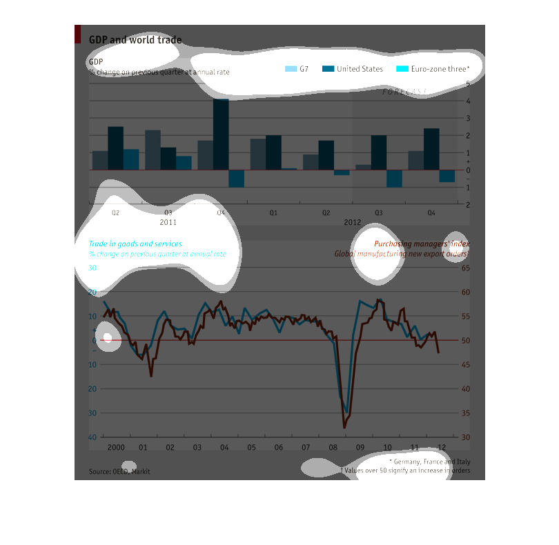
This graph seems to show the percent of trades of goods and services and the percent of global
manufacturing exports. This graph contains information from the years 2011 and 2012.
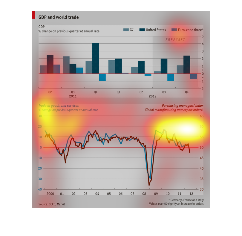
There are two graphs depicting the GDP and the world trade. The top graph compares three bars,
G7, United States and Euro-zone three. The United States bare stays above the x-axis while
the Euro-zone three bar fluctuates. The graph on bottom depicts trade of good and services
versus manufacturing using a line graph.
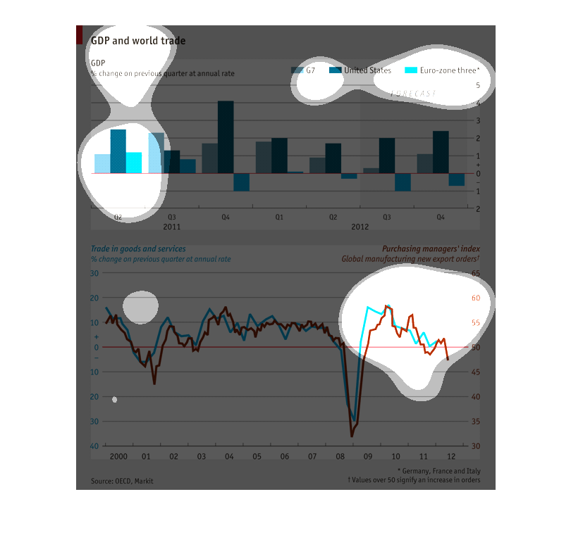
The top graph depicts GDP and world trade for G7, the US, and Europe.  The bottom graph shows
trade of goods and services with change from previous year.
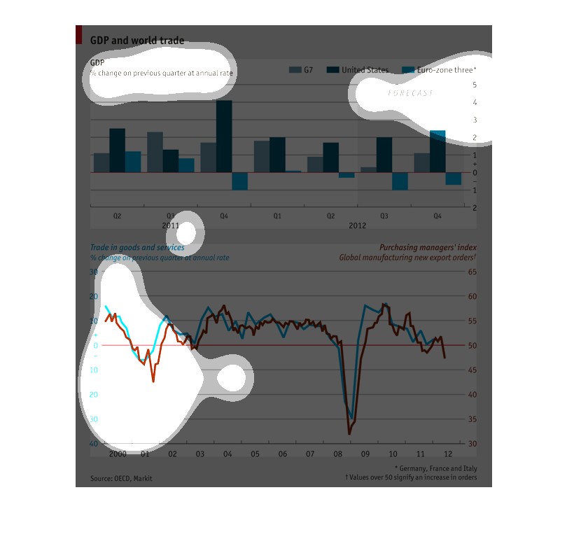
This is a comparative chart of GDP to world trade from 2011 to 2012. G7, US, and EU are recorded
and EU experienced GDP drops unlike the others. World trade bottomed out in 2008 along with
purchasing power and is on the decline again.
Two graphs, one bar and a line, called "GDP and World Trade". The bar graph centers on G7,
United States, and Euro-zone three. The line one has a blue and red line comparing the Purchasing
Manager's index and Trade in goods and service.
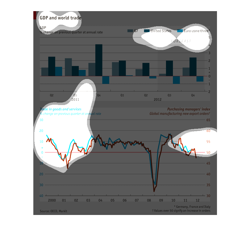
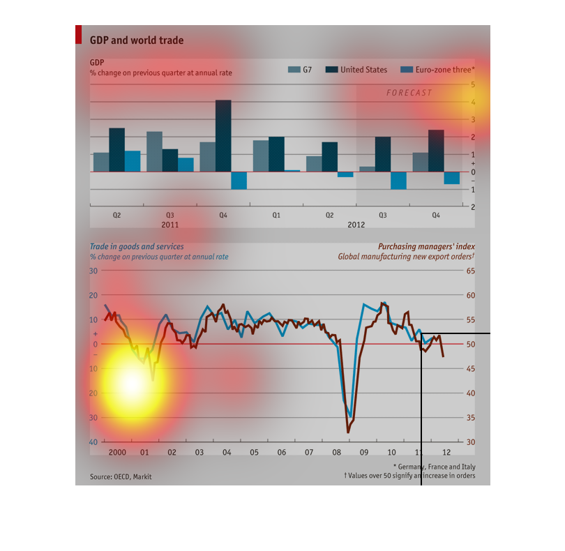
This graph shows the statistics of GDP and world trade in the US compared to Euro-zone 3 and
G7. On average, the U.S. is much higher, Euro-zone 3 is in the middle and G7 has the least
amount. The bottom graph shows a comparison between trades in goods and services and purchasing
manager's index. The results seem to conclude that the two play cat and mouse but are relatively
equal with no out liars.
This chart describes GDP and world trade percentage change on previous quarter at annual rate
for the United states and the Euro-Zone three. Chart covers the years 2000 - 2012.
This graph is about GDP and World Trade. The subjects are G7, the United States and Euro Zone
3.What is being measured is the percentage change on previous quarter at the annual rate.
The graph on the bottom depicts trends in Trade in goods and services.
this graph is about gdp and world trade the graph is color coded and dark green is the united
states and grenn is 7 blue is europe. europe was lower then the rest