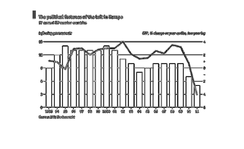
This chart is about the political fortunes of EU leftists. The scaling is by percent up or
down from the past year. There is a red like showing the overall pattern of the bars. This
is a bar graph. Increments are in 1 year. There is an overall decreasing pattern.
Error using .*
Matrix dimensions must agree.

Error in plotSpotlight (line 30)
    output = repmat(a,[1 1 3]).*single(im)/255;

Error in plot_individual_user_maps (line 49)
        [heat] = plotSpotlight(im,heatmap,3);