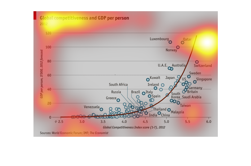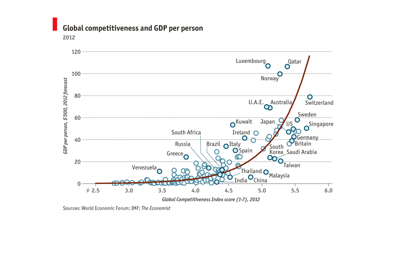
This graph is depicting global competitiveness versus GDP per person in a 2012 forecast. Each
country is depicted with an individual circle. It appears that there is a positive correlation
between level of competitiveness and GDP per person.
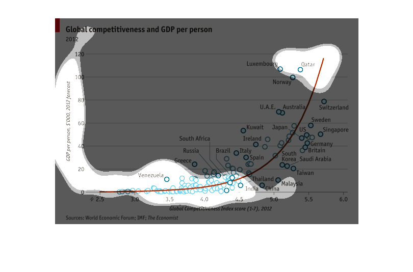
This graph shows the relationship between Gross Domestic Product Per Person (y-axis) and Global
Competitiveness Index Score (x-axis).  The relationship  appears to be exponential in nature.
The graph shows the correlation between competitiveness and GDP per person. The left side
of the graph show GDP and the bottom shows Global competitiveness index.
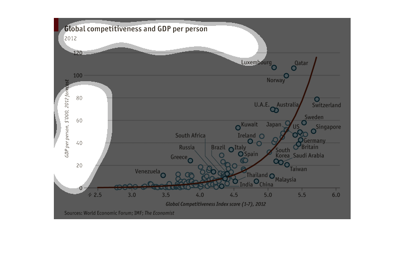
This graph displays global competitiveness and GDP per person in the year 2012.  It has an
upward trending line with dots that illustrate the various countries, and Qatar being highest
up on the line.
This chart shows the GDP per person averages in 2012 for numerous countries, and how it relates
to global competitiveness.  From the information, Switzerland and Singapore appear very close
to being the top two most competitive countries.
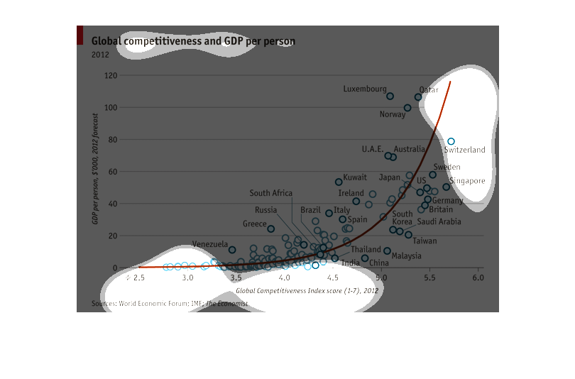
This graph illustrates the competitiveness and the relative GDP per person in specific countries
as of 2012.  Competitiveness is measured from left to right while GDP is measured from bottom
to top. Most of the countries listed are concentrated in the low competitiveness/ low GDP
per person range. The population slowly tapers off as competition and GDP rises.
This graph is global competitiveness and GDP per person. Graph increase over time. This graph
has a lot of countries in it. Qatar leading the way at the top.
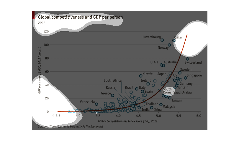
This chart displays the relationship between competitiveness and per person GDP for countries
of the world.  As competitiveness increases, per person GDP also increases.
This chart graphs GDP per person on the y-axis and global competitive index scores on the
x-axis. It seems to show a positive correlation between these two factors.
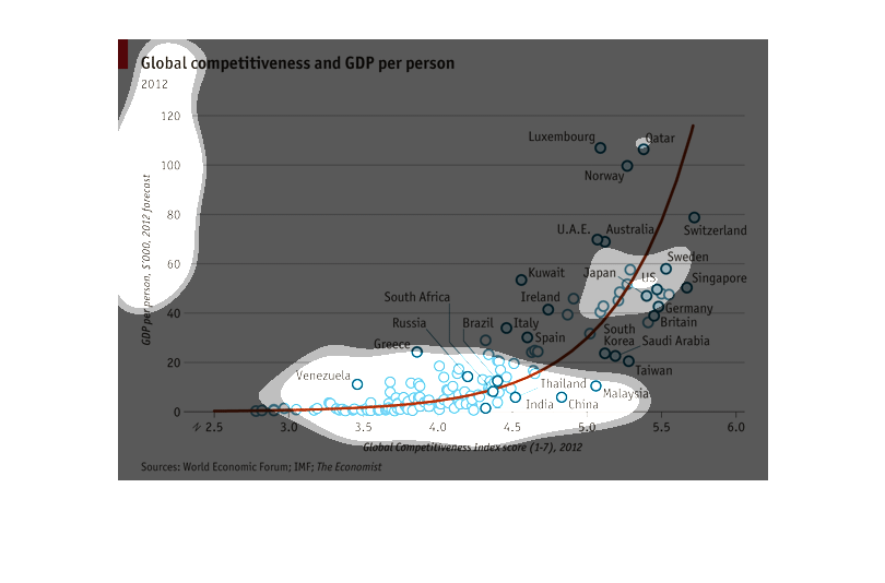
This graph represents the Global competitiveness and GDP per person from 2012.  It shows the
statistical data for many different countries around the world.
This chart describes global competitiveness and GDP per person. Countries on the chart include
India,Thailand, China, Malaysia, South Korea, Ireland, and the US.
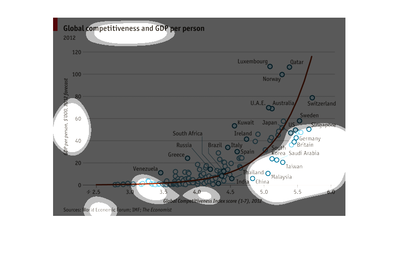
This chart shows Global Competitiveness and GDP Per Person for 2012. GDP per person is measured
in thousands of dollars. Global Competitiveness is an index score 1-7. Venezuela was near
the bottom for both. Qatar was near the top for both.
This chart compares the global GDP person and against a countries Global competitiveness Index
score.  There appears to be a clear correlation in that the countries with the highest Global
Competitiveness Index, have the highest GDP.
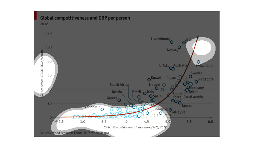
This is a chart depicting the correlation between global competitiveness and GDP per person.
The trend line for all countries sampled is upward sharply.