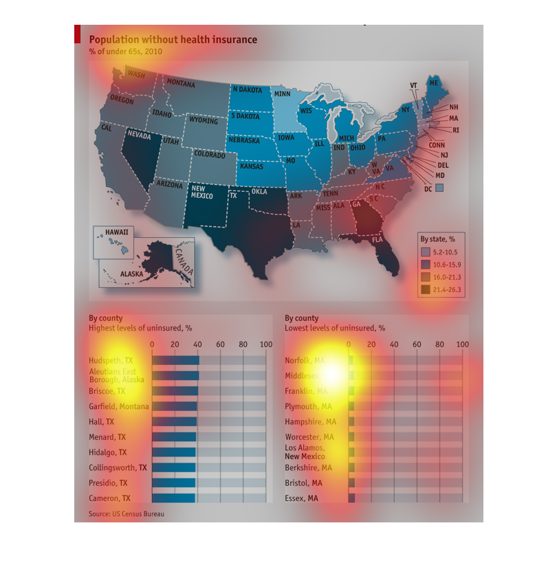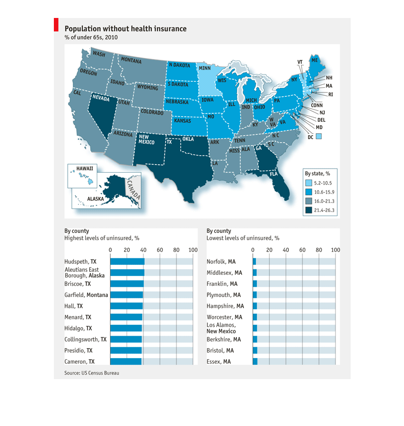
This is a map and accompanying chart of the US population without health insurance, as a %
of population under 65, from 2010. The states are color coded by severity and below is a chart
of the severity ranked by counties in different states.

The map of the United States shows the population without health insurance. The darker colors
mean a higher uninsured population. There is also a bar graph comparing, by county, the highest
levels of uninsured people. Most counties in this category seem to be in Texas. The other
bar graph shows, by county, the least uninsured people. Most seem to be in Massachusetts.
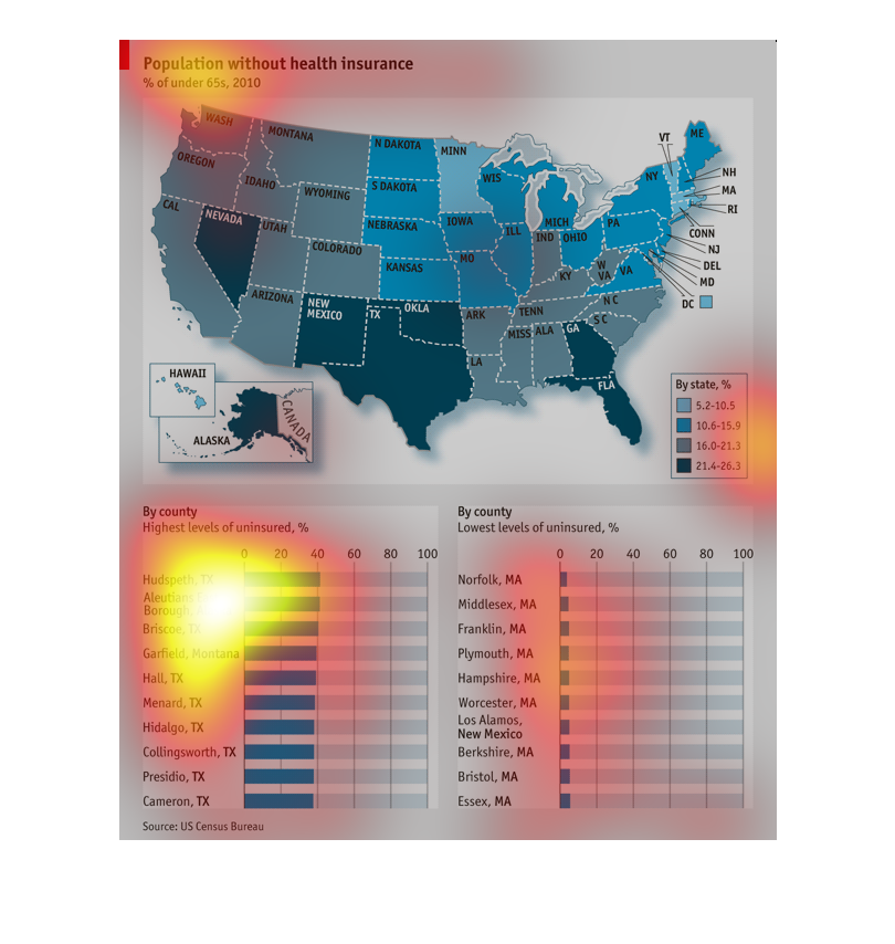
This is a picture of the population of people without health insurance in the United States.
Those in the Mid west and North East seem to have the most with Health insurance. The west
coast and southern areas seem to have the most without healthcare.
This graph clues us in about the population of the United States that does not have health
insurance.  It reads that that majority of the counties that appear on the "do not have health
insurance" line are from Texas.
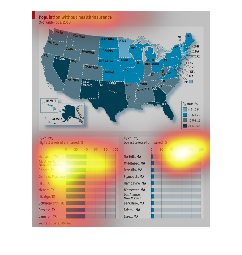
The top map of the United States shows the population without health insurance by state.
The bottom chart shows by county with the percentage of uninsured.
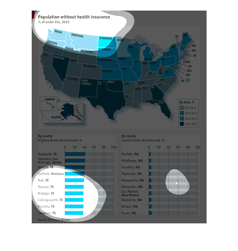
This chart describes the population without health insurance as a percent of under 65's in
the Unites States in 2010. The highest percentages without coverage were in Texas, New Mexico,
Oklahoma, Florida, Georgia, and Nevada. The county with the highest uninsured percentage was
Hudspeth, Texas while the county with the lowest percentage was Norfolk, MA.
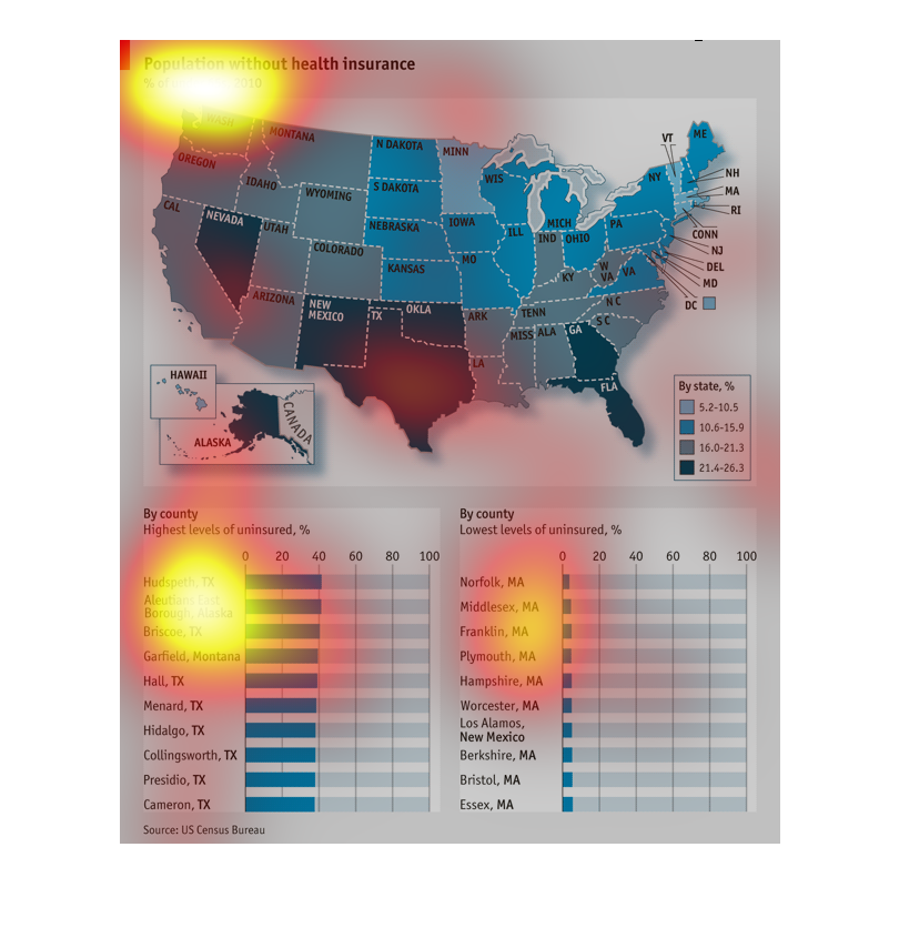
The chart shows the amount of people unisures by region . There is a map that show middle
America is mostly insured and that number Deminishes twards the cost lines. There is also
a bar chart showing the most and least insured city'
This chart describes population without health insurance percentage of under 65s for the year
2010. Areas in Texas on the chart include Hudspeth and  Briscoe.
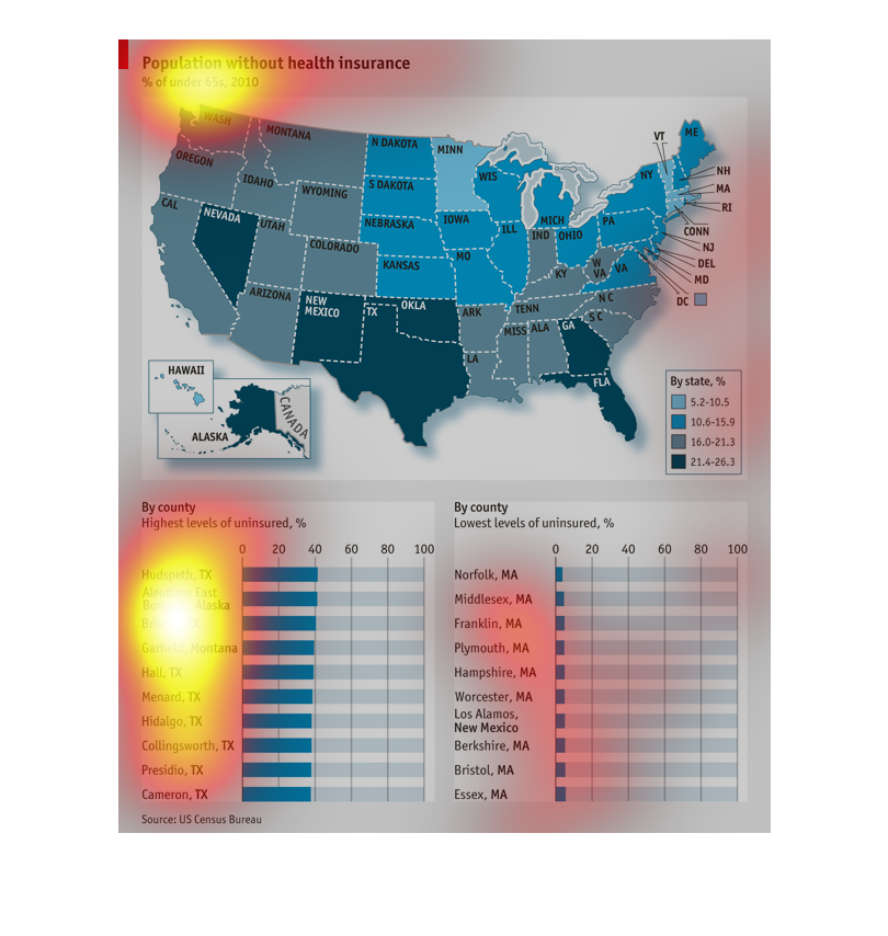
Map with percentage of US population under age 65 without health insurance by state. Chart
showing US counties with the highest and lowest level of uninsured people by percentage.
This map shows the percentage of Americans with out health insurance based on each state,
and by each county.  It's broken down by highest level of each county, and lowest levels of
each county.  The information was  collected by the US Census Bureau.
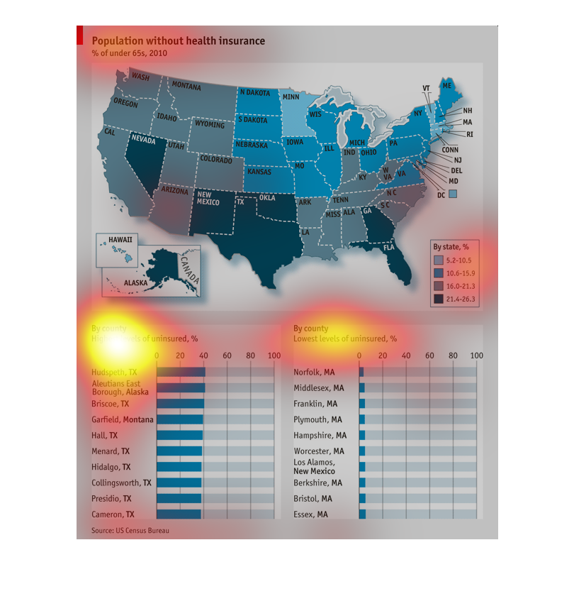
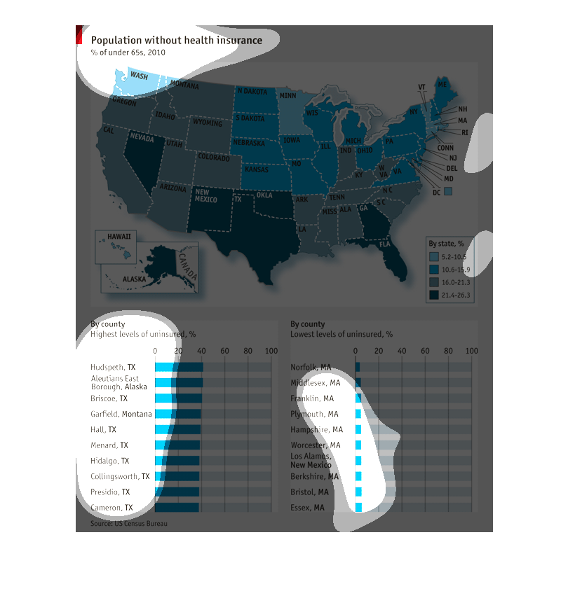
At the top there is a map of US states, color coded. It shows the percentage of population
without health insurance. Colors are shades of blue. The lighter the color, the smaller the
percentage.   At the bottom, there is an ordered list on the left for the highest levels of
uninsured by county and on the right, lowest levels of uninsured by county
This image uses color to show the density of U.S. residents without health insurance for residents
under 65 years old, in 2010.  The color of blue changes based on the density going from a
lighter blue to darker and density increases.  The bottom half of the chart has two sides:
the left side lists the counties with highest levels of uninsured and the bottom right the
counties with the lowest levels of uninsured.
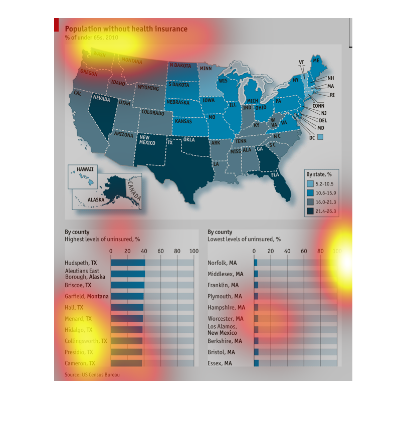
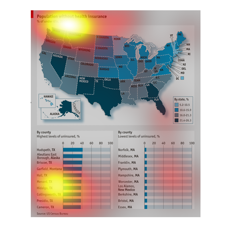
The graph is utilized to illustrate the rate of those without health insurance around the
continental United States. It specifically focuses on counties in Texas and Maine, with Texas
maintaining one of the highest areas of those uninsured and with Maine being the state with
the least amount of those uninsured. Darker shaded states have higher amounts of uninsured
citizens and lighter shaded states have lower.