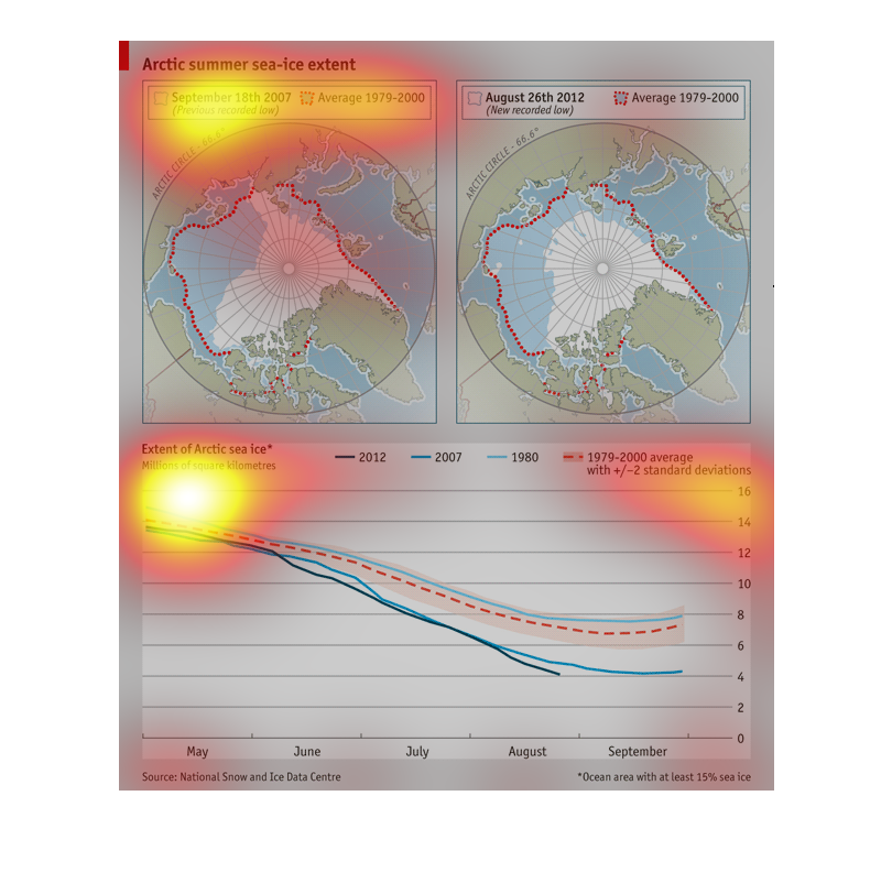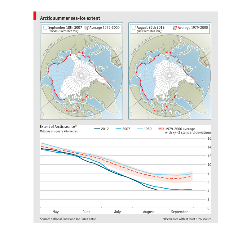
This chart describes the Arctic summer sea ice. The globes show a difference in sea ice from
2007 to 2012. The sea ice is decreasing steadily as time passes.
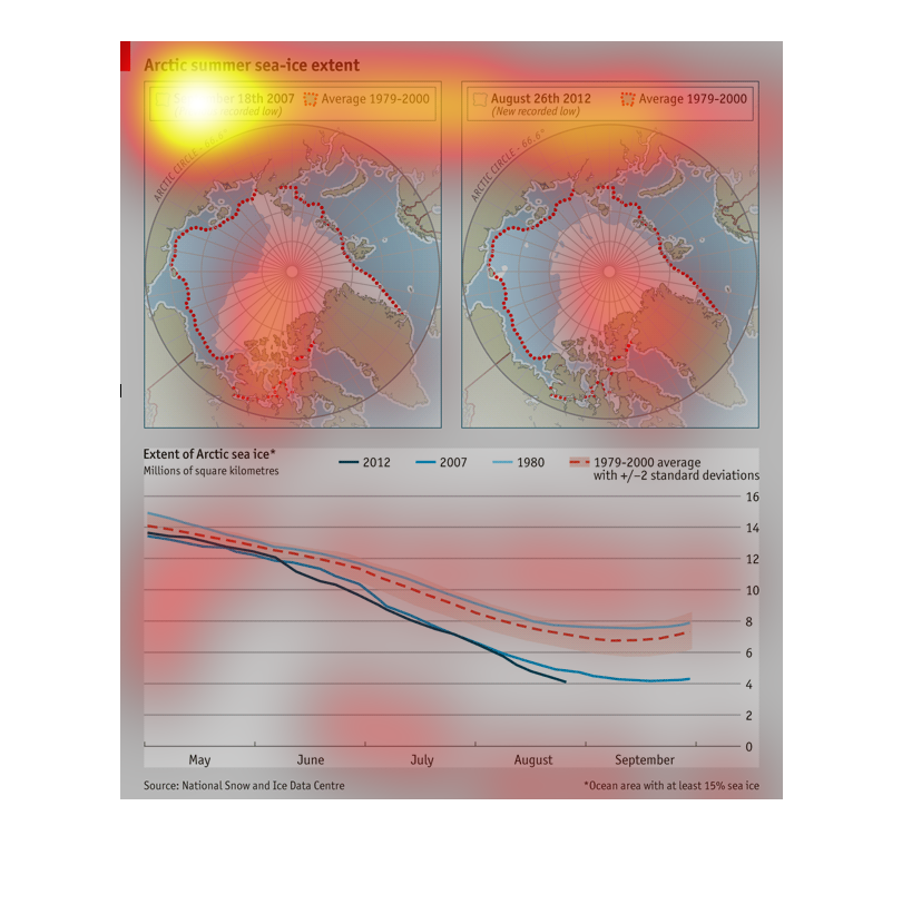
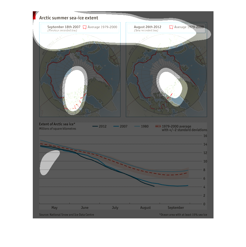
This image describes the change in the extent of sea ice in the Arctic Circle during the summer
between 1979 and 2012. Based on the bottom part of the graph, the divergences are at their
largest towards the end of the summer months.
This is another blurry image of a graph or chart of some sort.  It actually looks like a face
with a crooked smile.  It also has some maps on it that chart out different climates and temperatures
throughout the year.
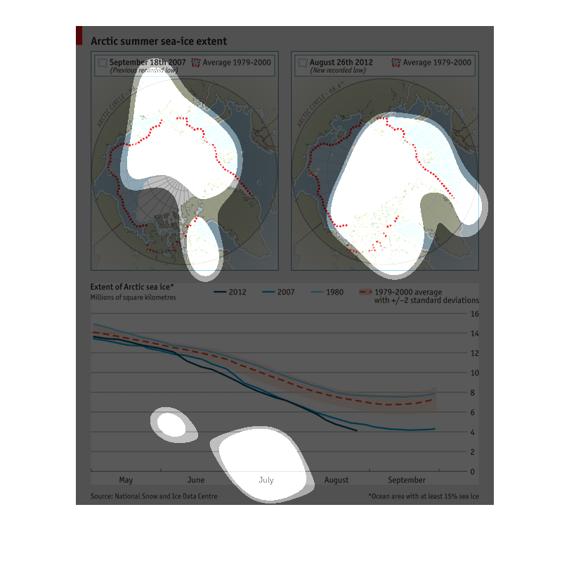
Artic Summer Sea-ice extent from 1979 to 2000, relevant to data in 2007. Summer sea ice appears
to be diminishing as the years go on. This indicates global warming.
The graph shows the artic ice sheets melting and retracting through the years. More recent
years have shown a global warming effect. That the warmer weather is melting the ice at an
accelerated rated as the decades go by.
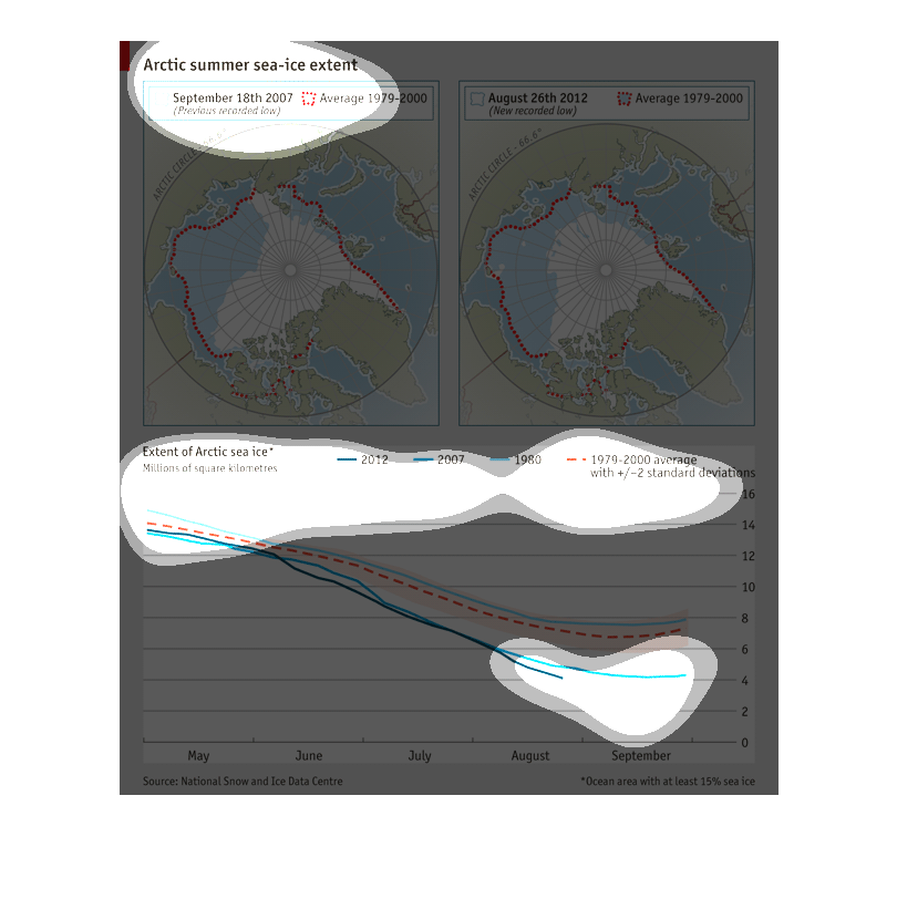
This chart describes the extent of Arctic summer sea-ice for the year 2008. The average is
measured for the years 1979 through 2000, and the chart is sourced by National snow and Ice
Data Center.
This chart shows the data related to the size of the arctic sea ice over time and how it has
decreased as global temperatures have increased. It shows it disappearing
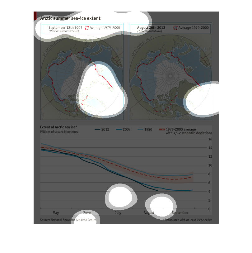
This chart shows arctic summer sea ice extent. It shows the numbers from 1979 to 2012. the
chart details the previously recorded low with a  red dotted line on a  globe and the right
one shows the new recorded low in the same manner.
This graph shows the amount of arctic ice remaining in the world, both visually in the elements
on the upper half of the figure, and graphically in the lower half. Each year, the ice is
shown as exhibiting the same amount of mass of ice melted.
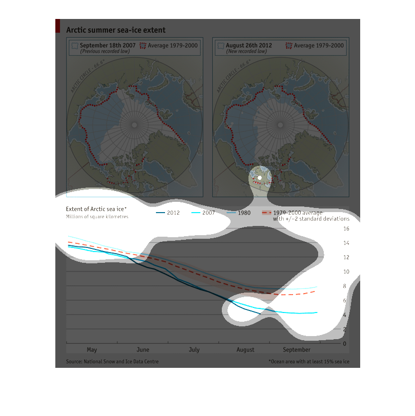
This image depicts in world graph and line formats the relationship of arctic summer sea-ice
extent around the world. From September 2007 to August 2012.
This chart clearly displays the arctic summer sea-ice extent comparison between the dates
September 18th 2007, and August 26th 2012. The chart shows two diagrams of globes with dotted
lines on them.
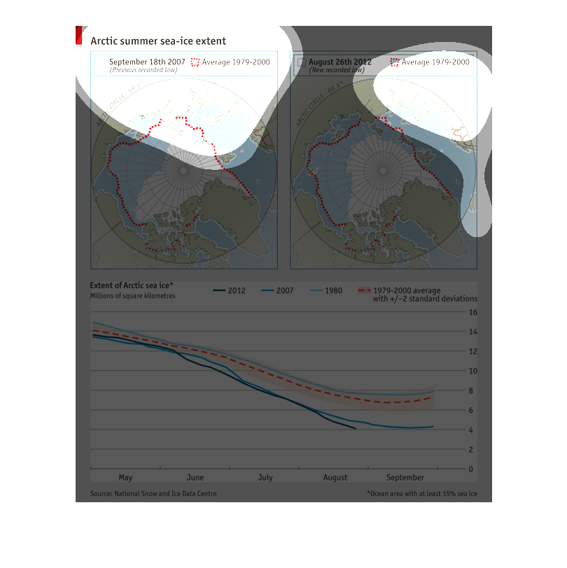
This image is showing the arctic summer sea extent with 3 charts. One of september and one
of august. Two of them show a map of antarctica and the third chart is the extent of ice.
THIS GRAPHIC SHOWS EXTENT OF ARCTIC SEA ICE LEVEL IN 2007 COMPARED TO THE HISTORICAL AVERAGE
BETWEEN 1979 THROUGH 2000. THIS IS ILLUSTRATED WITH LINES ON THE GLOBES AT TOP AND IN THE
LINE PLOT AT BOTTOM.
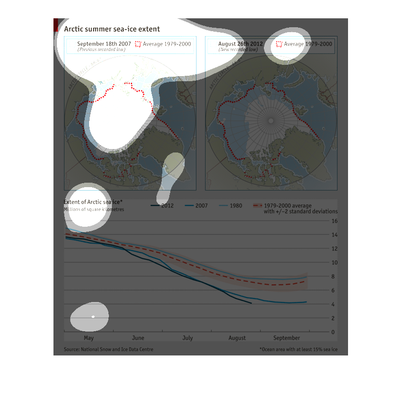
This image shows two maps and a graph documenting the loss of artic sea ice. The average from
1979-200 boundaries are shown in red on a two maps, one from 2007 and one from 2012. Finally
a series of colored lines show the extent of sea ice, monthly, across the years.