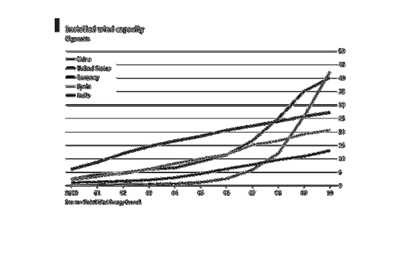
This graph shows the trend of installed wind power capacity per country, in gigawatts. The
colored lines represent world countries and trend upward, going from 2000-2010.
Error using .*
Matrix dimensions must agree.

Error in plotSpotlight (line 30)
    output = repmat(a,[1 1 3]).*single(im)/255;

Error in plot_individual_user_maps (line 49)
        [heat] = plotSpotlight(im,heatmap,3);