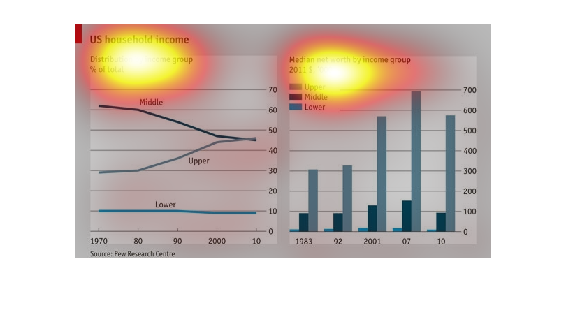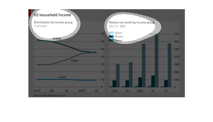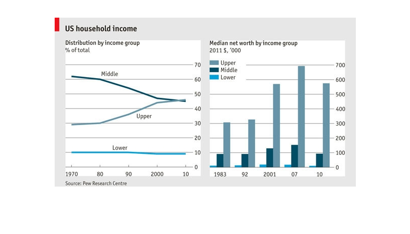
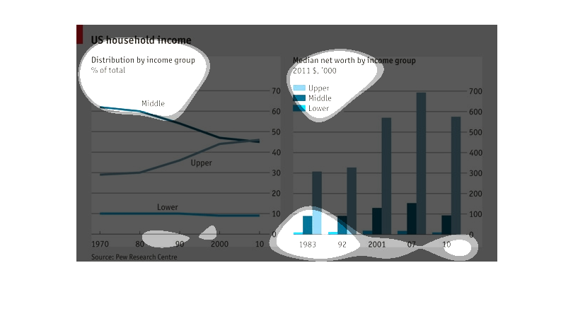
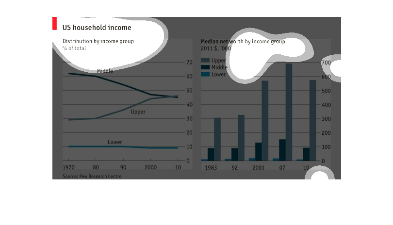
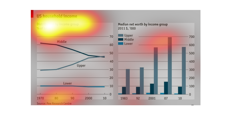
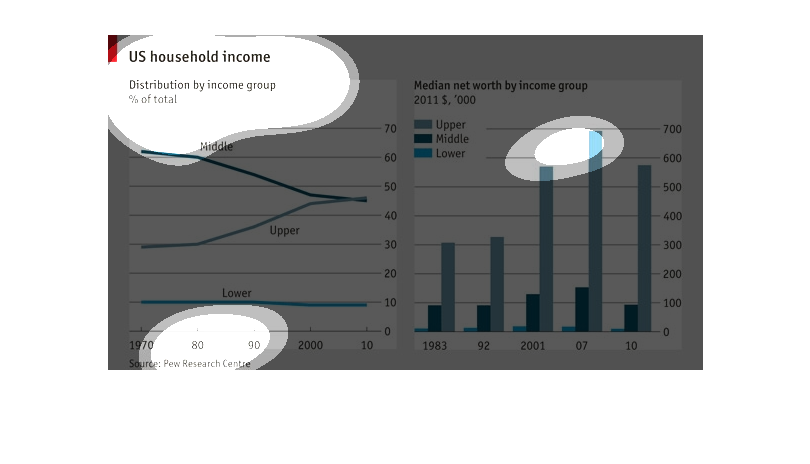
This chart describes US household income. Specifically distribution by income group. The chart
covers the years 1970 through 2010, and is divided between upper, middle, and lower class.
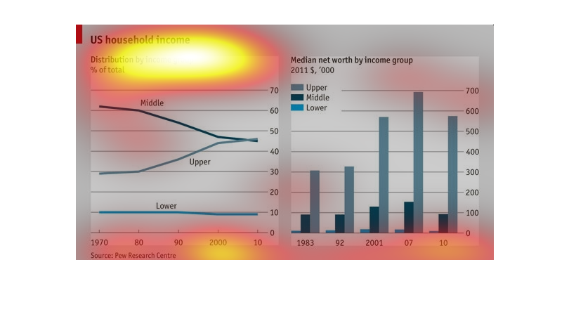
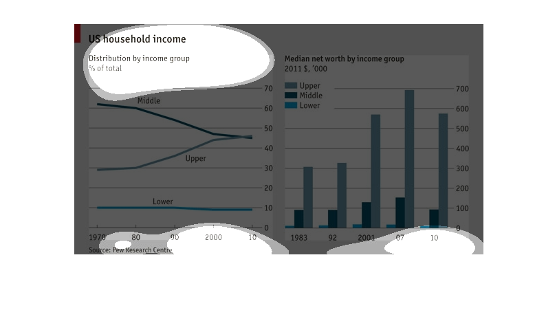
This is a graph that shows the United States of America household income. It shows the distribution
of income between various groups in terms of percentage.
The chart shows the median net worth by income group(lower, middle and upper class) from 1983
through 2010. The overall net worth has been increasing from 1983 through 2007. In 2010 there
was a decline when compared to 2007.The lower class net worth slightly decreased over time.
The upper class net worth increased significantly over time. While the middle class net worth
decreased significantly over time.
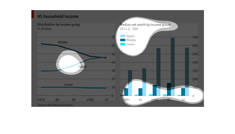
This graph is titled, "US household income".  There are two separate graphs side-by-side.
 The graph on the left lists data from 1973-2010.  The bar graph on the right lists data from
1983-2010.  Both graphs break down income segments into upper, middle, and lower income.
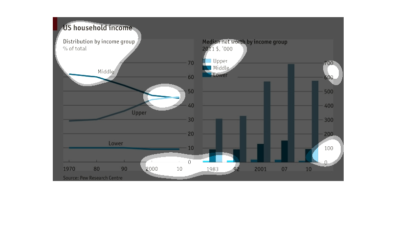
This chart is an income chart distributed by each income group. Each side represents each
income group which are upper, middle and lower. It also shows median net worth. The year starts
in 1970 and goes through 2001.
This graph depicts the US household income. The distribution is by income group. There is
also a graph that shows the medium net worth by income group. In 2007 there was the biggest
gap between upper class and the other classes of middle and lower.
These graphs depict US household income.  The line graph on the left shows distribution by
income group and the bar graph on the right shows median net worth by income in 2011 for upper,
middle, and lower class.
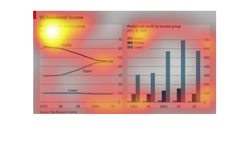
This graph shows the changes in the distribution of net income as a percentage of total income
across three socioeconomic classes (Lower, Middle, and Upper) in the US between 1970 and 2010.
 It appears that lower class wages have remained stagnant, while middle class wages have decreased
as a percentage of total wages and upper class wages have surpassed middle class wages as
a percentage of the total.  Additionally, there is a separate graph showing the progression
of net worth across the three socioeconomic classes between 1983 and 2010.  It appears that
lower and middle class net worth has remained roughly the same while upper class net worth
has increased dramatically.
This chart represents distribution of United States income. It has a representation from 1970
until now. It also represents how the median net worth has changed over the for lower, middle
and upper class.
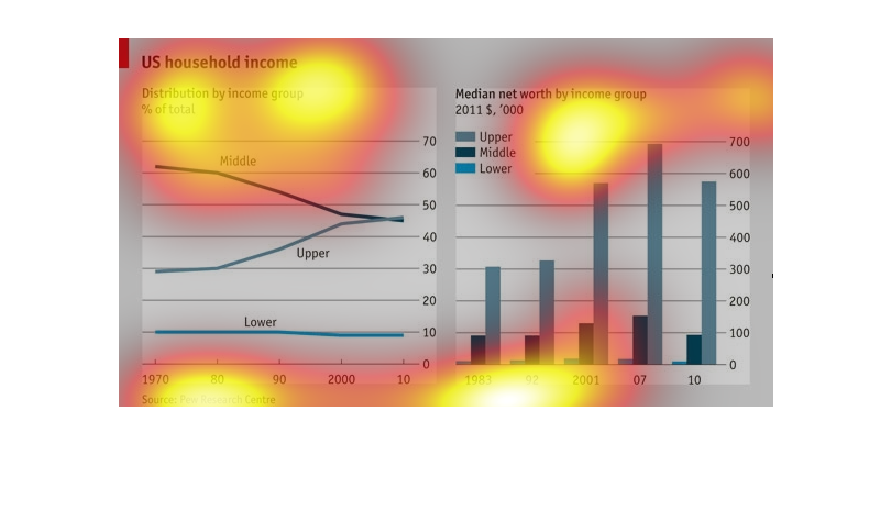
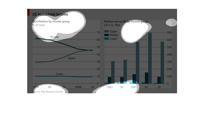
An infographic showing US Household Income, Distribution by group, Lower, Middle, Upper and
represented as a total of population from time period 1970 to 2010
I can see U.S. Household income on this chart. Median net worth by income group (Upper, Middle,
and Lower) in 2011 is differentiated by three color shades.
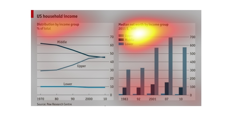
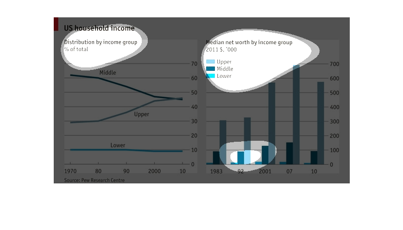
This graph is a representation of socioeconomic groups, i.e. middle class, and their median
wages from the period of 1983 till 2011. It shows that that the middle class has shrunk, while
the upper class has risen.
There's 2 graphs displaying information about US household income. The first graph is a line
graph, each line representing an income group (lower, middle, and upper class) showing the
percent of total. The second is a bar graph, again breaking down information based on class.
The subtitle says 2011 $, '000. Not sure what this means.