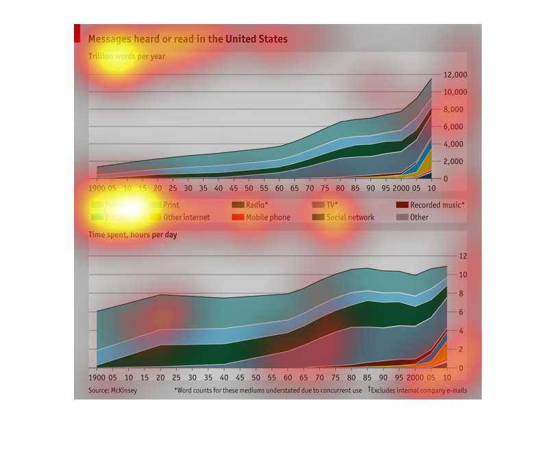
Messages heard or read in the United States. I There are two graphs. The criteria are the
print, time spent per day on each item, and other things included
This chart shows the messages read in the US.It states there are a trillion words per year.
The top chart shows the various types of messages, from 1900 around 2,000 to 2010. The bottom
shows the type of messages that were sent during that time frame.
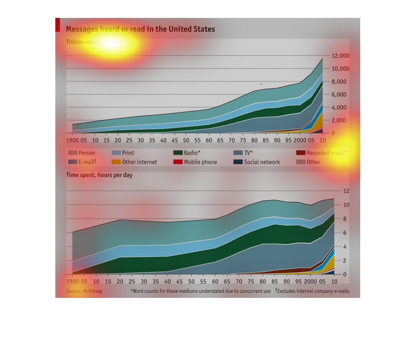
this double graph shows the messages hear/ read in the united states and how that number has
changed over the years. this is shown in the number of words.
Messages heard or read in the United States charted in trillions of words (1 = 1 trillion
words). All places words can be heard are differentiated on the graph. Data from 1900 through
2010 is accounted for. Print and in person oword exchange appears to be the main form of heard
and read words over the given time frame.
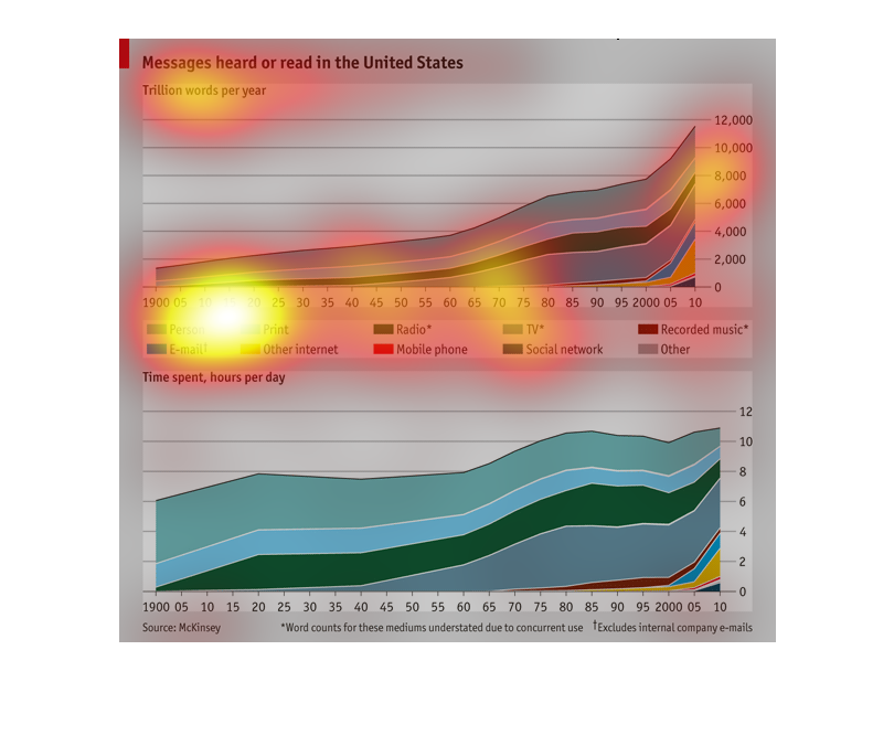
This is a graph that shows the number of messages read or heard in the united states of America.
It uses the measurement of a trillion words per year.
This is a moving average of the type of messages heard or read in the US between 1900 and
2010, along with word counts for those messages. Person to person dialogue has dominated most.
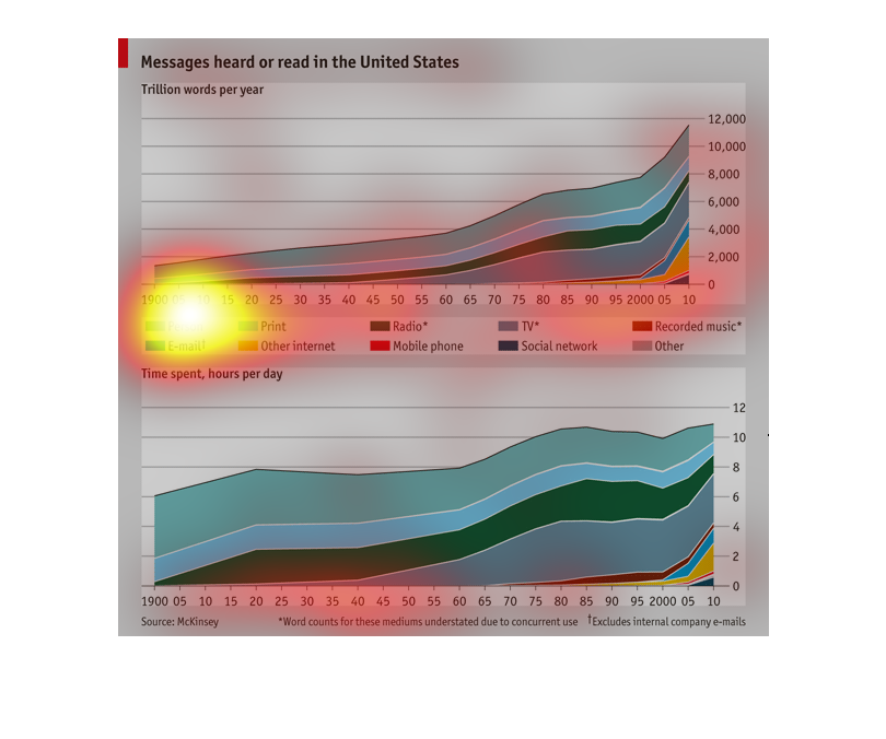
There are two charts. Both charts are messages heard or read in the US. The top chart shows
trillions of words per year. The bottom chart shows time spent by hours per day. The charts
are categorized by person, email, print, other internet, radio, mobile phone, TV, social network,
recorded music and other.
This is a filled in line chart with varying colors of messages heard or read in the United
States. The colors represent mediums on which they can be heard. For example print, radio,
phones, and social networks. It is measured in trillion words per year.
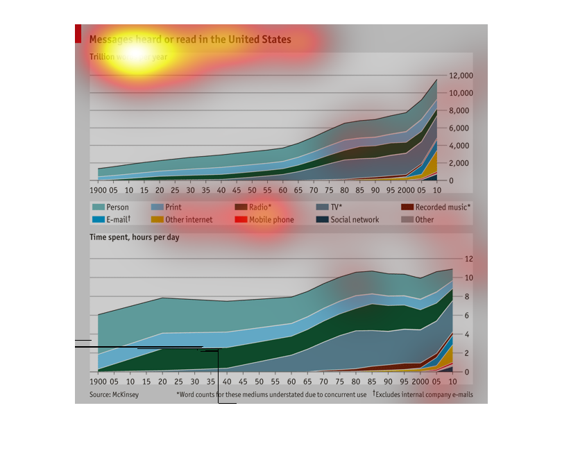
These graphs provide data about the number of messages read or heard in the US and how much
time is devoted to these tasks everyday.  The top graph also delineates how the message is
received be it from social media or tv etc.
This graph discusses messages heard or read in the United States.  It shows time spent in
hours per day.  It looks at different categories such as person, e-mail, phone, printer, radio,
other internet, social network and recorded music.
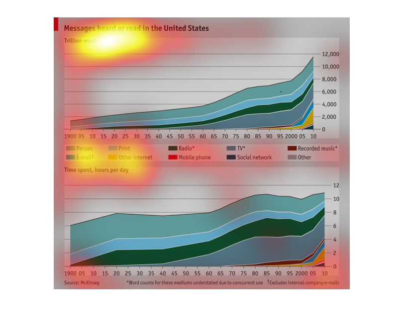
A graph of Messages heard or read in the United States, as expressed in trillions of words
per year with listing for various formats such as Email, radio, mobile phone, etc
This chart describes messages heard or read in the United States, in trillion words per year,
between the years 1900 and 2010. The chart is divided between person and e-mail.

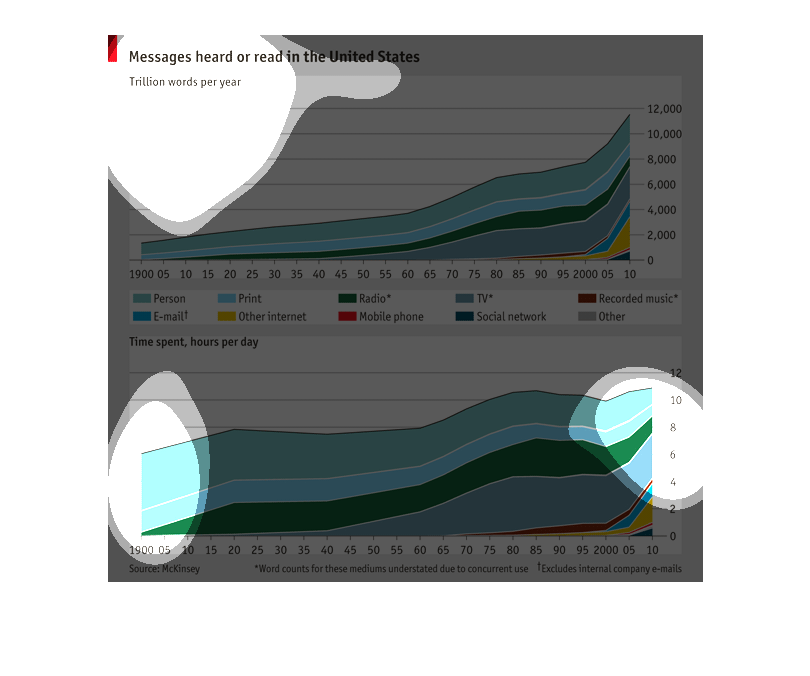
The image is about messages heard or read in the US.  These can vary from emails, print, internet
sources, to the radio, cell phones, and television.  They range from 1900 to 2010 and messages
heard have tremendously increased over the years in all areas.