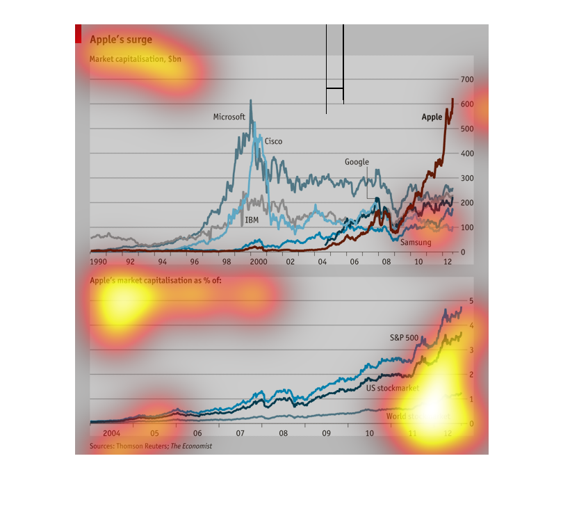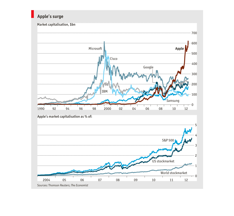
There are two charts here showing the surge of Apple in the marketshare. The chart starts
from 1990 and goes to 2013.  We see how in the year 2011 on up, Apple has a meteoric rise
to become the dominated computer company, reaching over 60 billion dollars. The bottom chart
shows Apple's percentage of the market share through the years.
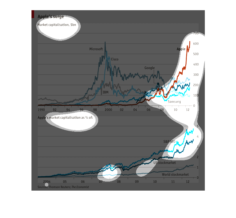
This graph shows "Apple's Surge. Market Capitalization, $bn." Below are two line graphs showing
the growth of Apple vs other companies and Apple in the world market and economies.
This chart compares Apple's market capitalization compared to other tech businesses between
the years 1990 and 2010, and compared to the stock market indexes  between the years 2004
and 2012 in billions dollars. Apple was worth $0 billion in 1990, and $600 billion in 2012.
The US stock market was worth 3.5 billion in 2012.
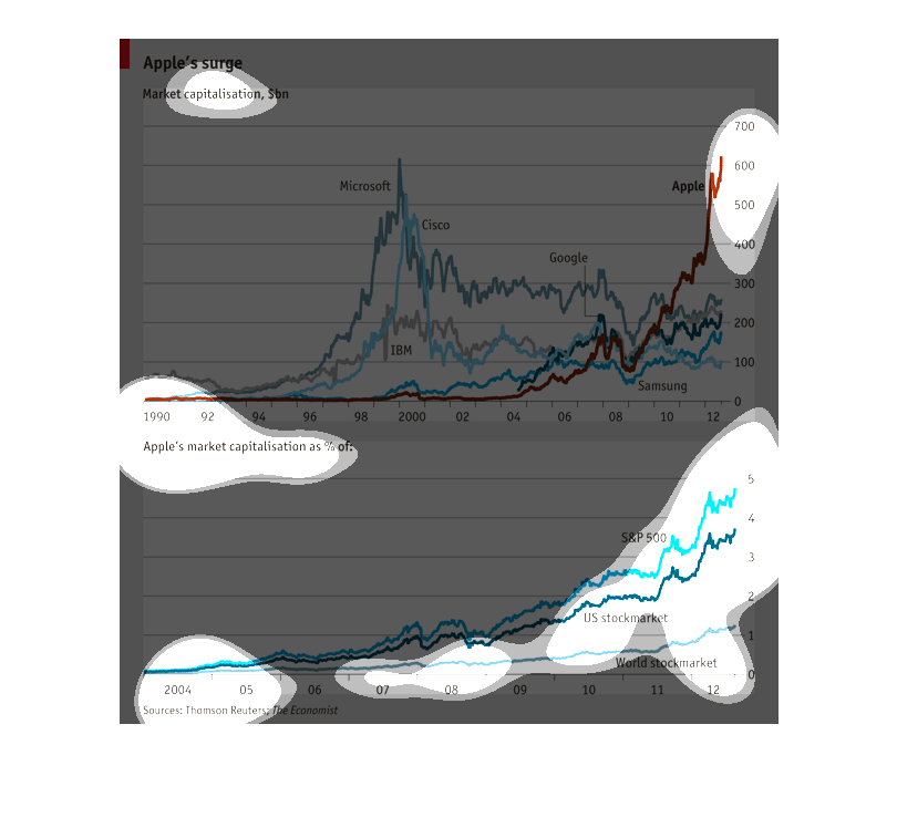
This is a chart showing Apples Surge and market capitalization in billions. The top chart
shows the time period from 1990 to 2012 and compares it to Samsung. the bottom has a chart
from 2004 to 2012 for the stock market.
Graph describes Apple's Surge from 1990 to 2012. In comparison to other companies such as
Microsoft, Cisco, Google,  and IBM. The top graph shows - Apple surged the most around 2012.
Probably because of the iPhone and iPad. I am not sure what the bottom graph describes, but
it measures the U.S. Stock market and the World stock market in comparison. Along with S&P
500.
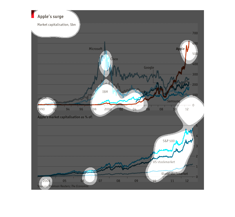
This chart describes Apple's surge between the years 1990 and 2012. It also covers the period
between 2004 and 2012. Companies represented on the chart include Microsoft and Cisco.
This chart depicts a number of facets related to the success or "surge" of Apple, Inc. It
shows and compares Apple's market capitalization, in billions of dollars, between the years
of 1990 and 2012, to other similar companies. It also shows Apple's market capilization as
a percentage of the United States stock market, and the world's stock market overall--depicting
how that percentage has risen during those 22 years.
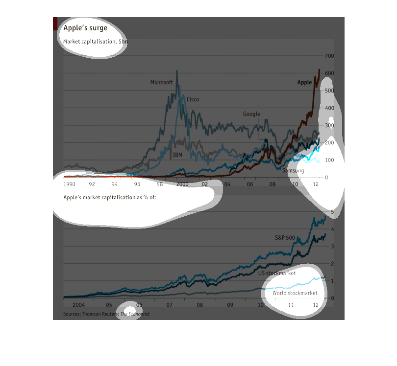
This data set shows Apple's surge in market capitalization. Apple competitors Microsoft and
Cisco peaked around 2000, Google peaked in 2008, and Apple surged in 2012.   The bottom data
set shows the increase in the percentage of Apple's stock. It has been steadily rising on
global and domestic markets since 2009.
A graph of the surge in Apple market capitalization from the year 1990 to 2012. Showing market
capitalization billions total and as a percentage of various market indexes
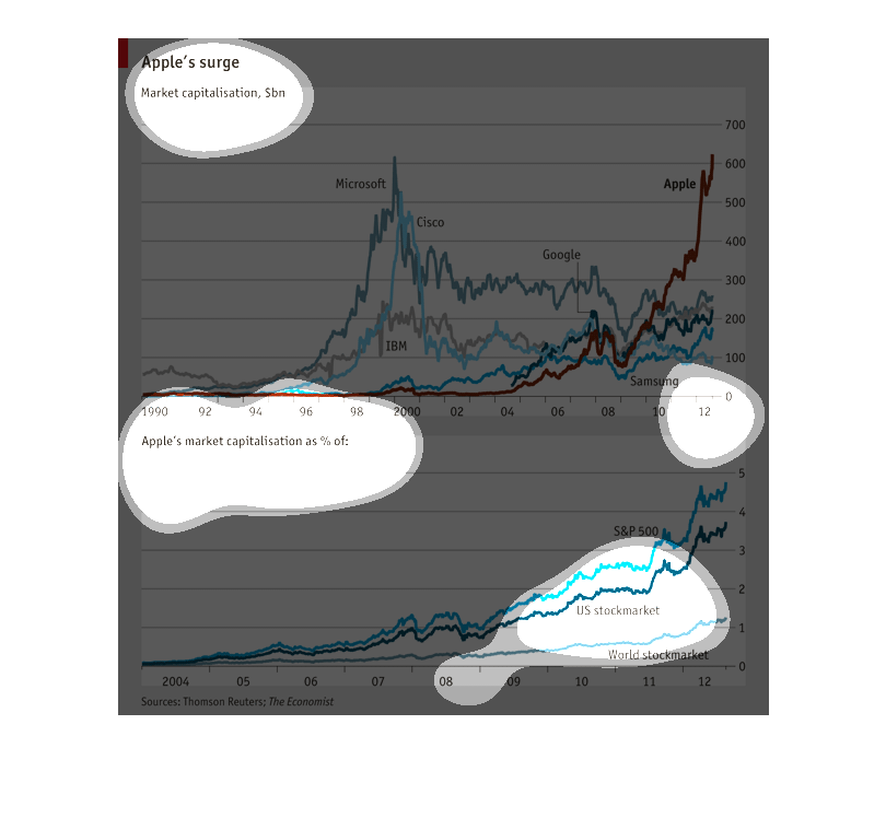
This is a stock market chart showing the surge in Apples stock prices over the last 16 years,
also shows apples total market capitilization on the secondary chart
This line graph shows Apple's surge from 1990 to 2012. Apple is being compared to Samsung,
Google, Cisco, and Microsoft. The second picture shows us the US stock market compared to
the world stocks.
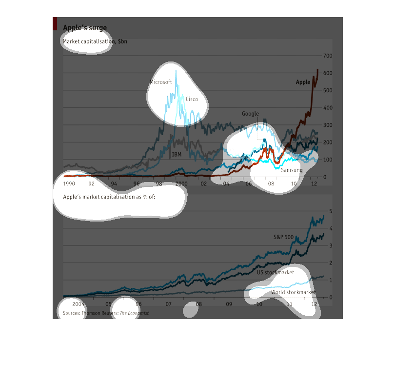
The surge of Apple stock, per billion, as compared to Microsoft, Google, IBM and Samsung stock
over the same time period; 1990 - 2012; and their percentage of market share from 2004 through
2012.
This graph appears to show how tech companies compare in the stock market . It also has a
graph to show how much Apple capitalized the Stock market broken down by country . It seams
that Apple and ibm are the best of the stocks in the comparison
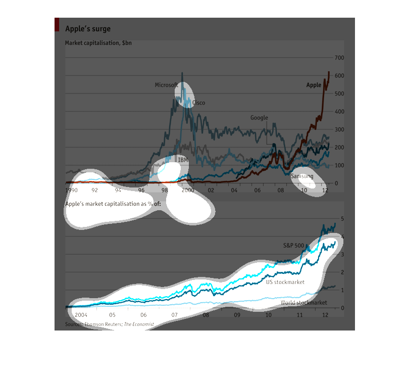
These graphs illustrate Apple's surge.  The top graph shows market capitalization in millions
for various technology companies.  The bottom graph shows Apple's market capitalization as
a percent of the S&P 500, the US stock market, and the world stock market.