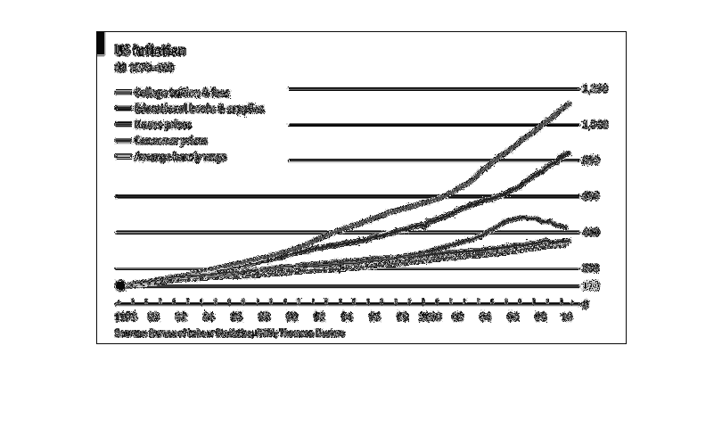
The graph describes US inflation between the years 1978 and 2010. It records college tuition
and fees, educational books and supplies, house prices, consumer prices, and the average hourly
wage. All five have a steady, matched up record until about 1985, where there's a bit of a
split as college and education costs rise, spiking the most out of the five. Housing has a
rise and fall between 2006 and 2008, while consumer prices and average hourly income remain
the lowest of the five lines, never rising above 400
Error using .*
Matrix dimensions must agree.

Error in plotSpotlight (line 30)
    output = repmat(a,[1 1 3]).*single(im)/255;

Error in plot_individual_user_maps (line 49)
        [heat] = plotSpotlight(im,heatmap,3);