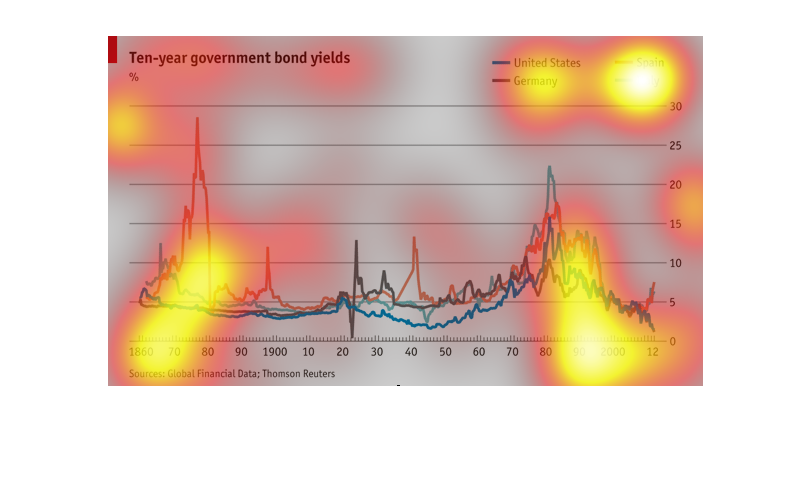
This fun little chart show the ten--years government bond yields. It displays the information
for the years 1860-2012. Around the year 1870 the percentages spiked.
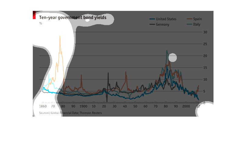
This chart shows the Government bond yields for 10 years for US, Italy, Spain, and Germany.
From 1860 to 2012. It shows Spain spiked at around 25% in 1870, and all below 10% by 2012.

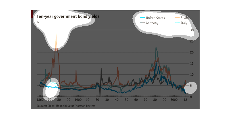
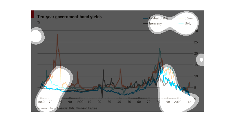
This chart shows the 10 year government bond yields for the US, Germany, Spain, and Italy.
Beginning with 1860 through 2012. The source of the information is Global Financial Data;
Thomson Reuters.
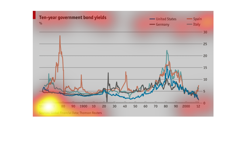
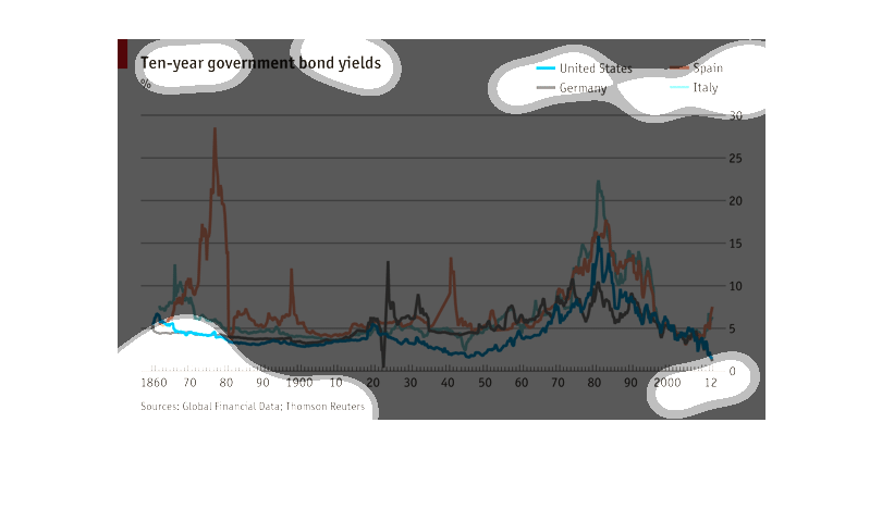
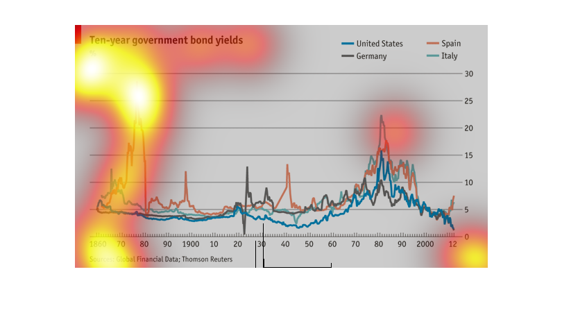
This graph shows the high and valuable investment choice that is government bounds. Here it
illustrates how the bonds are quite profitable and worth while of a ten year period, though
the information goes back much longer than that.
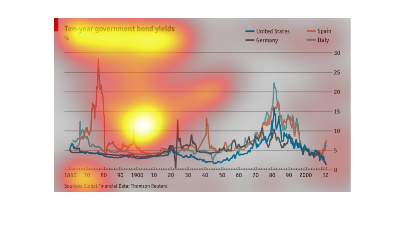
This chart describes ten year government bond yields percentage, from the years 1860 through
2012. Countries on the chart include the United States, Germany, Spain, and Italy.
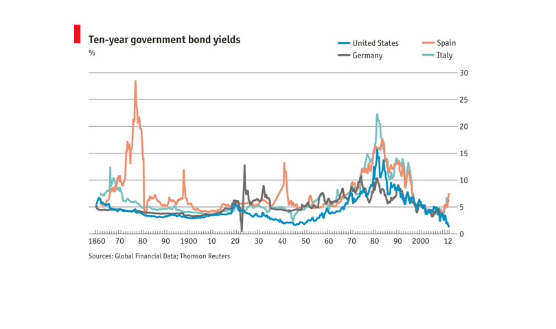
This is a chart depicting ten year government bond yields percentages between the US, Germany,
Spain and Italy from the years 1960 to 2012. Currently the highest yield is with Spain.
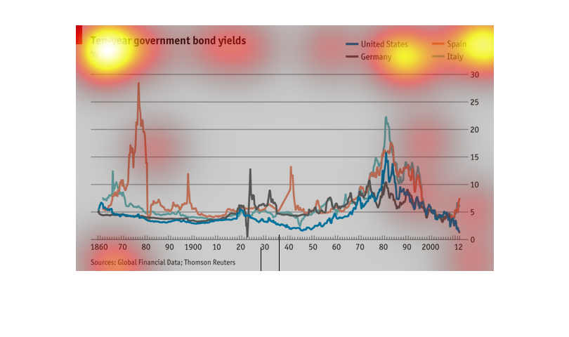
The following chart gives the 10 year government bond rate of the United States, Germany,
Spain and Italy from the years of 1860 all the way too 2012.
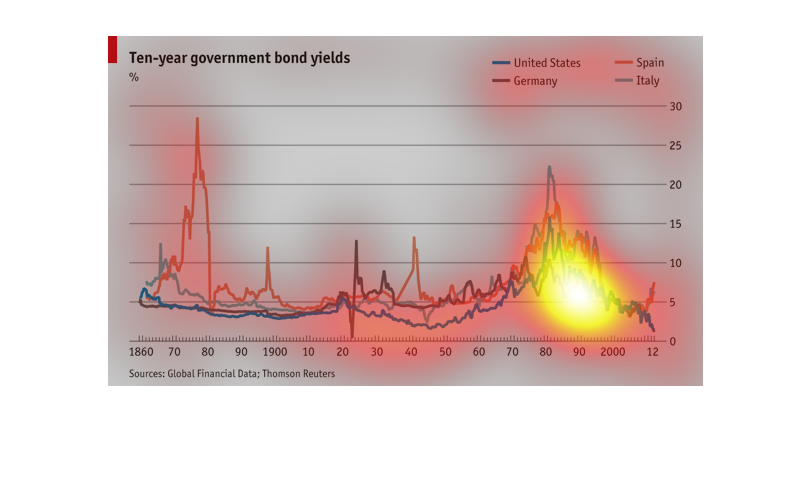
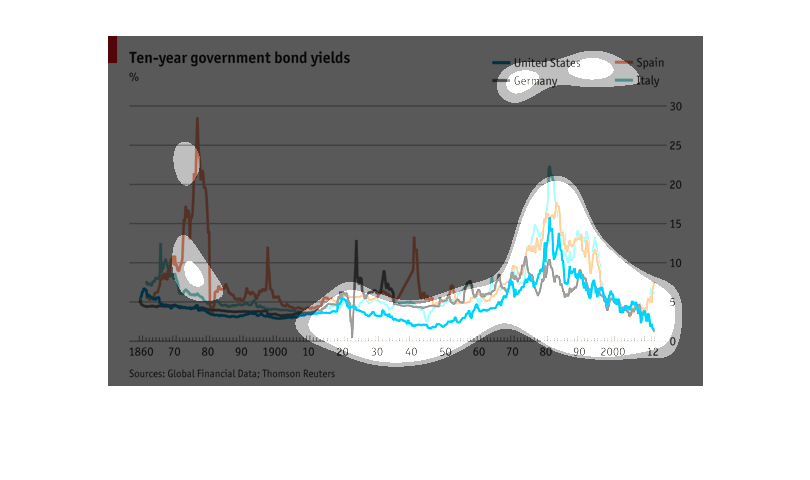
This shows government bond yields for the U.S., Britain, Spain and Italy from 1860 to 2012.
Spain had a big spike in the 1870s up to nearly 30% and Italy had a spike around 1980. In
2012, all were quite low, none over 7%
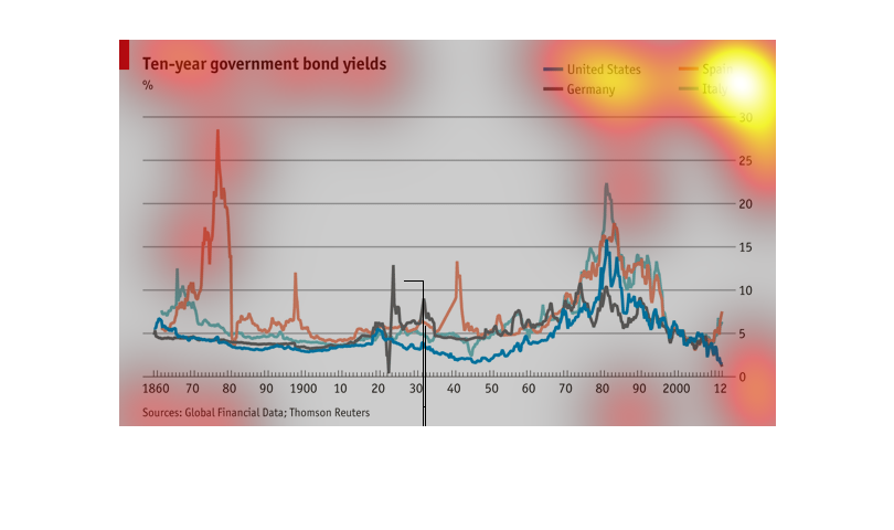
This chart describes the performance of 10 year government bonds from 1860 through 2012.
Based on the chart it seems to indicate that Spain while being the most volatile in terms
of rates is also consistently one of the best performers while the US bonds remained relatively
low.
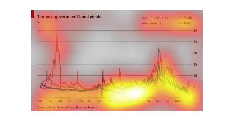
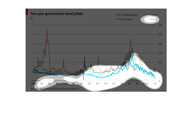
This graph show the yield of government bonds over a period of 10 years in the United States,
Spain, Italy, and Germany. Each country has a greater yield than the other three at some point
on the timeline.
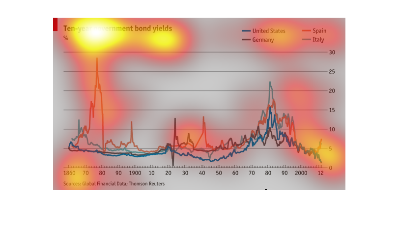
This is about 10 years of government bonds. Spain gave out the most government bonds the first
10 years. In the middle of the 10 years Spain and Germany was almost tied. When it was almost
the end it looked like Italy was going to be in the lead but then Spain ended up comming out
in the lead.
This graph shows the ten-year government bond yields for the United States, Germany, Spain,
and Italy. It marks the percentage over time from 1860 to 2012. While all nations had peaks
and valleys, they were particularly noticeable for Spain.
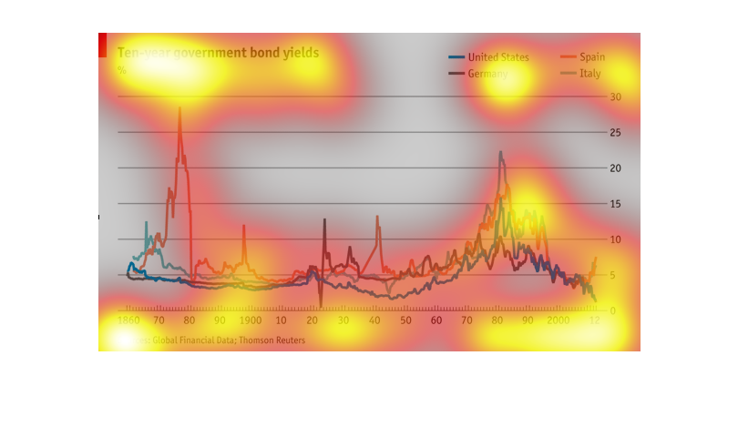
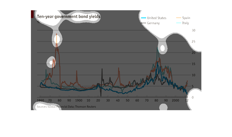
This graph is measuring something to do with the economy and is comparing multiple countries.
It is hard to tell what is being measured without a key.
THIS PLOT SHOWS THE YIELDS FROM TEN YEAR GOVERNMENT BONDS FOR THE UNITED STATES, GERMANY,
SPAIN, AND ITALY OVER TIME. THESE YIELDS HAVE BEEN DECREASING SINCE THE 1980S.