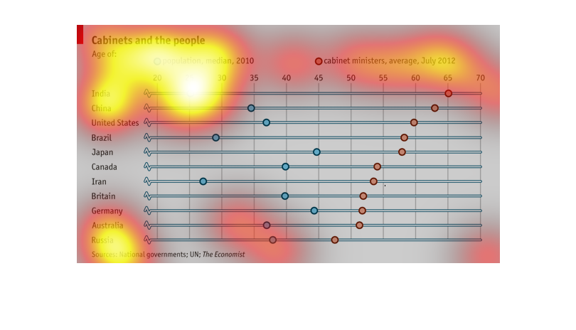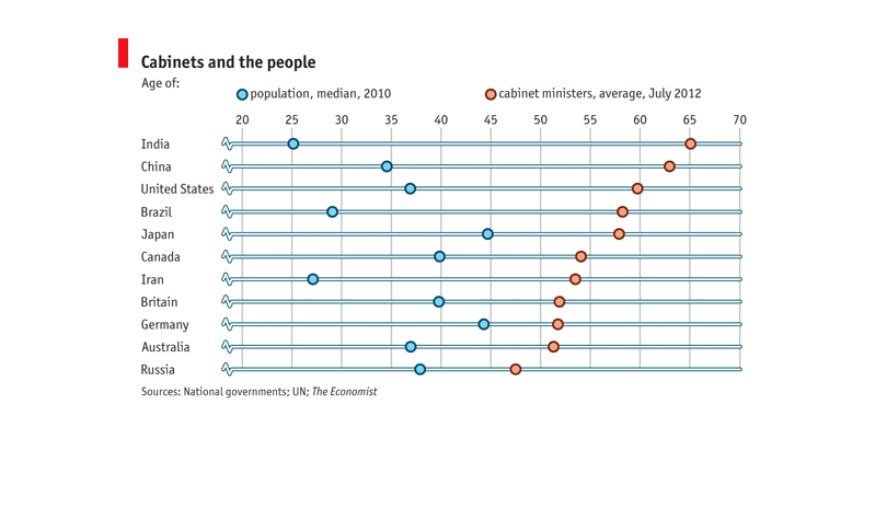
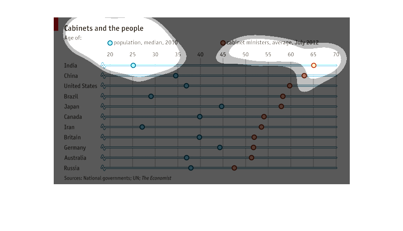
This is a chart showing the median age of the population versus the age of the cabinet members
of various countries. The chart shows most cabinet members to be 50 to 65 while the populations
are less than 45.
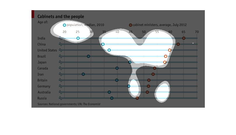
This chart is titled "Cabinet and the People". It shows the age of various countries around
the world which include India, China, US, Japan, Canada, Iran, Britain, Germany, Australia,
and Russia. The age goes from 20 to 70. This was recorded in 2010. India has the highest cabinet
age while Russia has the lowest
This graph shows the average age of the population, and its cabinet members, broken down by
country.  It is sorted by the average age of the cabinet members, from highest to lowest.
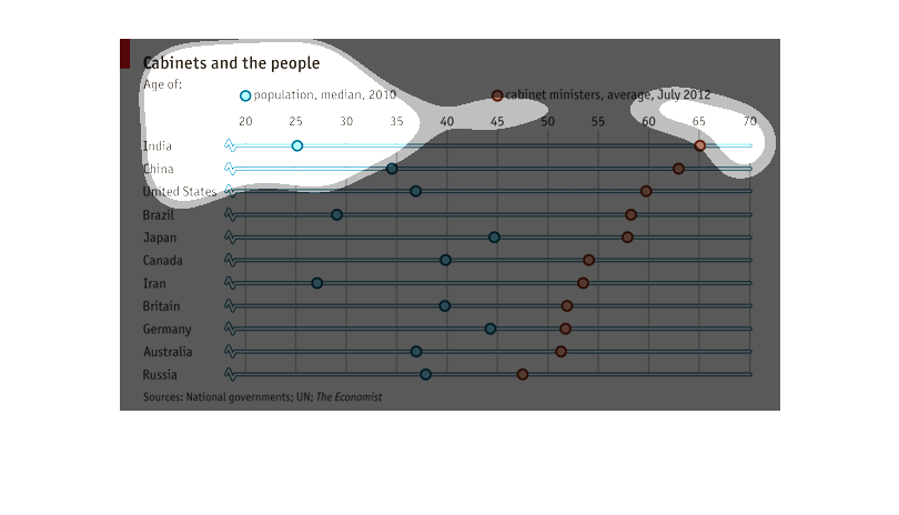
THIS PLOT COMPARES THE MEDIAN POPULATION AGE AND THE AVERAGE CABINET MEMBER AGE FOR SEVERAL
COUNTRIES. POPULATION AGE IS GIVEN IN BLUE WHILE CABINET AGE IS GIVEN IN YELLOW.
This image shows or depicts in statistical line and dot graph format of countries with cabinets
and the people. Leading countries are India, China and United States.
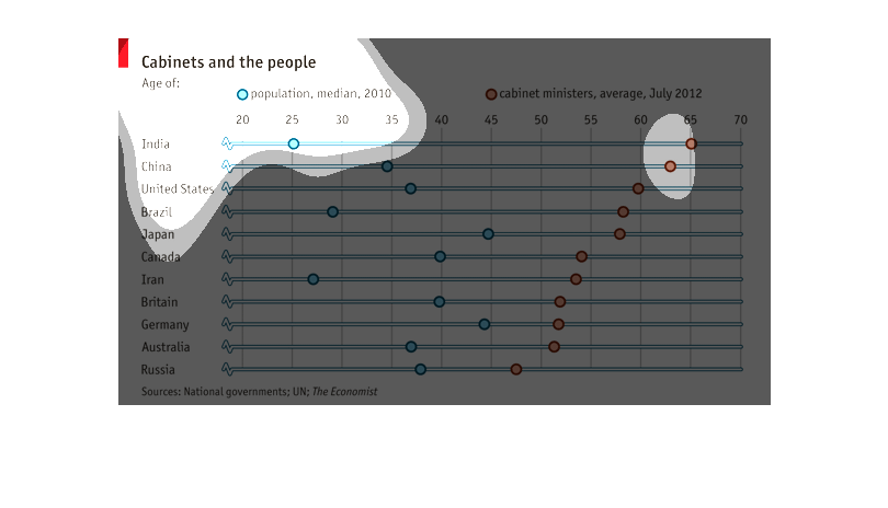
This is a graph representing cabinet ministries. Several countries cabinet ministries can
be shown for July of 2012. India is the highest in the rating.
The title of this graphs is, 'Cabinets and the people'.  Across the top of the graph are population,
median, 2010.  To the right of this heading is another; cabinet ministers, average, July 2012.
 On the left hand column of the graph there are about a dozen countries listed.
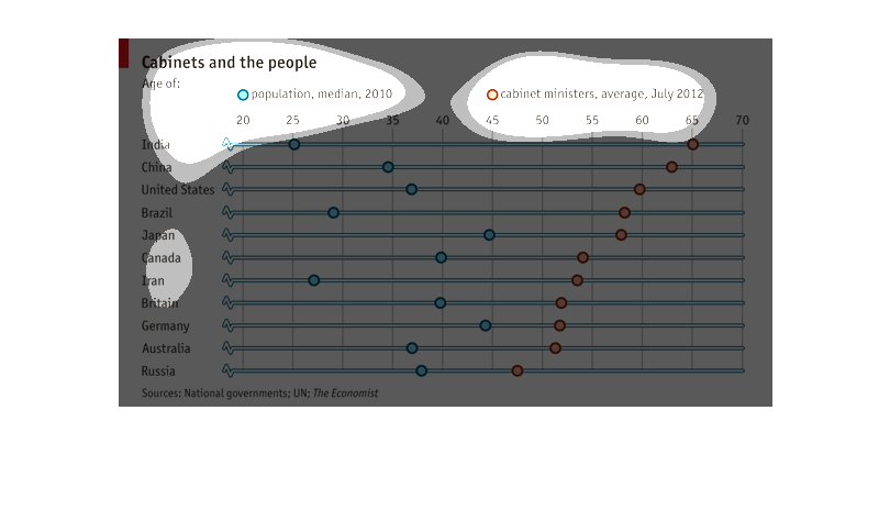
This chart describes cabinets and the people. Specifically the age of the population. Countries
on the chart include India, China, The United States, and Brazil.
on one axis is countries, the other is numerical values.  It is showing the relation between
population and cabinet members. the graph is using one dot color for cabinet information and
another color for population information. It visually shows the general correlation (if any)
between these two values.
cabinets and the people, age of: population median 2010, cabinet ministers average 2012, leading
countries of the modern world. I'm not understanding this graph.
This is a chart showing the median age of the population of a country and the median age of
the cabinet members of the country. There does not seem to be a strong correlation between
the two, but if there is, it might actually be that the younger populations have older cabinet
members on average.
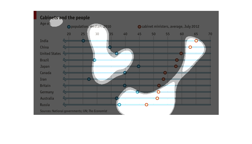
The graph compares between eleven different countries the average age of the population in
2010 versus the average age of cabinet ministers in July of 2012.
The image shows the population of individuals versus the age of cabinet members in different
countries. The source of the image data is from the Economist.
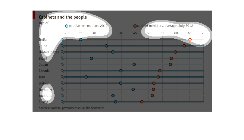
This is a chart depicting the median age of the population in relation the the median age
of the members of cabinet ministers in several countries around the world.
This graph illustrates cabinets and the people with ages for both the population median and
cabinet ministers.  India has the lowest population and highest cabinet age.  Russia has the
highest population and lowest cabinet age.