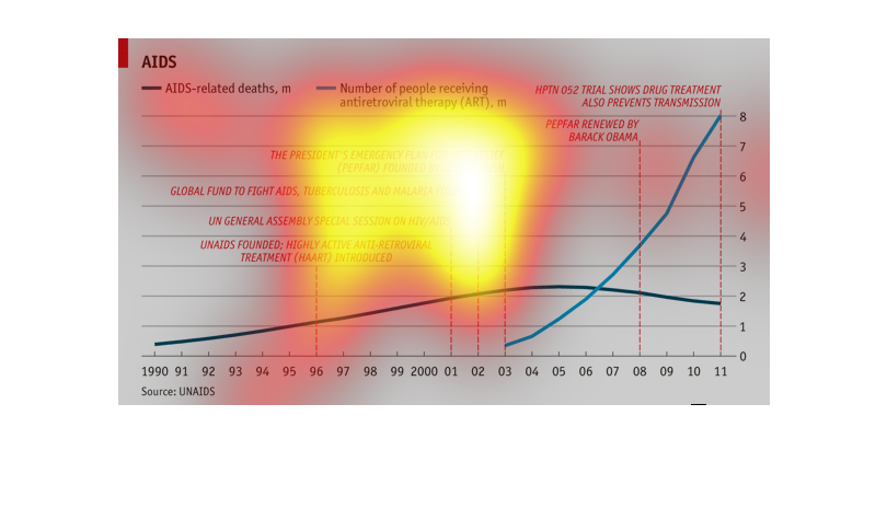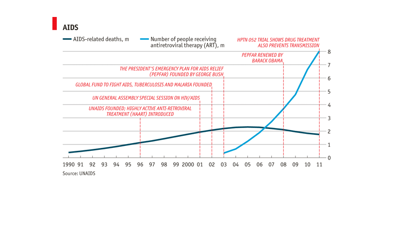
The title of this graph is, 'Aids, related deaths'.  The data was pulled from statistics from
1990-2011'. The graph displays actions by two US presidents, as well as UN assembly meetings
and global fund initiatives to combat Aids, and other related diseases.

The graph shows the number of AIDs related deaths from 1990 to 2011.  The number of deaths
was increasing until A.R.T. therapy was beginning to be used.  There is a very obvious correlation
on the chart between these two.
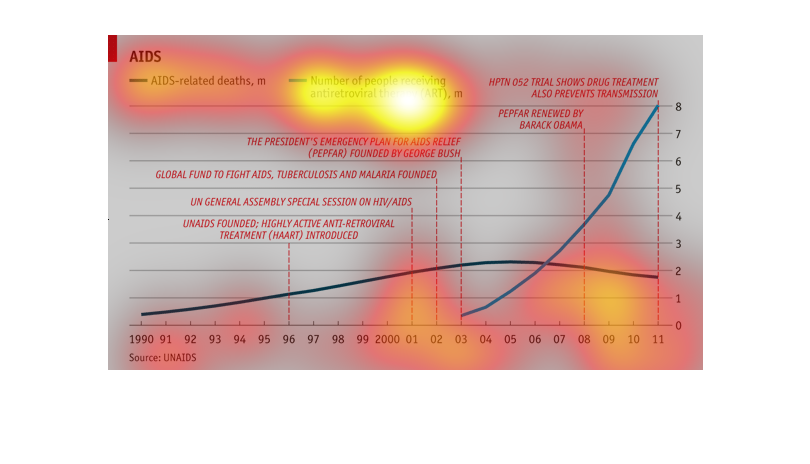
This chart shows the number of Aids related deaths, and the number of people received antiretroviral
therapy from 1990 to 2011. It shows the deaths dropped as the use of the drugs increased.
The title of the graph is AIDS measuring the number of AIDS related deaths and the number
of people receiving ART. The rest of the graph is a bit unclear even with the bubble access
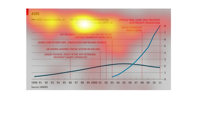
This graph shows the amount of people infected with the disease AIDS, shown in a sloping trend
line from 1990 to 2011, with a blue line representing the amount of people being treated with
antiviral drugs appearing in 2003.
This chart is interesting, and shows Aids infographics. In dark blue is shows the information
of Aids related deaths, and in light blue the information for number of people receiving antiretroviral
therapy.
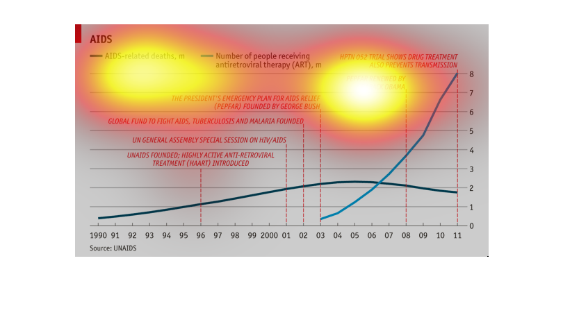
Aids related deaths and number of folks receiving antiretroviral treatment, 1990 through 2011,
we see a slight decline in deaths as treatments increase
This is a graph indicating AIDS related deaths and the differences of the AIDS infected and
the antiretroviral medications and Trial show drugs which was renewed by Barack Obama, between
the year 1990-2011.
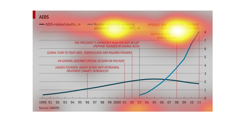
This chart describes Aids related deaths in the millions, from the year 1990 through to the
year 2011. Categories on the chart include number of people receiving antiretroviral therapy.
The graph shows that there is a disproportionate amount of government funds spent in a trial
drug that may or may not cure the AIDS virus, which has been a threat for more than 30 years.
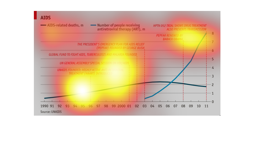
This is a graph comparing AIDS-related deaths with people who are receiving treatment for
AIDS. It starts in the 90's and goes to 2011. It looks like the number of people being treated
has gone up drastically, and the amount of deaths has slowly declined. There is also a timeline
of significant things that happened in the fight to treat AIDS.
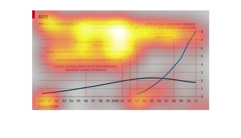
This graph shows data about AIDS related deaths and the number of people receiving antiretroviral
therapy from the years 1990 through 2011. Also on the graph are notes about specific related
events that occurred within that timeline, such as when the President's plan for AIDS relief
was founded (by George Bush) and when that same plan was renewed by Barak Obama.
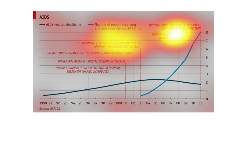
A graph about aids, it includes a timeline to show the aids epidemic as well as the anti-retroviral
therapy drug use for aids.  It would appear that the president's plan contributed greatly
to the increase in anti-retroviral therapy