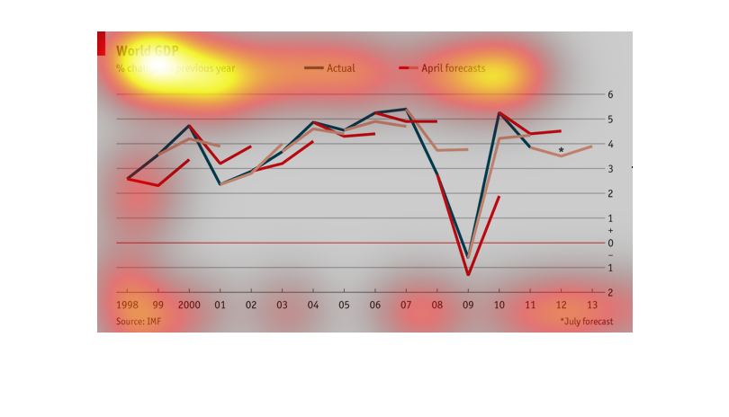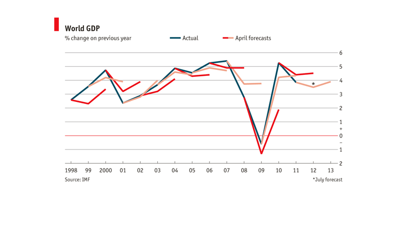
A line graph showing the world GDP percentage of change throughout the years starting in 1998.
It also has a prediction on what April and July will look like
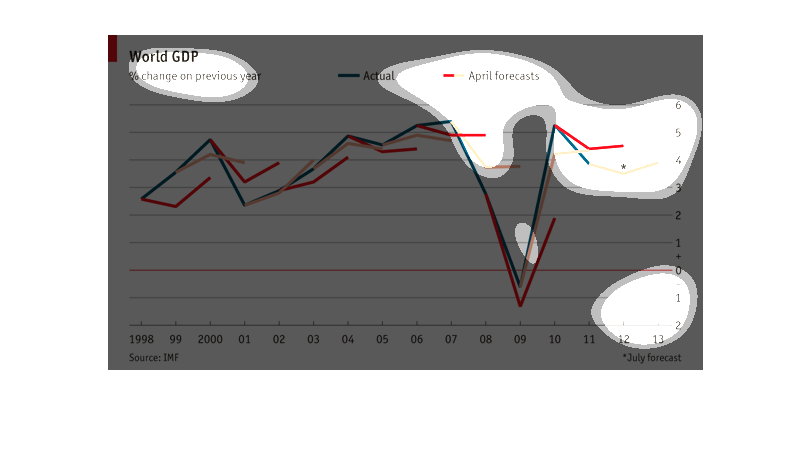
The graph describes the world GDP as a percent change from the previous year comparing the
forecasted amount vs actual recorded amount and a third red line which is unknown. The world
GDP was on a steady increase until 2009 where there was a sharp decrease that rebounded in
2010.
This graph shows the percent change of world GDP from the previous year from 1998 to 2013
and the blue line is the actual and the red/orange line is the April forecast.  The high peak
of the graph was in 2007 and fell steeply to the low point in 2009 where it climbed steeply
in 2010 almost to the 2007 point.
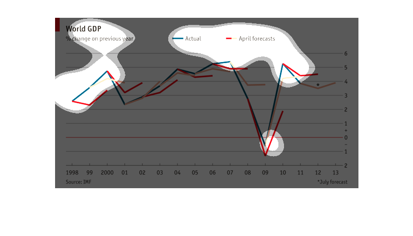
This graph illustrates world GDP with percent change on previous year from 1998 to 2011.
It contains both actual and forecast figures to show comparison in a line graph.
This is a graph of the world GDP for the month of April, the actual and the predicted in the
years 1999-2013. It shows there is a slow climb until 2008 then a severe driop in 2008-2009,
then climbs back up.
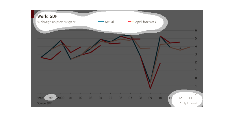
This is a chart depicting world GDP percentage change over the previous year from the years
1998 to 2013 comparing actual numbers to April or forecast numbers.
This is a chart that describes the world GDP changes from year to year. It goes from 1998
to 2013. The shape is pretty flat with exception of a sharp dip in 2009.
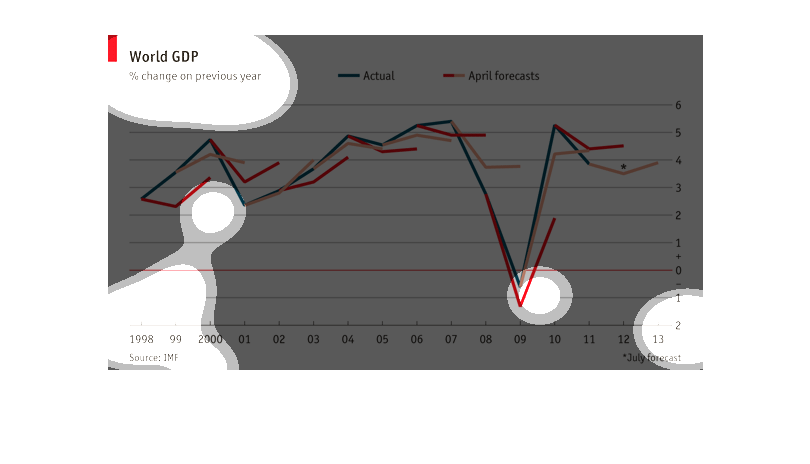
This shows the % change in global GDP from 1998 to 2013 and how it compares to the projected
% change.  Overall this chart shows that GDP is increasing once again after a hard crash but
not at the rate that is foretasted.
This is a graph that shows the Gross domestic product rate. It begins in the year 1988, it
ends in the year 2013. It is a line graph of actual and estimated.
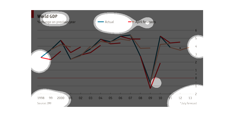
This image depicts in line graph format actual and April forecasts for World GDP % change
on previous year. Years forecasted is from 1998 to 2013. Source of statistics is IMF.
This chart describes world GDP as a percentage change from the previous year. The chart covers
the years 1998 through 2013. The chart is sourced by IMF.
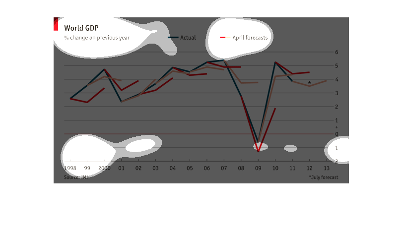
This graph shows the world GDP by percentage change from the previous year, from 1998 to 2013.
It compares the real percentage change with the April forecast, showing a very similar trend.
The graph displays World GDP based on percent change on the previous year from 1998 to 2013.
The graph plummets to the lowest point in 2009 but makes a sharp climb back up in 2010.
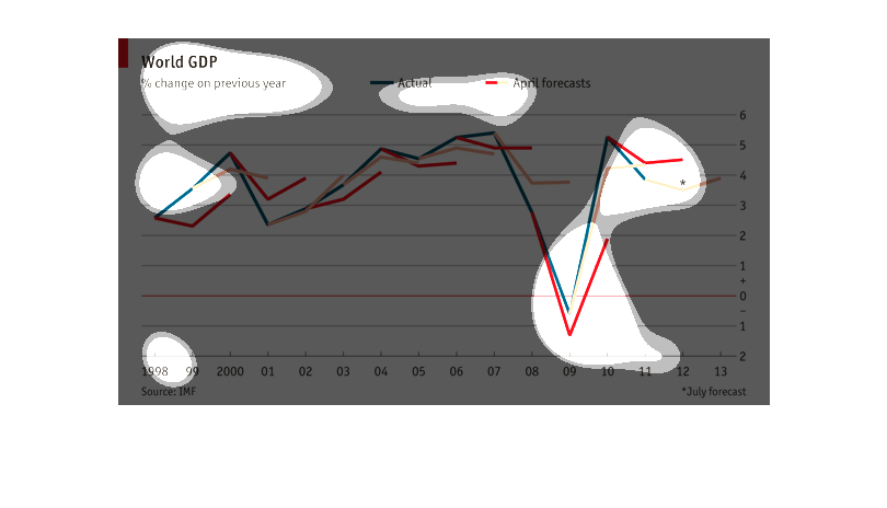
This is a chart showing the percentage of change in the world GDP. The chart shows the actual,
and the April forecasts and covers the period of 1998 to 2013.