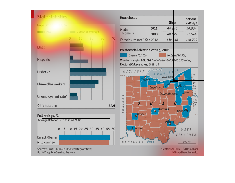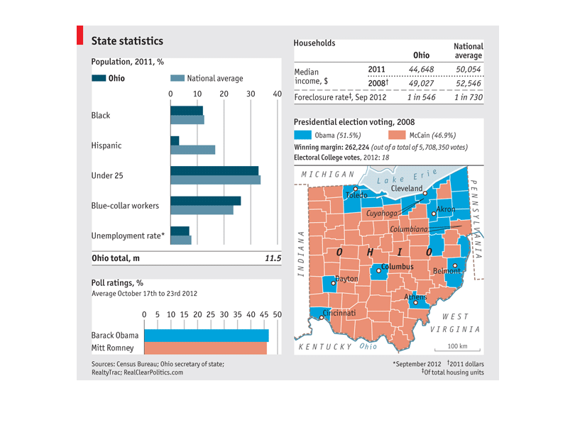
this graph is showing the viewer the certain statistics and numerical factors of a certain
state.mthe state being researched is Ohio and there is even a map next to the bar graphs
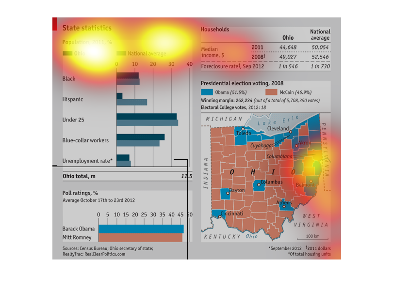
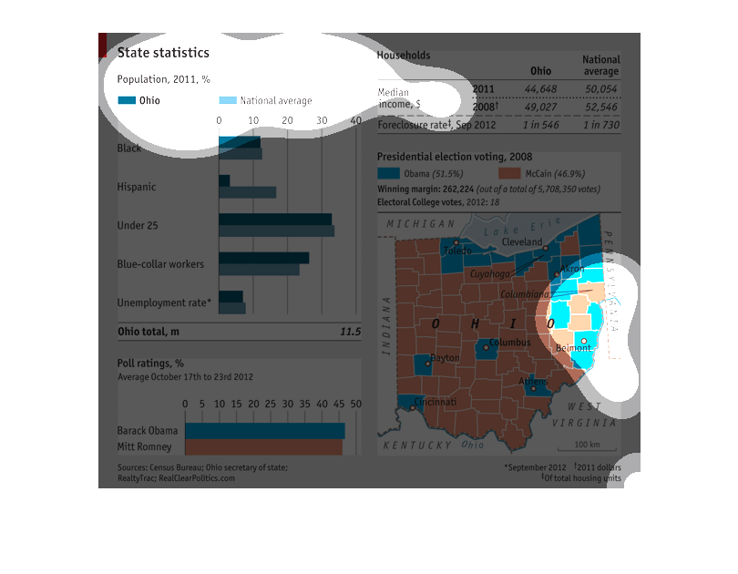
This graph shows various demographic data for the state of Ohio, based on data from 2011.
 Data includes racial percentages, poll ratings for Barack Obama and Mitt Romney, and household
income.  A by-county breakdown of the 2008 presidential race is also included.
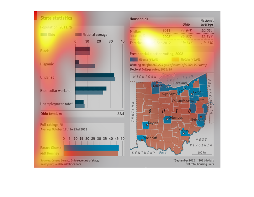
This image describes several variables of the state of Ohio. It is for a presidential election.
The north east part of the state is for the democratic candidate while the southwest is for
the republican candidate.
This graph illustrates state statistics with population in 2011 for Ohio and the nation. It
also has a map of presidential election voting in Ohio for 2008.
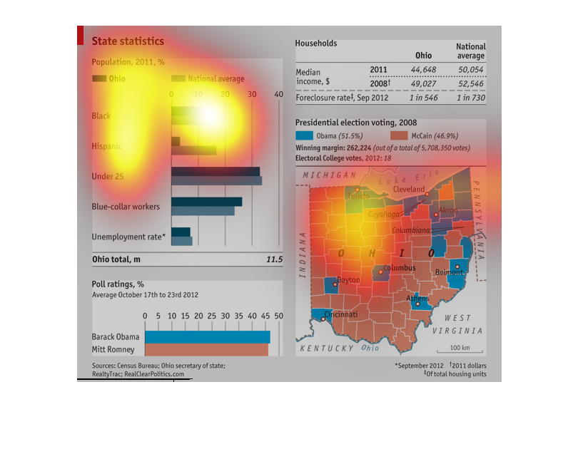
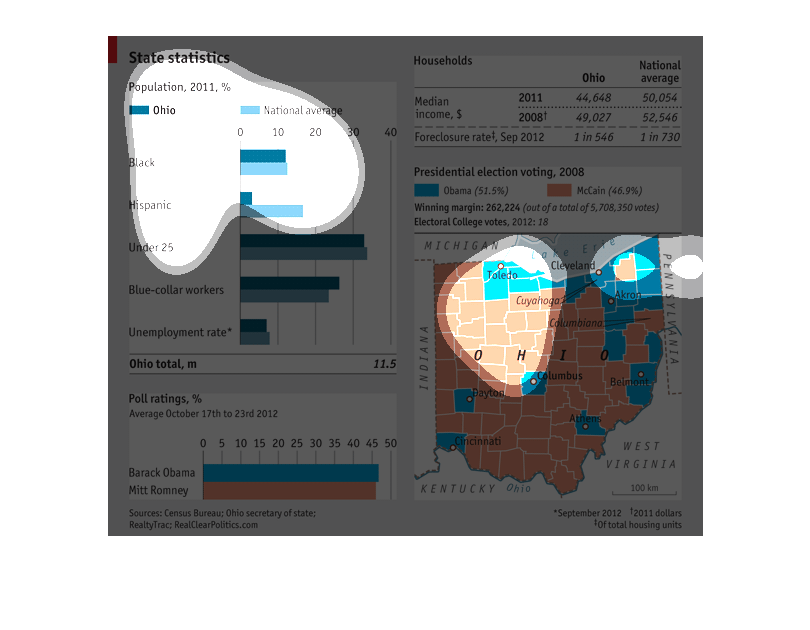
The title of this graph is, 'State statistics'.  The information provided in this graph reflects
data from Ohio versus national averages.  There is a graphic that displays Ohio's population
and demographic breakdown compared to national averages.  There is another graphic displaying
the different counties in Ohio.  This graphic breaks down voting data reflecting who voted
for Barack Obama, or Mitt Romney.  Additional information on this graph lists household incomes
for the state versus national averages.
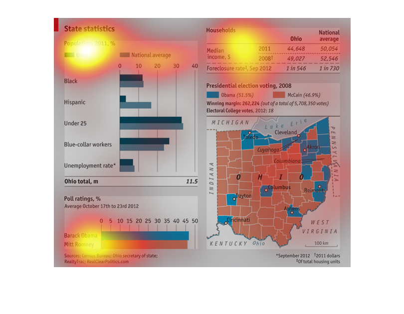
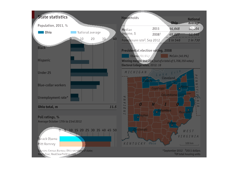
This chart describes state statistics as a percentage of the population for the year 2011.
Categories on the chart include black, Hispanic, and under 25.
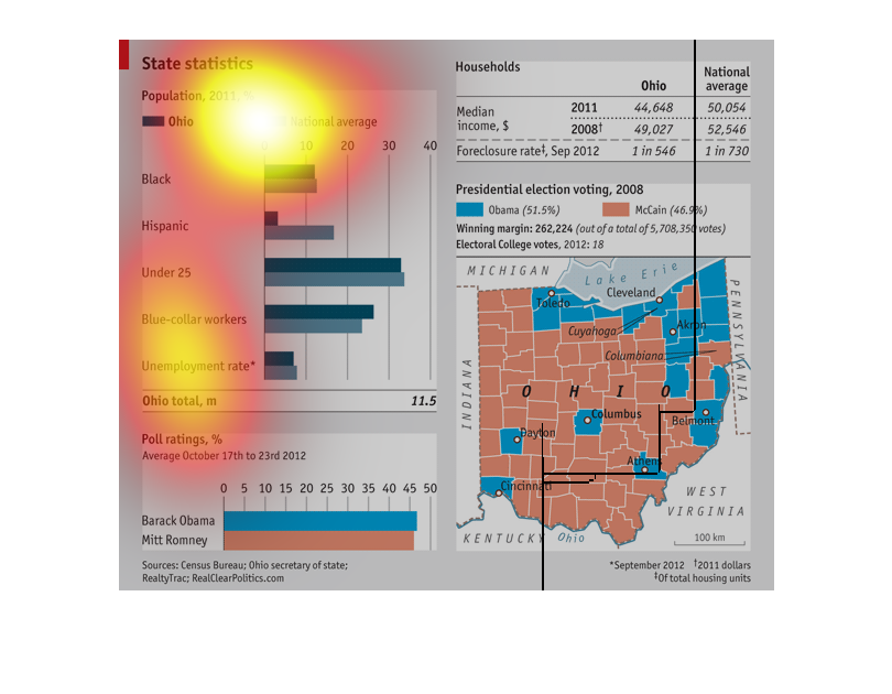
This graph shows "State Statistics. Population 2011, %". On the graph on the left in dark
blue shows Ohio, and in light blue shows the National Average. On the graph on the right in
the light blue shows Barack Obama, and  in the orange Mitt Romney for the state of Ohio.
An infographic showing demographics statistics for the state of Ohio and the 2008 election
and 2012 elections. It shows rural regions vote Republican and cities Democratic
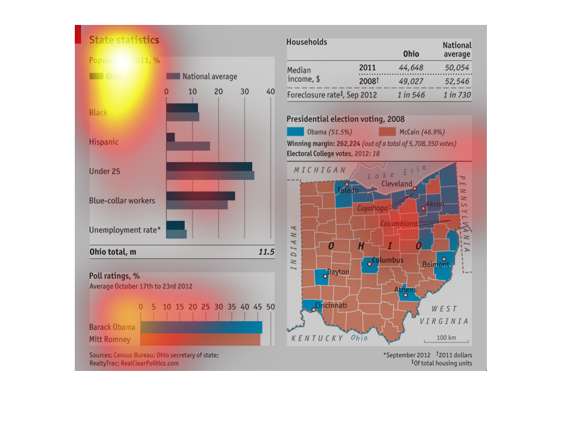
This is a chart showing Ohio state statistics including population racial demographics, voting
tendencies, income, and foreclosures. The chart shows the majority of the population is under
25.
This image shows political statistics about Ohio. It shows population by ethnic group and
it shows the percentages of Ohio residents that voted for each candidate in the 2008 and 2012
US presidential race.
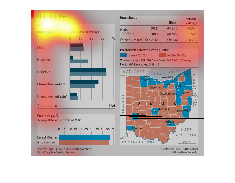
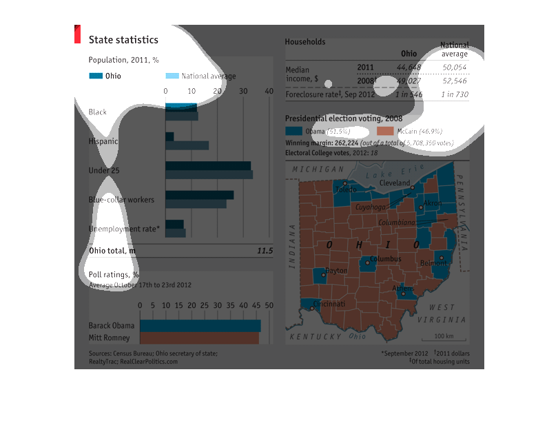
The graph shows the unequal disbursement of wealth among minorities in the state of Ohio,
based on race, age, blue-collar labor, and unemployment. The total sum is quite high.
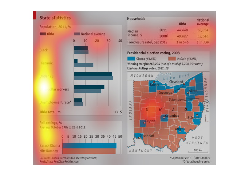
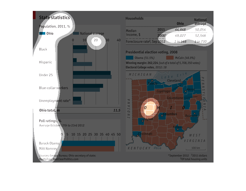
the name of this map is called state statistics and it shows a bar graph and a map of the
united states dark green is ohio and turquoise is national average.