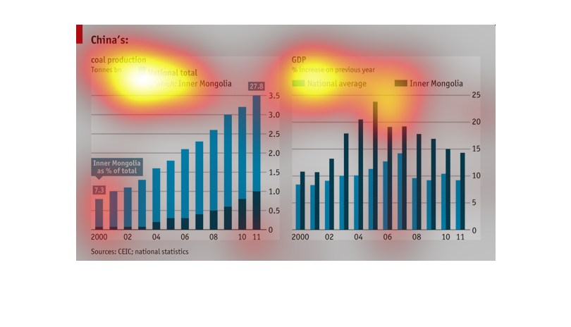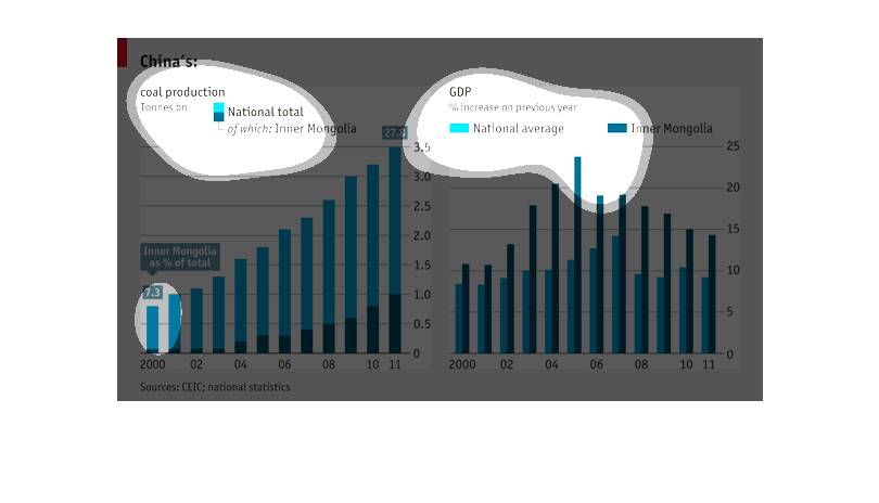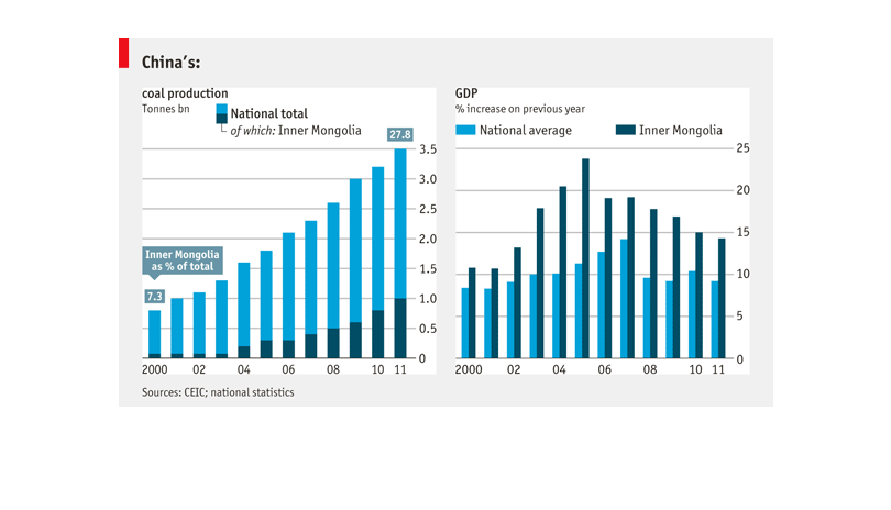
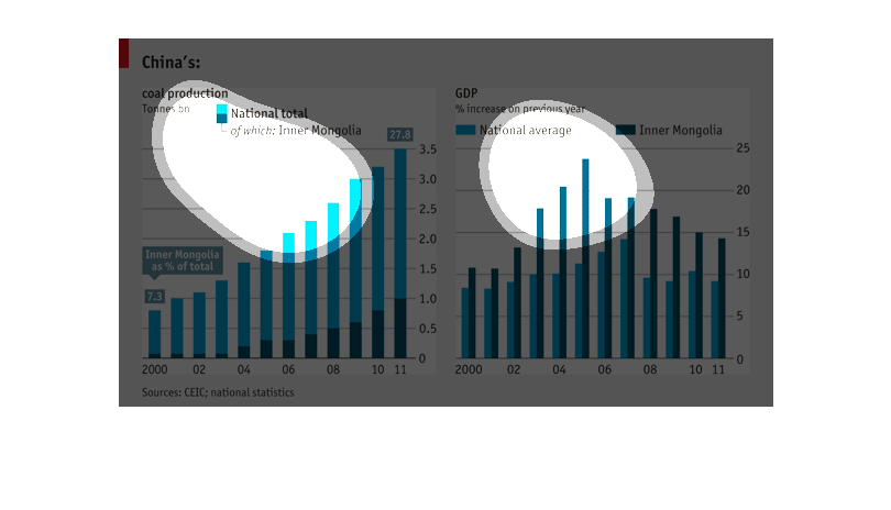
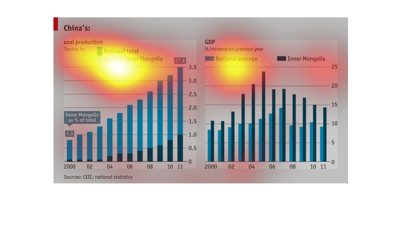
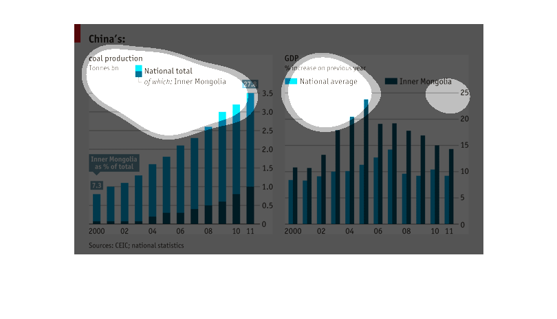
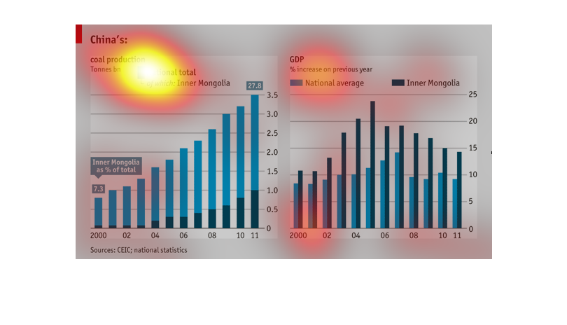
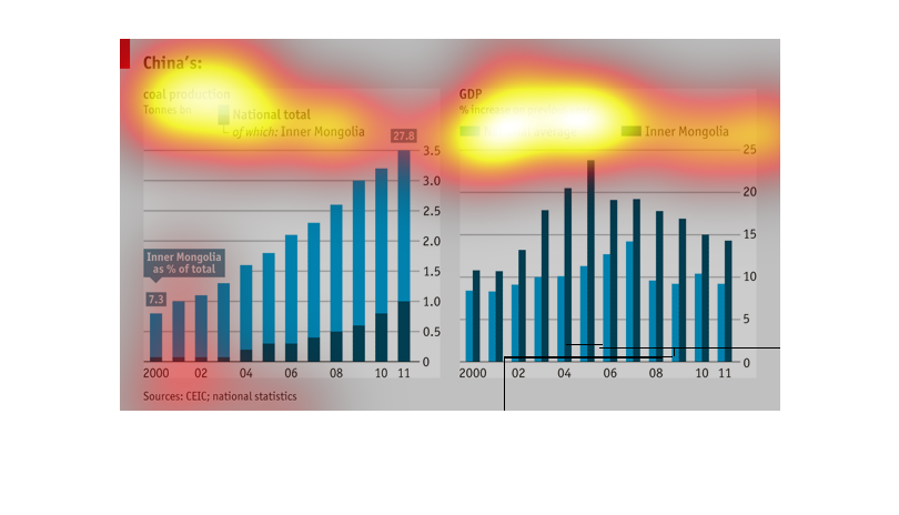
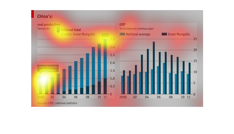
There are 2 bar graphs displaying information about China. The first graph focuses on China's
coal production, comparing numbers from Inner Mongolia against the National Total. The second
graph displays information about the GDP and the percent of increase on the previous year.
This graph, too, compares the numbers of Inner Mongolia against the National Average
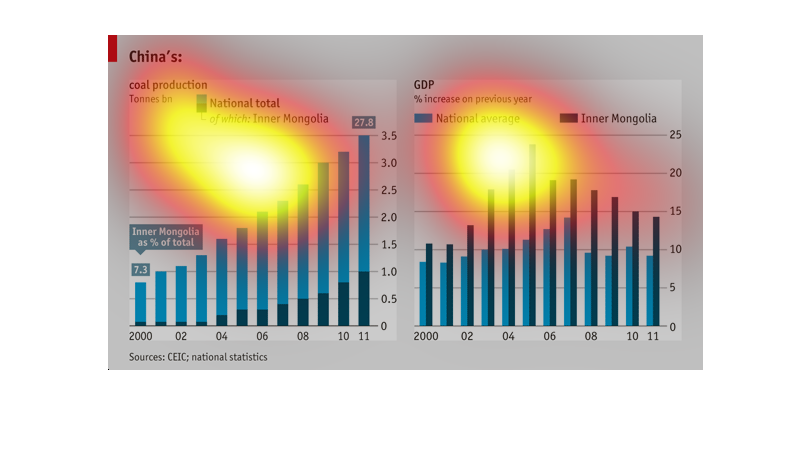
THIS GRAPHIC SHOWS THE AMOUNT OF COAL PRODUCTION IN CHINA EACH YEAR AS TOTAL IN ALL CHINA
(LT BLUE) AND FROM INNER MONGOLIA IN DARK BLUE. ALSO SHOWN IS THE CHANGE IN GDP FOR BOTH REGIONS.
Bar graphs of China's coal production and China's percent increase in GDP. Light blue is the
national total and dark blue is Inner-Mongolia. There is a bar for each year from 2000 to
2011.
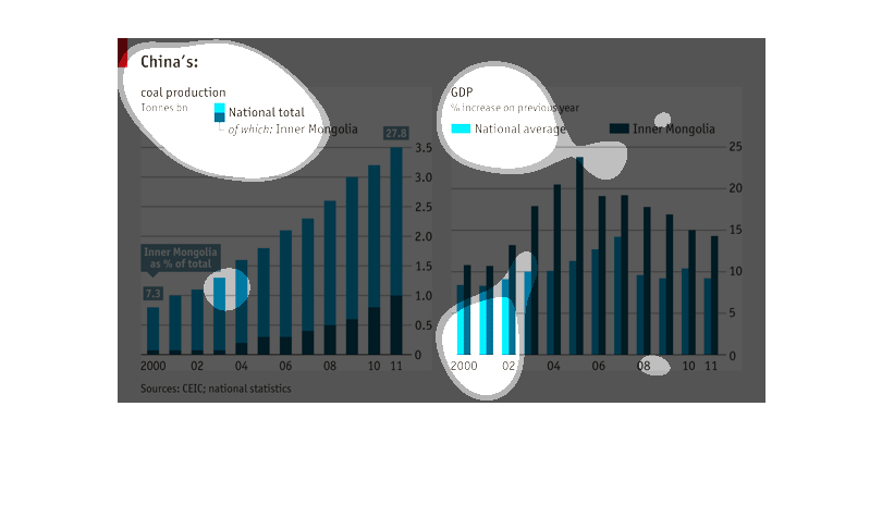
This is a graph that shows coal production levels in china. The graph shows these levels in
form of tonnes. it also shows the gross domestic product growth.
A graph infographic of China's coal production and GDP compared side by side. Shows general
increase in coal production from 2000 to 2011 with increase in GDP for most part until recent
decline
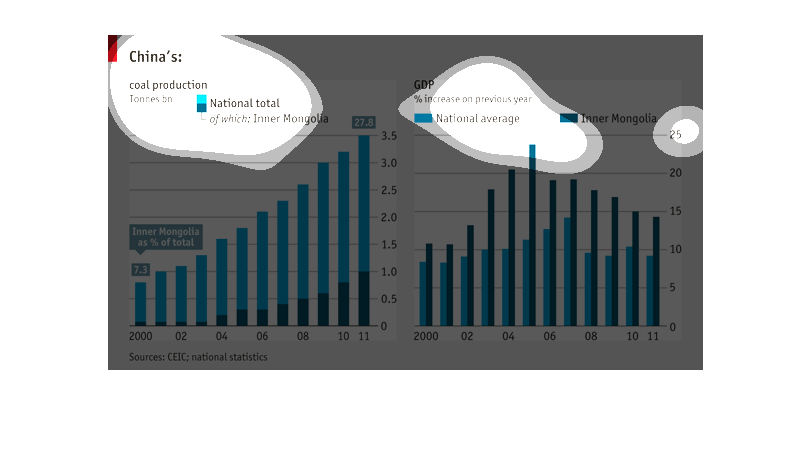
China's coal production and correlation to GDP. Coal production has steadily increased over
the first decade of the century. GDP in inner Mongolia and the country peaked, fell and has
mostly leveled off.
This is a series of graphs depicting China's total coal production as well as GDP. Each metric
is broken down by overall production and how much of the total came from Mongolia.
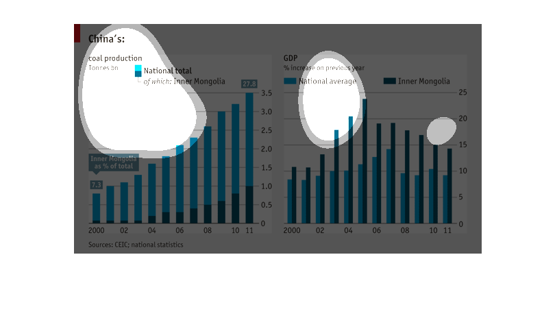
This chart describes China coal production in tonnes of billions. The chart is divided into
different categories, including the national total, and GDP.

The left graph shows production of coal in China.  The right graph shows GDP in China.  Both
are for the years from 2000 to 2011 and contain national totals year over year.
This chart shows China's coal production totals and its GDP percentage increases each year.
In 2011 the country was seeing increases of nearly 10 percent of GDP, and about 15 percent
in the Inner Mongolia area, according to the chart. And in 2011 there was a total of 3.5 billion
tonnes of coal production in the country, about 27.8 percent that came from Inner Mongolia.
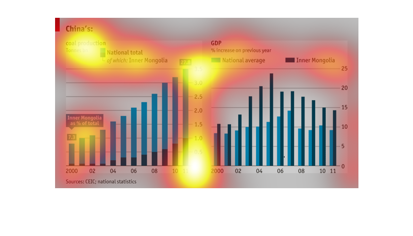
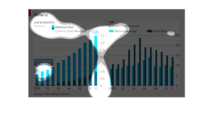
This image shows or depicts in 2 different stastisical bar graph format China's coal production
and GDP. First graph is for National total. GPD is for National average and inner Magnolia.
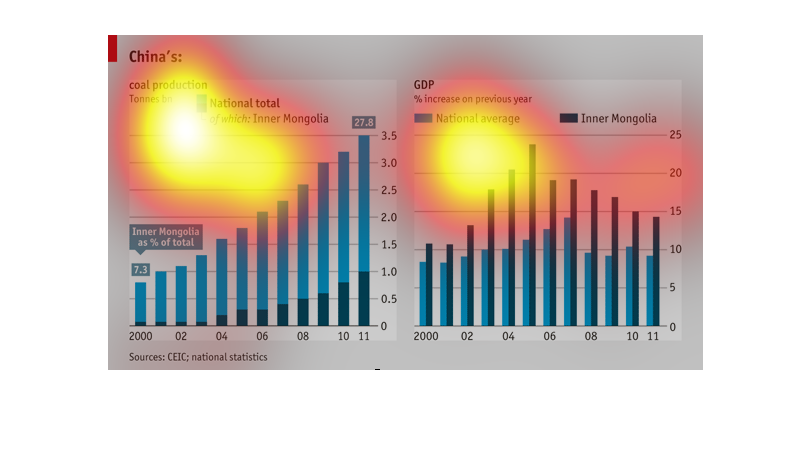
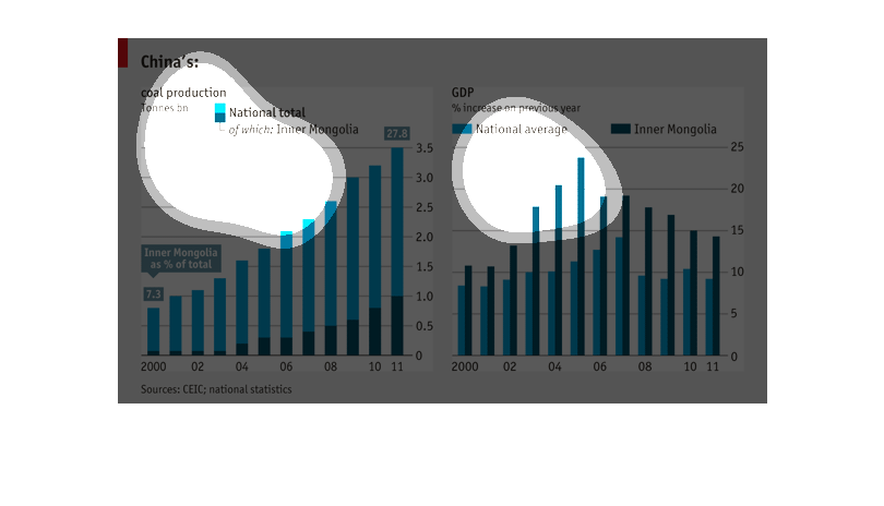
This chart compares China's coal production in inner mongolia and the percent increase in
GDP in China, specifically isolating inner mongolia, compared to the national average.
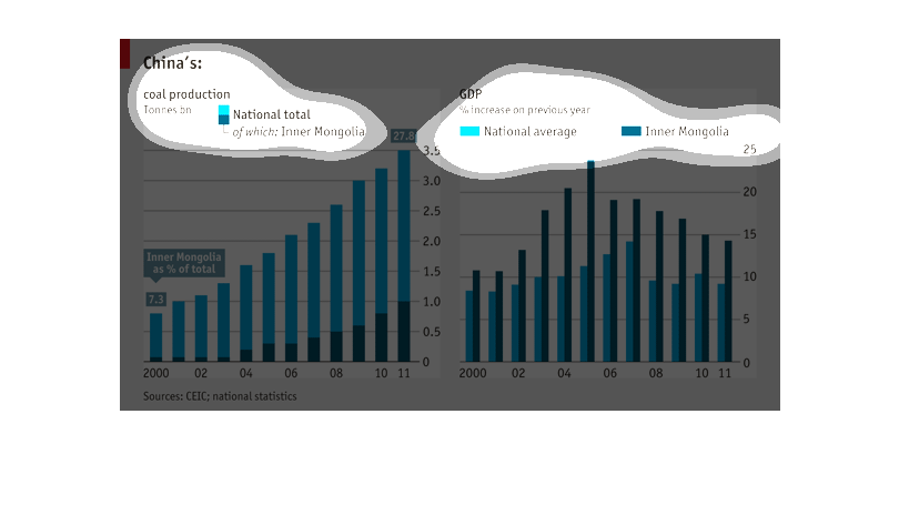
The two charts display China's national average and inner Mongolia's GDP and coal production
from 2000 to 2011.  Inner Mongolia saw an increase of total coal production between 2000 and
2011.  In 2000 Inner Mongolia accounted for 7.3% of total coal production in China and in
2011 Inner Mongolia accounted for 27.8%.
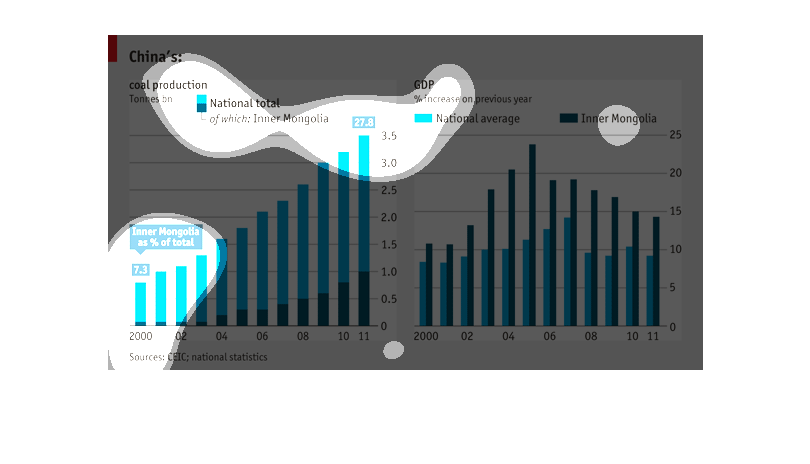
The chart on the left shows China's coal production in tonnes from 7.3 in 2000 to  27.8 in
2011. The right one shows GDP increase over previous years and spikes in 2005 to close to
25%.