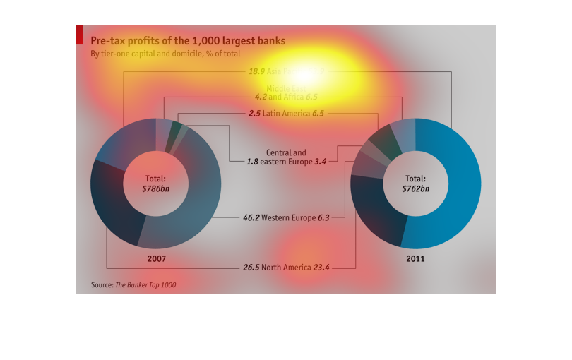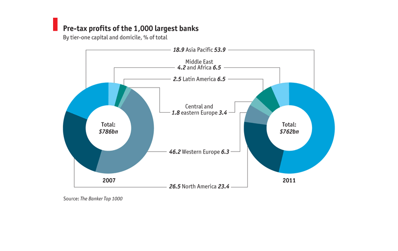
This shows pre-tax profits over the 1,000 largest banks.  It shows the amount of profits by
billions and by region that the bank is located in as well as by tier one capital and domicile..
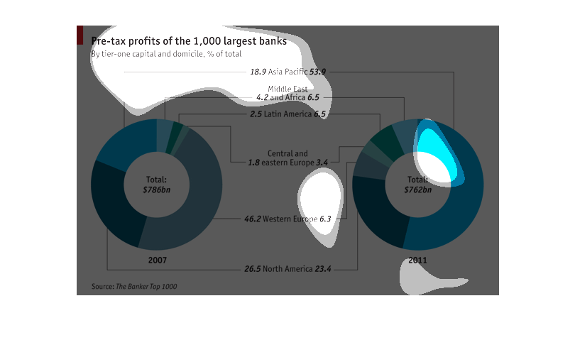
This chart is awesome,and shows Pre-tax profit of the 1,000 largest banks. It is by tier-one
capital, and domicile, % of total.  One the right is the total of $786 BN, and on the right
the total is 762BN.
This chart shows the amount of wealth in each country. It is broken down to in a pie chart.
The chart shows the us as having the most wealth among all of the country's listed
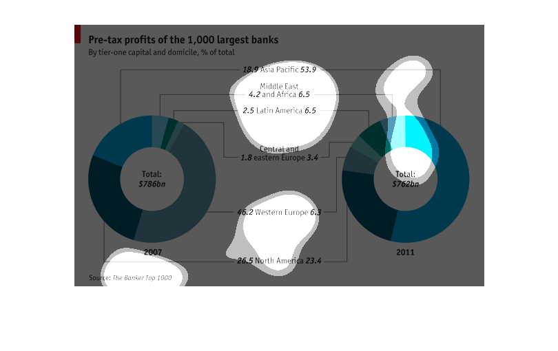
This graph is about pre-tax profits of the 1,000 largest banks.  In 2007, 26.5% was composed
of North America, 46.2% Western Europe, 1.8% Central and Eastern Europe, 2.5% Latin America,
4.2% Middle East and Africa, 18.9% Asia Pacific.  In 2011, 23.4% was composed of North America,
6.3% Western Europe, 3.4% Central and Eastern Europe, 6.5% Latin America, 6.5% Middle East
and Africa, 53.9% Asia Pacific.
This graph shows the pre-tax profits of the 1000 largest banks within the world. Western Europe
is responsible for the region with the most profits, accounting for about 42 percent of the
total of profits. Central and Eastern Europe account for the smallest percentage.
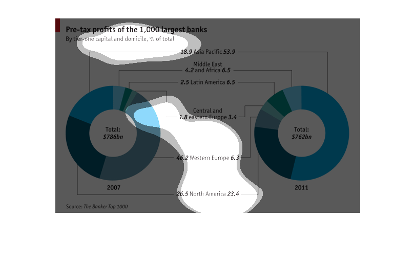
These are pie charts of the source of pretax income of the thousand largest banks by country,
in 2007 and 2011. In 2007 the majority of income was concentrated in Western Europe and North
America. In 2011, it was the Asia Pacific and North America regions.
Chart showing the profits of the largest banks in 2007 and 2011. Asia increased significantly,
Africa, Latin america increased a small amount, when Europe decreased substantially.
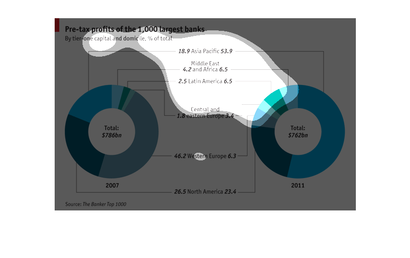
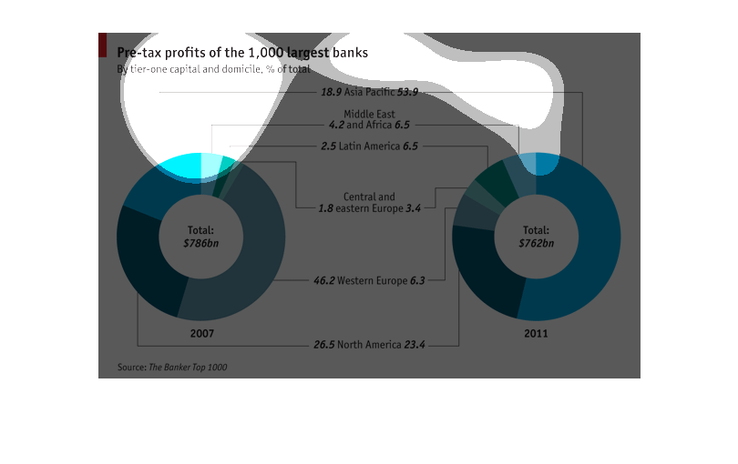
this graph has two circles on it and its called pre tax profits of the 1,000 largest banks.
and the circles show the oie ratio of what banks have what and who's in the lead.
This chart describes the pre-tax profits of the 1000 largest banks for 2007 and 2011. Asia
Pacific has seen the largest increase, and Western Europe the largest decrease over this time.
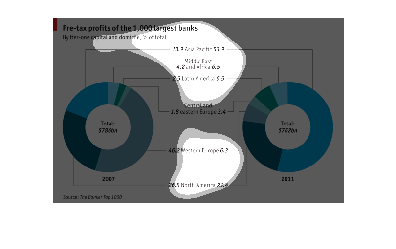
THIS PLOT ILLUSTRATES THE PRE-TAX PROFITS OF THE WORLDS MOST PROFITABLE BANKS IN 2007 AND
2011. BANKS ARE GROUPED BY REGION ACCORDING TO COLOR IN EACH DONUT.
The following chart shows the pre Tax profits of large banks by tier one profit and by docimile
percentage of the total.  From the years 2007 and 2011. Clearly shows that banks in North
America are the most profitable.
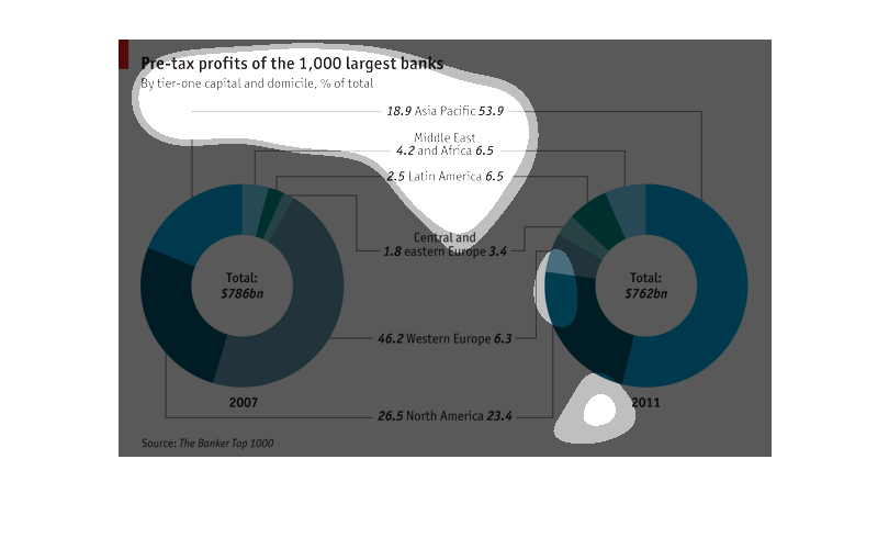
This chart shows pre-tax profits of the largest 1000 banks. On the left is 2007, on the right
is 2011. It shows North America, Western Europe, Central Europe, Latin America, and the middle
east, and Africa.
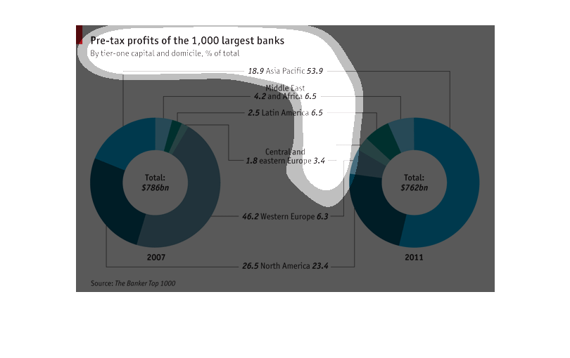
Pre-tax profits of the 1,000 largest banks in 2007 and 2011. Western Europe has highest profits
in 2007, which dramatically dropped in 2011. The rest of the courier remained consistent.
 But Asia Pacific did demonstrate a large increase.