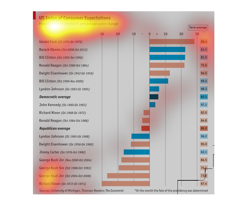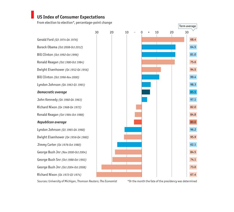
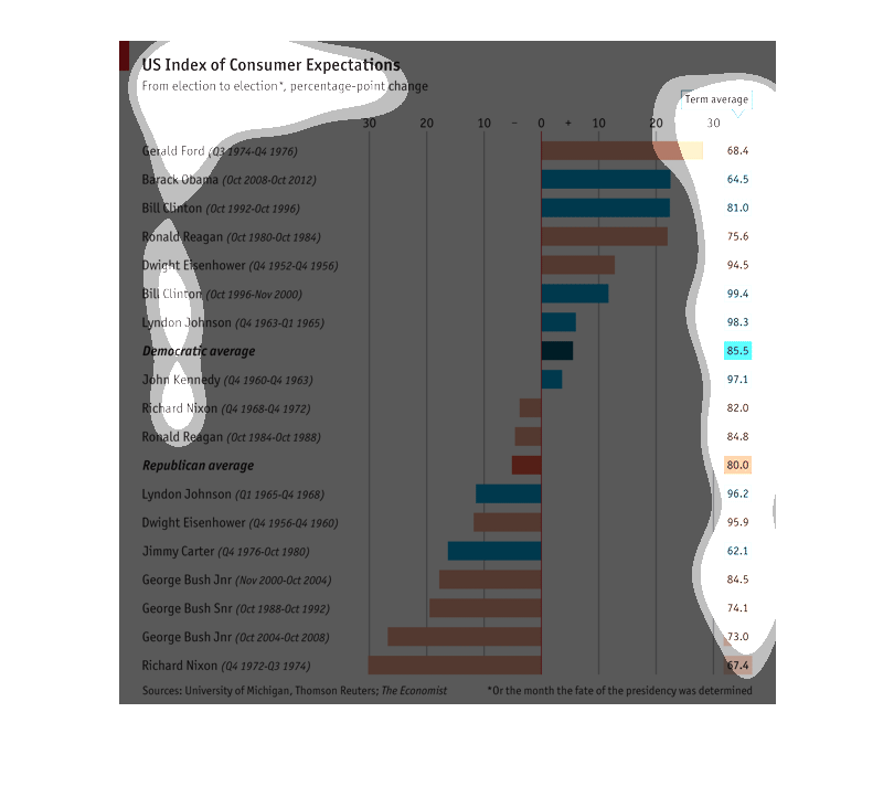
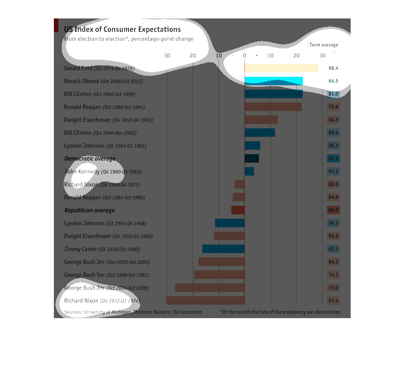
This bar graph show the US index of consumers expectations. It is from election to election*,
percentage-point change. This s very fun little graph...
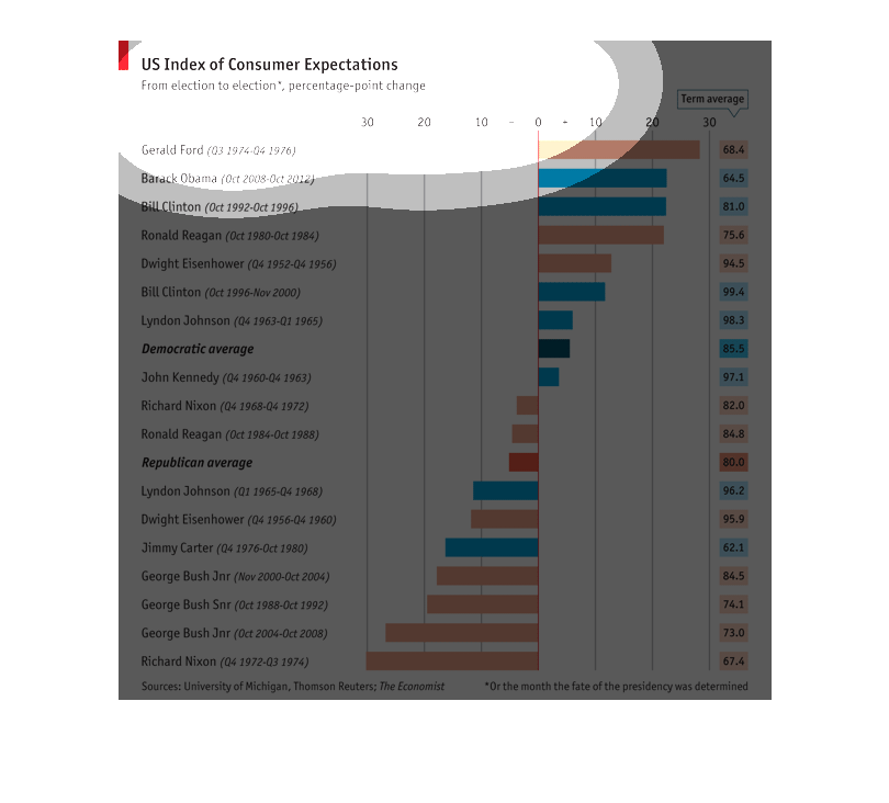
This chart shows "US Index of Consumer Expectations" from election to election. At the top
is Gerald Ford at close to 30% and a term average of 68.4%, and on the bottom Richard Nixon
at -30% and a term agerage of 67.4%.
This chart shows the US index of consumer expectations. From election to election as a percentage
point change. Listing the US presidents down the far left.  The center shows the consumer
expectations.  The far right shows the term average of each president.
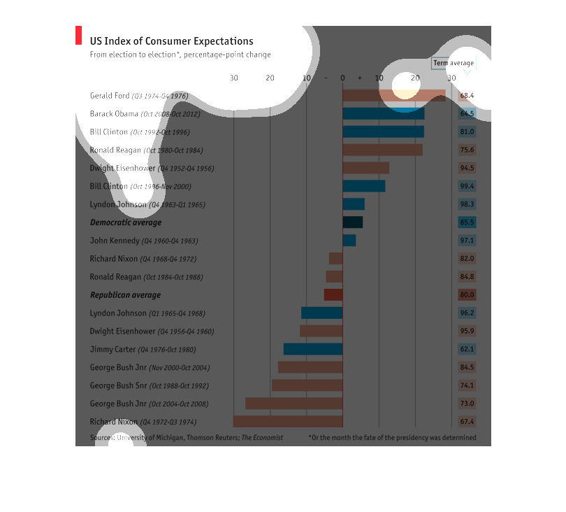
This graph illustrates the people's ideological investment- termed consumer expectations in
this study- of the American people and their elected commander in chief.
This chart describes US index of consumer expectations from election. Leaders on the chart
include Gerald Ford, Barack Obama, Bill Clinton, and Ronald Reagan.
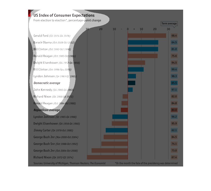
This is a graph of the US Index of Consumer Expectations from election to election in terms
of percentage point change. Gerald Ford had the largest positive swing.
The following chart shows the expectations of the Unites States of American Consumer during
a certain presidents time in service. It gives the average democrat and republican president.
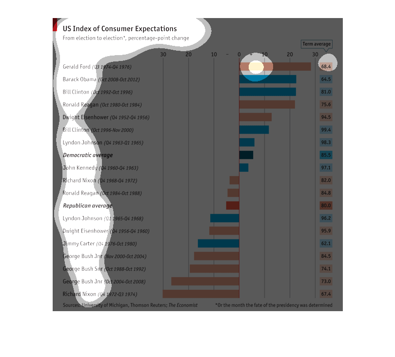
This shows US consumer expectations before and after the election of each President from Eisenhower
to Obama, sorted by Democrat versus Republican consumers. Broadly, the Democrats were more
optimistic regardless of the party of the President.
This graph shows the US index of consumer expectations in percentage by presidency.  Gerald
Ford had highest expectations and Richard Nixon had the lowest.
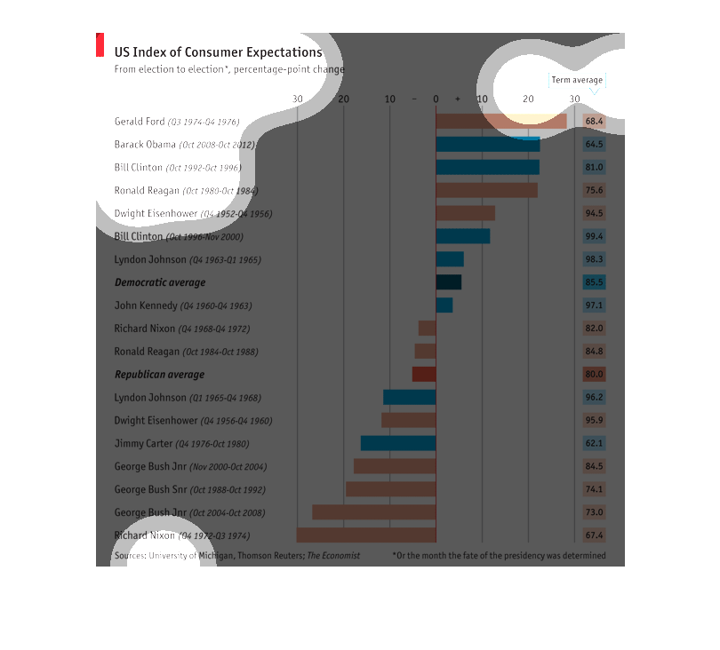
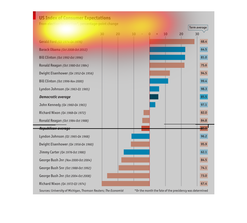
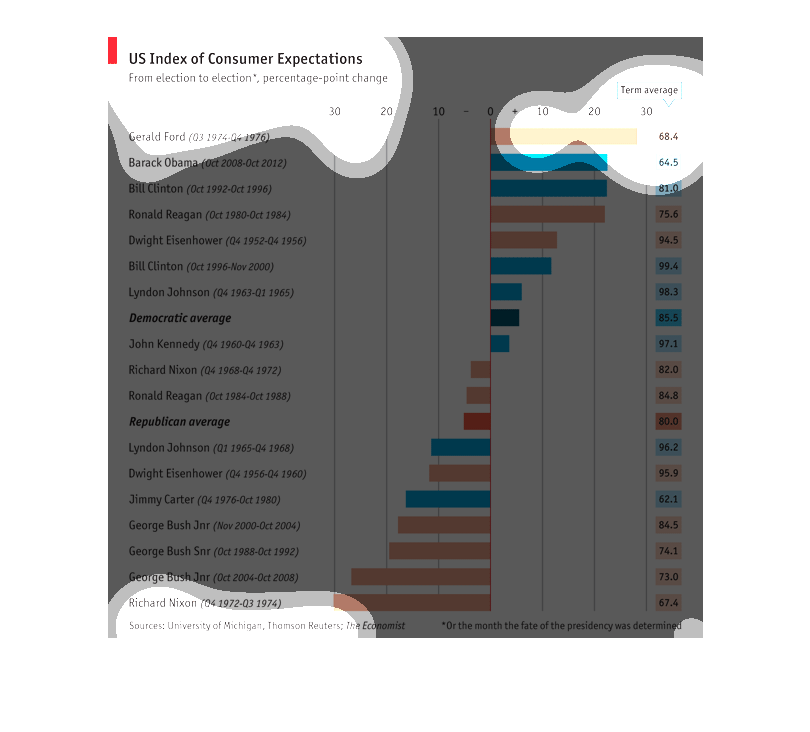
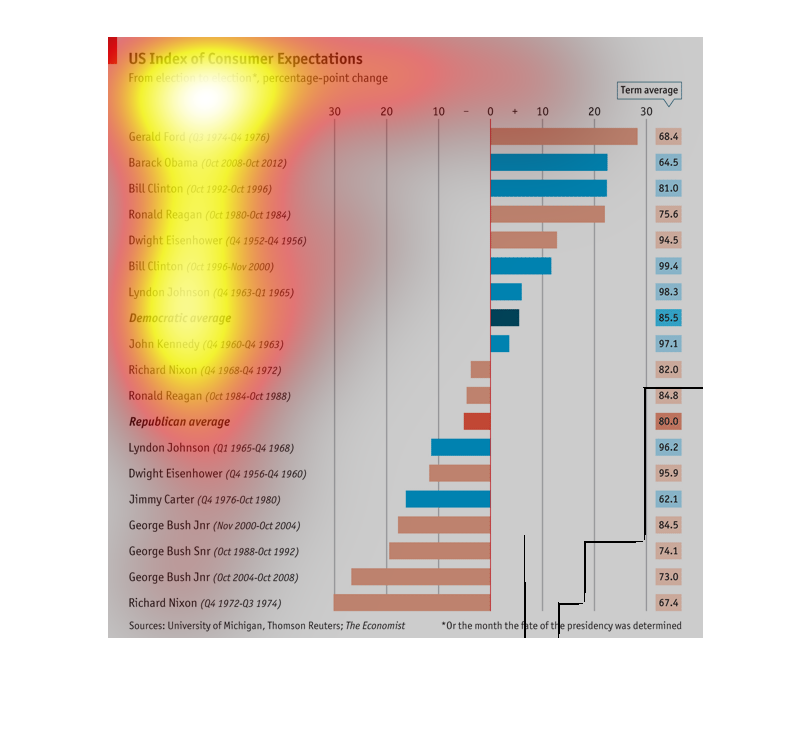
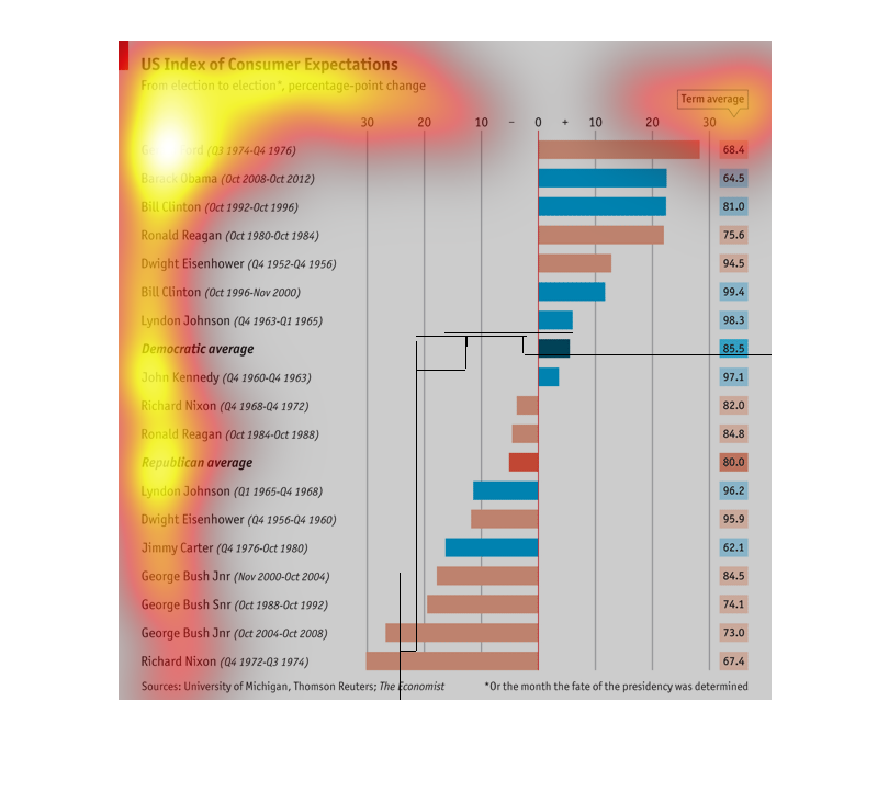
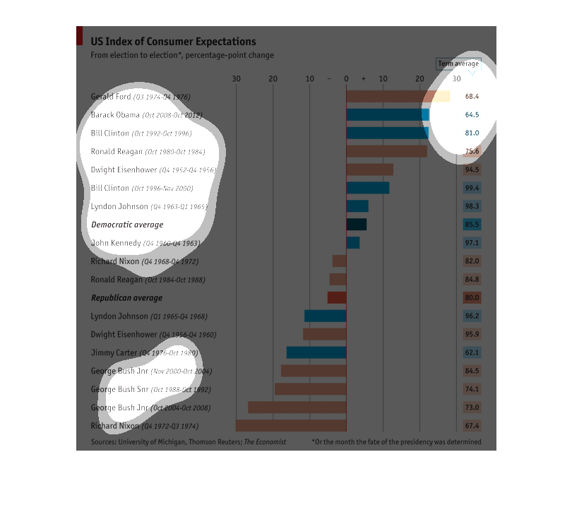
This chart appears to show for presidents who were elected to multiple terms the ones whose
chances to win their incumbent seat in the following election rose or fell over their first
term in office.
This is a graph of the US index of consumer expectations from election to election. The index
was the highest for Bill Clinton and the lowest for Jimmy Carter.
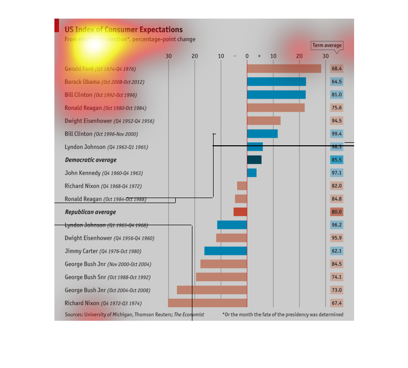
This is talking about how much votes they got in the last election. It's about who is pulling
ahead and who dropped out and who is catching up in the pools.
This graph is the US index of Consumer Expectations from presidential election to the following
election. It shows the percentage point change over these cycles.
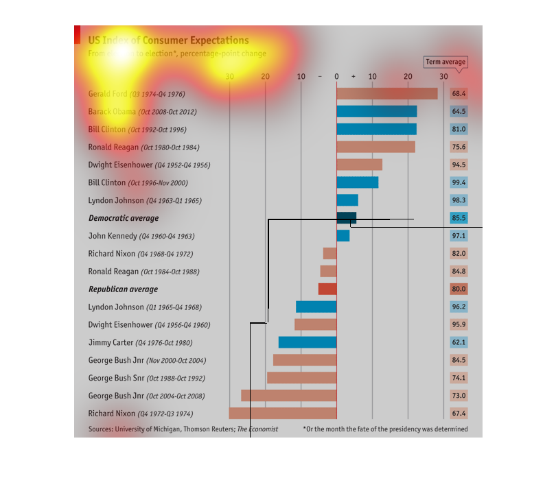
This graph is measuring a statistic between presidents over the years that they served. I
believe that it might be measuring approval ratings but it is hard to tell
THIS PLOT SHOWS THE UNITED STATES CONSUMER EXPECTATIONS INDEX FOR SECTIONS OF TIMES BETWEEN
DIFFERENT PRESIDENTS. AT RIGHT IS GIVEN AN AVERAGE OF THE INDEX FOR THAT PRESIDENTIAL TERM.