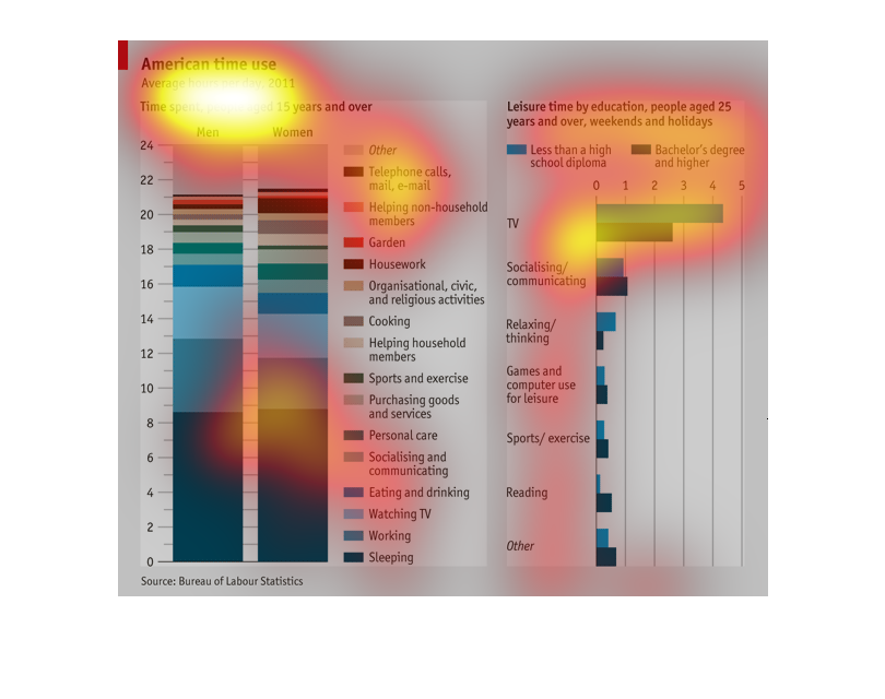
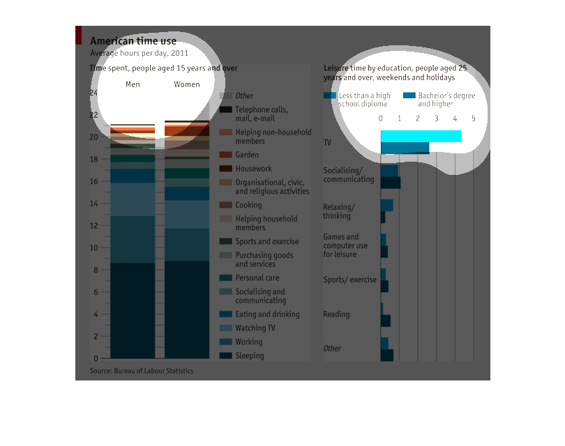
The graph shows how Americans over the age 15 spent their time in 2011 split out between women
and men. It also shows how leisure time was spent comparing those with a high school diploma
only versus those with a bachelors degree or more. The largest amount of time in both sexes
was spent sleeping. The least time on the telephone, mail and email
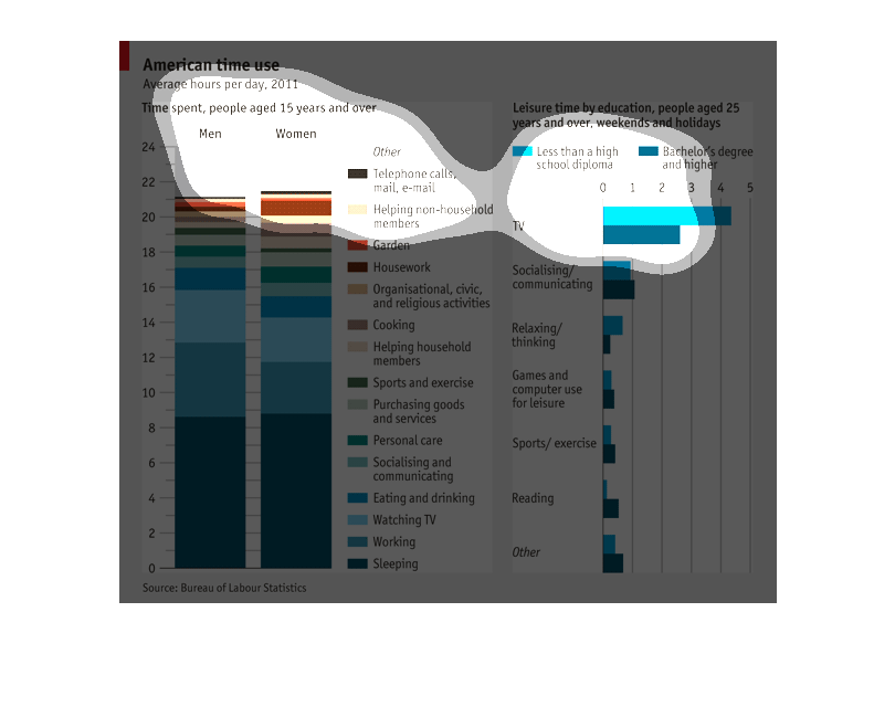
The title of this graph is, "American time use".  There are two graphs displayed.  One lists
men and women age 15 and above with more than a dozen different activities and the breakdown
between the ages and sexes, displaying how their time was spent.  Just to the right of this
graph is another graph displaying a breakdown of leisure time for 25 year olds and above,
sorted by education.
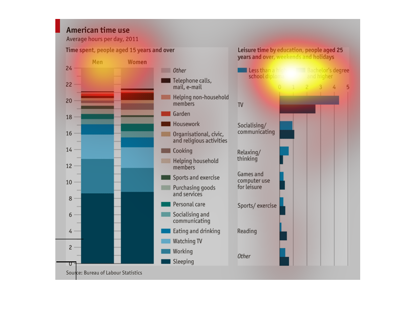
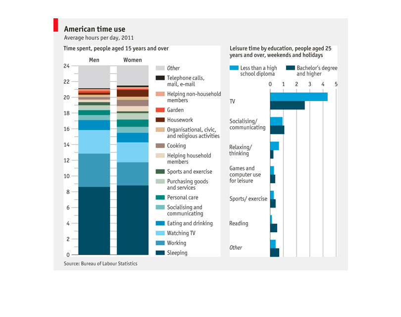
This graph depicts how people use their time, on average. The data is separated by gender,
male vs. female, and also education (whether a bachelor's degree has been attained).
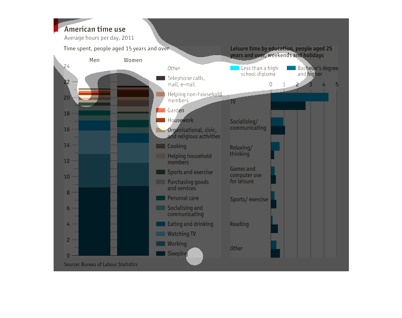
This chart describes American time use. Specifically average hours per day for the year 2011.
It also includes time spent for people aged 15 years and over.
American time use, average hours per day 2011. Ages 15 and older. Men and women are separated,
popular activities include sleeping and working the most, followed by television, socializing
after
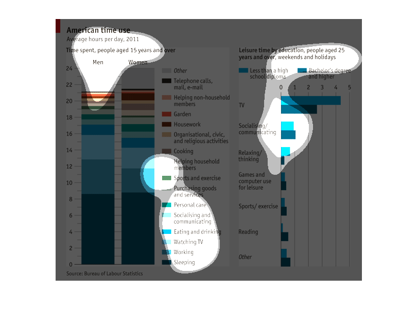
These graphs show the amount of time Americans in 2011 reported spending on tasks broken up
by gender as well as their reported number of leisure time by education level. Americans
reported spending the most time sleeping and working on average each day with men and women
both reporting similar times for sleeping, but men reporting more hours working. Women,
though, reported more time spending doing chores around the house and for loved ones than
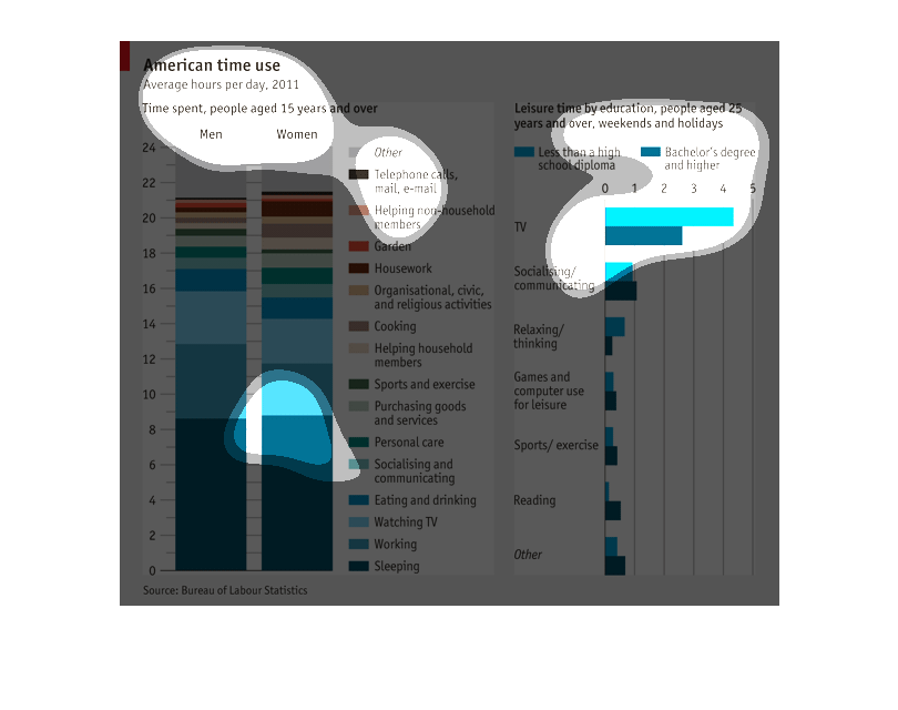
men. For leisure time, those with a high school diploma reported more leisure time than those
with a college education by 1.5 hours.
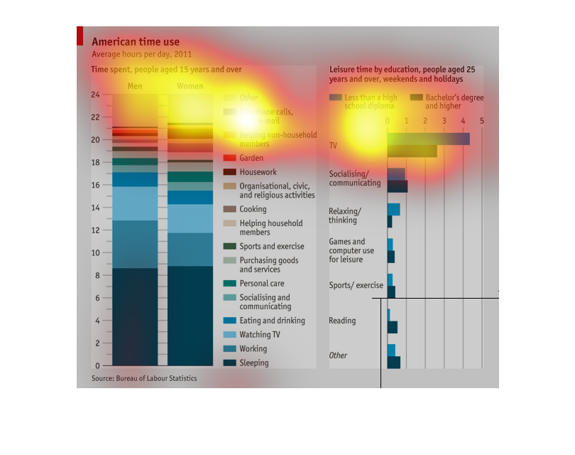
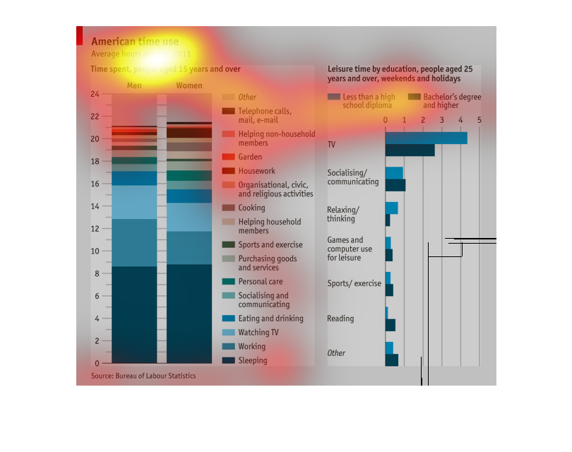
This images describes the time use between various academic, entertainment, and additional
normal activities broken down throughout the day.  The image also breaks down how different
each use is dependent on the education level of the individual.
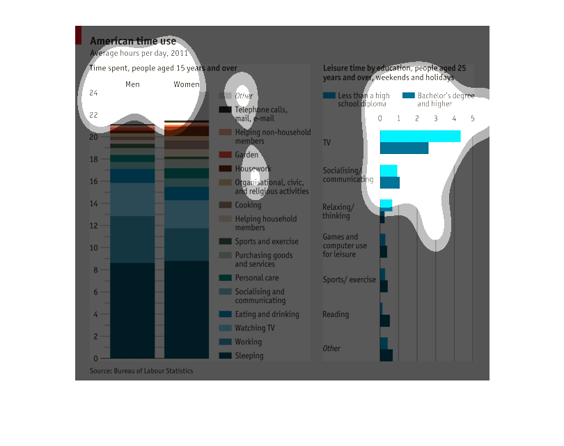
The following chart list the average American time spent doing certain actives. The number
one was Sleeping, followed by Working, Watching TV, Eating and Drinking and Socializing.
This image depicts or shows in statistical bar graph format the relationship of American time
use of average hours per day for the year 2011. Time spent, people aged 15 years and over.
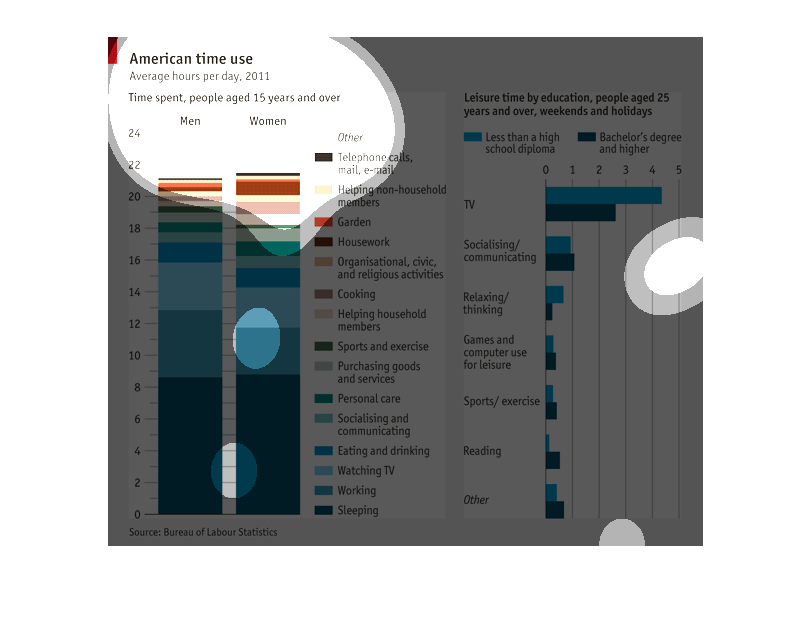
This graph depicts the hours that male and female Americans 15 yrs and over spent on various
everyday activities and they're education levels at 25and older.
A Infographic for America's Time Use, the number of hours spent on things each day in 2011.
Shows large hours of TV watching and socializining and communication
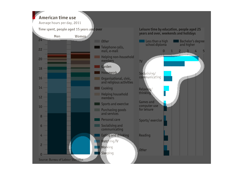
This graph illustrates American time use in average hours per day in 2011.  It is for those
age 15 years and over and is separated by men and women.  The left shows leisure time and
education for those age 25 and over with less than high school education compared to bachelors
degree and higher
This chart shows how people in American spend their time. First part of chart is people ages
15 and over and what they do in their everyday life. Second chart shows people ages 25 and
over in their leisure life hours.
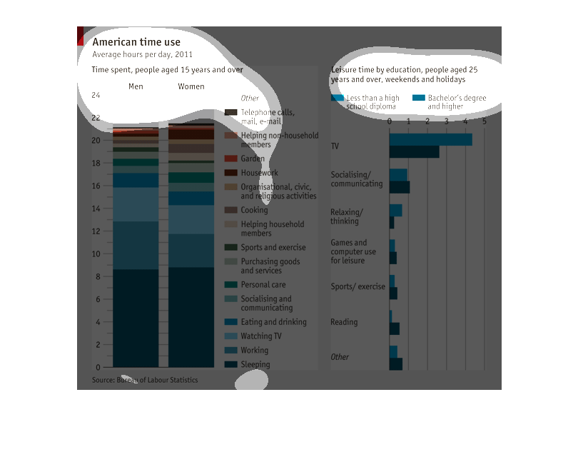
This graph depicts how Americans spend their time and also differentiates between men and
women. A large amount of it is spent sleeping and watching TV. The right side depicts the
leisure time spent by people 25 years and older by education, people less educated spend more
time watching TV and relaxing/thinking. More educated people spend more time on the computer
for leisure and exercising as well as reading.
This is a chart showing how American's use their time in 2011 for people over 15. the chart
shows that people of all education levels spend most of their free time watching TV.