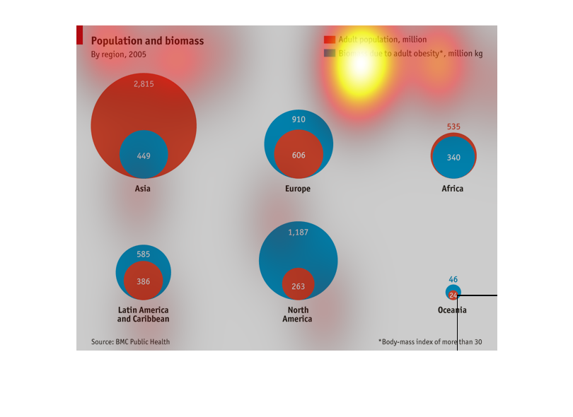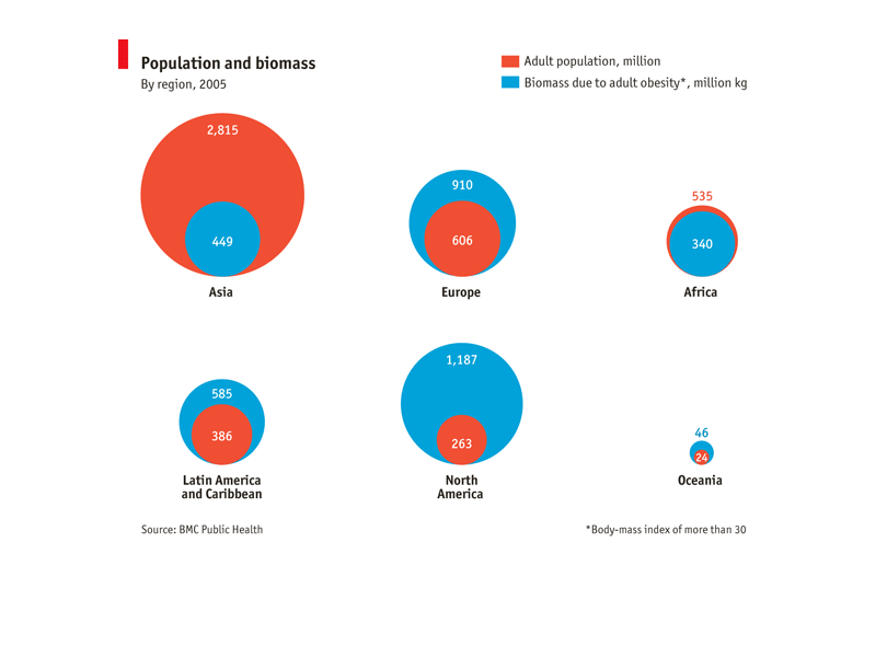
This chart shows population and biomass by region in 2005 shown as adult population and percentage
of biomass due to obesity. Asia is the region with the largest biomass at 2815 million while
only 449 million is due to obesity. North America on the other hand has a much larger percentage
of their biomass due to obesity and this is actually the dominant amount.
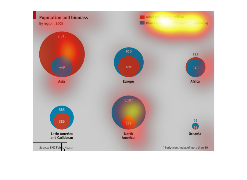
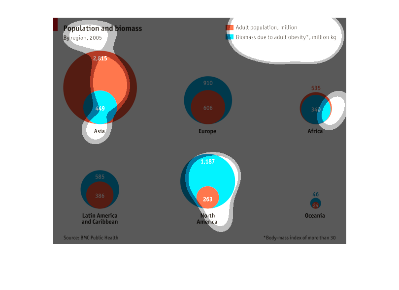
This chart describes population and biomass. The chart is divided between  the adult population
in the millions and biomass due to adult obesity. Regions on the chart include Africa and
Asia.
population and biomass by region as of 2008. Red representing adult populations of the region
in question and blue representing the biomass due to adult obesity of that region.
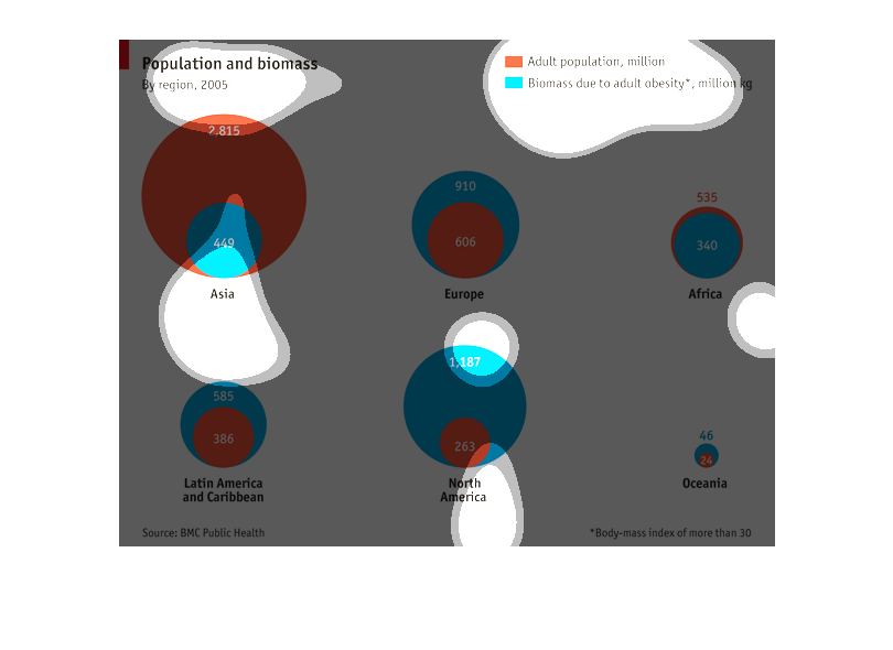
This chart depicts the relative concentration of biomass among the adult population for the
six continents, excluding Antarctica.  North America shows a significant biomass.
The graph shows the population compared to the biomass. The adult population is measured in
millions and labeled in red and biomass is due to adult obesity, measured in millions and
kg and is labeled in blue.
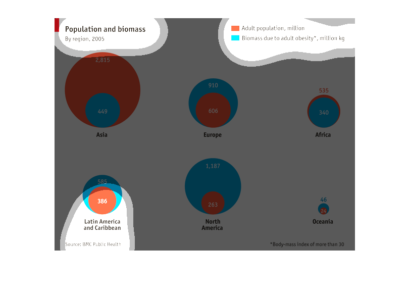
This chart shows Population and Biomass, by region in 2005. Data is segregated by continent/region.
The chart shows the population in millions, and the biomass attributed to adult obesity in
the population.
The chart describes the relationship between total population and biomass in different regions.
Asia has the smallest obesity to total population ratio.
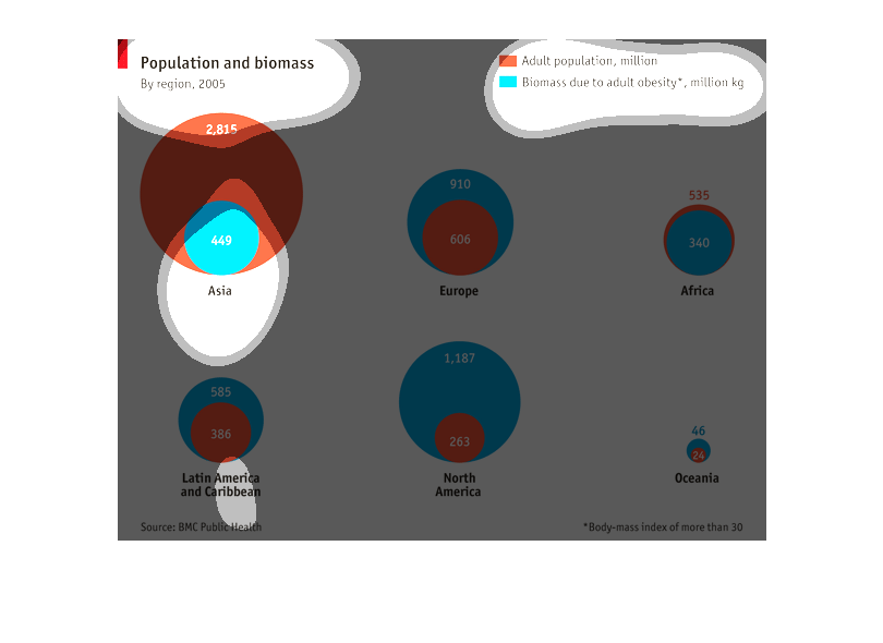
This chart is population and biomass by region, red being the adult population and blue the
obesity rate, over the regions you can see the variance of population to obesity rate, with
asia having the largest population to lowest obesity and North America having the opposite.
This image shows different adult populations throughout the world and their biomass due to
adult obesity based on data from 2005. The information shows that only Asia and Africa have
an adult population (in millions of individuals) that is greater than its biomass due to adult
obesity (in millions of kilograms). All other regions, including Europe, Latin America and
the Caribbean, North America, and Oceania have larger biomass due to adult obesity than adult
population.
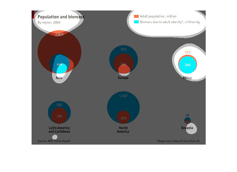
This chart shows regional population and biomass. It shows the adult population and biomass
due to obesity. Th US has the larges biomass vs population.
This image describes population and its relation to biomass due to obesity. It shows all of
the continents and shows the population of the continent and their respective biomass in millions.
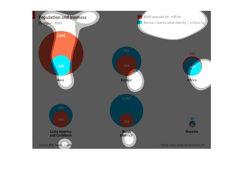
This circle graph shows population and biomass in 2005.  Asia has the highest population,
North America has the highest biomass, and Oceania has the lowest for both categories.
This chart compare population vs biomass in different continental areas.  It shows Asia to
be the largest area population wise but there's a great disparity between population size
and the number of obese people there.
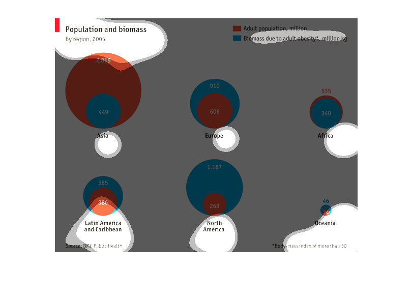
This chart measures population and biomass correlation by region.  Asia, Europe, Africa, Latin
American and Caribbean, North America, and Oceana are the regions.
This is a series of graphical charts depicting population and biomass by region in 2005. It
shows that Africa had the largest amount of biomass in relation to its population and Asia
had the largest overall population.
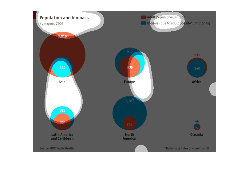
This chart shows the relationship of between the adult population of each continent, and what
population of that continent has adult obesity due to biomass.