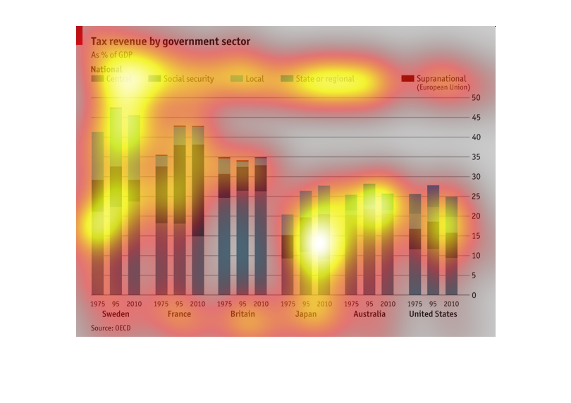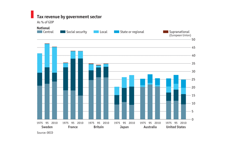
This is a graph about Tax revenue by sector. It analyzes several different countries. It goes
by different areas such as local, national, international, etc. It lists the results from
1975 up to 2010
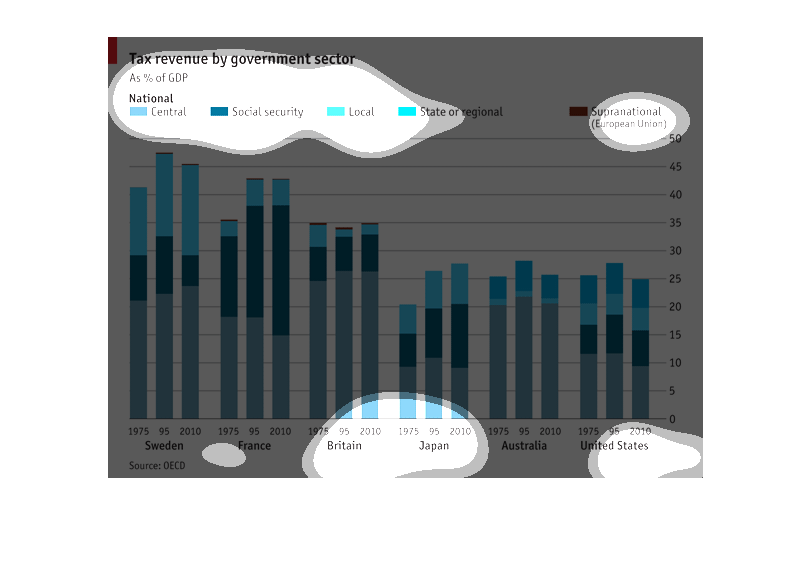
This chart describes tax revenue by government sector as a percentage of GDP. Categorires
on the chart include social security, local, state or region.
This graph shows tax revenue by government sector as a percent of GDP for central, social
security, local, state or regional and supernational. Sweden has the highest figures for all
years displayed.
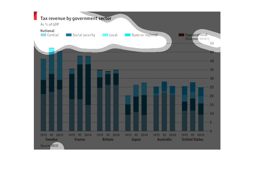
Tax revenue by government sector. It is a bar graph showing the composition of tax revenue
by country and time. It compares France, Sweden, Britain, Japan, Australia, and the United
States for 1975, 1995, and 2010. It compares sources like central, local, social security,
state or regional, and supernational.
This chart shows tax revenue by government sector as a % of GDP. The categories included are
Central, Social Security, Local, Sate or Regional, and Supernational. From the years 1975-2010,
Sweden had the greatest % of the total GDP coming from these sources while France was close
in second the majority from each coming from Central. The United States and Australia had
the lowest percentages with a much smaller portion coming from social security.
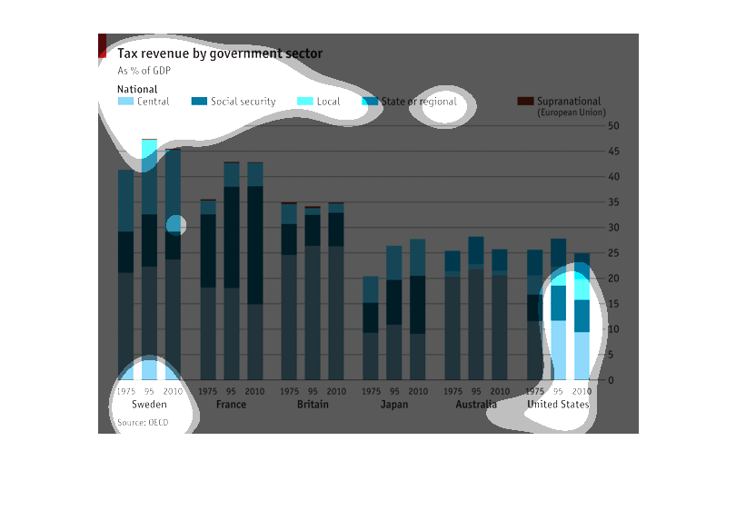
The following chart gives the taz revenue of a state or region as a percentage of the overall
GDP.  The countries that data is presented for in this study include the following: Sweeden,
France, Britain, Japan, Australia and the United States.
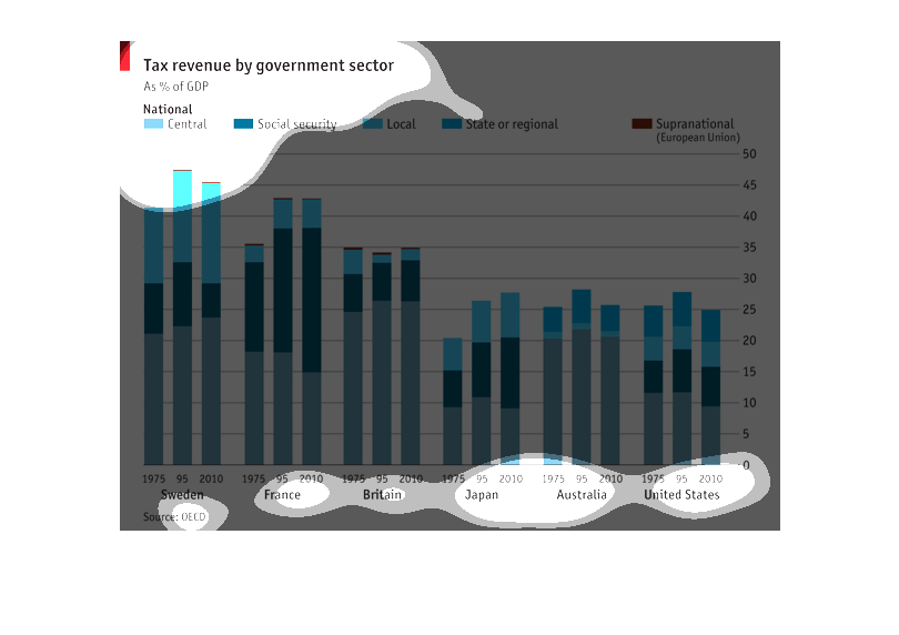
This graph displays the national tax revenue of different government sectors as a % of Gross
Domestic Product.  Three different sectors are considered: Central, Social Security, and Local.
 Six different first-world countries are under investigation, and for each country data for
three different years are displayed: 1975, 1995, and 2010.  Overall, the graph allows you
to visualized how tax revenue (as % of GDP) in three basic government sectors has changed
over time in six first-world countries.  Sweden has the highest tax revenue as %GDP and the
United States the lowest.  Sweden shows the most dramatic change in the ratios of different
sectors with a shrink in Social Security from 1995 to 2010.
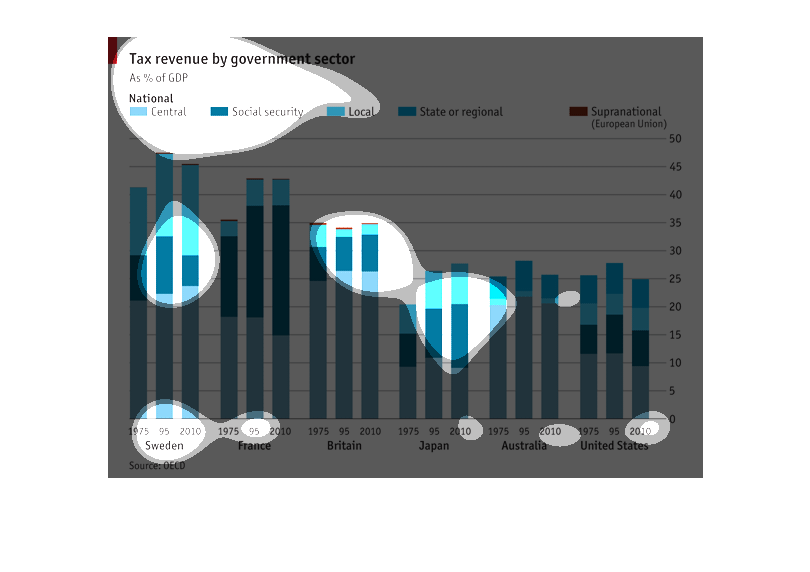
Describes tax revenue to each government sector between different countries. Sweeden has the
most tax revenue total, while France has the most coming from Social security. Japan, Australia
and United States are about equal.
This describes tax revenue for the US government and correlates the differences among multi
nations and the brackets define the sector from which taxes are milked from.
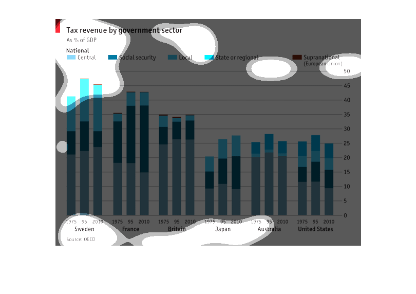
This is a bar chart of tax revenue by social sectors, as a percentage of the GPD. The different
sectors are color coded, while the bars are in groups denoting different world nations.
This graph shows tax revenue by government sector, comparing different sectors of government
in different locations throughout the world from the years 1975 until 2010.
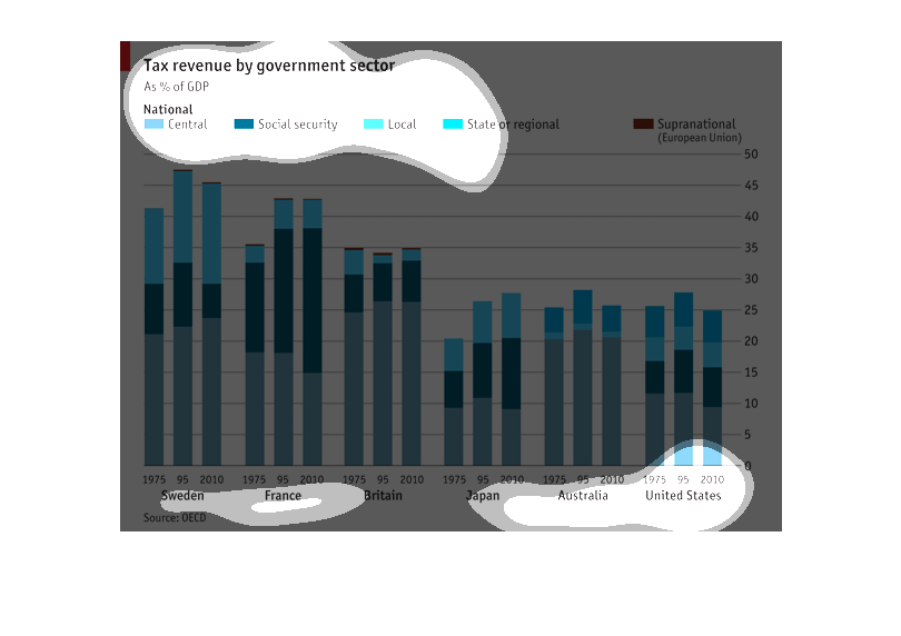
Titled Tax revenue by government sector.  Graphs are as $ of the GDP.  Based on Central, Social
Security, local, state or regional and supranational (European Union).  The countries and
years are at the bottom of the graphs.
This bar graph compares the percentage of tax revenue by government sector ( Central, Social
Security, Local, State or Regional, and Supranational) comparing different countries for 1975,
1995, 2010. The graph shows the importance and use of collected revenues by different countries
(Sweden, France Britain, Japan, Australia and the United States of America).
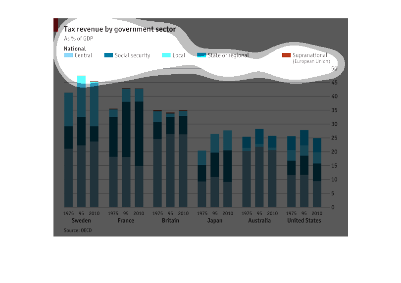
The graph shows the percentage of tax money used for different areas of the government in
1975, 1995, and 2010 for Sweden, France, Britain, Japan, Australia, and the United States.
Central, social security, local, state or regional, or supranational. Sweden was fairly consisten
over time, with the majority of money being central. France was consistent from 1975 to 2010,
however with more money now going to social security. Britain has spent low amounts of money
on local and the majority on central. Japan has maintained consistent percentages over the
years, with most money to central and social security. Australia spends the majority of the
money on central, and the US spends more than most on state.