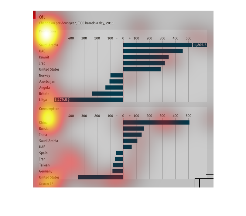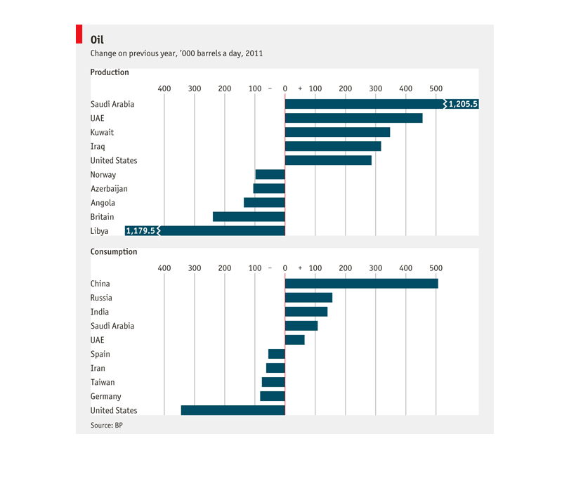
This chart examines the trends in oil production and consumption in 2011, compared to the
previous year. It lists different countries that produce/consume oil, such as Iraq and United
States and has bars for increased/decreased production, which also reflect magnitude of change.
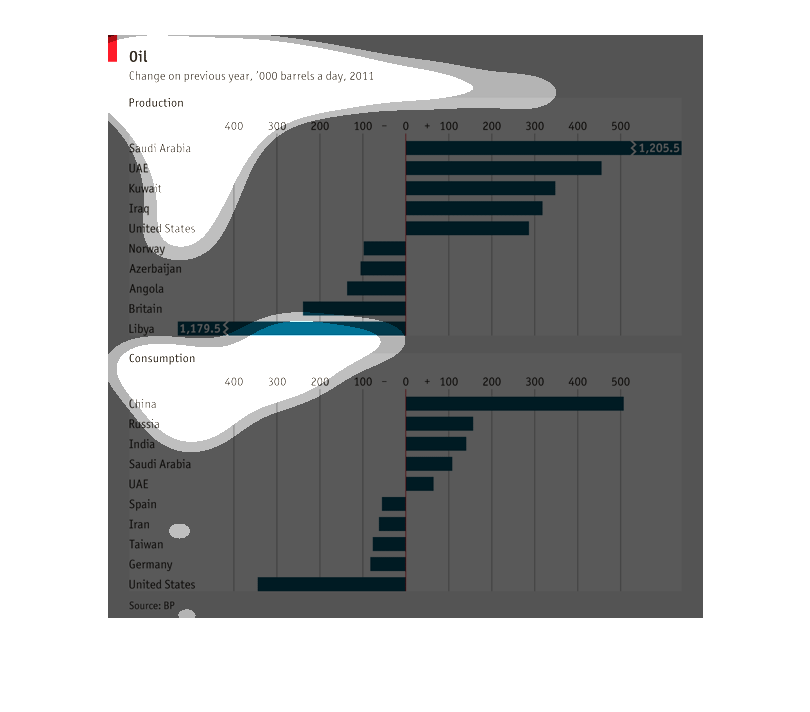
This graph illustrates the production of oil in their respective countries and in the bottom
have the countries that consume the oil produced. The graph is virtually identical in both,
stating a symbiotic relationship.
The following chart shows the change in the amount of oil produced in different countries
from one year to the next. The biggest increase in production came from Saudi Arabia. It also
showed the amount of increase is consumption by countries.
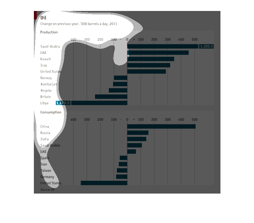
This graph compares the change in oil barrels per day for various countries. It compares production
and consumption for each country. The higher the production, the higher the consumption.
this is a chart showing oil production and consumption for numerous countries in 2011. It
shows Saudi Arabia producing 1,205.5 barrels a day , and China consuming 500.
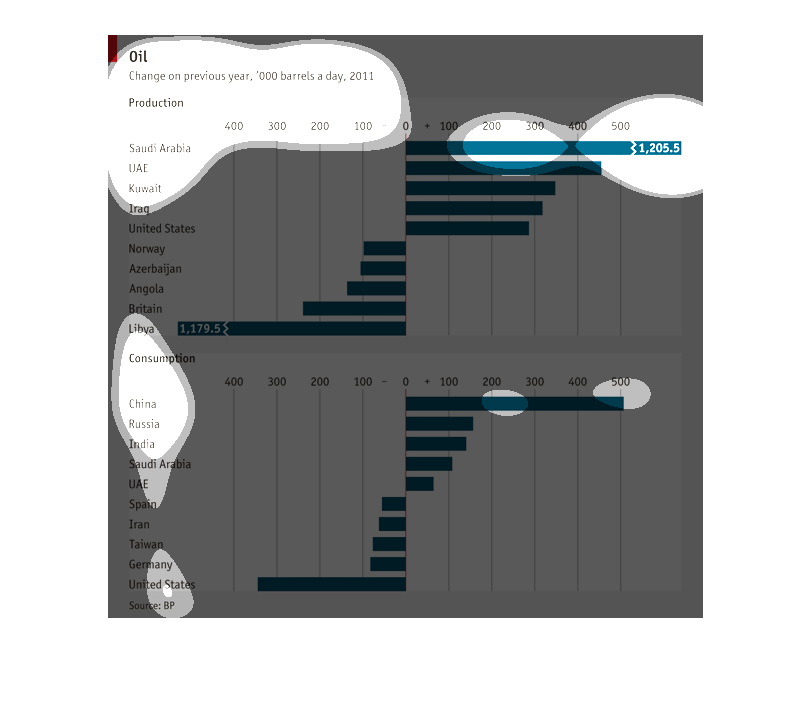
The graphs are demonstrating the changes in oil production from one year to next to compare
the resulting  oil consumption patterns in different countries
This is a a bar graph describing an unspecified amount of money that correlates to a specific
country. There is a positive and negative side to the graph.
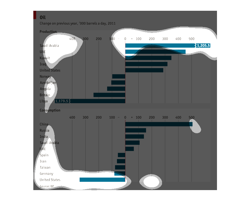
Oil production change on barrels from previous years its a graph with countries names running
down the left hand side also a break that says consumption and another graph both graphs have
numbers
The graph shows the change of previous years the production and the consumption of oil of
different countries by day. Saudi Arabia produce 1,205 barrels more while Lybia produces 1,179.5
less. This graph is from 2011.
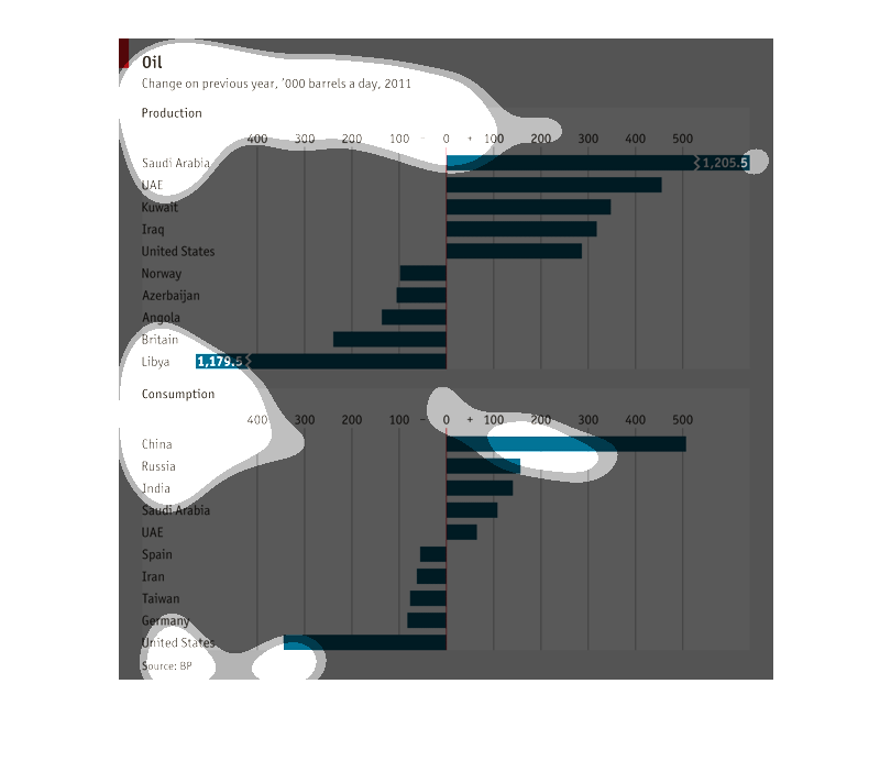
This is a list of world countries and their oil production, with horizontal lines denoting
the change in 2011, based on the previous years barrels per day.
this graph shows the growth of oil in different countries and where it comes from and how
much it costs each country and how they make money /profit from the barrels  over time, like
a comparison chart.
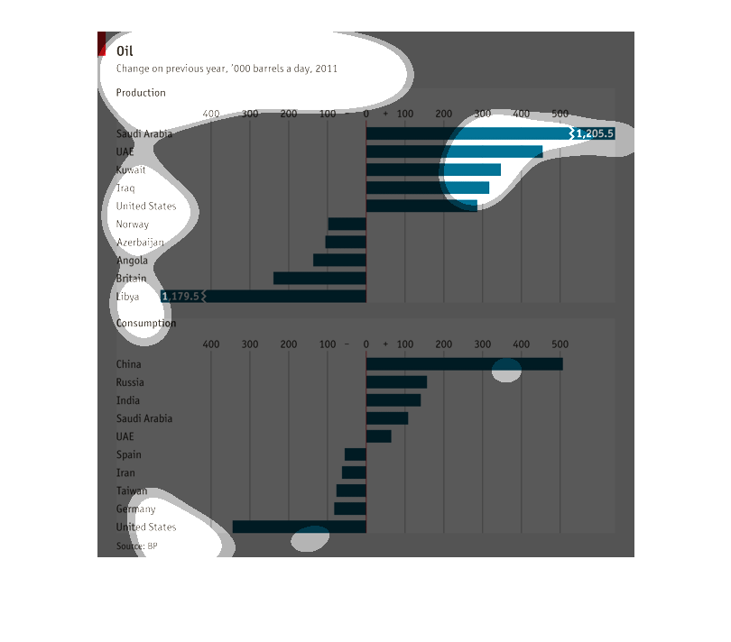
This graph depicts the change in oil production for various countries, as compared to the
previous year.  Middle East countries such as Saudi Arabia enjoyed the largest increase in
production.
This graph represents the production and consumption of multiple nations. It seems as if China
consumes the most and Saudi Arabia produces the most. There is a large gap in differences.