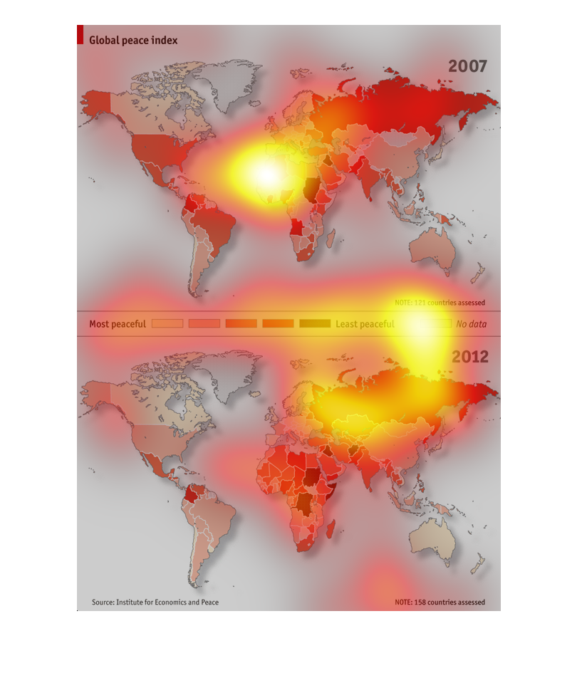
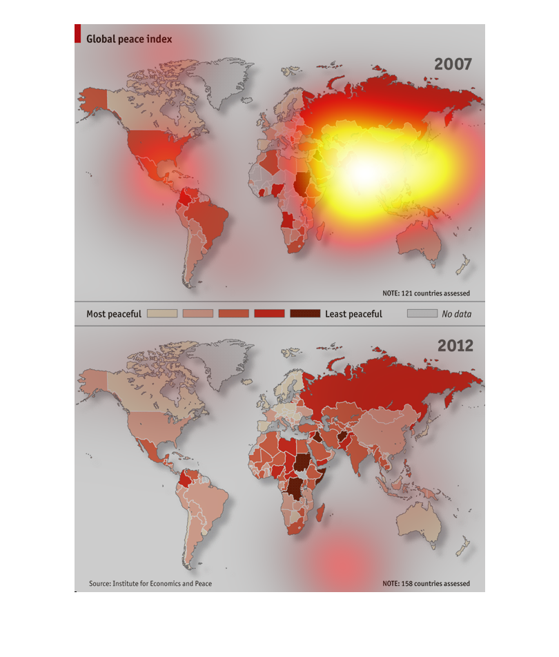
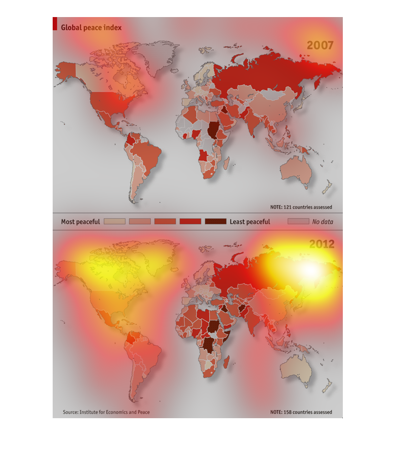
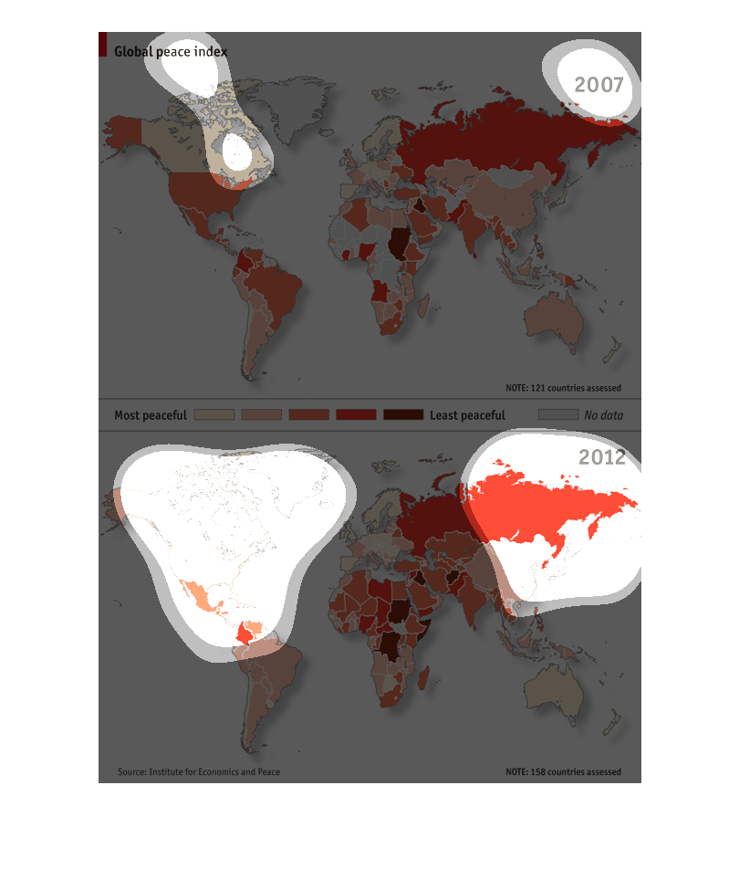
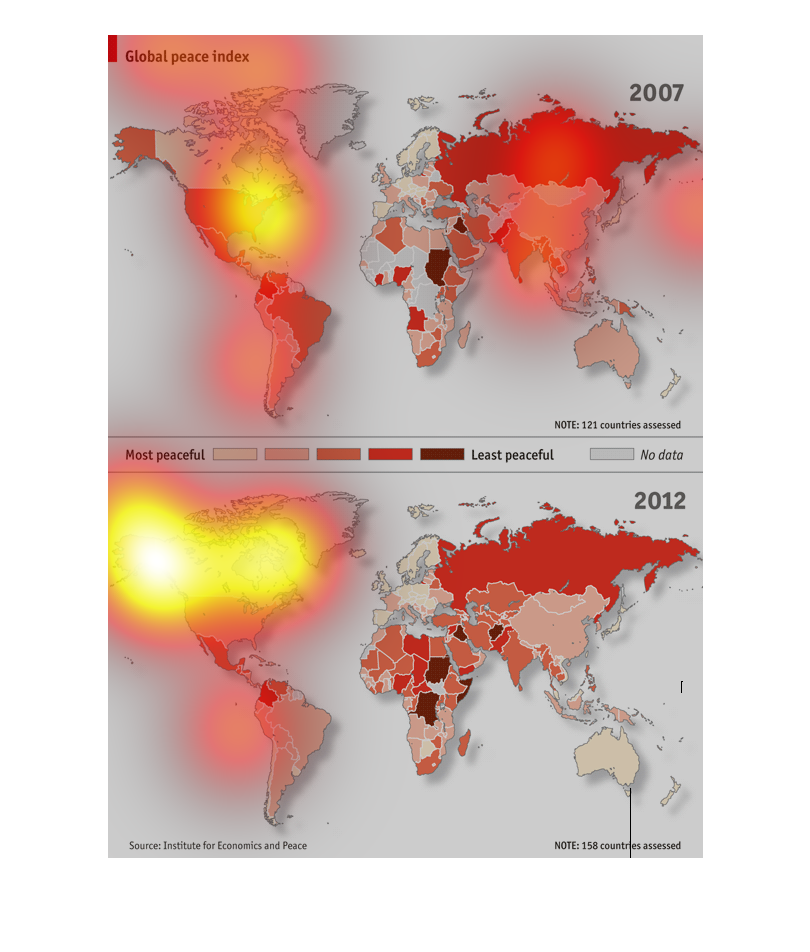
This graph displays the Global Peace Index of every country in the years 2007 and 2012. Most
locations have gotten more peaceful since 2007, with the largest exception being in some countries
in Africa.
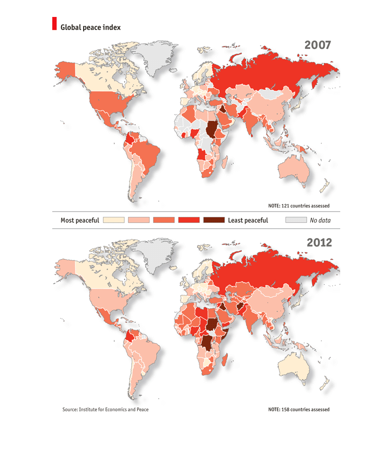
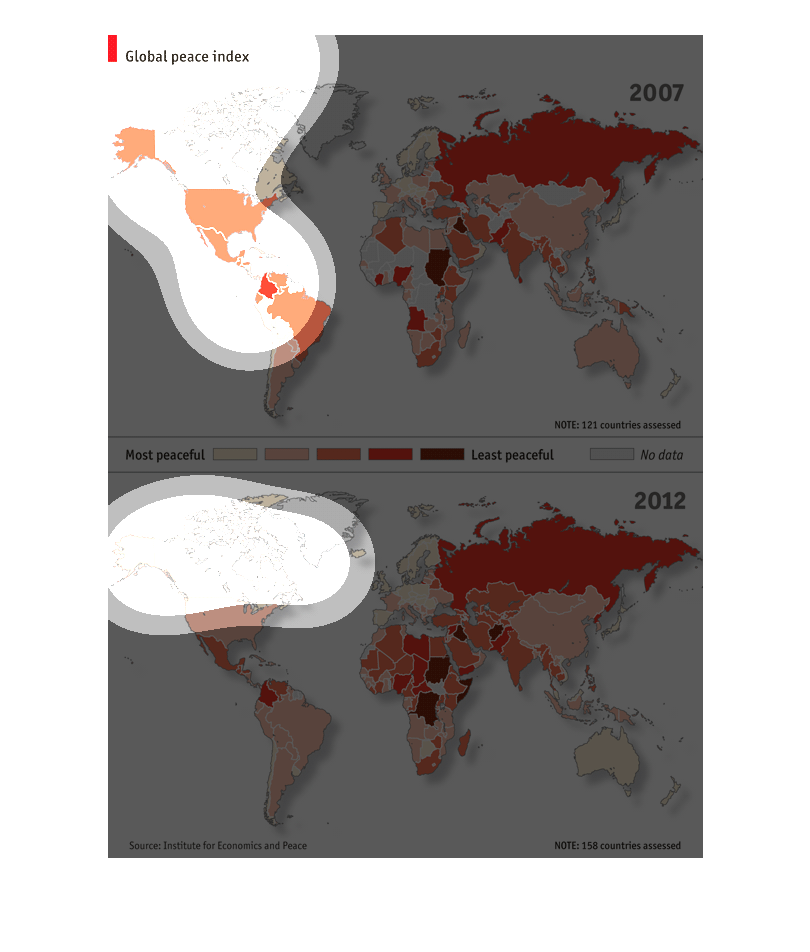
This chart shows the world map showing the global peace index. Canada shows to be one of the
most peaceful countries in the world, which is of no surprise to me.
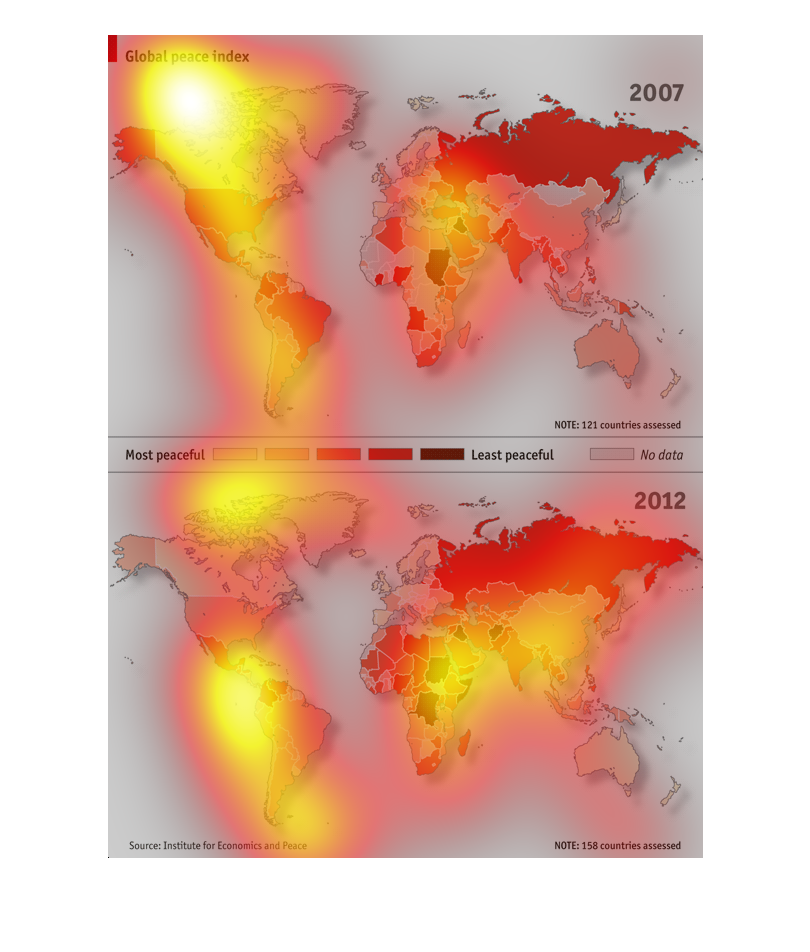
The image is showing through variations of color depending on intensity of category the peaceful/violent
average of said country. The difference of both images from 2007 to 2012, it concludes the
world is getting more violent, or at least our enemies are and we are getting more peaceful.
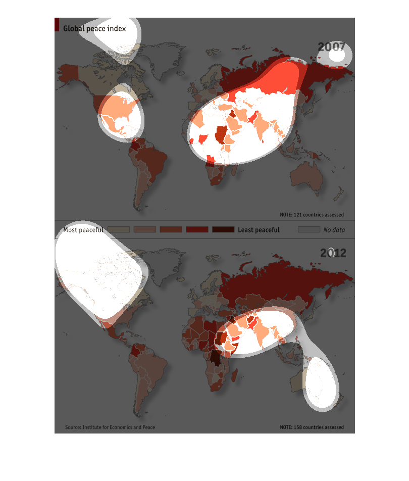
A map infographic of the global peace index. Its shows countries that have the least conflicts
with others. Russia stands out amongst the least peaceful
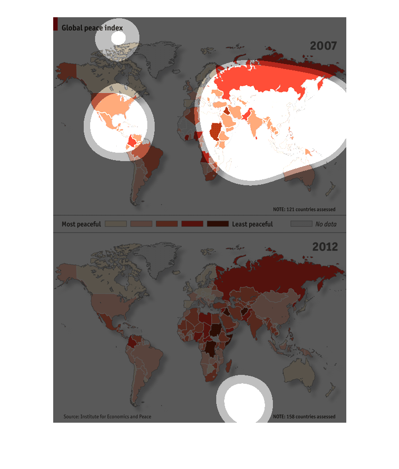
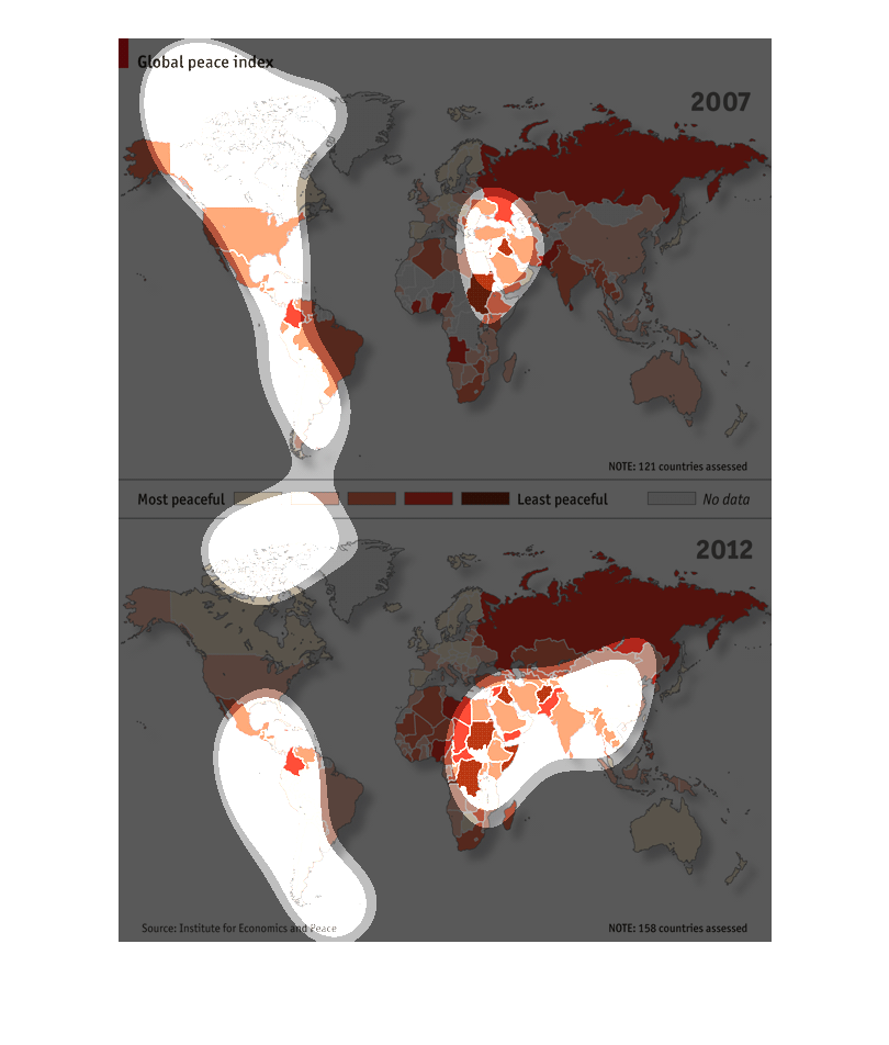
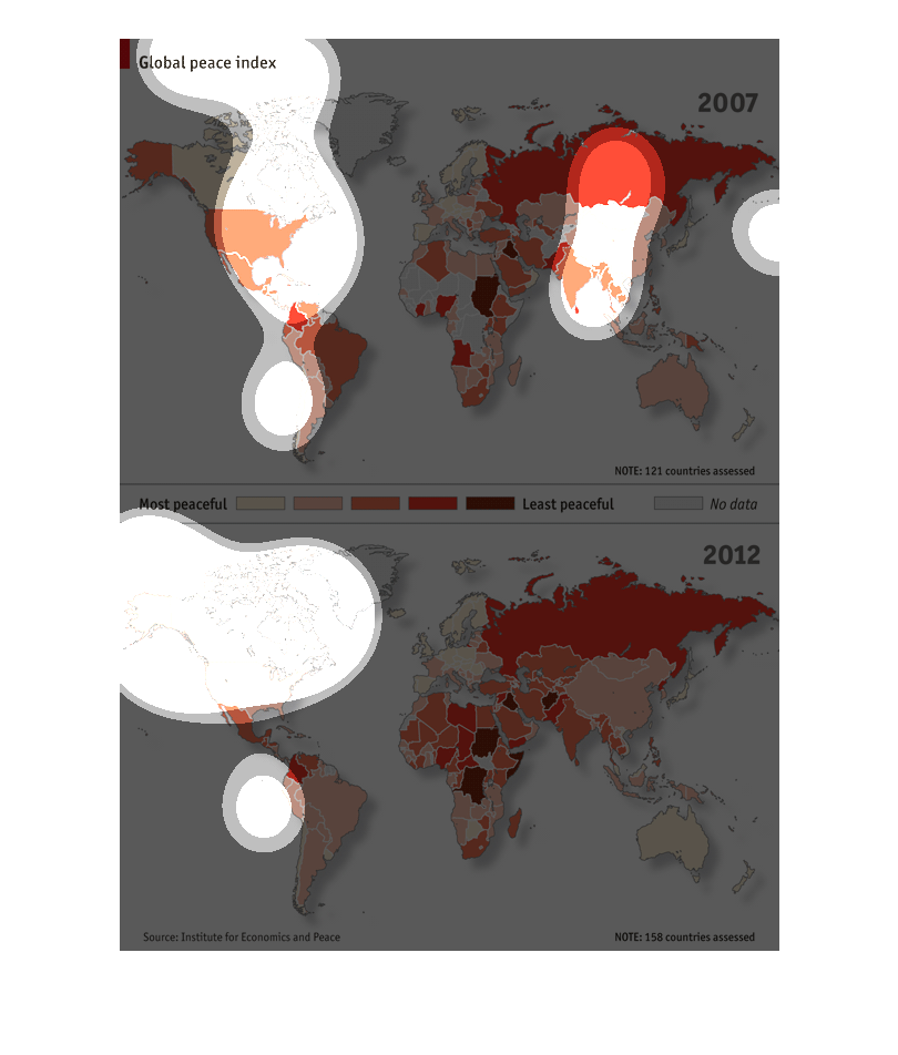
this image is of North America and South America.  the purpose is to show which areas are
more peaceful then others.  Also, it 121 different countries in which to better compare the
data.  This data was reported in the year 2007
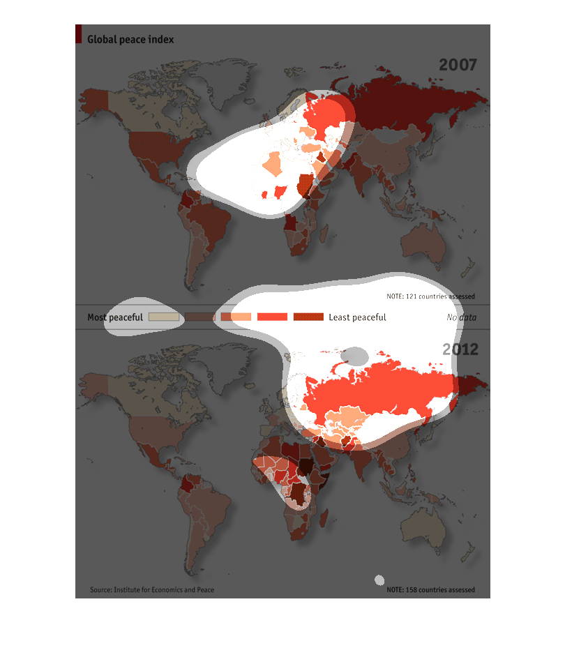
These two charts respectively represent the "Global Peace Index" and "Most Peaceful". The
statistics are shown by different colors on a map of the world. The maps are closely related
but there are some differences.
This is a chart labeled "Global Peace index". The chart shows the US to be peaceful, and shows
a few African countries to be the world's lease peaceful.
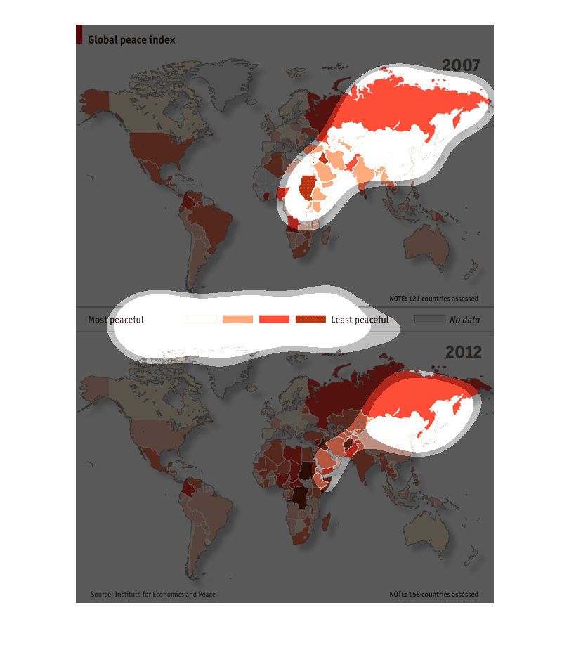
This chart describes about the Global Peace Index all over the world. The index have data
for 2 years 2007 and 2012. Canada get the first place of most peaceful country.
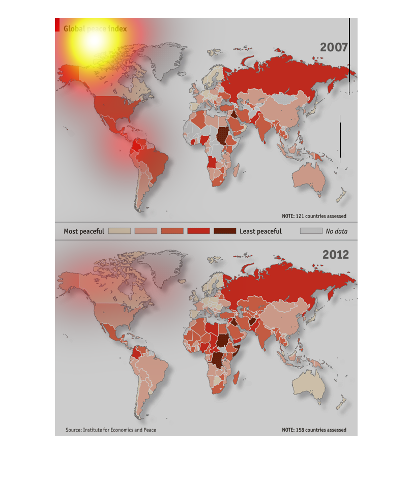
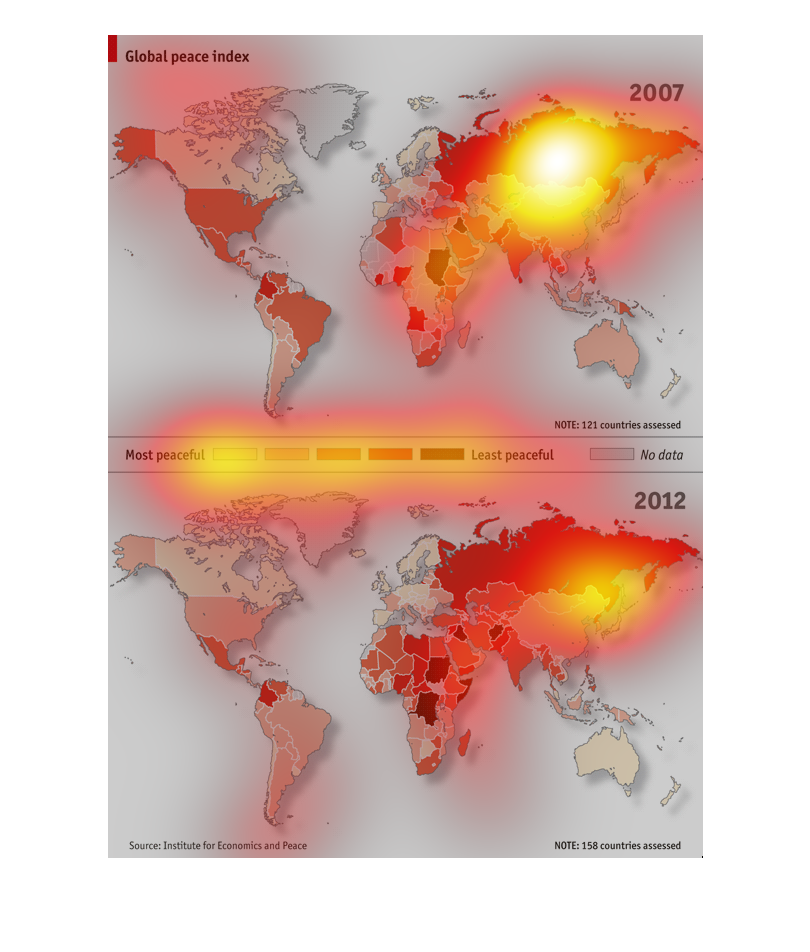
This image is a world heat map of the most peaceful places on the planet. In places like Russia,
China, and the majority of africa the heat map is very dark. Places like Australia, and canada
are extremely peaceful
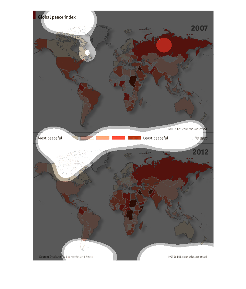
Global Peace Index, ranking of countries across the world. Showing the most peaceful countries
with a shade of red, both results from 2007 and 2012 are displayed.
This is a map of the world showing the global peace index of each country. Areas such as Northern
Europe are the most peaceful, while regions in the Middle East are the least peaceful.
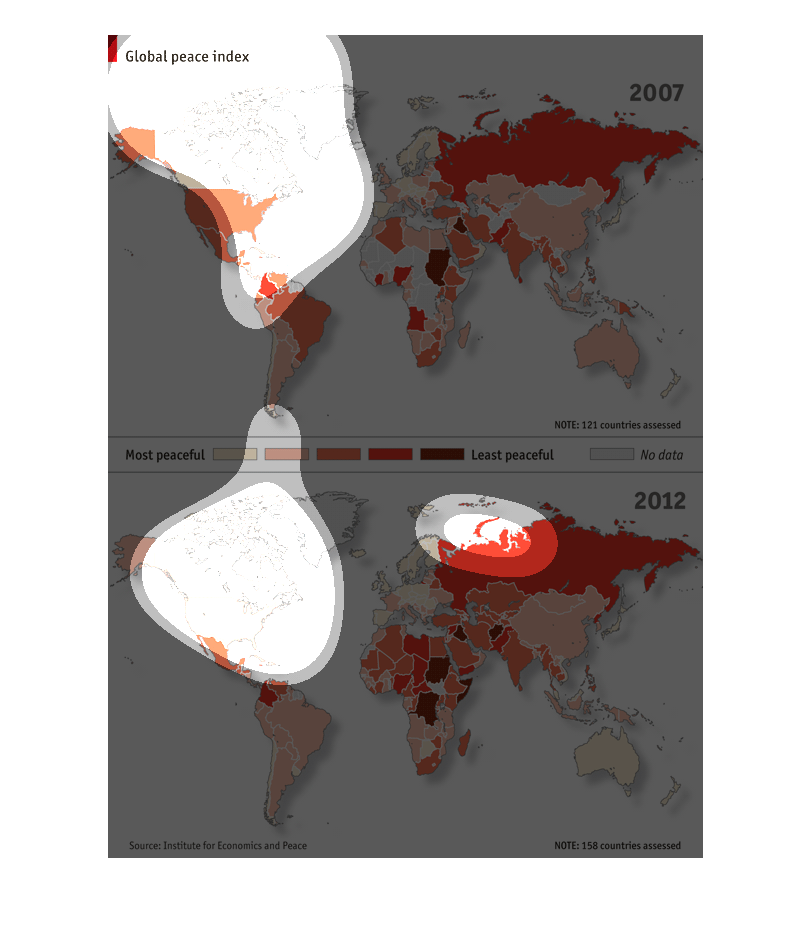
This image shows a world map, and is a 'global peace index,' color coded by levels of peacefullness
across each nation. There is one image for 2007 and one for 2012.
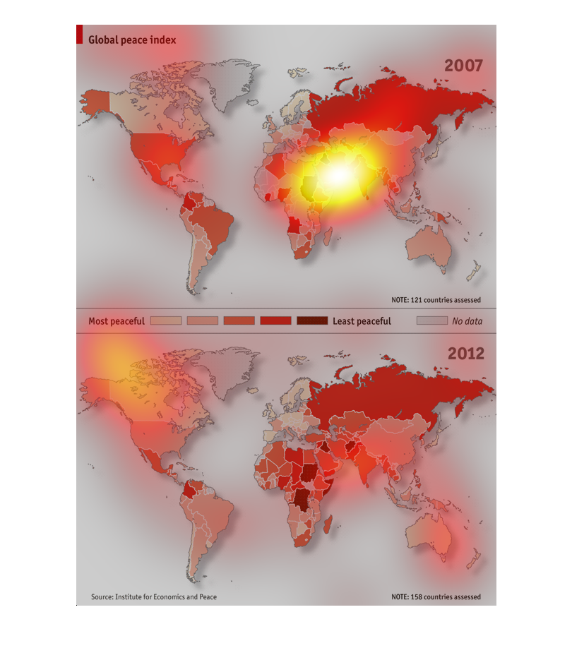
The image is of different continents on Earth, with each continent shaded colors from light
to dark based on how the peaceful the area of the world is.
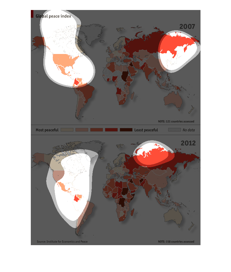
The map compares the levels of peace though out the world in 2007 to 2012. the darker the
color of the area the less peaceful or more war stricken the area is. In both charts Russia
and the Middle East appear to be the least peaceful. North Africa became less peaceful from
2007 to 2012.