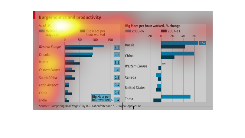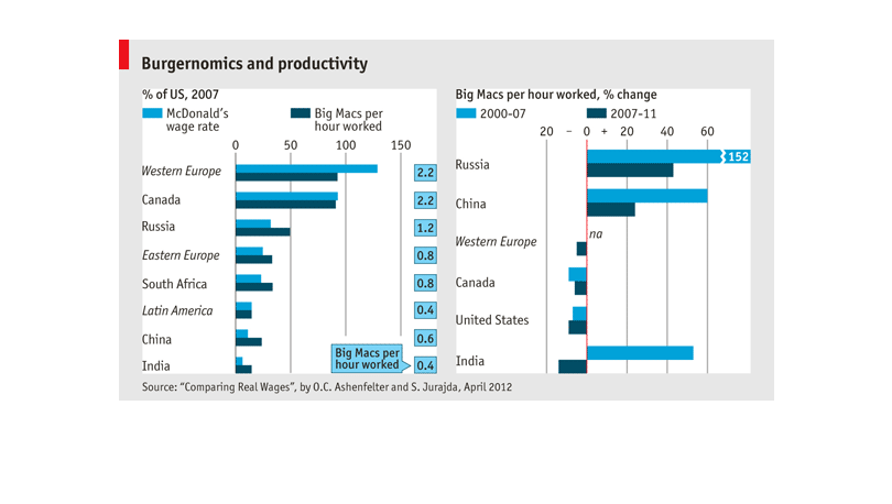
THIS PLOT SHOWS PURCHASING POWER OF CONSUMERS IN DIFFERENT COUNTRIES BY COMPARING THE WAGES
AT MCDONALDS TO THE AMOUNT OF BIG MACS PER HOUR WORKED A WORKER COULD PURCHASE WITH SAID WAGES.
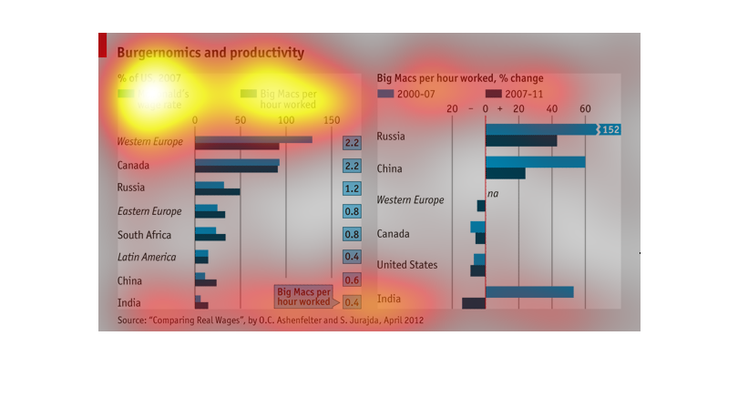
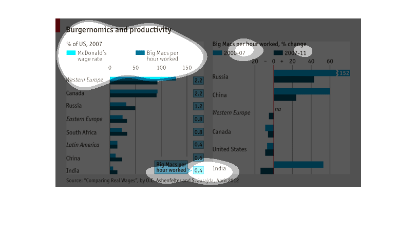
This chart describes the relationship between McDonald's workers' wage rates and their output
productivity.  It compares by countries and shows the relationship between how much workers
are paid versus how much they produce.
The graph is based off of Burgernomics and productivity.It uses data taken from McDonald's
from 2007 to 2011. The chart details how much the employee's wages were, and how much they
changed with the number of Big Mac's sold.
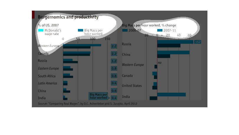
The following chart is called Burgernomics and productivity. It shows the amount of Big Macs
produced versus the hours worked in making them. It shows data from many different countries.
This is a chart about fast food economy. It shows McDonalds wage rate, Big Macs per hour worked.
It also shows Big Mac per hour worked from 2000 to 2007 with Russia on the top around 152%
change from to 2007-2011 and on the bottom is India with -20%.
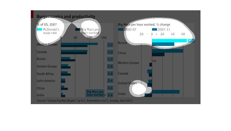
This chart displays and compares the ideas of "burgernomics" and productivity in different
countries.  In the graph on the left hand side, the McDonald's wage rate in various countries
is compared to the potential Big Macs purchased per hour worked.  These figures are different
in every country.
This chart indicates Burgernomics and productivity. The countries represented are Russia,
Canada, Western Europe, Eastern Europe, South Africa, Latin America, China, India,
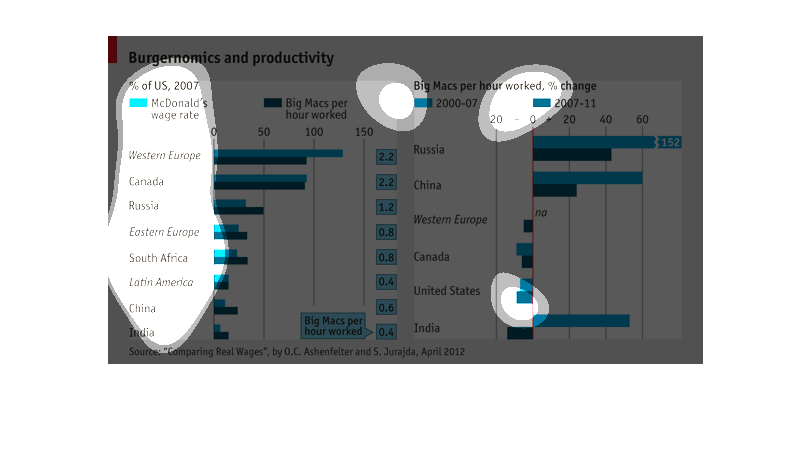
The graph is titled Burgernomics and Productivity, and compares a change in Big Mac's per
hour worked in two periods, 2000-2007 and 2007-2011.  Russia is hown to have the highest number
of Big Mac's while China has the smallest.  The Graph also shows McDonald's wage rate for
several countries.  According to the graph, Western Europe has the highest wage rate, with
a rate of about 130, while India shows a rate of about 20. The data comes form a study titles,
"Comparing Real Wages" by O.C Ashenfelter and S. Jurajda.
These graphs show burgernomics and productivity.  On the right is the McDonalds wage rate
and Big Macs per hours worked.  On the left is the percent change in Big Macs per hours worked.
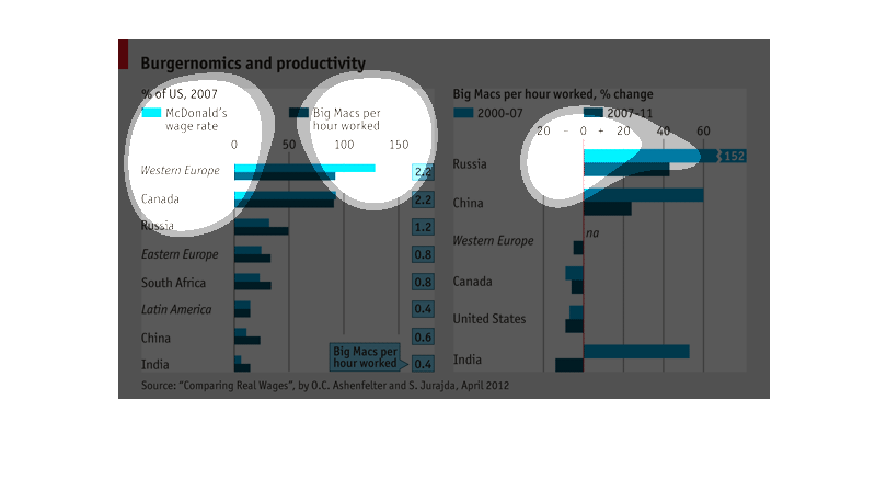
This chart describes burger-nomics and productivity as a percentage of US in the year 2007.
Specifically the McDonald's wage rate. Countries include Canada and Russia.
The graph shows listnigs of burgernomics and productivity, a listing of the productivity of
McDonalds workers measured in Big Macs produced per hour. Variables analyzed include wage
rate and country/region.
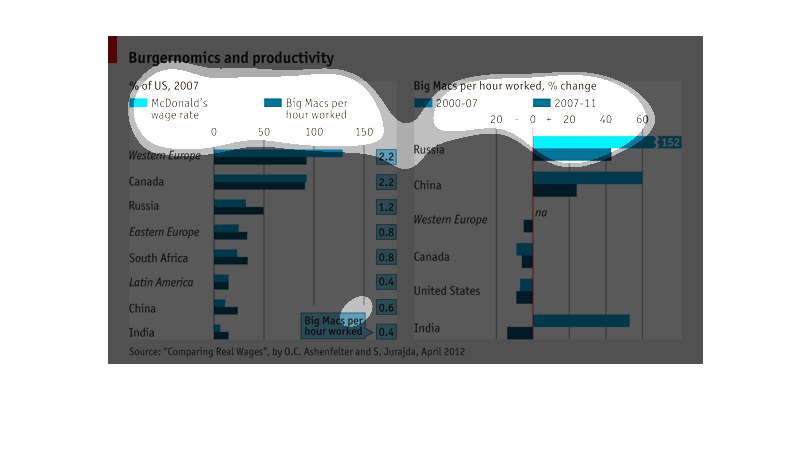
The chart describes something called burger omits and productivity. It compares McDonald's
wage rates with number of Big Macs produced in various countries and regions. India has the
lowest wage rates and productivity. Western Europe has the highest in both categories. It
also shows the percentage change between 2007 and 2011.
This graph shows the relationship between fast food sales of McDonald's Big Mac hamburger
and hourly wages across countries. It's not clear whether the 'Big Macs Per Hour Worked' data
shows how many Big Macs could be purchased with each hourly wage, or how many were made.
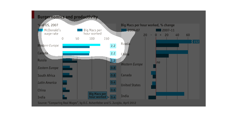
This is a graph of the productivity of McDonald's and the rate at which they produce hamburgers
in each country, as well as the companies wage rate. Russia  appears to make the most big
macs per hour worked.
Graph is trying to show that there is a definitive link between how much a McDonald's employee
makes and his productivity. The study was conducted in several different countries illustrating
the more a worker makes, the more he or she will put in the effort to do a good job.