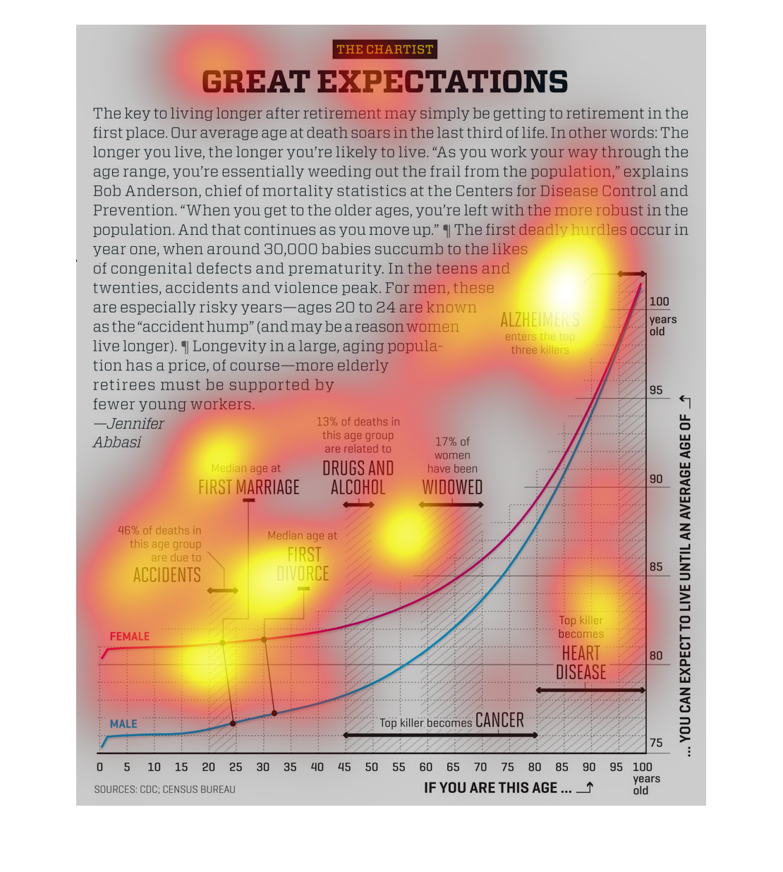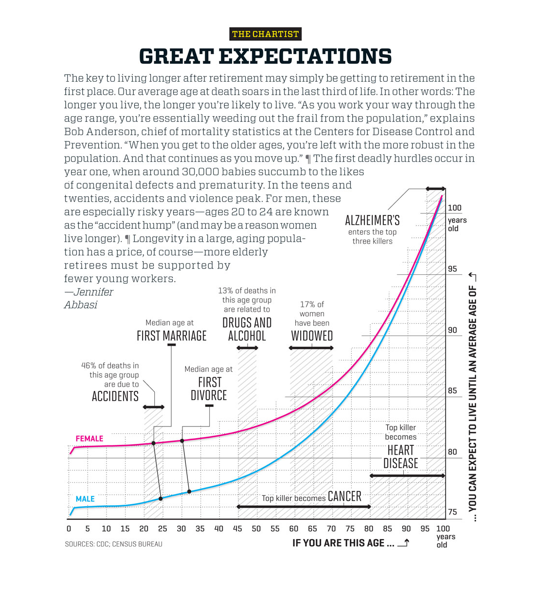
This chart examines different adult life events that may happen leading up to retirement.
Life events include divorce, heart disease, getting Alzheimers, etc.
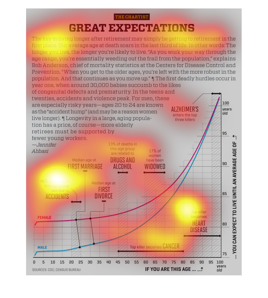
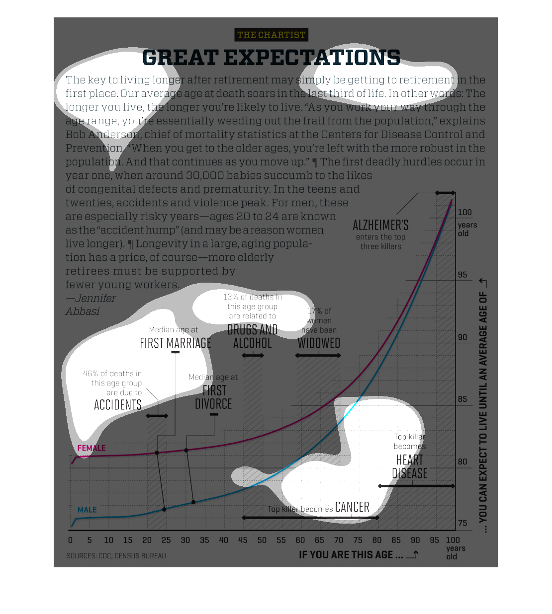
Interesting study; the graph is trying to illustrate how as you grow older your chances of
an accidental death decrease tremendously as you encounter lesser dangers, while in youth
you are more susceptible.
The following chart shows the rate of mortality among different age groups. With a high mortality
rate among new born and of course among the elderly as well.
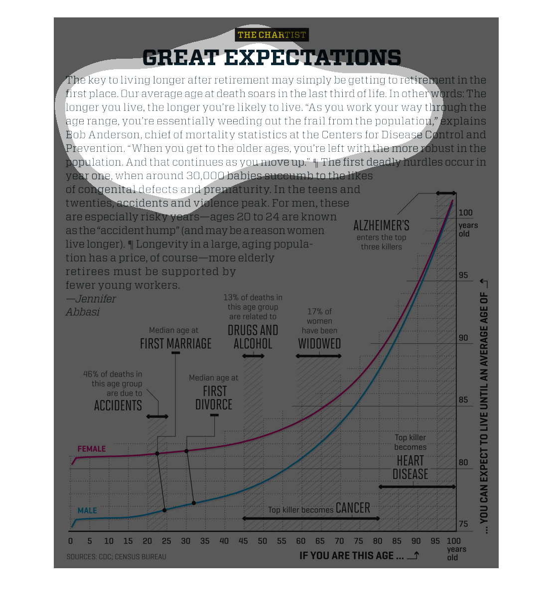
This graph is showing how long, on average, people live after retirement. The x-axis is the
age you are currently, while the y-axis shows how long you can expect to live until.
This is a chart showing the reasons men and women die before living to the age of 100. The
chart shows from 45 to 80 the largest killer is cancer, and heart disease from 80 to 100.
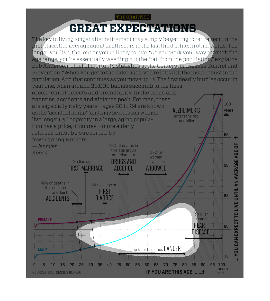
It shows how the longer that you live, the longer you can expect to live. At each age, your
life expectancy increases with entering the new age groups. makes sense!
This is a double graph that consists of a bar graph and a line graph. The X-Axis is the age
which you are at, and the Y-Axis is what you can expect to die from. The bar graph reaches
up and whatever part of the line hits that bar, you can achieve the results of your "average"
death.
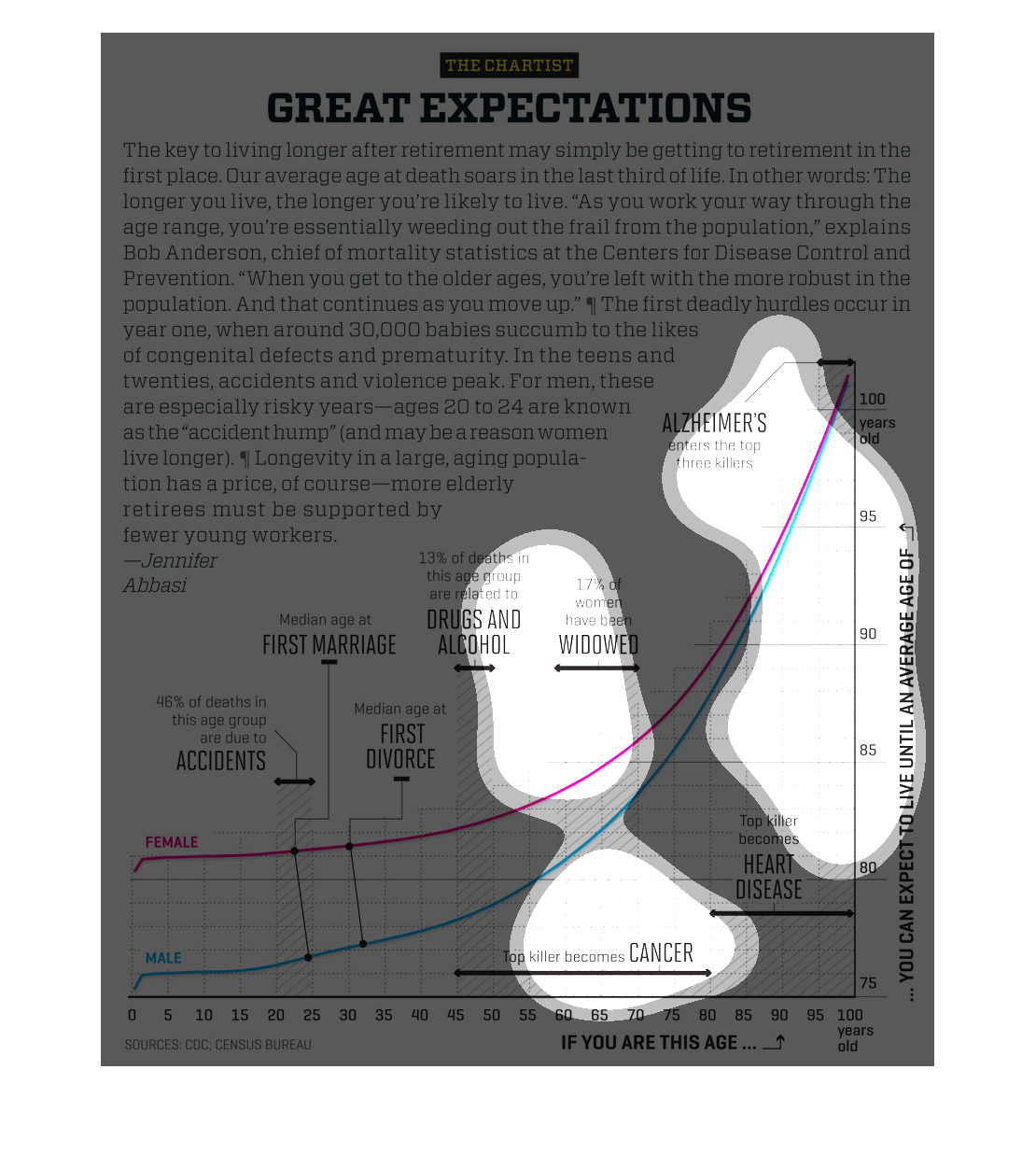
The chartist great expectations article about living longer into retirement and how this is
done by jennifer abbasi there is also a graph with female and male and different pinpoints
such as accidents, first marriage first divorce, drugs and alcohol widowed, alzheimers, heart
disease, cancer each has % and there is also numbers along the bottom of the graph and side
with ages
This infograph from The Chartis title is Great Expectations. The graphs explains the cause
of death at differents ages. The top killers are cancer with an age average  of 45 to 80,
Heart disease betwen ages of 80 and 100 and Alzheimer 95 to 100. It also mentions the that
45% of the age group 20 to 25 dies on accidents.
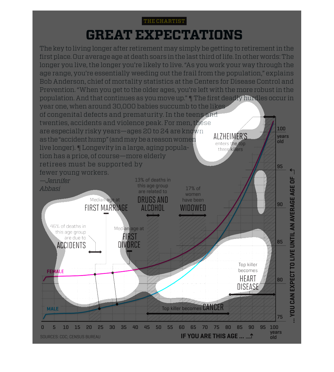
This is a charted line of median ages of men and women, with one axis denoting current age
with the other pointing out what one could expect to live to. Along the way are various causes
of death and other terrible life circumstances and events.
this is a graph showing the projected life spans of both males and females over some time
and rates how marriage , accidents, if they use drugs or alcohol, death and /or how diseases
affect their lifetspan.
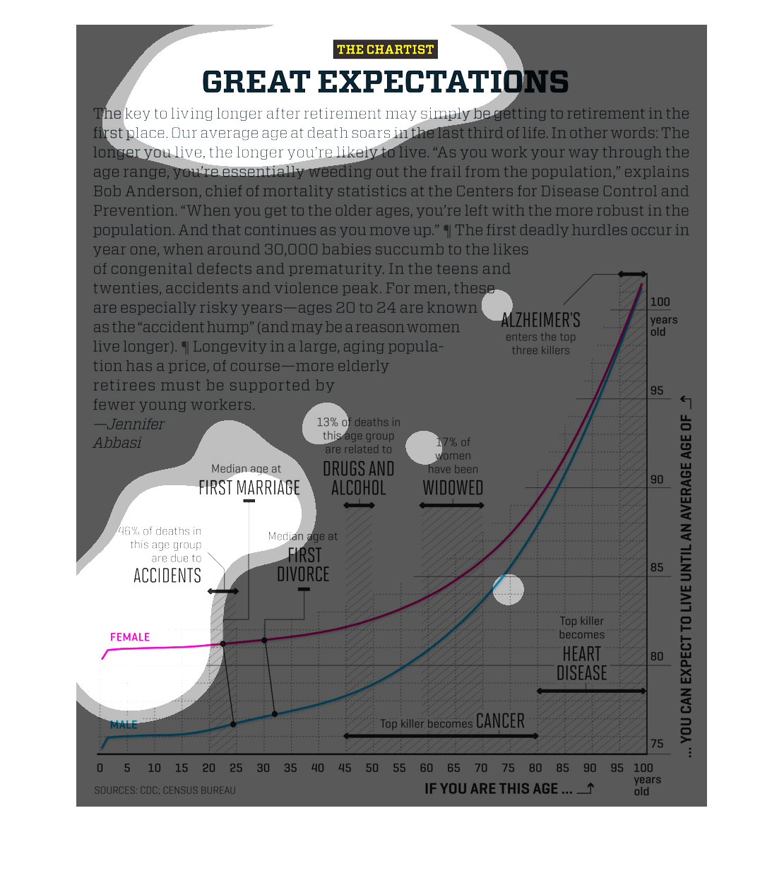
The title of this graph is, Great expectations. The first sentence of the paragraph explains
a lot. It say: The key to living longer after retirement is getting to retirement in the first
place.
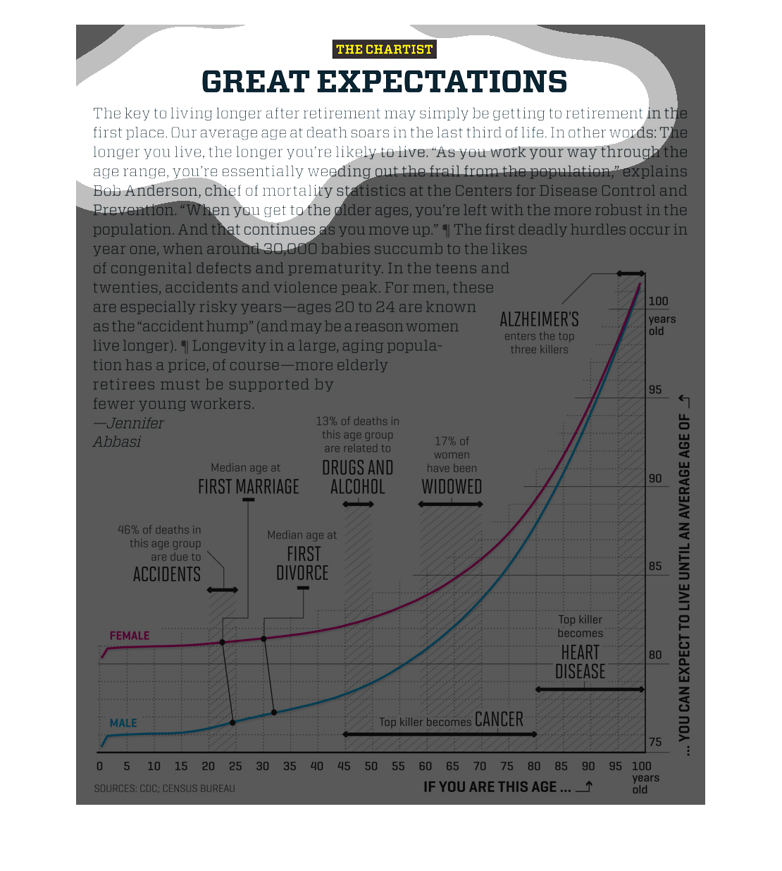
This graph depicts the leading causes of death as a function of age group.  Male and female
data are plotted separately.  At young ages, accidents are the leading cause of death.
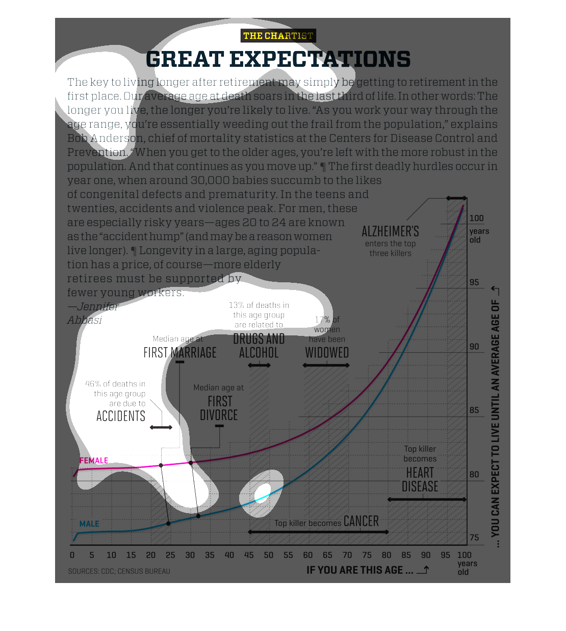
This chart describes great expectations. Specifically, the key to living longer after retirement
may simply be getting to retirement in the first place.
This chart shows the differences between males and females in multiple categories. It seems
as if females tend to be higher in these categories. Their chance of having these issues,
are higher than men.