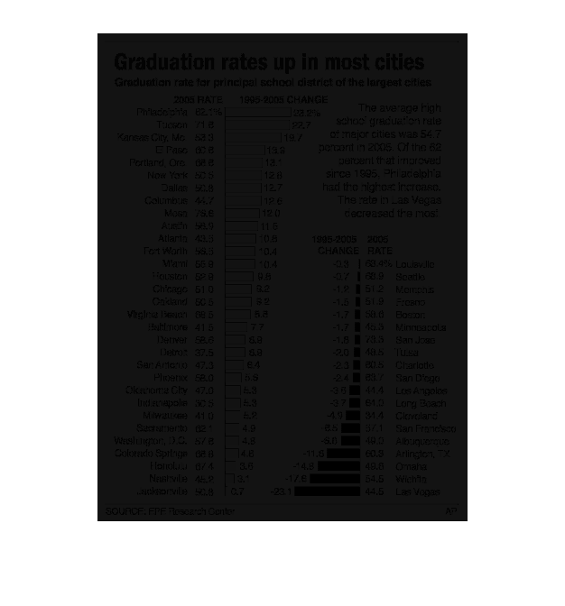
This graph depicts the rising graduation rates across the nation. On one side, the graduation
rate percentage is shown, while, on the other side, the percent change of graduation from
1995 to 2005 is shown. The cities in blue on the left represent positive and increasing graduation
rates, while the cities in red on the right represent negative and decreasing graduation rates.
Error using .*
Matrix dimensions must agree.

Error in plotSpotlight (line 30)
    output = repmat(a,[1 1 3]).*single(im)/255;

Error in plot_individual_user_maps (line 49)
        [heat] = plotSpotlight(im,heatmap,3);