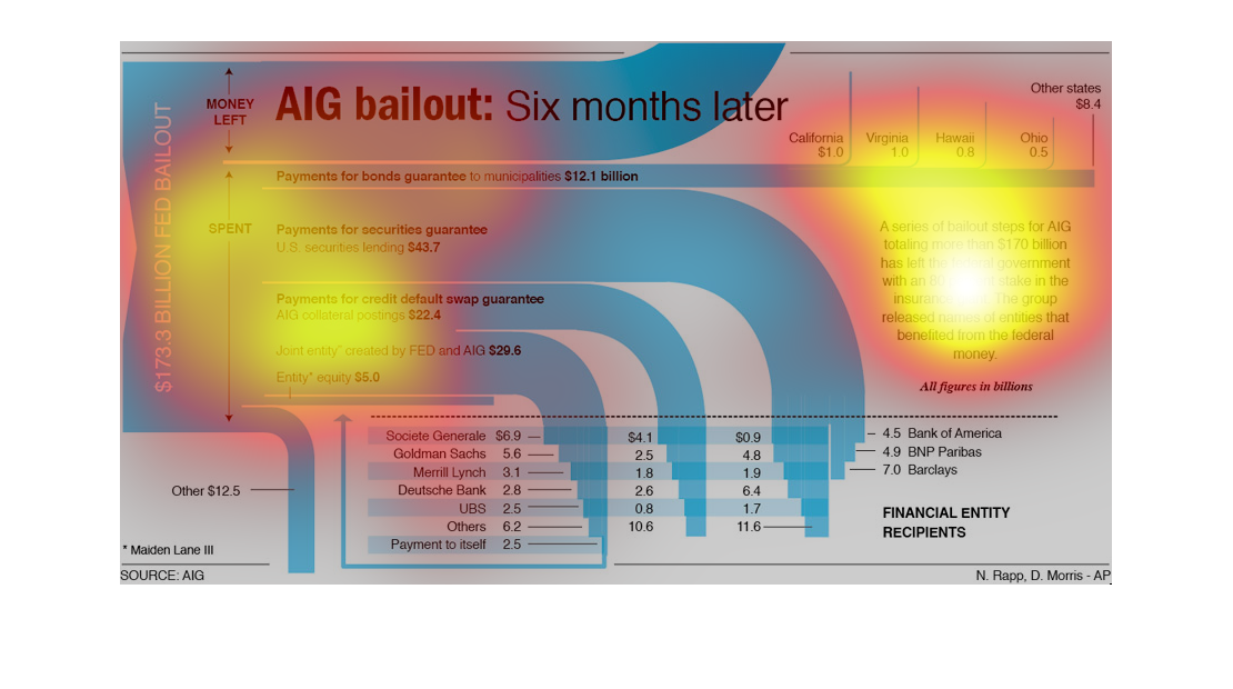
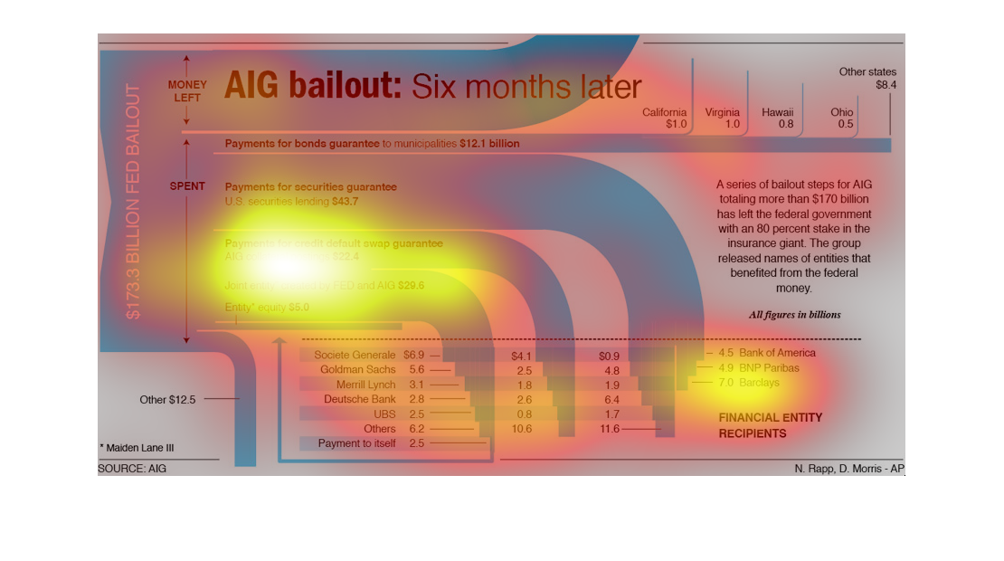
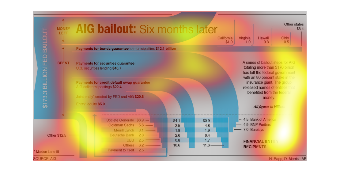
This is more of a flow chart but with some graphing qualities. It discusses the AIG Bailout
and examines the initial 6 months following the bailout. It talks about the money that was
spent and how it was spent and shows how much is left.
This is a chart about the AIG $170 billion federal government bail out and the effects of
it 6 months later. The chart shows CA, VA, HI, and other states.
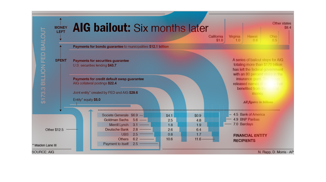
This graphic shows the results of the AIG corporate bailout six months after it happened.
It breaks down the money sources into categories spent, and shows what is left and where it
is going out to.
This image shows or depicts in detailed statistical terms the effect of the AIG Bailout 6
months after it was completed. Payments of bonds that total in the billions.
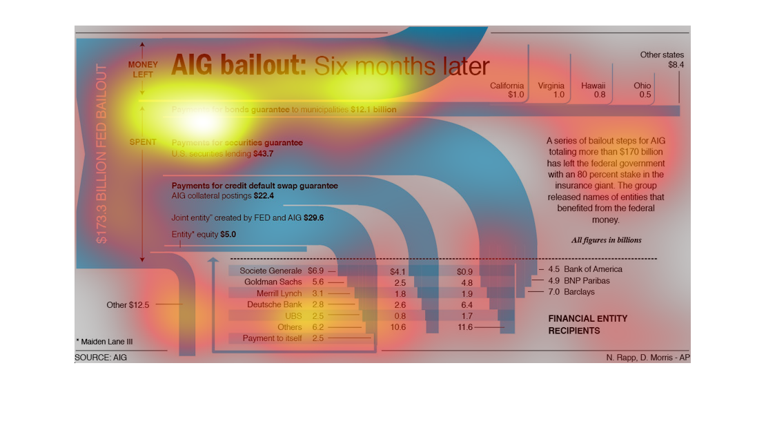
The graphs illustrates the $173 billion dollar Federal bailout.  It contains important dates,
which banks received the funding, and narrative around the funds.
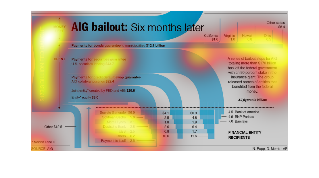
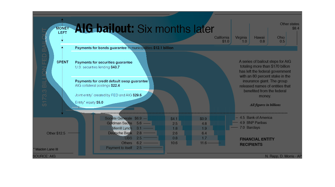
This chart is small and hard to read, but it seems to show where the money went for the $173.3
Billion Fed Bailout. AIG is in the headline, but I see a lot of other companies in the chart
such as Bank of America, Barclays, Goldman Sachs, and Merril Lynch. The other are unreadable.
This image is an incredibly obscure assorted charts regarding the AIG Bailout.  Information
is scattered and placed in difficult to understand locations.
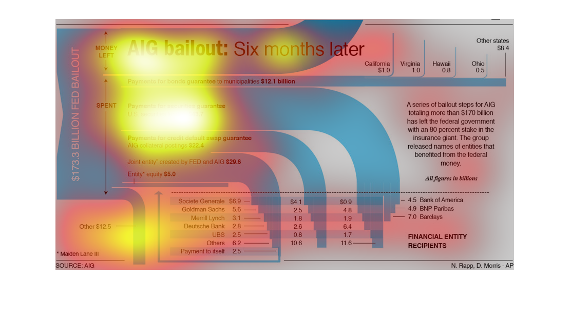
The image is an infographic depicting the situation six months after the AIG bailout. While
it is apparent several different statistics are displayed in the infographic, it is near impossible
to interpret the information without seeing a larger picture.
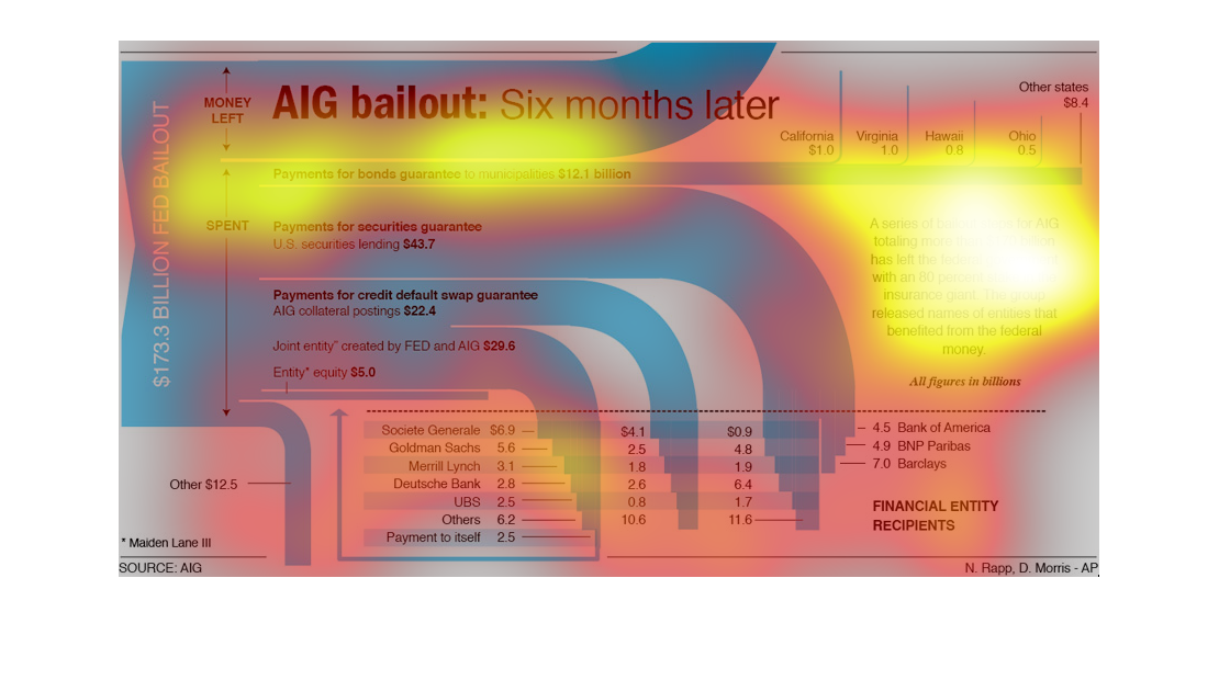
This chart describes AIG bailout six months later. areas on the chart include payments for
bonds guarantee  to 12.1 billion, and payments for securities guarantee.
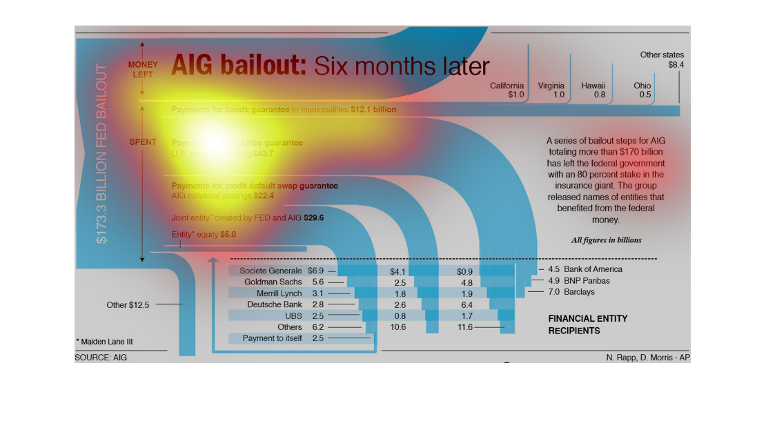
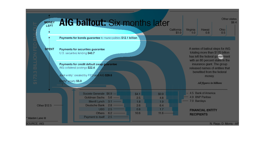
This graph shows the AIG bailout results 6 months post-bail out. It shows the disbursal of
money and the overall financial data that shows the recipients and use of funds in its nature.
This chart is showing the AIG bailout after six months. There is numerous information to be
read, numbers and financial lingo that I honestly cannot remember with the small little bubble
I get. My apologies
This graph is very much a pictograph type of graph. It displays facts and figures related
to the $173.3 billion federal bailout of AIG, and what has happened within six months of that
event.
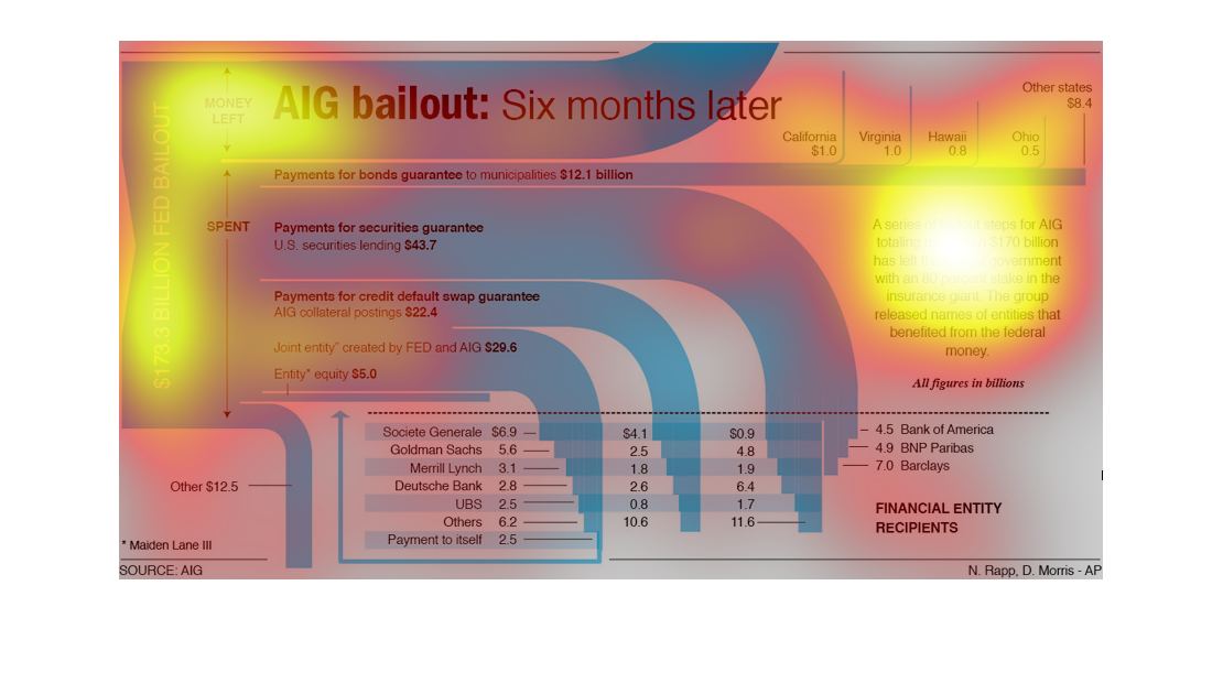
This chart describes the effect of the AIG bailout after 6 months. It describes the different
paths the money took and how they helped out specific institutions.
This is a chart about an insurance the federal government has a stock in different states.
It includes information about California, Virginia, Hawaii, and Ohio. There is also a section
for other states.