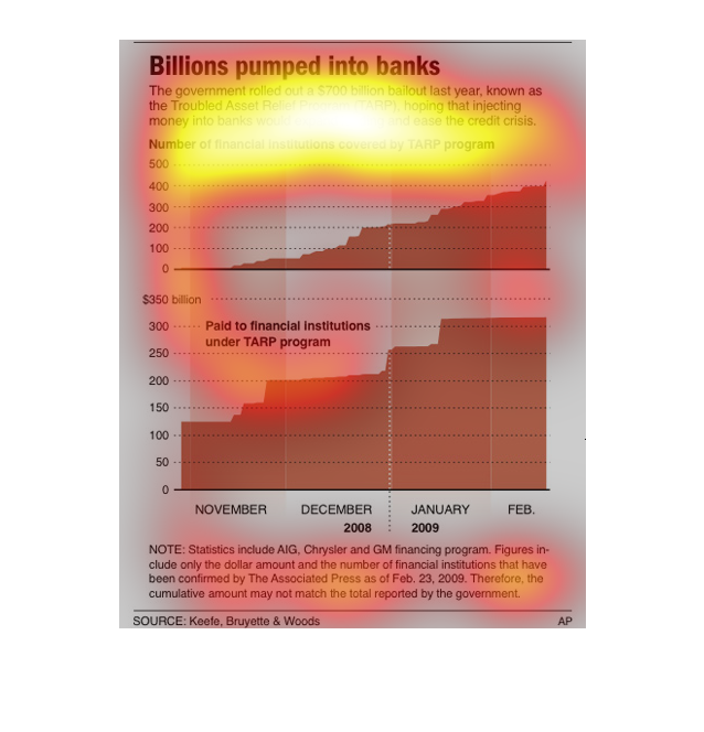
The graph shows the number of banks included in the $700B TARP program rolled out by the Federal
Government and the amount paid to these financial institutions over time between Nov 2008
and Feb 2009. About 400 institutions received money totaling just over $300 B.
The title ofthis graph is, "Billions pumped into banks".  The information charted within this
graph displays information from back in 2008-2009,  when the United States federal government
defied the basic tenants of capitalism and bailed out private institutions with TARP's and
other programs.
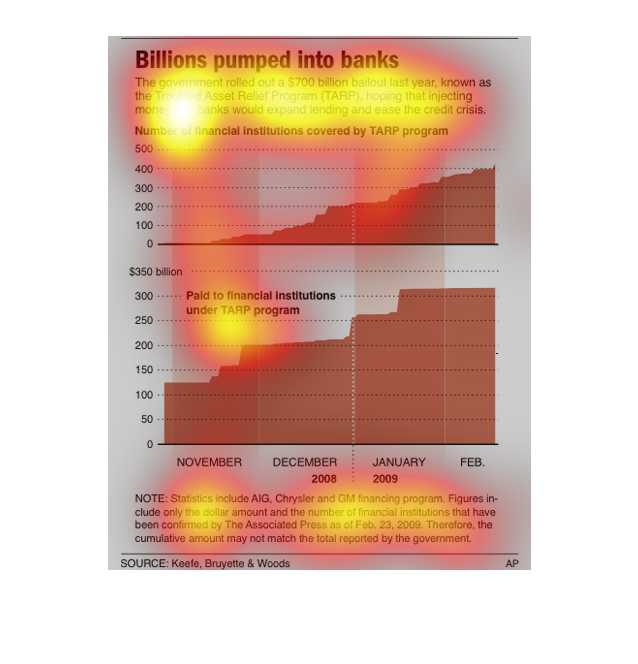
This graph depicts the amount of money pumped into banks during the Financial Crisis, as a
function of time.  Statistics also include loans to the auto industry.
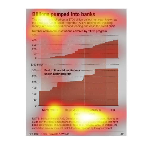
This chart describes billions pumped into banks. It states that the government rolled out
a $700 billion bailout last year in a troubled asset relief program.
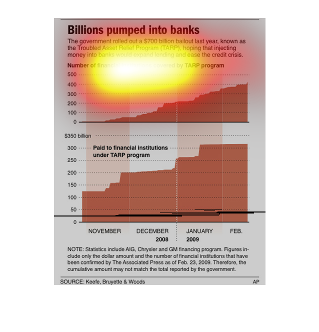
Billions pumped into bank, 700 billion dollar bailout, number of financial institutions covered
by TARP the acronym for the bailout. november 2008 to january 2009
This image shows two graphs displaying the number of banks that participated in the TARP program
and the amount of money funded to TARP from November 2007 to February 2008.  The graphs show
that few institutions used TARP right when it was first funded, however more and more joined
steadily over the next few months.  The amount of money used by TARP grew in spurts with large
increases in November and January but plateauing in December and February.
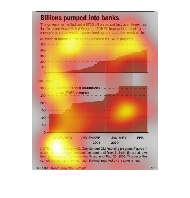
These charts describe how much money was given to certain banks to aide in relief efforts
to help with the credit crisis.  The bottom chart shoes how each month there has been an increase
in billions given.
The following chart shows the total amount of money pumped into the United States Financial
System during the TARP Bailouts. From November 2008 until FEB 2009.
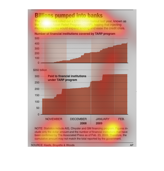
This image depicts or shows in 2 different bar graph statistical formats of the billions of
dollars pumped into banks. The government rolled out a $700 billion bailout during the year
before.
This graph shows the billions of dollars that the government injected into the banking business
to help them expand lending and ease the credit crisis in a program called (TARP) The graph
shows the number of institutions as well as the dollar amount the government has put out in
a 3-month period.
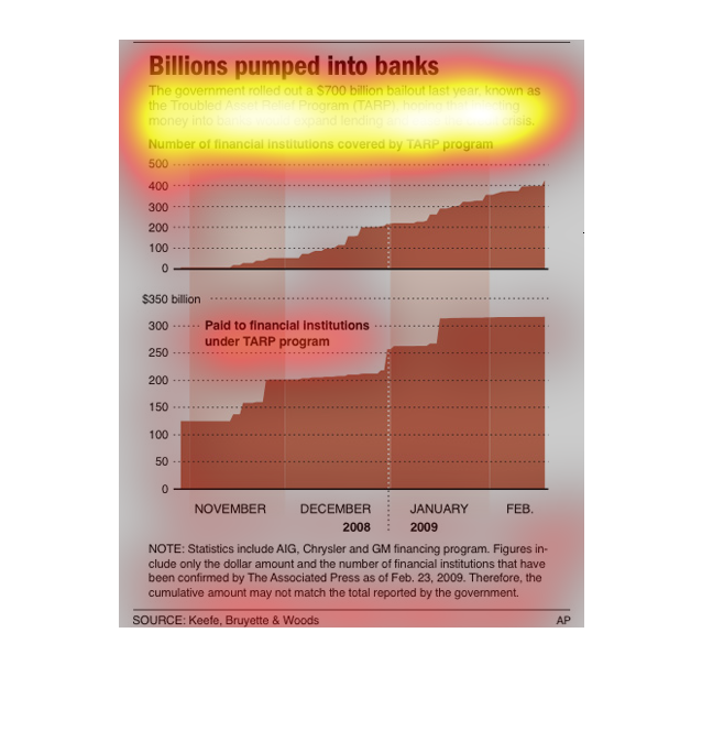
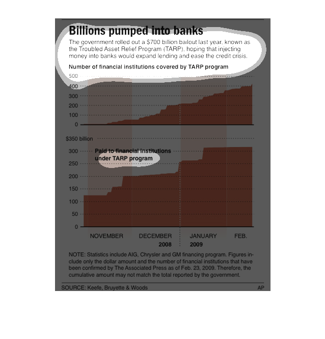
An infographic showing the billions of dollars pumped into the banking system over a several
month period as bailouts. A graph of funds for the TARP bill
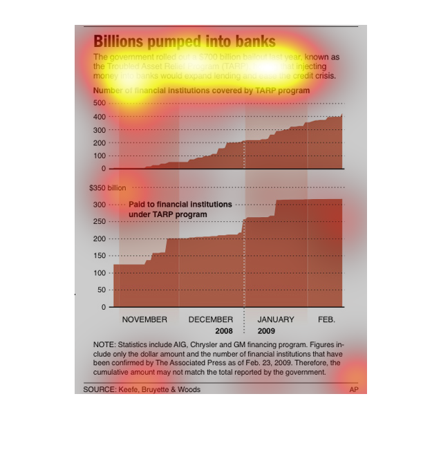
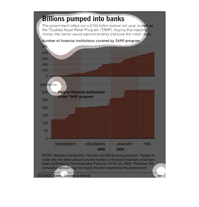
This graph illustrates the billions that have been pushed into the banks for the economic
bailouts.  The top is the number of financial instituions covered by TARP programs.  The bottom
shows money paid to financial instituions by the TARP programs.
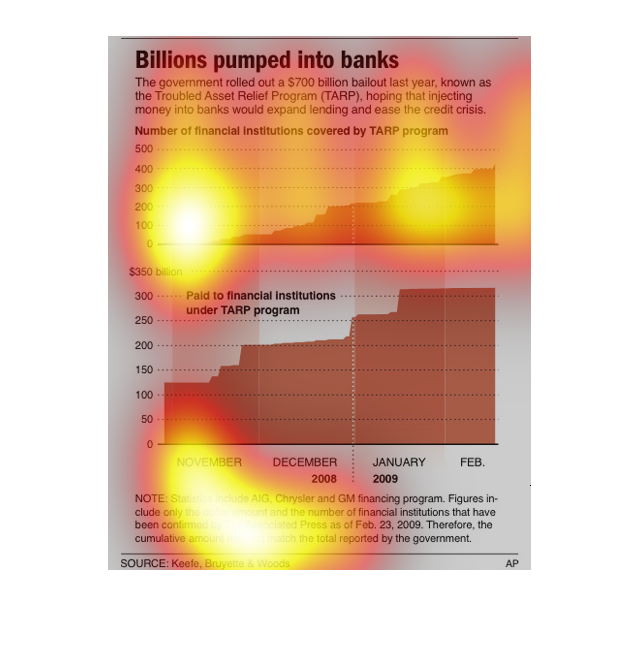
This chart shows the different financial institutes that are covered by the new government
program called TARP. The money being put into these banks should help the credit issue and
help relieve financial troubles.
The graphs depict the bail out of banks in the TARP program. They show the difference pouring
the money into the banks made and how many more banks were covered by the TARP program over
time.
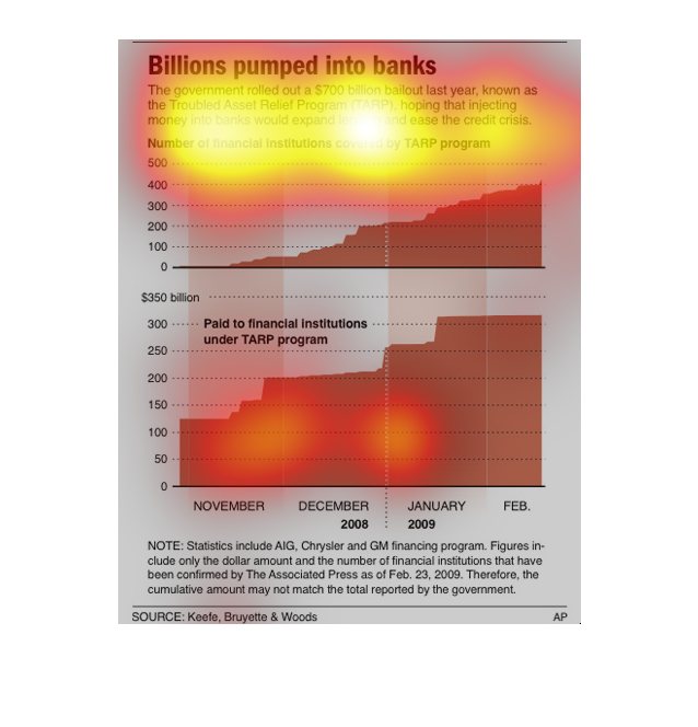
This is a chart showing the outcome of the $700 billion pumped into banks to ease the credit
crunch from November of 2008 to February of 2009. The chart shows there were 500 financial
institutions covered by tarp.