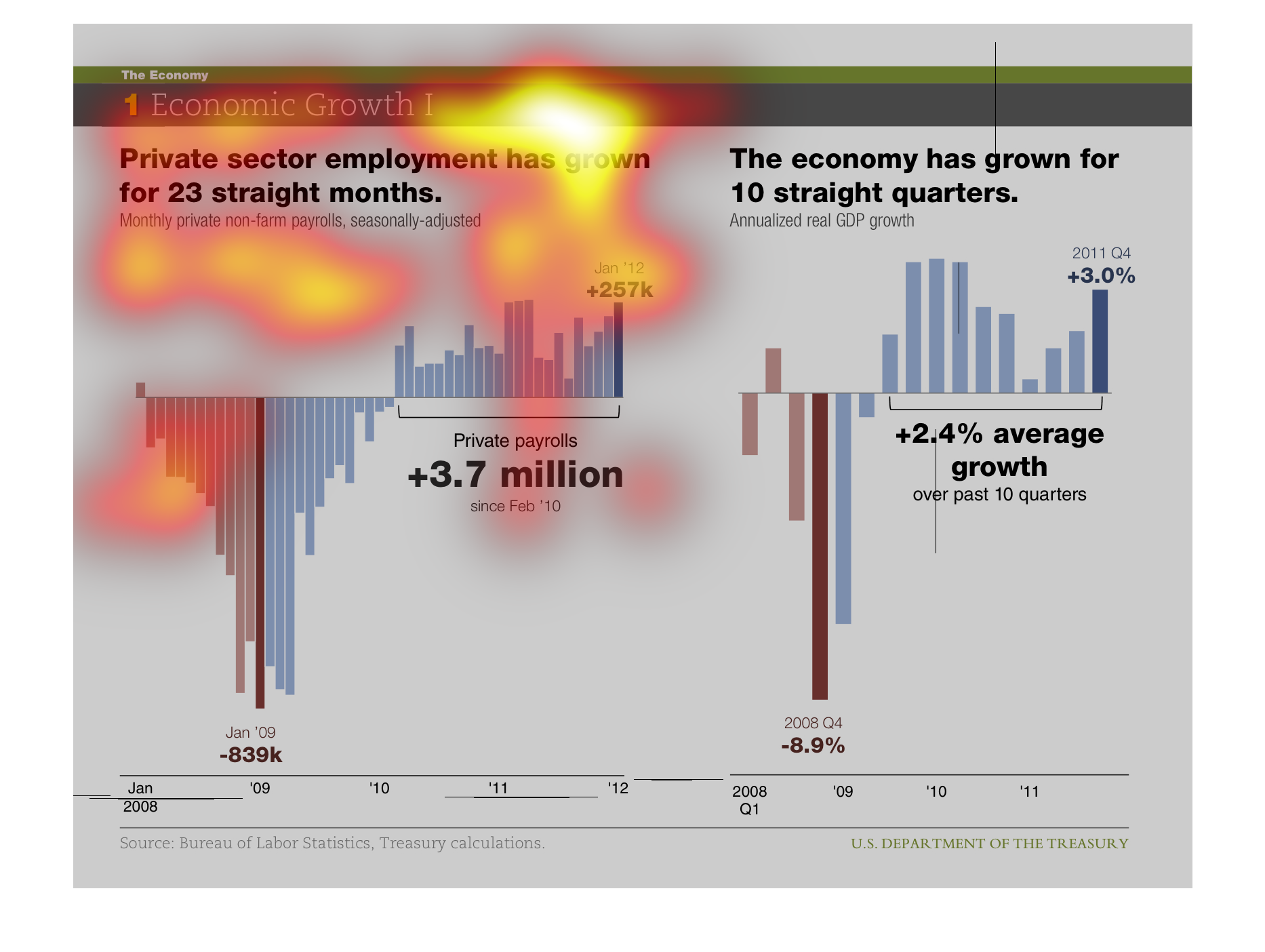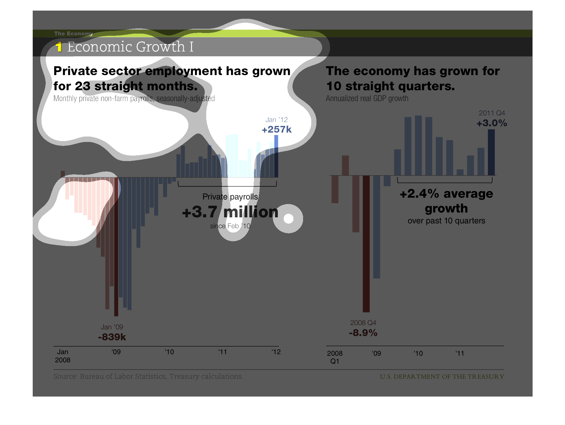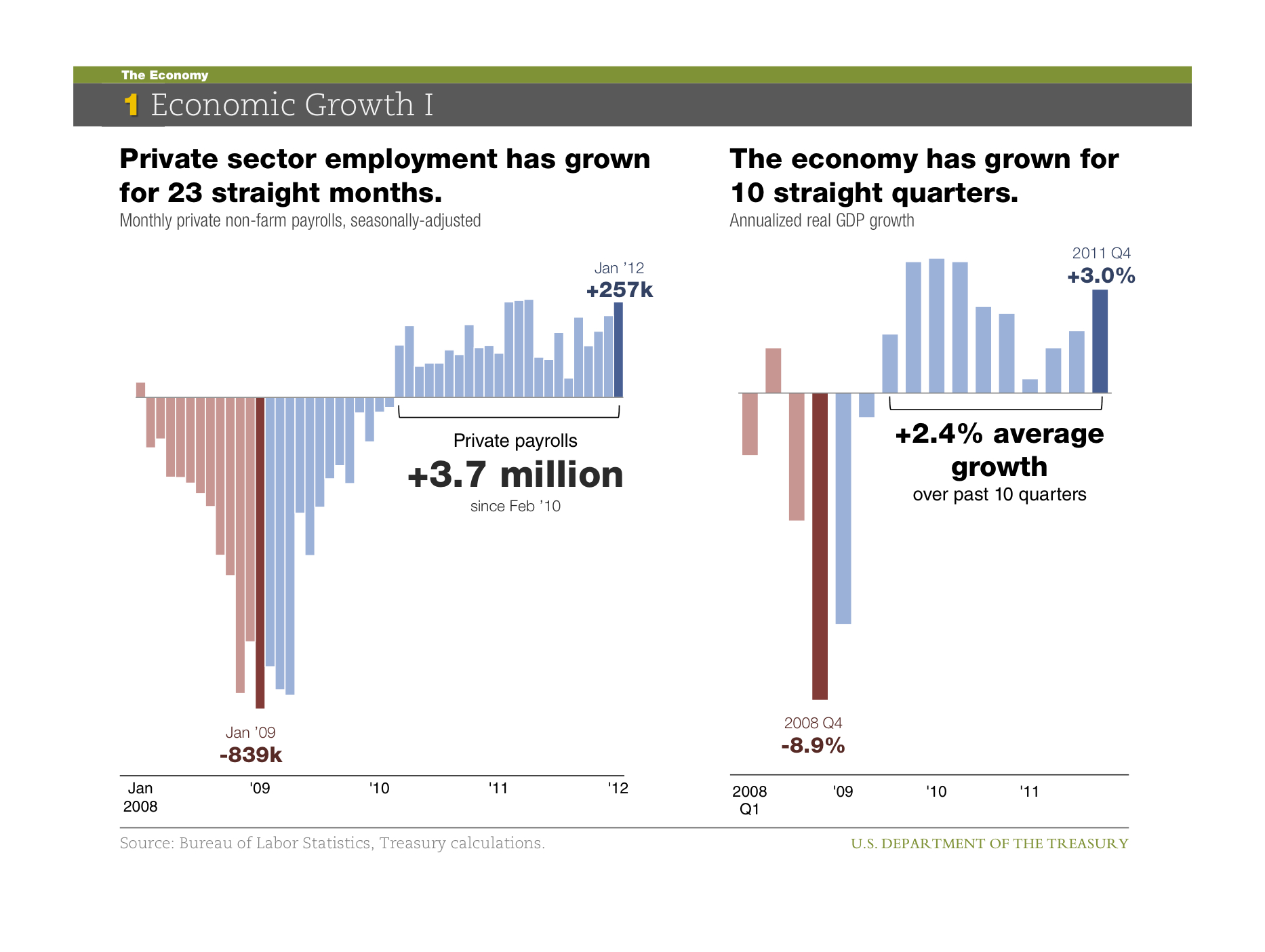
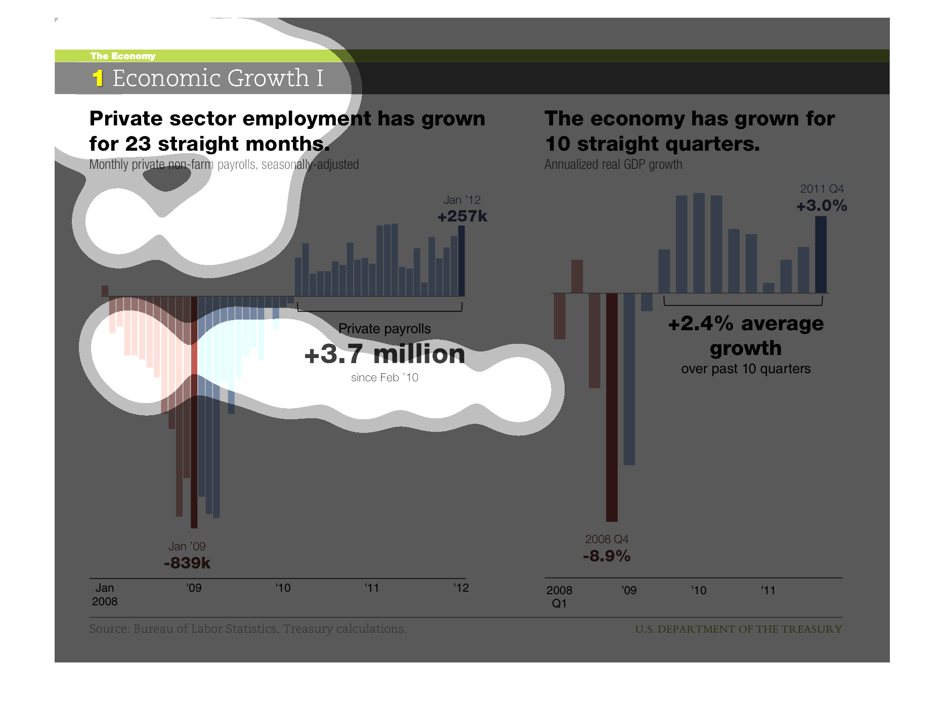
This chart shows how private sector employment has grown for 23 straight months. It has grown
by 3.7 million have dropping $839,000 previously. It also shows how the economy has grown
for 10 straight quarters. In 2008, there was a sharp fall of 8.9% but over the last 10 quarters
there has been an average growth of 2.4%
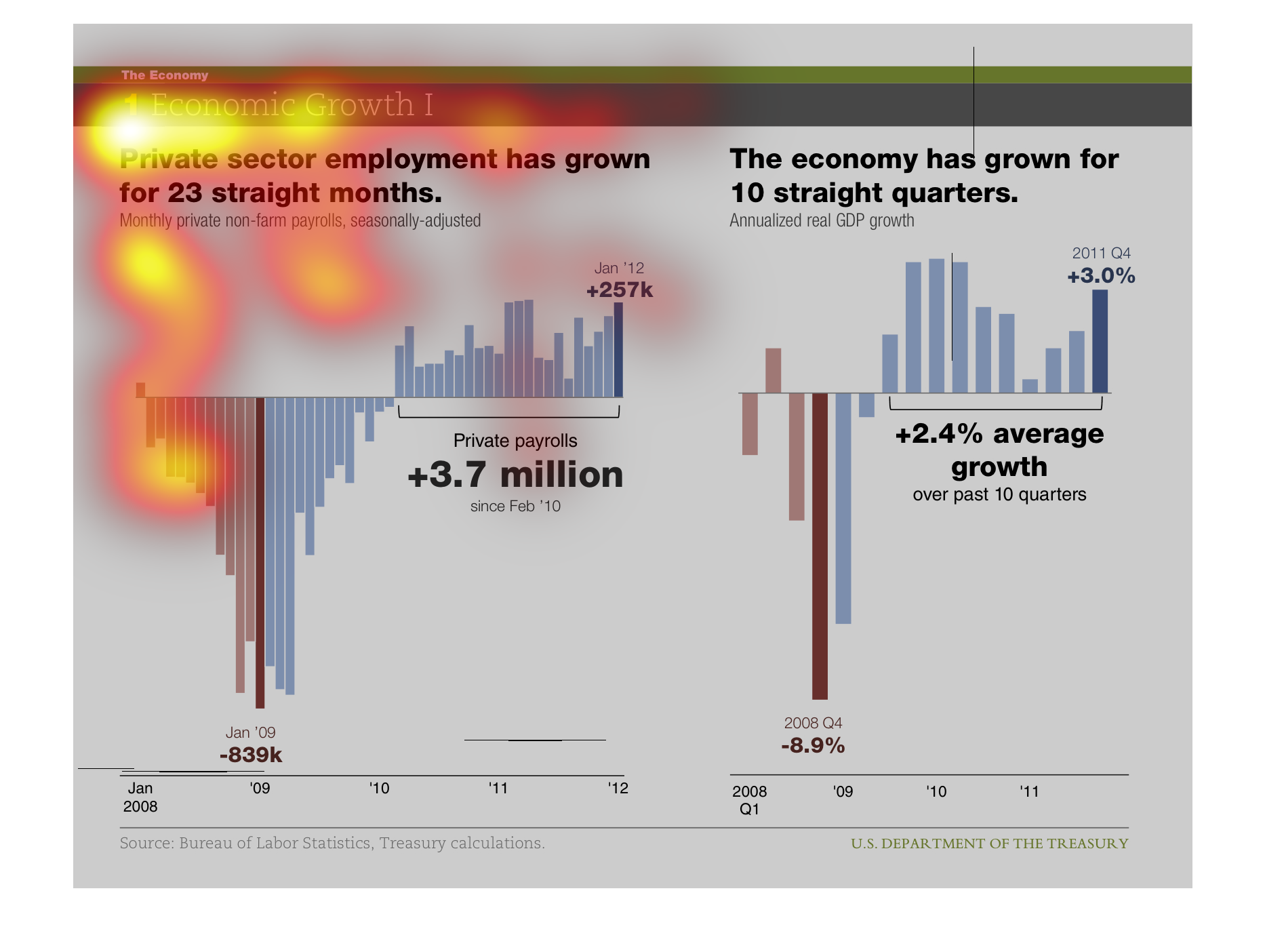
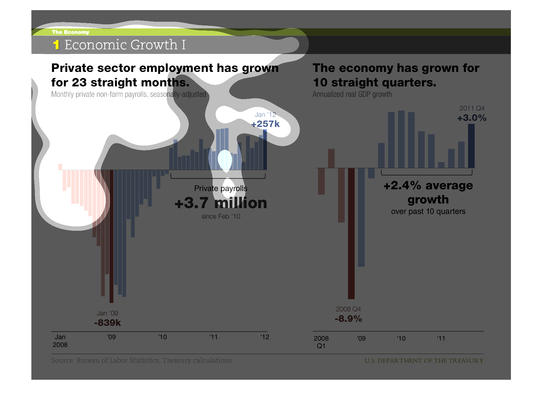
This chart describes that private sector employment has grown for 23 straight months. Specifically,
monthly private non-farm payrolls that have been seasonally adjusted.
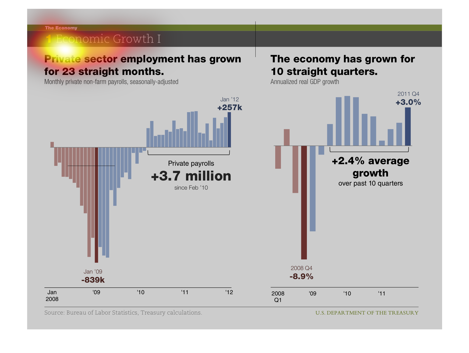
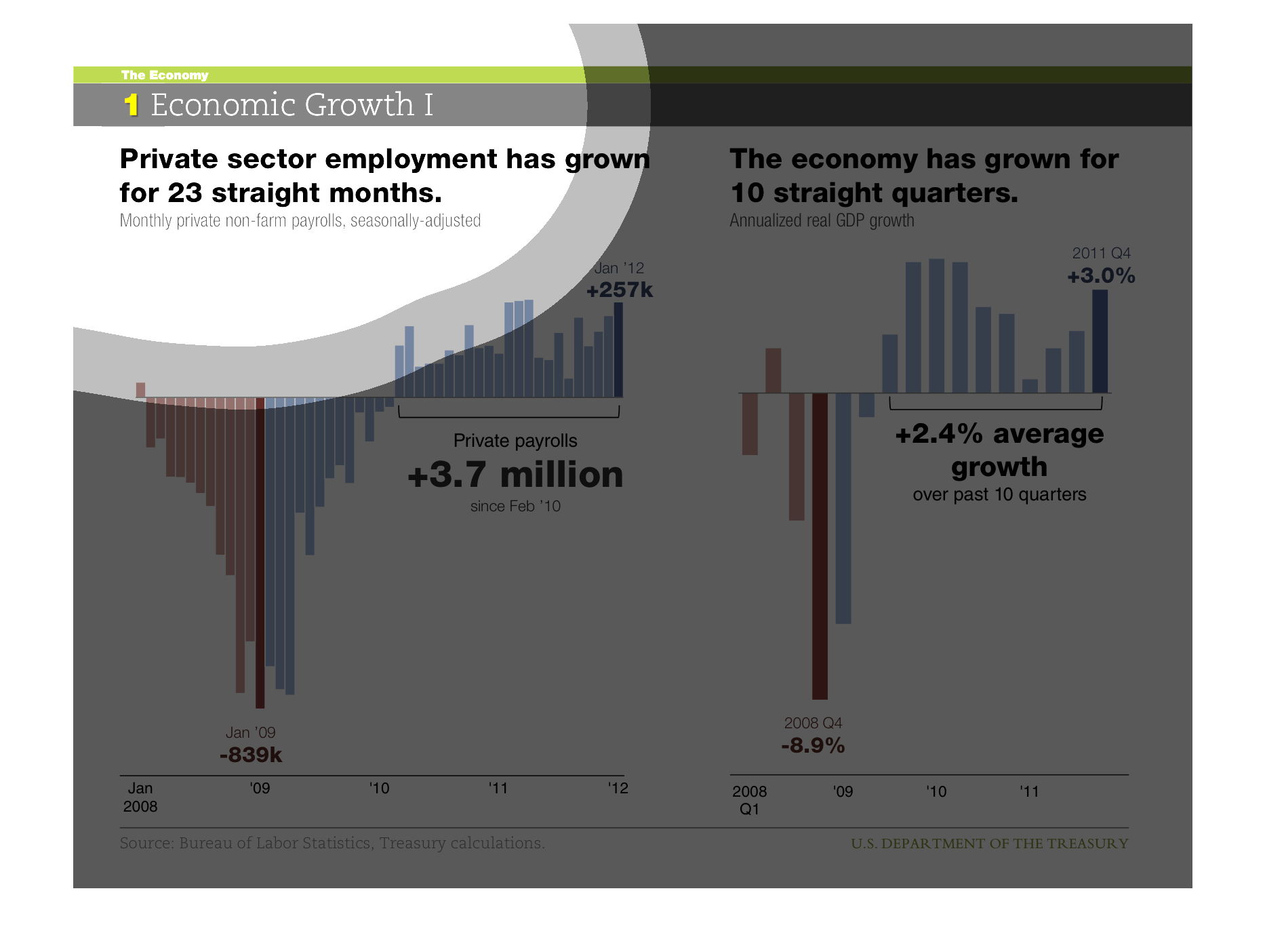
Economic Growth. Private sector employment has grown for 23 straight months, the economy has
grown for ten straight quarters. The graphs show crashes in 2008 and 2009, but only steady
growth afterwards.
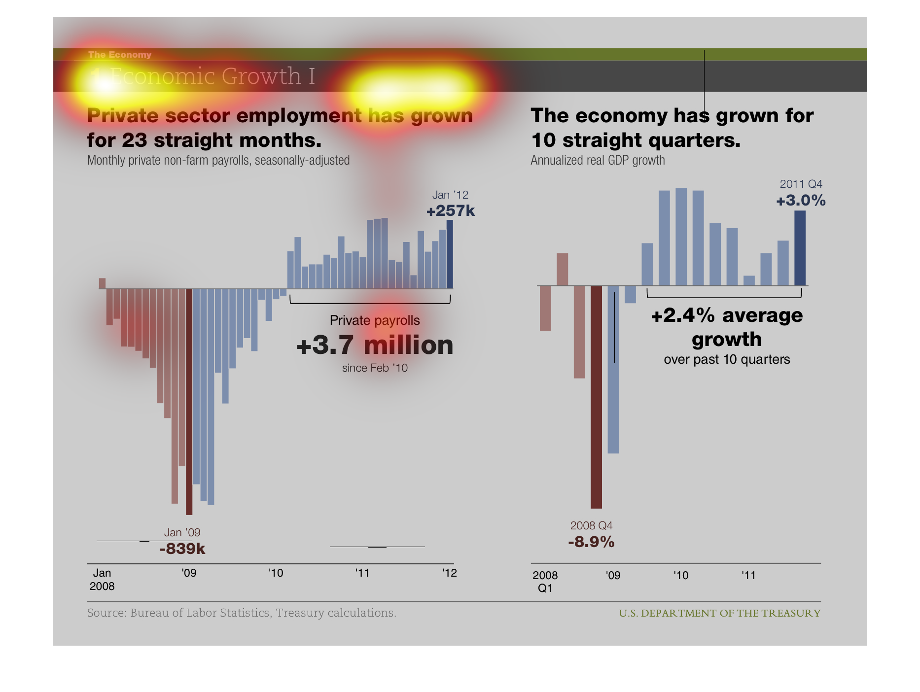
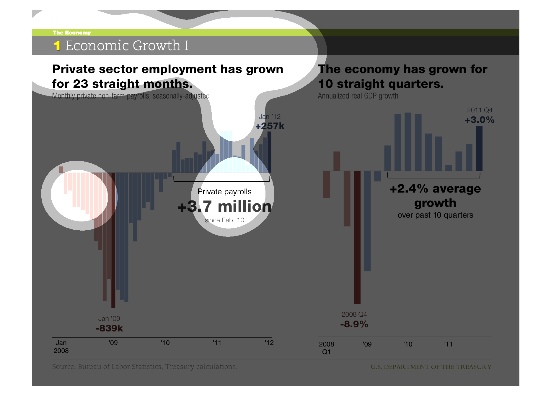
This chart depicts growth (or loss) in private sector employment, and in gross domestic product
growth.  Both private sector and GDP have enjoyed growth of late.
The image is comparing Private sector employment has grown for 23 straight months and The
economy has grown for 10 straight quarters. The time span was from January 2008 to 2012.
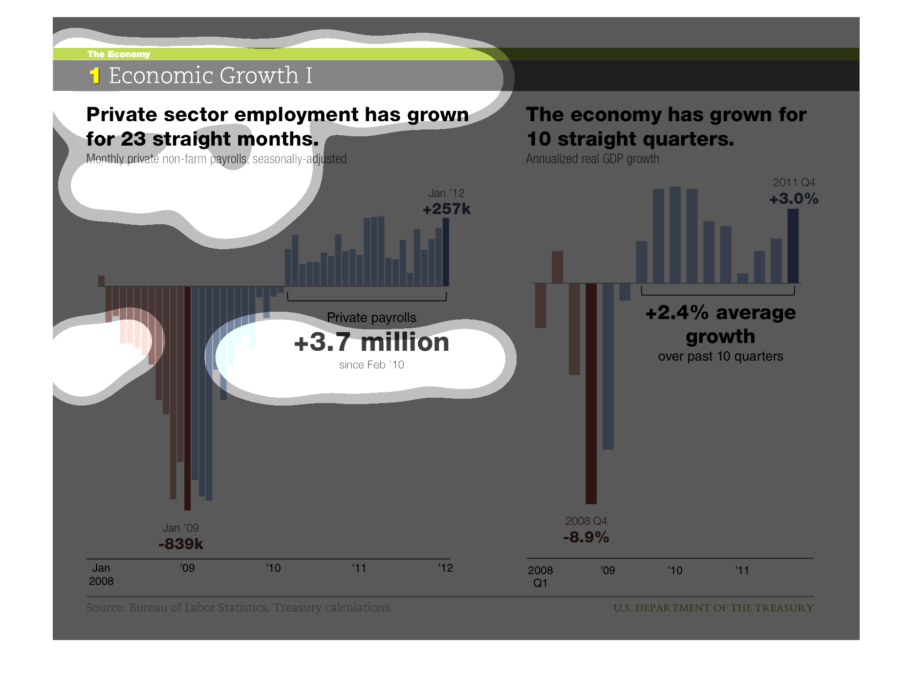
This chart shows Economic Growth. It details how Private sector growth has grown for 23 straight
months. Data shown is from  2008-2011. It includes private payroll, as well as the overall
economy.
This is Economy Growth, employment and economy growth over ten quarters. 208-2012 private
payroll increase 3.7. the economy has grown equally over the last 10 quarters.
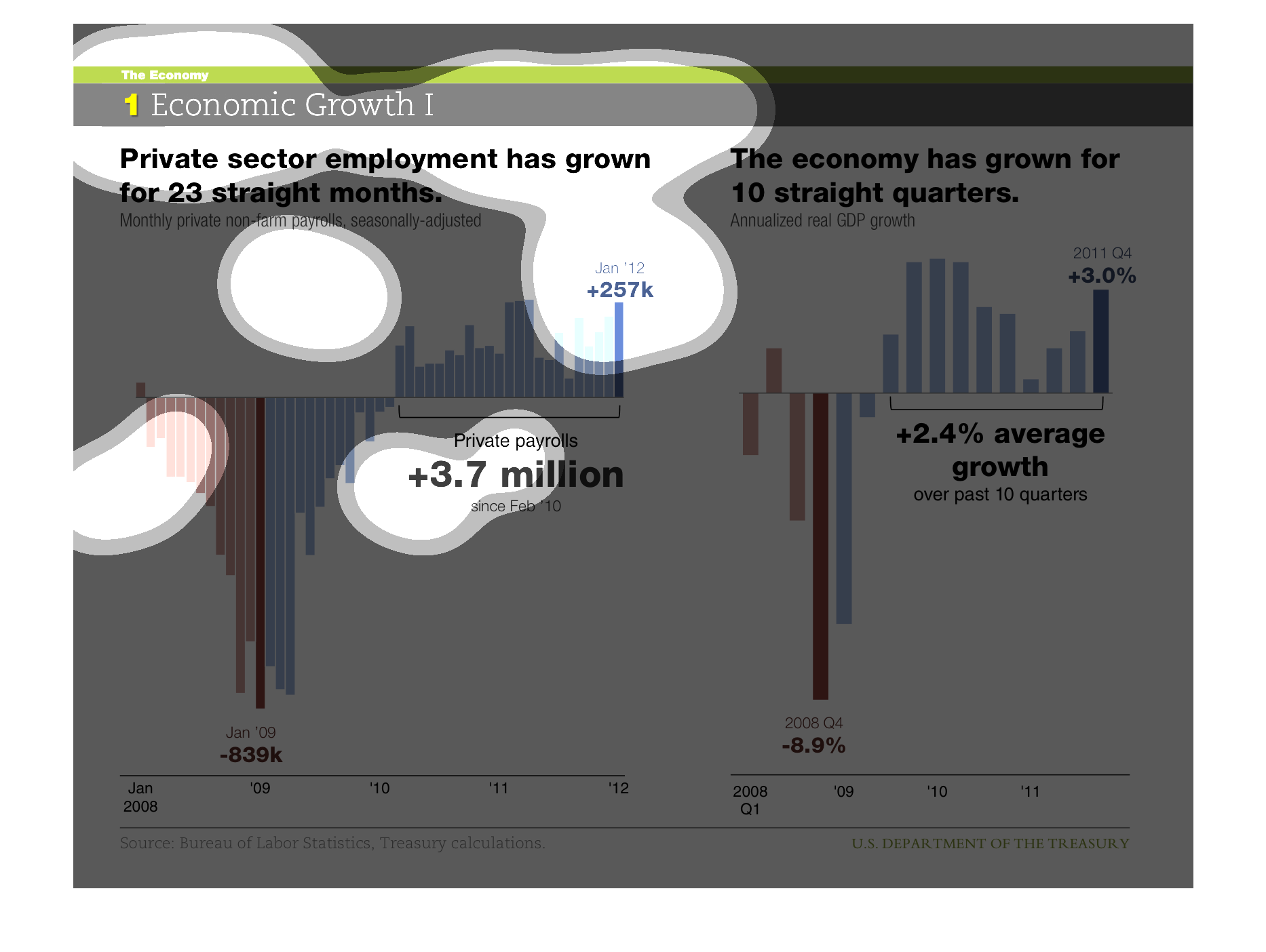
This is a chart saying private sector employment has grown for 23 months straight from Jan
2008 to 2012. It also shows the economy had grown for 10 straight quarters.
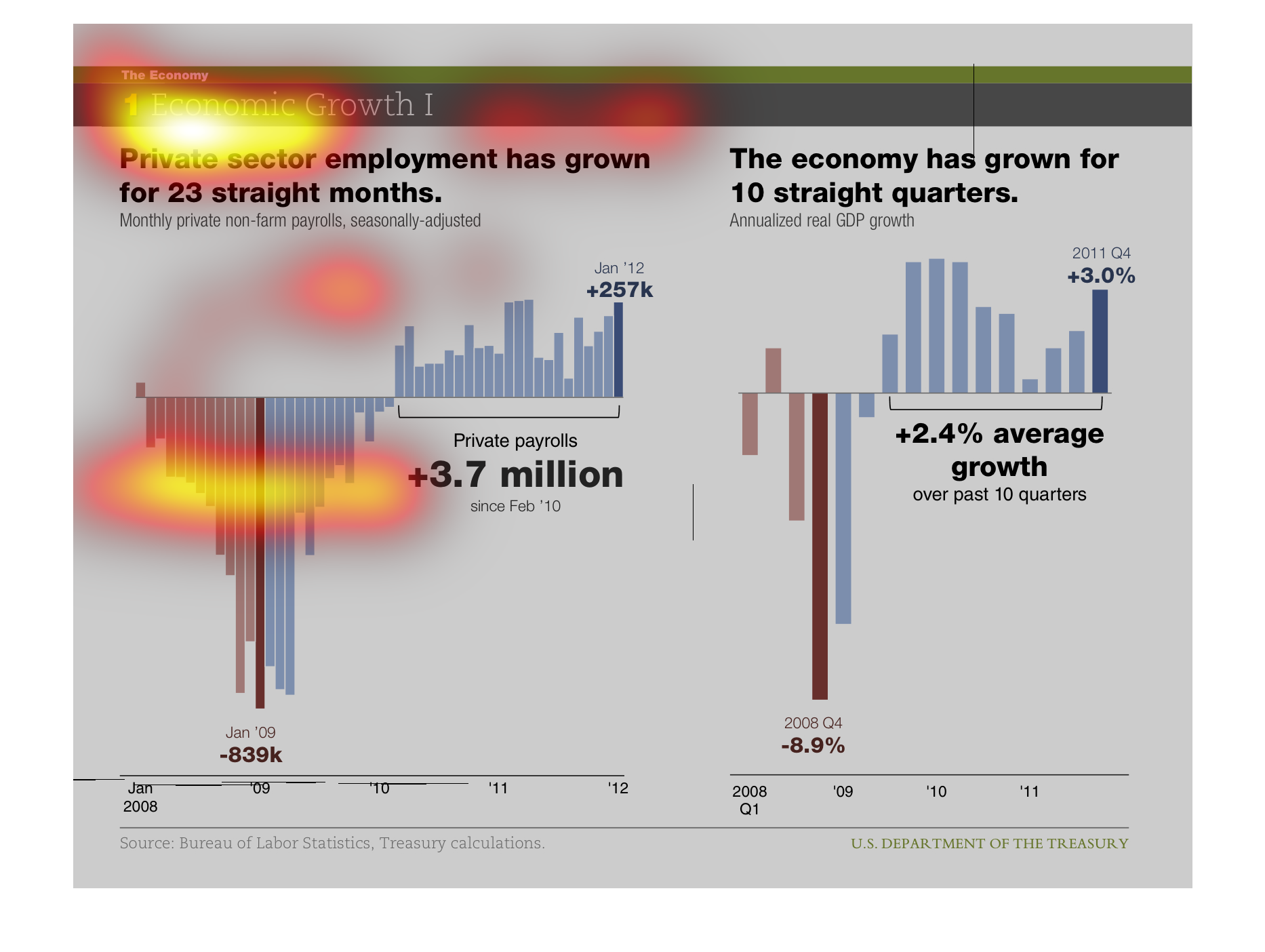
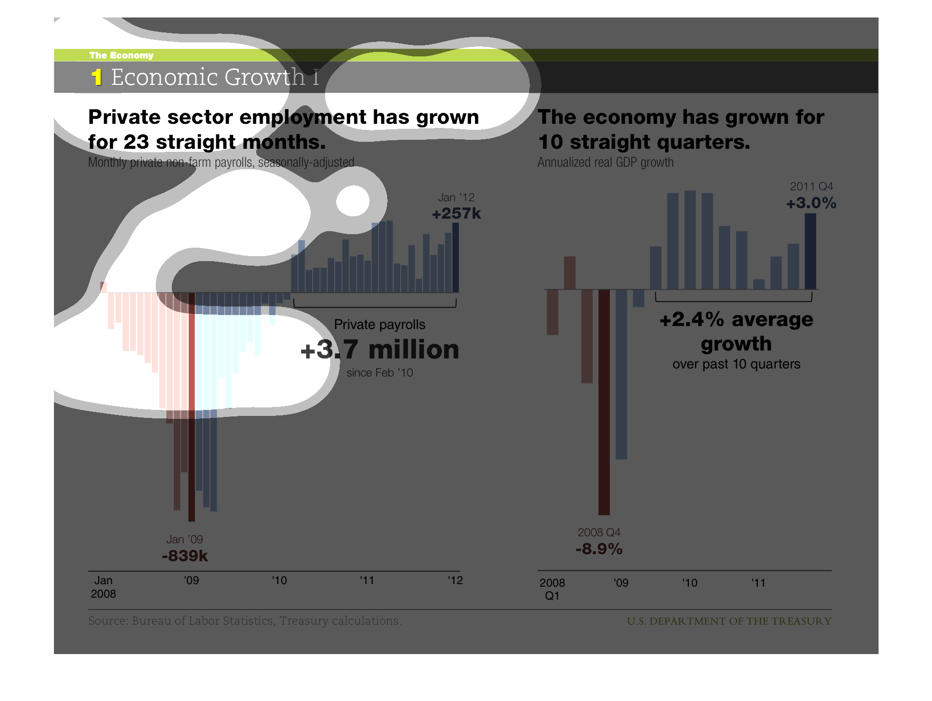
This image displays various graphs that display how private sector growth has grown and that
the economy has grown for 10 straight quarters. It shows graphs in two different types of
displays.
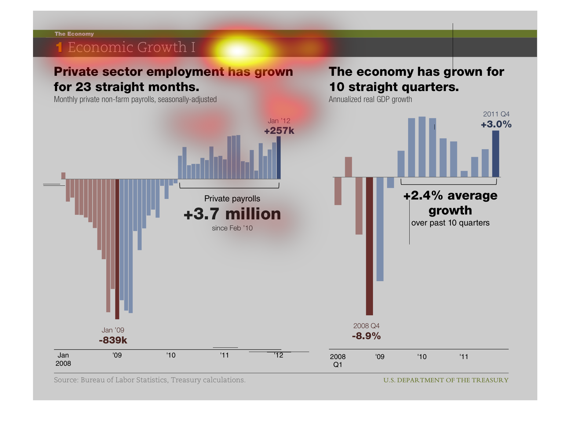
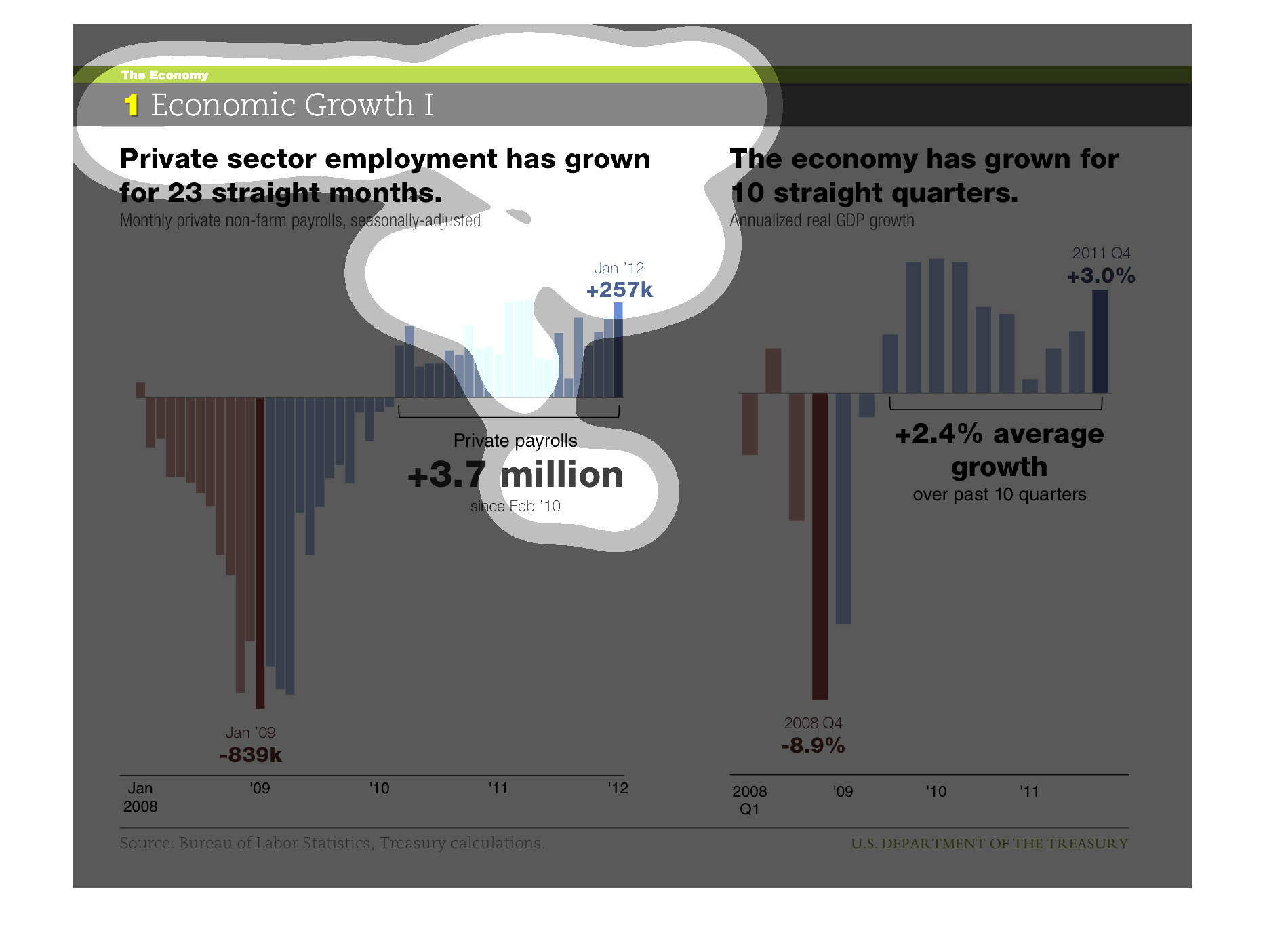
The graph on the left illustrates employment growth over the last 2 years.  The right graph
illustrates how the economy has grown over the last 10 years.
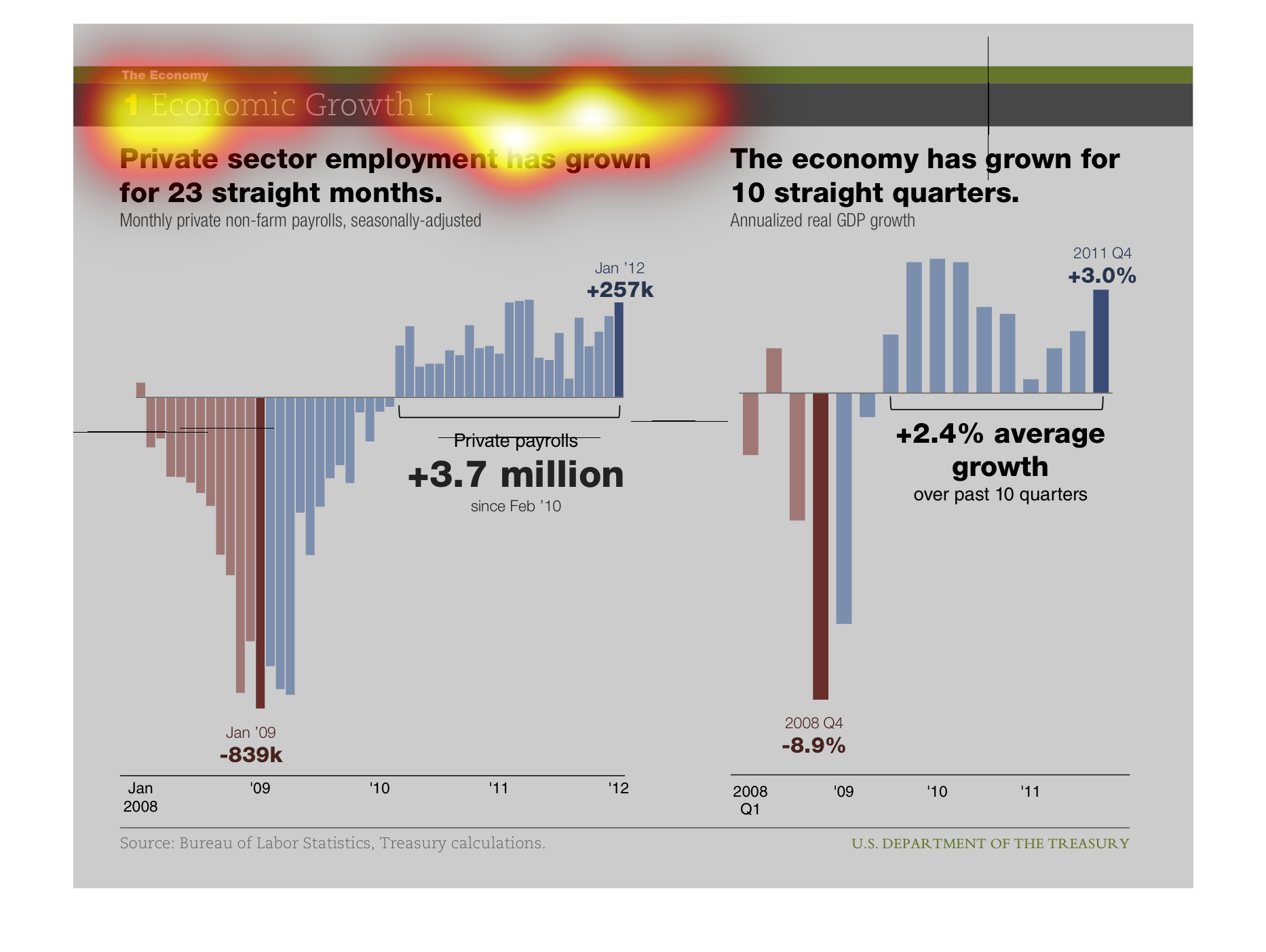
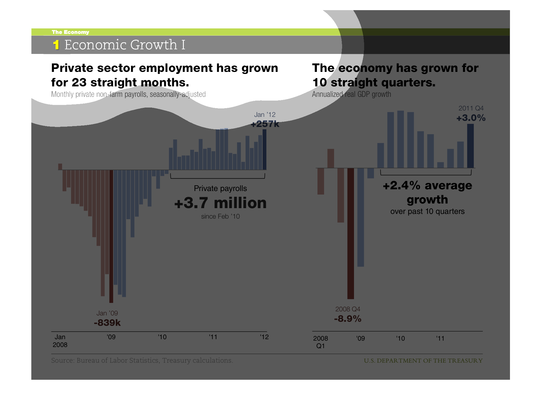
Economic Growth has grown for 23 straight months and the economy has grown for 10 straight
quarter (average of +2.4 % growth.  It looks at 2008 to 2012.
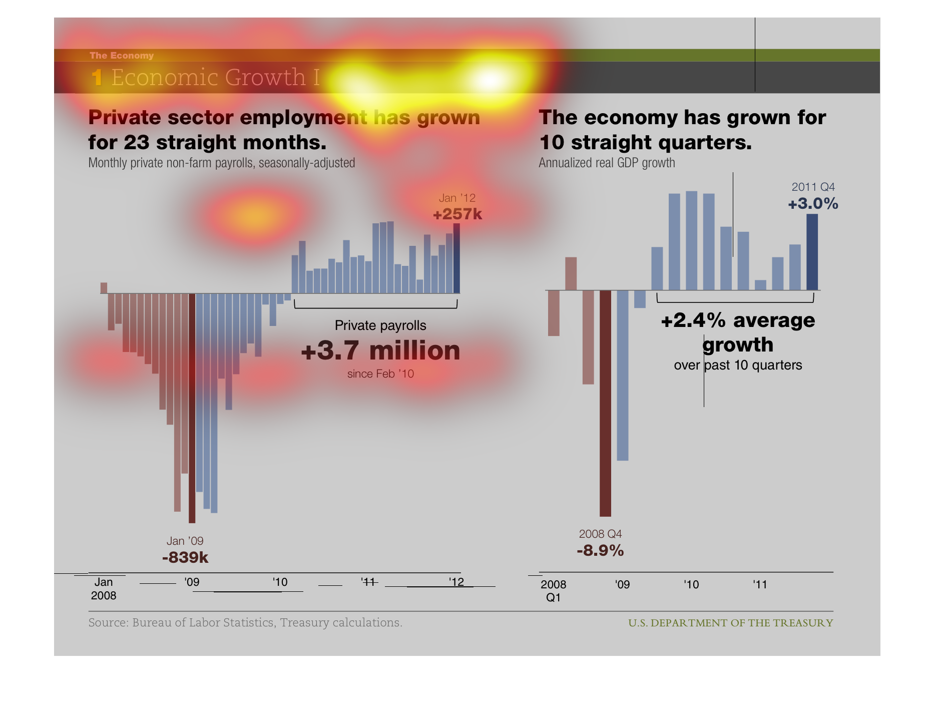
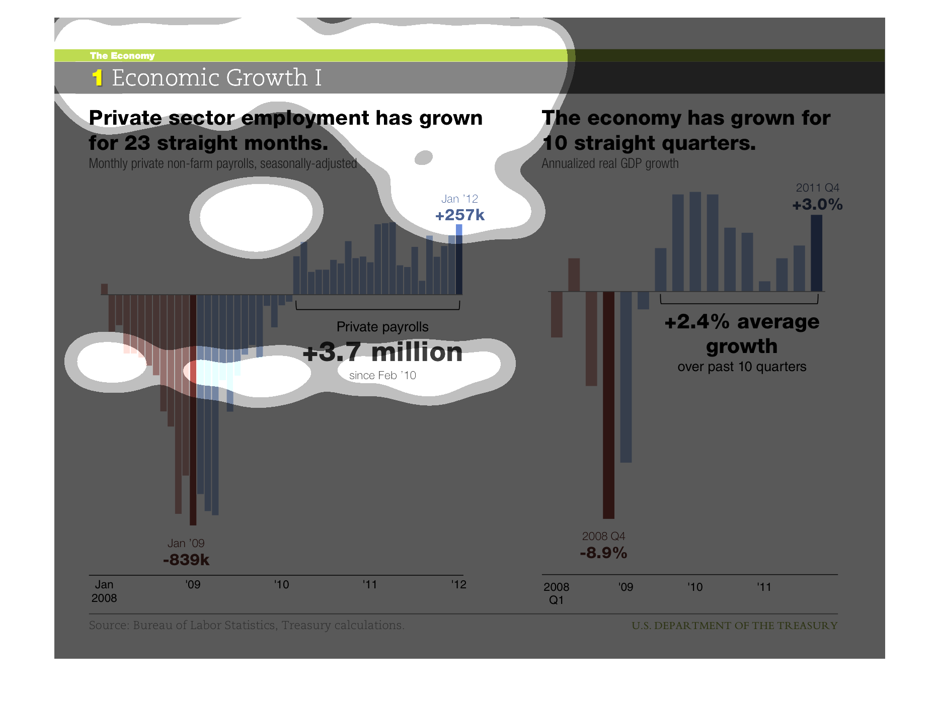
This chart describes economic growth.  There is a section measuring private sector growth
starting Jan. 2008 and going to 2012.  There is a section of this that measures growth and
one that measures decline. There is a similar chart that measures public economic growth.
This is a series of graphs depicting economic growth and shows that private sector employment
had grown for 23 straight months through the study period of 2012.
This chart shows the relationship between the private sector industry and the economy. More
specifically, this chart is comparing the growth of private sector employment with the growth
of the economy.