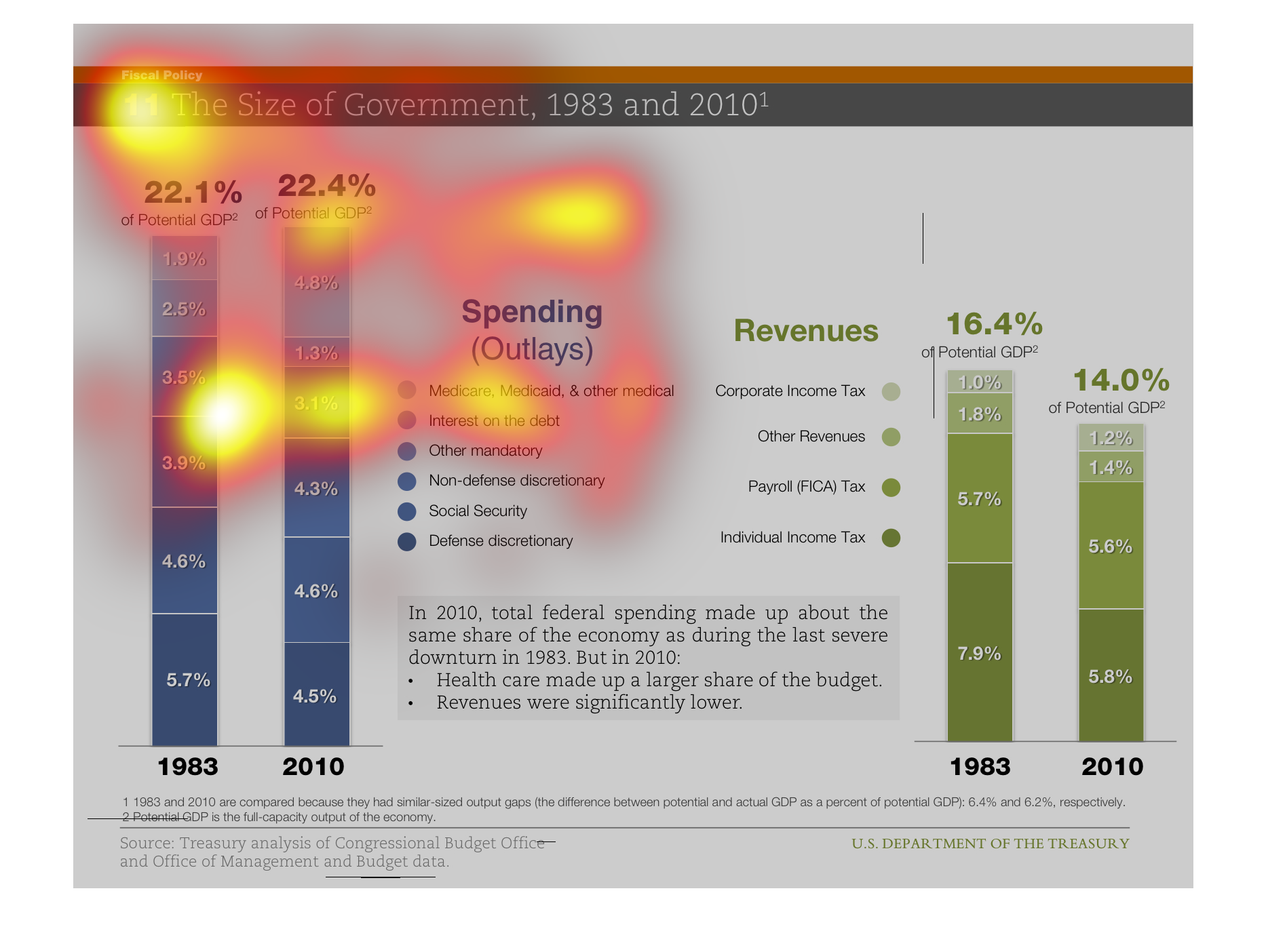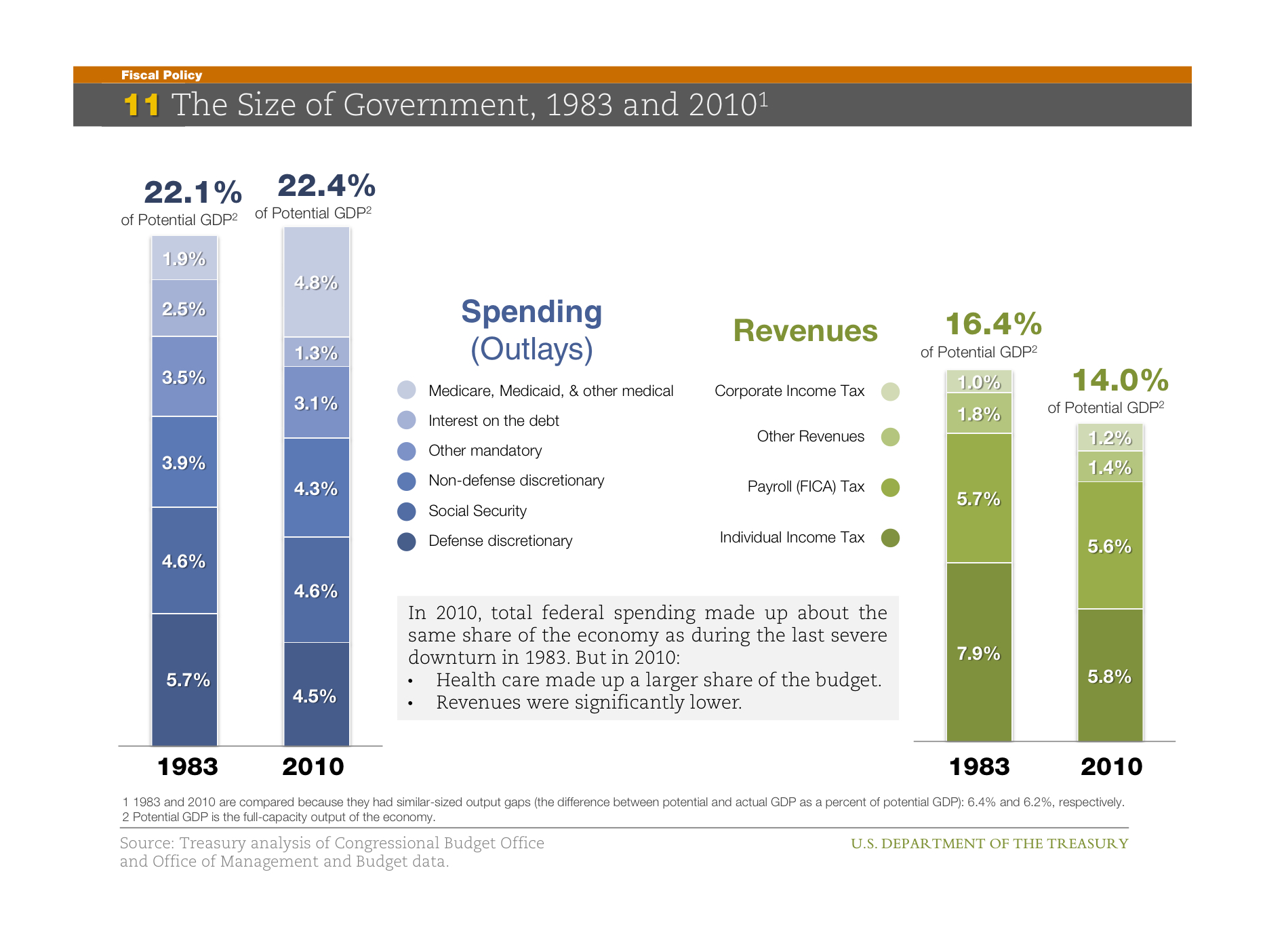
This chart shows the size of the Government in 1983 and 2010. In 1983 spending was 22.1% while
revenue was 16.45 while in 2010 spending is 22.4 and revenue is 14.0%.
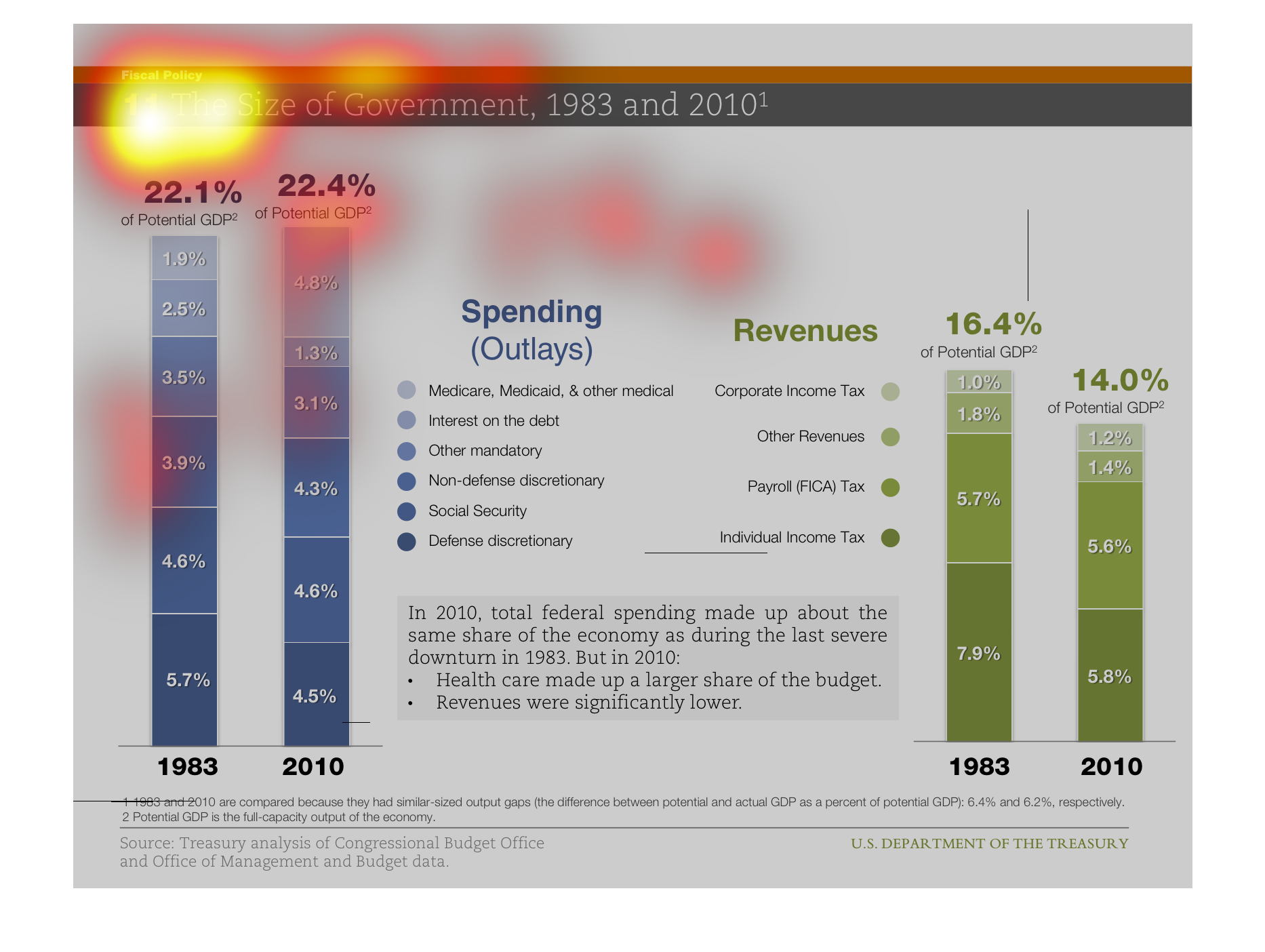
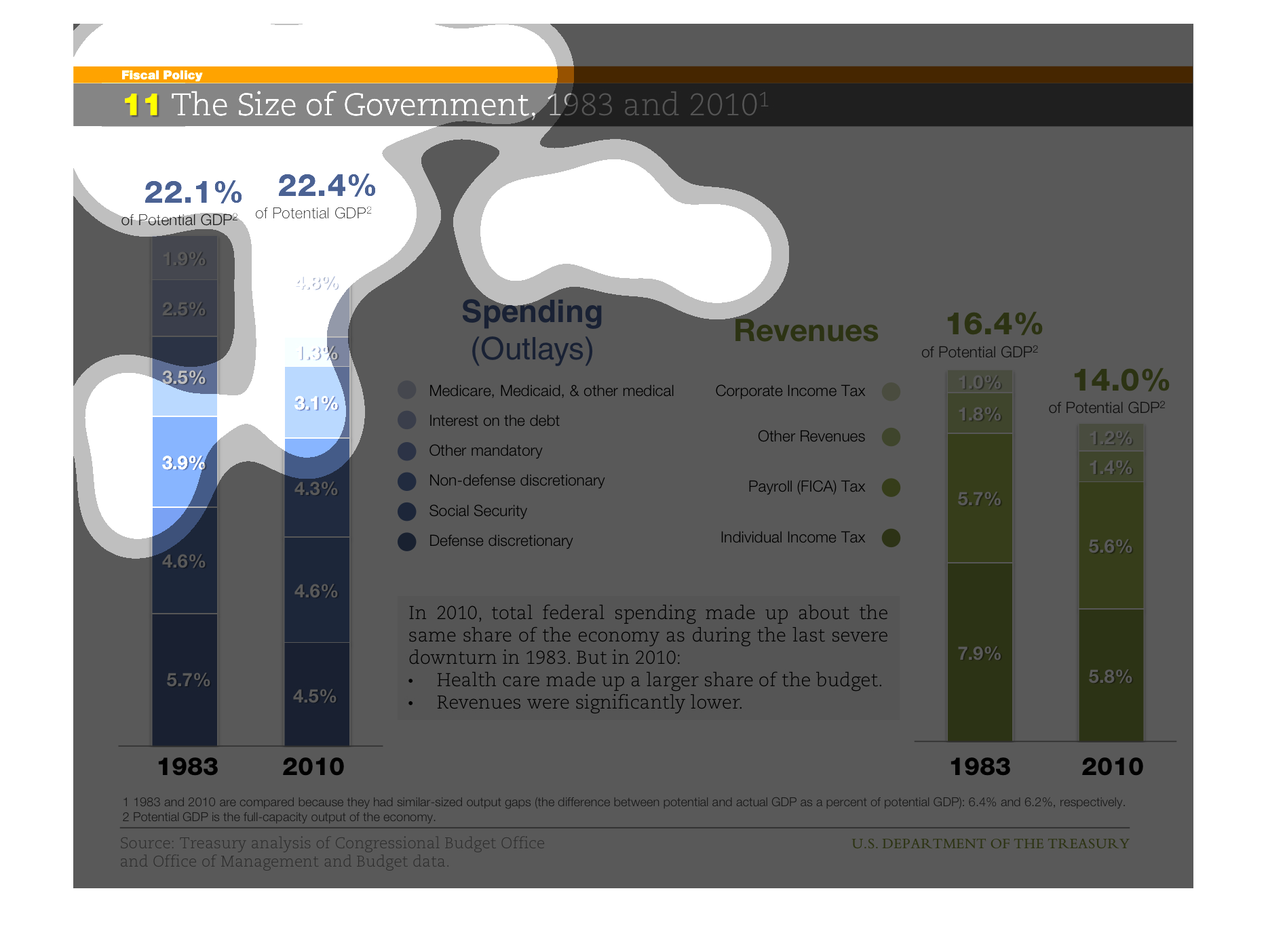
The size of government 1983 and 2010 divided into revenue and spending as a percentage of
the GDP.  The revenue in 2010 was slightly larger, however the revenues are much lower in
2010.
This graph shows the difference in revenue for gdp from 1983 and 2010. In 2010 it was significantly
lower although the total federal spending made up about the same share of the economy.
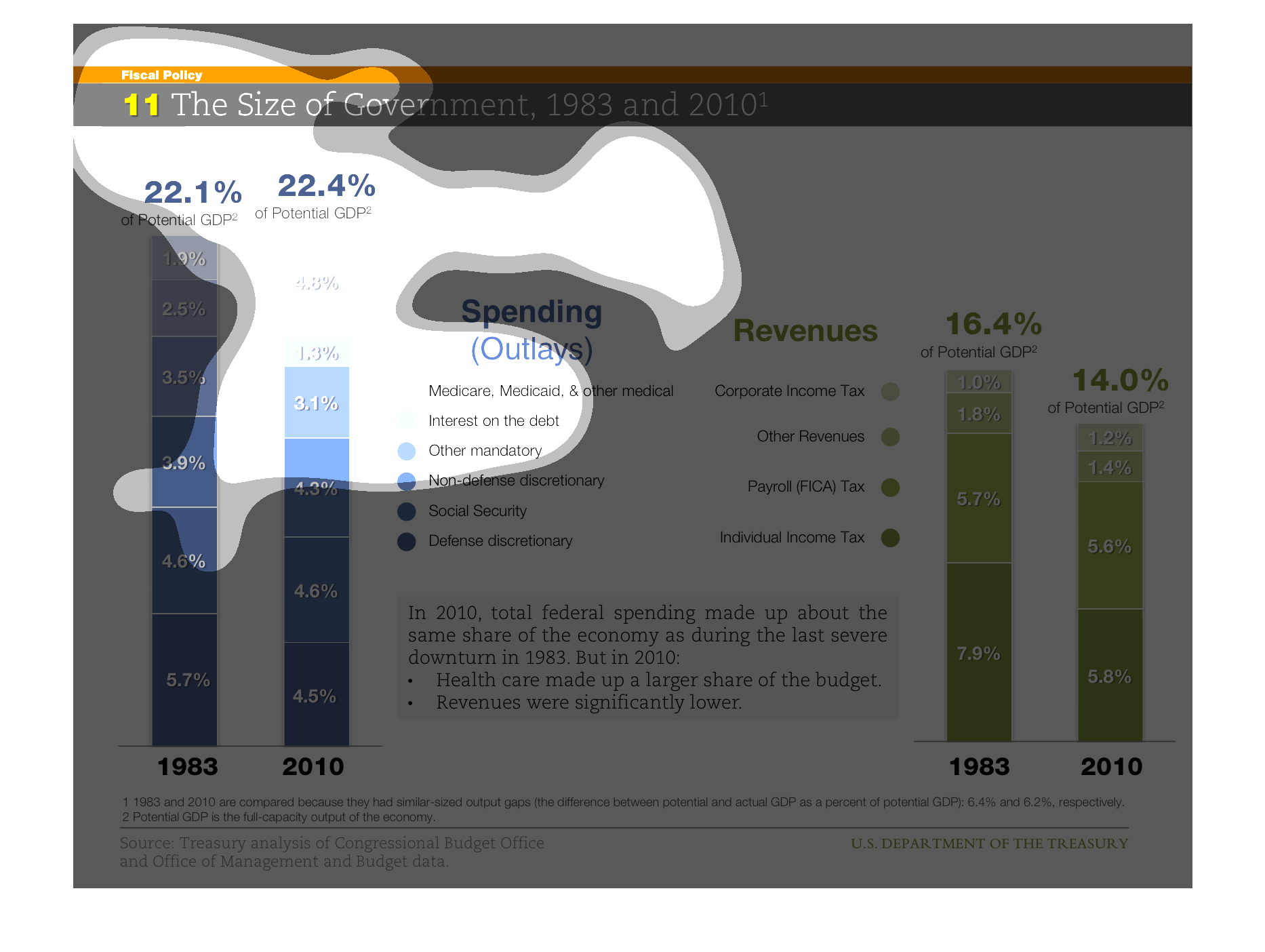
The following chart gives the overall size of the government in terms of spending. It depicts
from the years 1983 to 2010 during the last economic downturn in the United States. The biggest
change is the overall amount we spend on health care now as compared to 1983.
This infograph shows the size of US government, from 1983 and 2010, broken into two size:
Spending and revenue, as % of GDP. Each chart is color shaded to denote different programs
or sources.
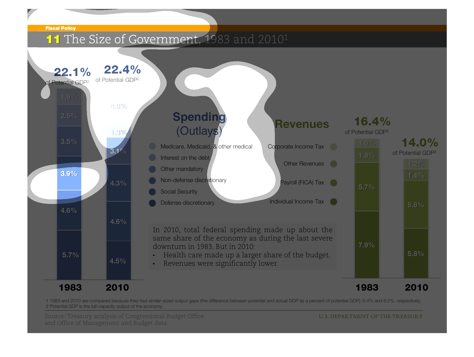
This charts shows the size of Government, for the years 1983, and 2010. In 1983 the percentage
of the potential GPD for the country was at 22.1%. It 2010 it was not much higher at 22.4%
This graph portrays federal spending as a percentage of GDP, as well as revenue as a percent
of GDP.  It compares 1983 to 2010, with the two following conclusions: 1) health care costs
are a larger share of spending in 2010, and 2) revenues were significantly lower in 2010.
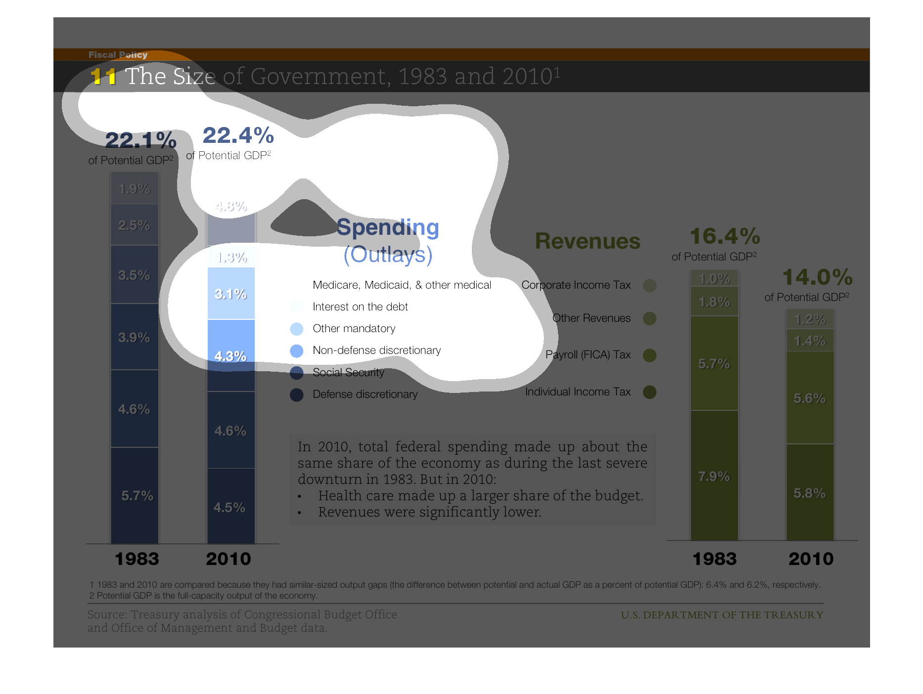
It is two bar graphs comparing the size of a government spending from 1983-2010. Relative
GDP's and revenues for over the years. It also includes a small conclusion of the graphs at
the bottom.
This graph compares government revenue and spending between 1983 and 2010. The graph presents
that the spending were more than the revenue in both 1983 and 2010. However, when only spending
are compared between 1983 and 2010 then there is a negligible difference. On the other hand,
revenue collected during 1983 was more than revenue of 2010.
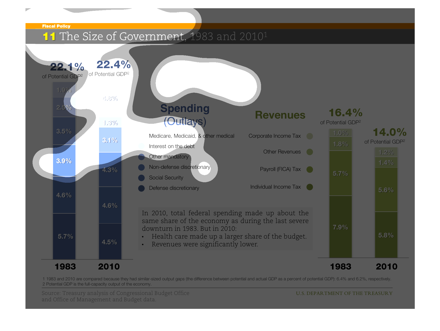
The chart compares the size of the US Government from 1983 to 2010. It shows the expenditures
in reference to % of GDP were similar, but where the money was spent was varied
This is a graph that shows the size of the government between the fiscal years of 1983 and
the year 2010. it shows the spending and the revenues of the government.
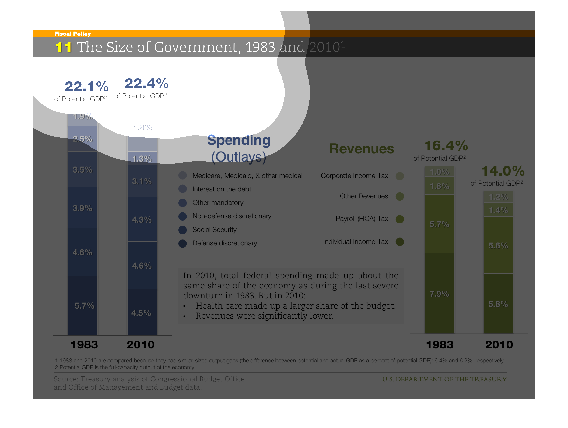
This chart describes the size of government for the years 1983 and 2010. Categories on the
chart include Medicare, Medicaid, interest on the debt,  and other mandatory.
This is a graph comparison. The style is using columns to compare. They are comparing the
size of government. It begins in the year 1983 and it ends in the year 2010.
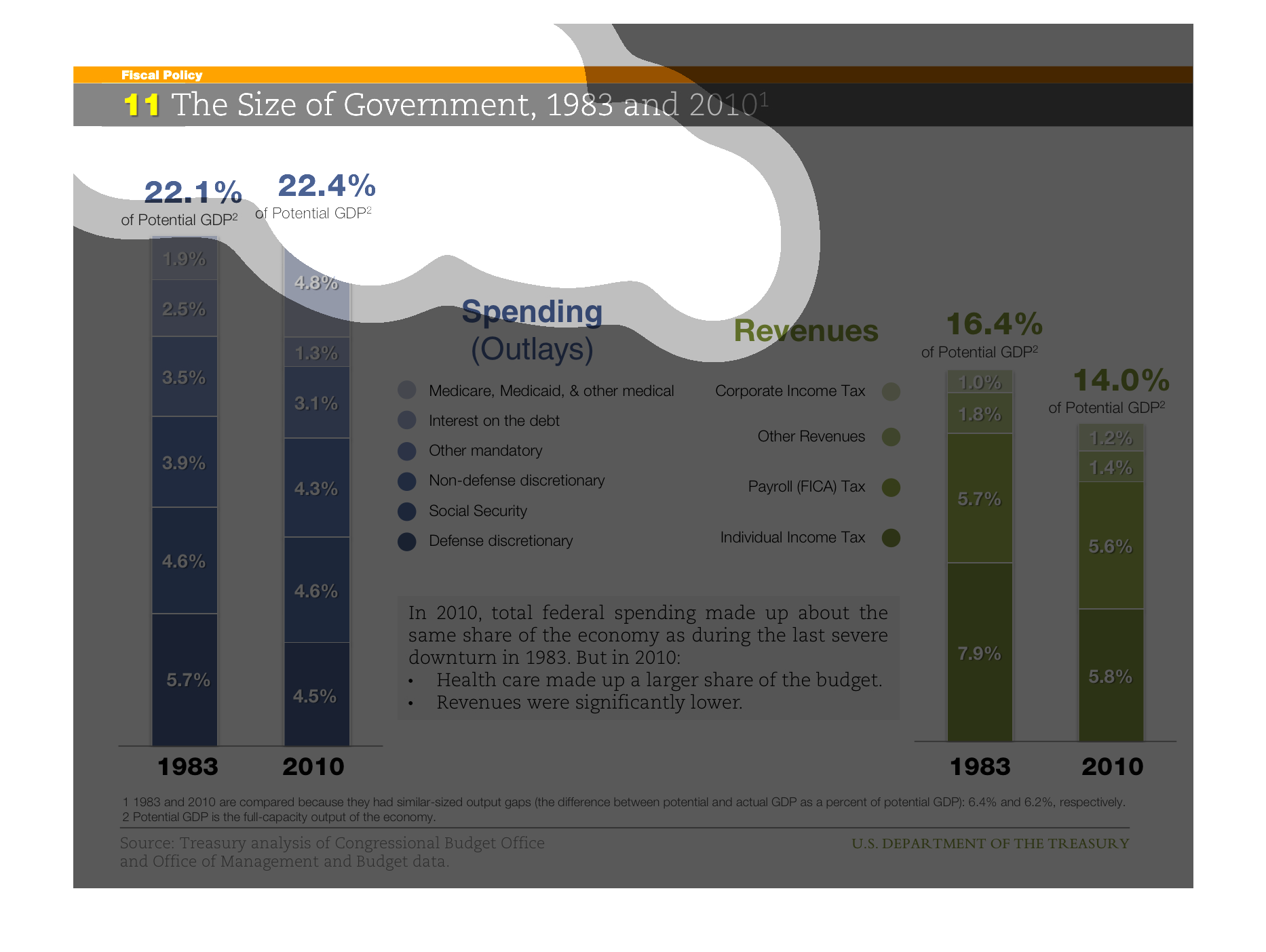
This graph compares the size of government for 1983 vs. 2010.  Both tax revenues and government
spending are compared, with the sources of each subdivided in the chart.
Big Brother is constantly watching every move you make. The graph illustrates how government
interference in people's everyday life has sharply increased since 1983