a graph that shows how most american cannot afford the healthcare that is now mandatory to
have and that the average citizen still has no health care in todays age
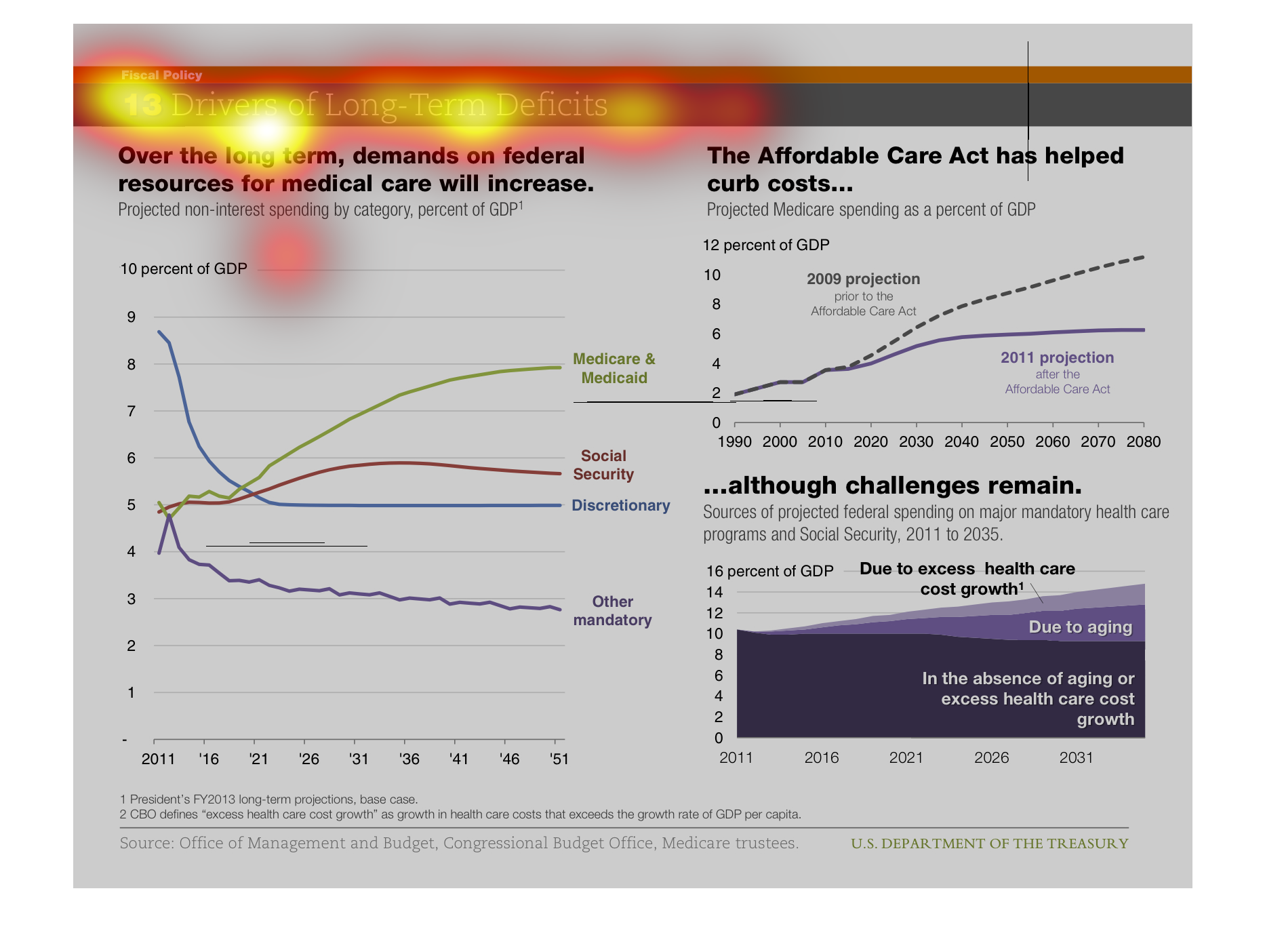
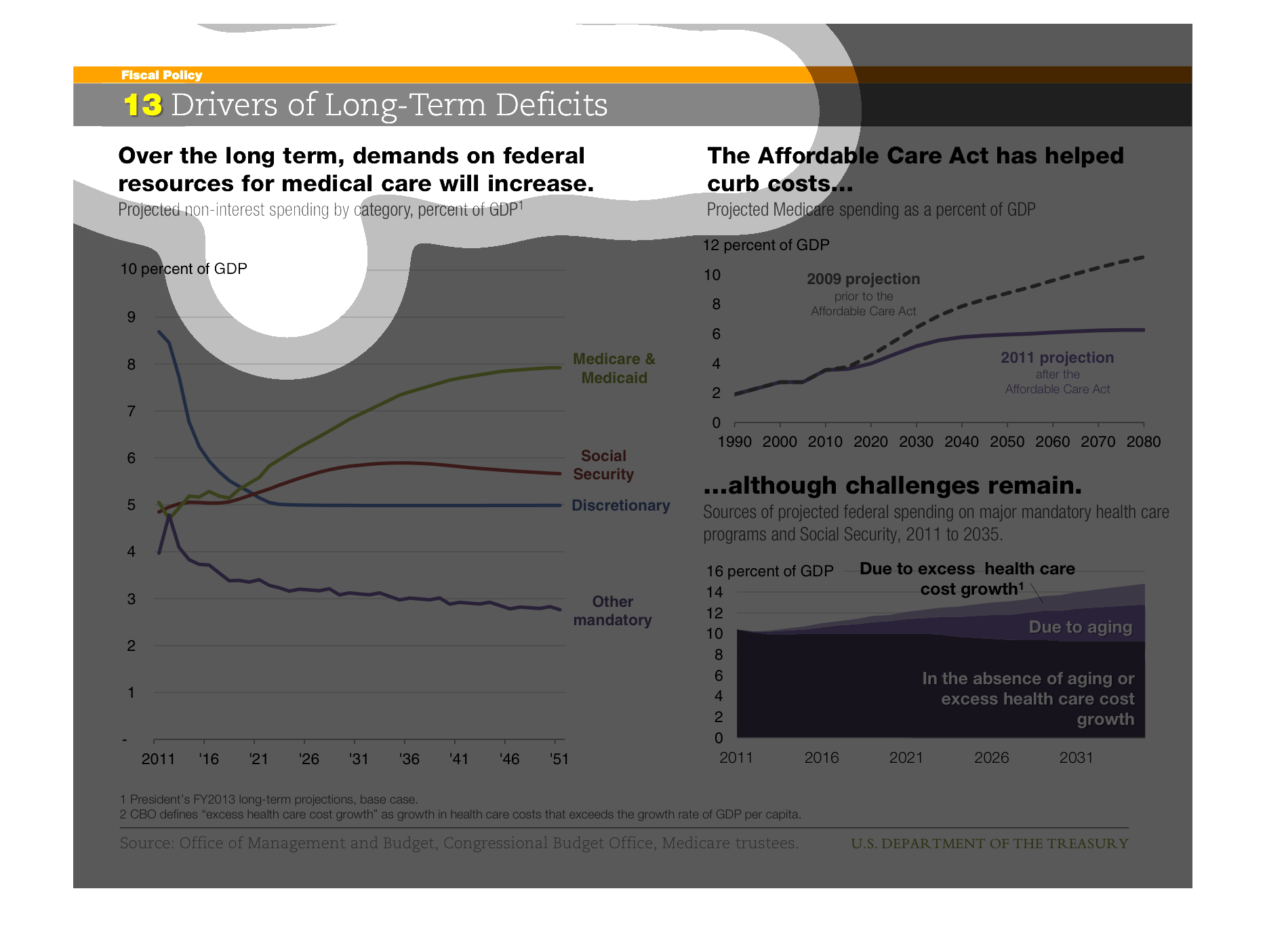
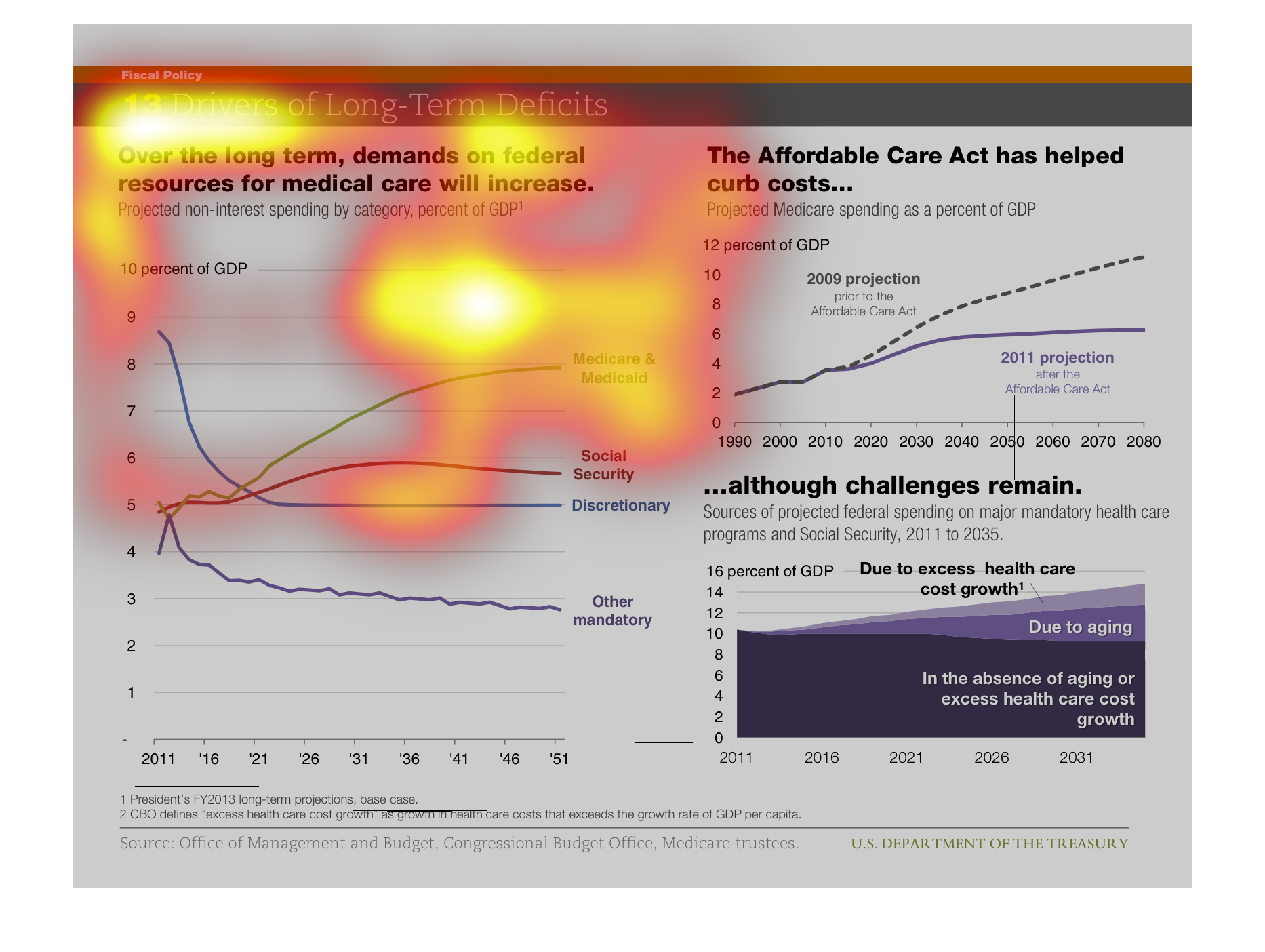
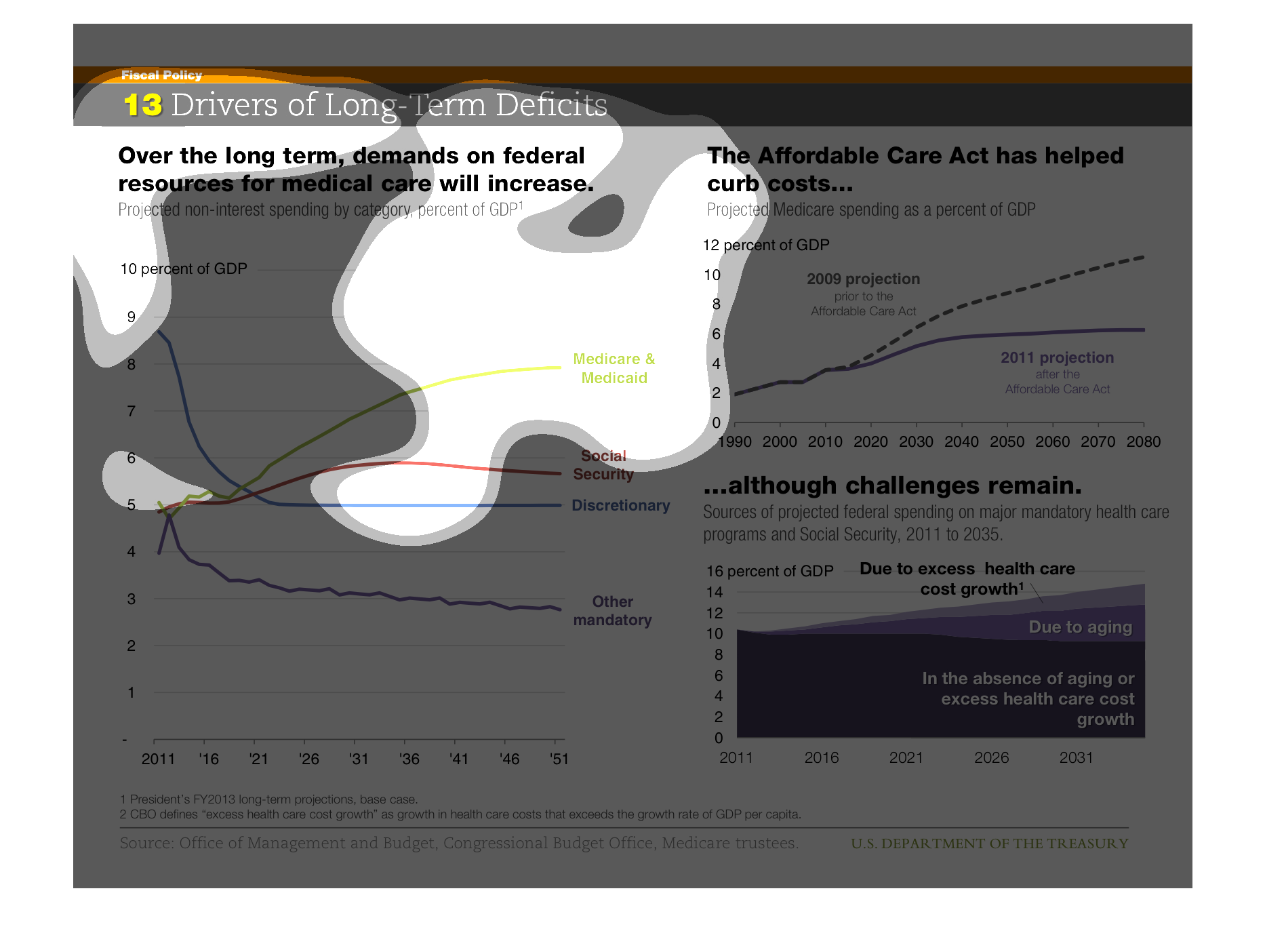
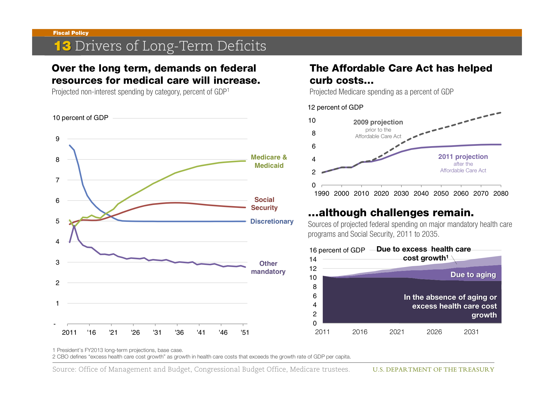
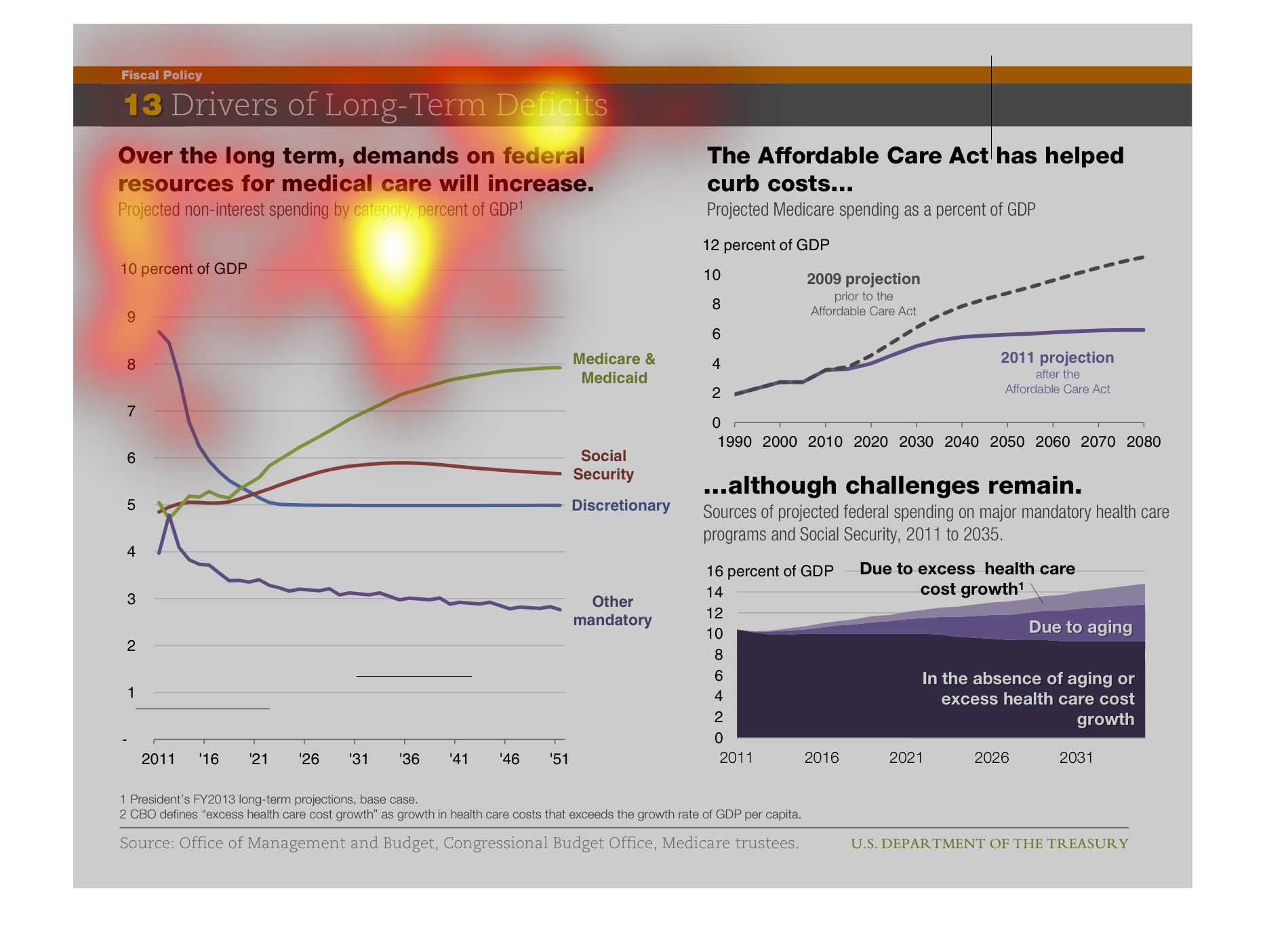
This is showing how demands on federal resources for medical will increase over time.   It
claims that the Affordable Care Act has helped curb costs due to excess health care costs.

This chart is very interesting, and shows Drivers of long-term deficits. It si very interesting,
and shows over the long term, demands on federal resources for medical care will increase.
This chart shows the demand for federal resources for medical care. It shows that over time
the demand for federal resources will increase greatly over time
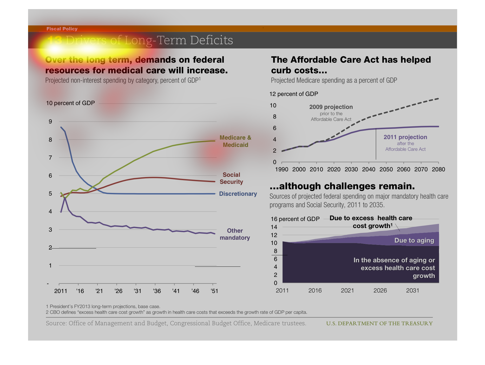
Over the long term demands on federal resources for medical care will increase.  The Affordable
Care Act has helped curb costs although challenges remain.
This particular image shows thirteen drivers of long term deficits. These drivers include
things such as medicare and medicaid, social security, discretionary, among other things.
Medicare and Medicaid accounts for the highest amount of GDP. The second graph to the right
shows that the Affordable Care Act is helping to lower the costs of those dealing with certain
deficits.
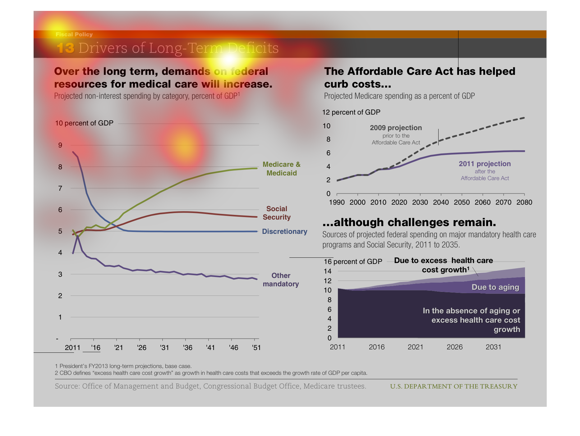
This is a collection of graphs studying the long term causes of budget deficit. Medicare and
Medicaid are predicted to cause huge issues. Obama's plan will curb the issue, but not solve
it.
Government costs such as medicare and social security have created deficits, The affordable
care act has decreased some of these costs to hopefully lower the deficit over time.
this is a graph of something the name of this graph is called drivers of long term deficits.
there's a line graph that shows you how long drivers been driving.
While demands on federal spending for health care has increased, the Affordable Care Act has
alleviated some of the costs. Some difficulties remain, primarily due to cost growth and an
aging population.
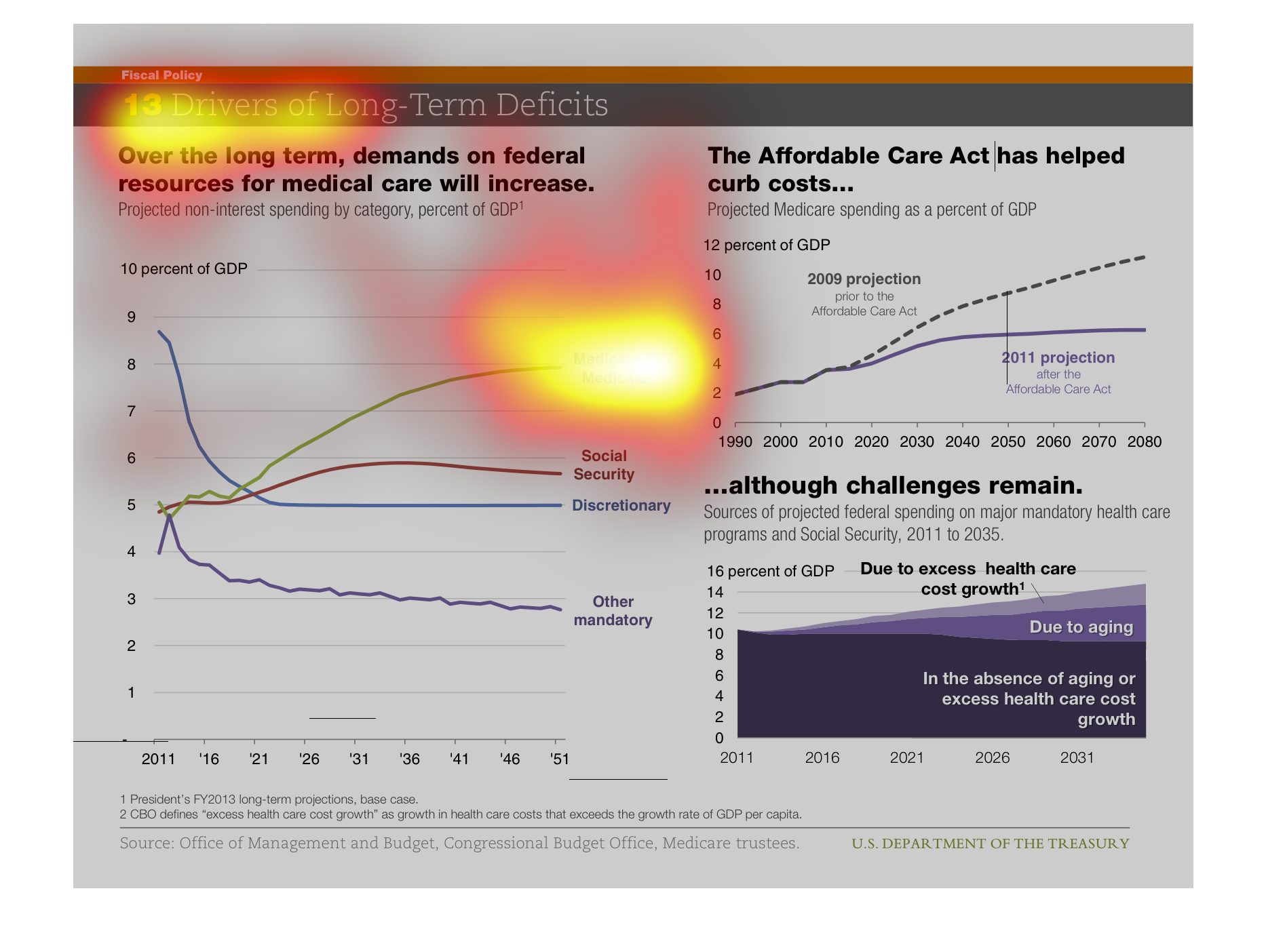
THIS PLOT SHOWS THE INCREASING MEDICAL COSTS IN THE UNITED STATES IN THE FUTURE. AT LEFT IS
SHOWN GREATER DEMAND ON FEDERAL MEDICAL SERVICES. AT RIGHT, SHOWN IS THAT THE ACA HAS REDUCED
COSTS BUT MEDICAL COSTS WILL MAKE UP A GREATER PERCENT OF GDP IN THE FUTURE.
The following chart shows where that the demand for increases in federal spending will only
increase as the demand for higher cost in health continue to increase.
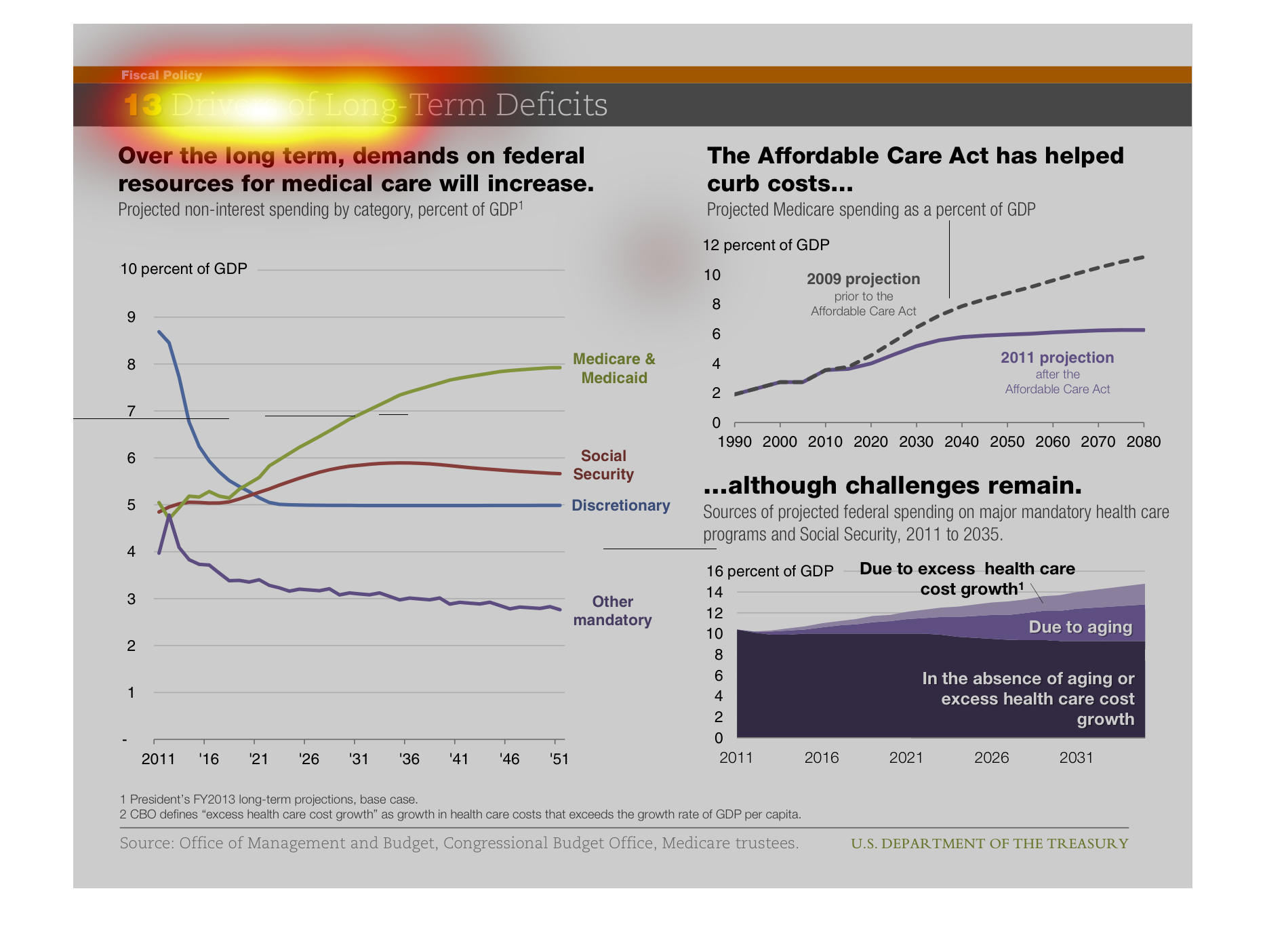
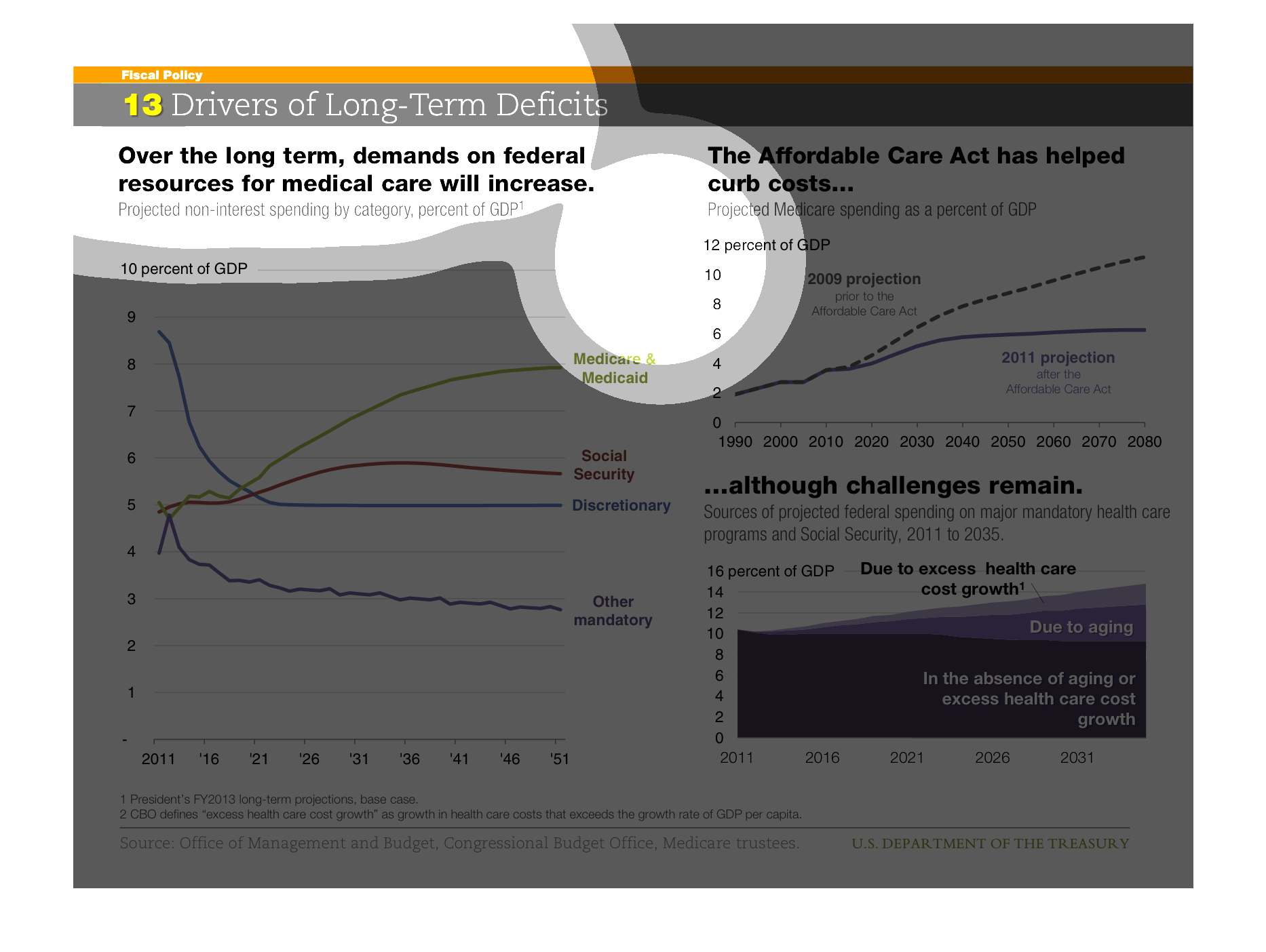
This is a chart showing what creates deficits in the US. It states federal medicare demands
will increase. From 2011 to 2051 it shows health care rising from 5% to an 8%
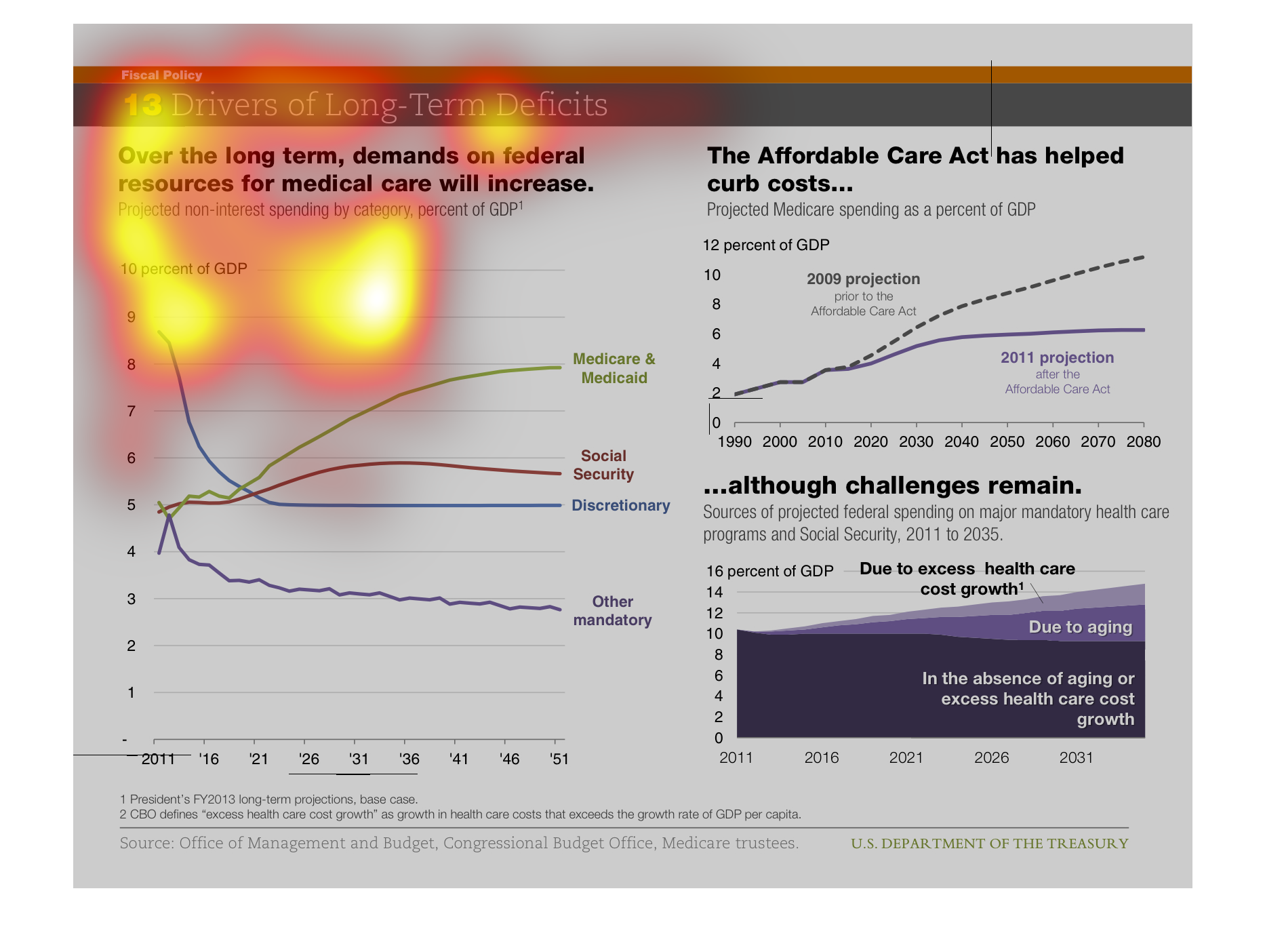
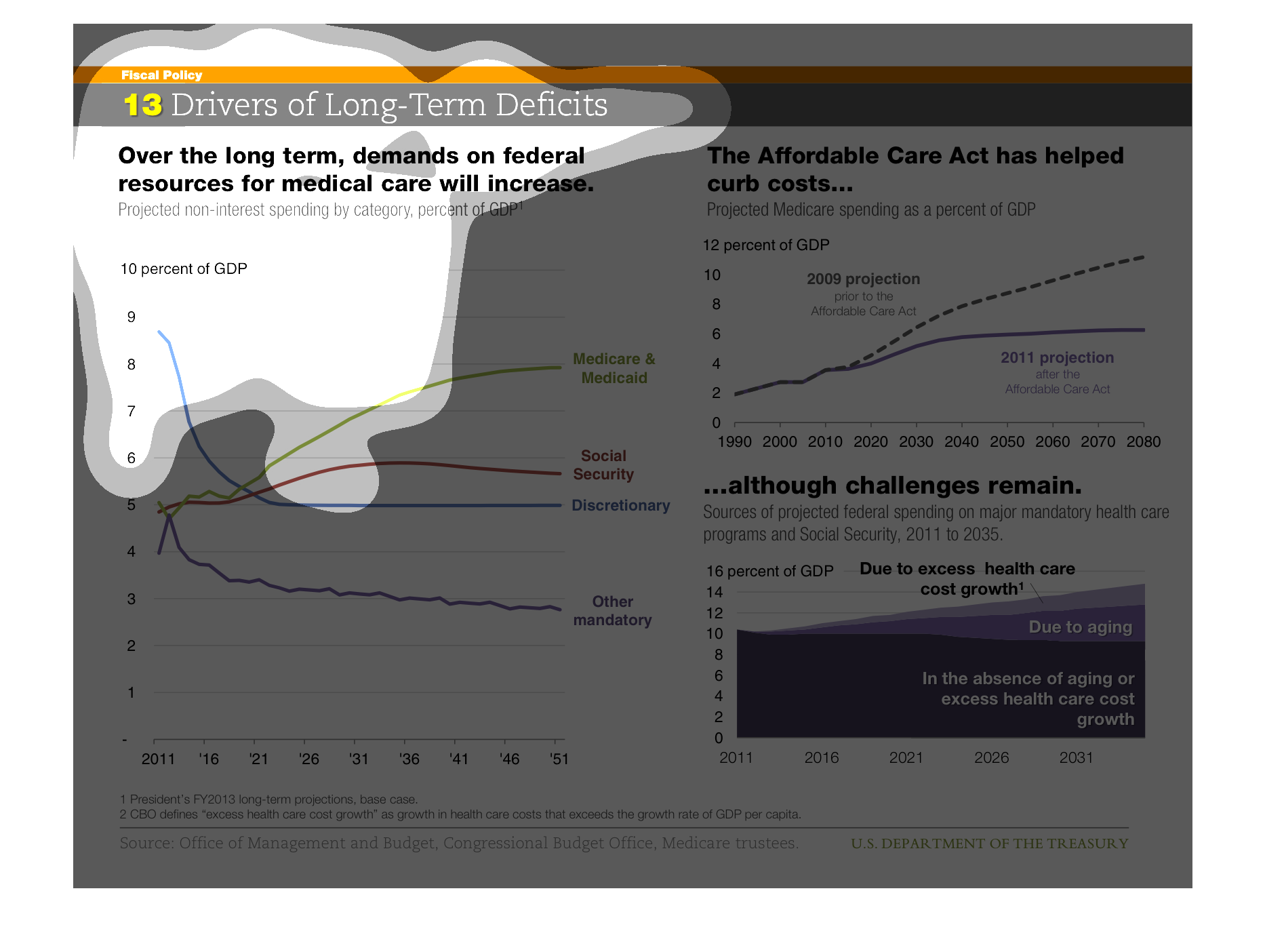
The line graph on the left shows the amount of federal resources allocated in different areas.
The lines so that over time federal resources for medical care will increase. The line graph
on the right shows compares percent spending in 2011 before and after implementation of the
Affordable Care Act. This Act has greatly reduced costs. However,  as the graph on the bottom
right shows there are still some factors that are increasing costs over time such as aging
and increase in medical cost that is independent of the act.