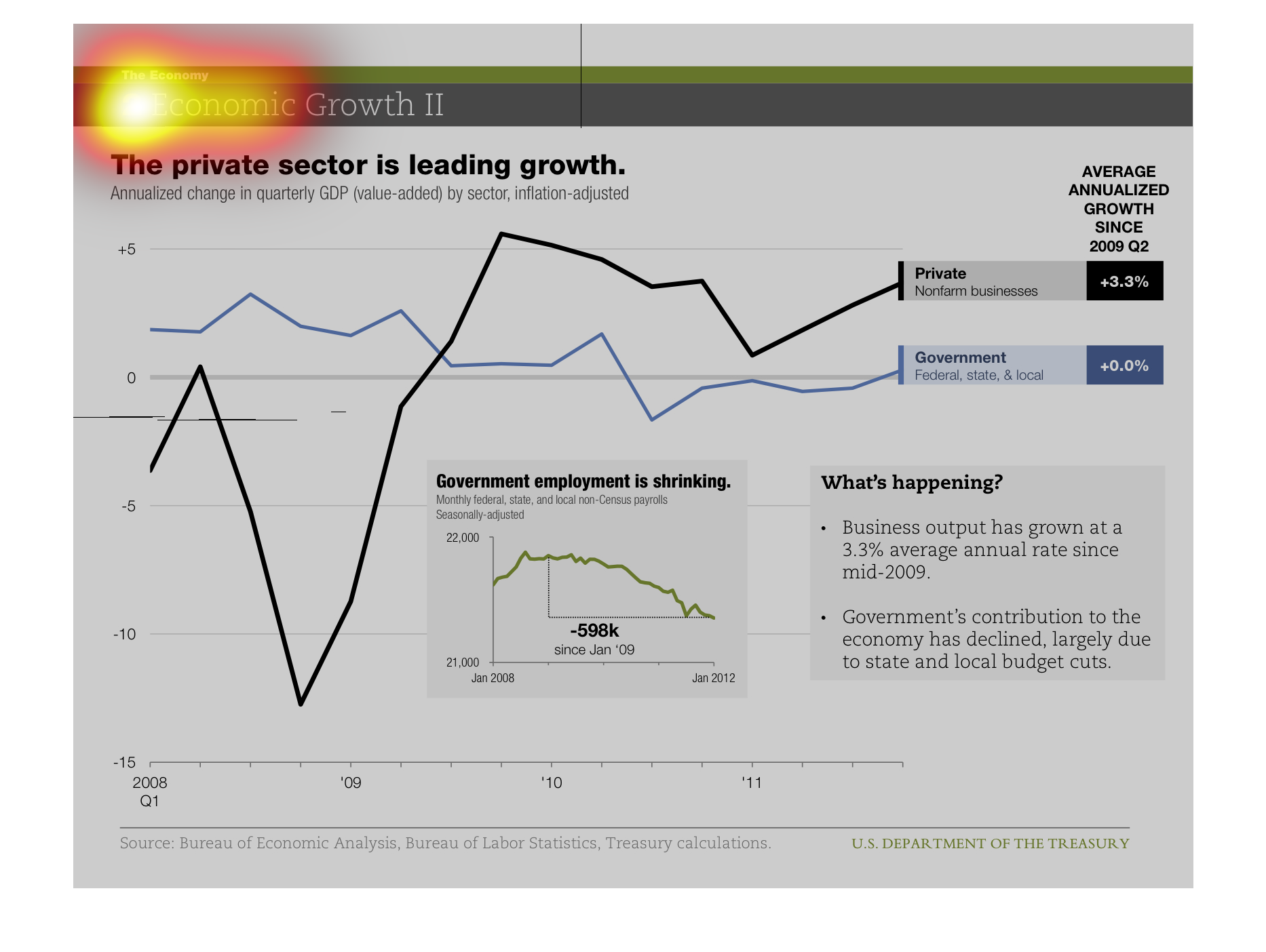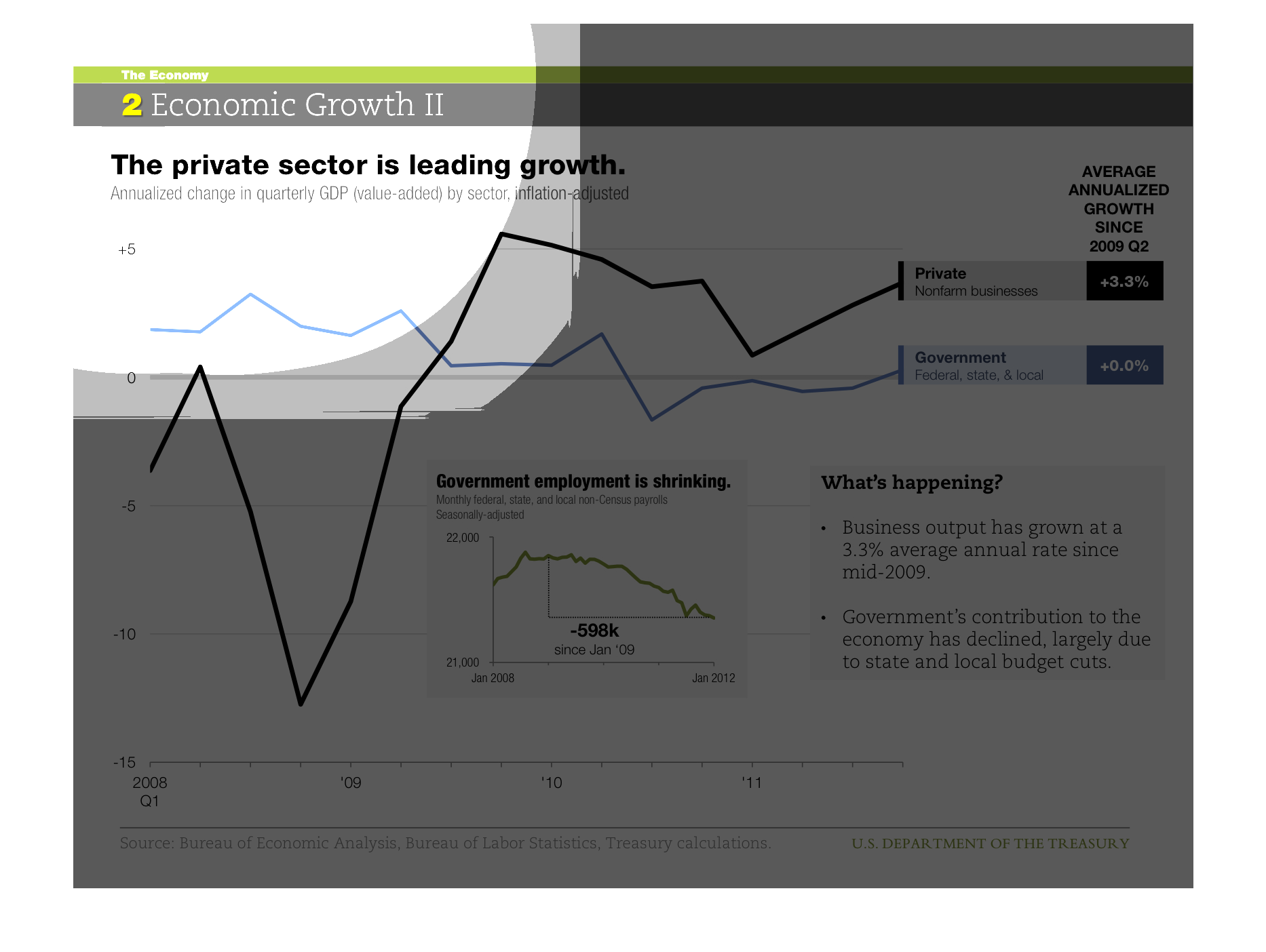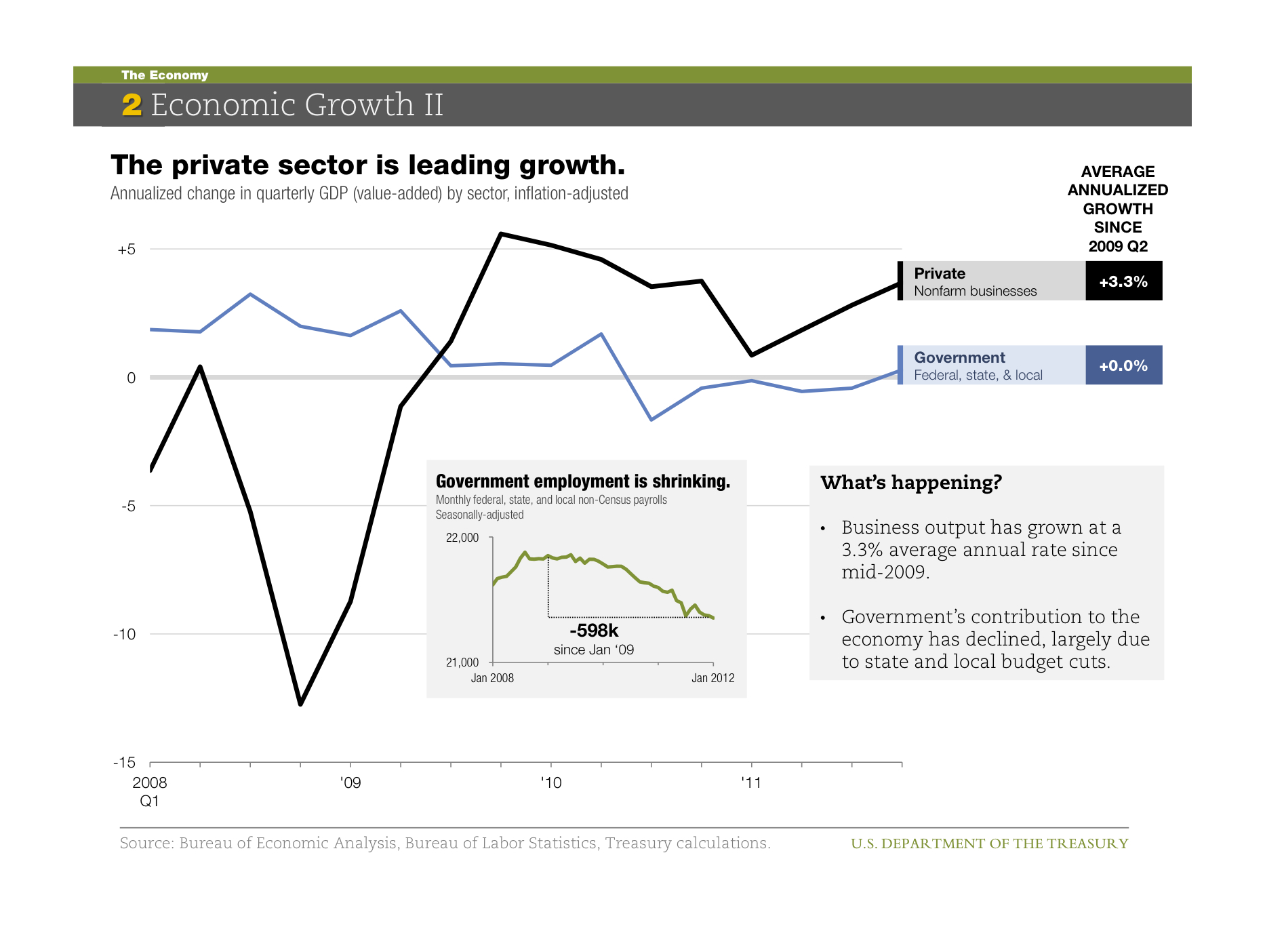
This chart shows the Economic growth II. it displays the private sector is leader growth.
It is the Annualized change in quarterly GDP (value-added) by sector, inflation-adjusted.
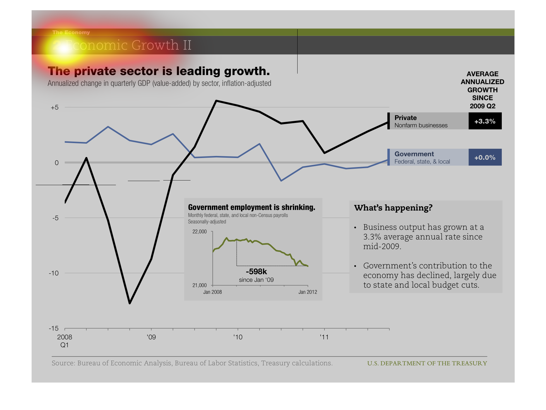
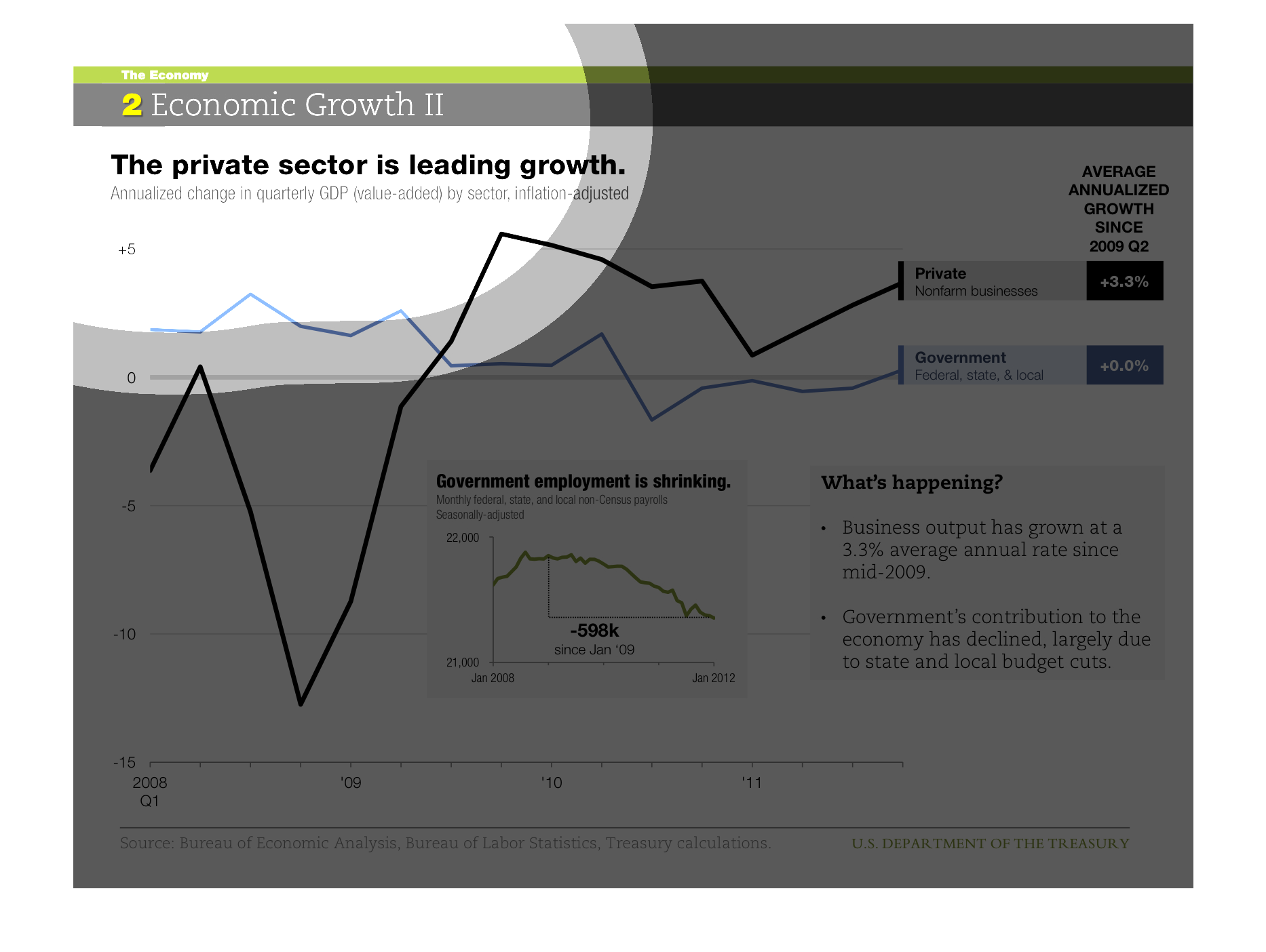
The private sector is leading growth. 3.3% average annual growth rate since 2009 quarter 2.
Government contribution has declined to to economic stressors and government employment is
shrinking
chart describes growth and loss of the economy from a period of 2009-12 quarterly.it his was
an all time low in the beginning of 2009 but quickly spiked in 2010
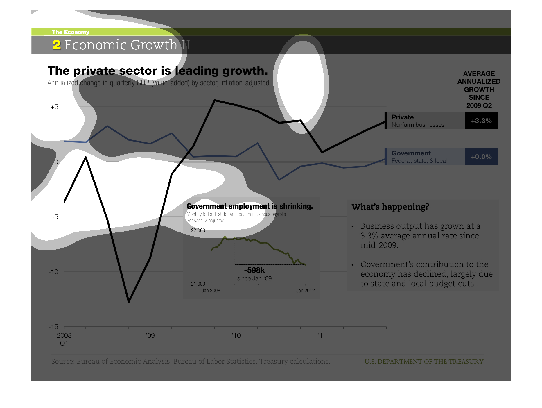
This chart describes that the private sector is leading growth. The chart covers the first
quarter of 2006 through the year 2011. The chart is sourced by the Bureau of Economic Analysis.
This graph shows the rise and decline of the economic growth in the private sector and government
since 2009. The lowest economic growth was in the private sectors at -3% which rose to +3.3%.
The highest economic growth was in the government at +3% with a decline of +0.0%.
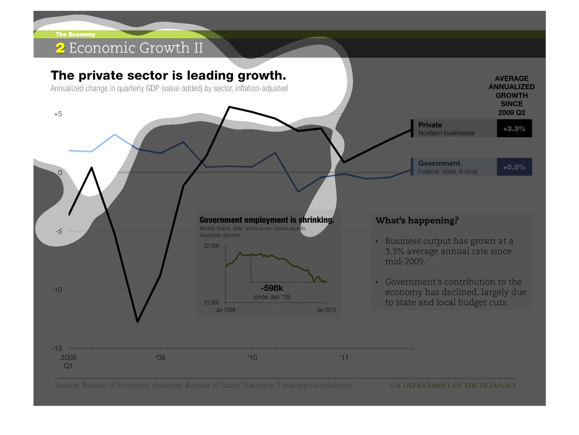
The title of this graph is, 'Economic Growth II'.  The sub heading for this graph is, 'The
private sector is leading growth'.  There are two data streams being charted, private non
farm business, and the federal government.
This image is about economic growth between 2008-2011 between the private and Government.
The Government economy kinda stayed steady whereas the private economy has a significant decrease
mid 2008
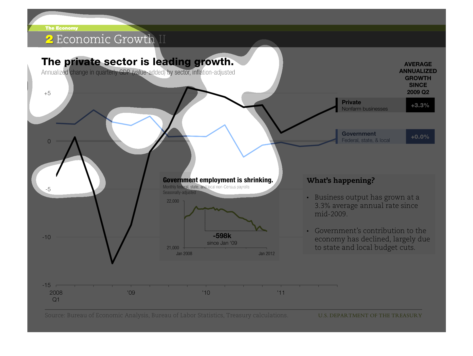
This is a moving average of private and government sector business growth between 2008 and
2012. The private sector took a sharp hit with the recession in 2009, and bounced back quickly.
Government is seeing steady negative growth.
This is a chart showing the private sector is leading economic growth from Q1 2008 to 2011.
The chart shows the federal government with 0.0% growth and 3.3% growth for the private sector.
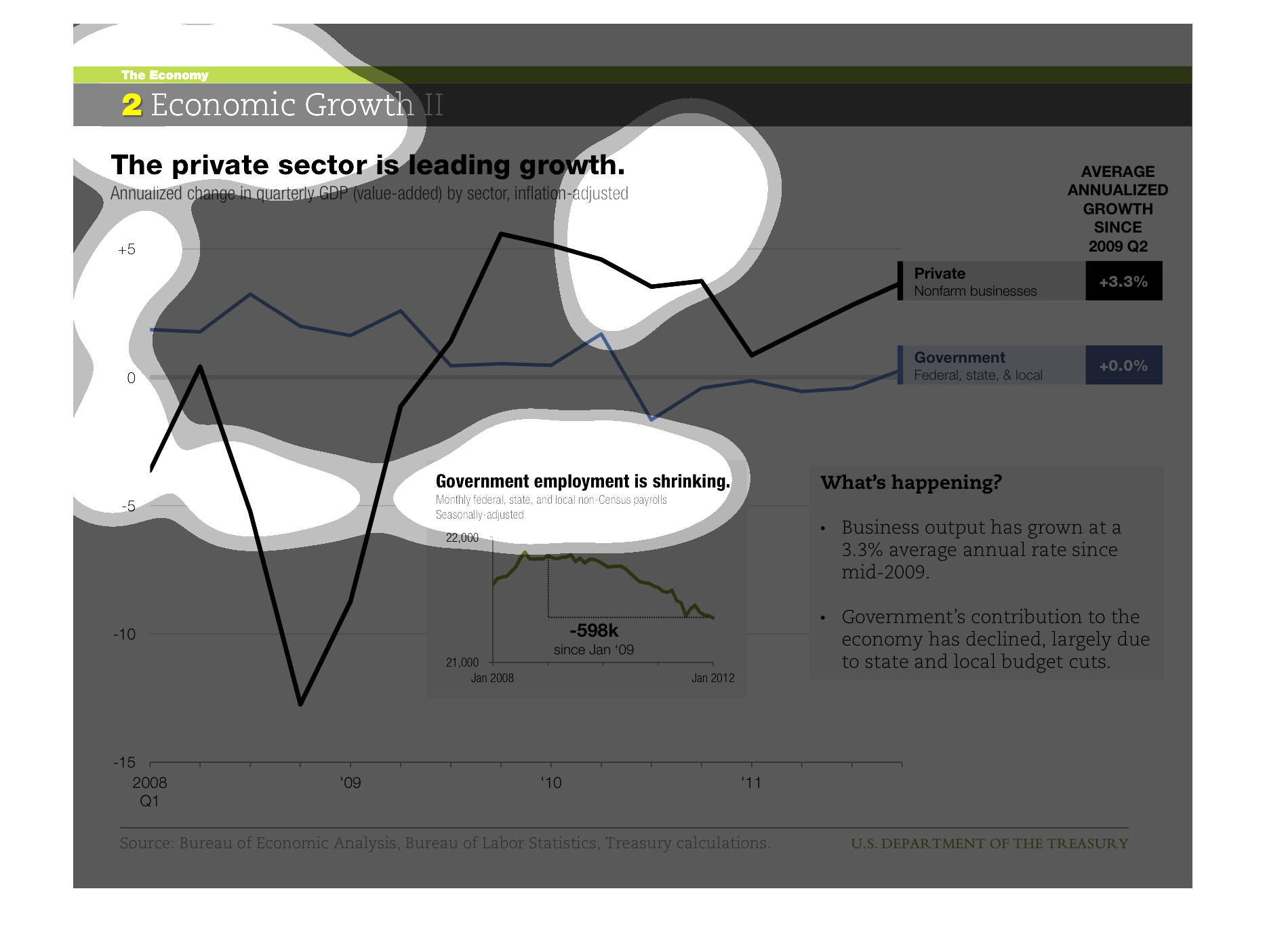
This chart shows that the private sector is leading growth. There is a trend over time of
private sector growth and government sector growth since 2009 Q2. Government's contribution
to the economy has been lagging behind that of the private sector.
THIS PLOT SHOWS THAT SINCE THE GREAT RECESSION THE PRIVATE SECTOR HAS CONTRIBUTED MOST TO
ANNUALIZED GDP GROWTH AFTER TAKING A HIT AROUND 2008-2009. GOVERNMENT GROWTH WAS AT A LOWER
RATE BUT REMAINED ABOUT STEADY.
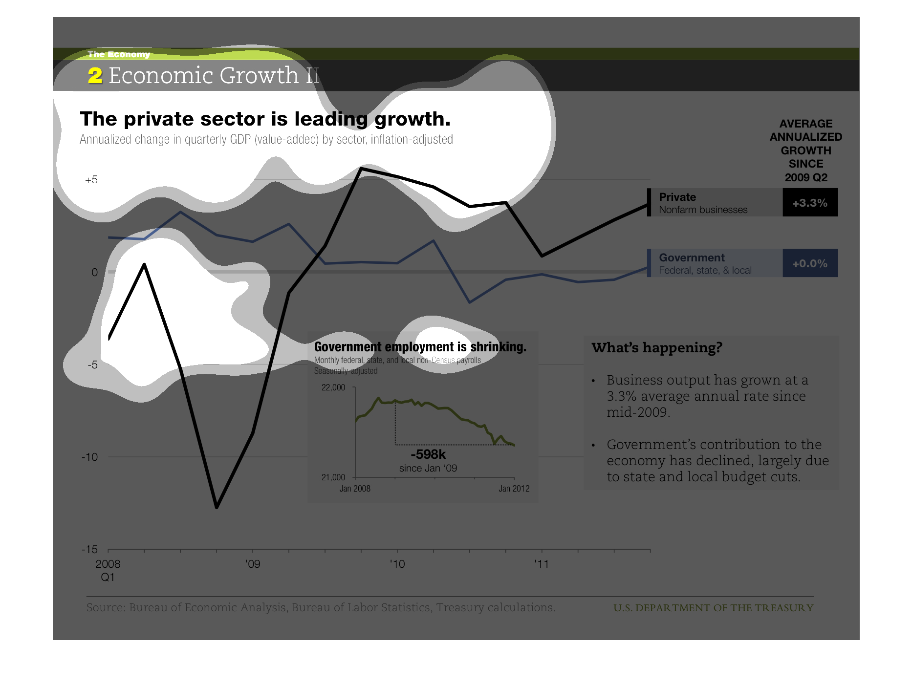
This graph illustrates that the private sector is leading growth.  It illustrates a spike
in growth from the display of years from 2006 to 2011 and has lines representing the government
and private sectors
This graph shows the amount of growth the private sector has experienced in relation to the
governmental sector. The graph shows the private sector has experienced more growth.
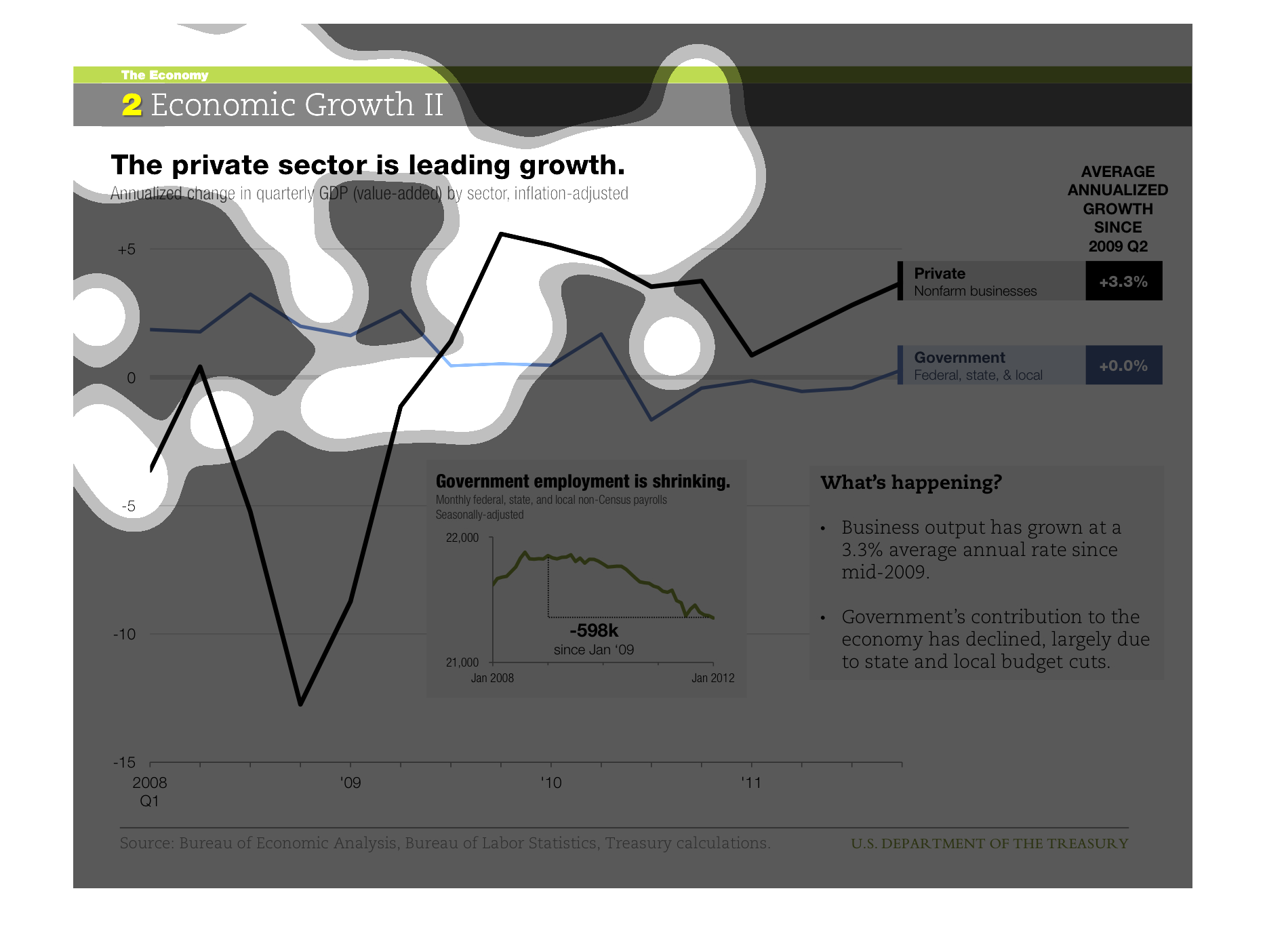
This is a series of charts and graphs depicting economic growth in terms of how the private
sector is leading the way and/or the driving force behind the recovery.