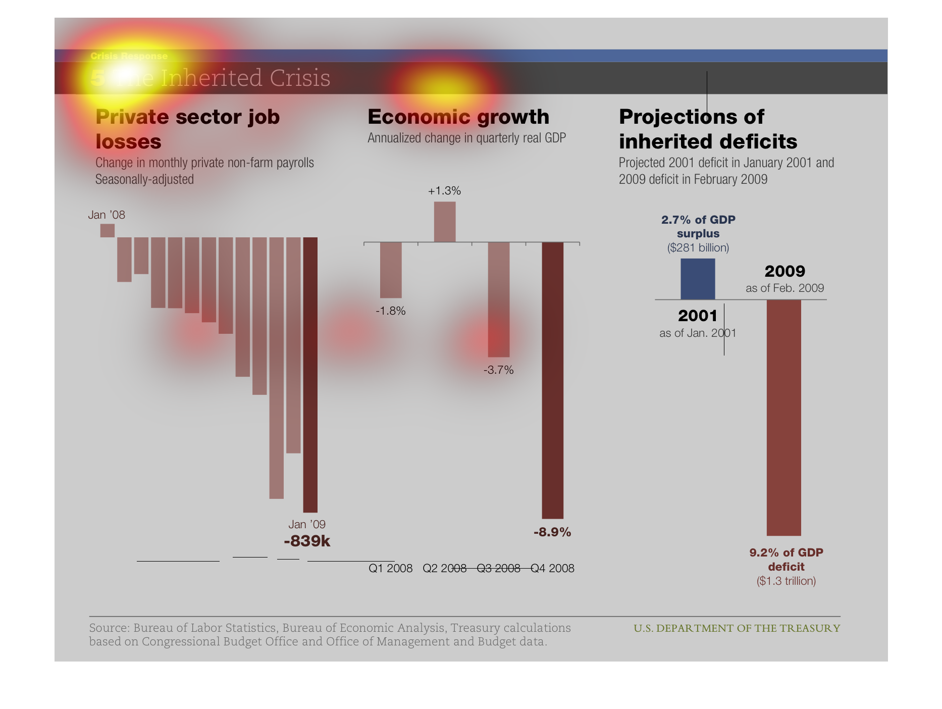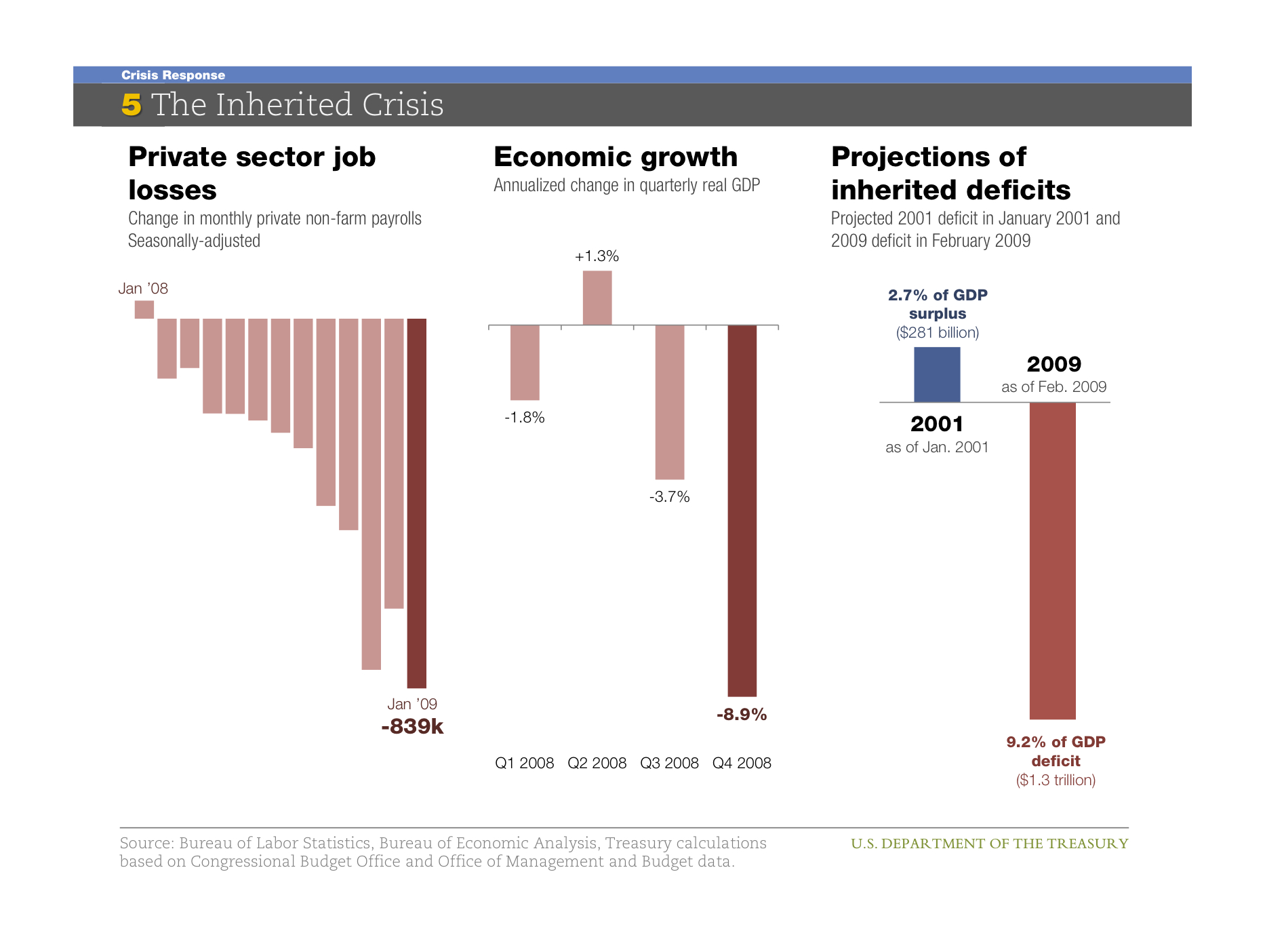
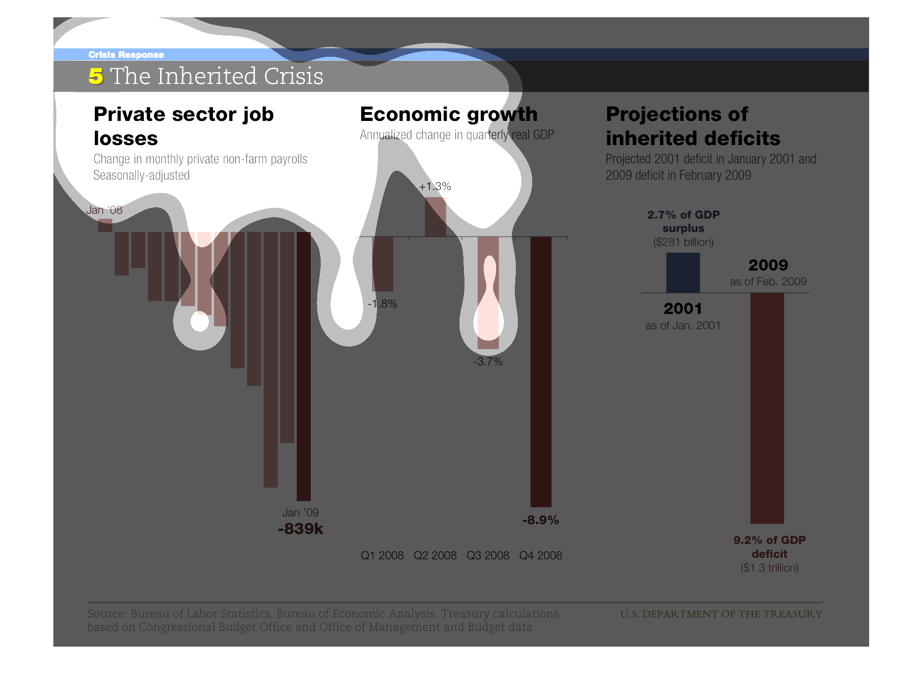
This graph is title The Inherited Crisis. It consist of 3 bar graphs, each graphing different
information. The first of three is titled Private sector job losses graphs the change in monthly
private non farm payoffs that are seasonally adjusted. The second of three graphs Economic
Growth and the Annualized change in quarterly real GDP. The third graph shows Projections
of inherited deficits with a projected 2001 deficit in January 2001 and 2009 deficit in February
2009
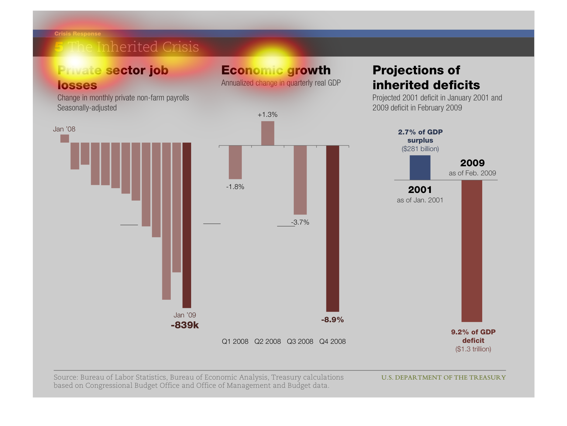
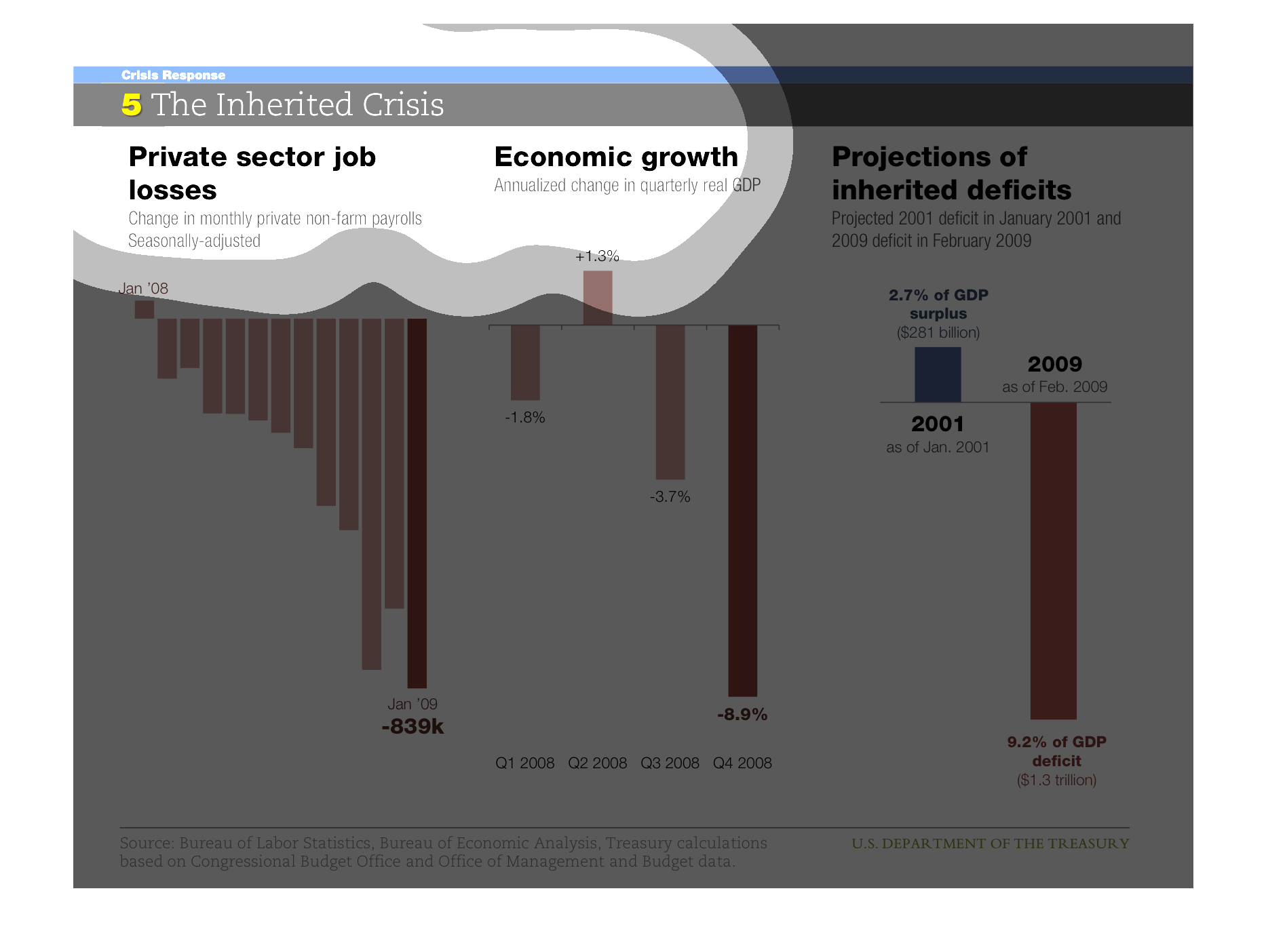
This is a chart about job losses in the private sector showing -839k losses by Jan 09 from
Jan 06 , economic growth showing -8.9 by q4 2008, and projected inherited deficits at 9.2%
deficit by 2009 from 2001.
These three charts show private sector job loss, economic growth by gdp, and the projected
deficits that will be inherited in the future. They are denoted by color graphs.
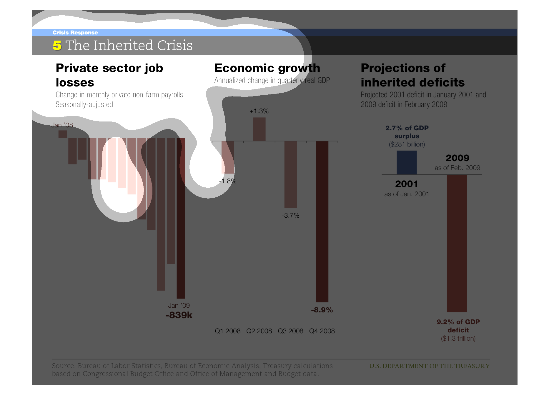
This image shows or depicts in 3 different statistical bar graph formats the relationship
of the inherited financial crisis between private sector job losses, economic growth and projections
onf inherited deficits.
Grouped into 3 parts: Private sector job losses, economic growth, and projections of inherited
deficits. The time frames seem to range from 2001 to 2009, and therefore show the decline
of the economy into the Great Recession.
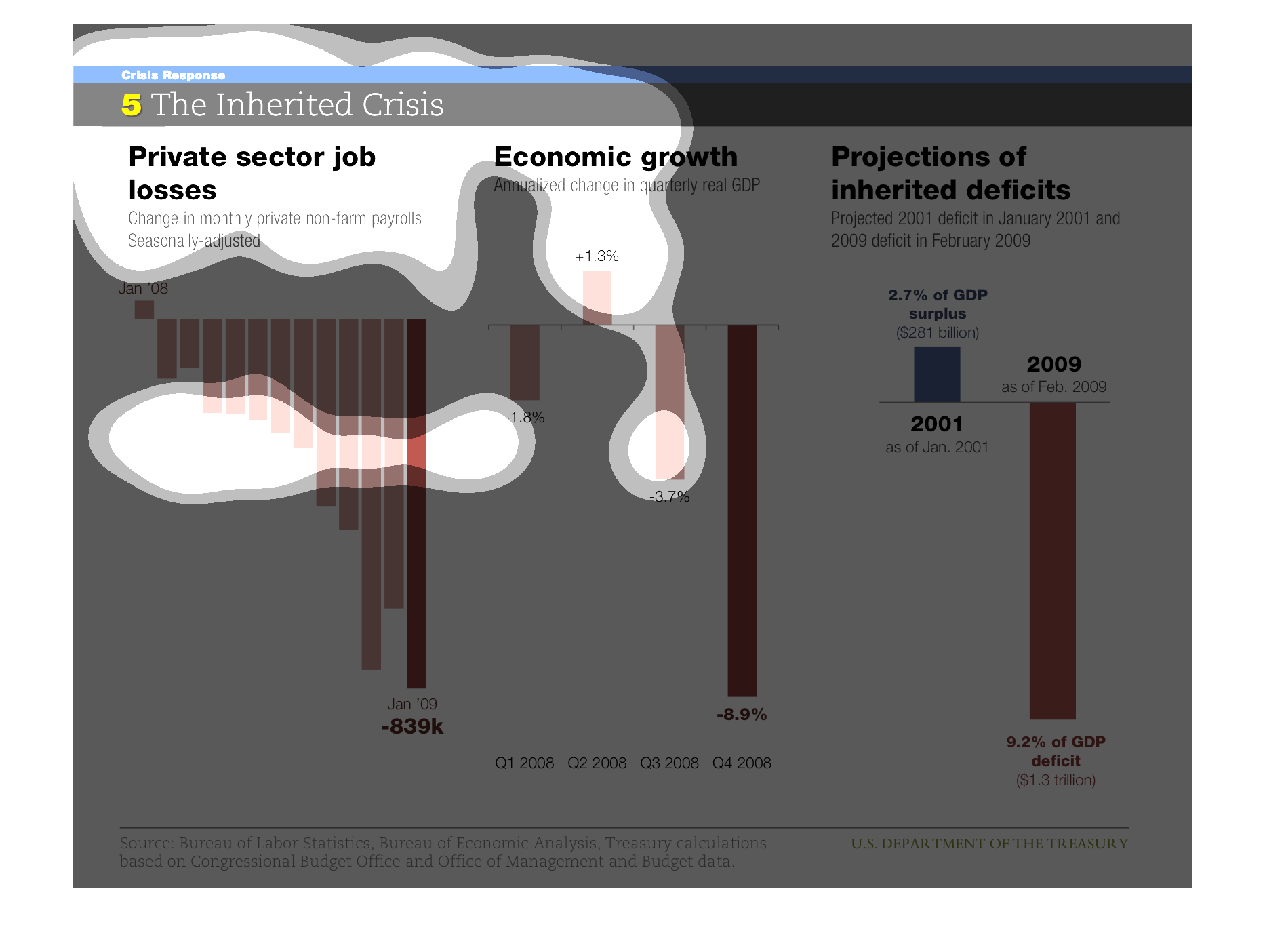
This image is of three economic charts.  The chart at the far left is of private monthly payrolls,
which is decreasing exponentially.  The center chart is of also decreasing Real GDP values.
 The right-most chart is a comparison of 2001's surplus and 2009's deficit.
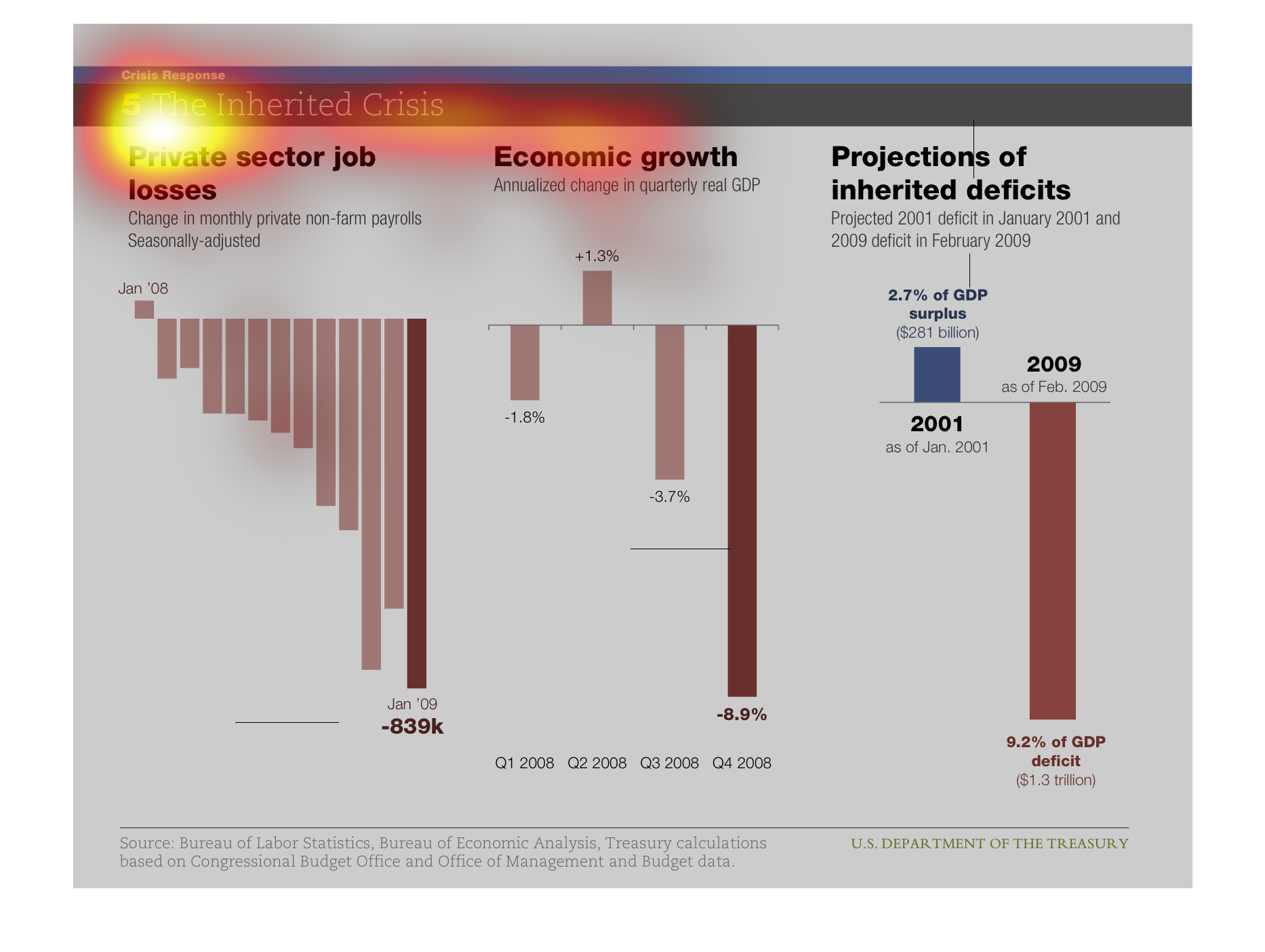
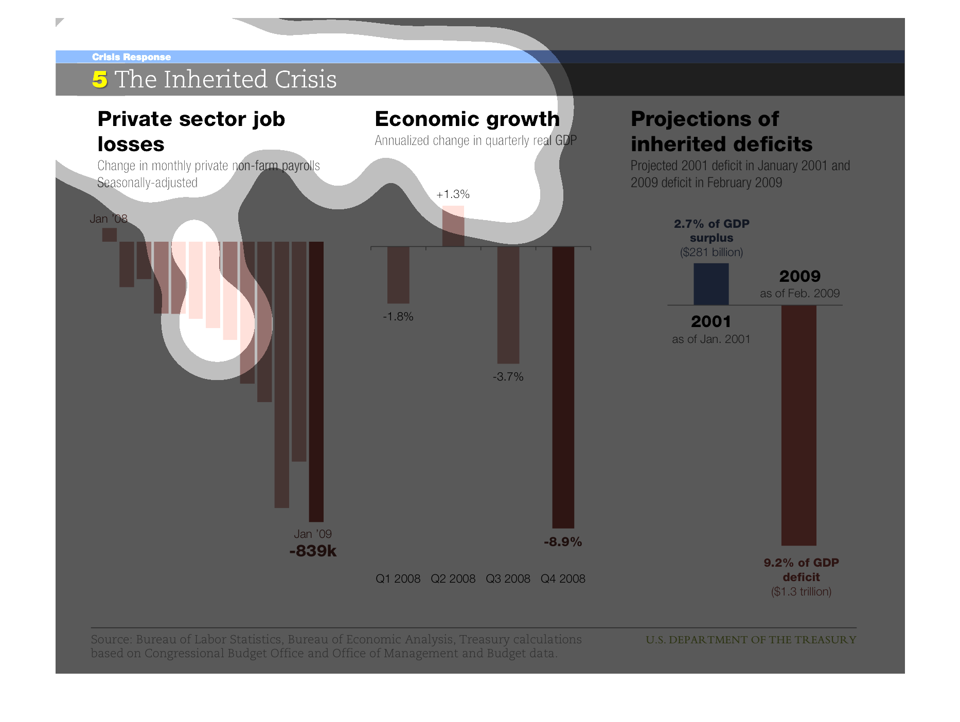
Three diagrams are displayed representing (left to right) private sector job losses, economic
growth and projections of inherited deficits. While a positive value is given in January 2008
for job losses, each month displayed through January 2009 is a negative value. It should be
noted that these values are relative to each other and do not represent a decrease in unemployment.
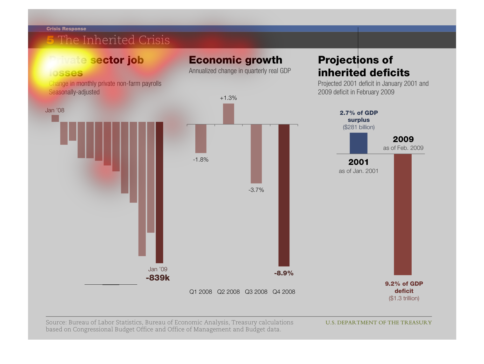
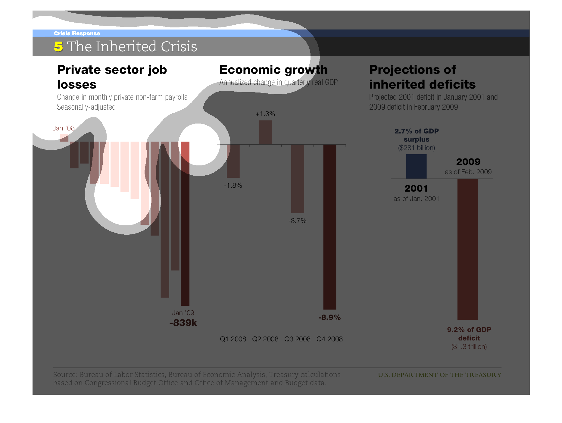
This chart describes private sector job losses. Specifically change in monthly private non-farm
seasonally adjusted. The chart also covers economic growth.
The graph shows three main topics: the losses of private sector jobs, economic growth, and
predictions of future deficits. Overall each factor shows the decrease of jobs in the private
sector has hurt the economy and future prospects predict loss as well.
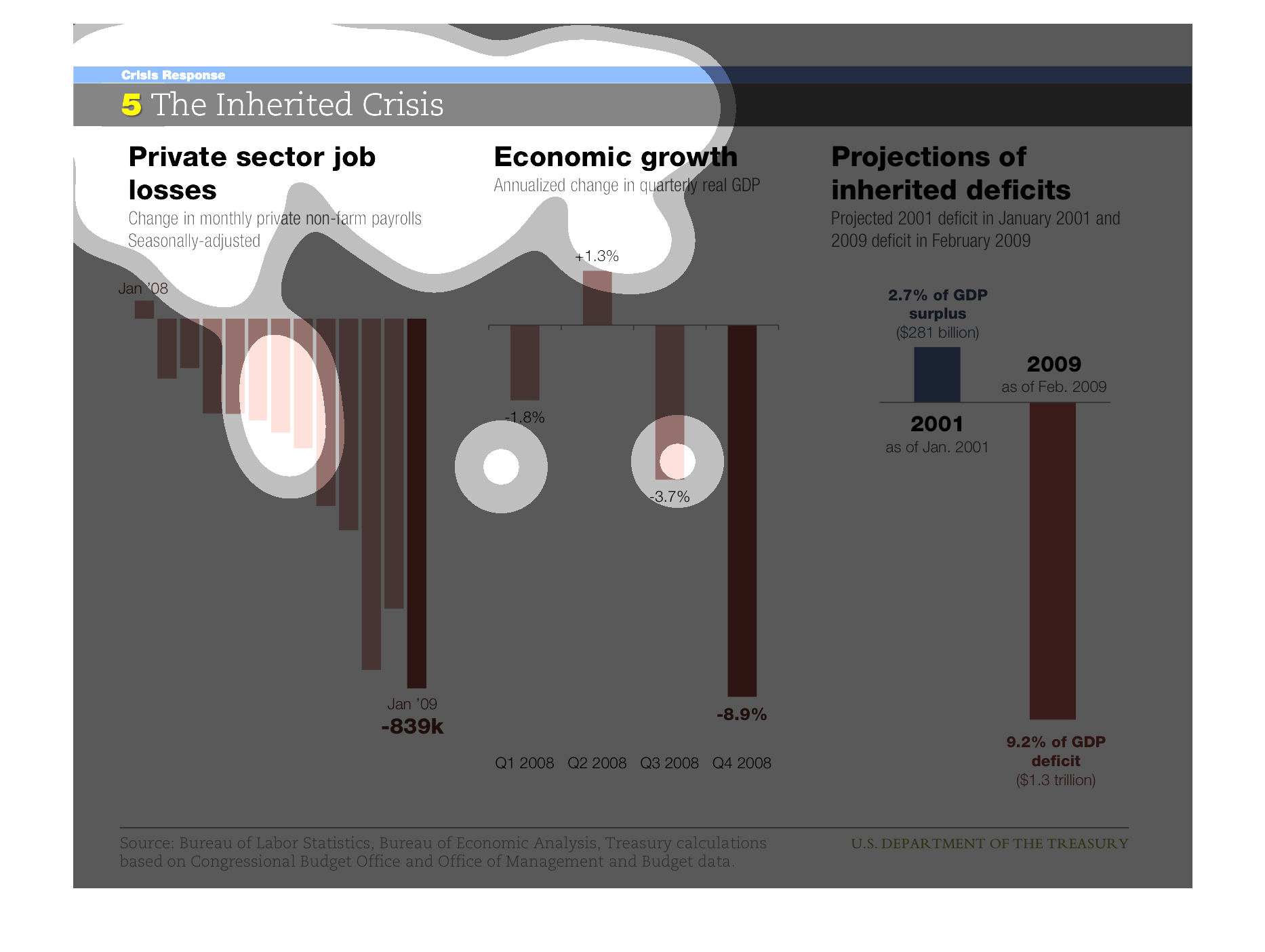
This graph is showing over the span over multiple years in 2000 the major drop in the Economy,
GDP deficit, and the numerous loss of jobs in the private sector. It shows in 2001 the GDB
was in surplus, ever since it has almost tripled in the negatives
The title of this graph is, "The Inherited Crisis".  The data in these graphs have three sub
headings; Private sector job losses, Economic growth, Projections of inherited deficits.
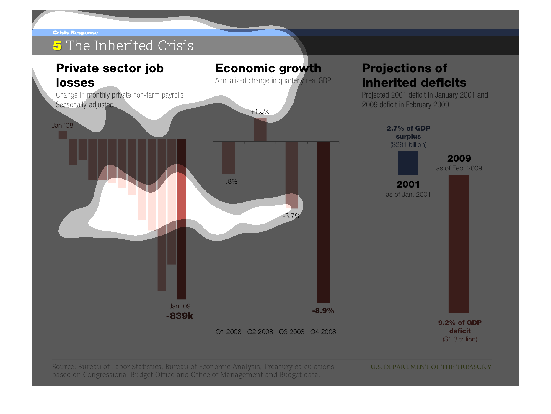
This is a series of three charts. The first on the left is showing private sector job losses
between January of 2006 and January of 2009. It shows the number growing steadily, ultimately
reaching losses of 839,000. The next chart shows economic growth in 2008. This chart compares
all four quarters of 2008 to each other as they relate to real GDP, and by the fourth quarter,
economic growth was down to -8.9%. The last chart shows projections of inherited deficits,
comparing 2001 to 2009. In 2001, there was a 2.7% surplus of GDP, while by 2009, there was
a 9.2% of GDP deficit.
This chart describes an inherited money crisis. It details private sector losses, economic
growth, and projected deficits in the year 2008. Overall the trend is negative, especially
in the private sector losses.
This chart is comparing job losses with economic growth and and the projected deficits. This
chart contains information from January 2006. From looking at the chart, you can see that
they were all even in that month.