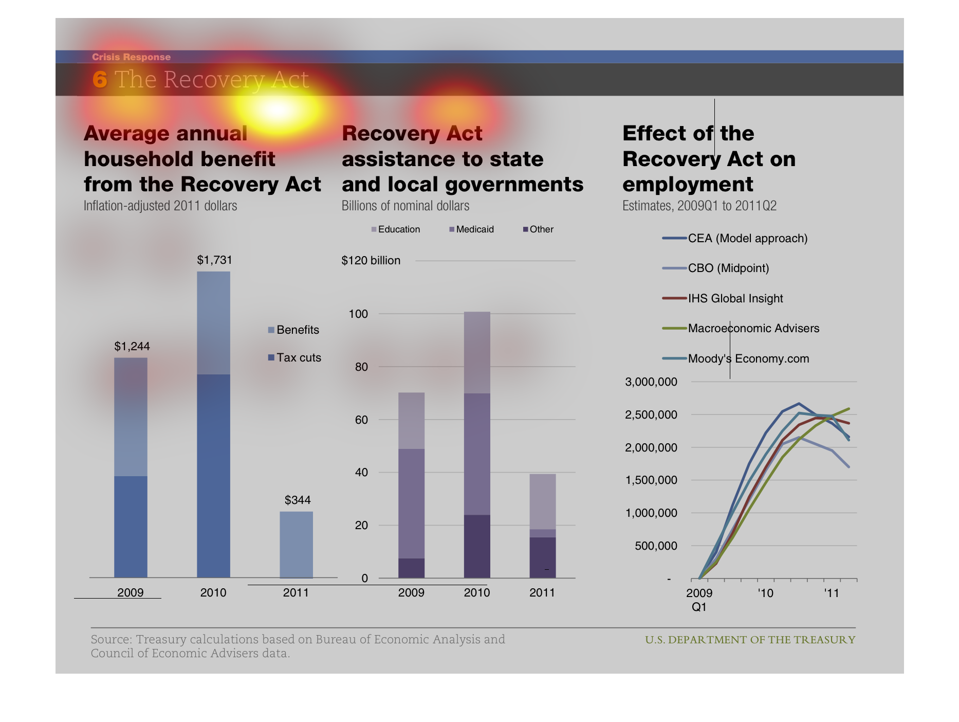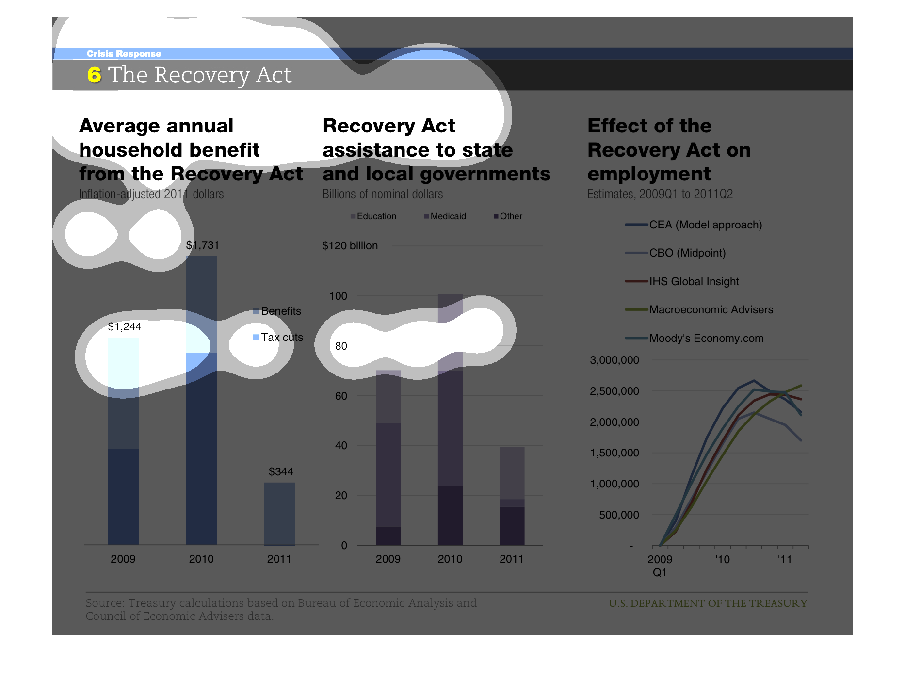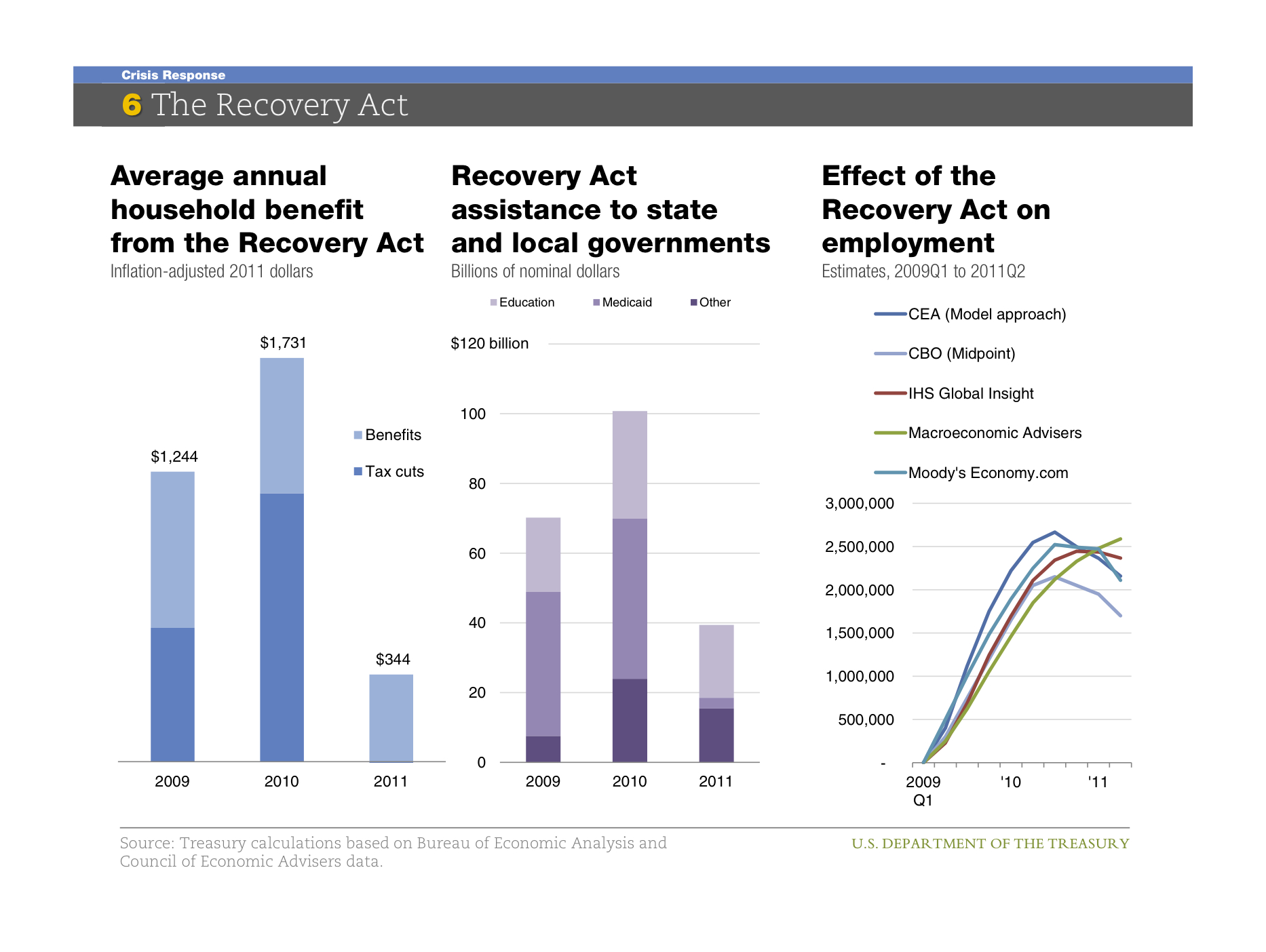
This chart describes the average annual household benefit from the Recovery act. The chart
also covers recovery act assistance to local governments in the US.
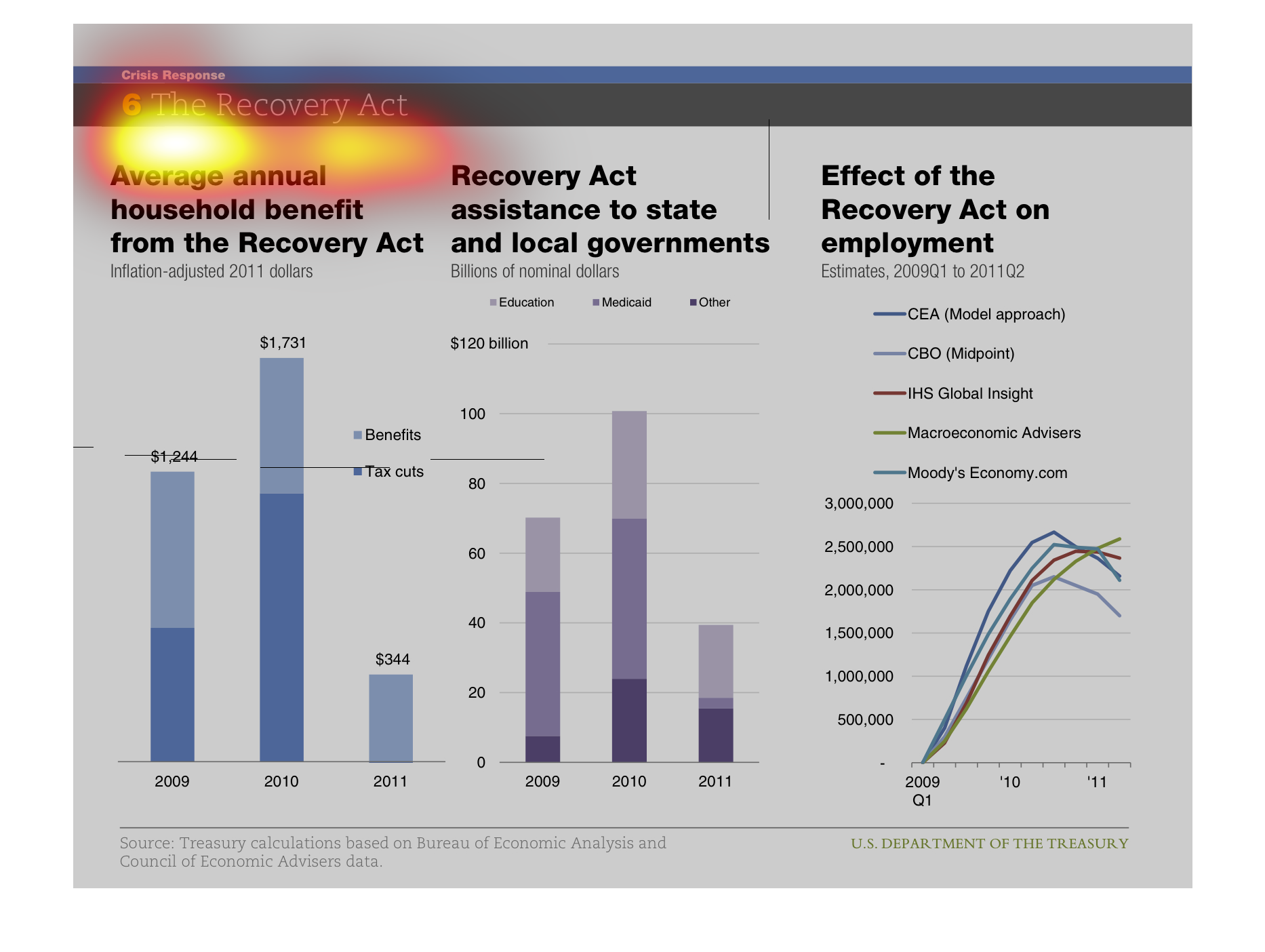
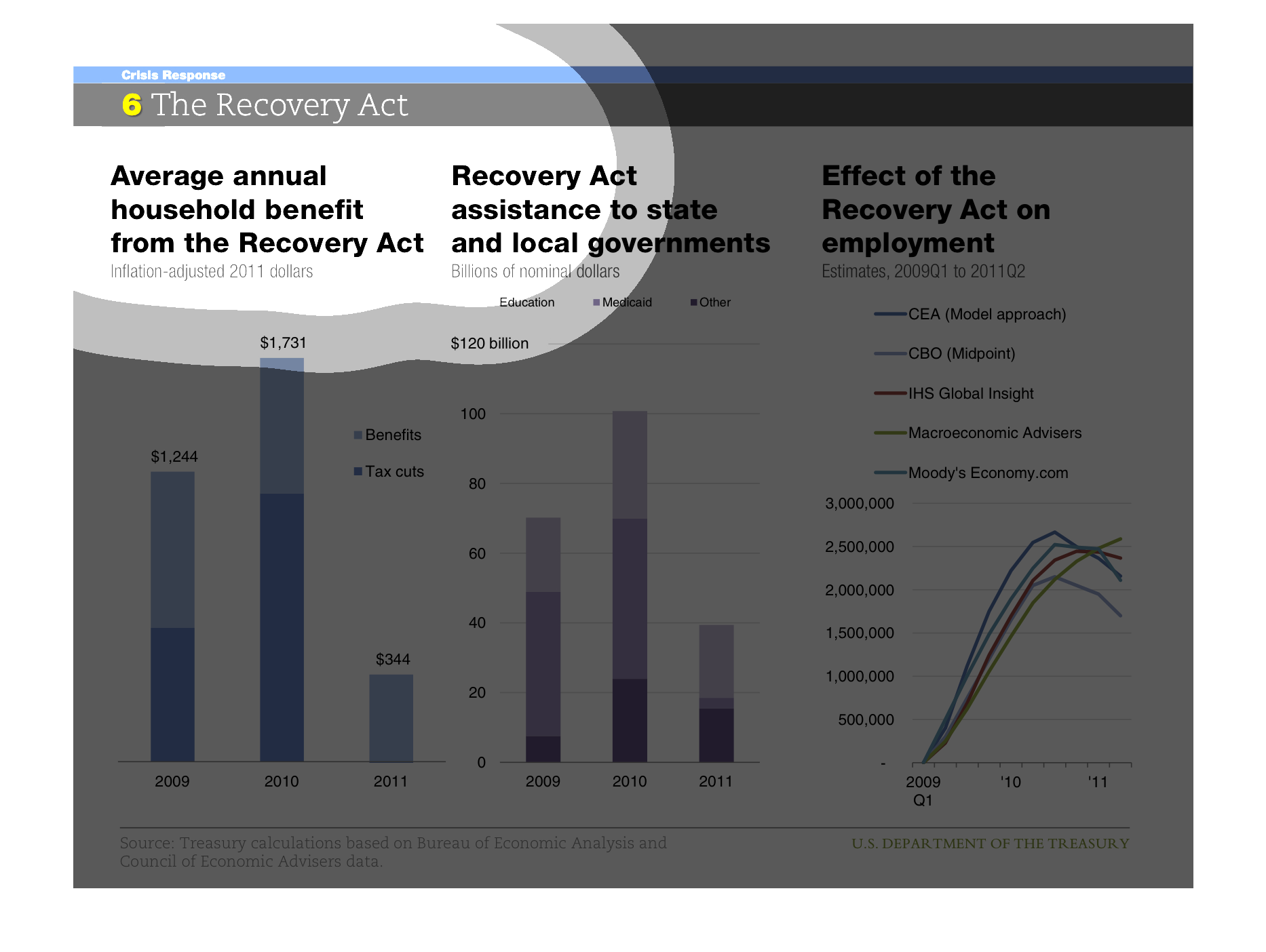
THIS PLOT SHOWS THE FINANCIAL BENEFITS OF THE RECOVERY ACT. AT LEFT IS GIVEN THE BENEFIT TO
INDIVIDUAL HOUSEHOLDS. IN CENTER IS THE BENEFIT TO STATE AND LOCAL GOVERNMENTS. AT RIGHT IS
THE EFFECT ON JOB GROWTH.
The page is about the Recovery Act. The charts provide a graphical representation of the benefits,
assistance to government agencies, and the effect on employment.
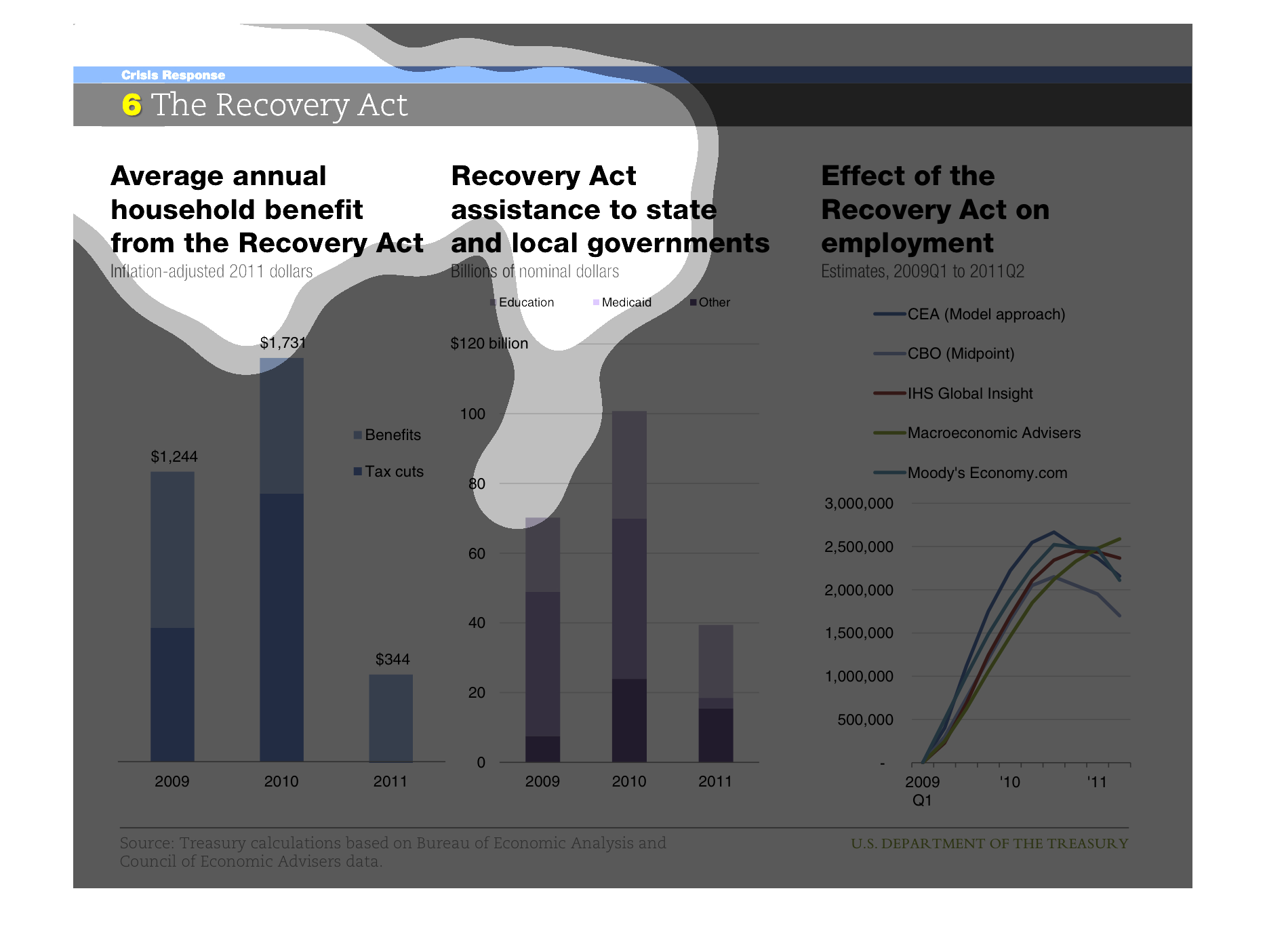
The recovery act. Average annual household benefit, assistance to state and local government,
effect of recovery on employment, all three category's graphs show slow growth and then a
slump, they all correlate pretty closely
This slide is all about the Recovery Act.  It contains 3 graphs of data related to the Recovery
Act.  The first is the average annual household benefit from the act, the second is the act's
assistance to state and local governments, and the third is its effect on employment.
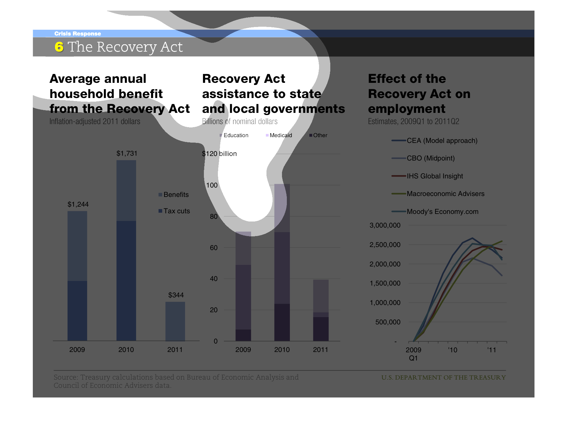
This is a chart showing local household, state, and employment benefits from the recovery
act in 2009-2011. it shows 2011  was the year the least benefits were received.
This is a series of graphs and charts depicting the Recovery Act and it's various effects
on different sectors of the United States economy following the financial crises.
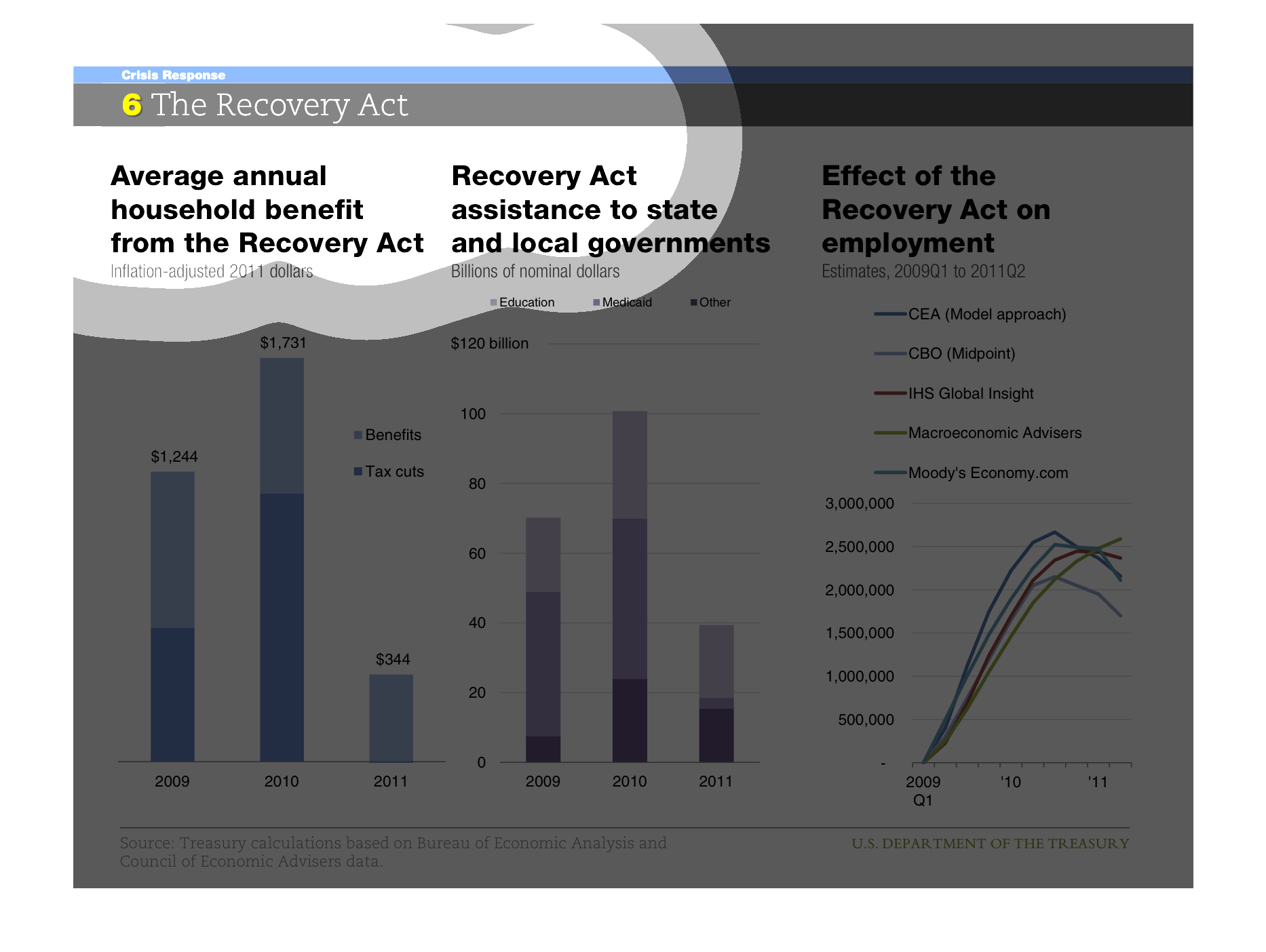
The graph states the effectiveness of the recovery act in a wide variety of different sectors
throughout the years. The graph shows that the act had varying degrees of success.
The first chart shows average household benefit from the Recovery Act, the second shows the
assistance to state and local government by the Recovery Act, and the third shows the Recovery
Act's impact on employment.  Benefits to households and state/local government peaked in 2010,
and employment's impact appears to have peaked in 2011.
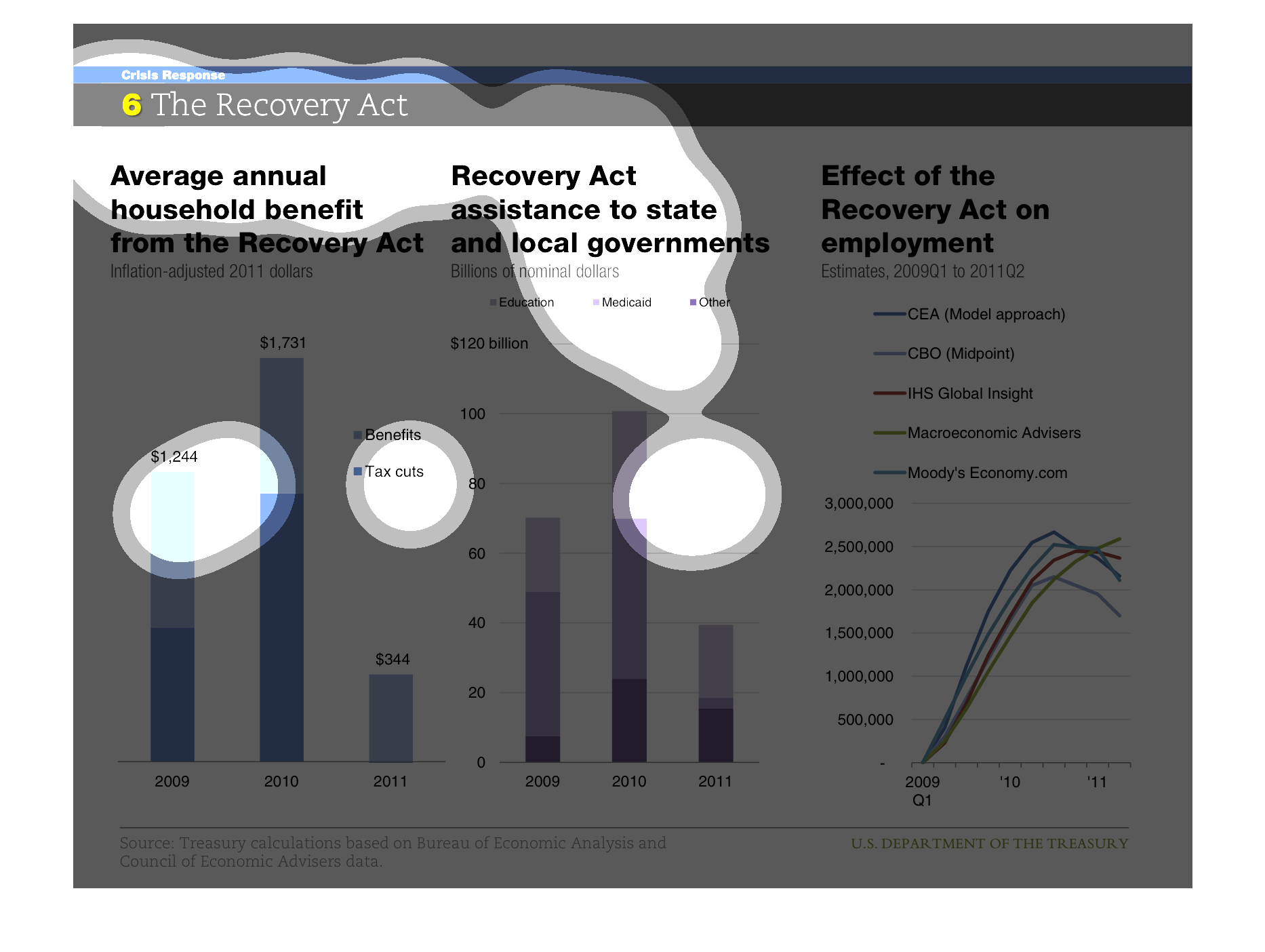
The Recovery Act. The average annual household benefit from this act shows the largest gain
in 2010. The assisstance to state and local government also shows the largest gain in 2010.
The effect of the recovery act on employment shows how it increased from 1 million to almost
3 million from 2009-2010 and then evened out
The graph contains three charts that refers to the Recovery Act and how it helped the American
household and government and employment. It seems 2010 was the best year overall for all three
catgories
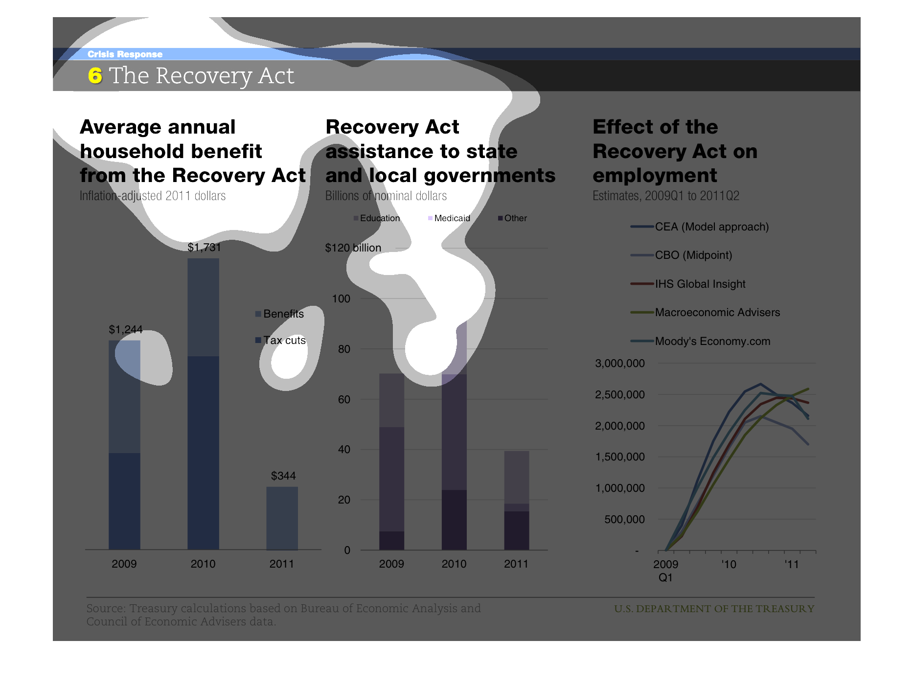
This chart describes the benefits of the Recovery Act.  In 2010 the most households benefited
from the Recovery Act.   In addition, in 2010 the most Recovery Act assistance was given to
state and local governments.  The Recovery Act also had a positive impact on employment in
2010.  Although there were benefits to households, state and local governments, and employment
in 2009 and 2011 as well, the largest positive impact of this act came in 2010.
The first part of the graph describes the correlation of Annual household benifits from the
Recovery Act from 2009 to 2010. The second graph describes the correlation between the Recovery
Act assistance to local and state government between 2009-2011. The third and last part of
the graph shows the effect of the Recovery Act on employment in 2009 amongst the CEA, CBO,
IHS, Macinoeconomic Advisors, and Moody's Economic.com. The CBO or midpoint is the lowest,
and the highest is Macinoeconomic Advisors.
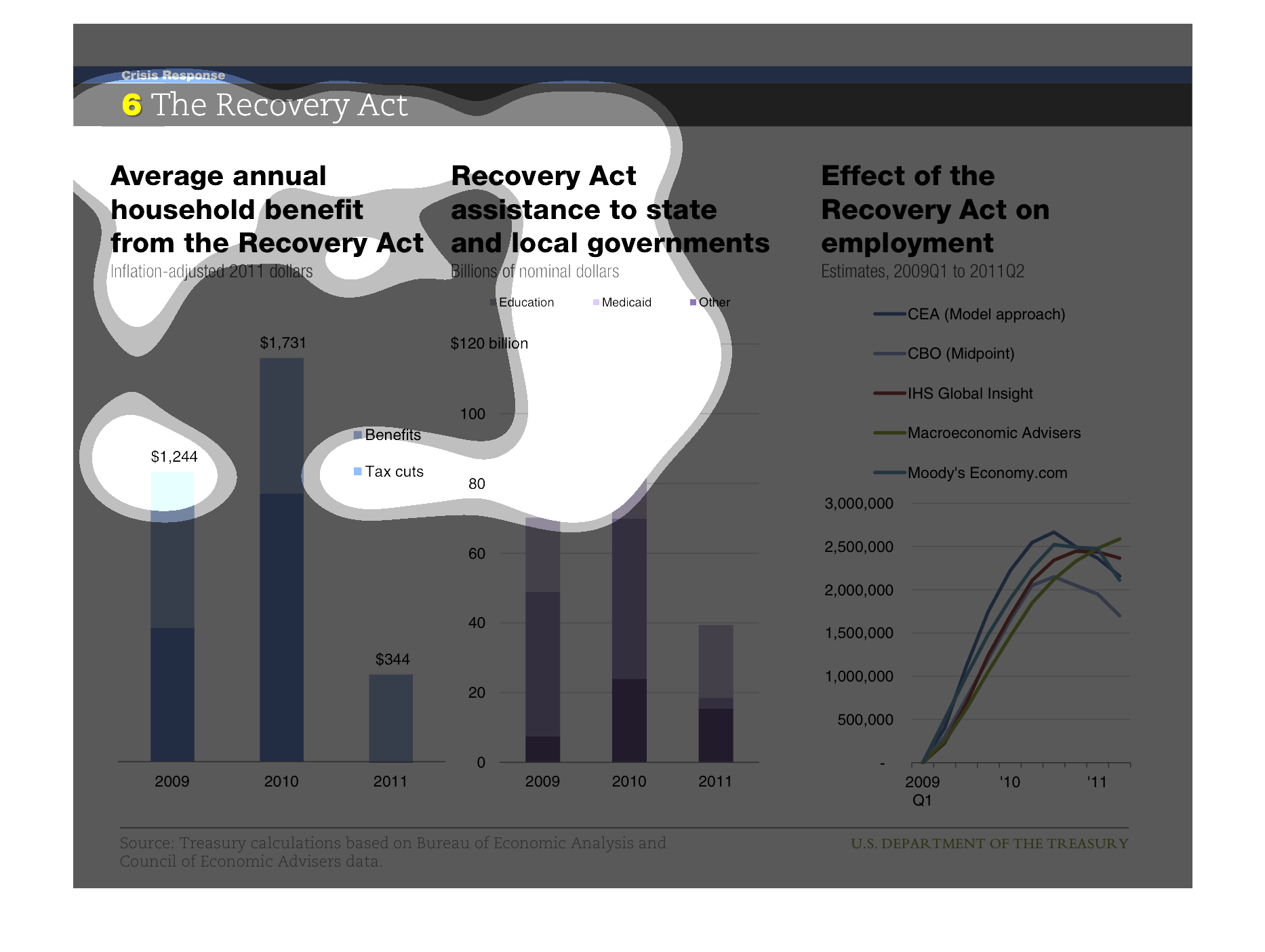
This is a chart about the recovery act. It shows the average annual household income of the
recovery act, the recovery act assistance to state and local government and the effect of
the recovery act on employment.
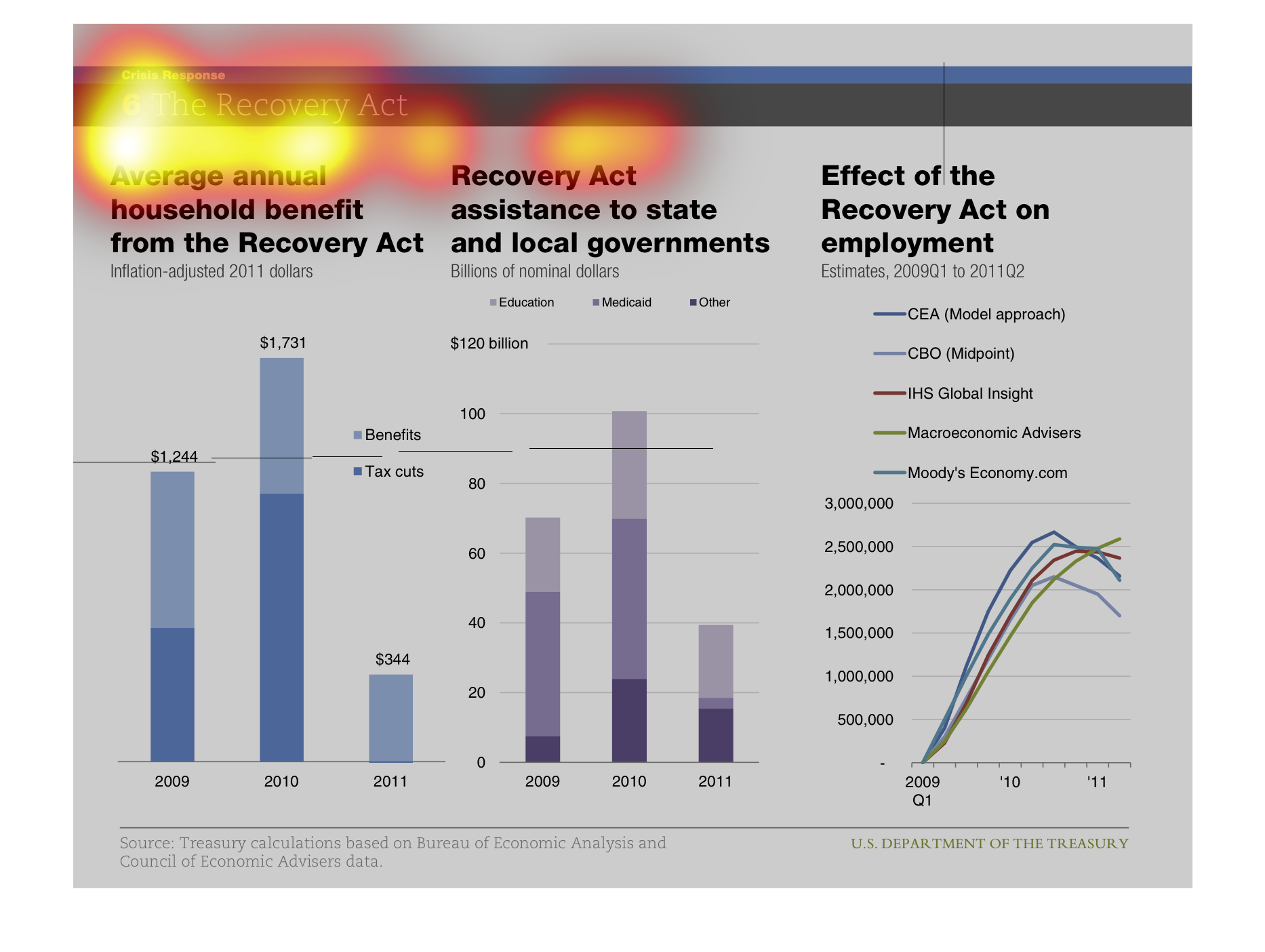
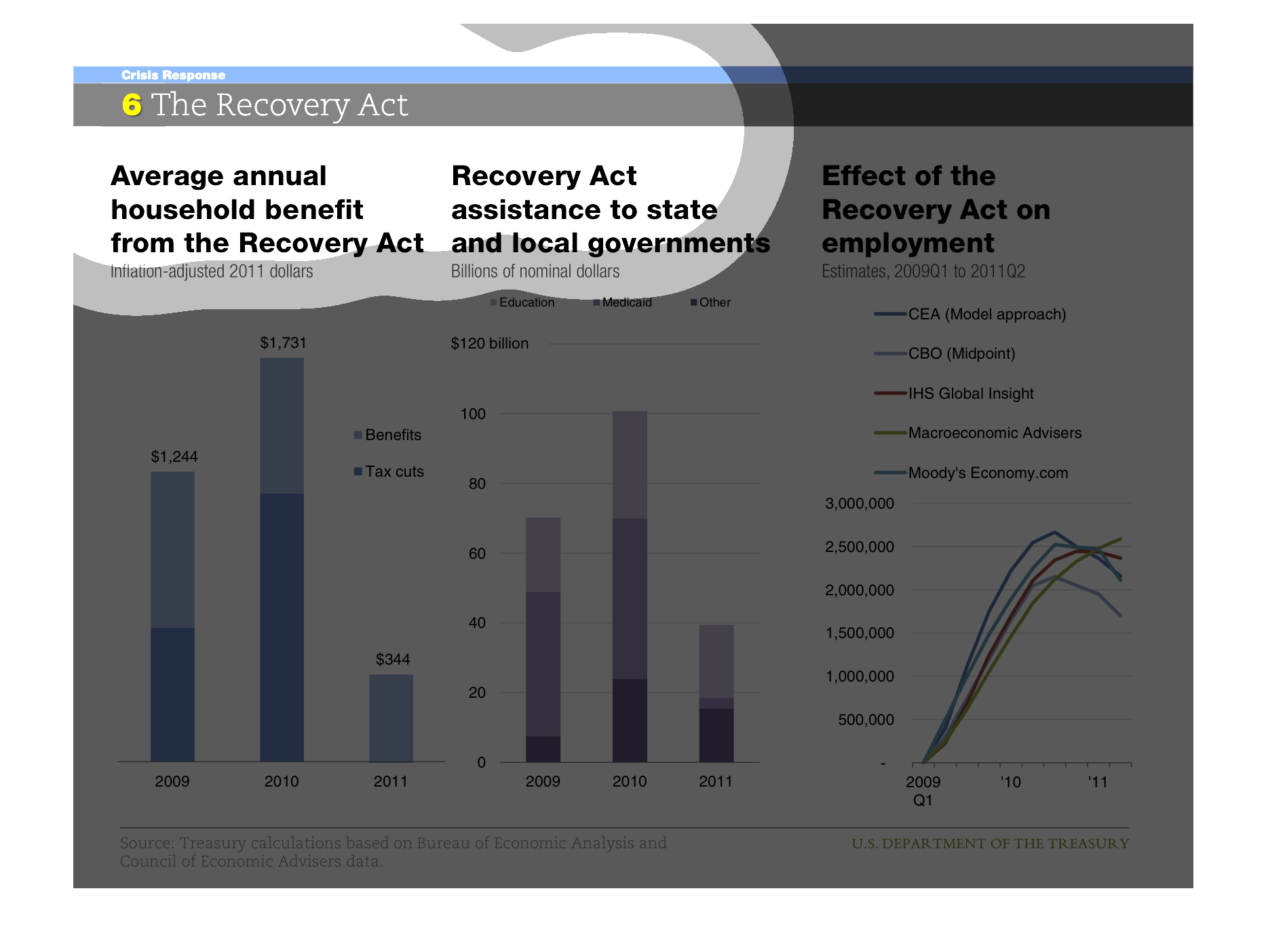
This image shows or depicts using statistical bar graph format the various effects of the
Recovery Act on household incomes, assistance to local and state goverments and on employment
from years 2009 to 2011.