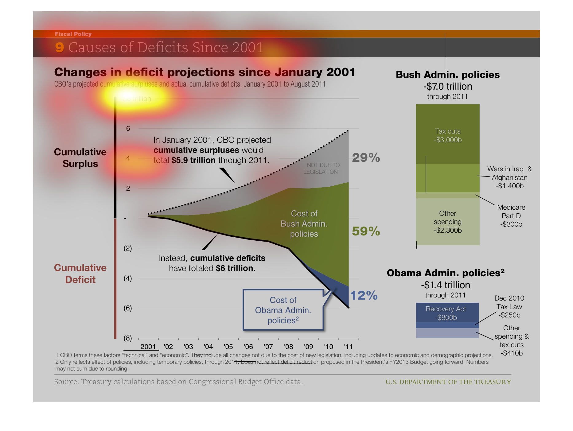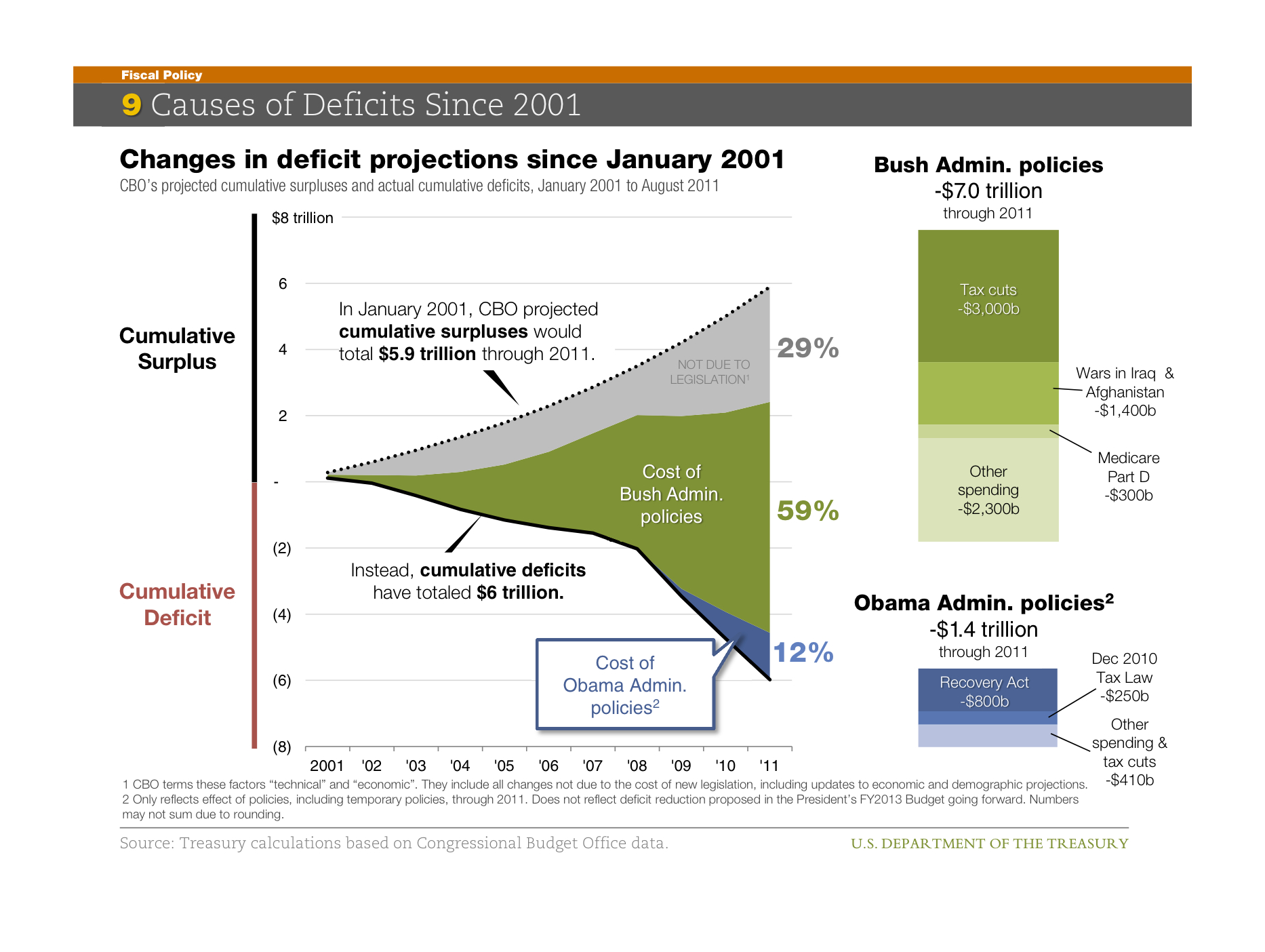
Nine causes of deficits since 2001 with changes in deficit since 2001. Seems to be talking
about cumulative surplus and deficit. Unclear what the giant shapes are.
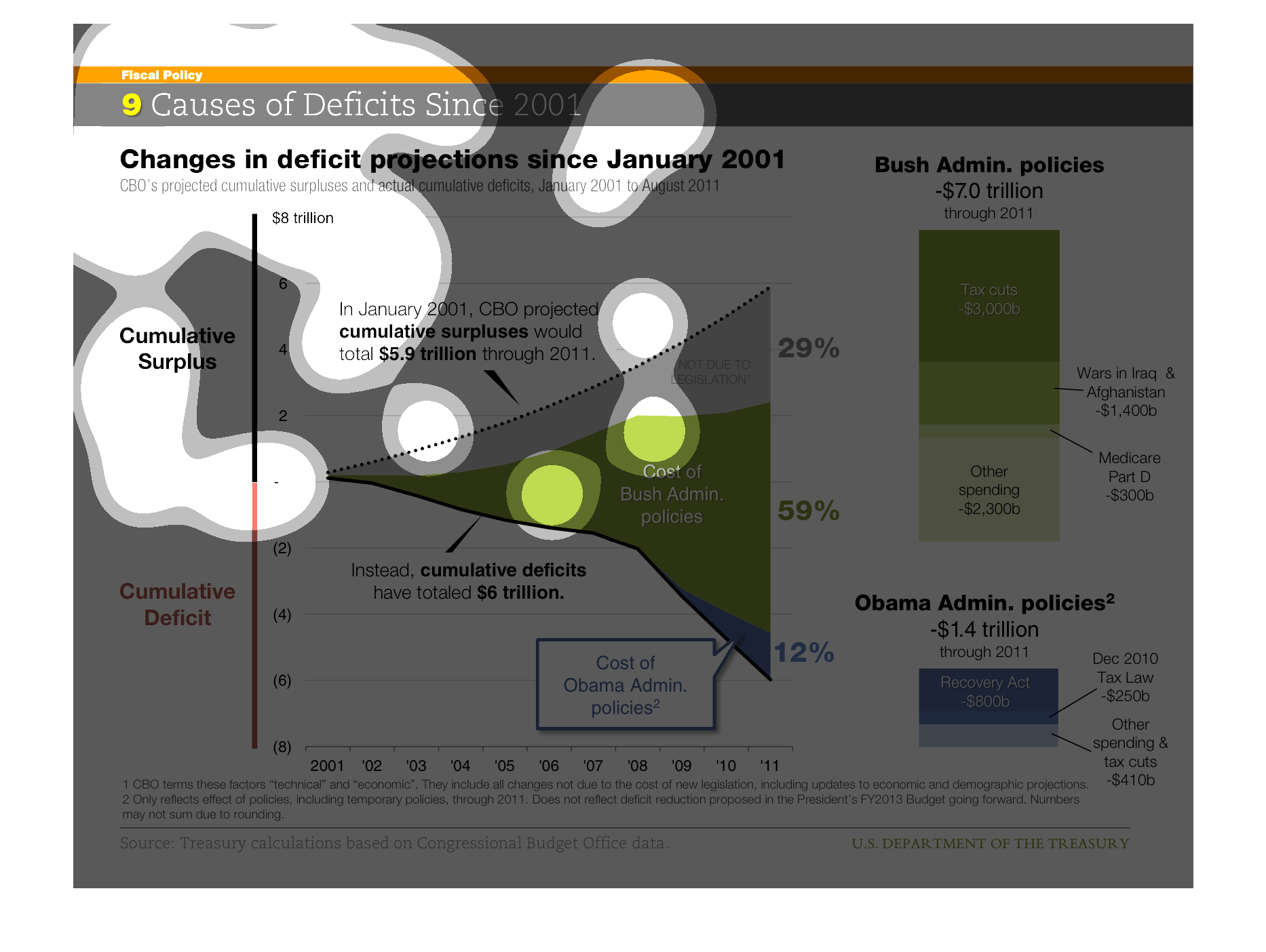
This graph is titled Causes of Deficits Since 2001. It displays changes in deficit projections
since January 2001. It also shows Bush's admin policies putting us -$7.0 trillion and Obama's
Admin policies putting us -$1.4 trillion in debt.
This is a chart showing changes in projections of deficits in January 2001 to August 2011.
There are a few charts, and on the right are the Bush administration, and the Obama administration.
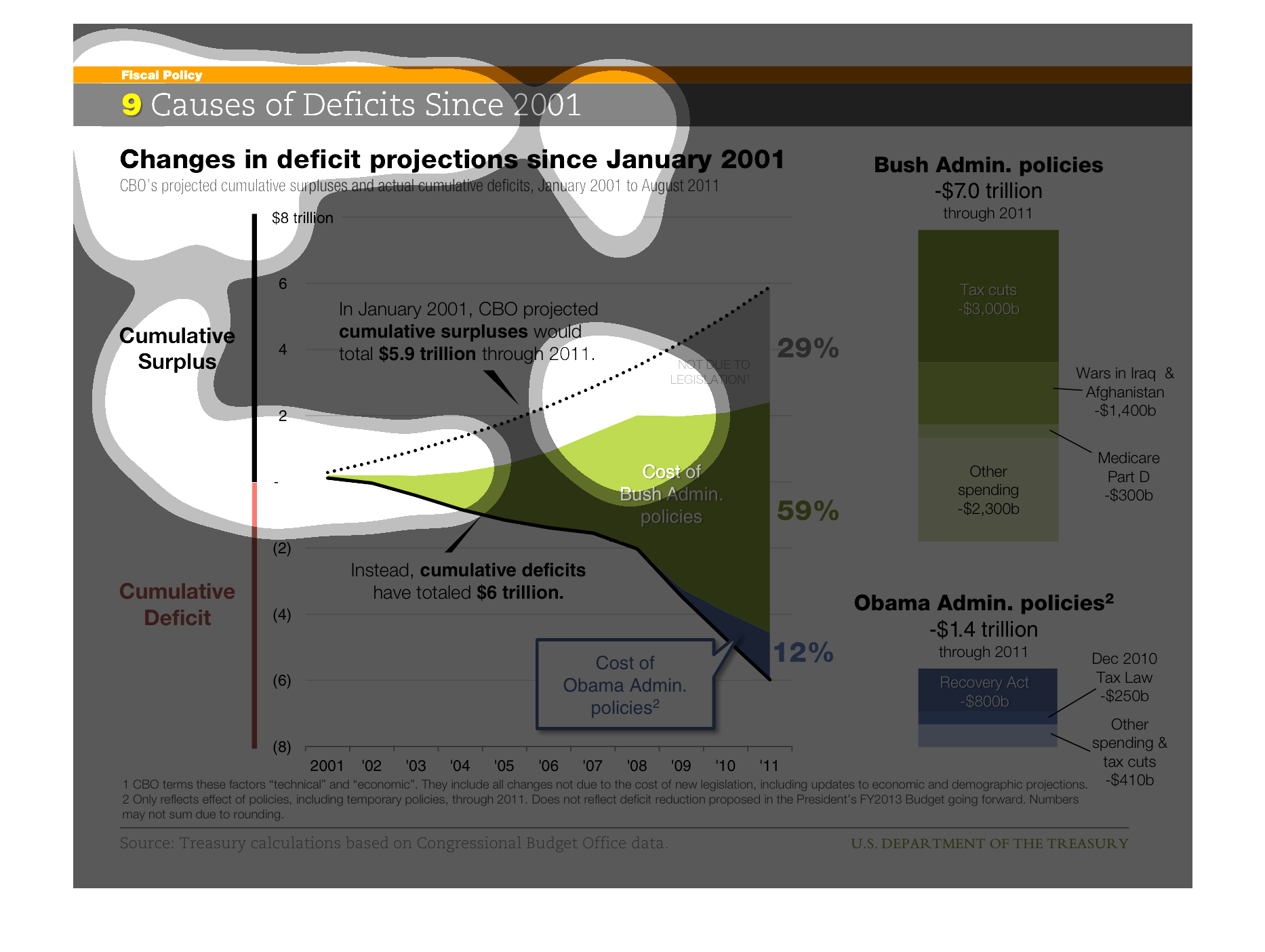
The title of this graph is, 'Causes of deficits Since 2001'.  Below this is another heading,
'Changes in deficit projections since January 2001'.  The graphics contained in the graph
displays cost of policies under the Bush administration and the Obama administration.
The graph try to convey the notion that commutative surplus has been in the works for a while
and that those founds have contributed to a deficit that has affected the nation.
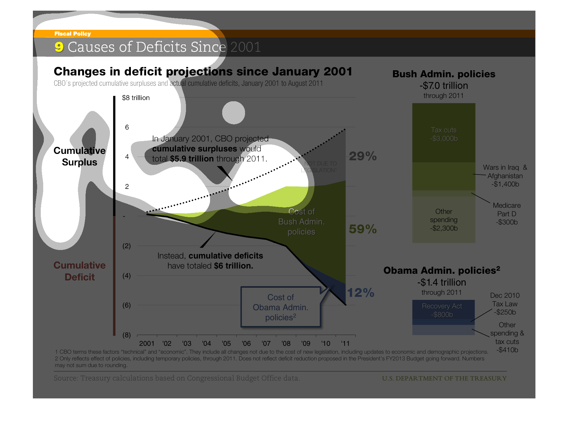
This graph shows the 9 causes of deficiencies since 2001 in the presidential administration.
The graph is divided by surplus as well as cumulative deficit. The Obama administration is
compared to the Bush administration, which shows how money was divided by each presidential
choice. There are several types of graphs used in this example, which allows the reader to
see a comparison and breakdown between each president.
This graph illustrates changes in deficit projections since January 2001 on a continuum of
cumulative deficit to cumulative surplus.  It also shows deficit in trillions cause by Bush
and Obama administration policies.
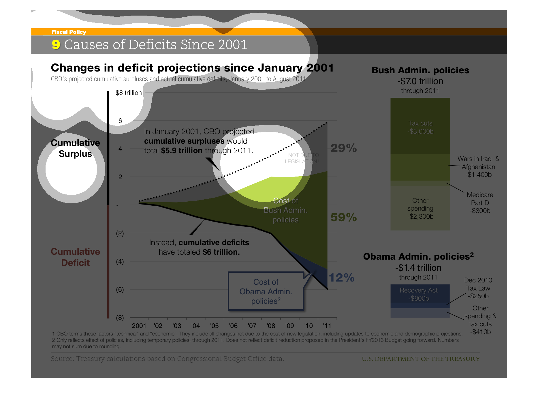
THESE PLOTS SHOW THE PROJECT GOVERNMENT DEFICIT VERSUS THE ACTUAL DEFICIT/SURPLUS OVER TIME.
ALSO, THE CAUSES OF THE DEFICIT ARE GIVEN ON THE RIGHT SIDE.
The image is associated with the 9 causes of deficits since 2001.  The main comparison of
deficits is made between the Bush Administration and Obama Administration in the United States.
 The image depicts that the Bush Administration through 2011 was the cause of a 7 trillion
dollar deficit.  Obama's policies cause a 1.4 trillion deficit.  The image also explains that
the Wars in Iraq as well as Medicare Part D were the leading causes of the deficit during
the Bush Administration.
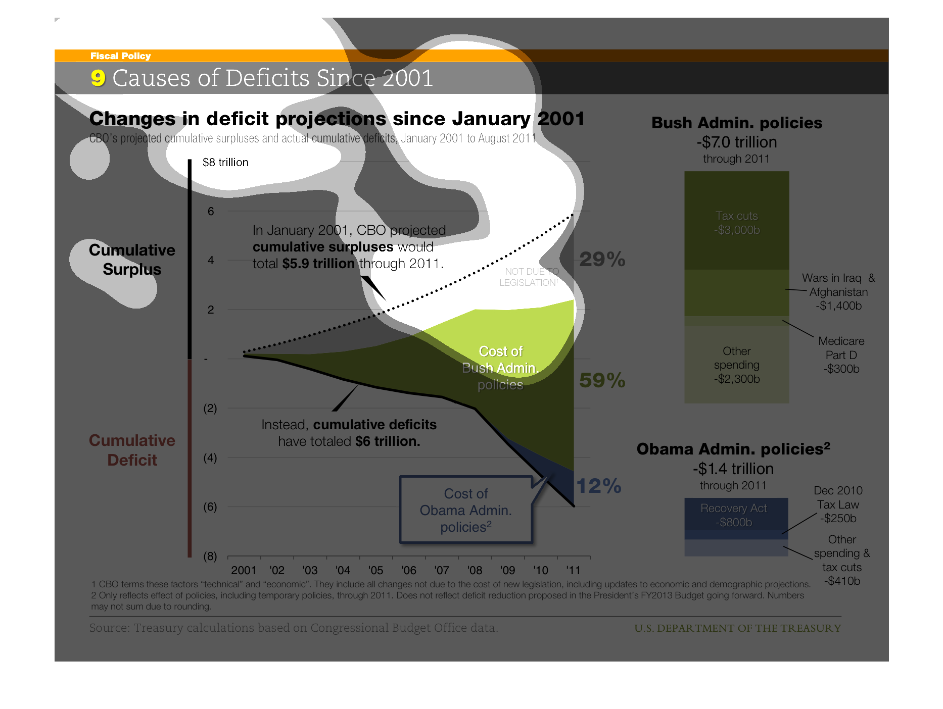
This graph shows the nine major causes of budget deficits in the United States since 2001.
It shows that the Bush administration policies were 7 trillion, while the Obama administration
policies were about 1.4 trillion.
causes of deficits since 2001, and changes in projections since January 2001. Cumulative surplus
versus cumulative deficit highlighting what exactly and who is responsible for what

This graph shows "9 Causes Deficits Since 2001. Changes in deficits projection since January
2001." Include Cumulative Surplus & Cumulative Deficit, Bush Administration Policies and Obama
Administration Policies.
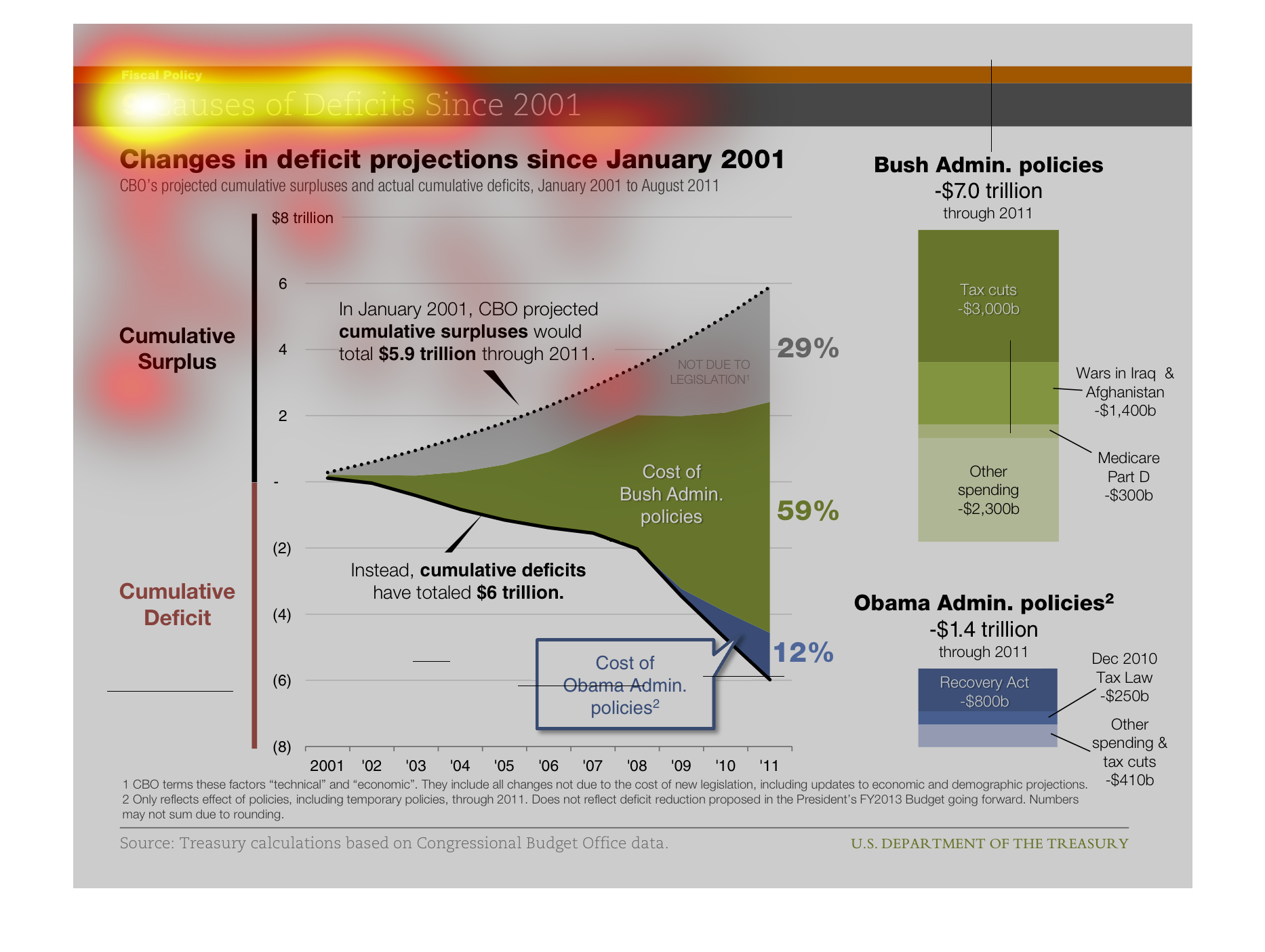
This chart describes changes in deficit projections since January 2001. Categories on the
chart include cumulative surplus, cumulative deficit, and Obama administration policies.
This image shows causes of deficits in the Unites States since 2001. Main idea: In January
2001, CBO projected cumulative surpluses $5,9 trillion through 2011. Instead cumulative deficits
in $6 trillion total.