Warning: Image is too big to fit on screen; displaying at 50%

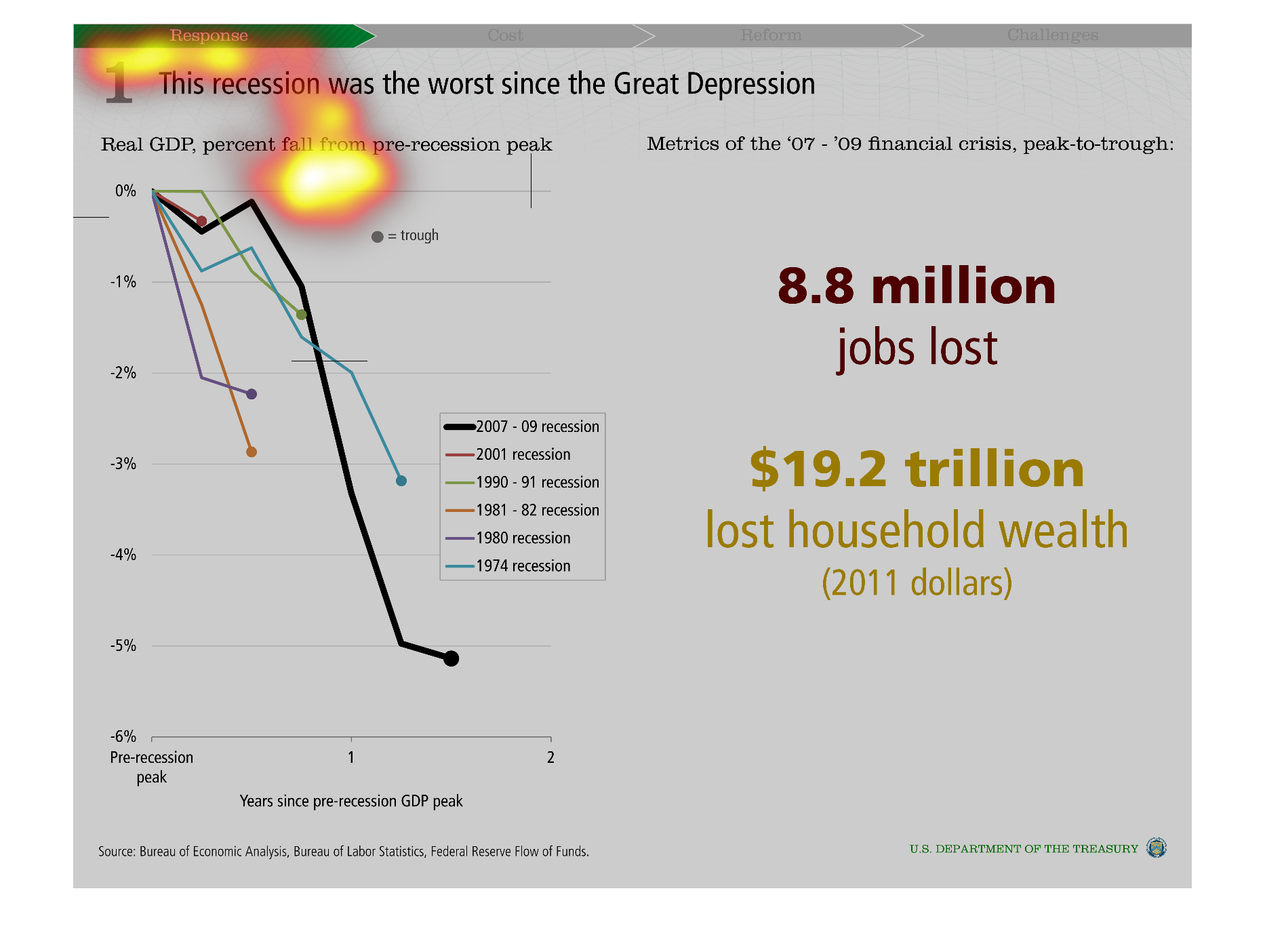
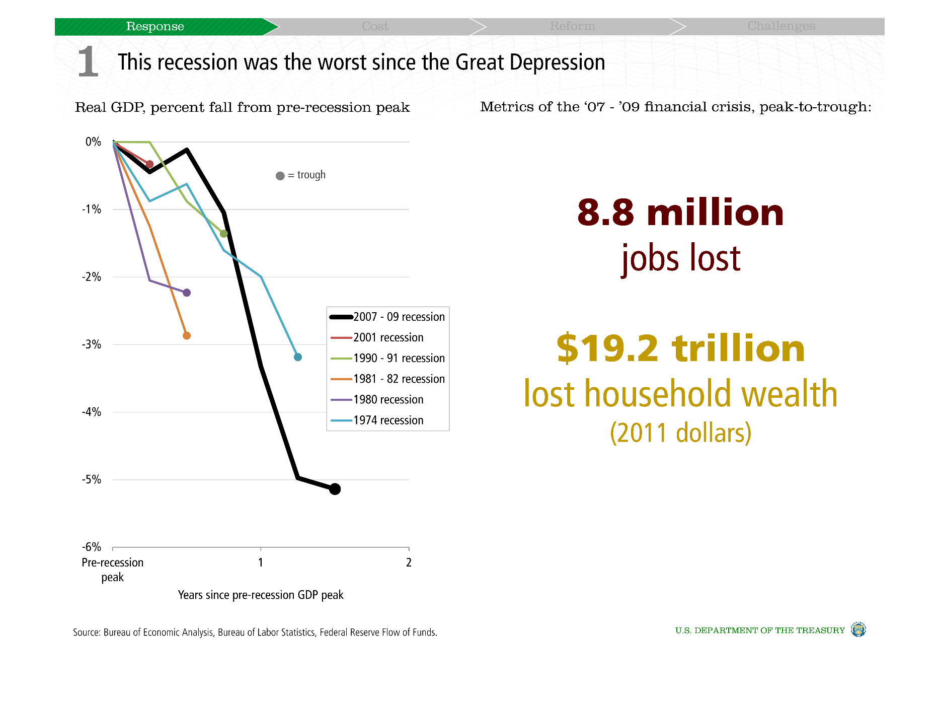
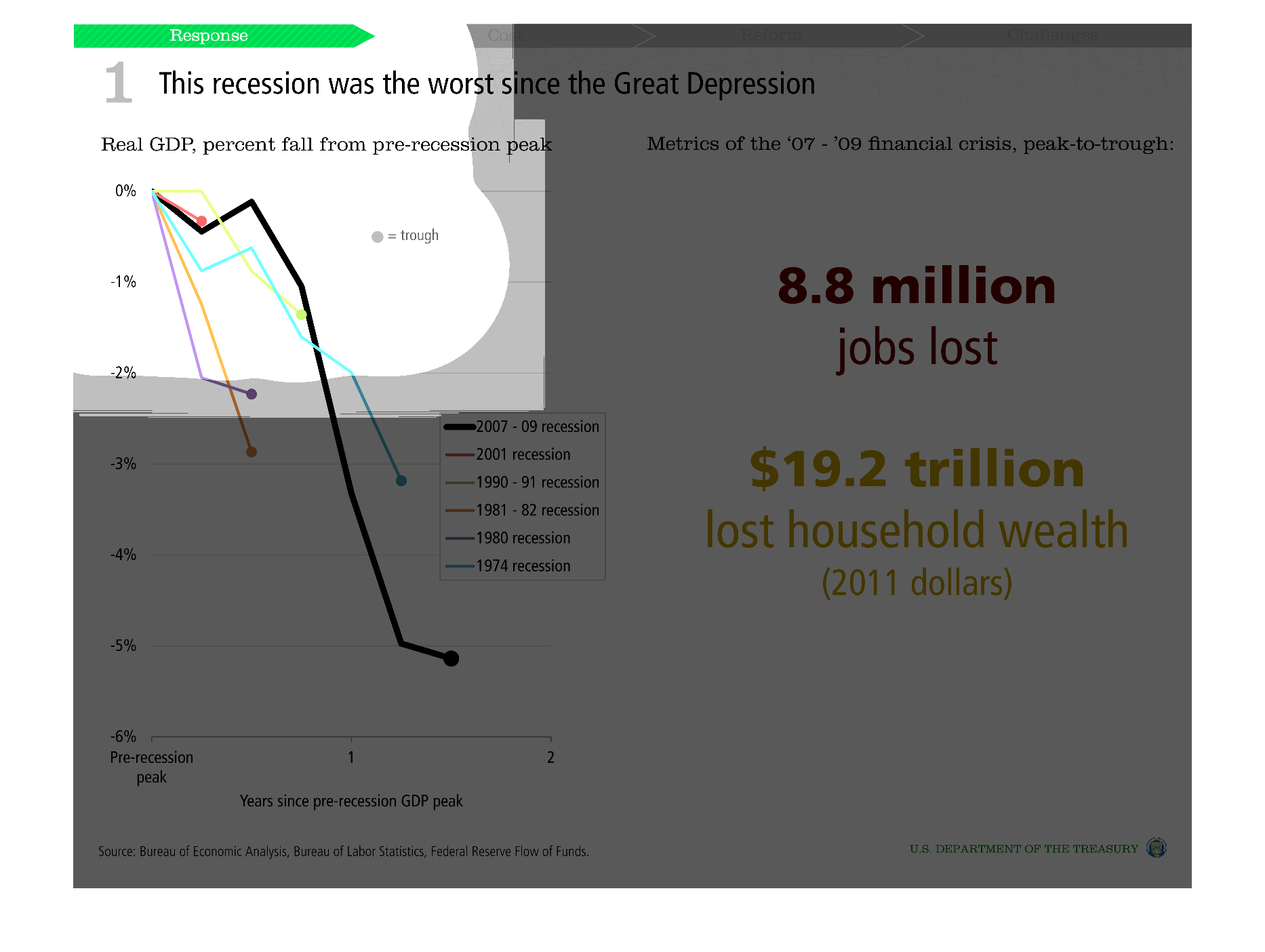
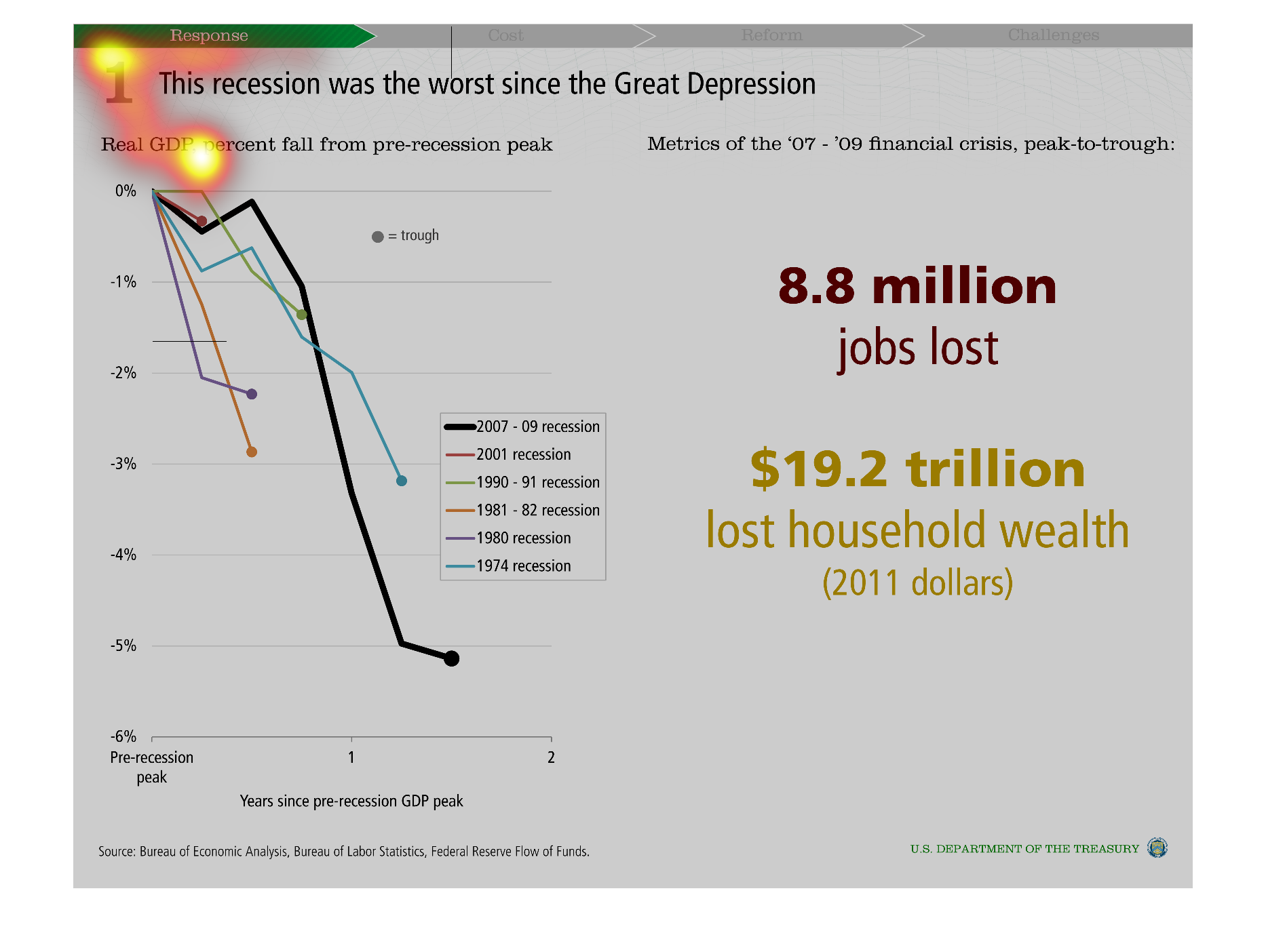
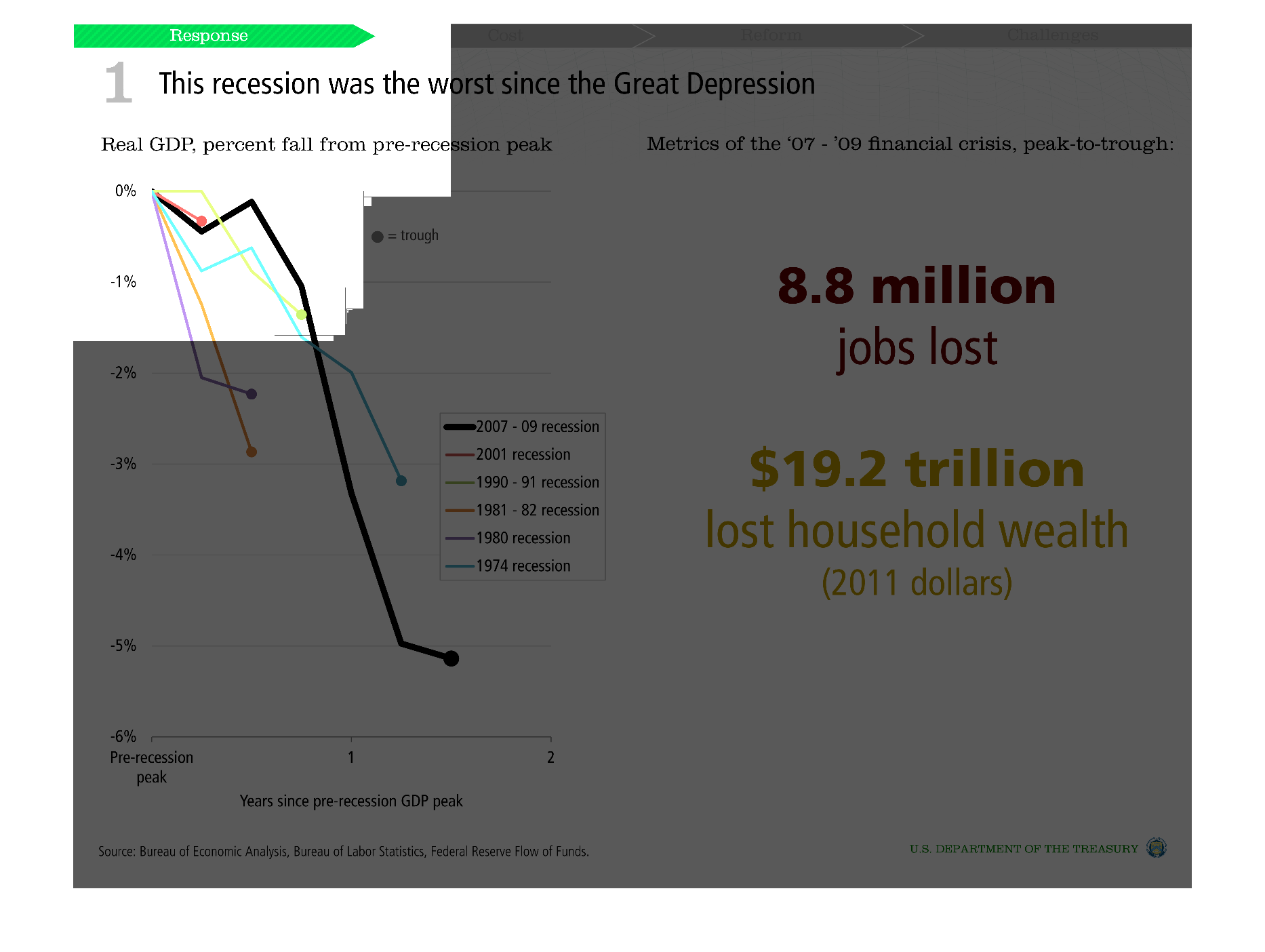
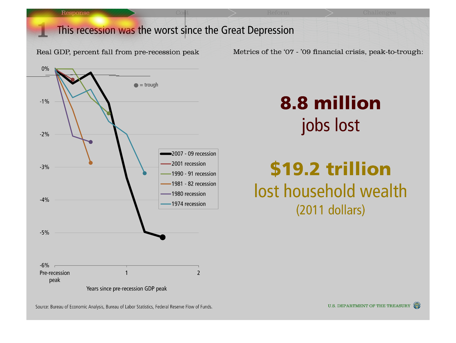
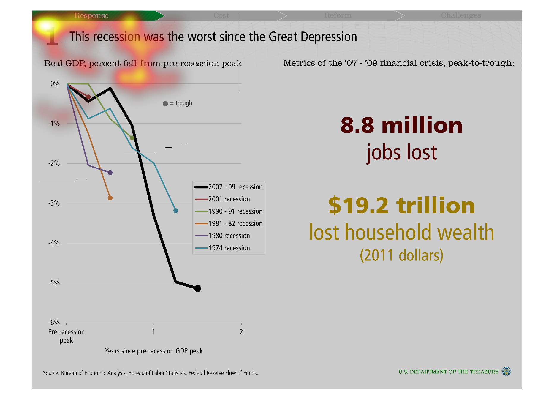
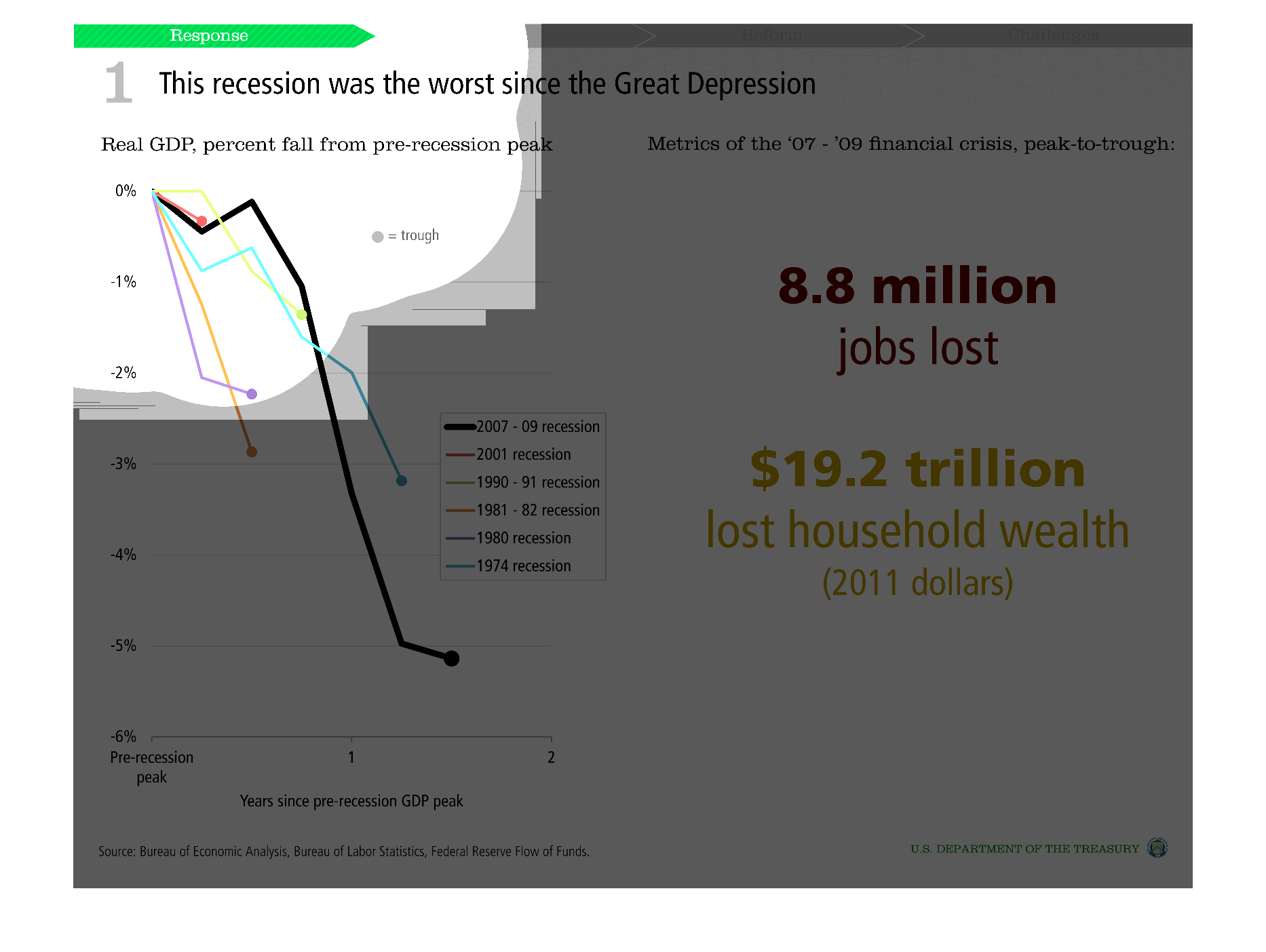
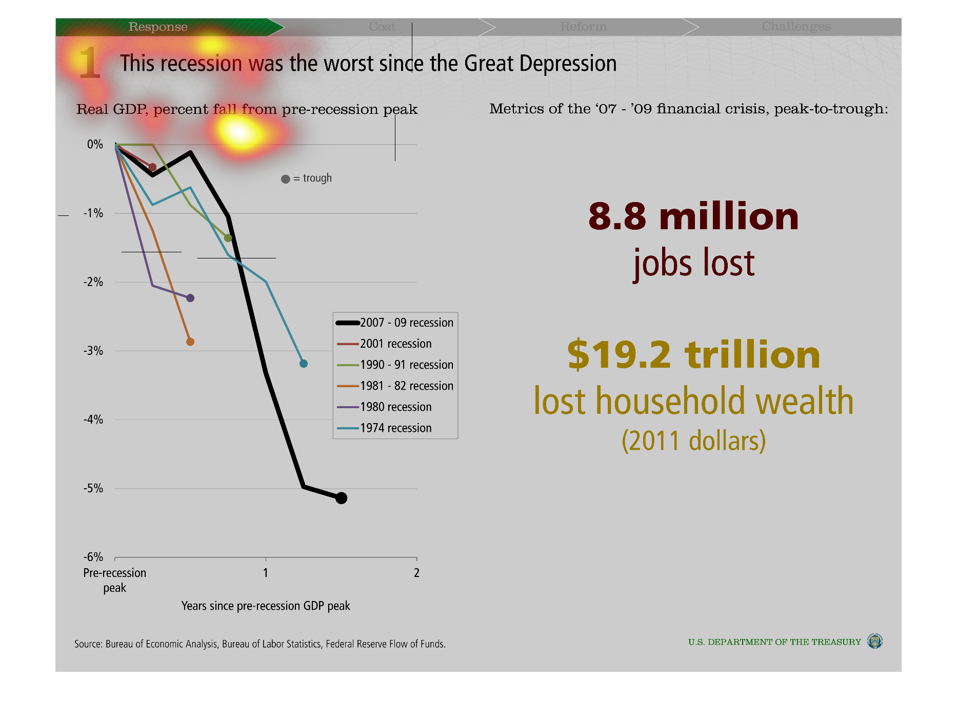
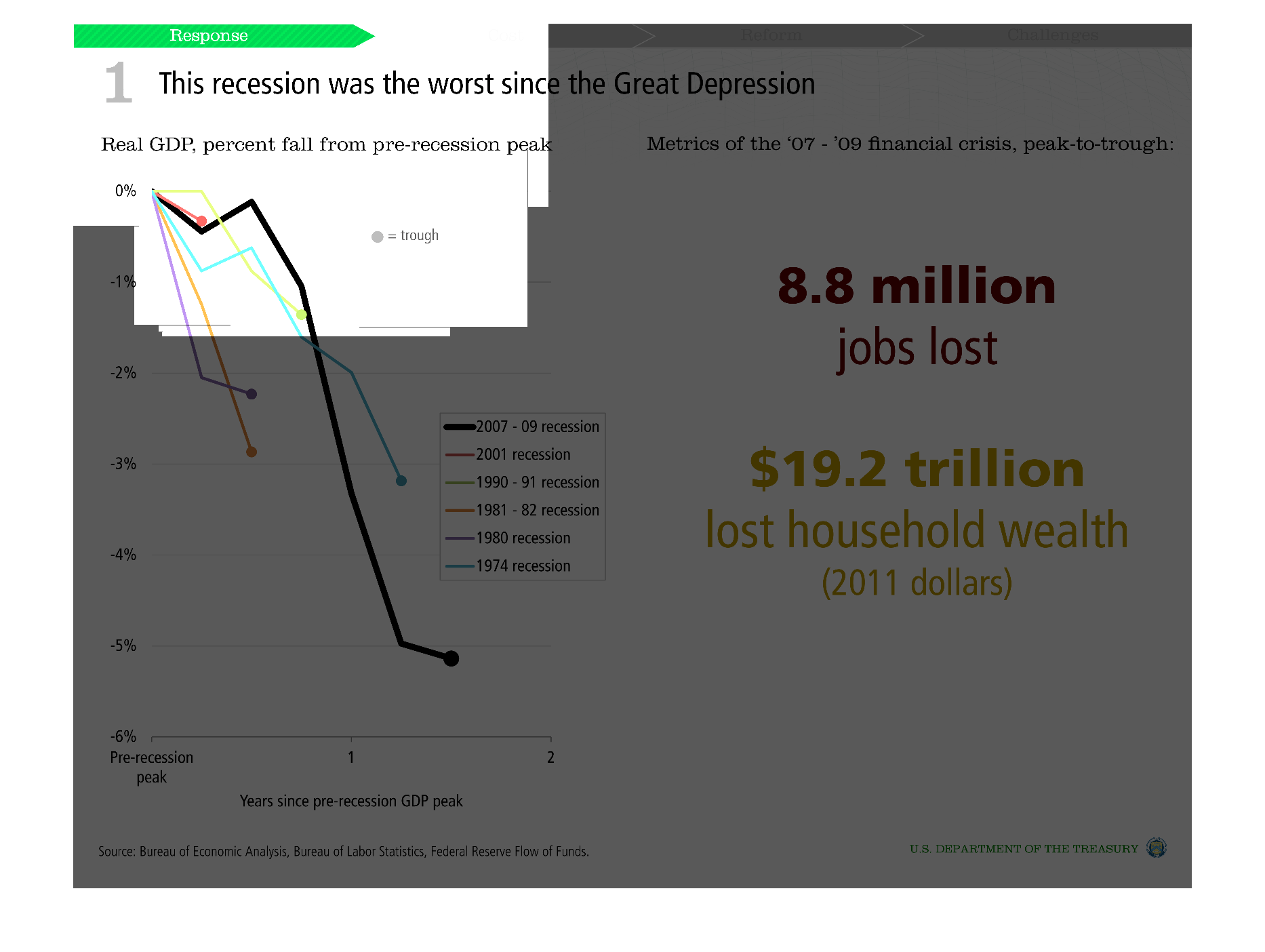
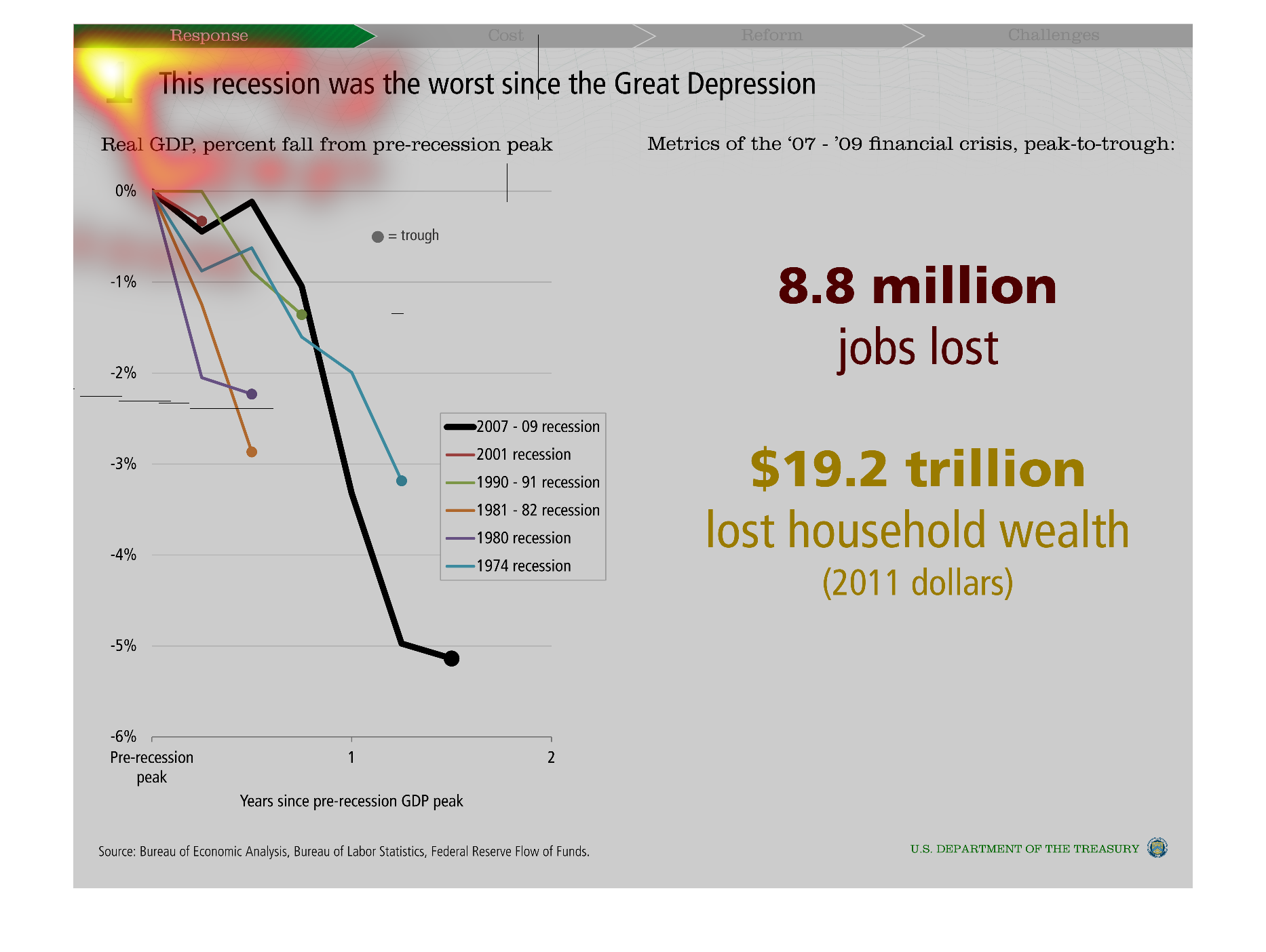
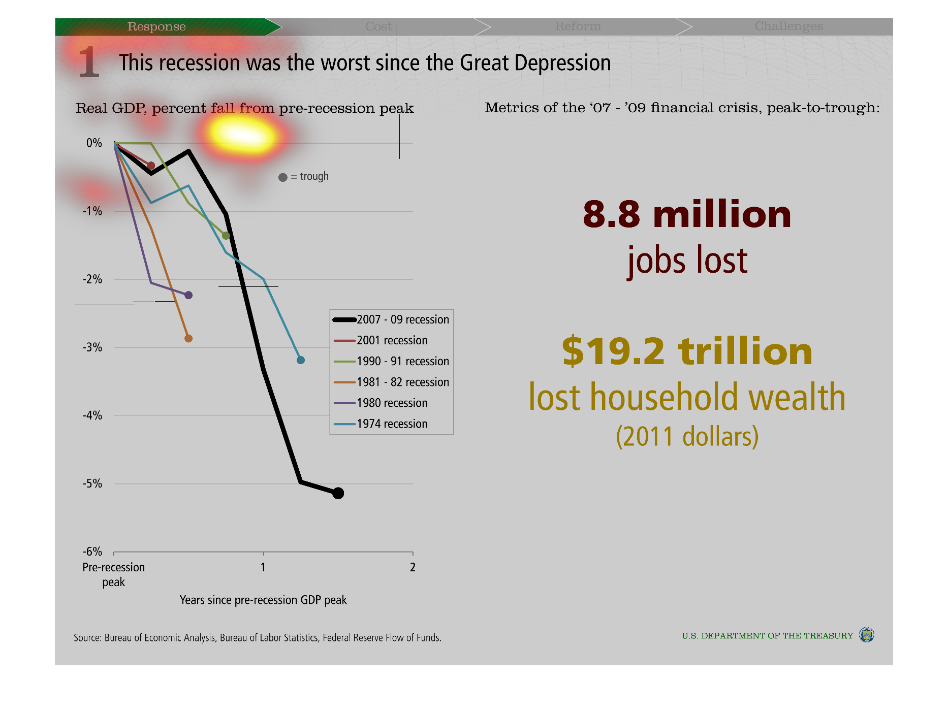
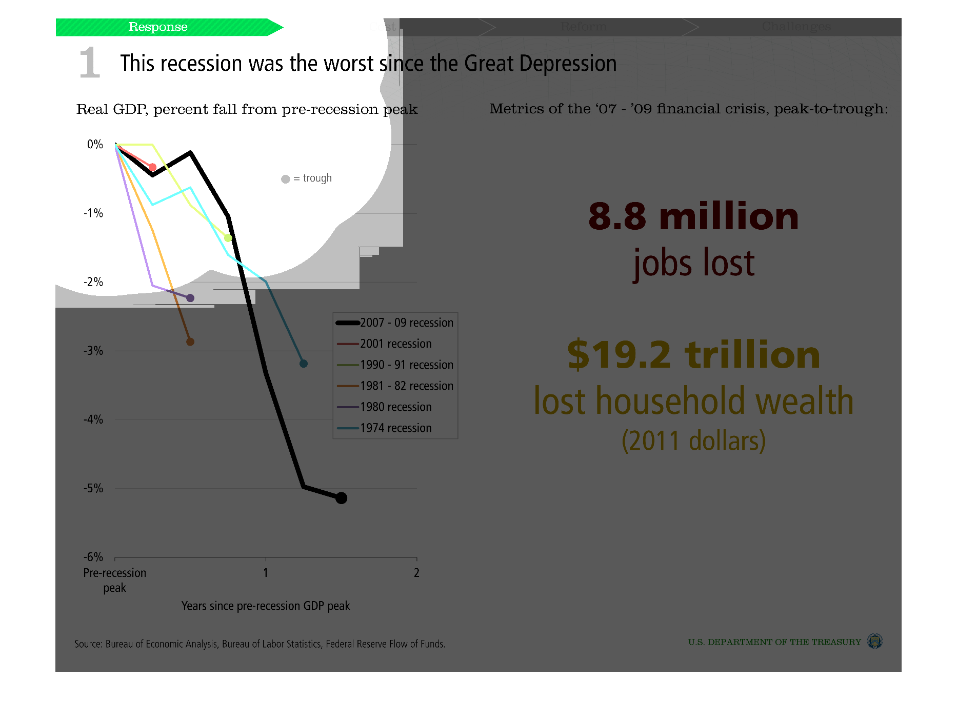
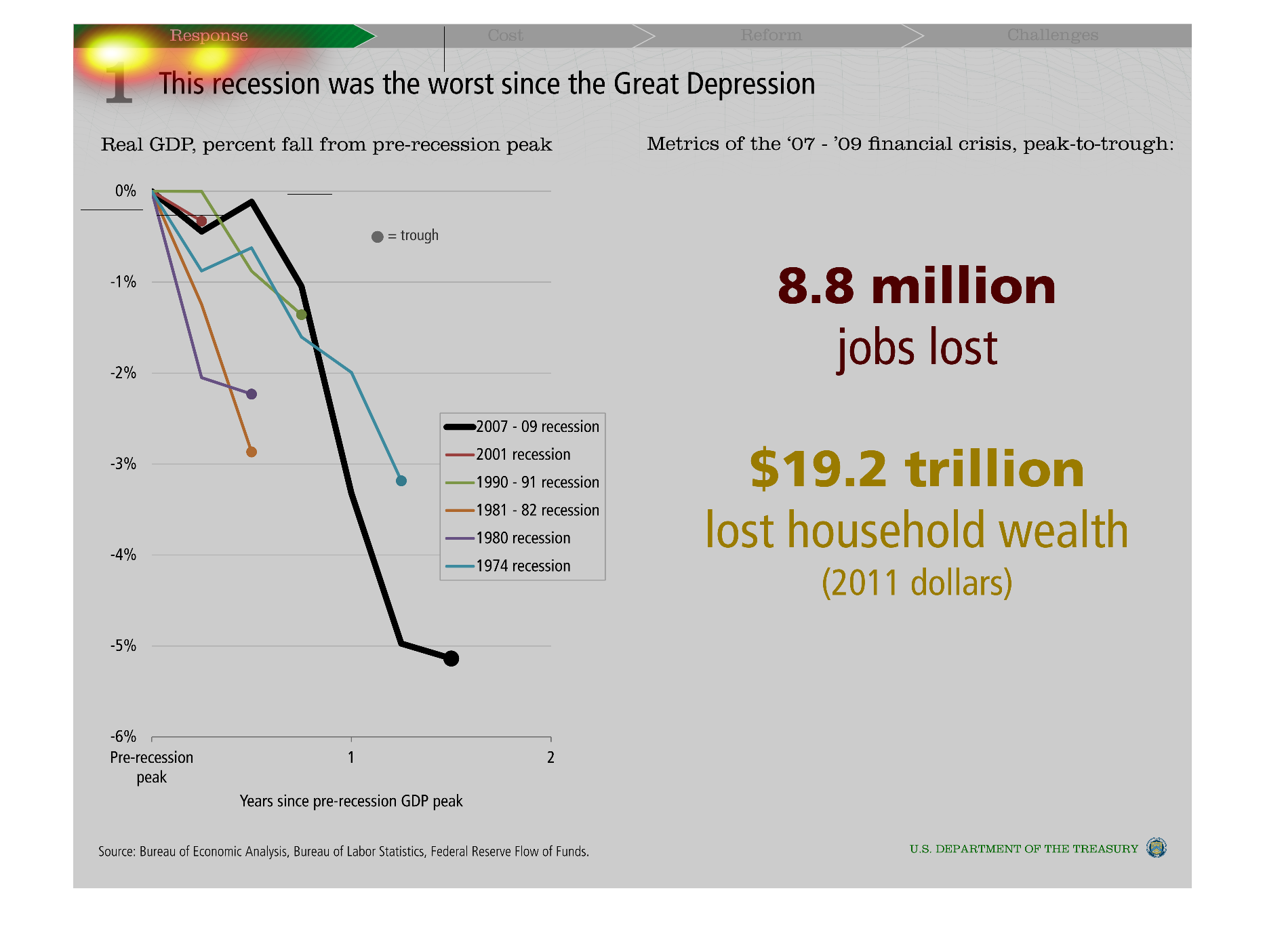
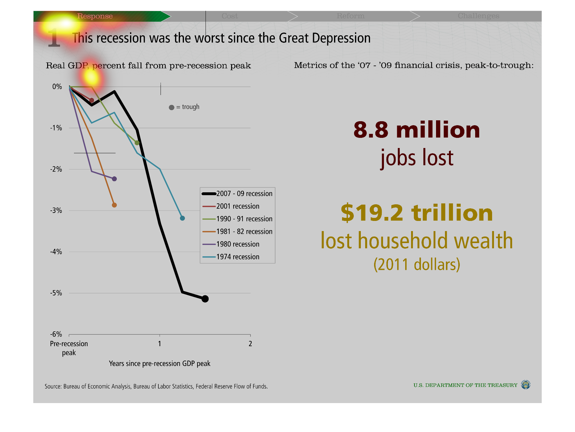
This graph tries to illustrate how the recent economic recession was just as bad as the great
depression during its day, based on level of lost jobs and wealth.
Warning: Image is too big to fit on screen; displaying at 50%
Warning: Image is too big to fit on screen; displaying at 50%


An infographic exploring the saying that this Depression was the worst thing since the Great
Depression. Its shows the read GDP, percentage fall since pre-recession
Warning: Image is too big to fit on screen; displaying at 50%
Warning: Image is too big to fit on screen; displaying at 50%


This graph shows the recession since the great Depression.  On the left is real GDP and on
the right is metrics of the financial crisis in 2007 to 2008.
Warning: Image is too big to fit on screen; displaying at 50%
Warning: Image is too big to fit on screen; displaying at 50%


This is describing the recession numbers from 2008.  The worst since the great depression.
 Showing number of jobs lost and lost household income the real gdp.
Warning: Image is too big to fit on screen; displaying at 50%
Warning: Image is too big to fit on screen; displaying at 50%


The chart shows the percentage of decline for GDP from pre recession peak, for these six recessions:
1974, 1980, 1981-1982, 1991-1992, 2001, 2007-2009.
Warning: Image is too big to fit on screen; displaying at 50%
Warning: Image is too big to fit on screen; displaying at 50%


This recession was the worst since the great depression, Metrics of the 2007 through 2009
recession. Compared to all recorded recessions in United States history. 19.2 trillion lost
in household wealth, 8.8 million jobs lost
Warning: Image is too big to fit on screen; displaying at 50%
Warning: Image is too big to fit on screen; displaying at 50%


This image graphs the latest repression stemming from the 07-09 financial crisis, noting that
8.8 million jobs  and $19.2 trillion in household wealth was lost.
Warning: Image is too big to fit on screen; displaying at 50%
Warning: Image is too big to fit on screen; displaying at 50%


This graph shows that the most recent recession was the worst since the great depression.
It illustrates the fall of GDP from pre-recession levels over time.
Warning: Image is too big to fit on screen; displaying at 50%
Warning: Image is too big to fit on screen; displaying at 50%


This is a chart saying the recession was the worst since the great depression. The chart states
there was a $19.2 trillion loss of household wealth in 2011 dollars.
Warning: Image is too big to fit on screen; displaying at 50%
Warning: Image is too big to fit on screen; displaying at 50%


This chart clearly displays that this depression was the worst since the great depression.
This chart shows the real GDP percent fall from the pre-recession peak.
Warning: Image is too big to fit on screen; displaying at 50%
Warning: Image is too big to fit on screen; displaying at 50%


This is a chart about recessions. It shows a chart of the path of different recessions in
different years. It emphasizes the worst recession being the one of 2002. It is depicting
recessions from 1974 to 2002.
Warning: Image is too big to fit on screen; displaying at 50%
Warning: Image is too big to fit on screen; displaying at 50%


This chart describes that this recession was the worst since the great depression. Years of
recession covered in the chart include 1974, 1980, 1981, 1990 - 91, and 2001.
Warning: Image is too big to fit on screen; displaying at 50%
Warning: Image is too big to fit on screen; displaying at 50%


The following chart gives data to prove that the great recession of 2008-2009 was the worst
since the Great Depression. With over 8.8 million people loosing a job and over 19.2 Trillion
dollars in wealth lost.
Warning: Image is too big to fit on screen; displaying at 50%
Warning: Image is too big to fit on screen; displaying at 50%
