Warning: Image is too big to fit on screen; displaying at 50%
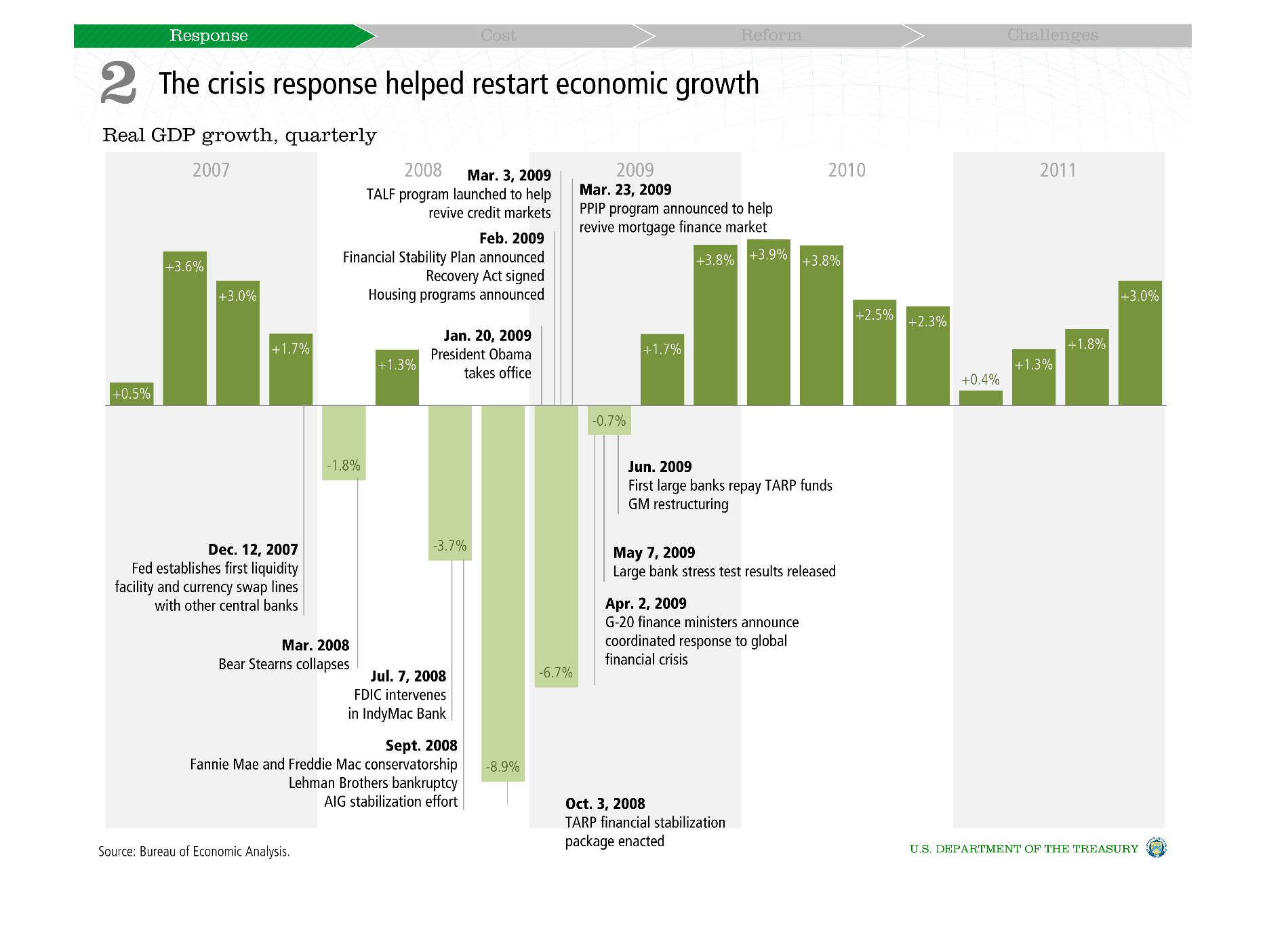
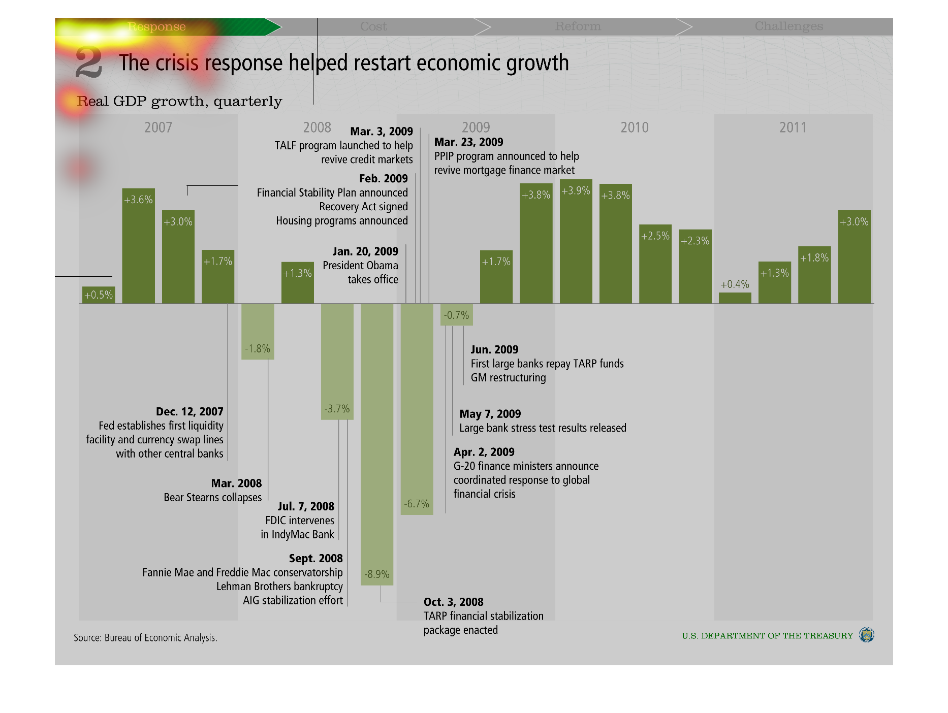
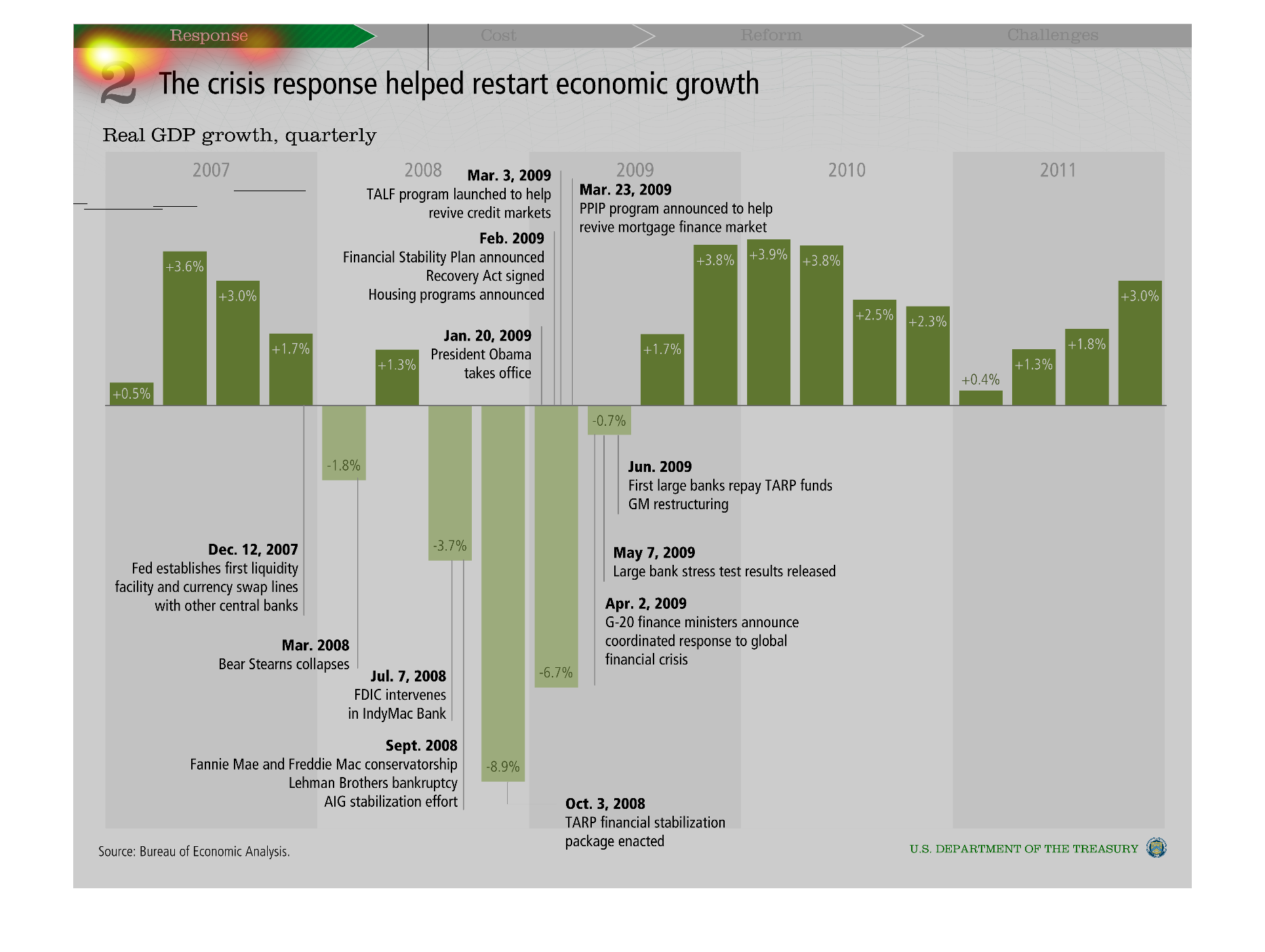
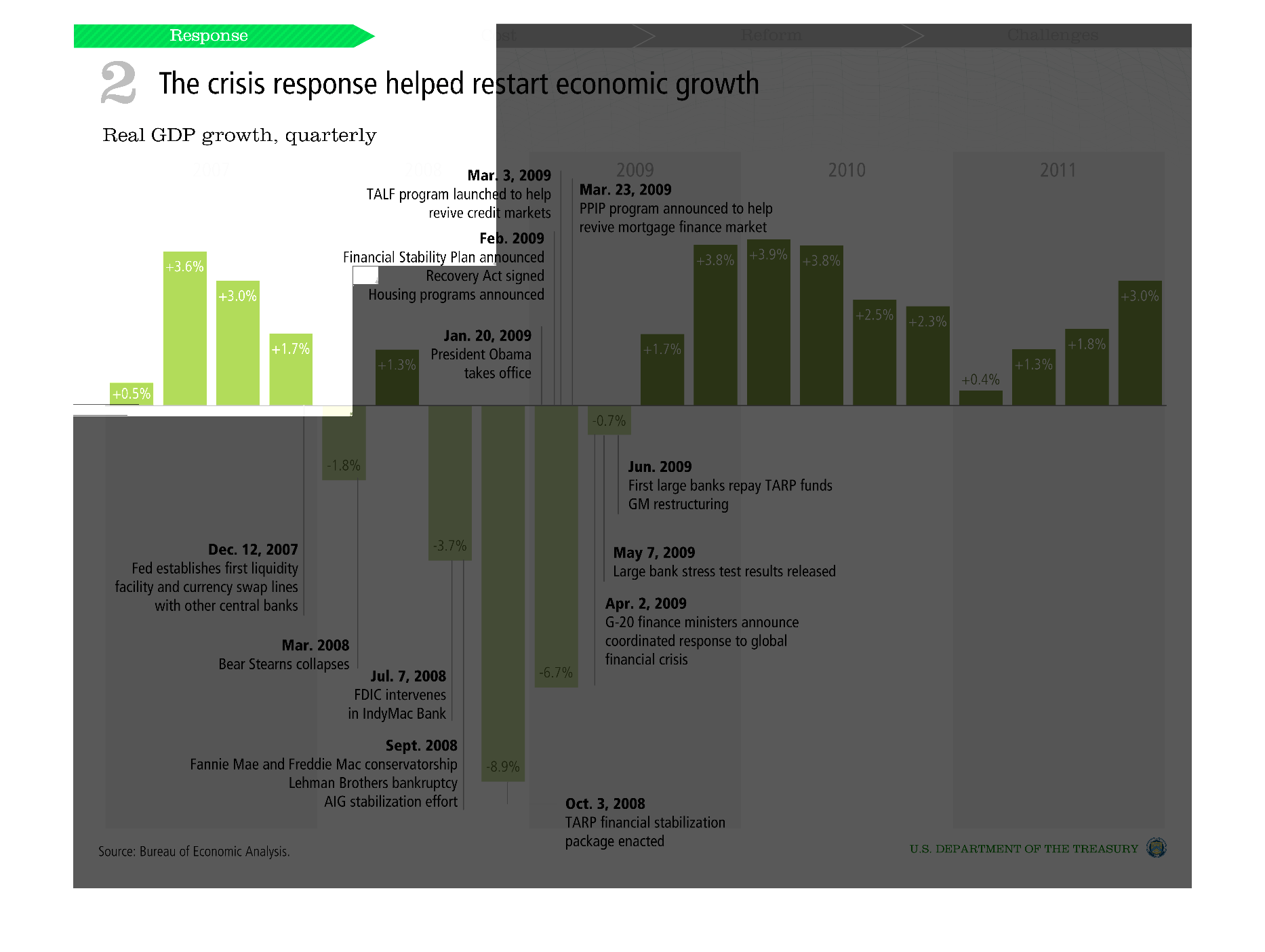
The image seems to be from an article that describes the response to the economic crisis,
and intends to show that that response has provided the economic growth. It is also shown
a bar graph which shows the real GDP growth by quarters.
Warning: Image is too big to fit on screen; displaying at 50%
Warning: Image is too big to fit on screen; displaying at 50%

the crisis response helped restart economic growth, according to quarterly GDP growth, even
after growth and a sudden plummet it has mostly evened out
Warning: Image is too big to fit on screen; displaying at 50%
Warning: Image is too big to fit on screen; displaying at 50%
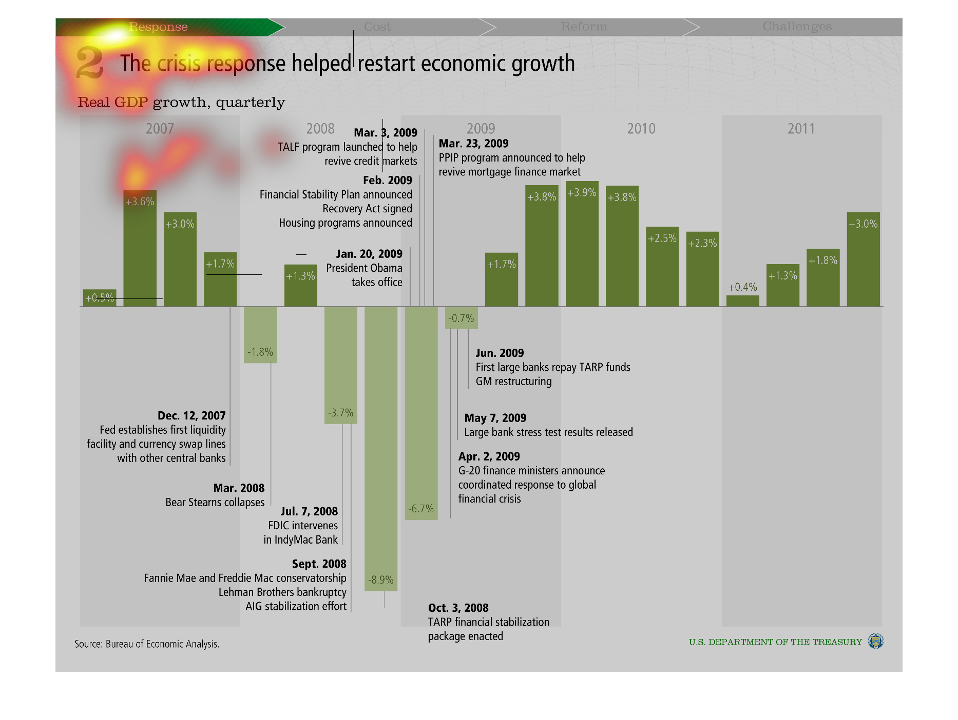
An infographic showing how the response to the recession causes GDP real growth. It does the
timeline of response and the resulting changes in GDP growth
Warning: Image is too big to fit on screen; displaying at 50%
Warning: Image is too big to fit on screen; displaying at 50%
This are graphs that show the real gross domestic product growth for the quarter selected.
The figures shown are for the hear 2009 and they cover various sectors of the economy.
Warning: Image is too big to fit on screen; displaying at 50%
Warning: Image is too big to fit on screen; displaying at 50%
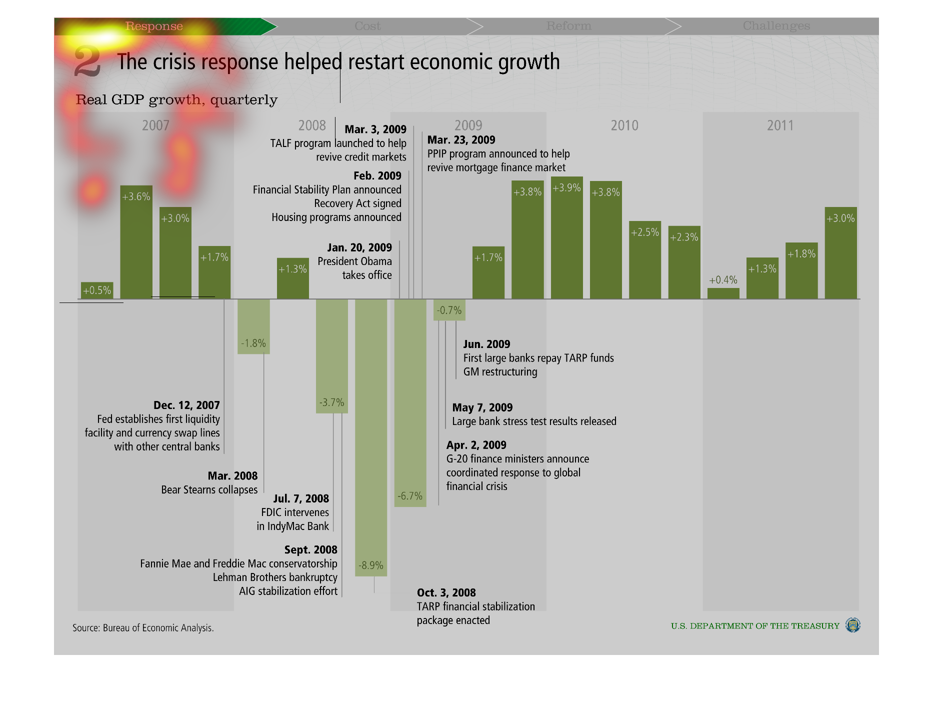
This graph talking about economic growth and the crash of ~2008 and how low it got in those
surrounding years. It is now on an upward trend, but went down again in ~2010.
Warning: Image is too big to fit on screen; displaying at 50%
Warning: Image is too big to fit on screen; displaying at 50%
This chart describes how the crisis response helped restart economic growth. Specifically
real GDP growth, quarterly. The chart covers multiple years throughout.
Warning: Image is too big to fit on screen; displaying at 50%
Warning: Image is too big to fit on screen; displaying at 50%
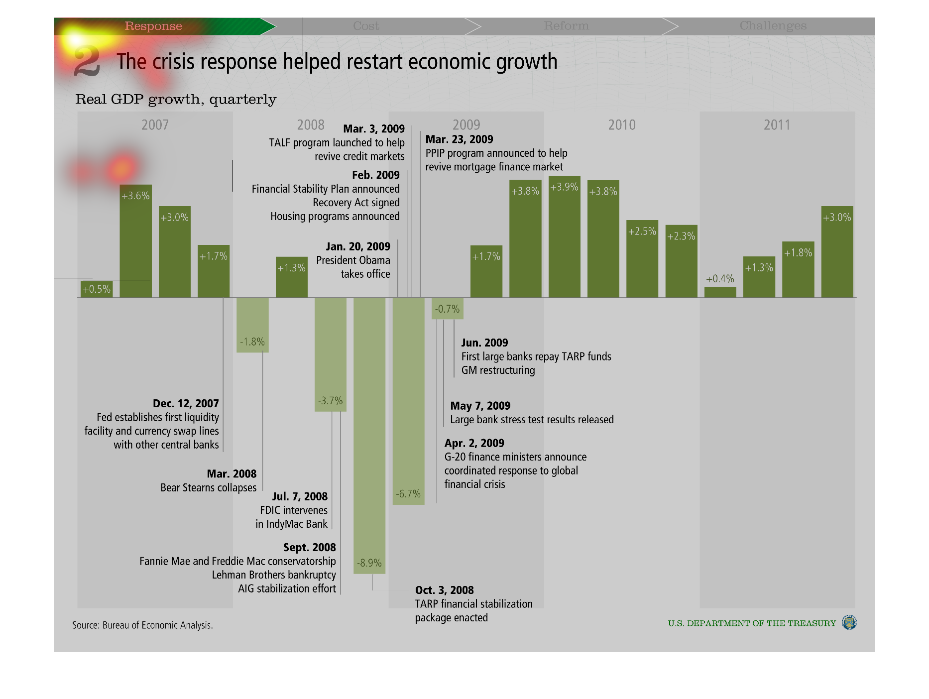
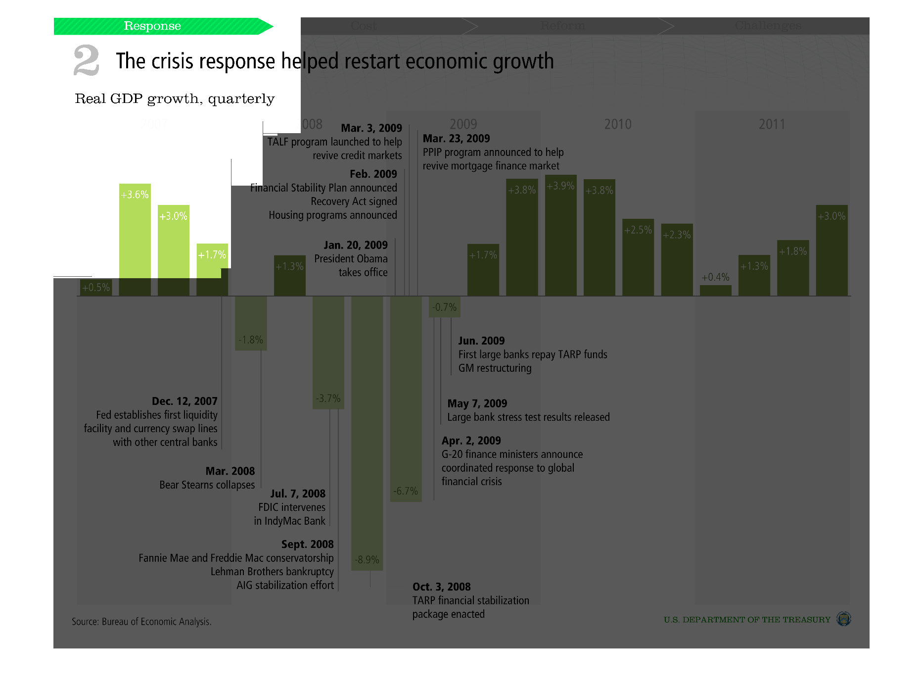
Chart showing the crisis response that helped restart economic growth. it details the 2008
housing crash caused by the CRA and the subsequent economic recovery.
Warning: Image is too big to fit on screen; displaying at 50%
Warning: Image is too big to fit on screen; displaying at 50%
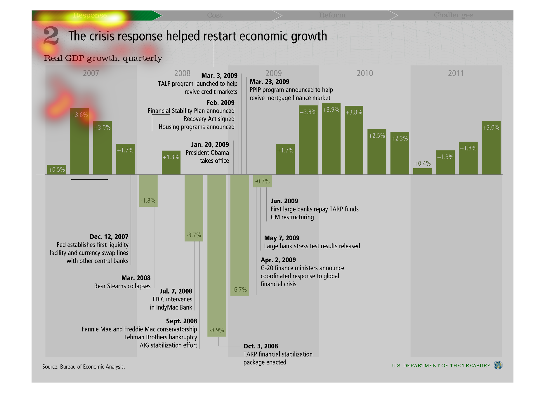
The image describes the finances of the government over a period of time based on the actions
that the government took. The first half of the image describes GDP growth from 2007 - 2008.
The second half of the image describes GDP growth from 2009 to 2010.
Warning: Image is too big to fit on screen; displaying at 50%
Warning: Image is too big to fit on screen; displaying at 50%
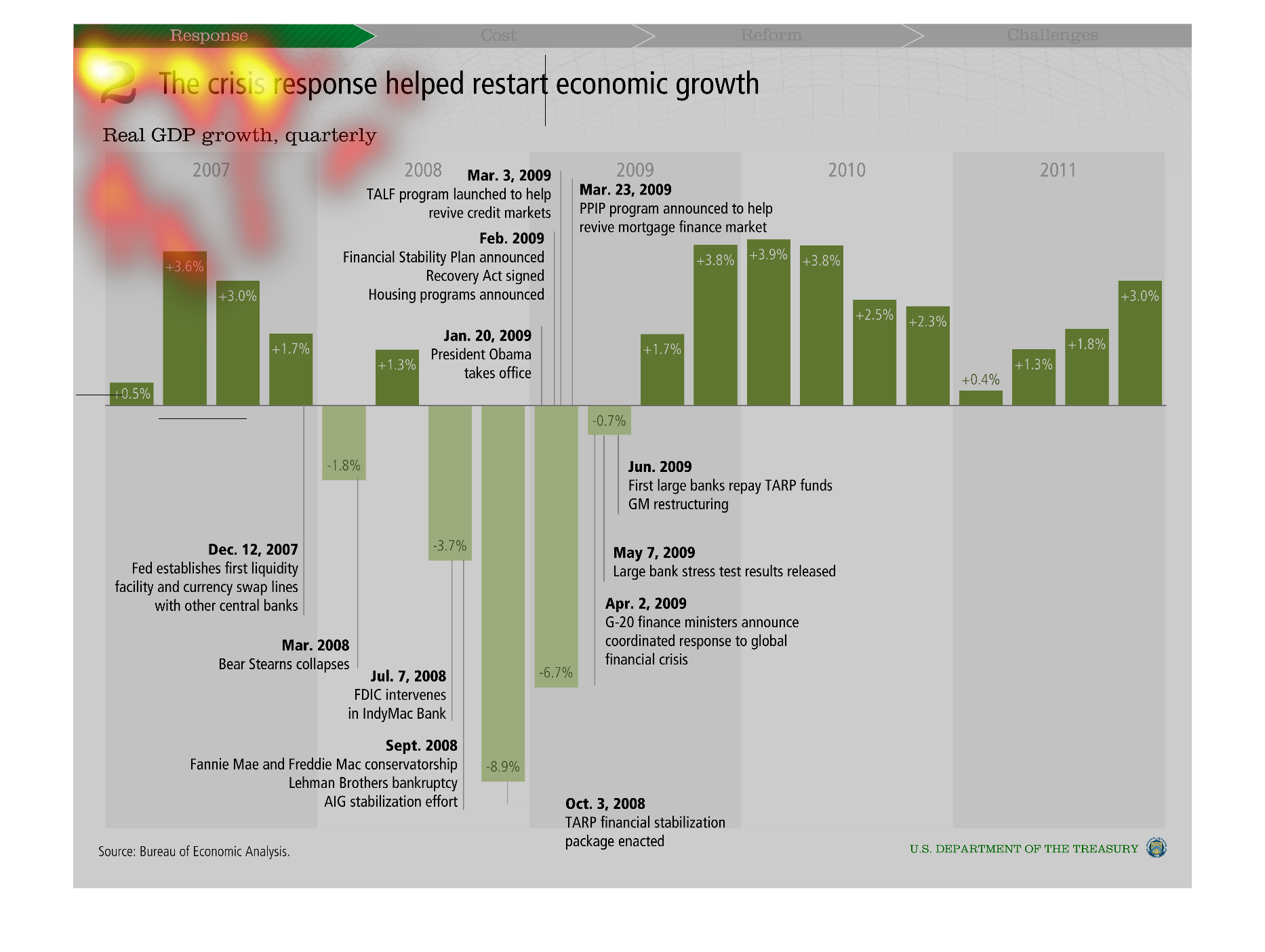
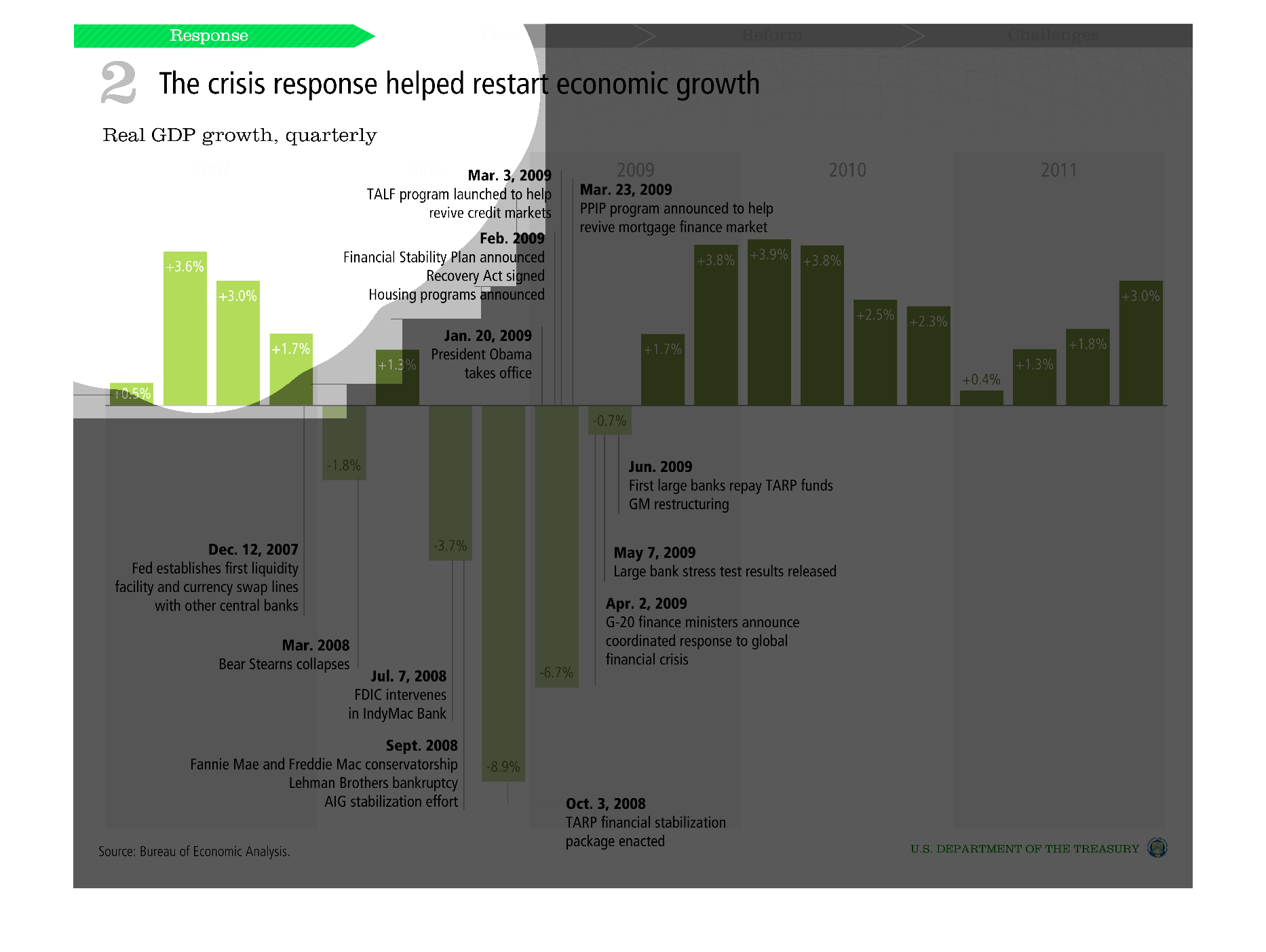
This graph shows how the crisis response helped restart economic growth.  It shows real GDP
growth quarterly and summarizes milestones throughout the period.
Warning: Image is too big to fit on screen; displaying at 50%
Warning: Image is too big to fit on screen; displaying at 50%
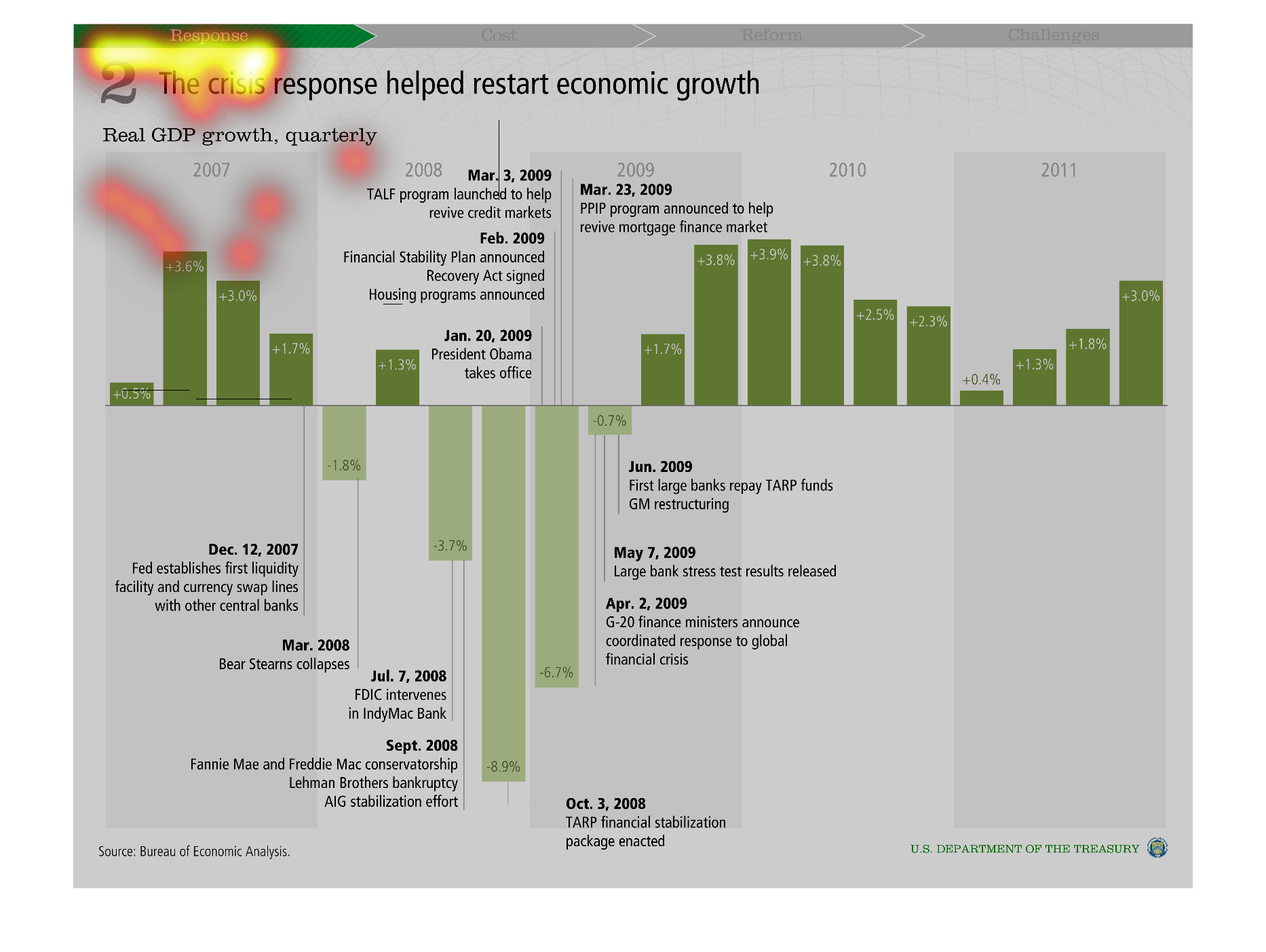
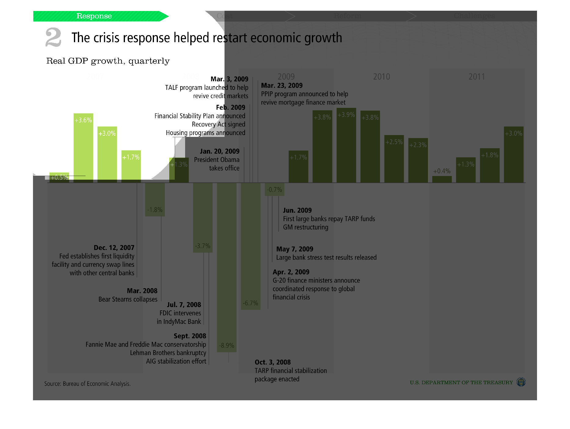
These graphs show different metrics that chart economic performance over time. They attempt
to show the effect that economic stimulus had on Real GDP Growth following the 2008 economic
collapse.
Warning: Image is too big to fit on screen; displaying at 50%
Warning: Image is too big to fit on screen; displaying at 50%
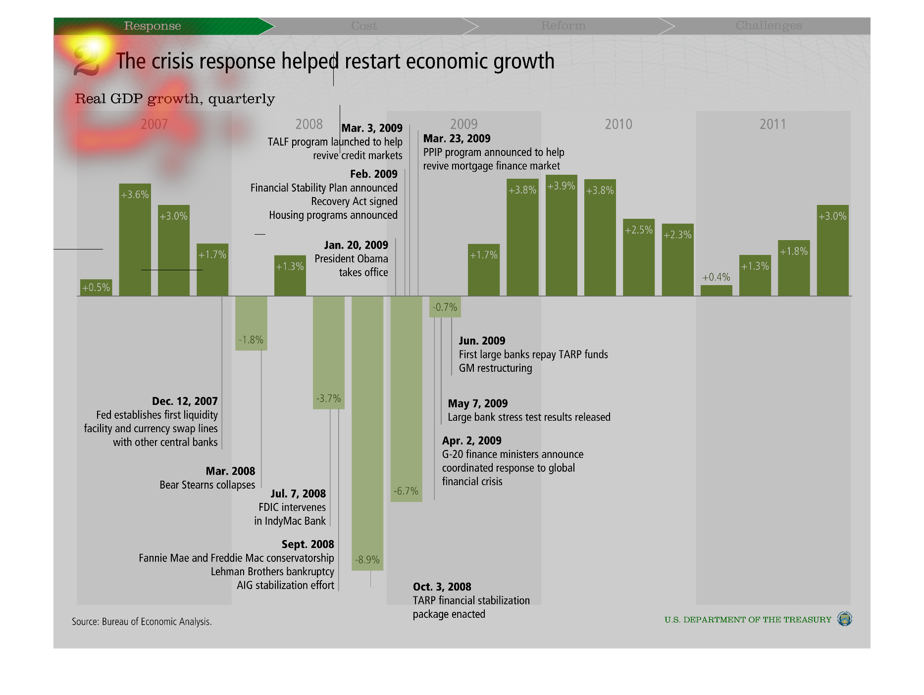
US department of treasury issues a report indicating economic growth was restarted by the
crisis. There was a downfall until 2009 when Obama took office. After that, he helped with
this crisis by implementing new plans.
Warning: Image is too big to fit on screen; displaying at 50%
Warning: Image is too big to fit on screen; displaying at 50%
This is a series of graphs depicting how the response to the financial crises helped to restart
the economy in terms of quarterly real GDP growth in the United States.
Warning: Image is too big to fit on screen; displaying at 50%
Warning: Image is too big to fit on screen; displaying at 50%
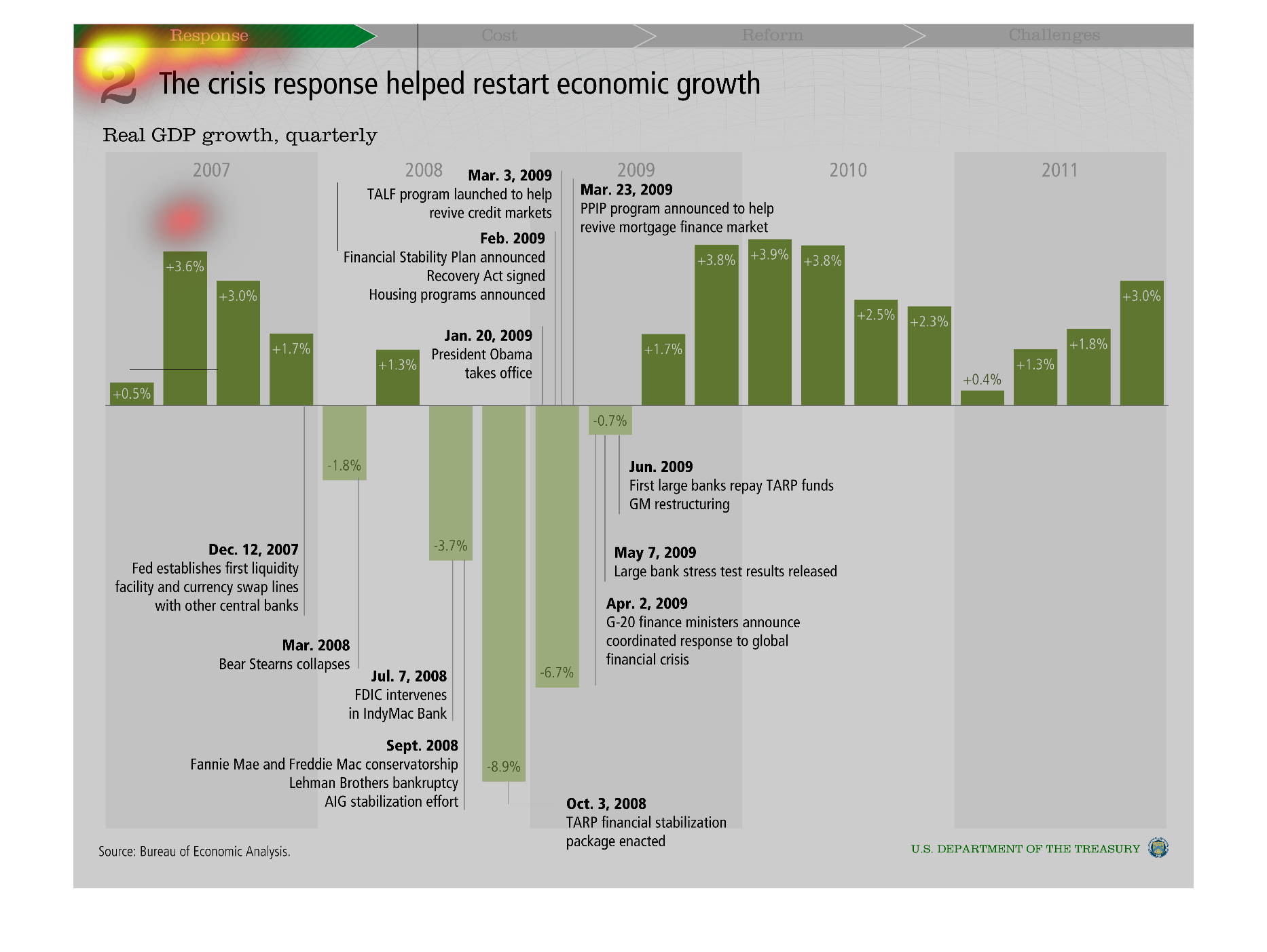
The title of this chart is: 2 The crisis response helped restart economic growth, real GPD
growth, quarterly. on of the dates that is documented for is Mar., 3rd 2009.
Warning: Image is too big to fit on screen; displaying at 50%
Warning: Image is too big to fit on screen; displaying at 50%