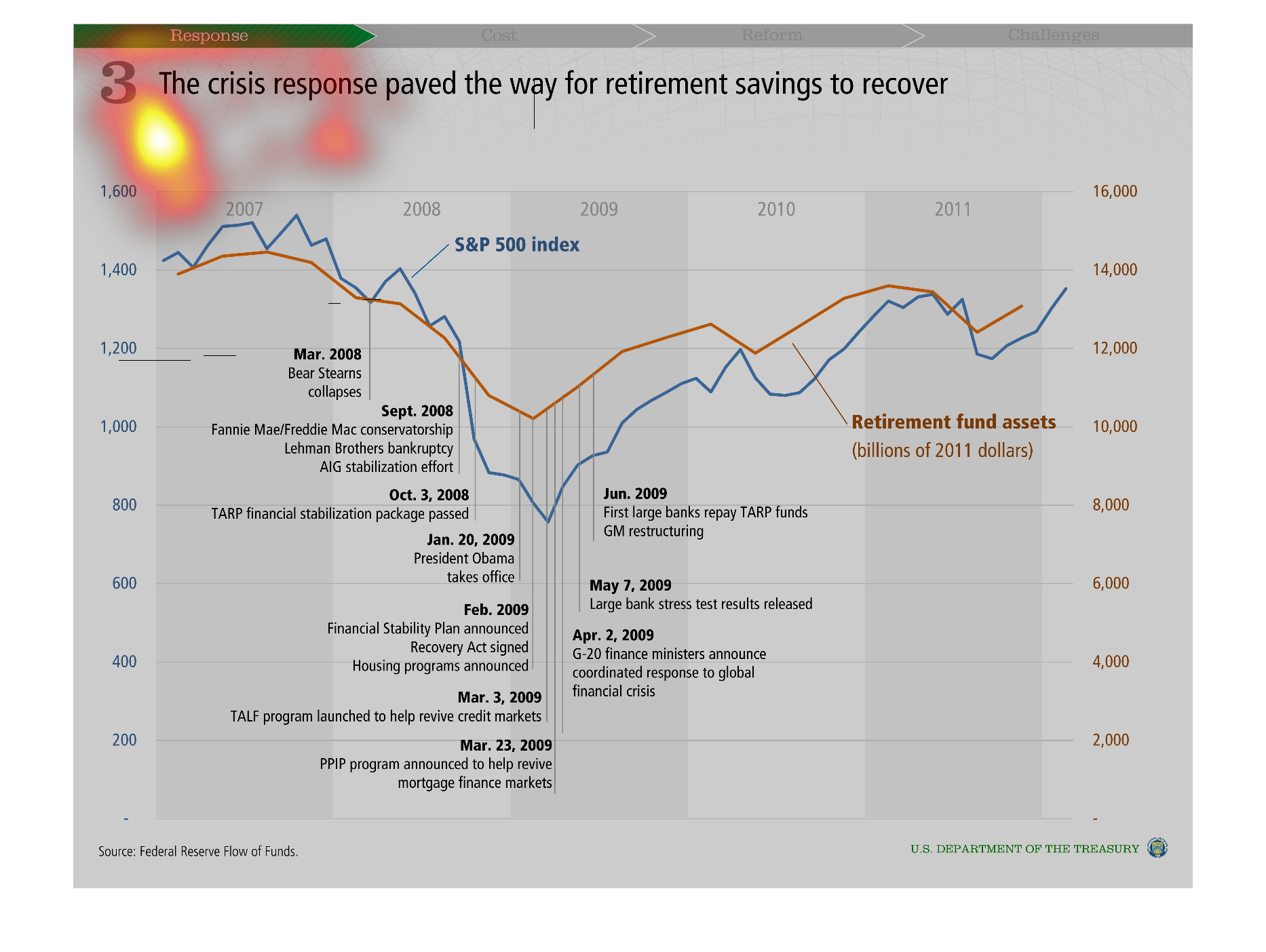
Warning: Image is too big to fit on screen; displaying at 50%
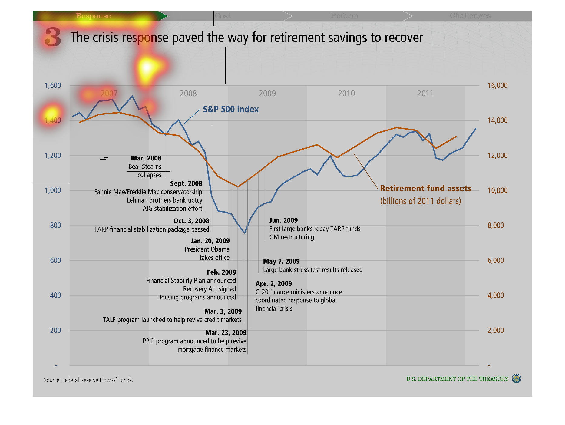
This chart shows the crisis paved the way for retirement savings to recover from March 2008
to March 2009. The chart shows retirement funds assets around 14,000 as of 2011.
Warning: Image is too big to fit on screen; displaying at 50%
Warning: Image is too big to fit on screen; displaying at 50%
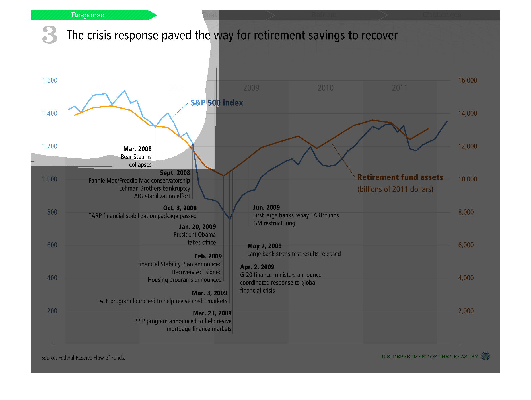
This graphic chart is titled the "Crisis response paved the way to retirement savings recover.the
chart goes from the number 0 to 1600. Chart says retirement chart funds and other things like
that. It's very hard to read this chart compared to the others. It shows the dates of certain
events.
Warning: Image is too big to fit on screen; displaying at 50%
Warning: Image is too big to fit on screen; displaying at 50%
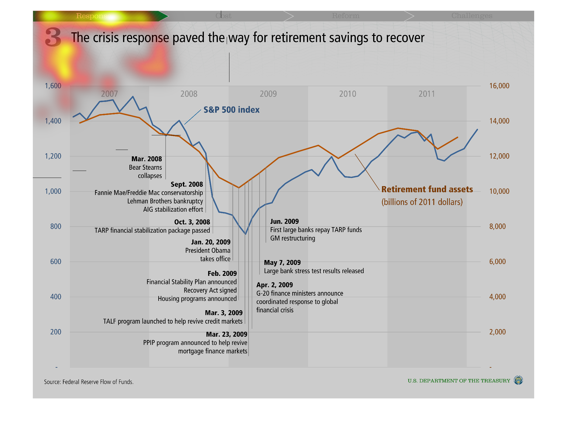
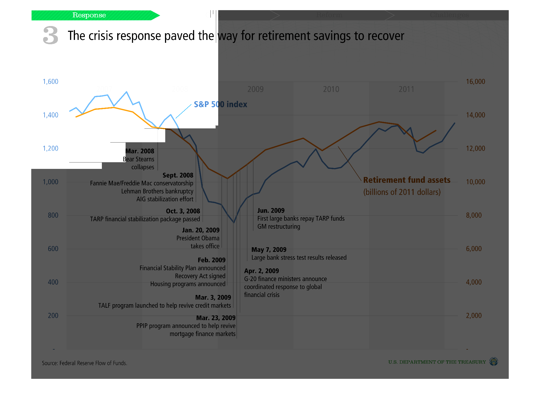
This is a chart of the stock market, and retirement fund assets, specifically over the years
of the great recession.  key points are labeled relating to the responses to the crisis, so
that the correlation between the response and the financial markets can be seen.
Warning: Image is too big to fit on screen; displaying at 50%
Warning: Image is too big to fit on screen; displaying at 50%
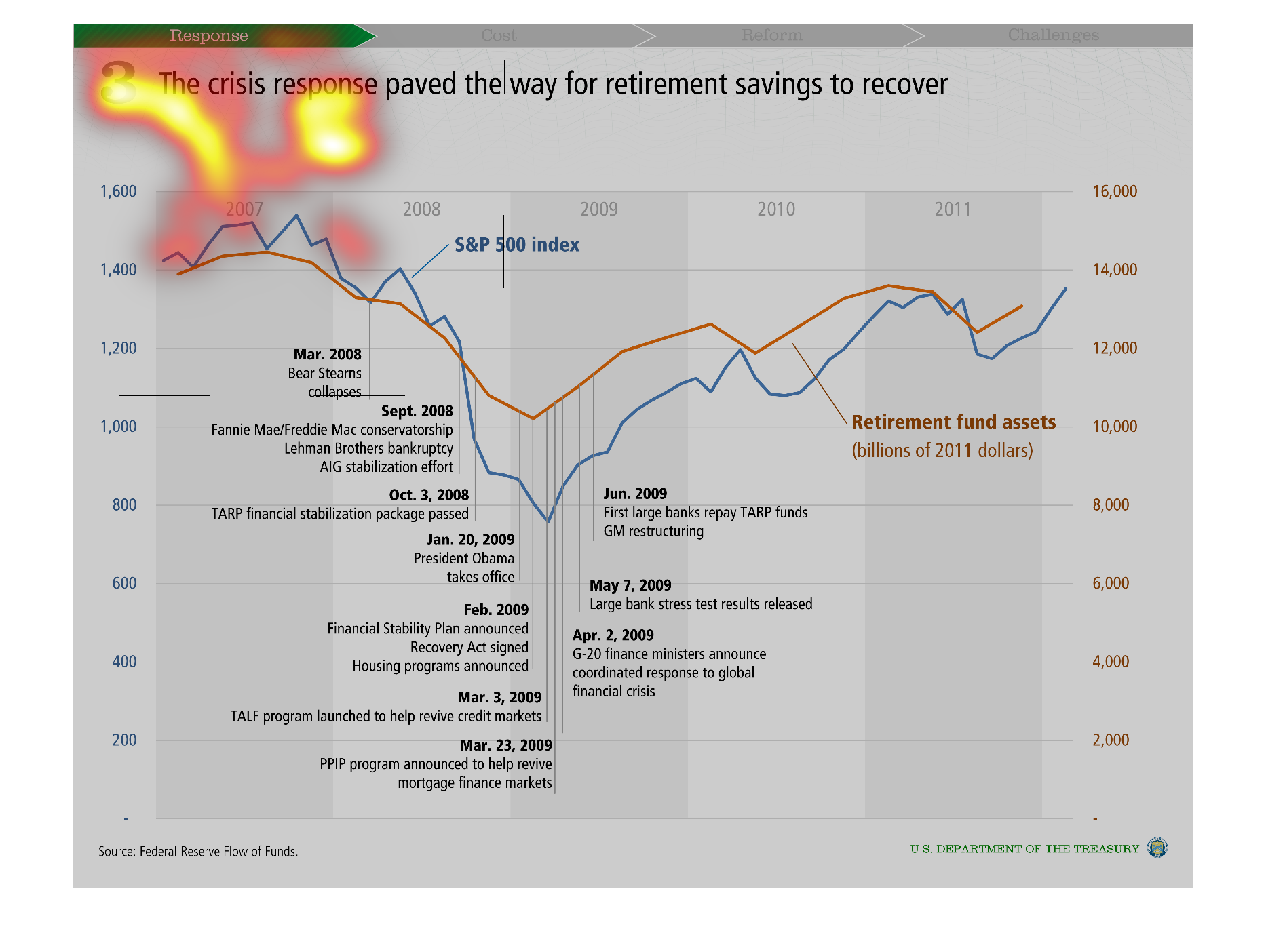
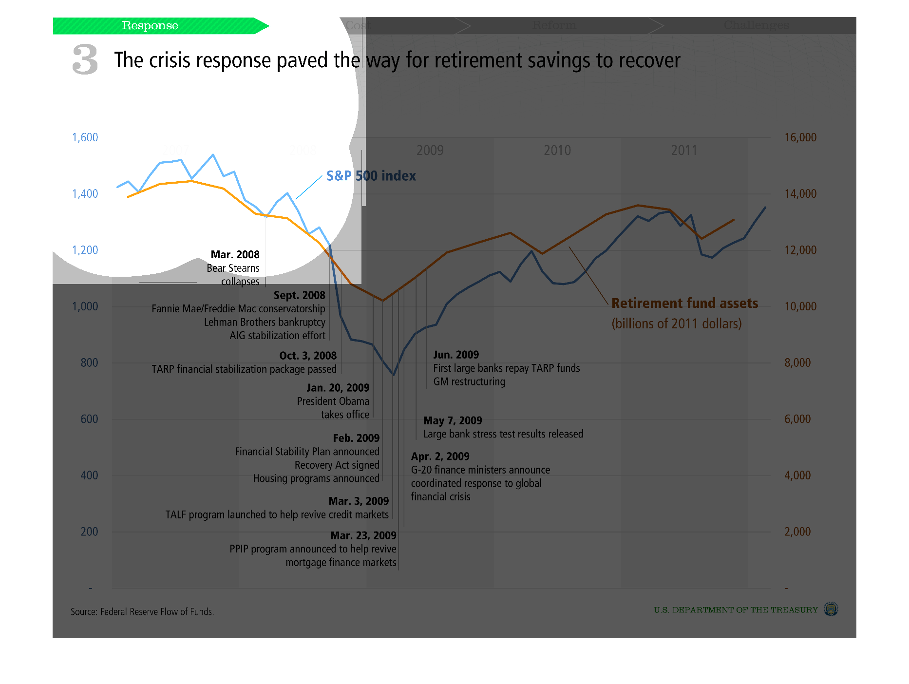
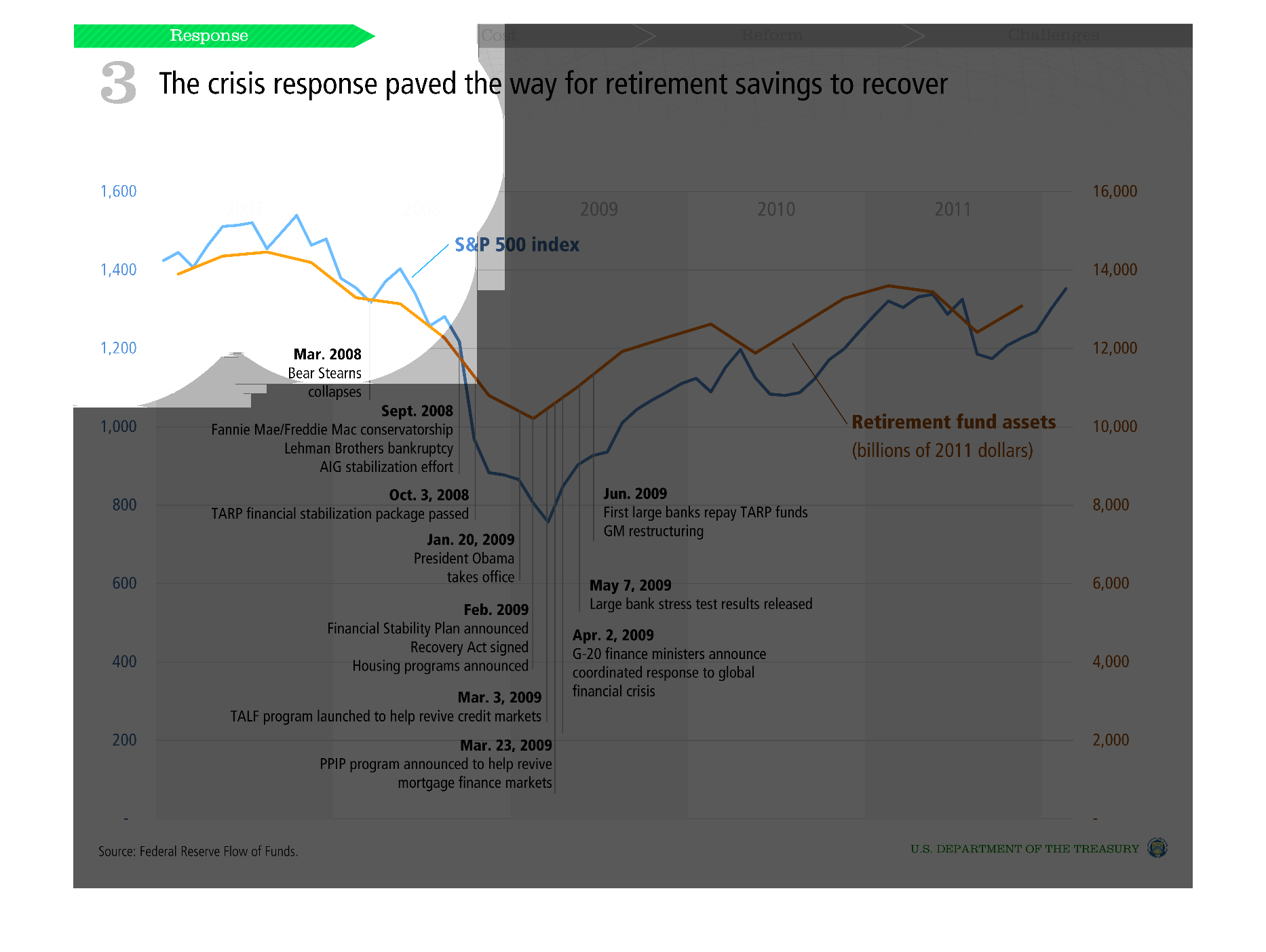
THIS PLOT SHOWS THE THE CORRELATION BETWEEN RETIREMENT SAVINGS AND THE S&P 500 STOCK INDEX
PLOTTED AGAINST TIME. ALSO SHOWN ARE SIGNIFICANT EVENTS DURING THE CRISIS RESPONSE.
Warning: Image is too big to fit on screen; displaying at 50%
Warning: Image is too big to fit on screen; displaying at 50%
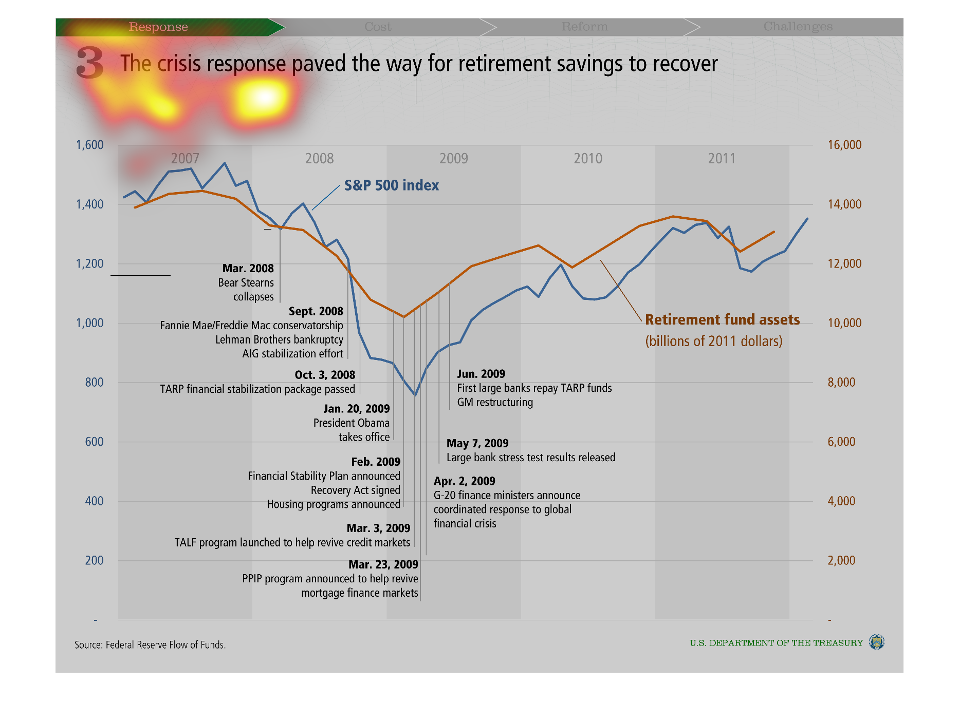

This image shows or depicts using statistcal line graph format along with written footnotes
in regards to the crisis response paved the way for retirement savings to recover.
Warning: Image is too big to fit on screen; displaying at 50%
Warning: Image is too big to fit on screen; displaying at 50%
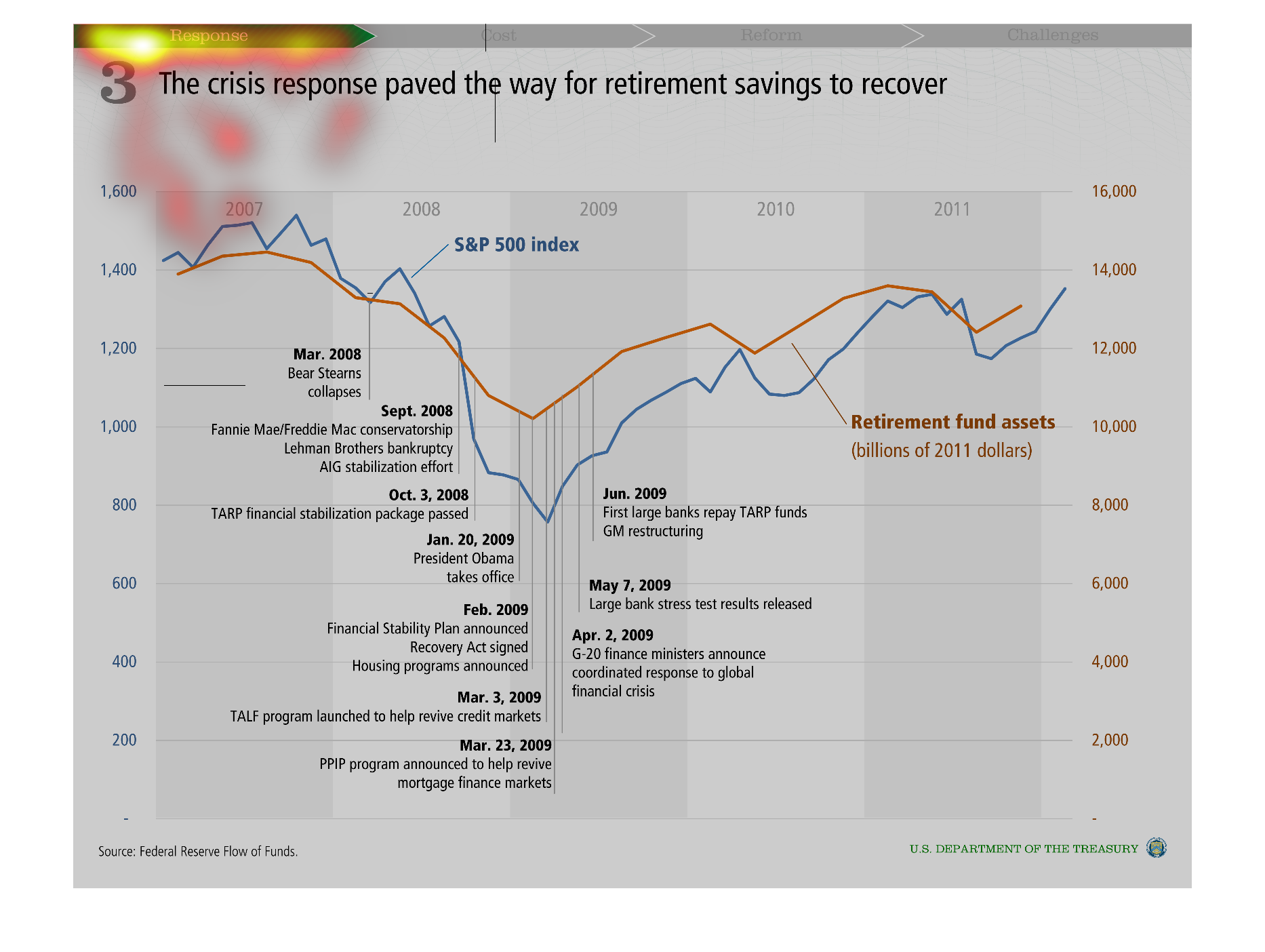
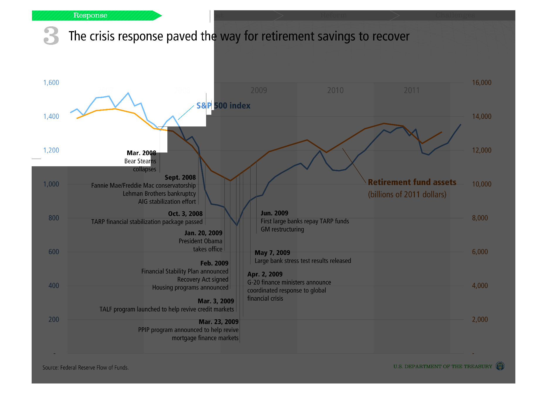
This is a line graph showing the rise and fall and rise again in retirement savings. It began
in 2007 and it show the length of time out to 2011. Overall it is back on track now.
Warning: Image is too big to fit on screen; displaying at 50%
Warning: Image is too big to fit on screen; displaying at 50%
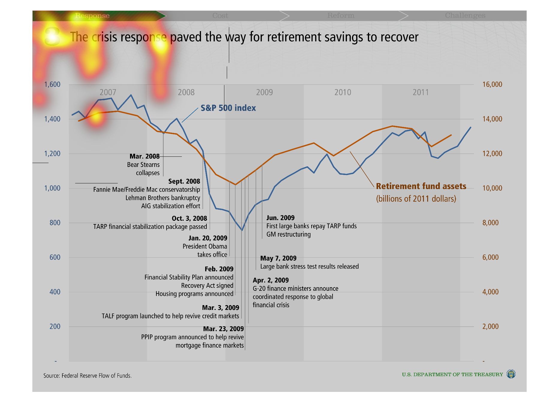
The title of this graph is, 'The crisis response paved the way for retirement savings to recover'.
 This graph charts a number of financial institutions bankruptcies and collapse.  Also on
this graph is the date and year in which federal programs and legislation were setup to combat
these financial disasters.
Warning: Image is too big to fit on screen; displaying at 50%
Warning: Image is too big to fit on screen; displaying at 50%
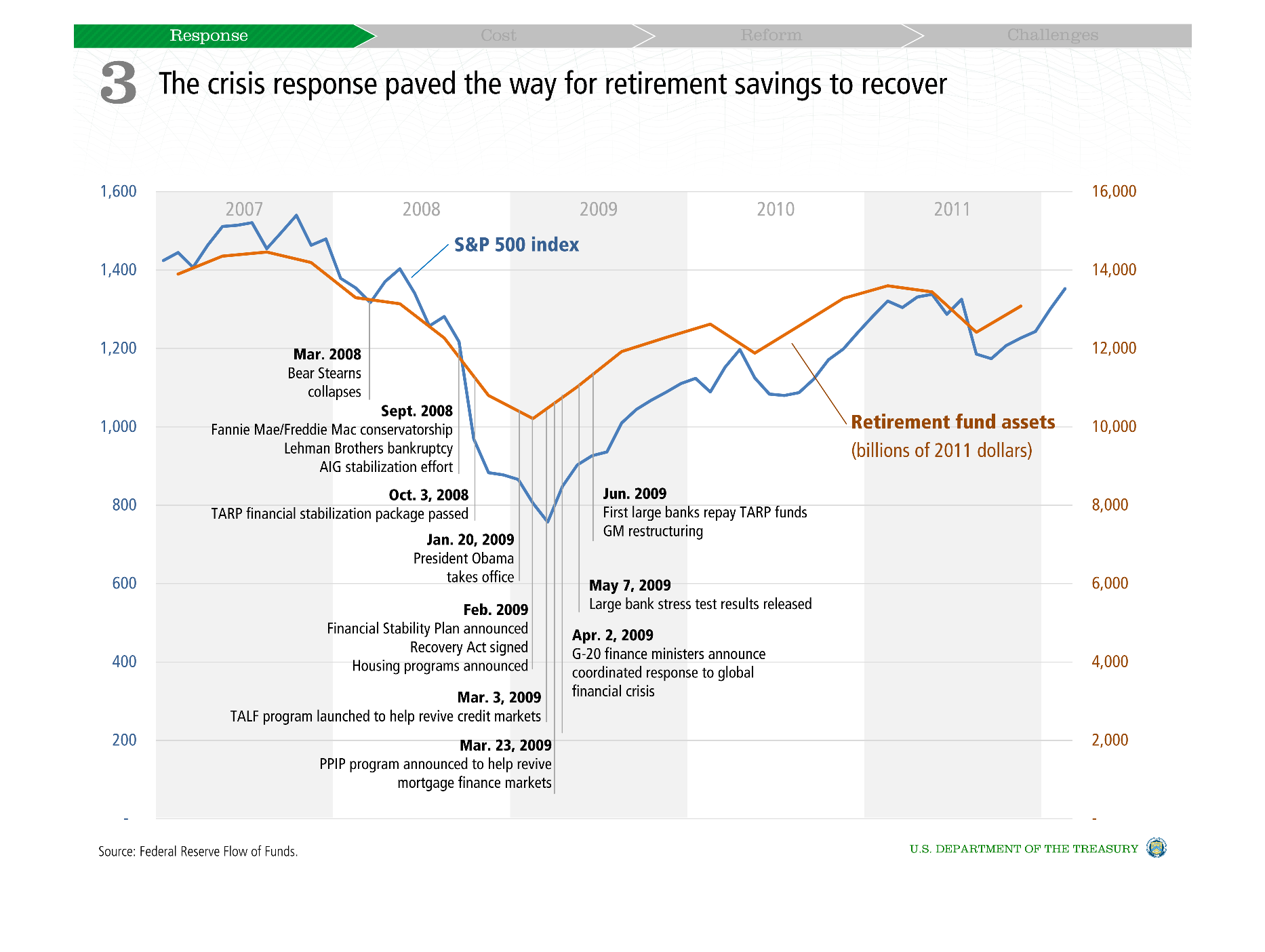
This chart describes that the crisis response paved the way for retirement savings to recover
for the years 2007 through to 2011. The chart has a number of peaks and valleys.
Warning: Image is too big to fit on screen; displaying at 50%
Warning: Image is too big to fit on screen; displaying at 50%
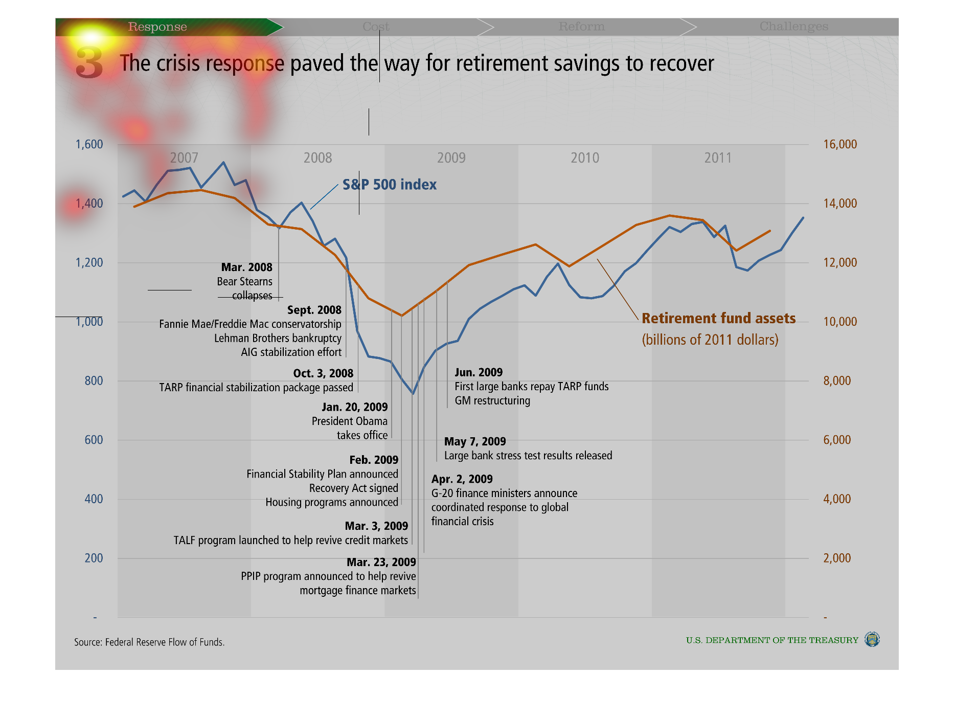
Has to do with retirement savings. The chart has lots of information. it shows the relation
between retirement fund assets and S&P 500. They appear to correlate most of the time. The
graph also seems to give information as to what was happening at each point of the graph that
could have caused the changes between 2007 and 201.
Warning: Image is too big to fit on screen; displaying at 50%
Warning: Image is too big to fit on screen; displaying at 50%
the crisis response paved the way for retirement savings to recover. I can't read anything
on here but, I can see that the graph dips dramatically and then recovers.
Warning: Image is too big to fit on screen; displaying at 50%
Warning: Image is too big to fit on screen; displaying at 50%
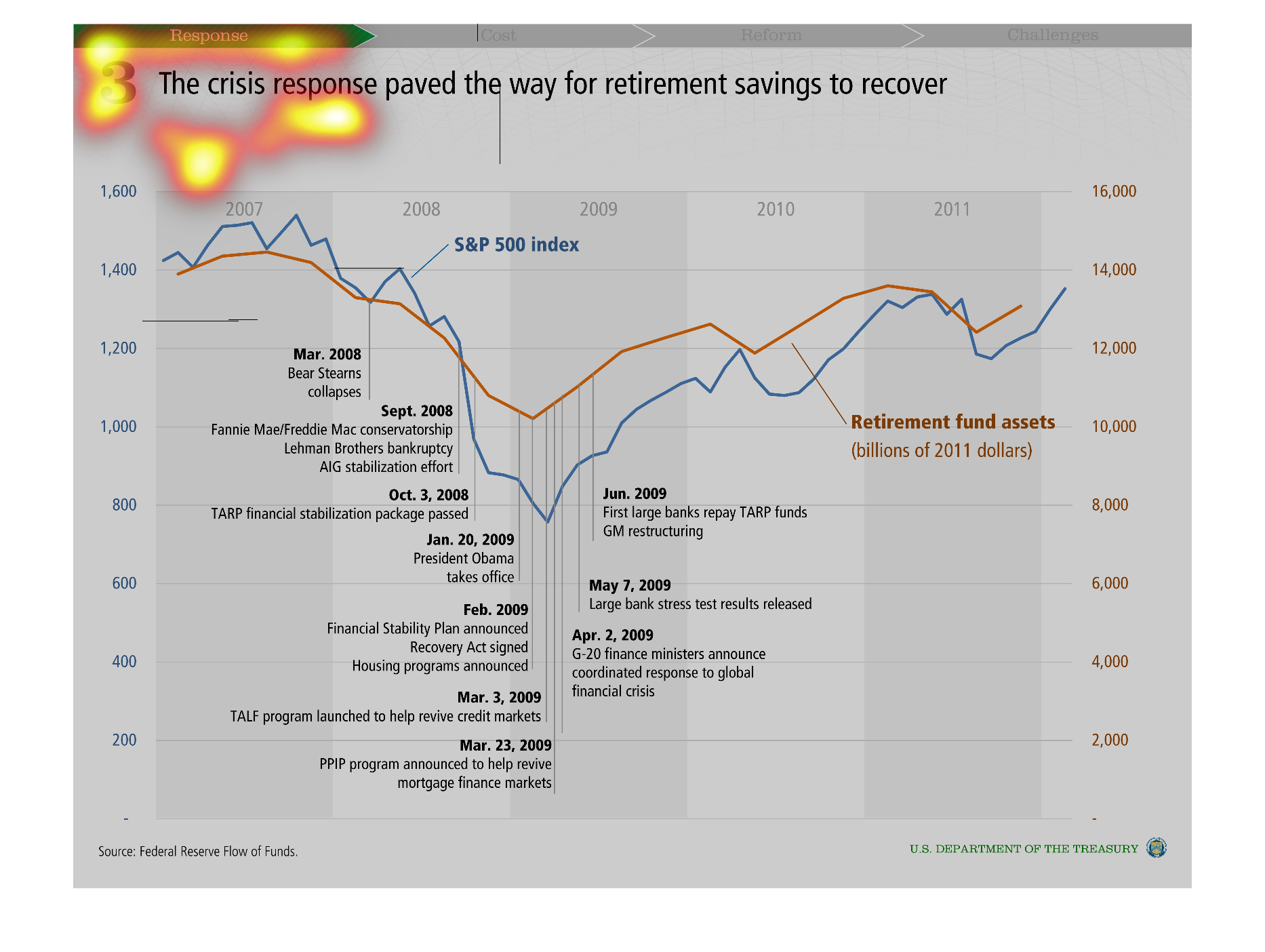
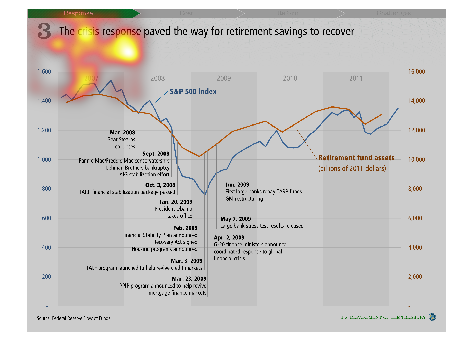
This is a chart showing of the crisis response effort helped retirement efforts after the
recession. It includes many specific data points with dates linked to them and small explanations.
It shows how retirement account assets dropped significantly during the recession, but have
started to climb back up.
Warning: Image is too big to fit on screen; displaying at 50%
Warning: Image is too big to fit on screen; displaying at 50%
The chart is a timeline plotting important moments during the Financial Crisis from years
2007-2011. The timeline is being used to connect the financial crisis to the recovery of retirement
savings.
Warning: Image is too big to fit on screen; displaying at 50%
Warning: Image is too big to fit on screen; displaying at 50%
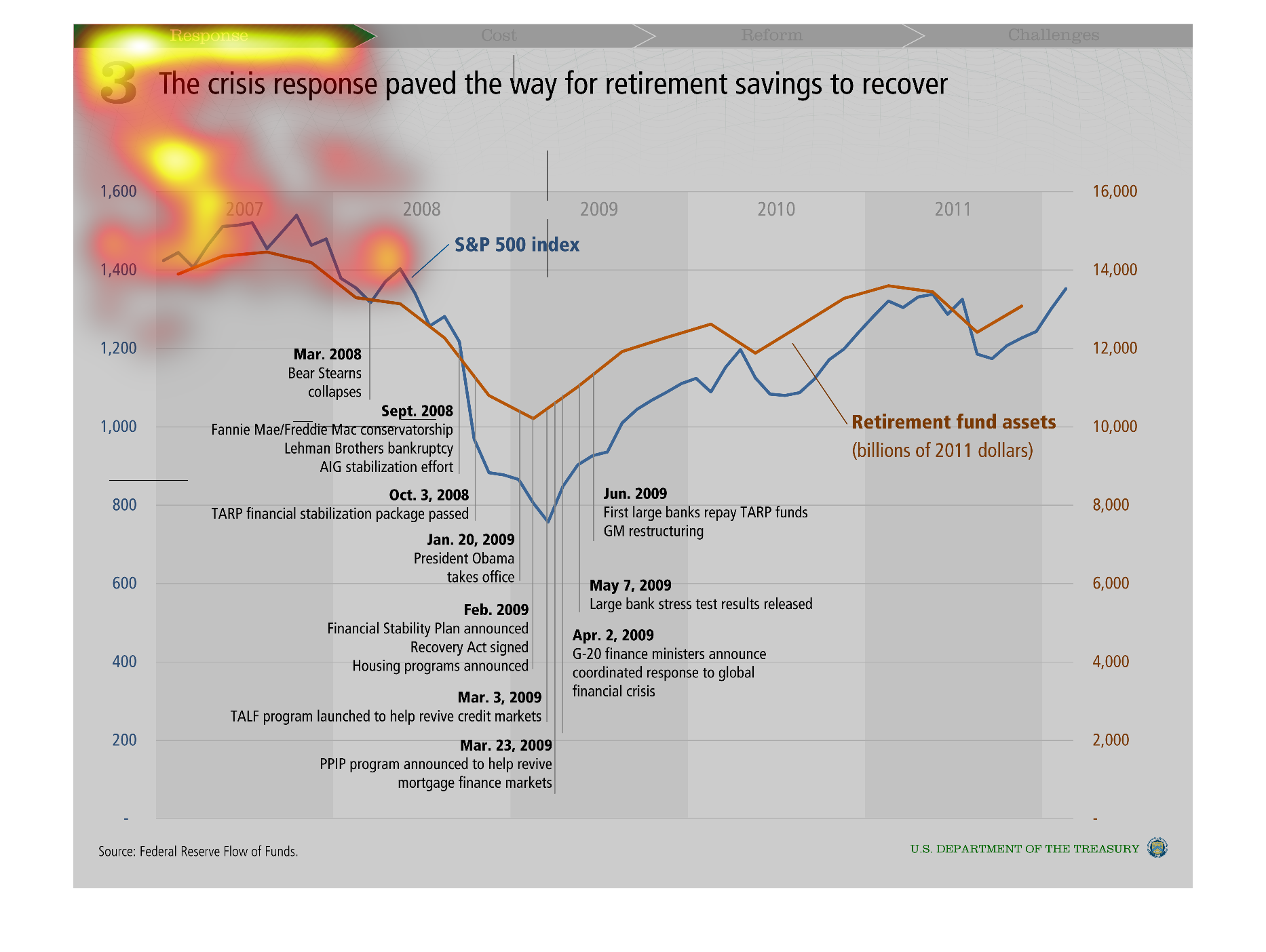
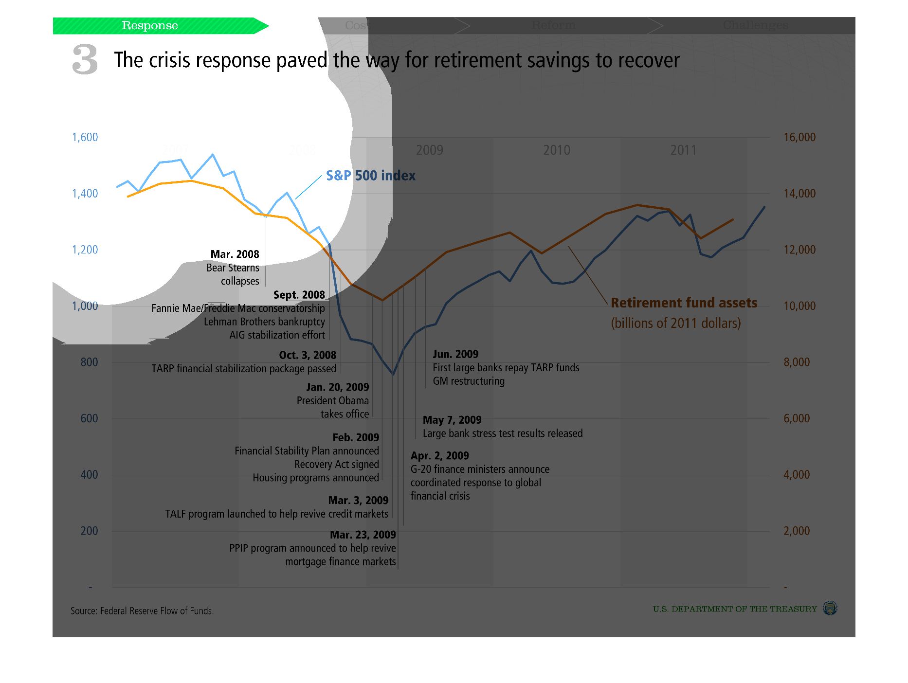
The image shows how the crisis recovery aid supported retirement funding. It shows how the
financial components influenced various factors in a positive way.
Warning: Image is too big to fit on screen; displaying at 50%
Warning: Image is too big to fit on screen; displaying at 50%
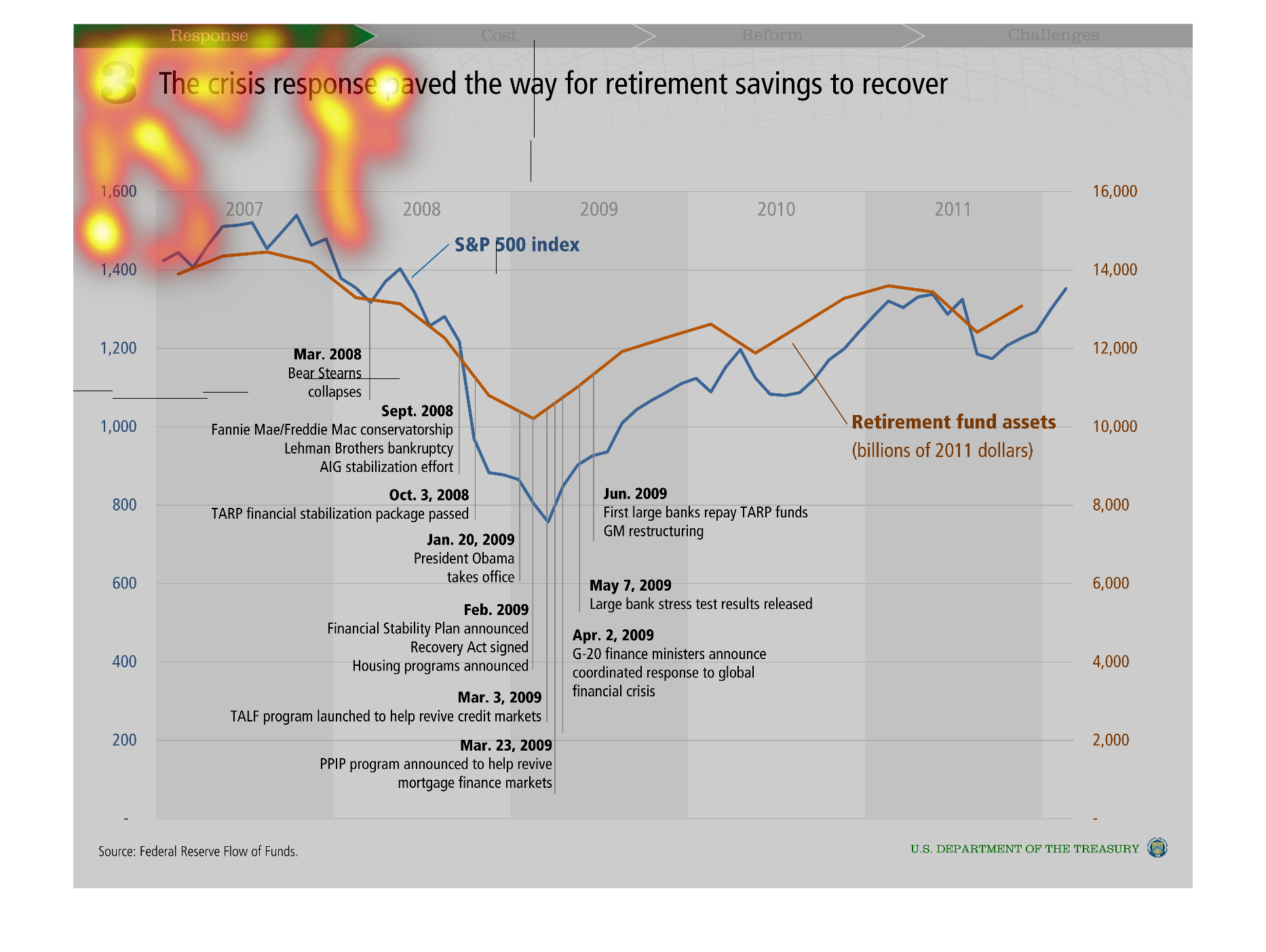
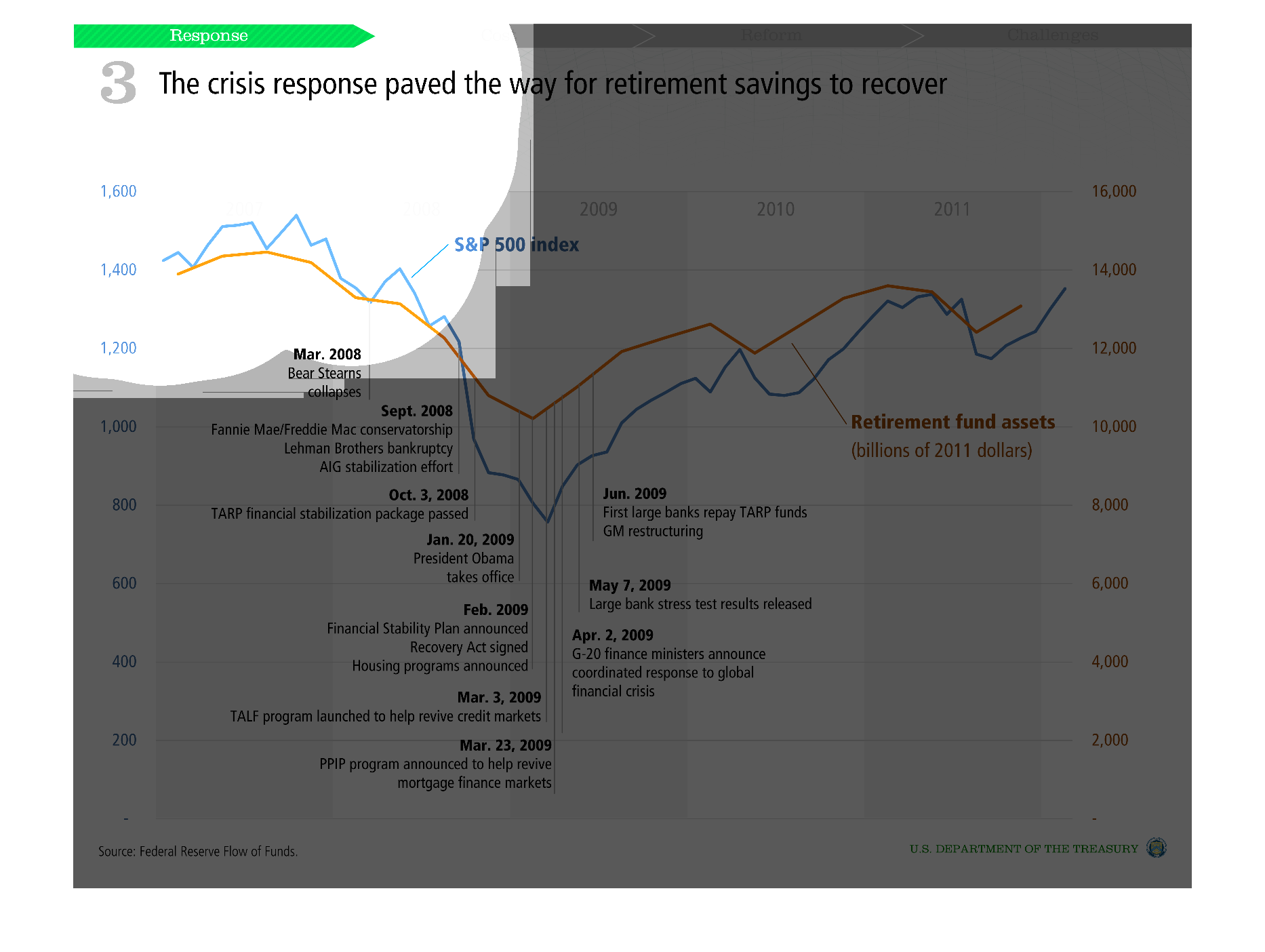
This is a series of charts depicting how the response to the financial crises paved the way
for retirement savings to recover from the years 2007 to 2009.
Warning: Image is too big to fit on screen; displaying at 50%
Warning: Image is too big to fit on screen; displaying at 50%
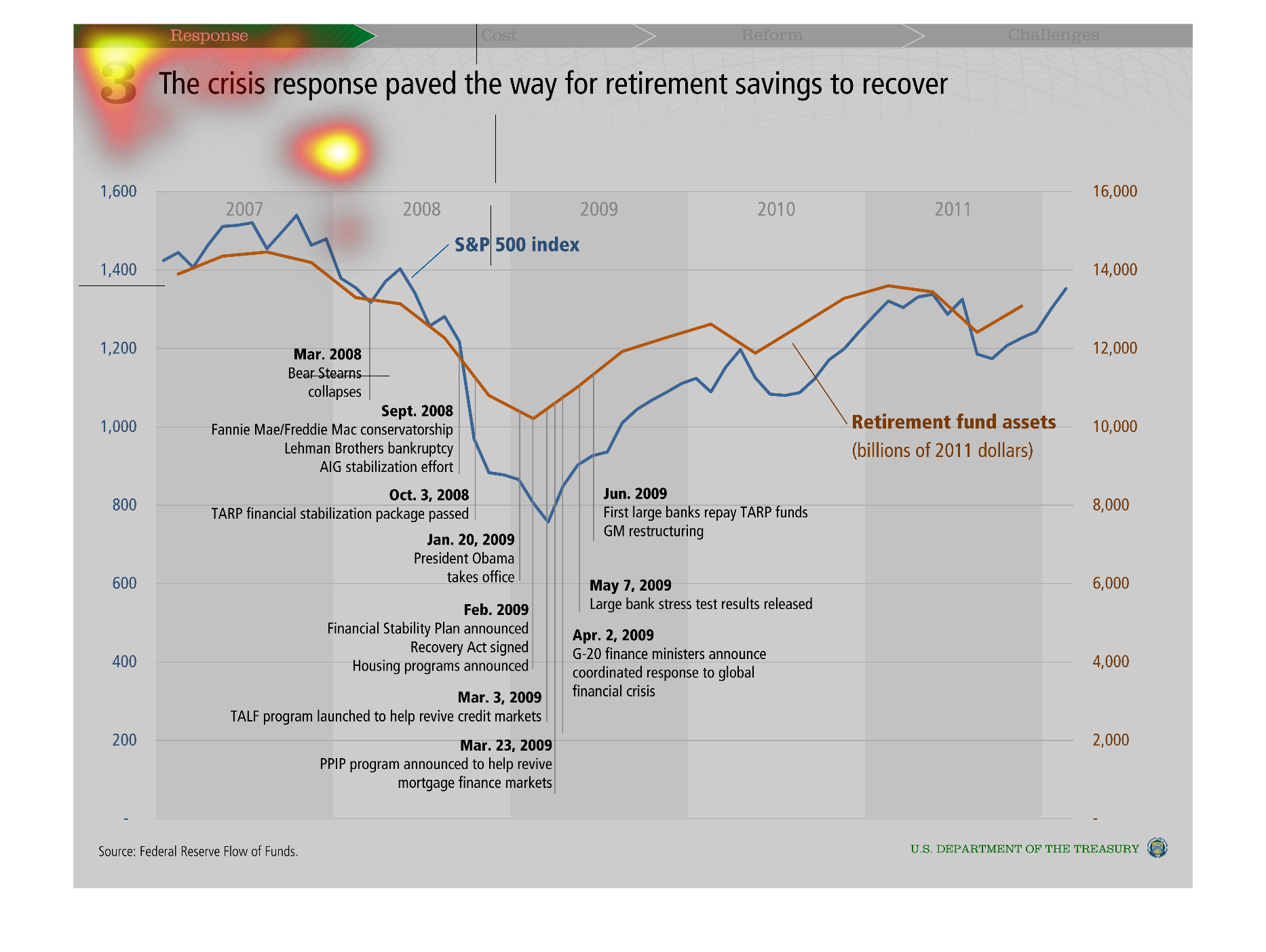
This graph illustrates how the crisis response paved the way for retirement savings to recover.
 It displays retirement fund assets and has milestone markers over time.
Warning: Image is too big to fit on screen; displaying at 50%
Warning: Image is too big to fit on screen; displaying at 50%