Warning: Image is too big to fit on screen; displaying at 50%
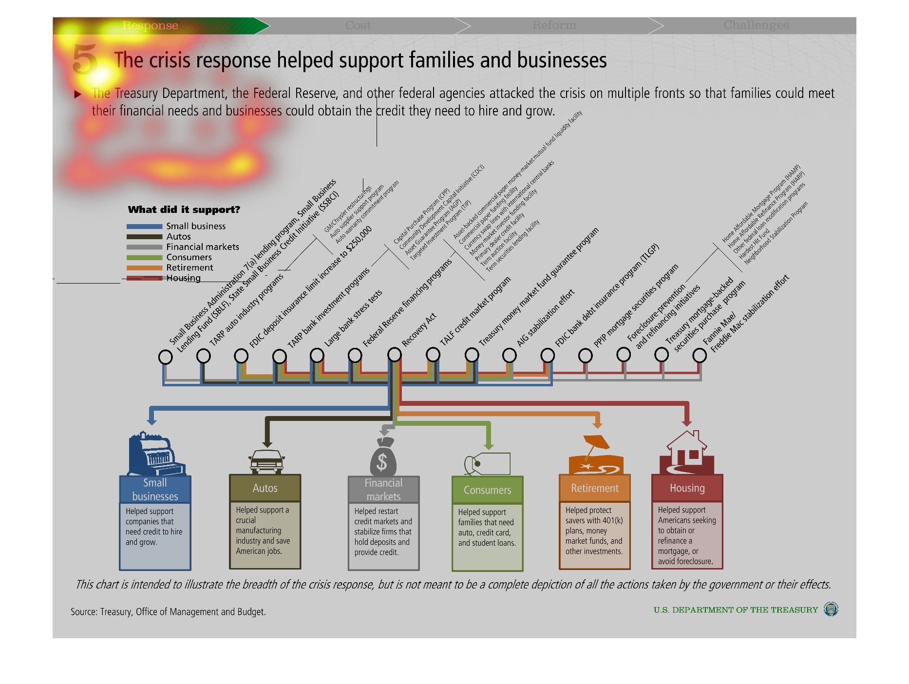
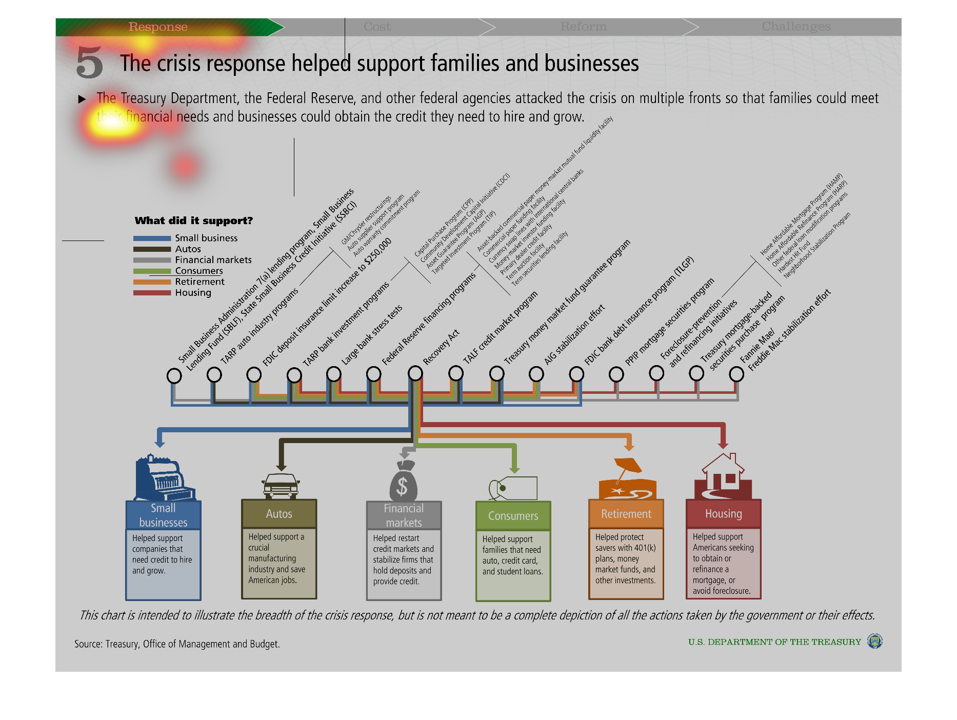
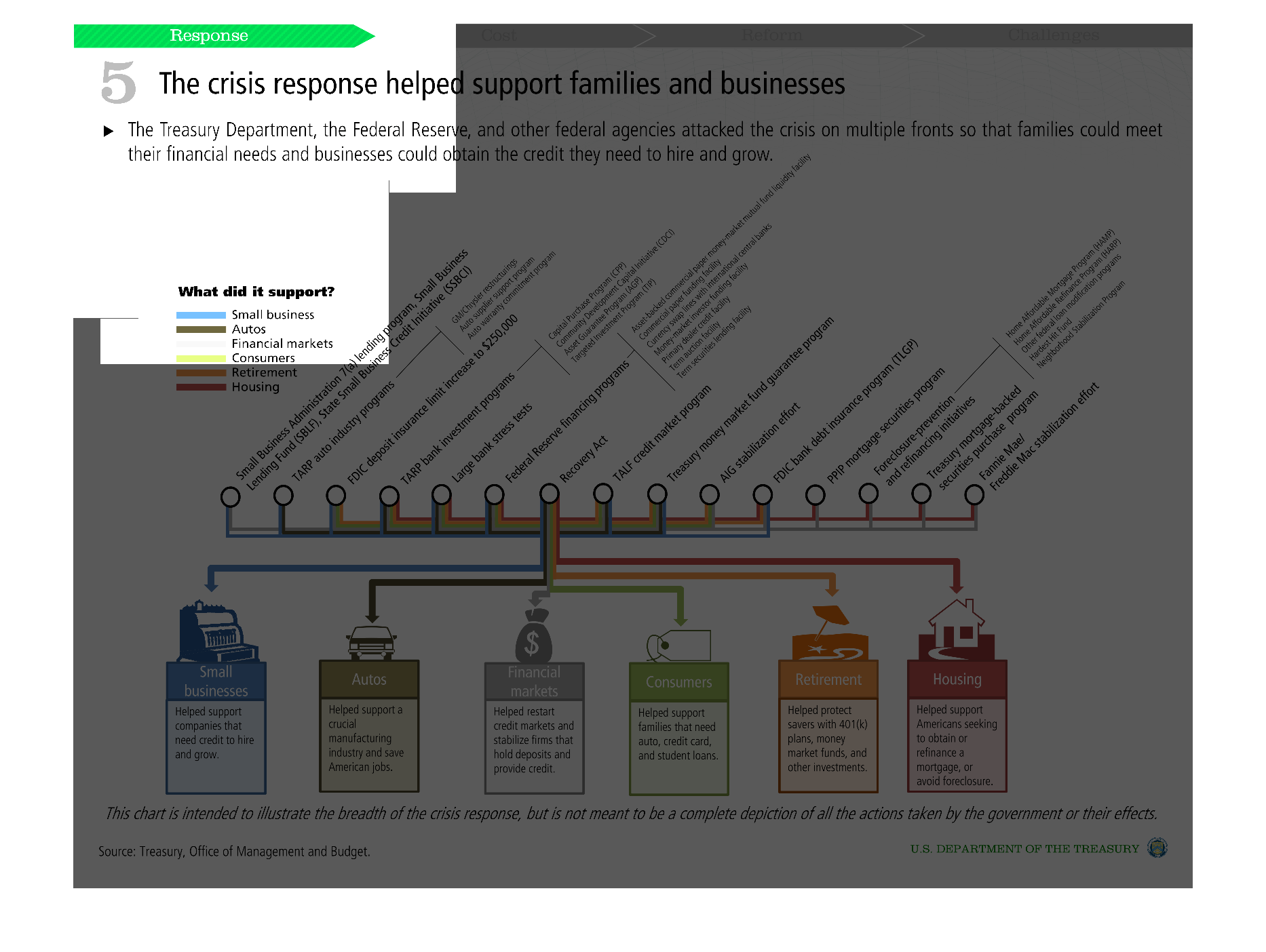
this is a chart showing the Government assistance through the crisis for small business, autos,
financial markets, consumers, retirement, and housing.
Warning: Image is too big to fit on screen; displaying at 50%
Warning: Image is too big to fit on screen; displaying at 50%
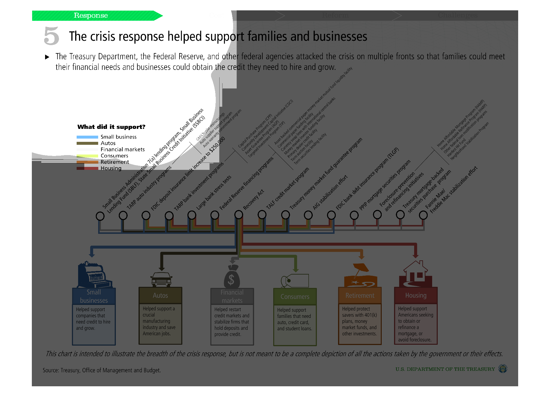
This chart describes the financial crisis response from the government, to help people meet
their financial needs. The chart shows what organizations or people received the support.
Warning: Image is too big to fit on screen; displaying at 50%
Warning: Image is too big to fit on screen; displaying at 50%
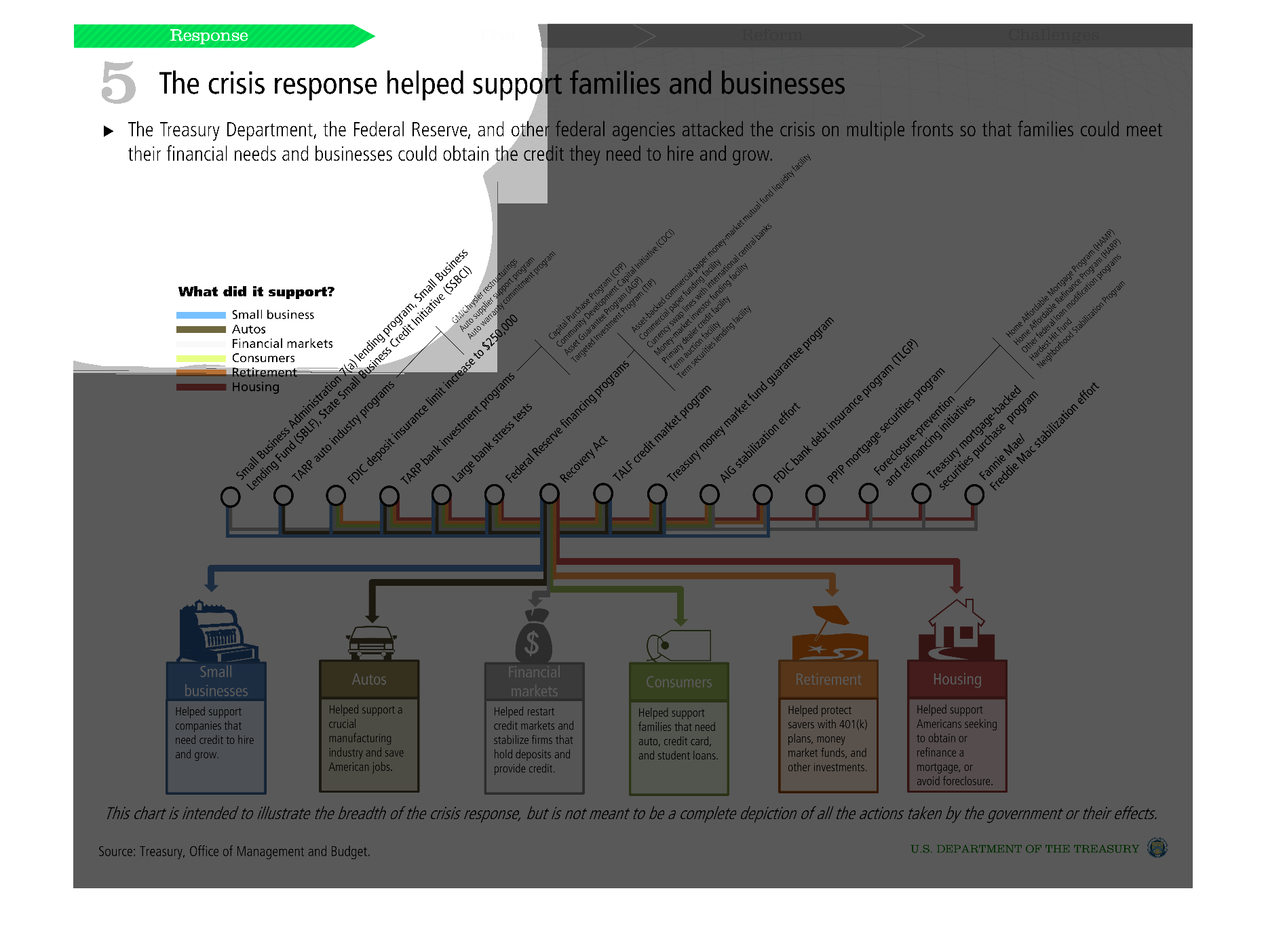
crisis response helped support business' and families, including many variables and aspects
of the community and those that inhabit it, the graph shows exactly who and what was supported
Warning: Image is too big to fit on screen; displaying at 50%
Warning: Image is too big to fit on screen; displaying at 50%
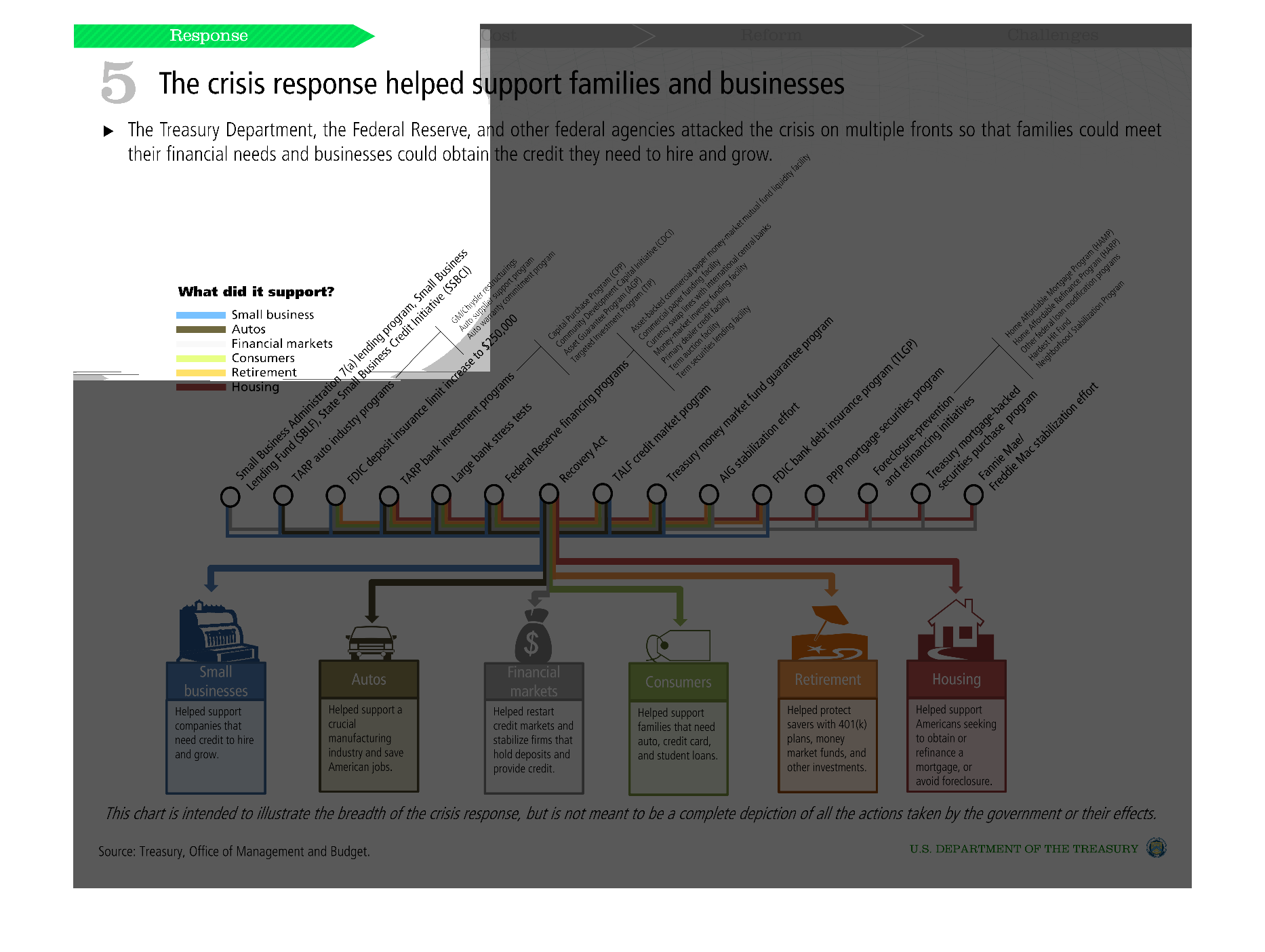
This is a graph that measures how the Treasury Department and the Federal Reserve helped alleviate
the financial crisis' burden on families and small businesses.  This was done so Families
could survive economically and small businesses could attain the capital needed to practice
in their field.
Warning: Image is too big to fit on screen; displaying at 50%
Warning: Image is too big to fit on screen; displaying at 50%
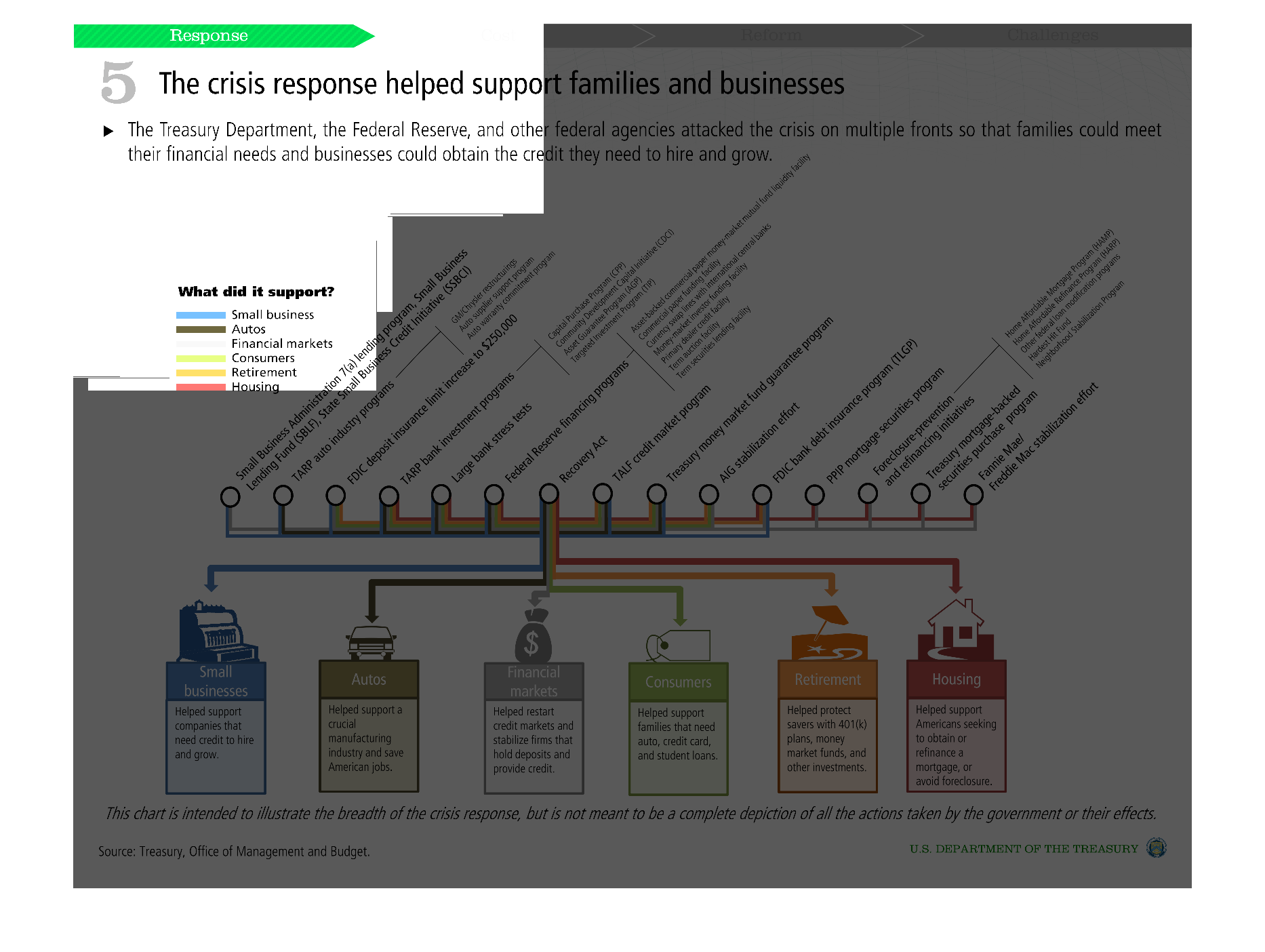
The title of this graph is, 'Crisis response helps families and businesses'.  This graph lists
at the very bottom, six segments or indexes that were directly helped through federal response,
via TARP's and legislative acts.
Warning: Image is too big to fit on screen; displaying at 50%
Warning: Image is too big to fit on screen; displaying at 50%

This graph shows how the crisis response helped support families and business. It illustrates
these by categories of support such as auto, housing, and small businesses.
Warning: Image is too big to fit on screen; displaying at 50%
Warning: Image is too big to fit on screen; displaying at 50%
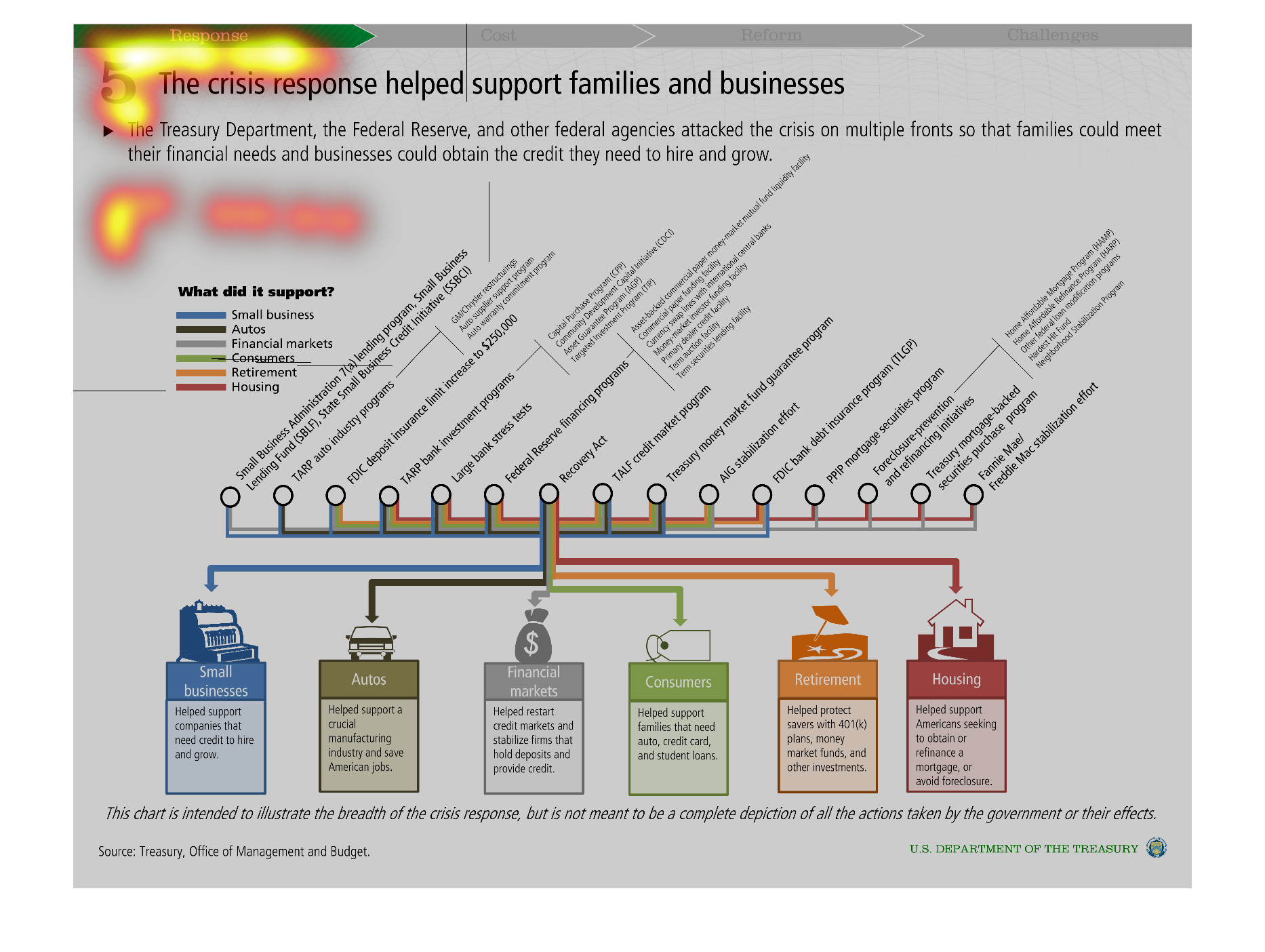
The chart shows how branches of the federal government responded and contributed to a crisis.
They were measured on their response times/contributions to small business, financial markets,
autos, consumers, retirement and housing.
Warning: Image is too big to fit on screen; displaying at 50%
Warning: Image is too big to fit on screen; displaying at 50%
A chart for people that need major financial help. Poor people and people who qualify for
government assistance. Basically what type of people are on and need food stamps
Warning: Image is too big to fit on screen; displaying at 50%
Warning: Image is too big to fit on screen; displaying at 50%
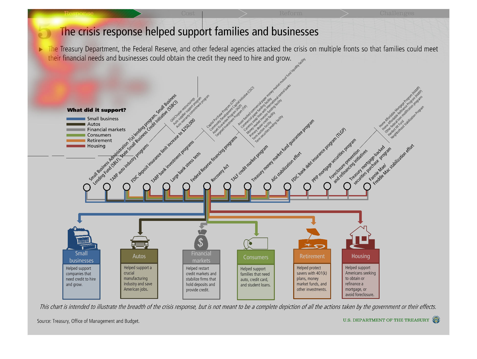
This is a chart of the various Insurance and Social safety net programs the federal government
provides and who the beneficiaries of those programs are.
Warning: Image is too big to fit on screen; displaying at 50%
Warning: Image is too big to fit on screen; displaying at 50%
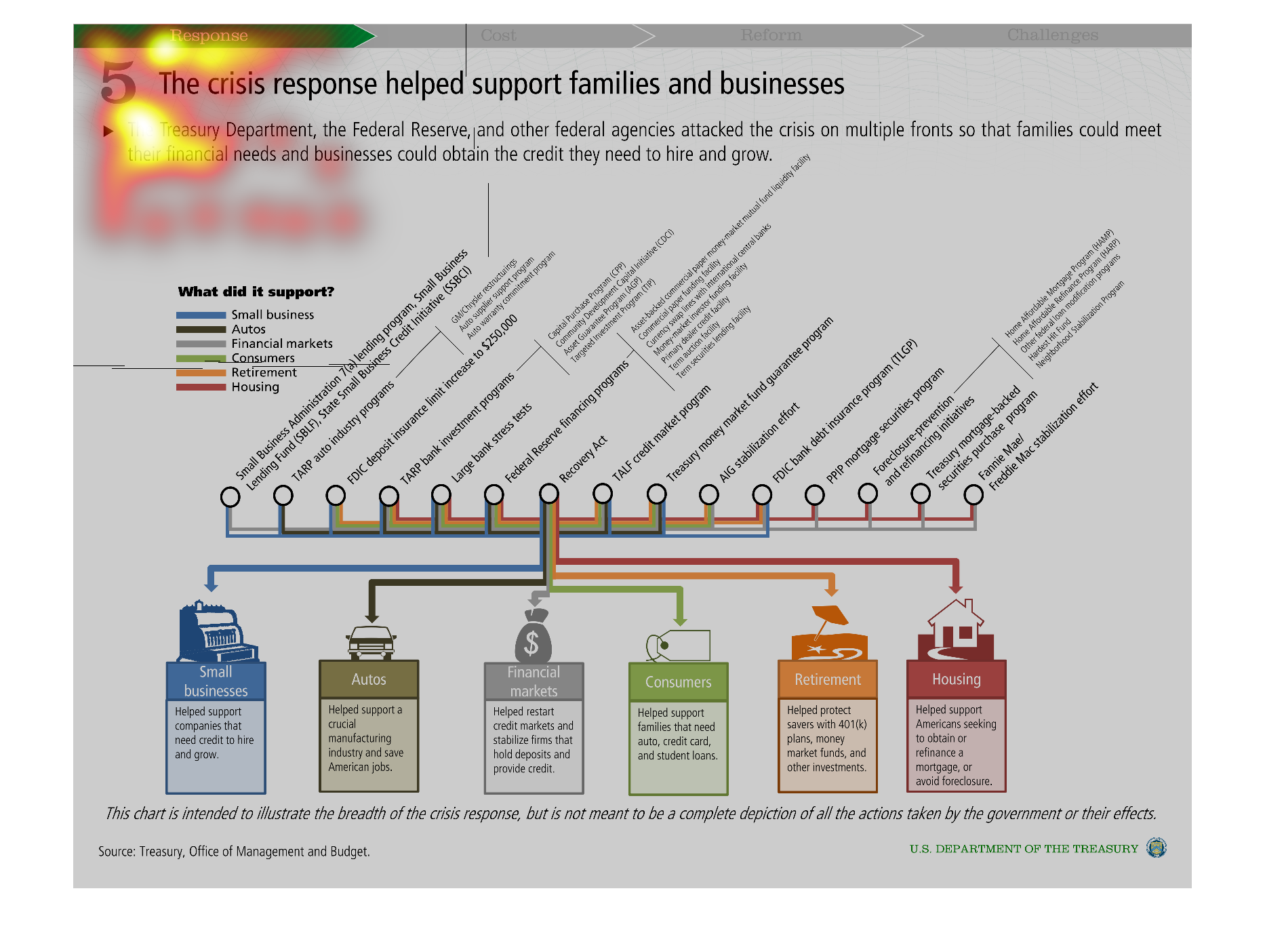
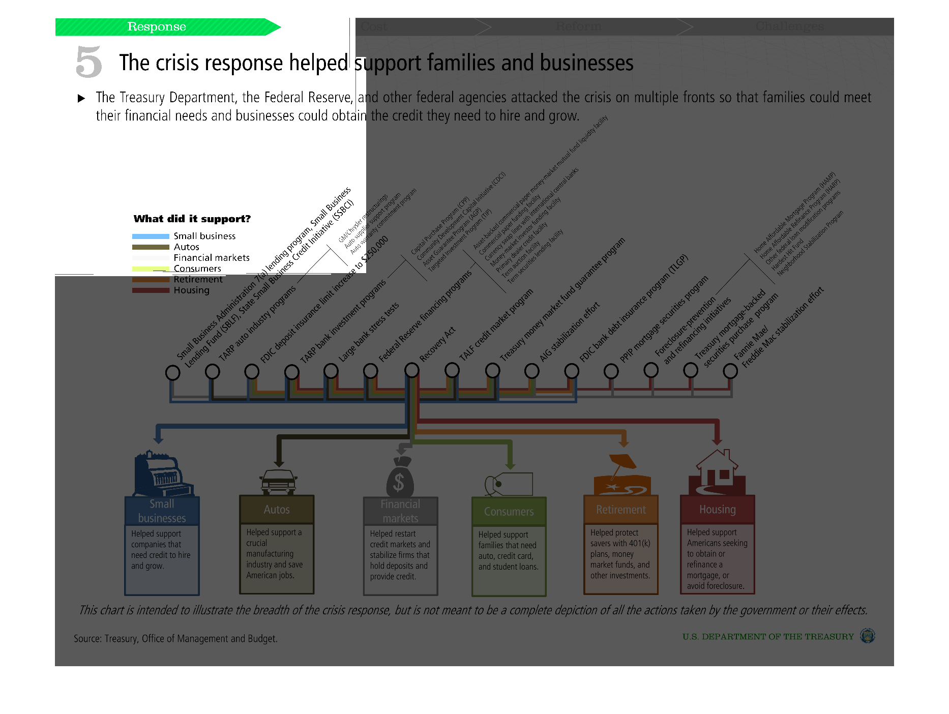
This chart shows how the bailout effected each part of the economy. It shows small businesses
and banks and the automaker industry and how the bailout went to each.
Warning: Image is too big to fit on screen; displaying at 50%
Warning: Image is too big to fit on screen; displaying at 50%
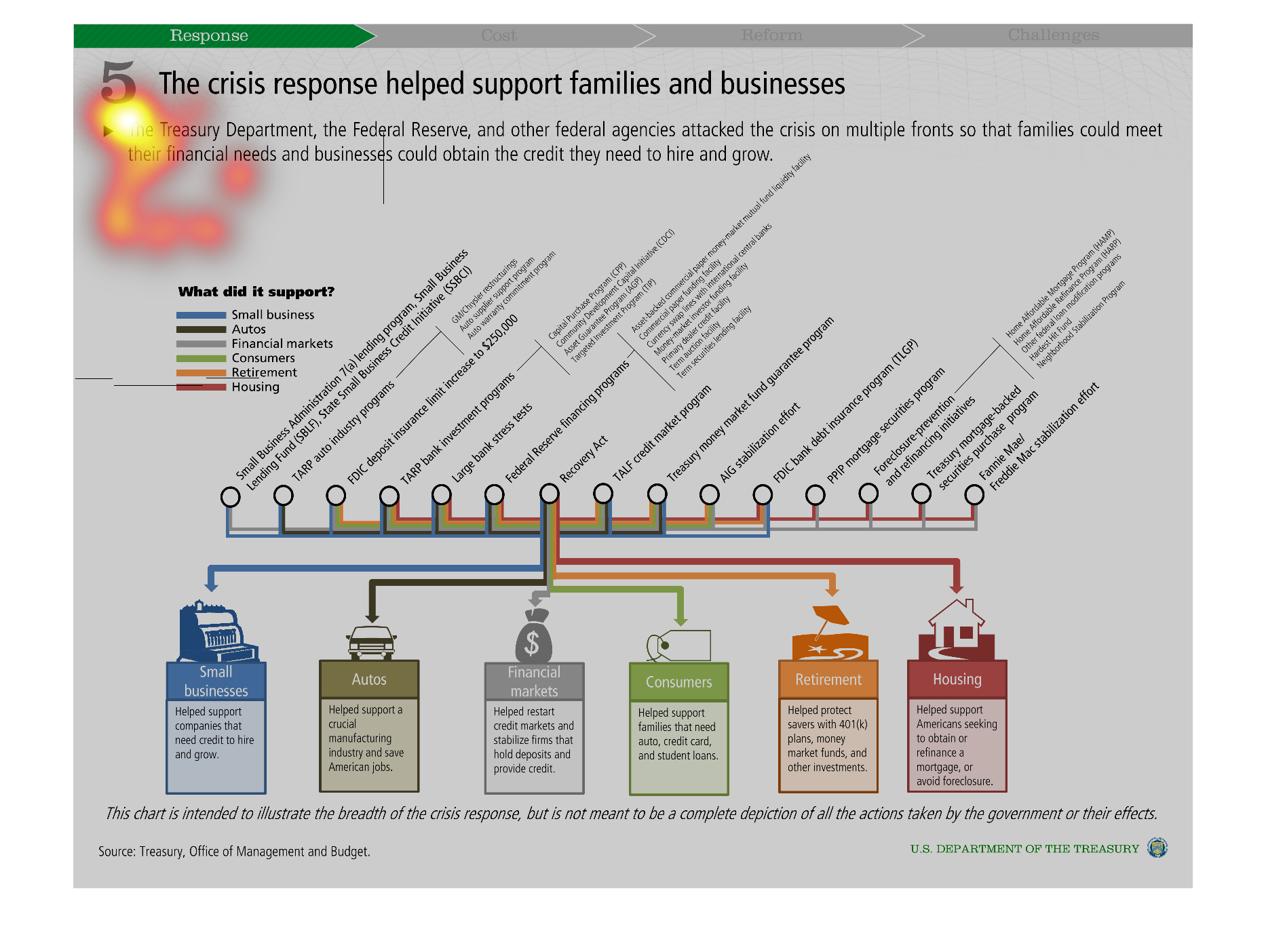
This picture depicts areas of the economy that were affected by crisis response. The chart
illustrates how the Treasury Department, Federal Reserve, and other federal agencies were
able to help small businesses, autos, retirement, consumers, financial markets and more by
helping to support families and businesses.
Warning: Image is too big to fit on screen; displaying at 50%
Warning: Image is too big to fit on screen; displaying at 50%
This chart measures how small businesses and families received crisis financial aid.  Housing
is one of a number of categories listed along the bottom of the graph. The majority of words
and categories in this graph are too small to read, though.
Warning: Image is too big to fit on screen; displaying at 50%
Warning: Image is too big to fit on screen; displaying at 50%
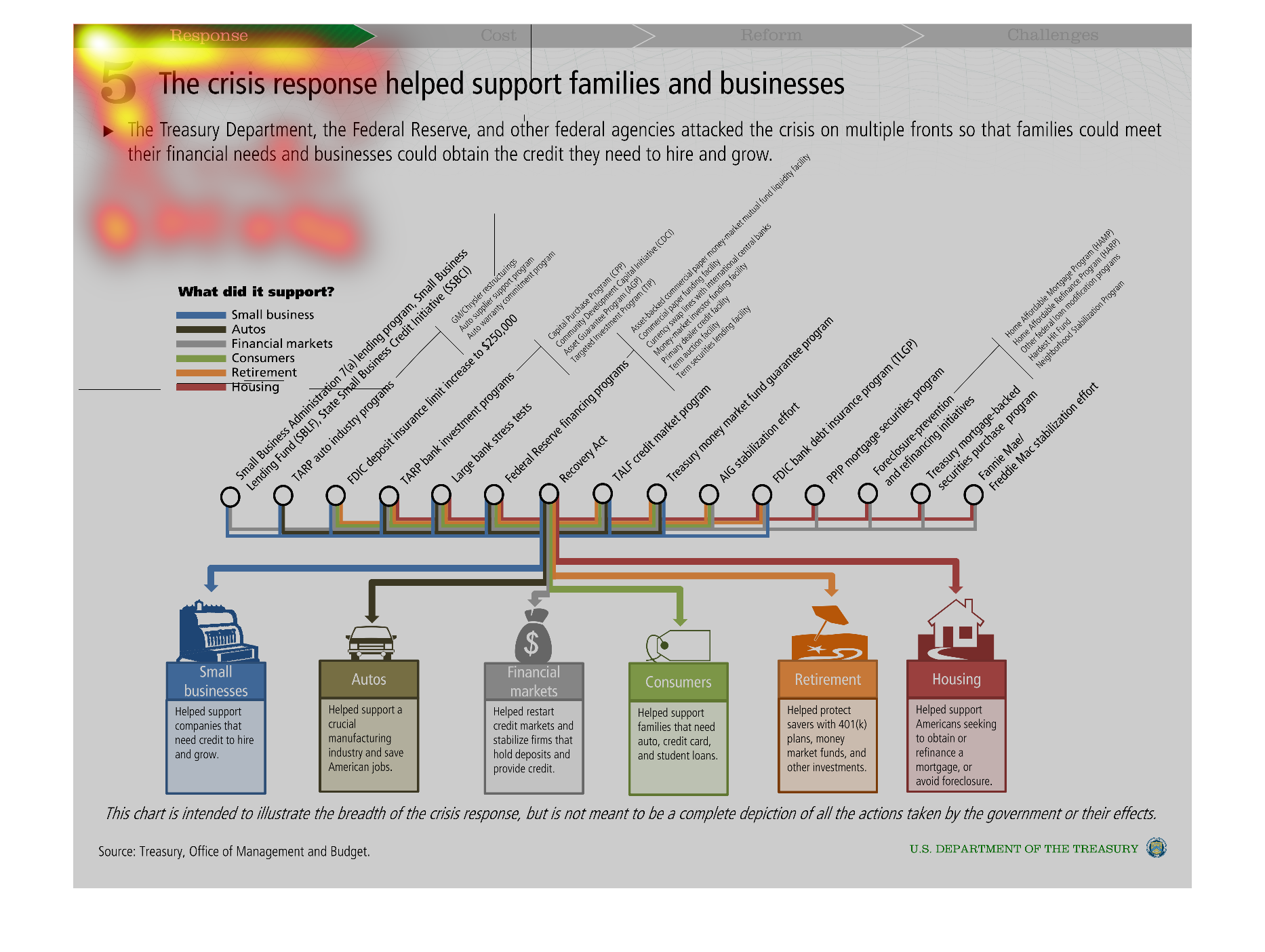
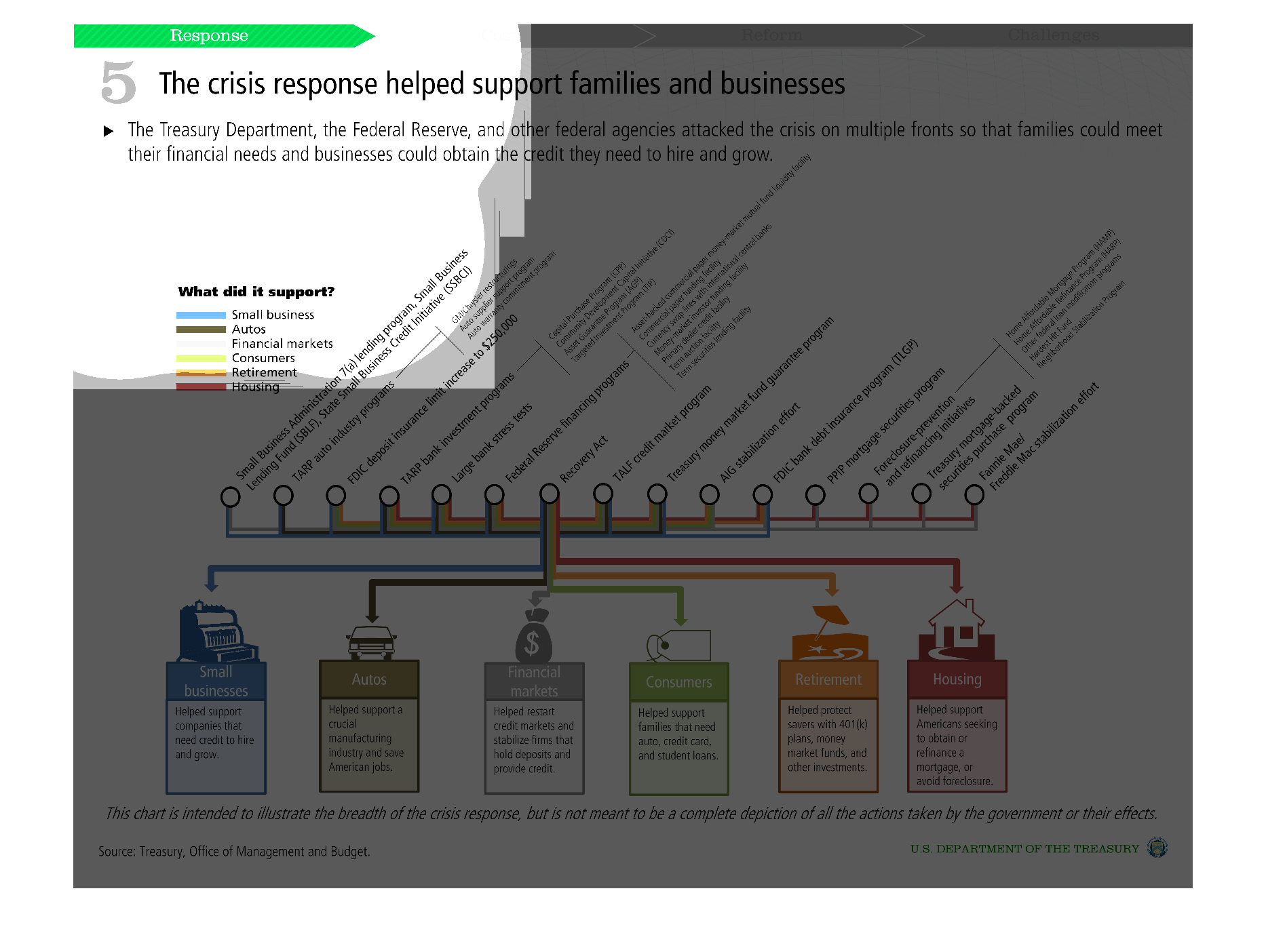
This infographic shows all the ways the federal reserve attacked the financial crisis, and
colorcoded bars show how each avenue of business was affected and befitted from it.
Warning: Image is too big to fit on screen; displaying at 50%
Warning: Image is too big to fit on screen; displaying at 50%
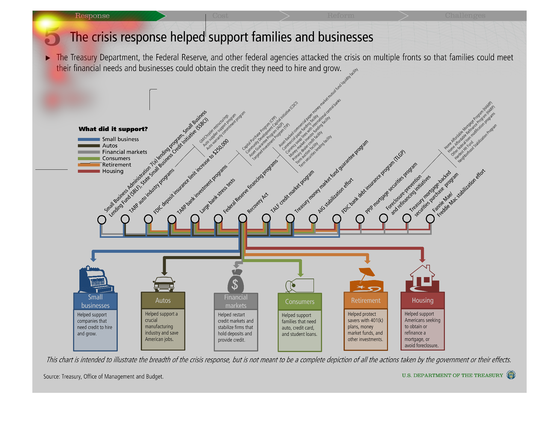
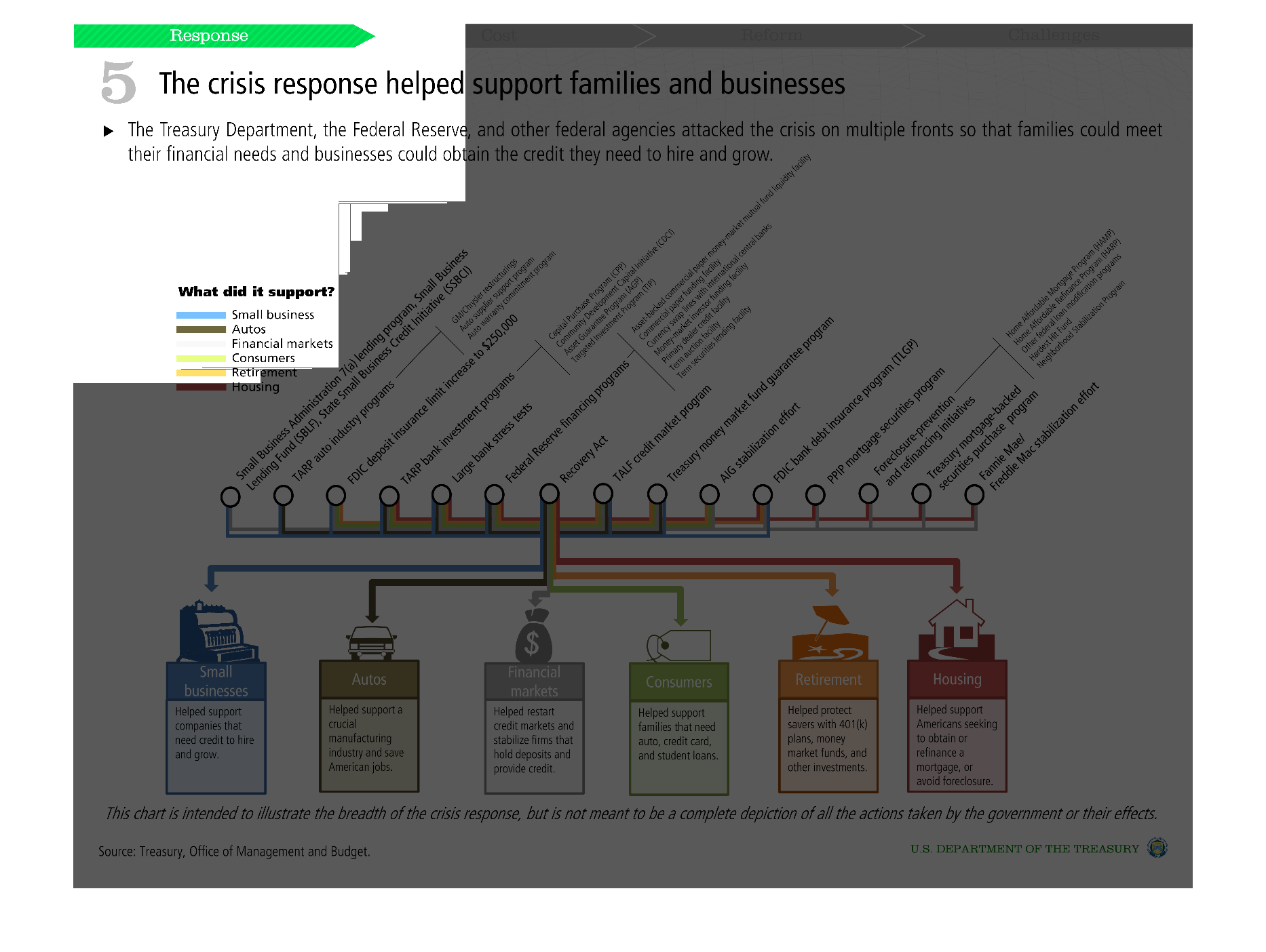
The image shows the results that would indicate the positive effects of the crisis response
on families, specifically factors such as small businesses, the housing market, etc to name
a few.
Warning: Image is too big to fit on screen; displaying at 50%
Warning: Image is too big to fit on screen; displaying at 50%