Warning: Image is too big to fit on screen; displaying at 50%
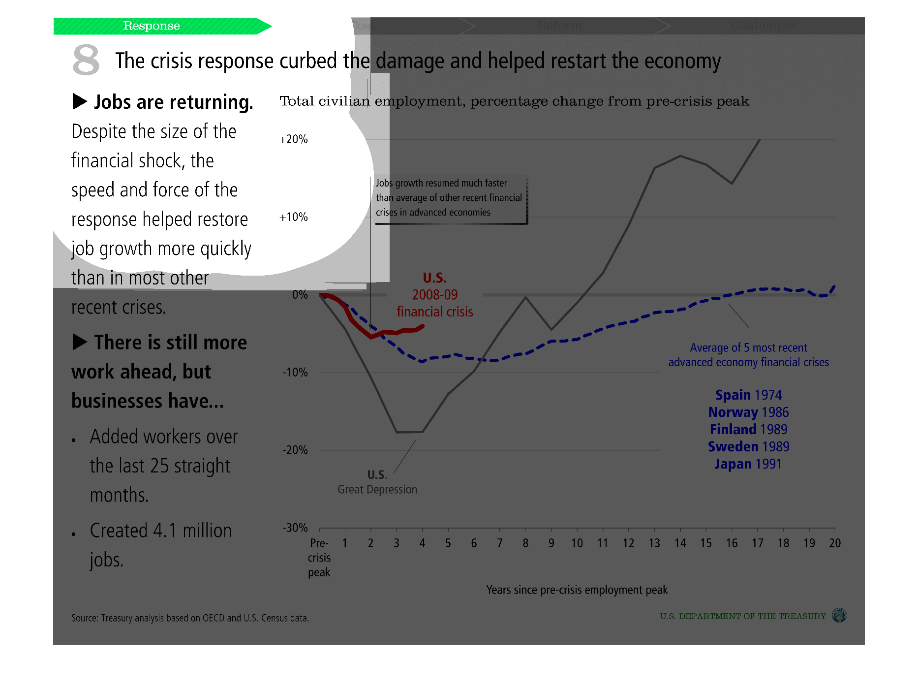
This image was difficult to understand due to the size of the fonts.  It showed the relationship
between the us economy collapse and job creations and employment.  The text described the
difficulties surrounding these rates.
Warning: Image is too big to fit on screen; displaying at 50%
Warning: Image is too big to fit on screen; displaying at 50%
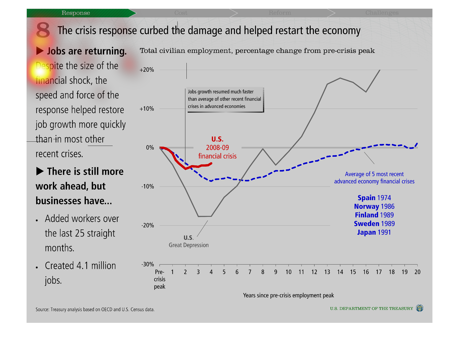
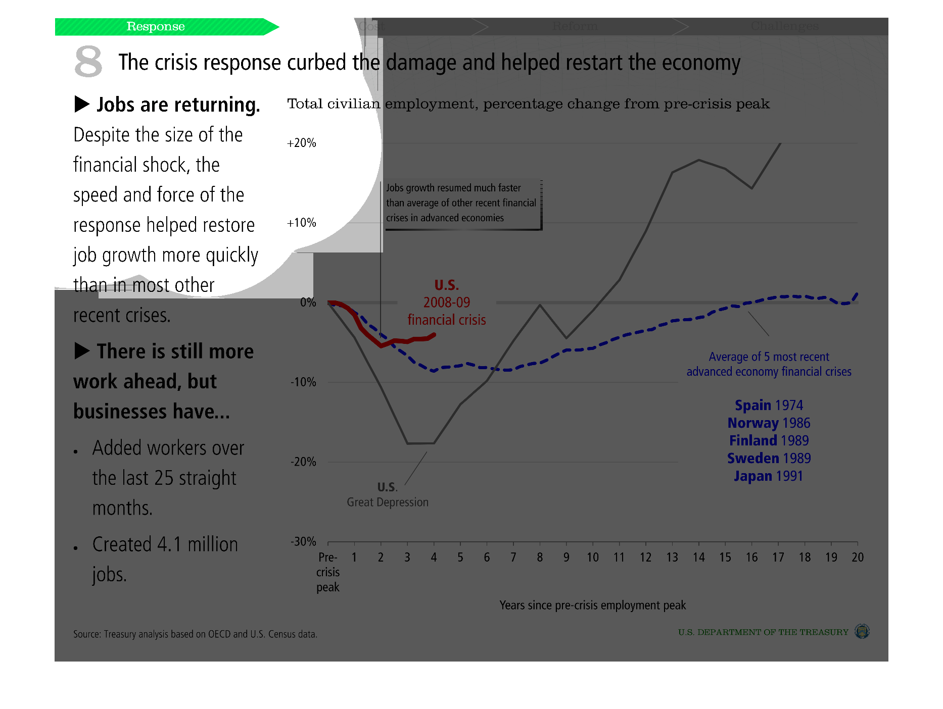
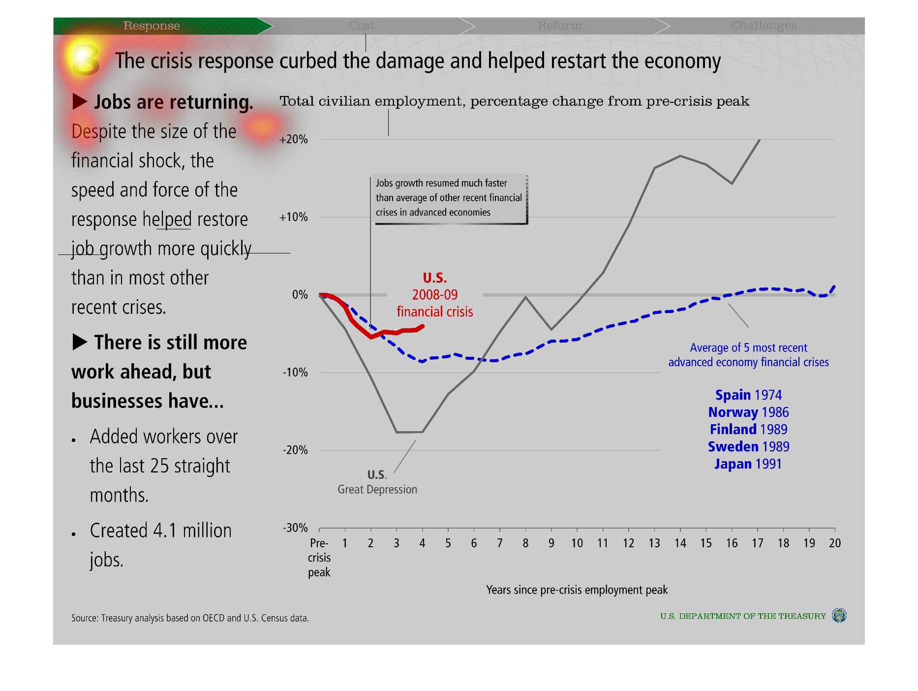
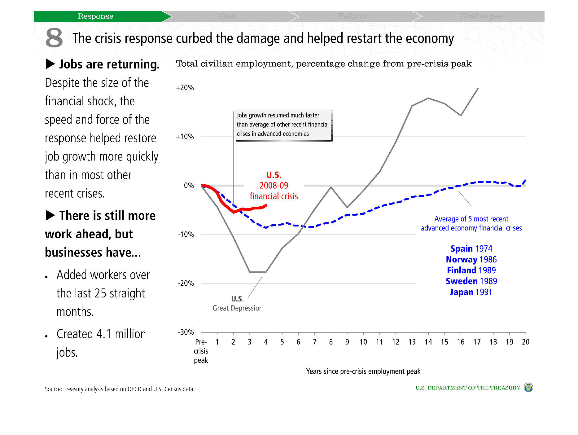
This chart describes how the crisis response curbed the damage and helped restart the economy.
And how jobs are returning despite the size of the financial shock.
Warning: Image is too big to fit on screen; displaying at 50%
Warning: Image is too big to fit on screen; displaying at 50%
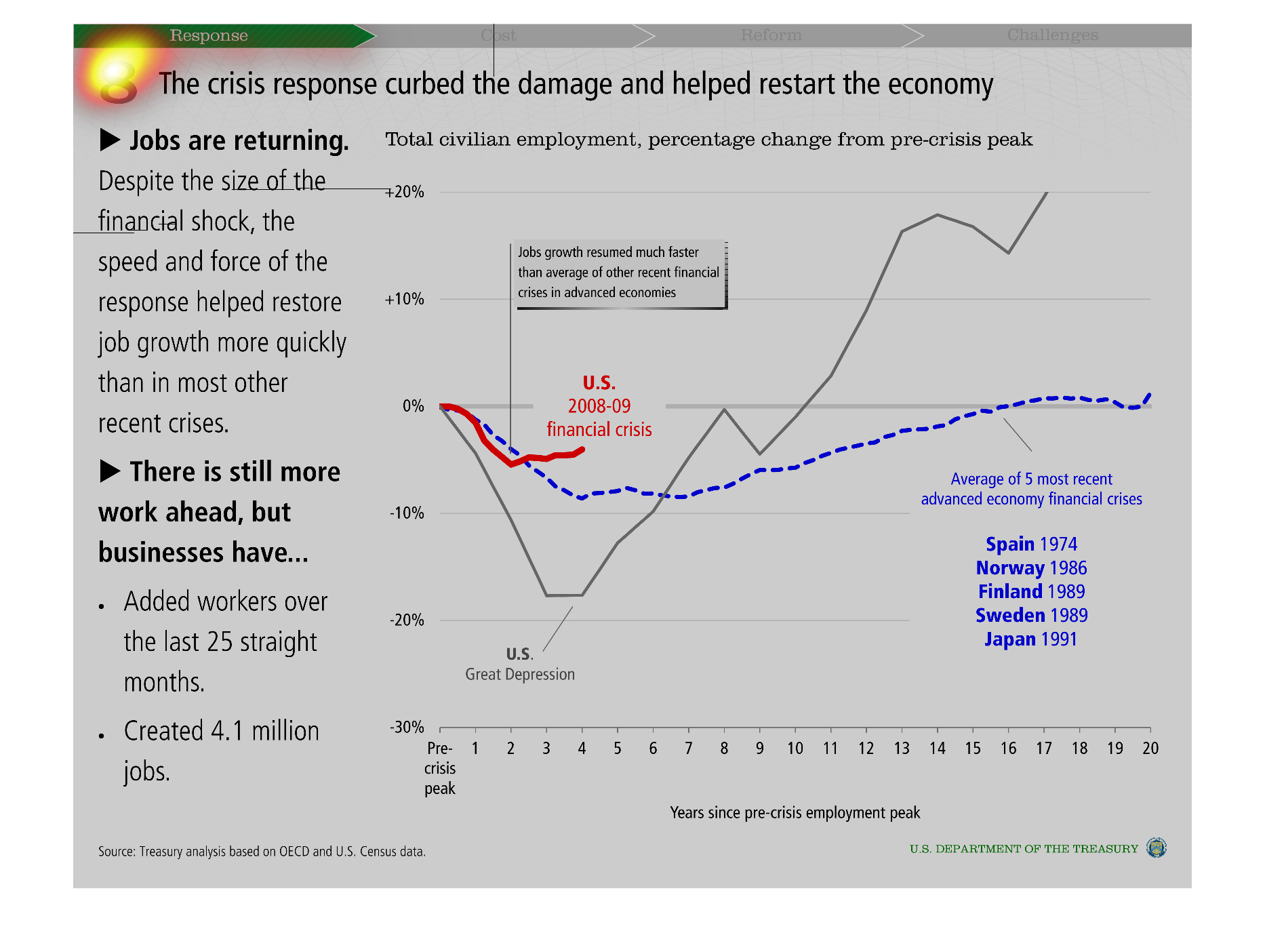
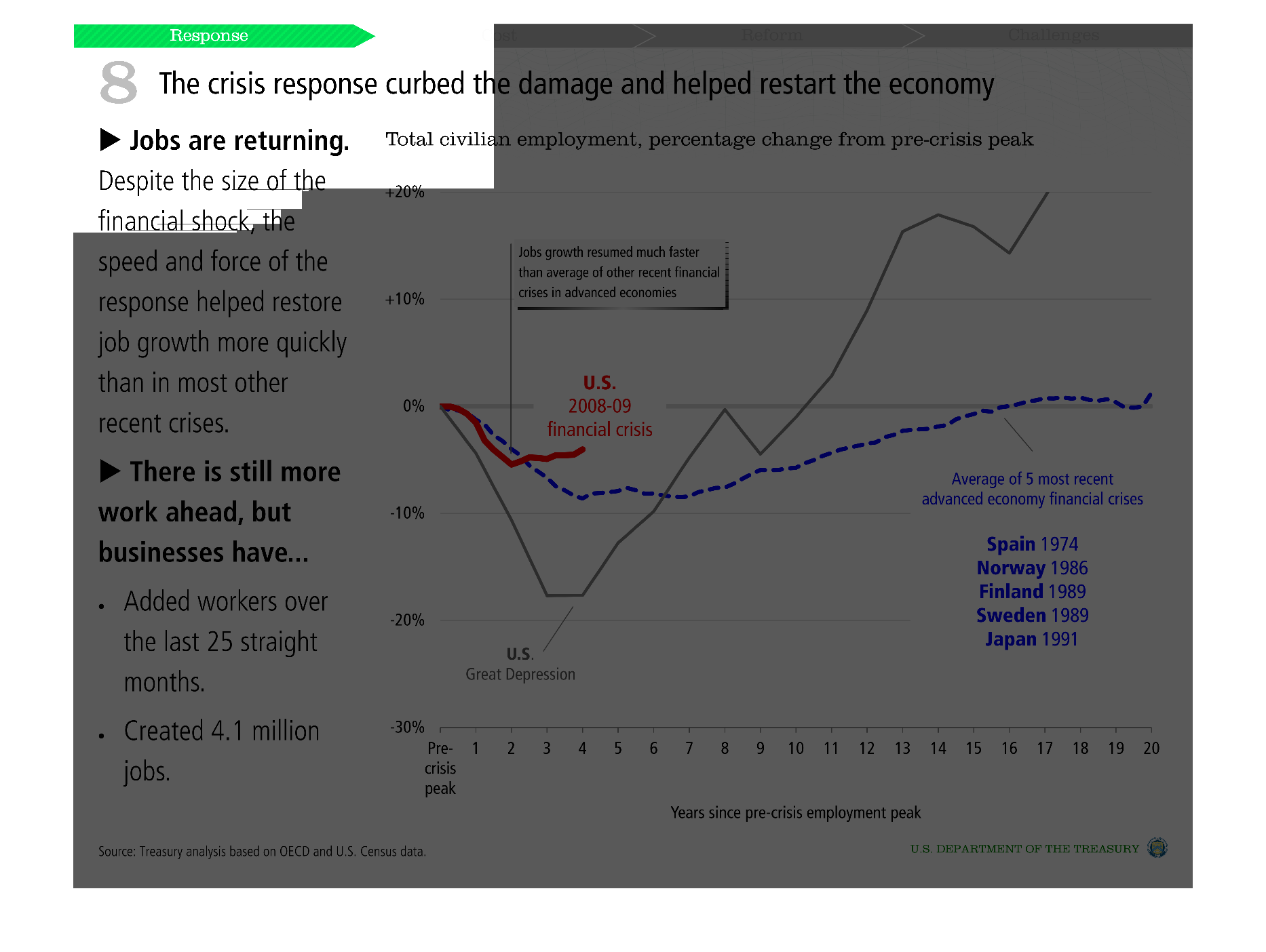
This is a chart about restarting the economy after the crisis. the chart details the employment
rat in the US at the pre-crisis peak, and states we are recovering slowly.
Warning: Image is too big to fit on screen; displaying at 50%
Warning: Image is too big to fit on screen; displaying at 50%
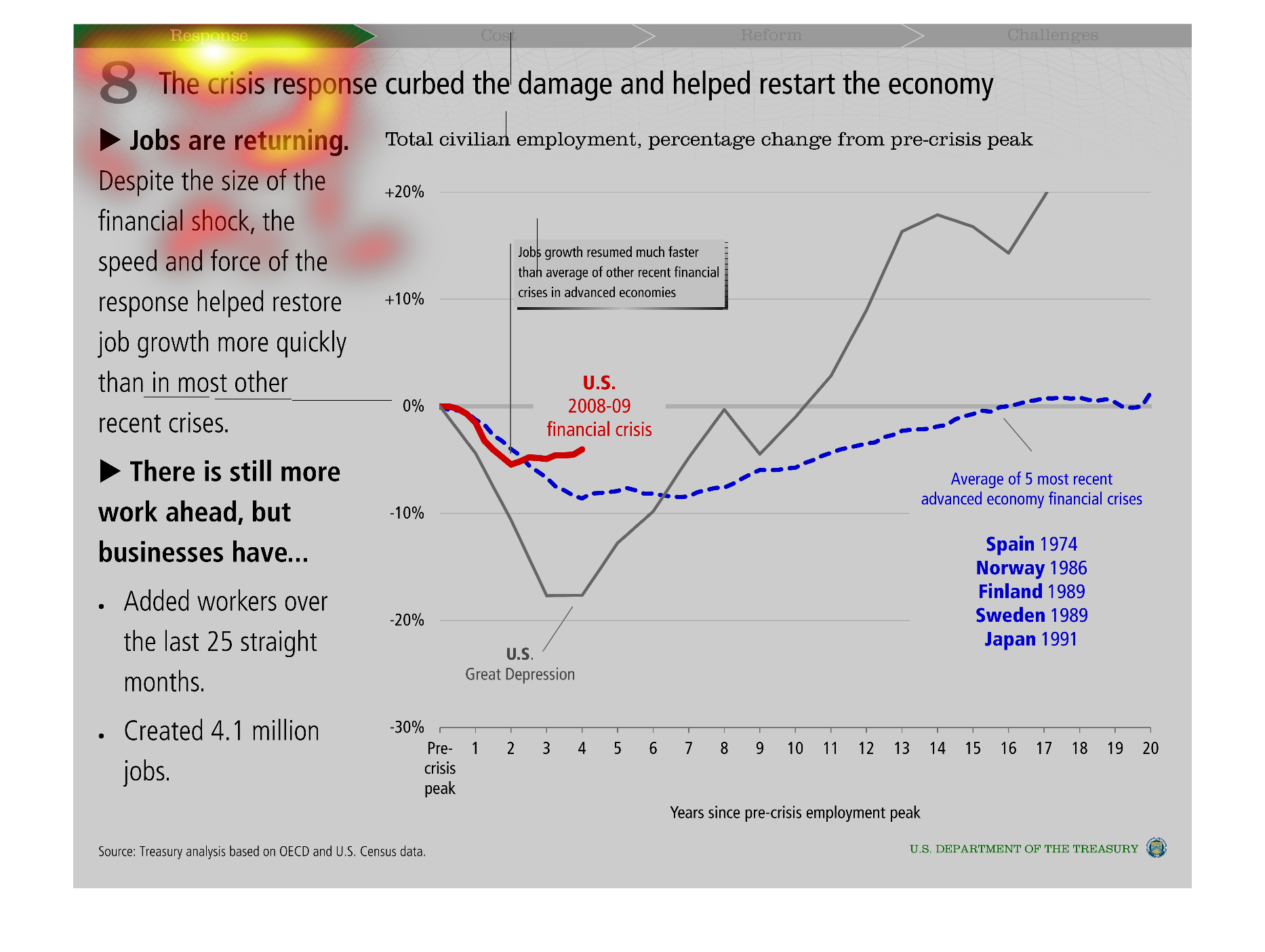
This graph tries to illustrate that in a way the collapse was a good thing which forced the
GOP to change things for the better and regulate more the economy.
Warning: Image is too big to fit on screen; displaying at 50%
Warning: Image is too big to fit on screen; displaying at 50%
this is a graph about the economy and the graph is a lined graph. and it went up and down
in the past years and the colors are red and blue spain is blue.
Warning: Image is too big to fit on screen; displaying at 50%
Warning: Image is too big to fit on screen; displaying at 50%
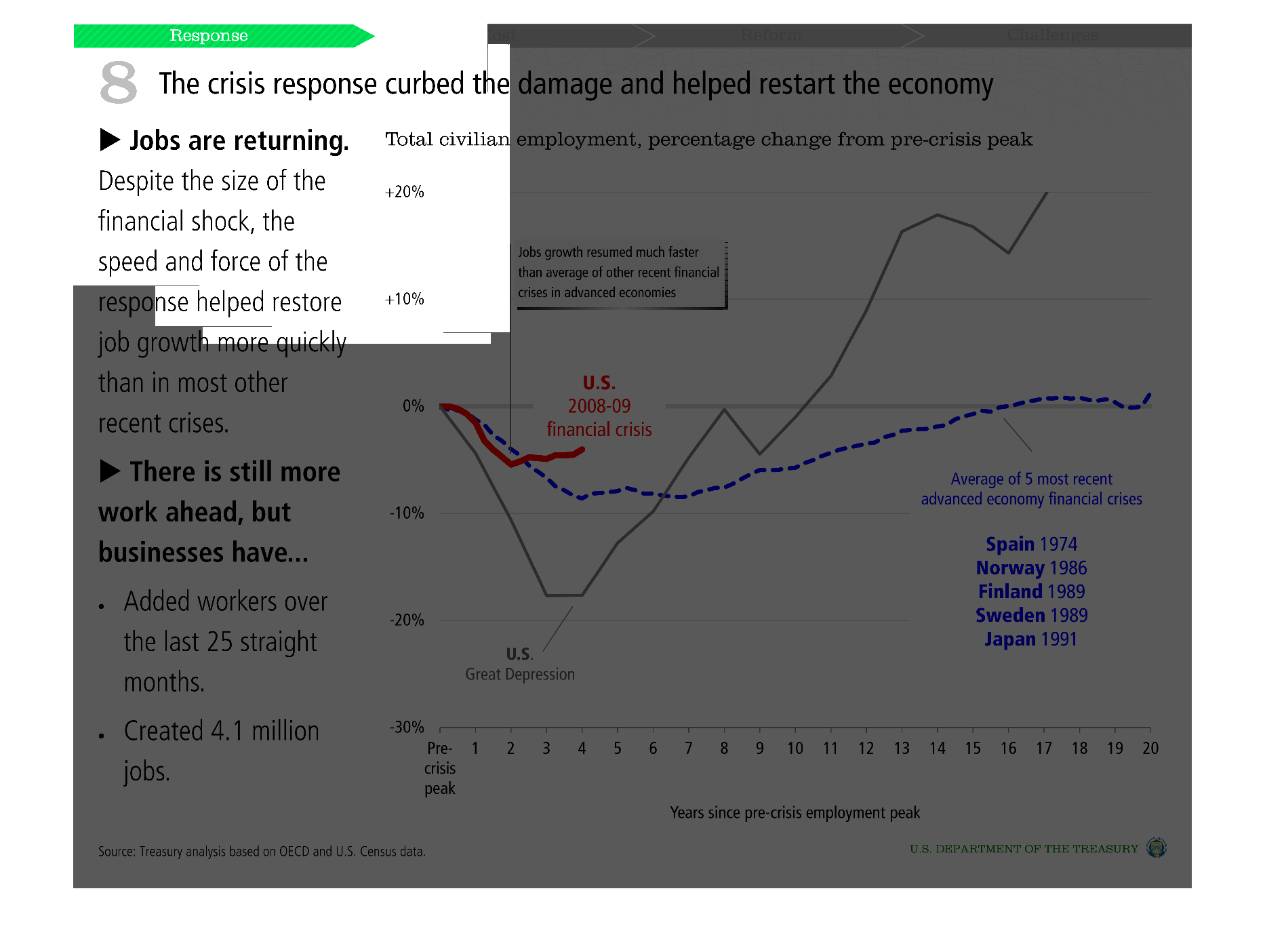
This image shows job market trends following economic crisis periods. In grey, the graph shows
that the was a sharp decline in employment in the 3 years following the Great Depression,
and then the market grew and exceeded the pre-crisis peak. In red, following the US 2008-09
crisis, there was a slight drop in employment that leveled out by year 3.
Warning: Image is too big to fit on screen; displaying at 50%
Warning: Image is too big to fit on screen; displaying at 50%
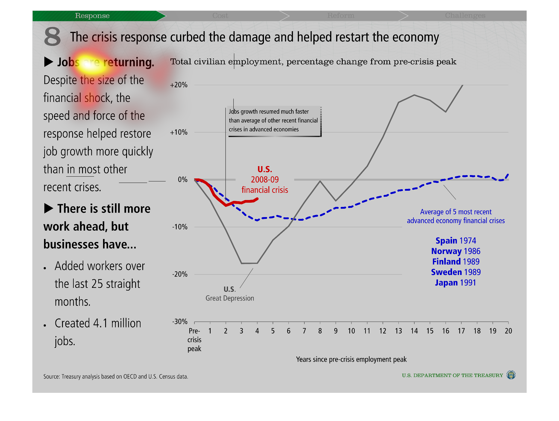
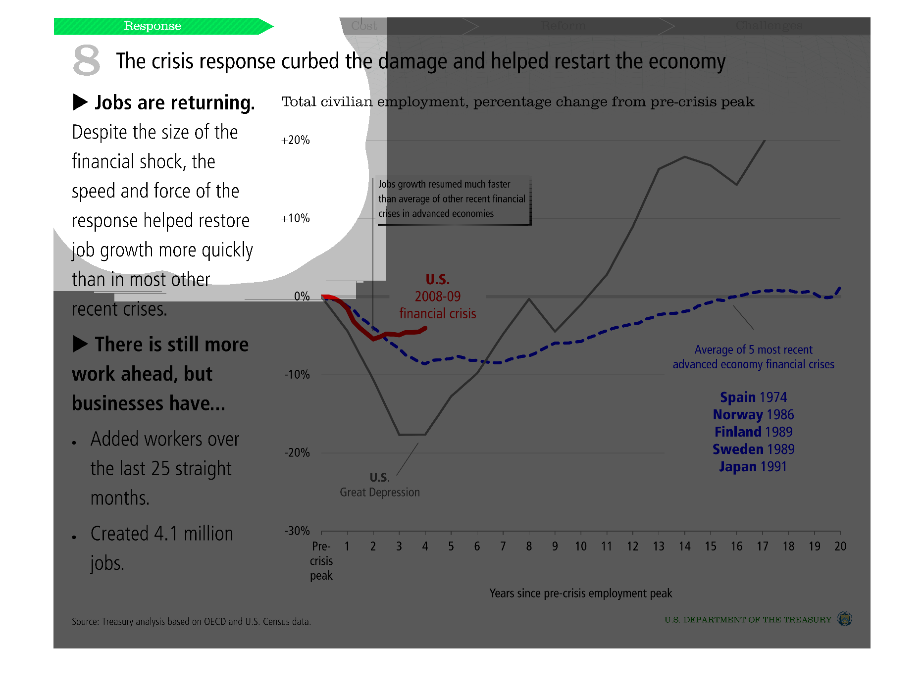
This graph describes the job growth since the recession.  It shows increase of workers hired
to the job field since 2008. Also shows comparisons between other countries that experienced
the same thing and how the US recovery compares.
Warning: Image is too big to fit on screen; displaying at 50%
Warning: Image is too big to fit on screen; displaying at 50%
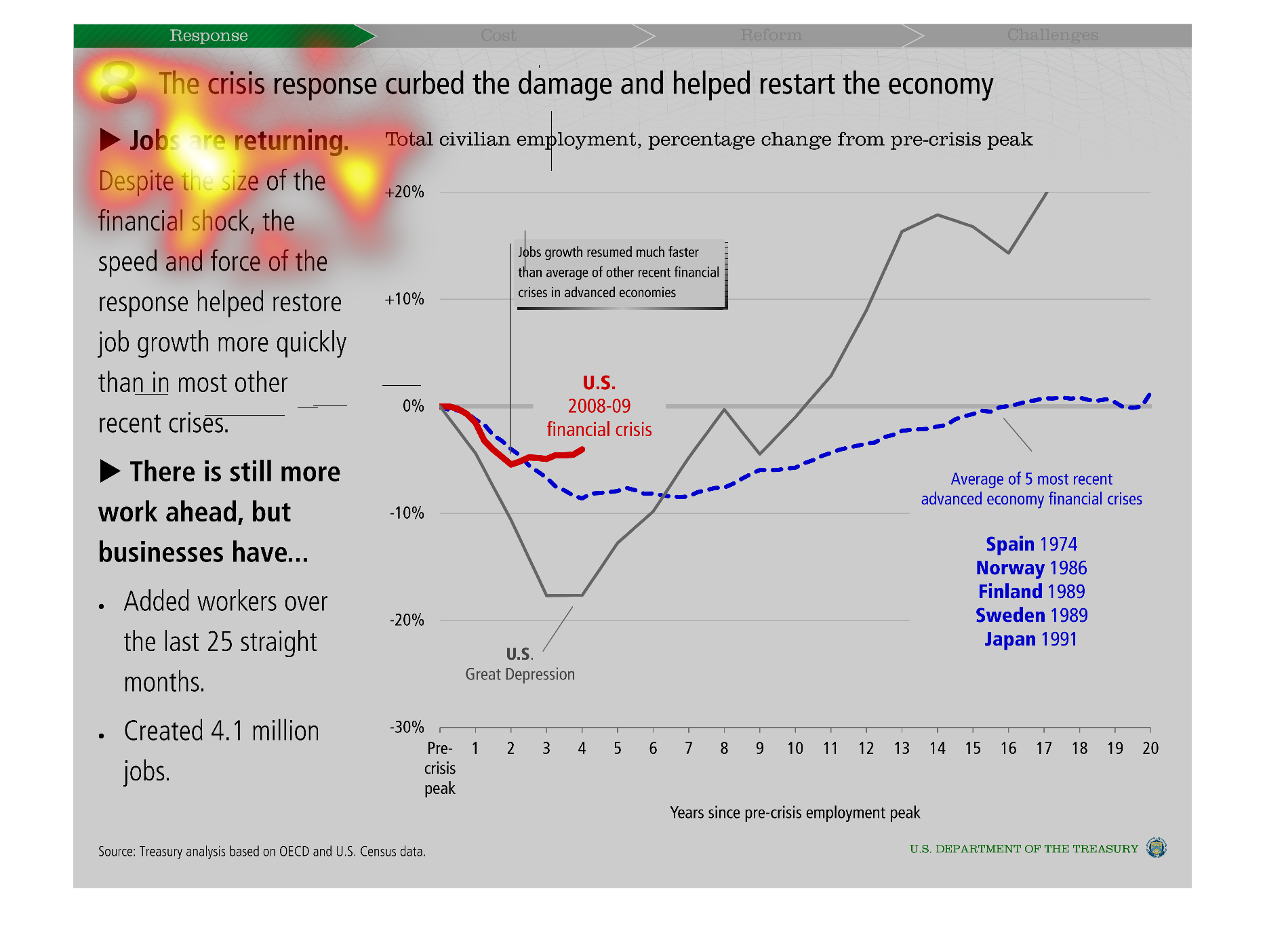
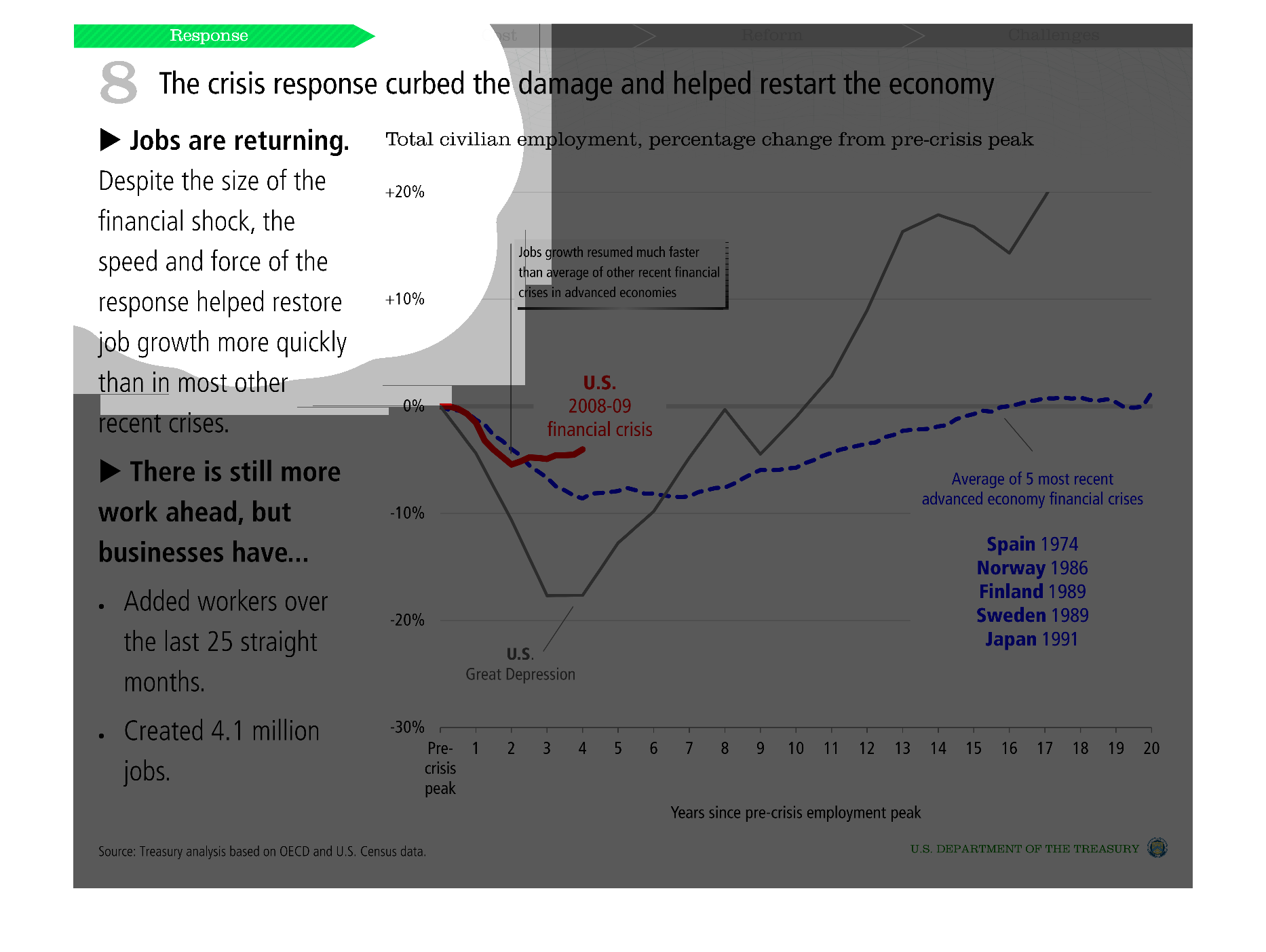
Crisis response curbed damage and restored the economy by adding workers over the last 25
straight months and creating 4.1 million jobs. Compared current crisis to average of 5 most
recent advanced economy financial crises.
Warning: Image is too big to fit on screen; displaying at 50%
Warning: Image is too big to fit on screen; displaying at 50%
THIS PLOT SHOWS THAT THE CRISIS RESPONSE TO THE GREAT RECESSION HELPED TO STIMULATE JOB GROWTH
BY COMPARING JOB GROWTH POST RECESSION TO JOB GROWTH DURING THE GREAT RECESSION.
Warning: Image is too big to fit on screen; displaying at 50%
Warning: Image is too big to fit on screen; displaying at 50%
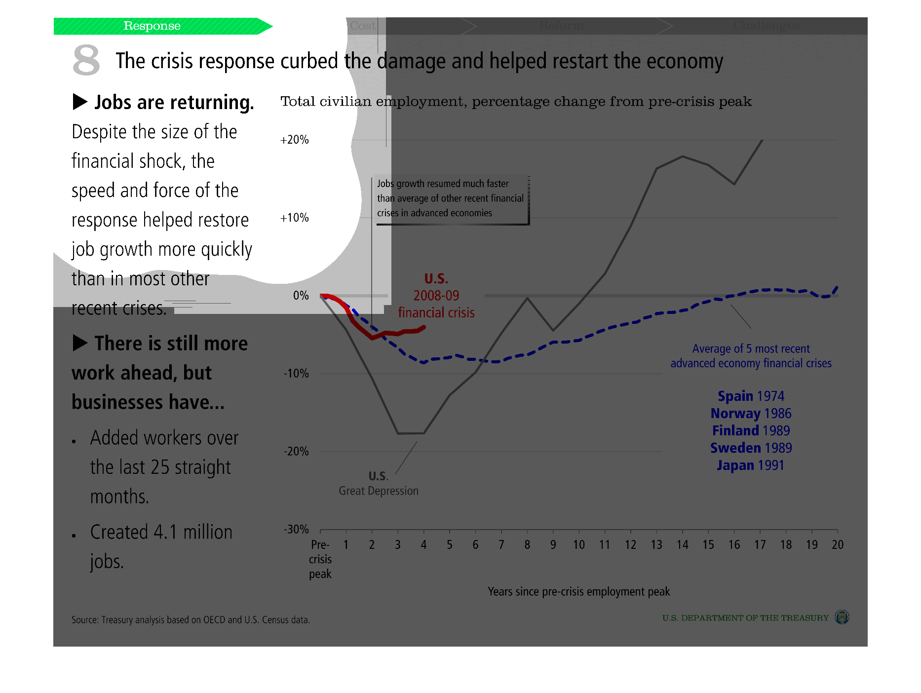
An infographic that shows that the crisis response to the 2008 recession curbed the damaged
and sparked a real recovery. It shows that jobs are returning.
Warning: Image is too big to fit on screen; displaying at 50%
Warning: Image is too big to fit on screen; displaying at 50%
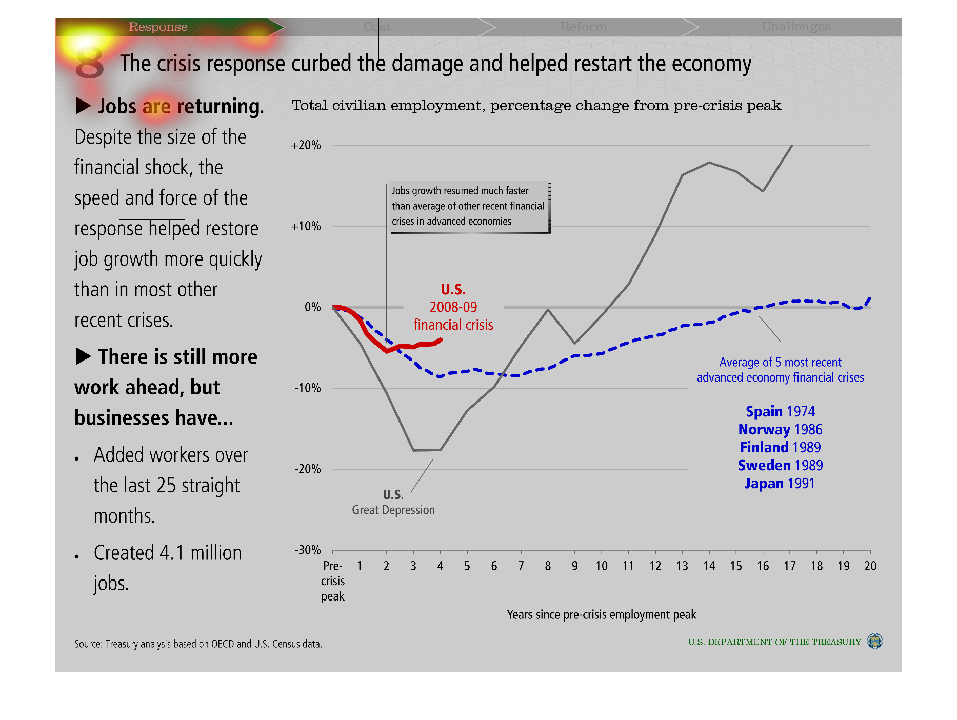
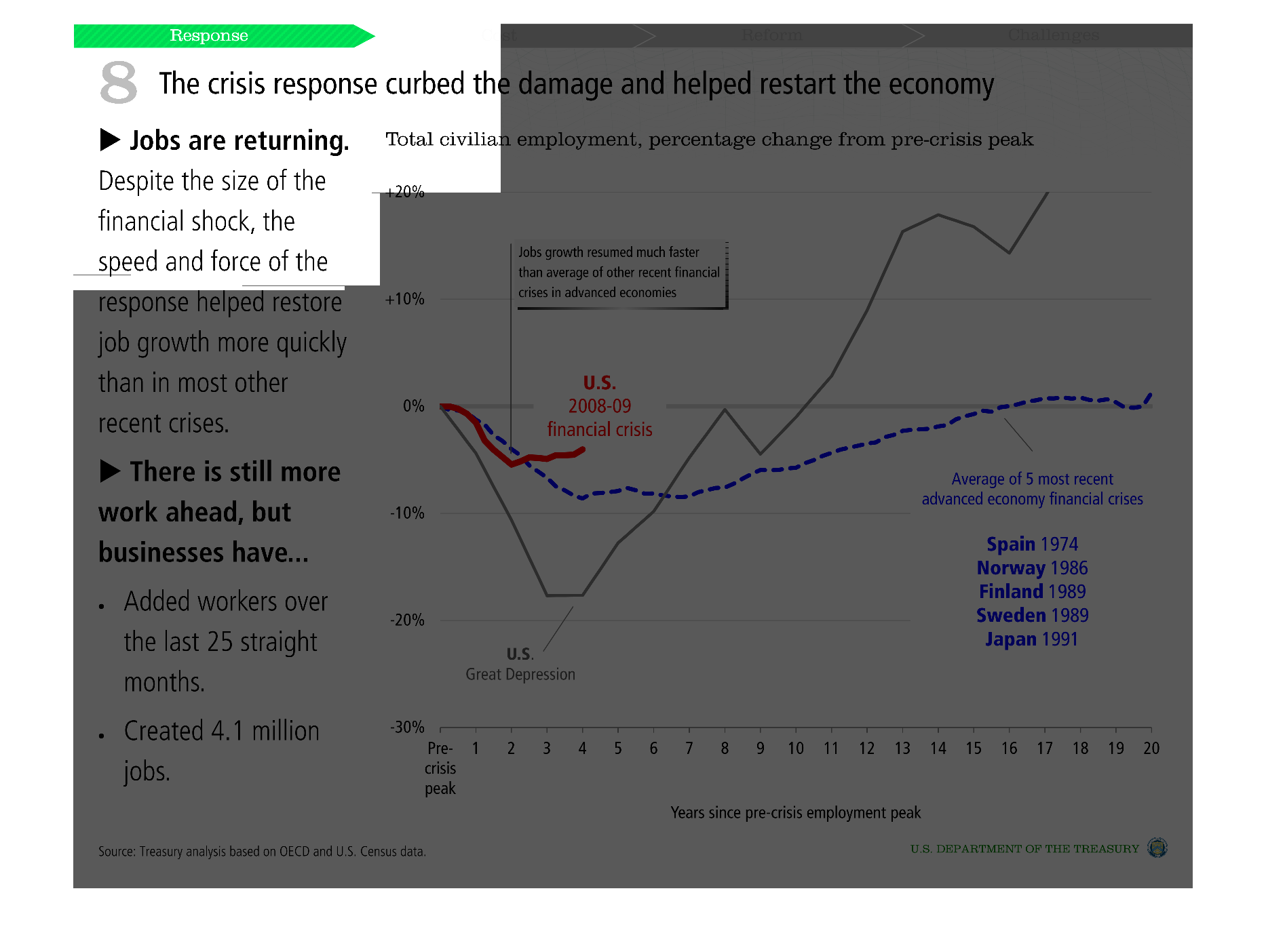
This graph shows total civilian employment with percentage change from pre-crisis peak.  It
displays against the average of the 5 most recent economy financial crises and names them
by country and year.
Warning: Image is too big to fit on screen; displaying at 50%
Warning: Image is too big to fit on screen; displaying at 50%
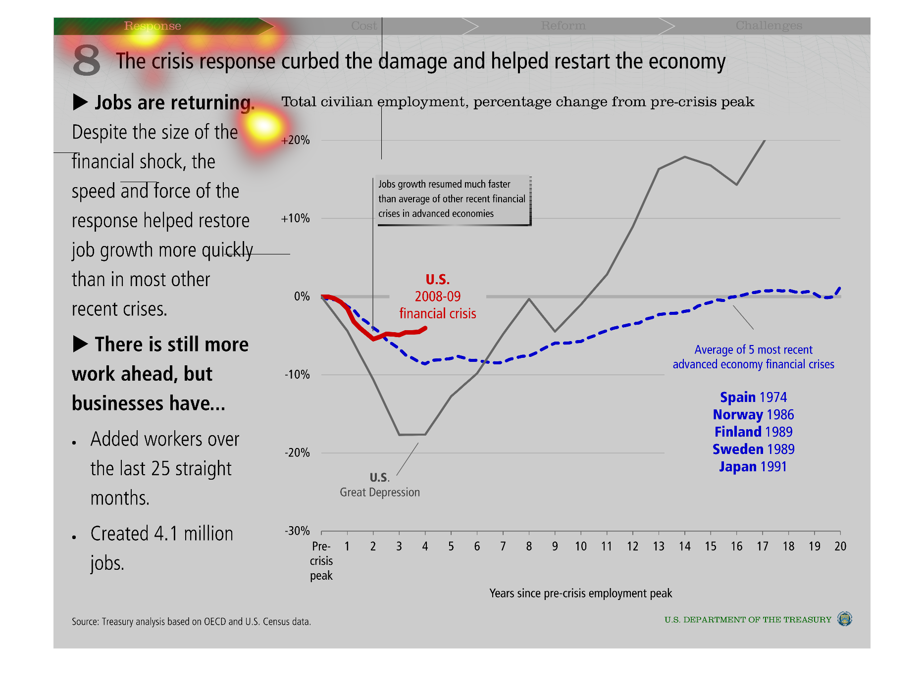
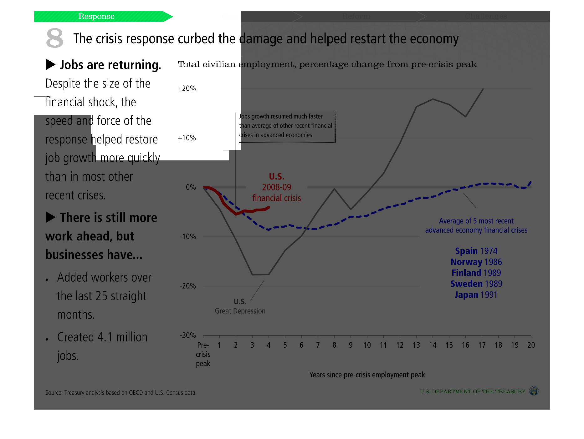
Crisis response curbs damage and helps the economy. Jobs are created in order to help the
recovery. Several examples are shown in various countries.  They plot how employment is effected
years after the crisis.
Warning: Image is too big to fit on screen; displaying at 50%
Warning: Image is too big to fit on screen; displaying at 50%
The image is a graph showing how the economic crisis response curbed the damage and helped
to restart the economy and how hobs are returning. The image has has information about other
historical economic crisis and also includes information on other countries and the economy.
Warning: Image is too big to fit on screen; displaying at 50%
Warning: Image is too big to fit on screen; displaying at 50%
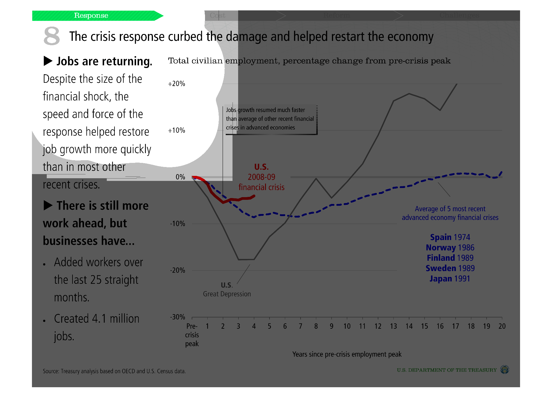
This chart shows total civilian employment percentage change from pre-crisis peak. It compares
recovery rates between the average of the 5 most recent advanced financial crisis, the US
2008-2009 financial crisis, and the great depression.
Warning: Image is too big to fit on screen; displaying at 50%
Warning: Image is too big to fit on screen; displaying at 50%
The title of this graph is, 'The crisis response curbed the damage and helped restart the
economy'.  The commentary on the left side of the graph explains how jobs are coming back
after despite the 2008-09 financial crisis (crime).
Warning: Image is too big to fit on screen; displaying at 50%
Warning: Image is too big to fit on screen; displaying at 50%