Warning: Image is too big to fit on screen; displaying at 50%
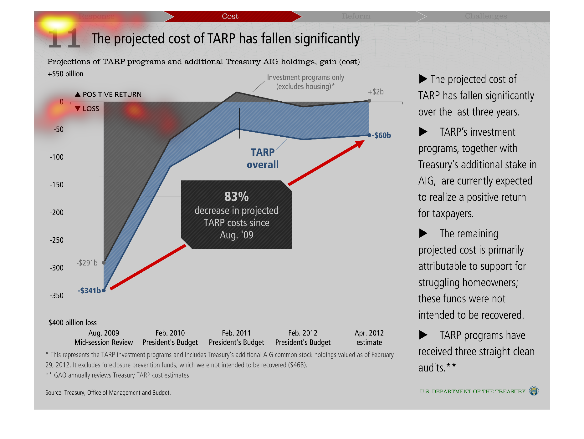
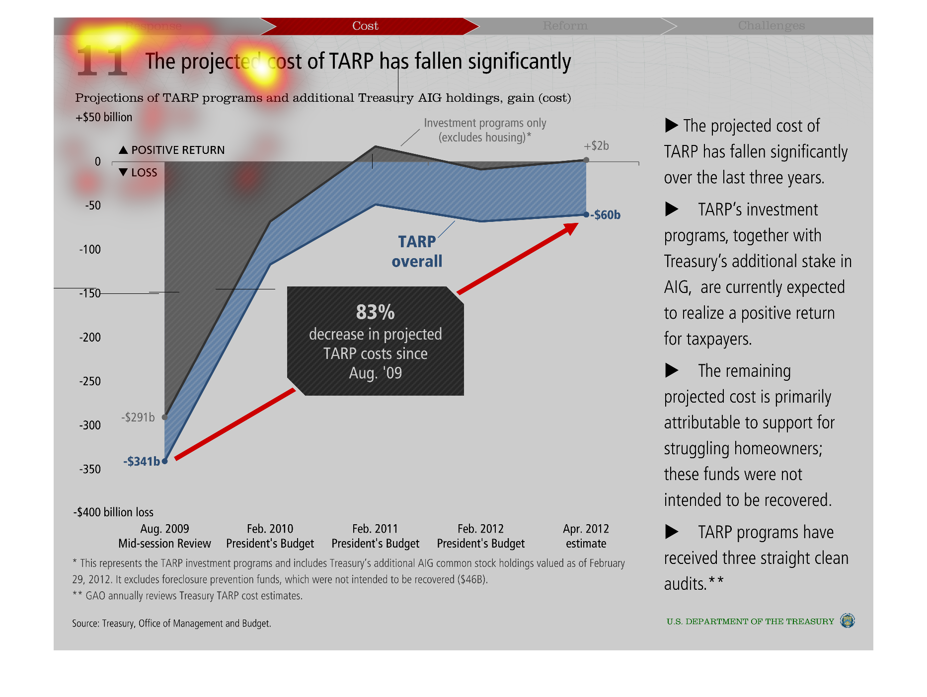
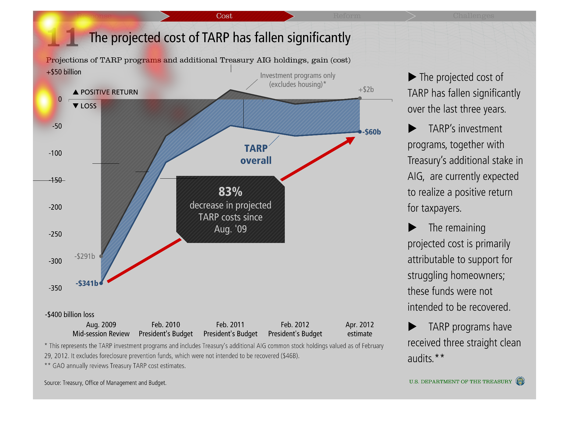
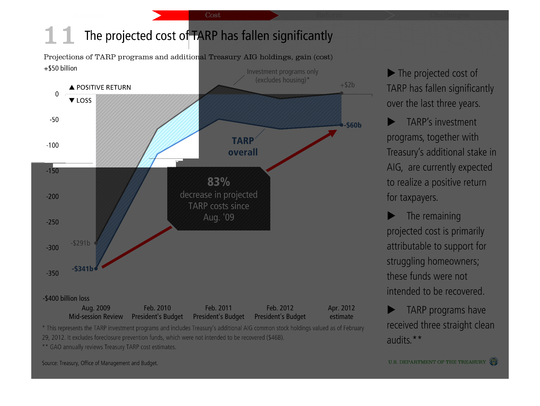
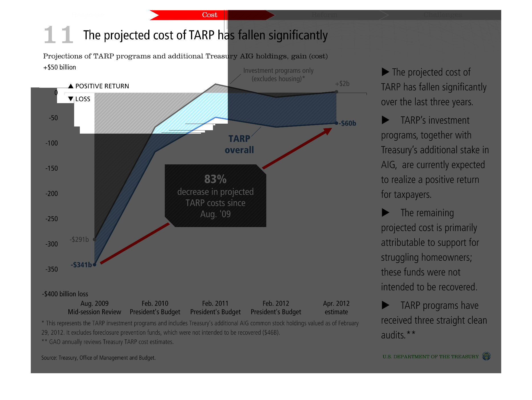
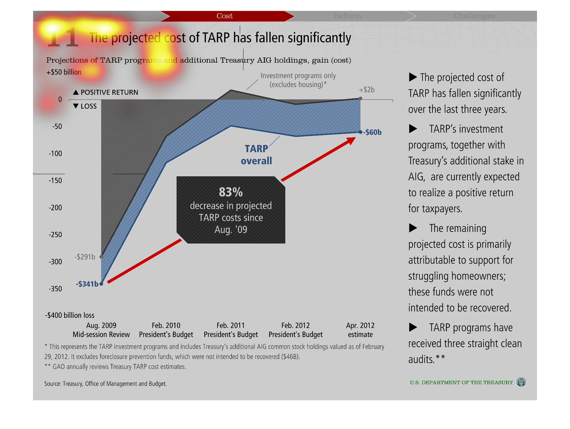
This chart shows that the projected cost of TARP has fallen significantly. The line graph
shows that there has been an 83% drop in the projected cost of TARP since August 2009.
Warning: Image is too big to fit on screen; displaying at 50%
Warning: Image is too big to fit on screen; displaying at 50%

This graph shows that the projected cost of TARP has fallen significantly over the past 3
years. TARP and the additional stake in AIG are expected to be a positive return for taxpayers
by February 2011. The rest of the funds went to helping struggling homeowners. There has been
an 83% decrease in projected TARP cost since August 2009.
Warning: Image is too big to fit on screen; displaying at 50%
Warning: Image is too big to fit on screen; displaying at 50%

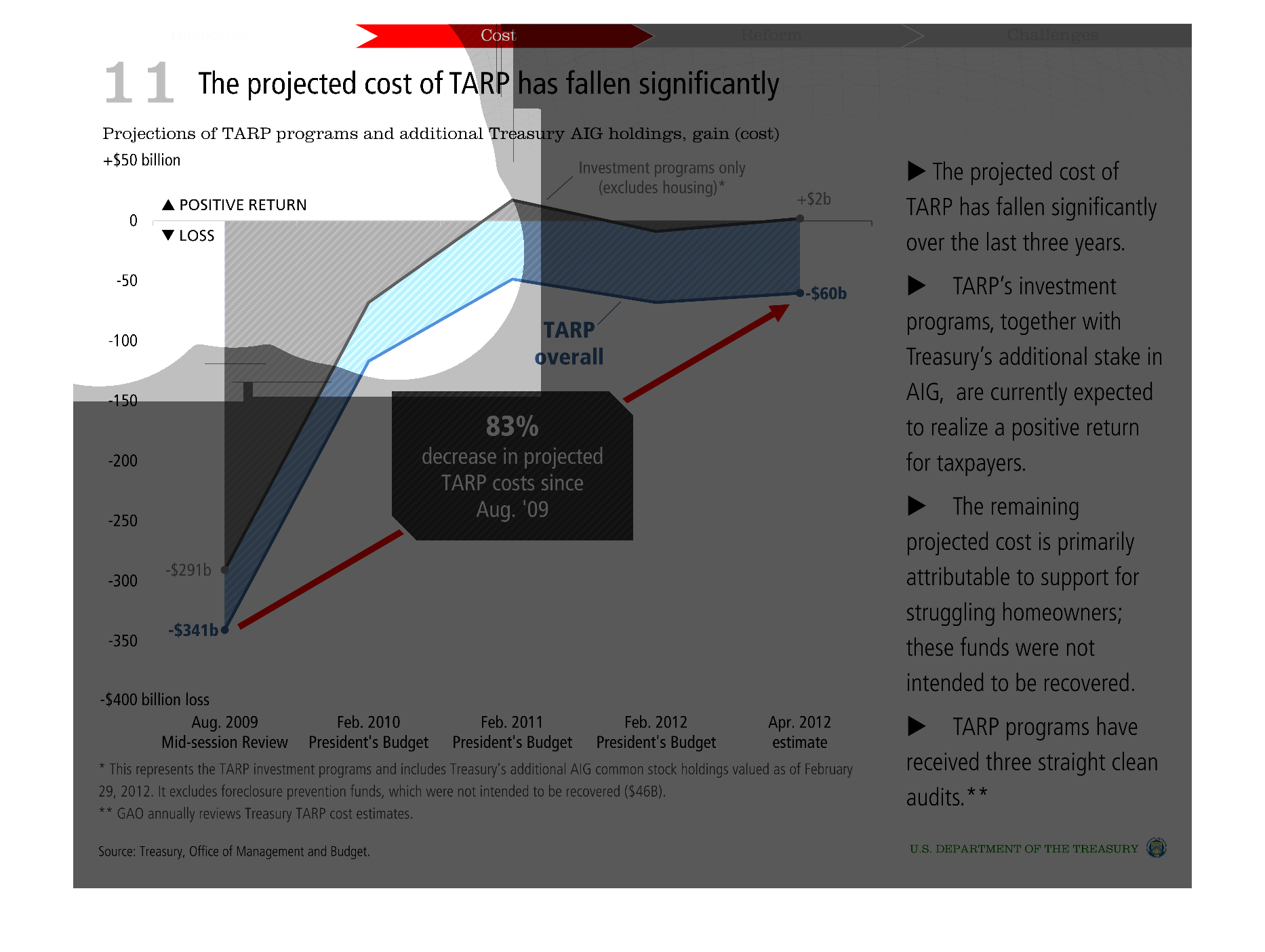
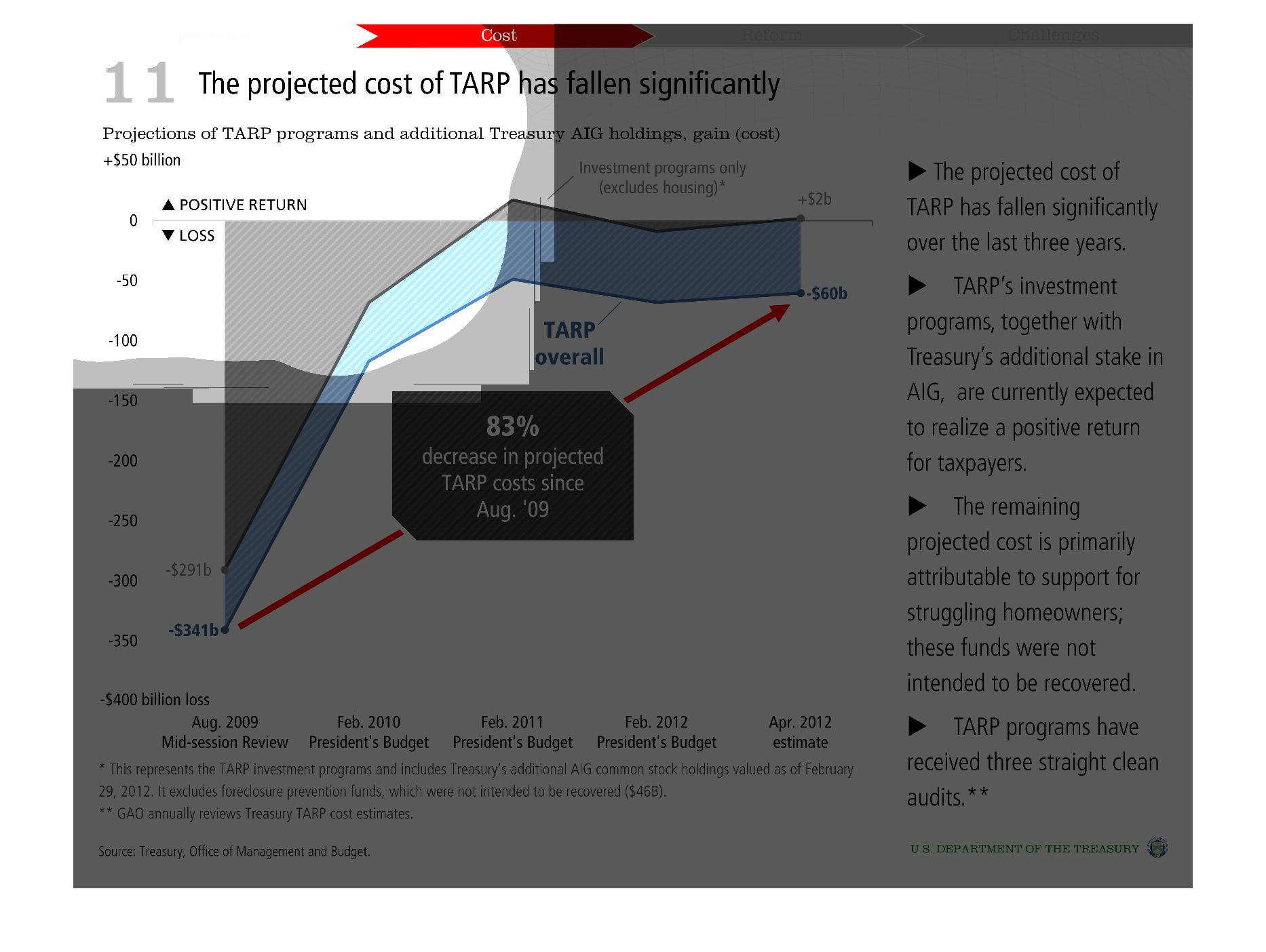
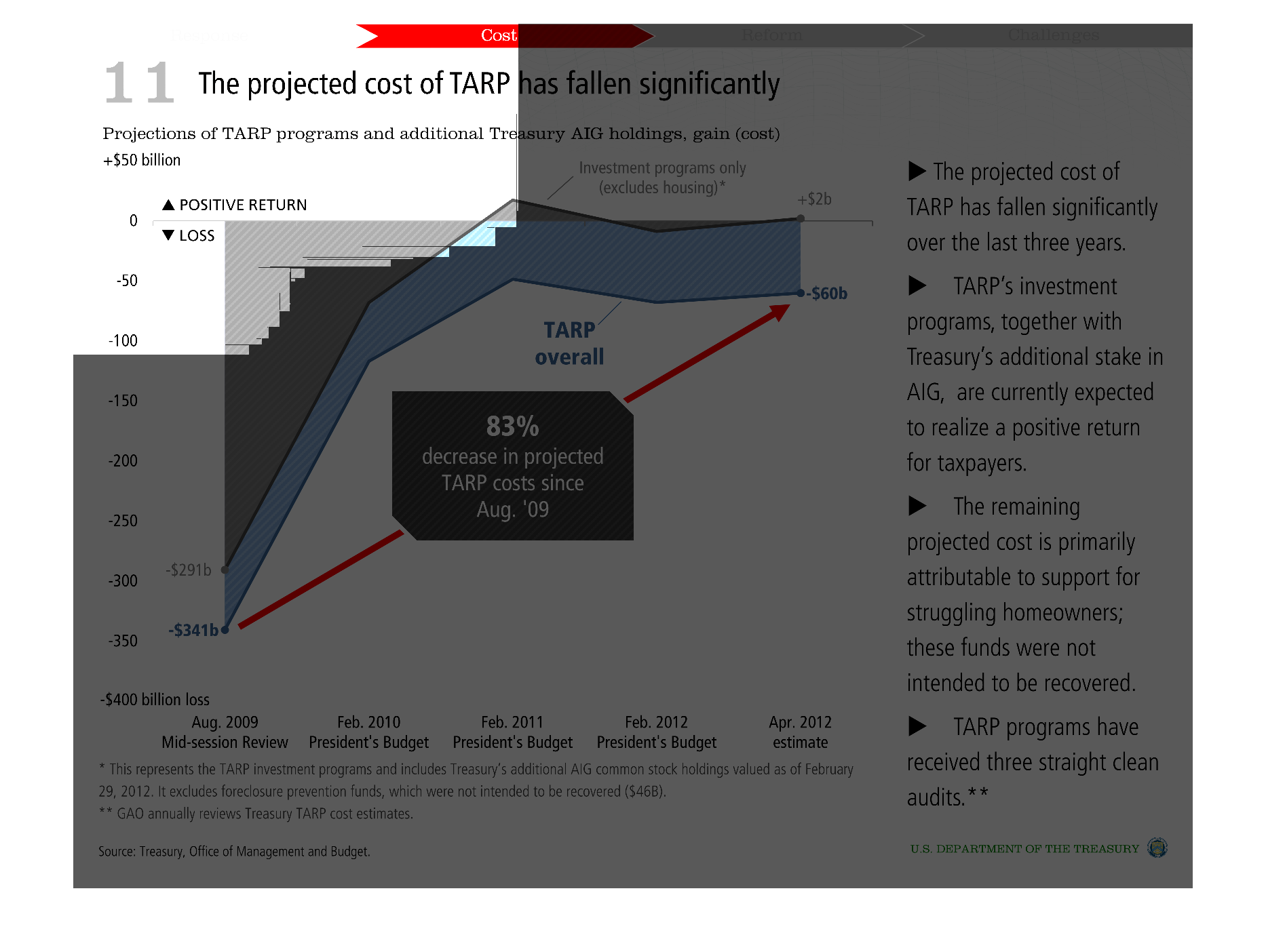
This image shows or depicts in statistical bar graph format in regards to the projected costs
of TARP has fallen significantly. The costs has pros and cons.
Warning: Image is too big to fit on screen; displaying at 50%
Warning: Image is too big to fit on screen; displaying at 50%
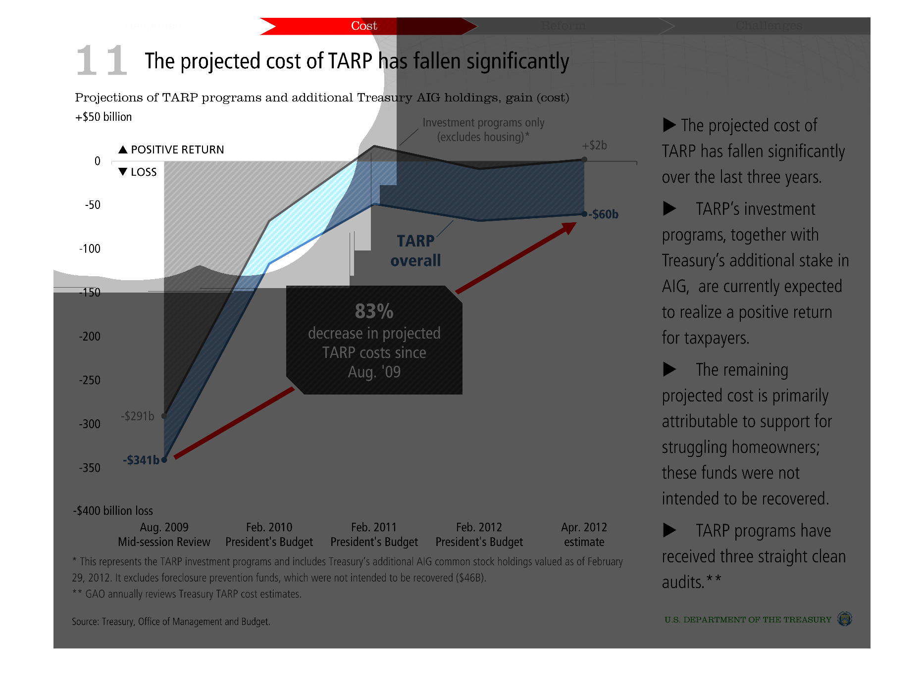
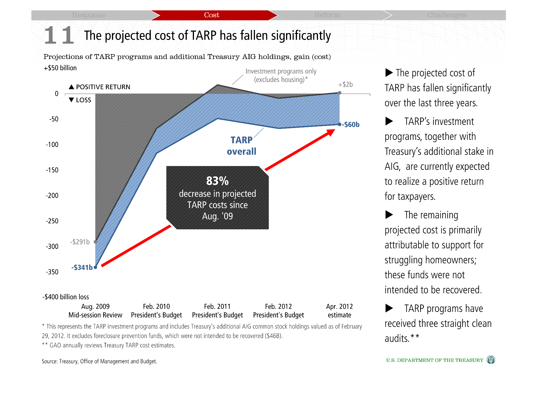
This chart seems to show the projected cost of the TARP program, ranked yearly, with an overall
83% decrease in cost since its start. There are facts about the history of the project on
the right.
Warning: Image is too big to fit on screen; displaying at 50%
Warning: Image is too big to fit on screen; displaying at 50%
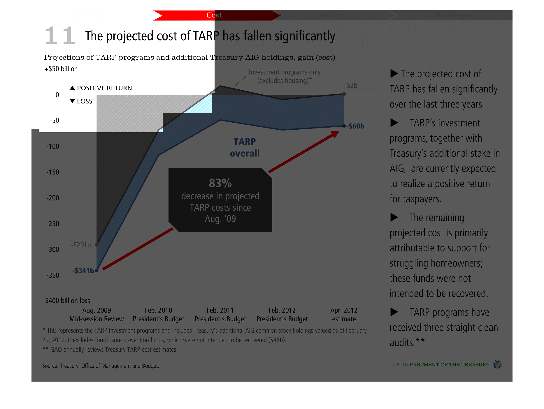
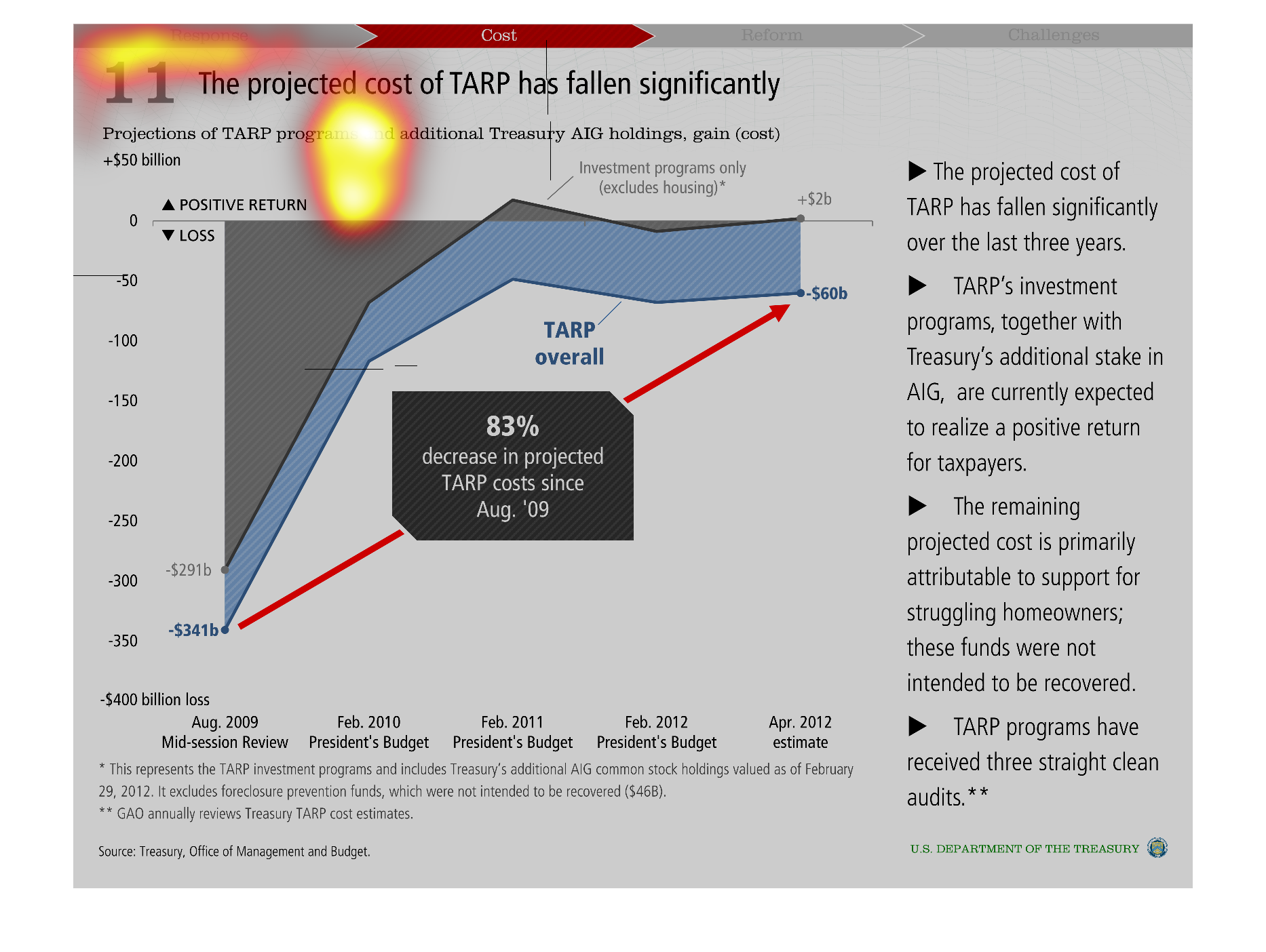
This graph illustrates how the investments made during the onset of the economic crisis have
payed dividends and actually the cost has gone significantly down in the years since.
Warning: Image is too big to fit on screen; displaying at 50%
Warning: Image is too big to fit on screen; displaying at 50%
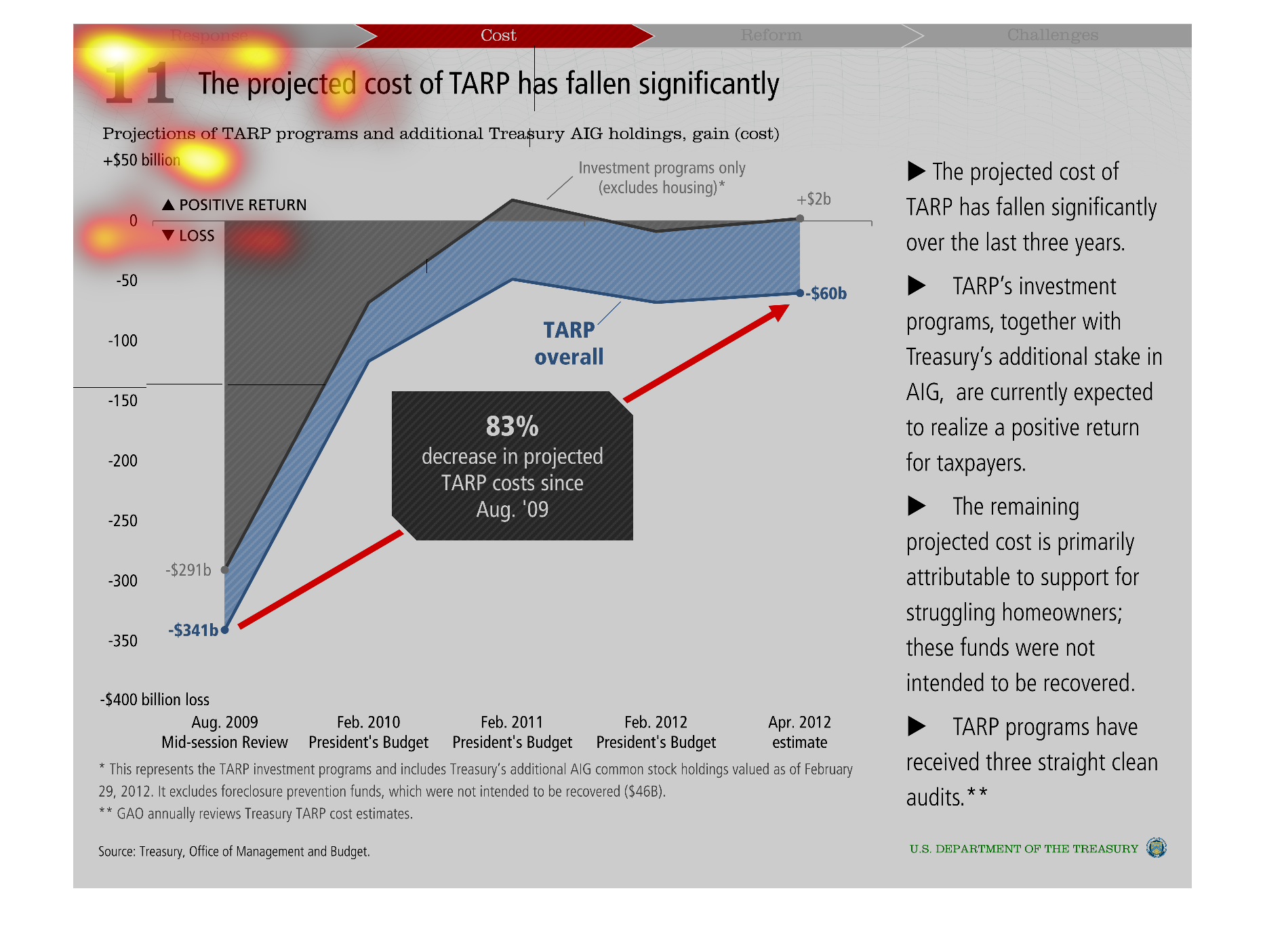
This charts depicts the projected cost of TARP to taxpayers vs. time.  The initial cost was
expected to be much higher, but some TARP investments have yielded a positive return, such
as TARP investment in AIG.
Warning: Image is too big to fit on screen; displaying at 50%
Warning: Image is too big to fit on screen; displaying at 50%
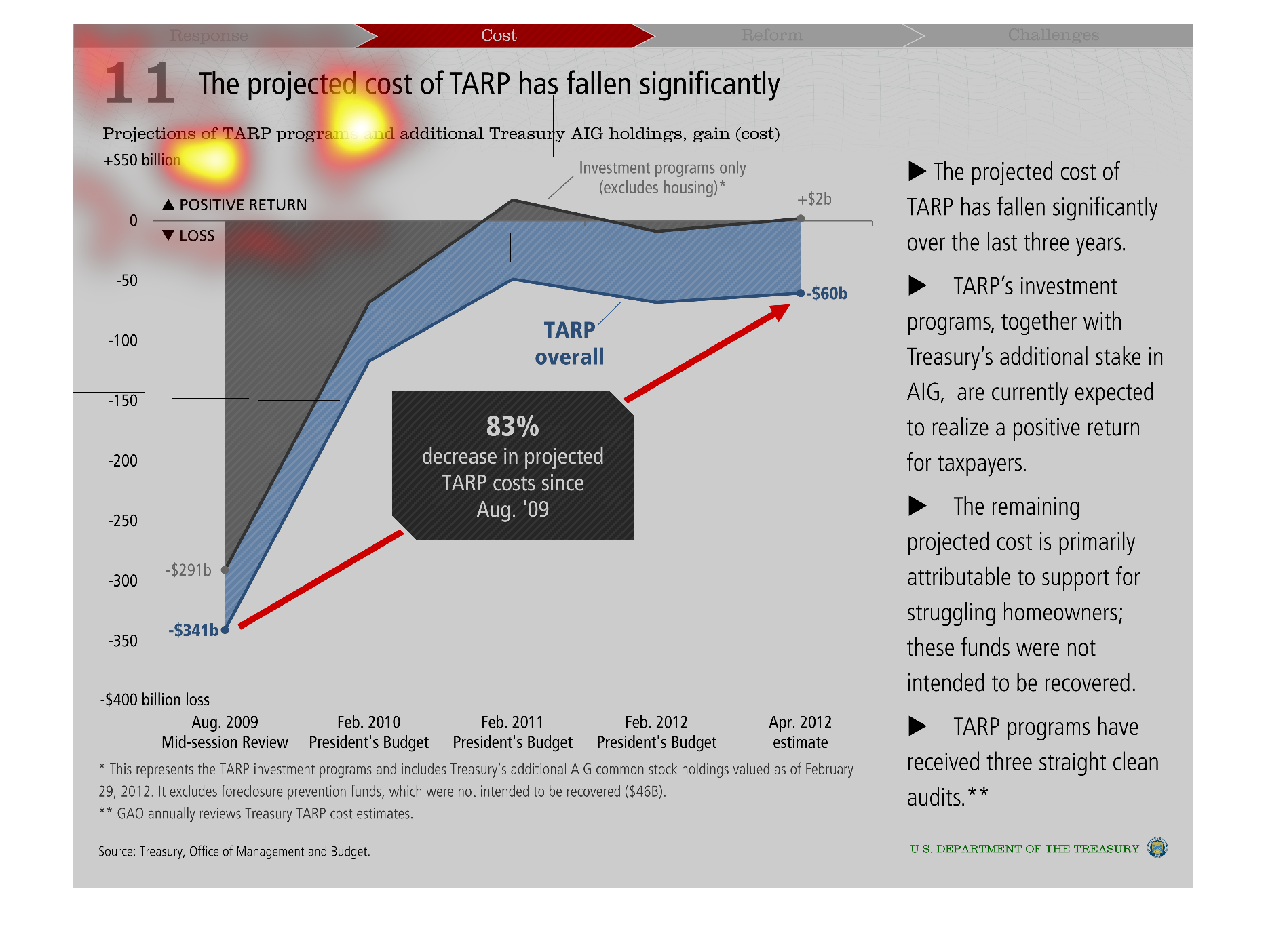
This graph shows how the projected cost of TARP has decreased significantly since 2009.  It
shows positive return and loss for August 2009, February 2010, 2011, and 2012, and April 2012.
Warning: Image is too big to fit on screen; displaying at 50%
Warning: Image is too big to fit on screen; displaying at 50%

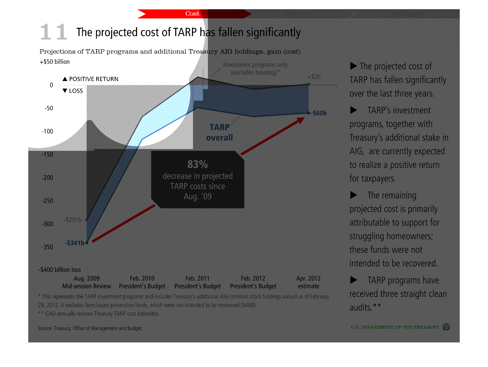
This shows us how the projected cost of TARP has fallen significantly from 2009-2010. It also
has a shortsynopsis of some reasons that may have contributed to these falling cost numbers.
Warning: Image is too big to fit on screen; displaying at 50%
Warning: Image is too big to fit on screen; displaying at 50%

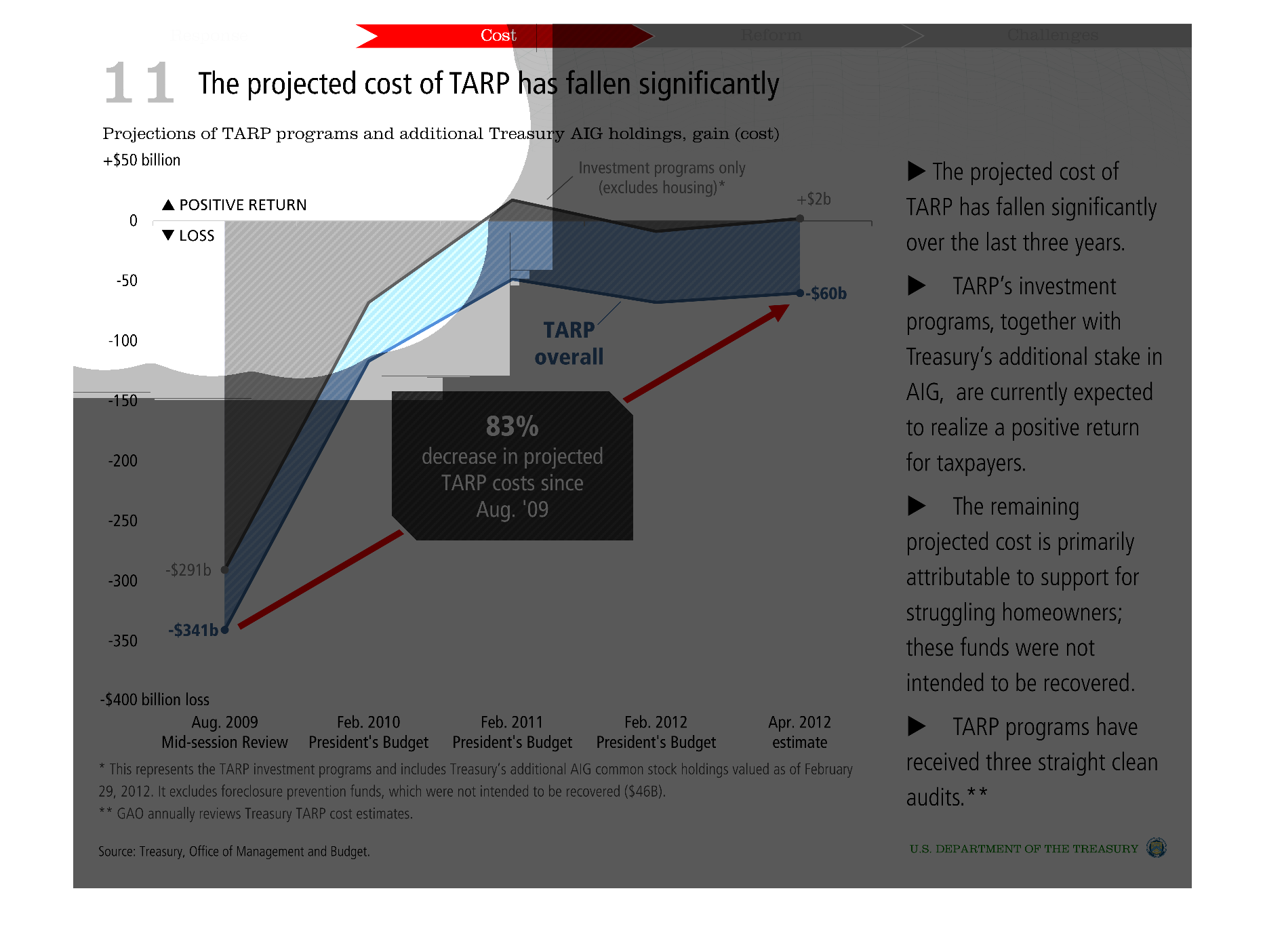
This graph shows the projected cost of TARP has fallen significantly.  It shows the projected
TARP costs over time and has some stated facts about TARP along the right hand side.
Warning: Image is too big to fit on screen; displaying at 50%
Warning: Image is too big to fit on screen; displaying at 50%

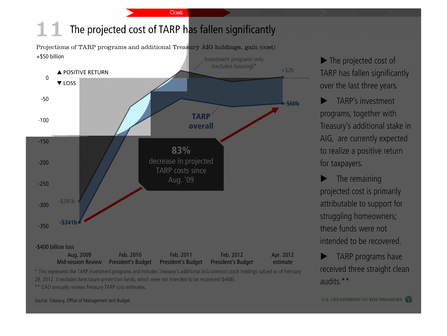
This chart describes that the projected cost of Tarp has fallen significantly over the last
three years. It also covers additional treasury AIG holdings and gains.
Warning: Image is too big to fit on screen; displaying at 50%
Warning: Image is too big to fit on screen; displaying at 50%

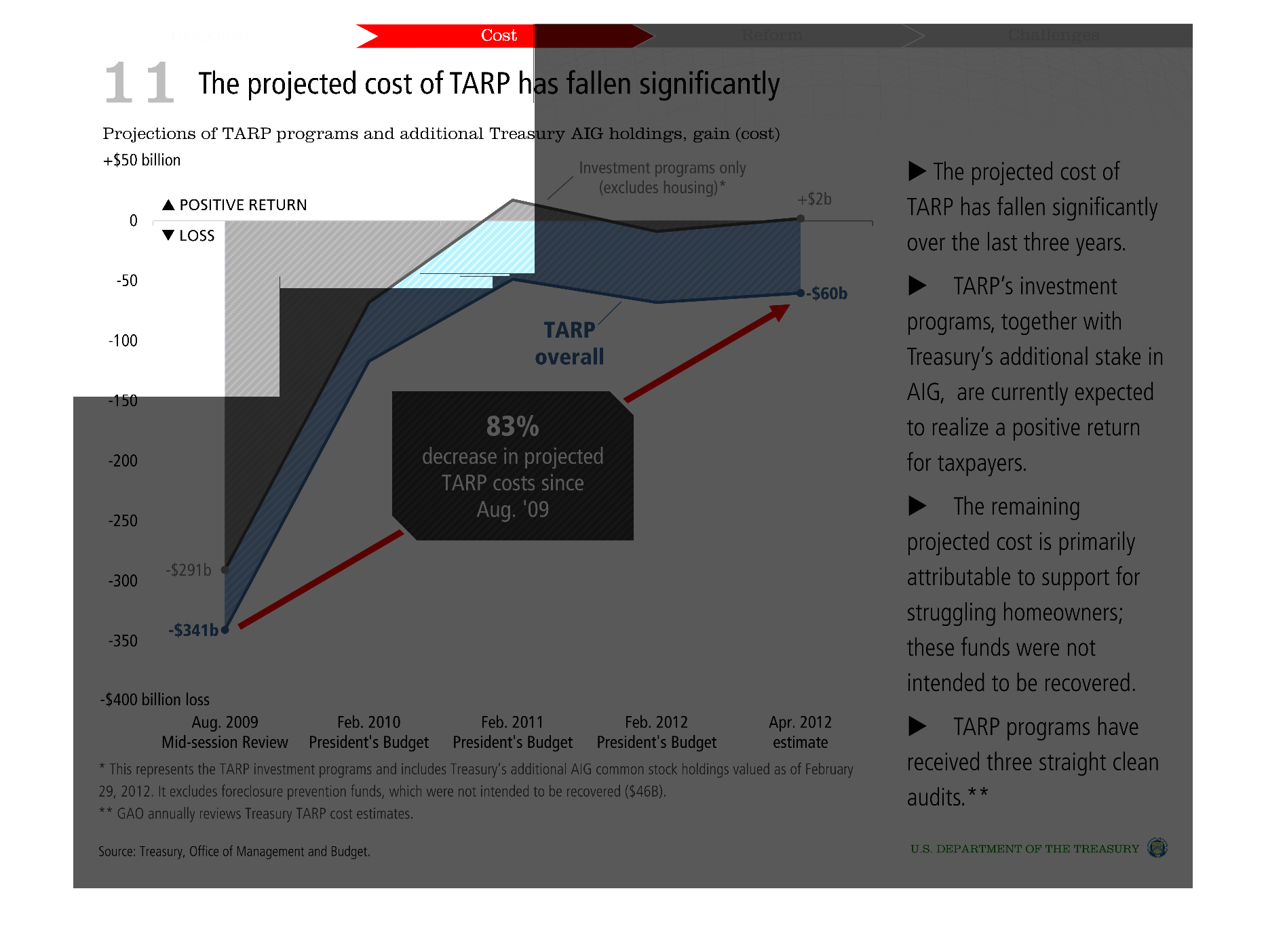
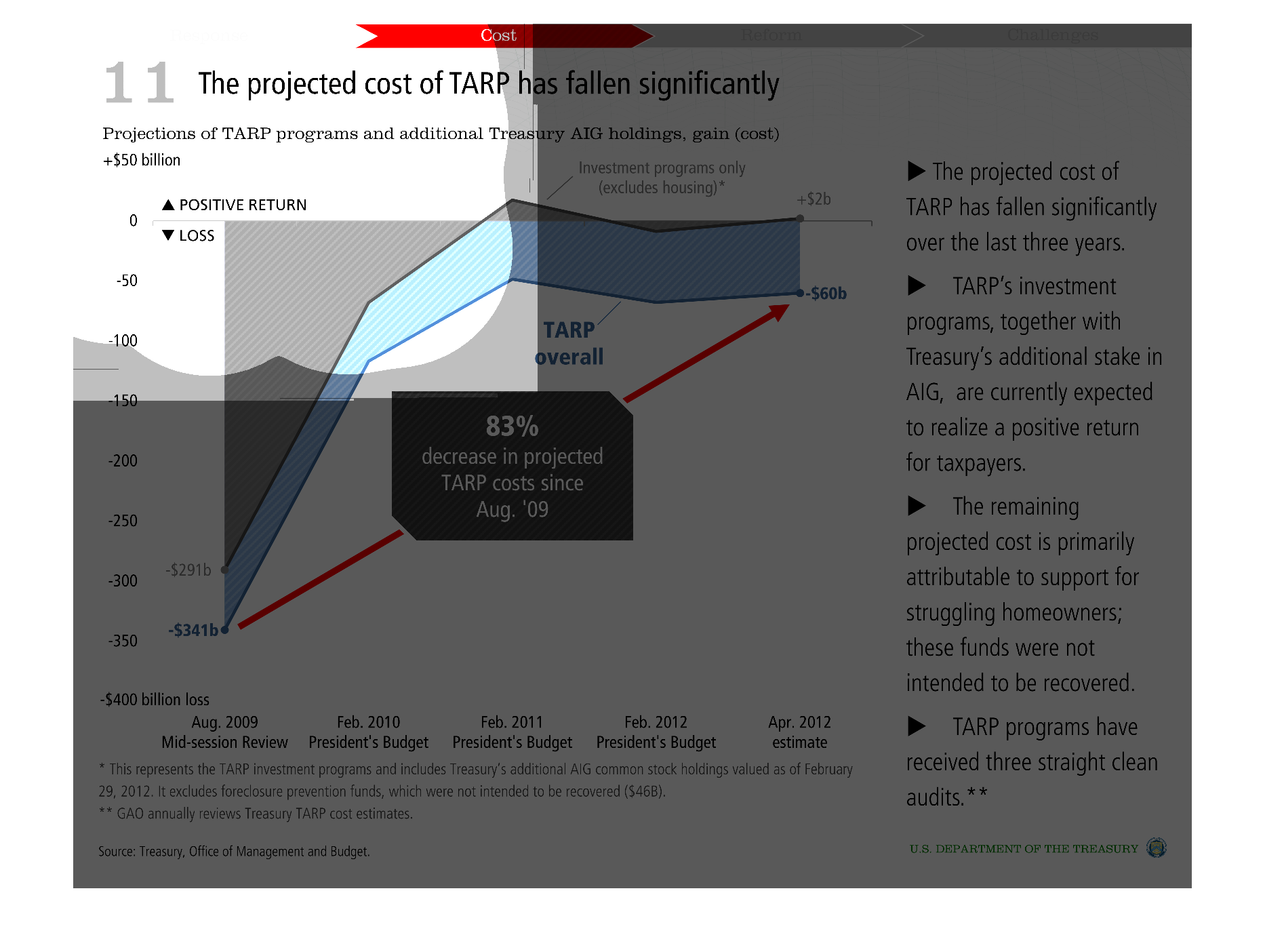
This chart clearly displays that the project cost of TARP has fallen significantly over the
last three years. TARP is expected to have a positive return to taxpayers.
Warning: Image is too big to fit on screen; displaying at 50%
Warning: Image is too big to fit on screen; displaying at 50%

The following chart shows that the projected costs of the U.S Government TARP program has
fallen dramatically over the last 6 years. With Many of the companies paying off there debts
to the U.S government. And some doing so with interests.
Warning: Image is too big to fit on screen; displaying at 50%
Warning: Image is too big to fit on screen; displaying at 50%

This graph discusses how the cost of tarp has fallen significantly. Tarp along with treasuries
stake in AIG are expected to have a positive turnout for taxpayers.The remaining projected
loss is due to saving struggling homeowners. Apparently these funds we not intended to be
recovered.
Warning: Image is too big to fit on screen; displaying at 50%
Warning: Image is too big to fit on screen; displaying at 50%
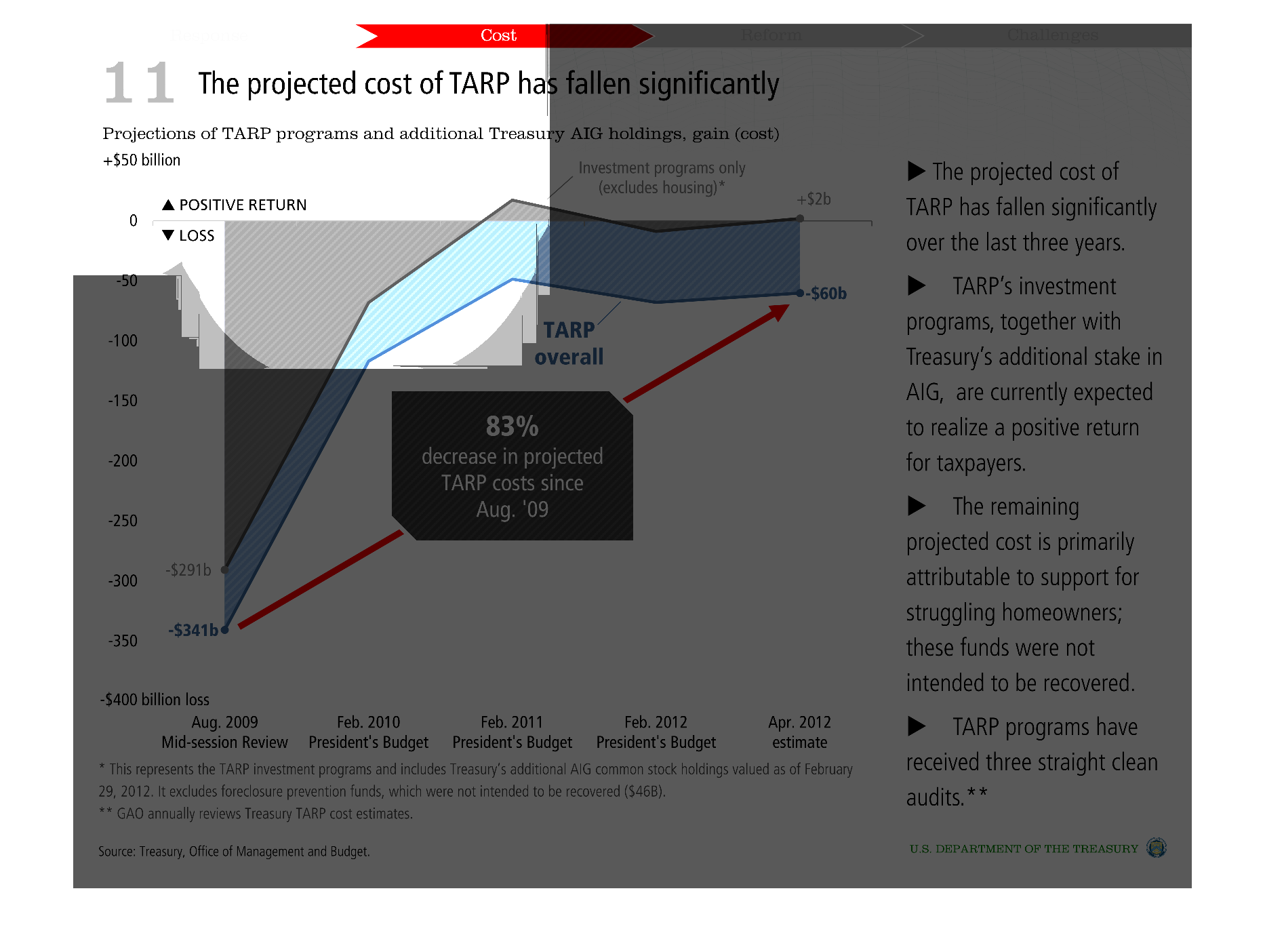
This graph shows  projected  cost of TARP and additional AIG holdings. It shows that there
was a 83% decrease in the projected cost of TARP since Aug. 09' and that it has significantly
fallen over the last three years.  TARP's investment programs, along with AIG holdings will
show a positive return to the taxpayers.
Warning: Image is too big to fit on screen; displaying at 50%
Warning: Image is too big to fit on screen; displaying at 50%
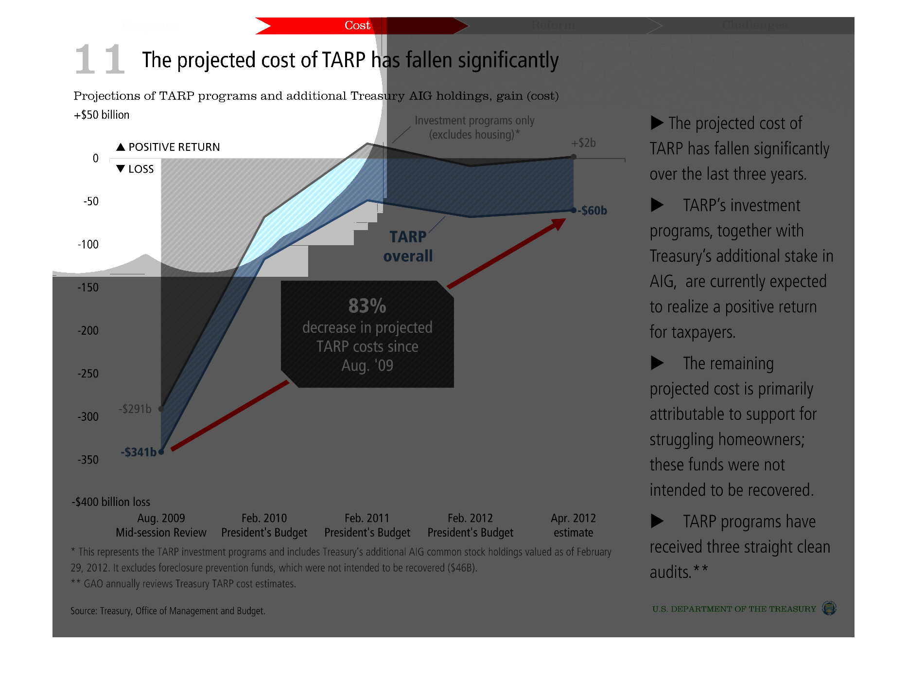
The image shows the projected cost of TARP has fallen significantly due to future projections
budgeting months from 2009 through 2012.   These reviews prove TARP works
Warning: Image is too big to fit on screen; displaying at 50%
Warning: Image is too big to fit on screen; displaying at 50%