Warning: Image is too big to fit on screen; displaying at 50%
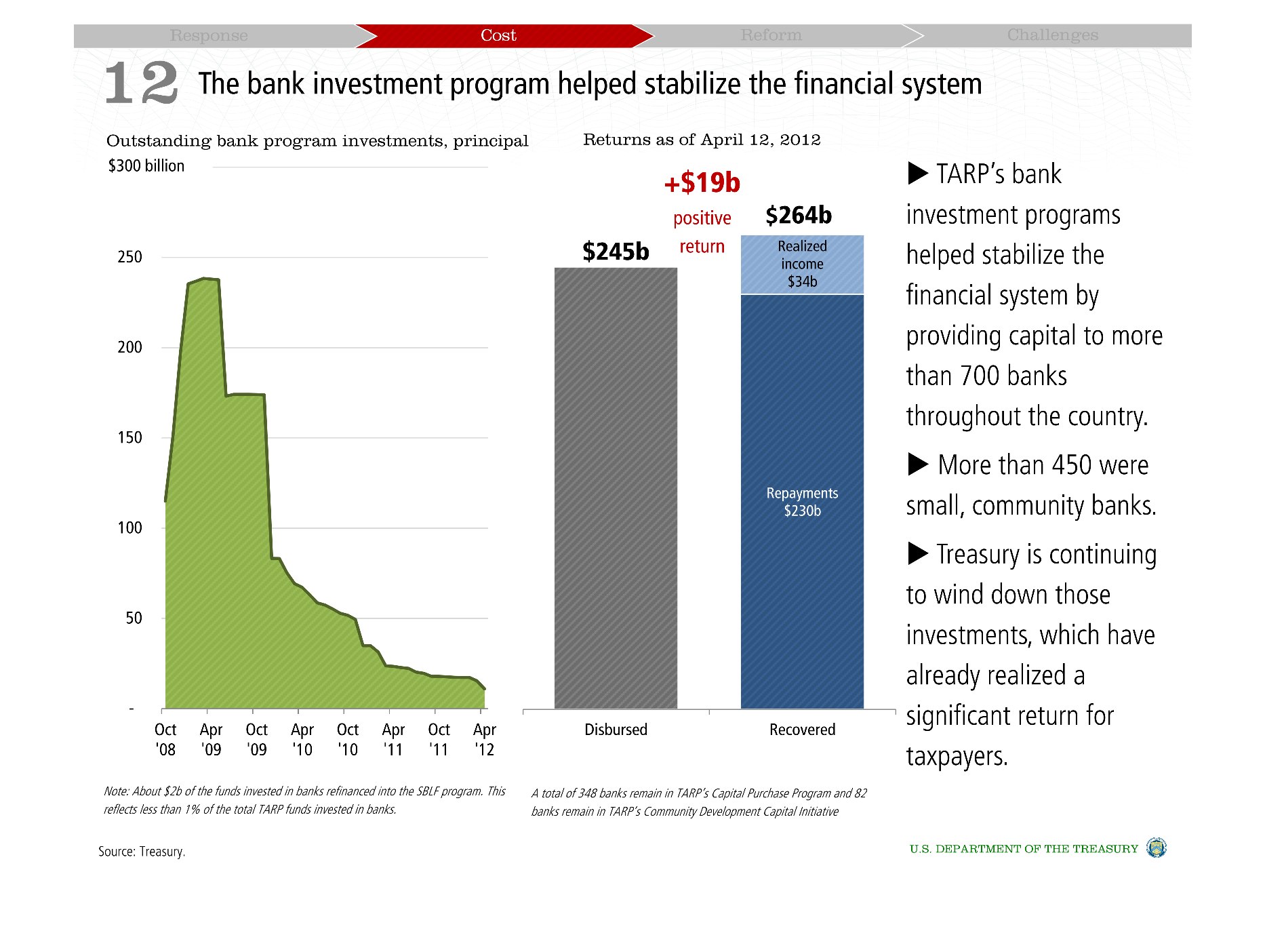
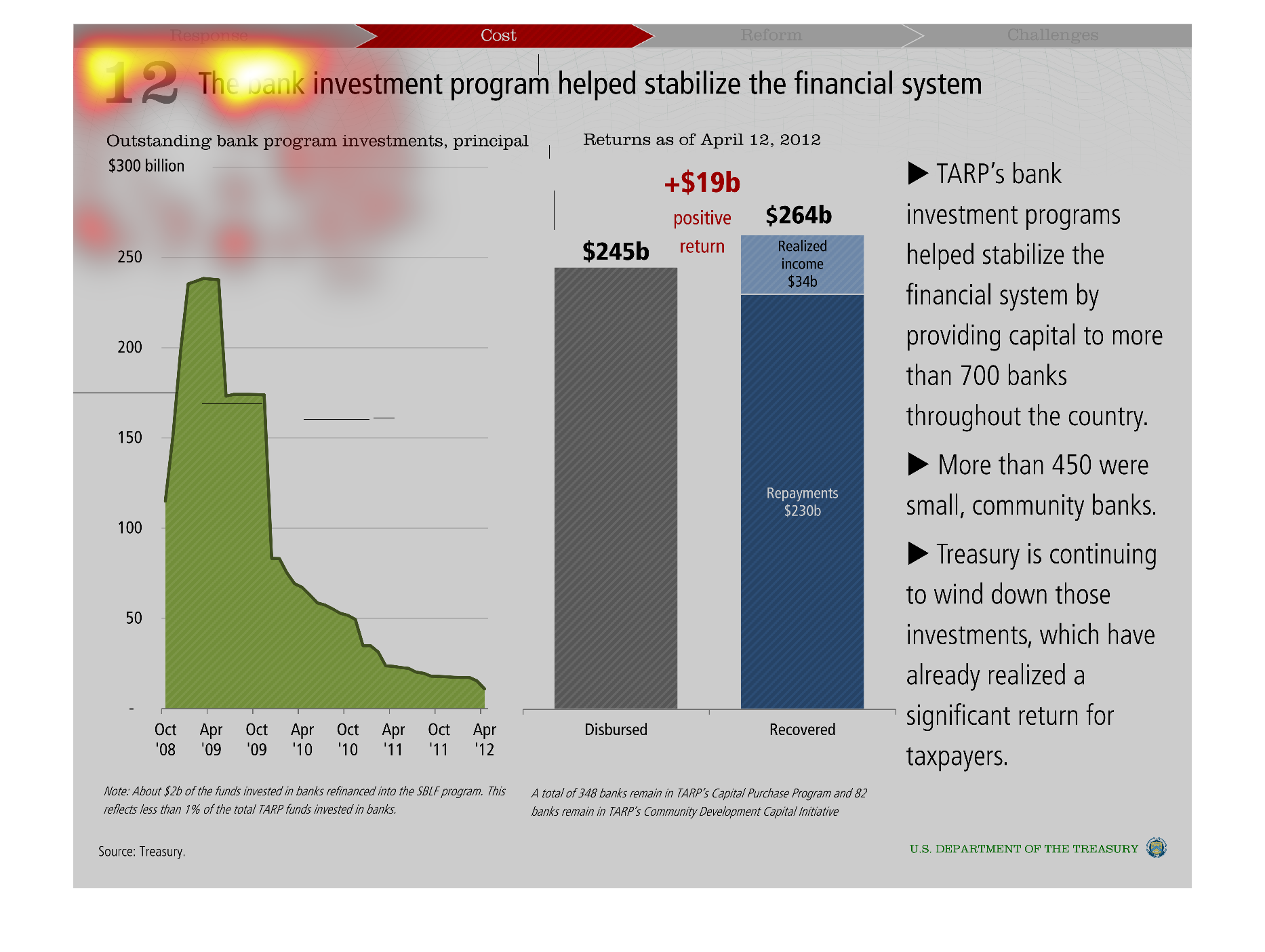
This is a chart showing how the banking system helped save the financial system. It shows
how  the money was recovered and disbursed. It also shows how over time it proves this.
Warning: Image is too big to fit on screen; displaying at 50%
Warning: Image is too big to fit on screen; displaying at 50%

This chart describes how the bank investment program helped stabilize the financial system.
Specifically outstanding bank program investments, principal $300 billion.
Warning: Image is too big to fit on screen; displaying at 50%
Warning: Image is too big to fit on screen; displaying at 50%
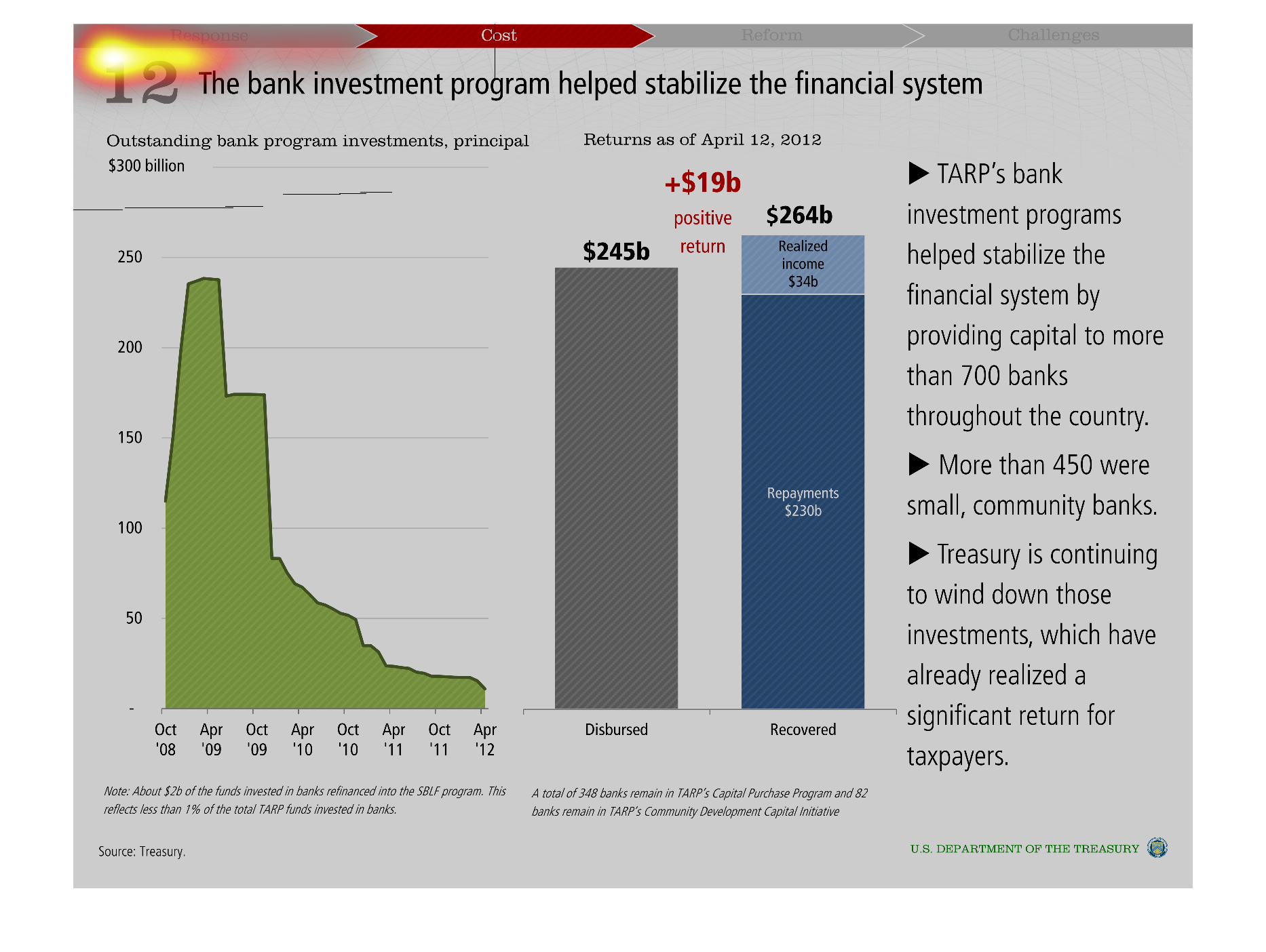
These graphs show bank investments stabilizing the financial system.  The left graph has standing
bank program investment.  The right graph shows returns as of April 2012.
Warning: Image is too big to fit on screen; displaying at 50%
Warning: Image is too big to fit on screen; displaying at 50%
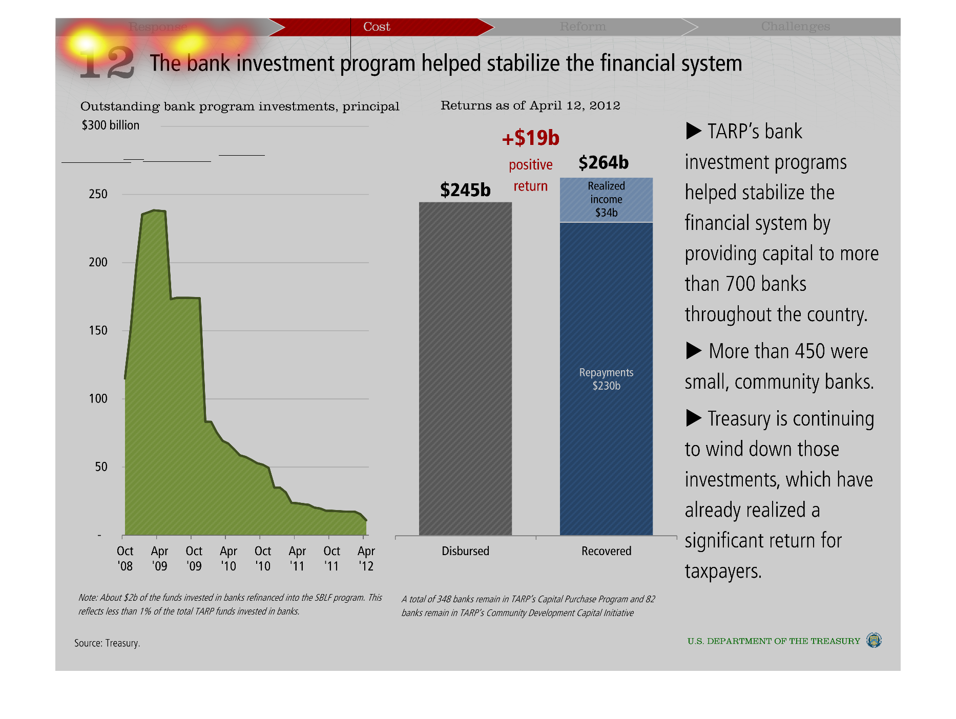
The bank investment program helped stabilize the financial system. There are two graphs. The
first is a bar graphs showing the relationship between time ,between October of 2008 and April
of 2012, and principal on outstanding bank program investments, which started at about 100,
increased to .nearly 250 in  October 2009, and decreased to less than 50 by the end of the
time. The second graph is a bar graph comparing the returns as of April 12th, 2012 on disbursed
and recovered assets, which is a 19$ billion positive return for the recovered assets.
Warning: Image is too big to fit on screen; displaying at 50%
Warning: Image is too big to fit on screen; displaying at 50%
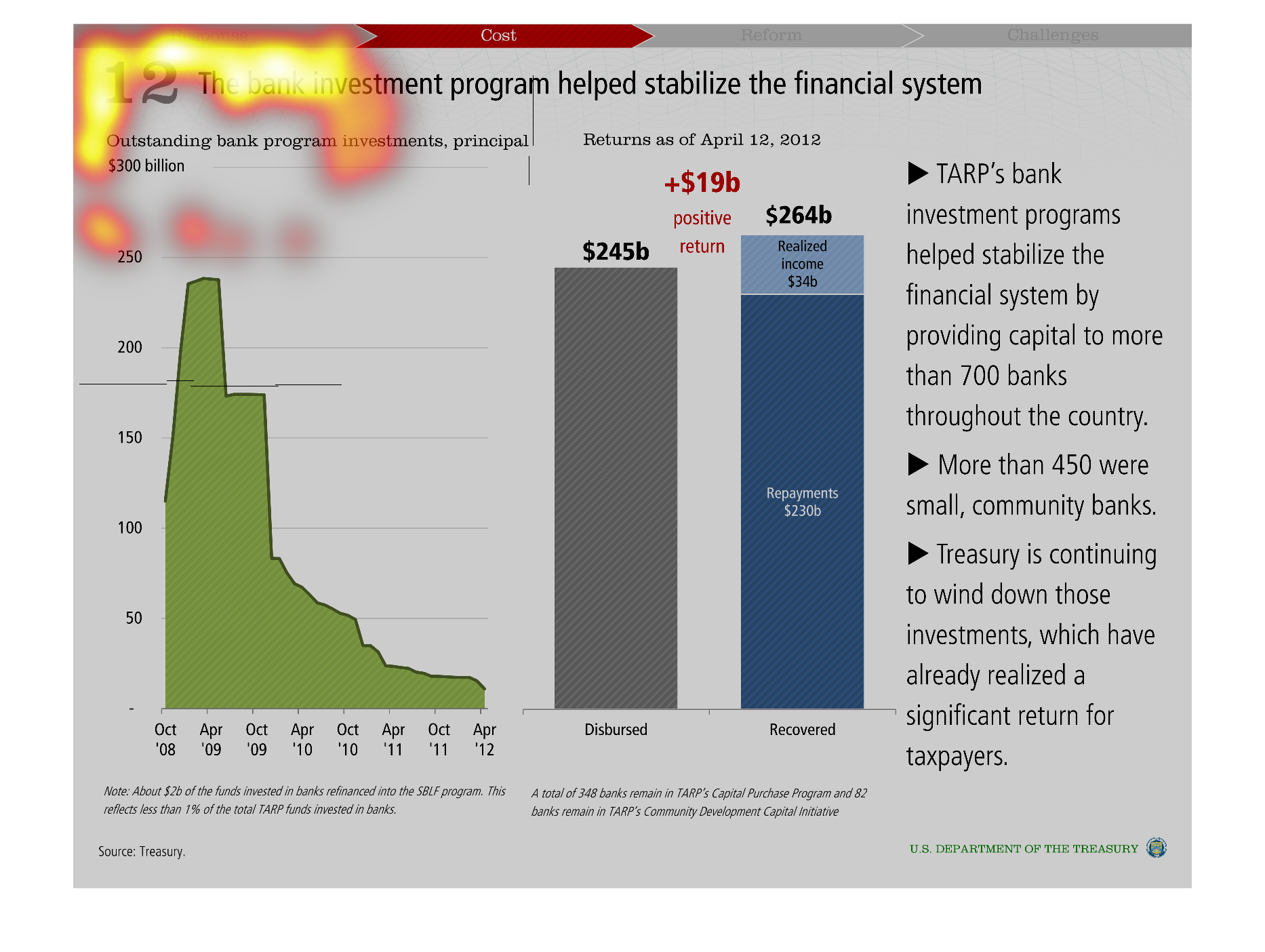
This chart shows how the bank investment program helped stabilize the financial system. TARP's
program helped provide capital to more than 700 banks throughout the country with more than
450 being small community banks. The net result was a positive return of 19 billion dollars.
Warning: Image is too big to fit on screen; displaying at 50%
Warning: Image is too big to fit on screen; displaying at 50%
The following chart shows how the Bank Investment program helped stabilize the financial system.
More commonly known as TARP this aid went to over 700 financial institution in order to stabilize
the financial system and prevent in some cases them from becoming insolvent.
Warning: Image is too big to fit on screen; displaying at 50%
Warning: Image is too big to fit on screen; displaying at 50%
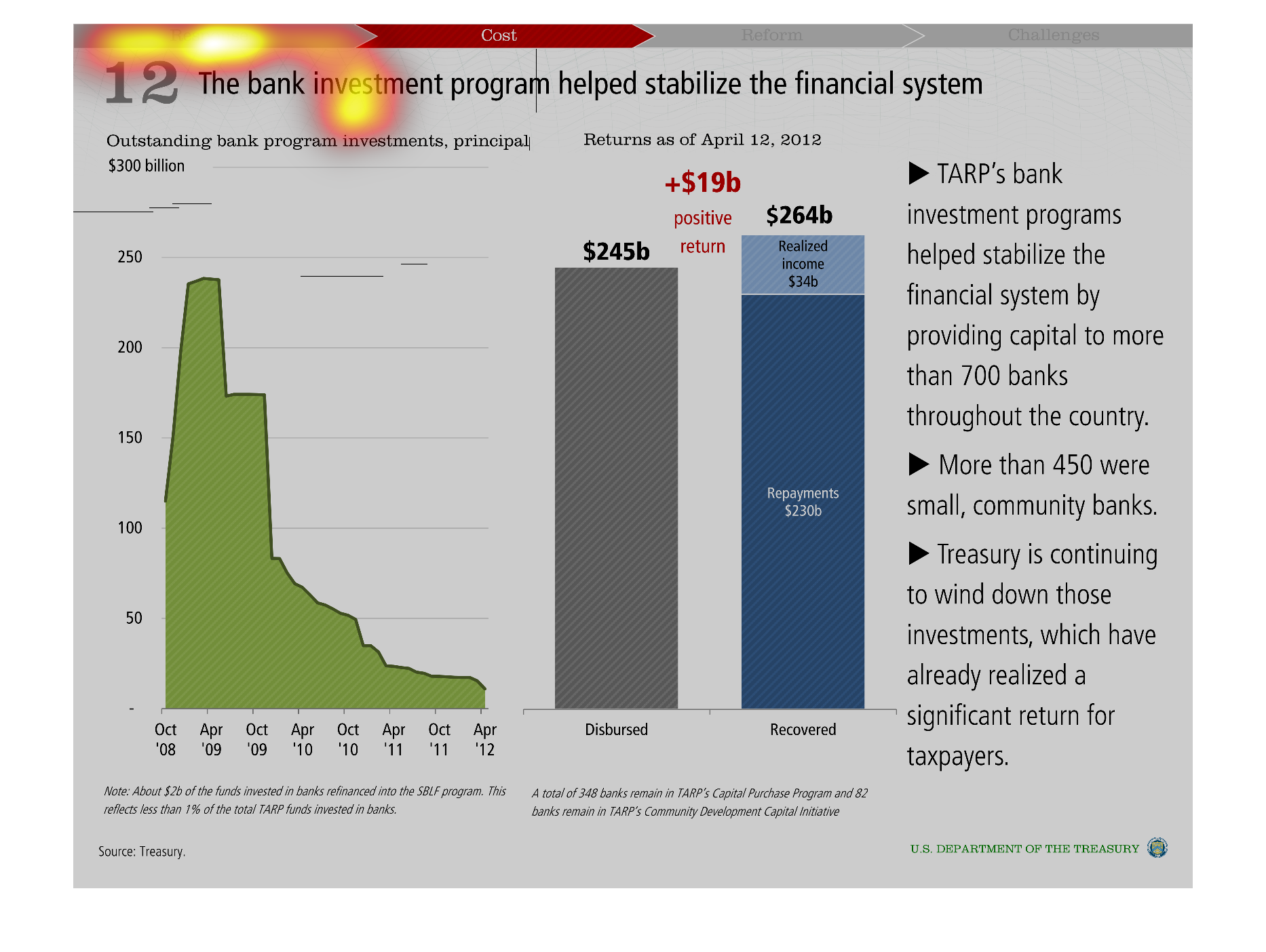
This graph describes how TARP's bank investment program help to stabilize the financial system.
 There are two separate graphs.  The first is a line graph with the space between the line
and the axis filled-in.  This graph shows the amount of investment that the TARP program made
in banks during the time period from Oct 08' to Apr '12.  The amount of money invested seemed
to decrease exponentially over time. The second graph is a bar graph that displays the money
disbursed and recovered by the TARP program.  $245 billion was dispersed and $264 billion
was recovered, so overall it sounds like a success.
Warning: Image is too big to fit on screen; displaying at 50%
Warning: Image is too big to fit on screen; displaying at 50%
Outstanding bank investments organized by date, and then dollar amounts disbursed. Most investments
occured in October 2008, and then steadily declined until October 2009 in which there was
a sharp drop
Warning: Image is too big to fit on screen; displaying at 50%
Warning: Image is too big to fit on screen; displaying at 50%
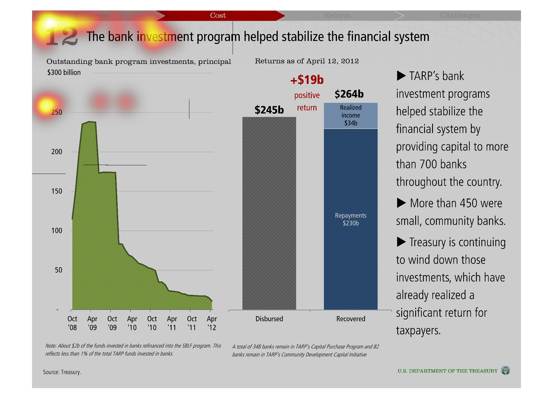
This graph shows the positive correlation of TARP's bank investment programs among 700 banks
and the capital invested throughout the country. Taxpayers also see a return given that the
US treasury reduces the capital influx.
Warning: Image is too big to fit on screen; displaying at 50%
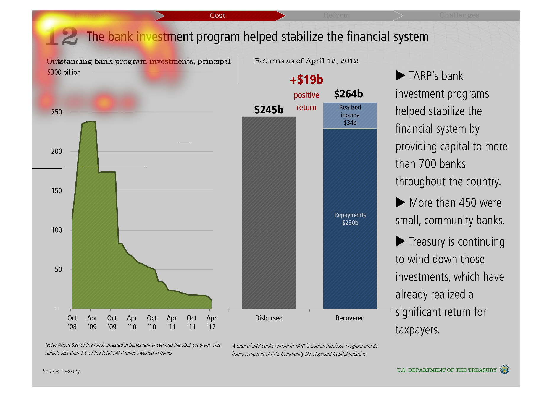
Warning: Image is too big to fit on screen; displaying at 50%
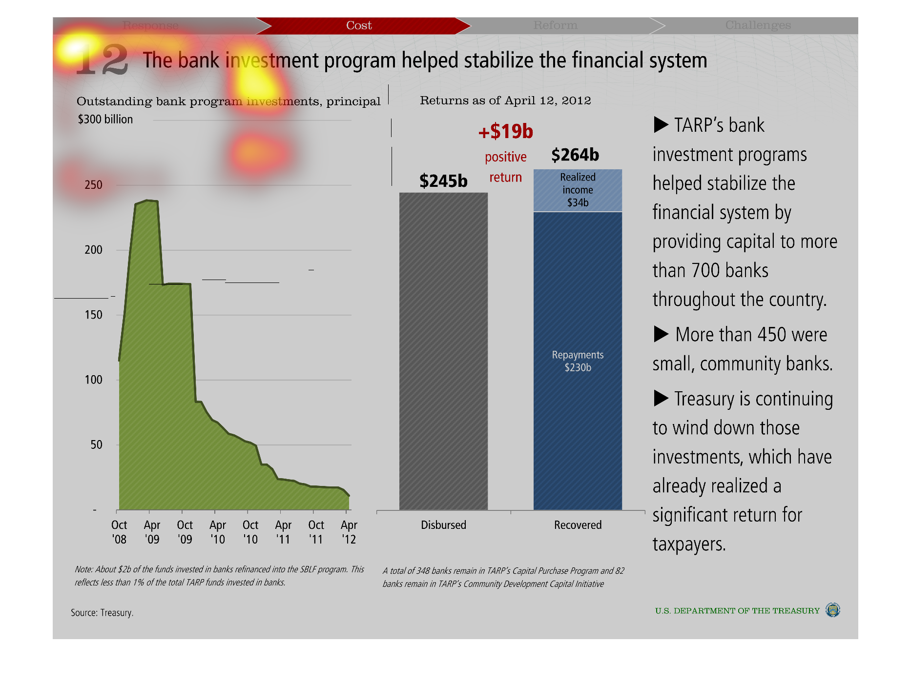
These charts show how the bank investiment program helped stabilize things after the financial
crisis. There is a graph on the left showing outstanding money going, trending down from 2008,
with two colored bars onthe right showing how the money was spend on what sectors.
Warning: Image is too big to fit on screen; displaying at 50%
Warning: Image is too big to fit on screen; displaying at 50%
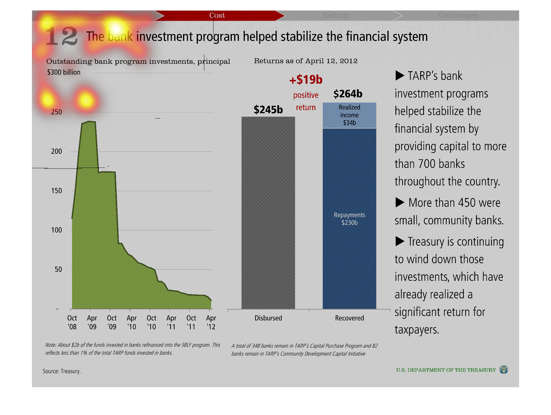
This graph shows how a bank investment program helped stabilize the financial system, comparing
outstanding principals for bank program investments and the returns of those investments as
of April 12th, 2012.
Warning: Image is too big to fit on screen; displaying at 50%
Warning: Image is too big to fit on screen; displaying at 50%
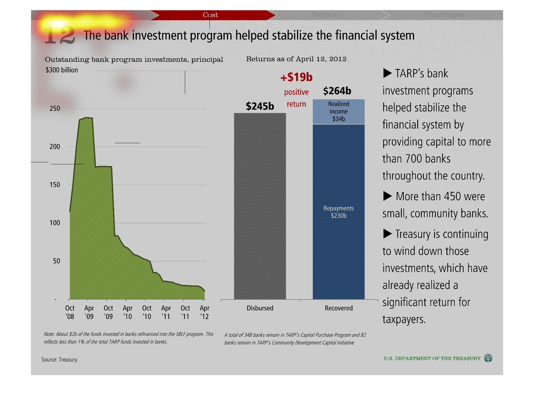
Titled the Bank Investment Program Helped Stabilize the Financial System at the top.  The
graph to the left, in green, lists out the outstanding bank program investments, principal
of $300 billion.  The graphs in gray and blue to the right are the disbursed and received
returns as of April 12, 2012.  There is a positive return of +$19billion.
Warning: Image is too big to fit on screen; displaying at 50%
Warning: Image is too big to fit on screen; displaying at 50%
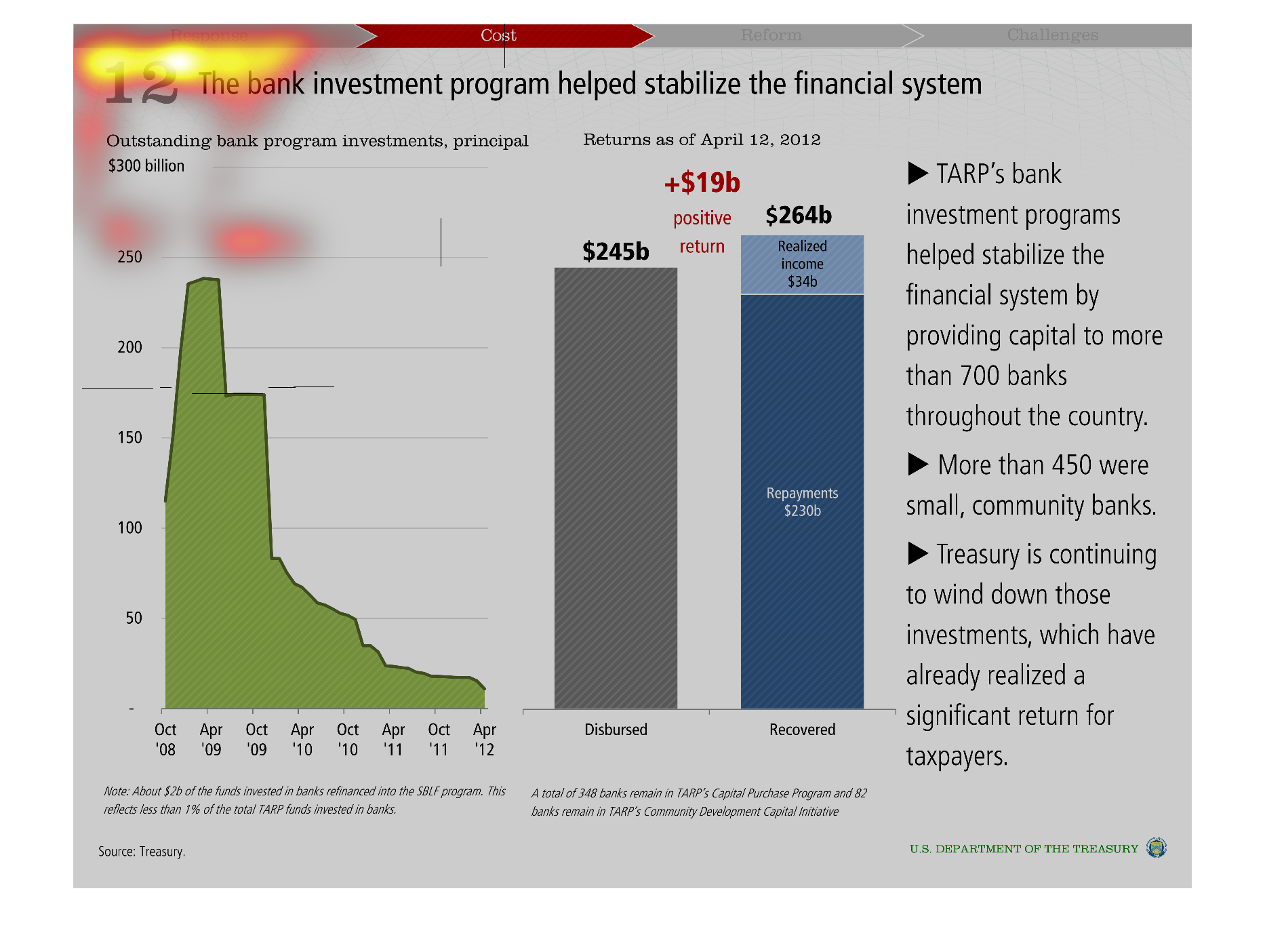
This is a graph of the Federal Reserve Program to stabilize the banking system through the
TARP programs. It shows the amount of dollars invested reducing annually and the amount of
return to taxpayers for their actions. The amount of return is 19 billion dollars.
Warning: Image is too big to fit on screen; displaying at 50%
Warning: Image is too big to fit on screen; displaying at 50%
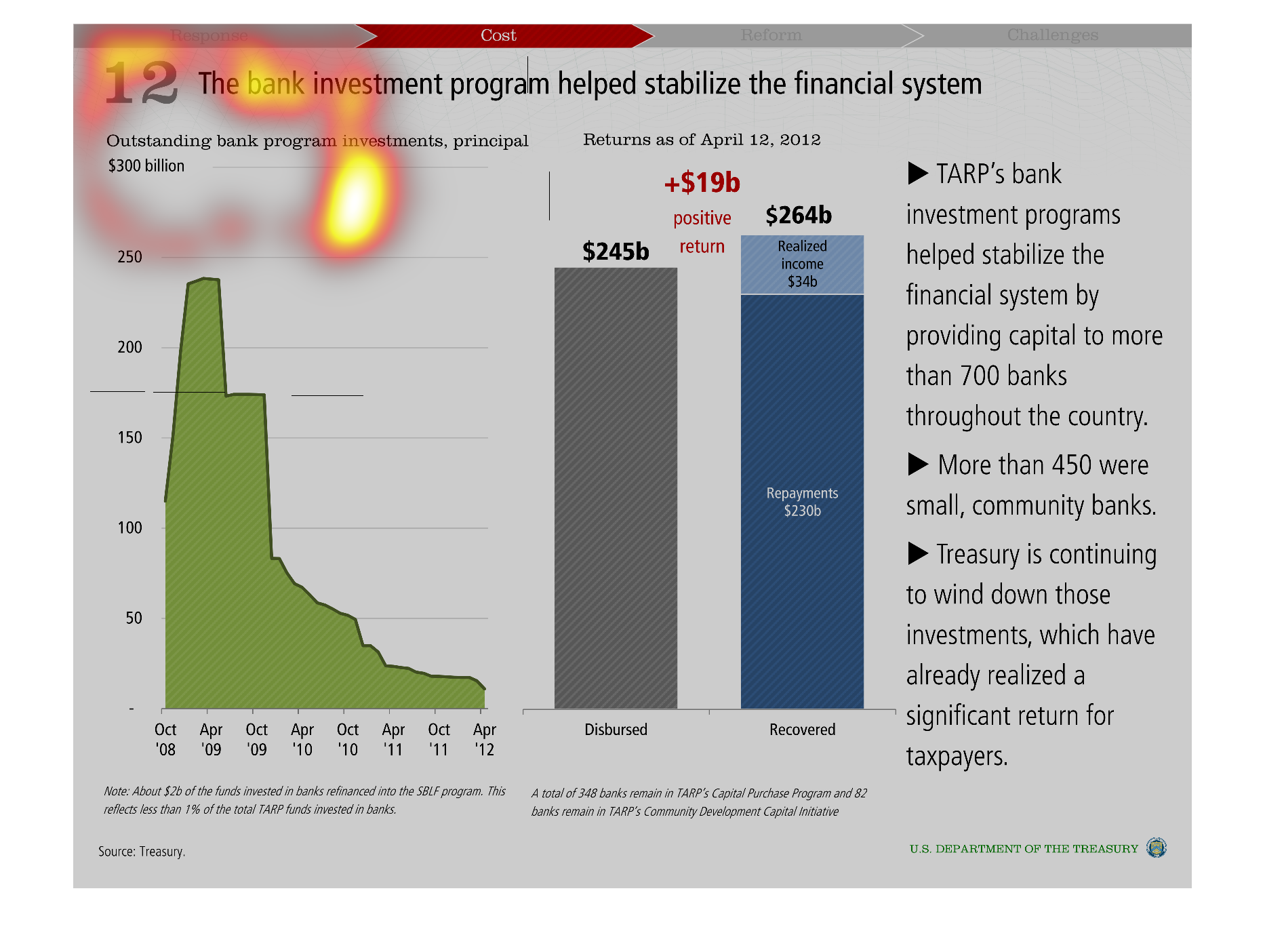
This graph describes investments made to banks from October 2008 to April 2012. The amount
of money that still needs to be paid back decreased as time went on, going from almost $250
billion to less than $50 billion, meaning that banks were paying back money they were loaned.
The charts on the left show that the amount of investments made was $245 billion, while the
amount of income made or money repaid came out to be $264 billion, meaning that the investments
netted the banks and investors $19 billion.
Warning: Image is too big to fit on screen; displaying at 50%
Warning: Image is too big to fit on screen; displaying at 50%