Warning: Image is too big to fit on screen; displaying at 50%
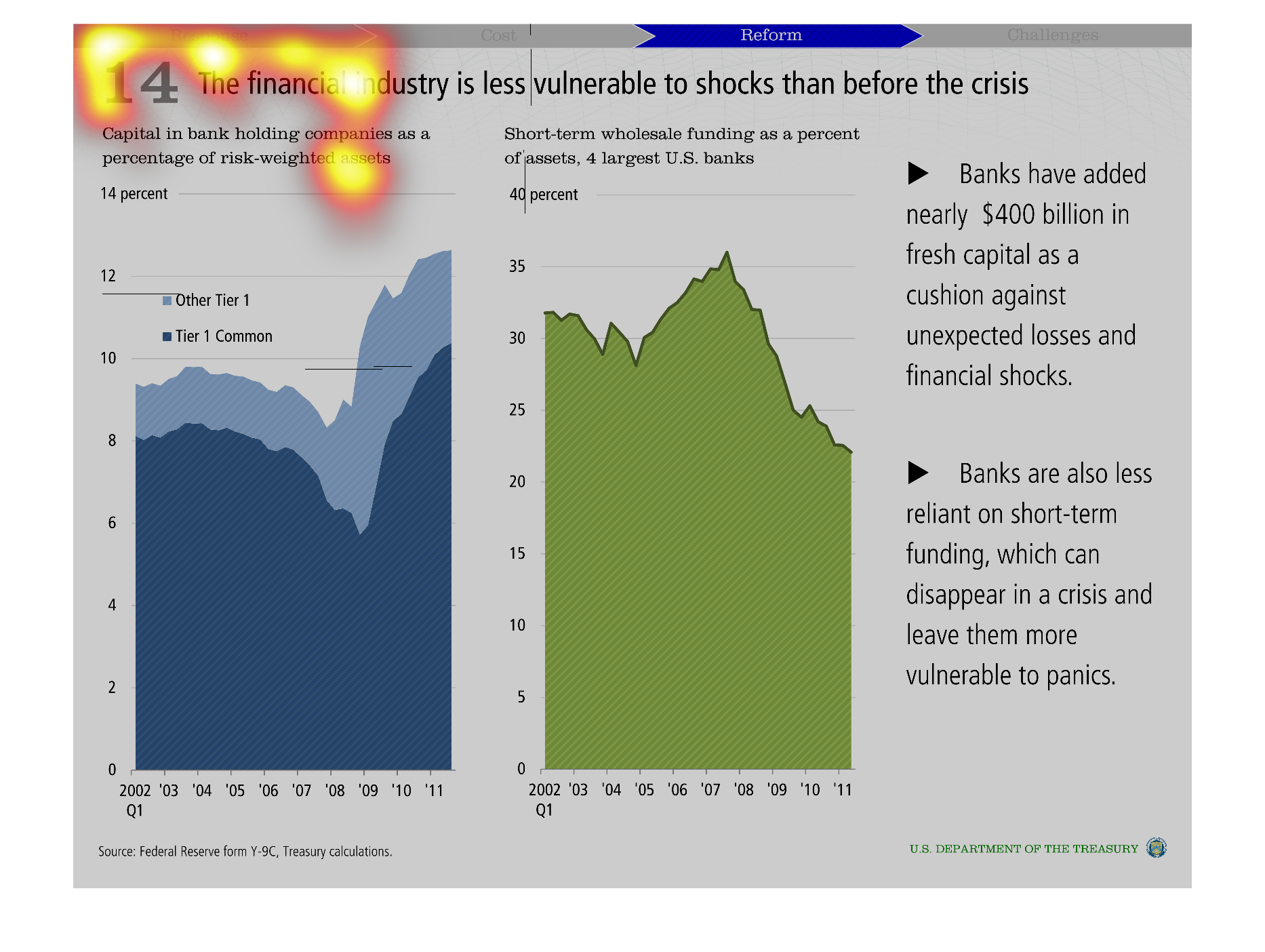
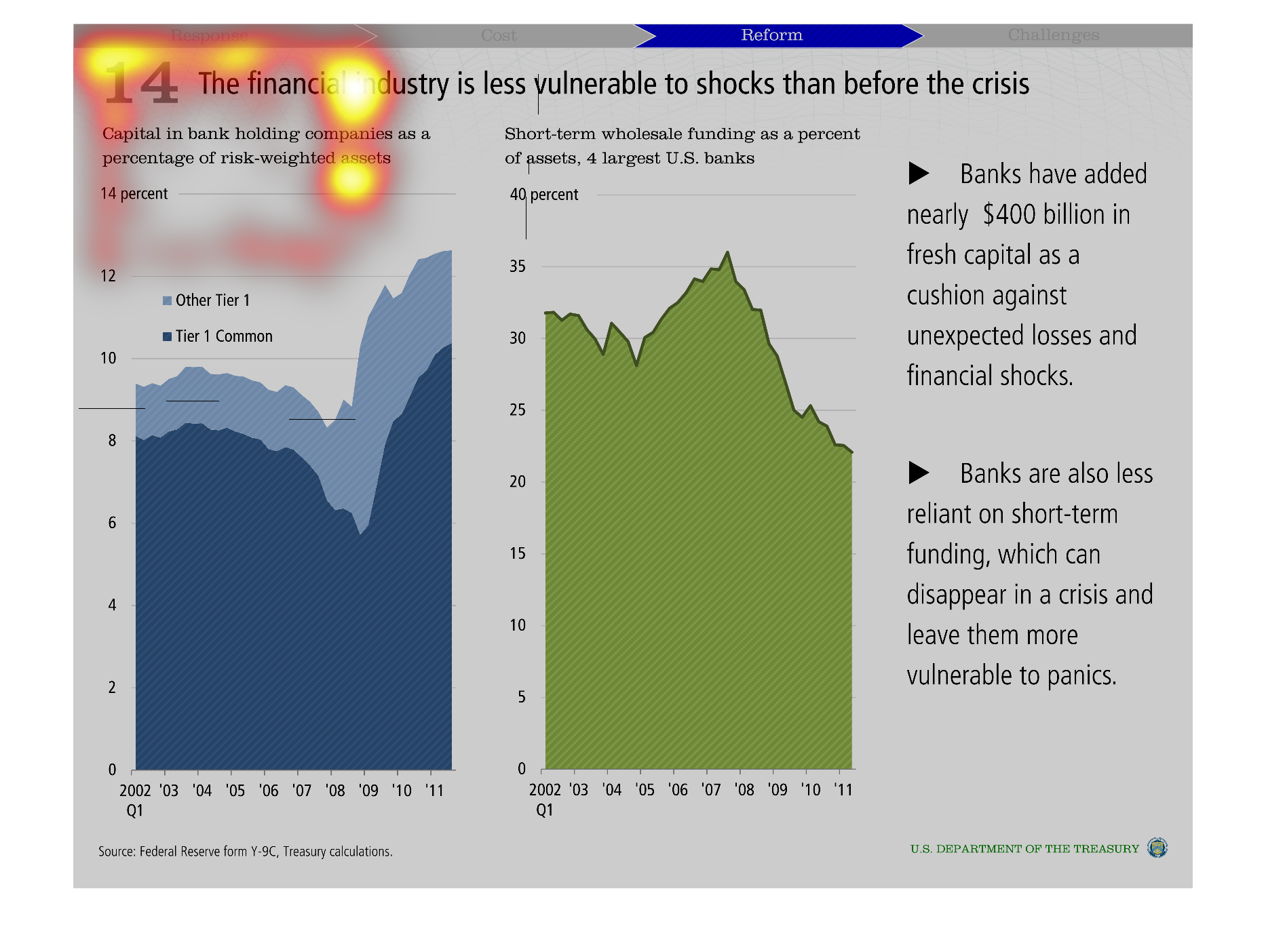
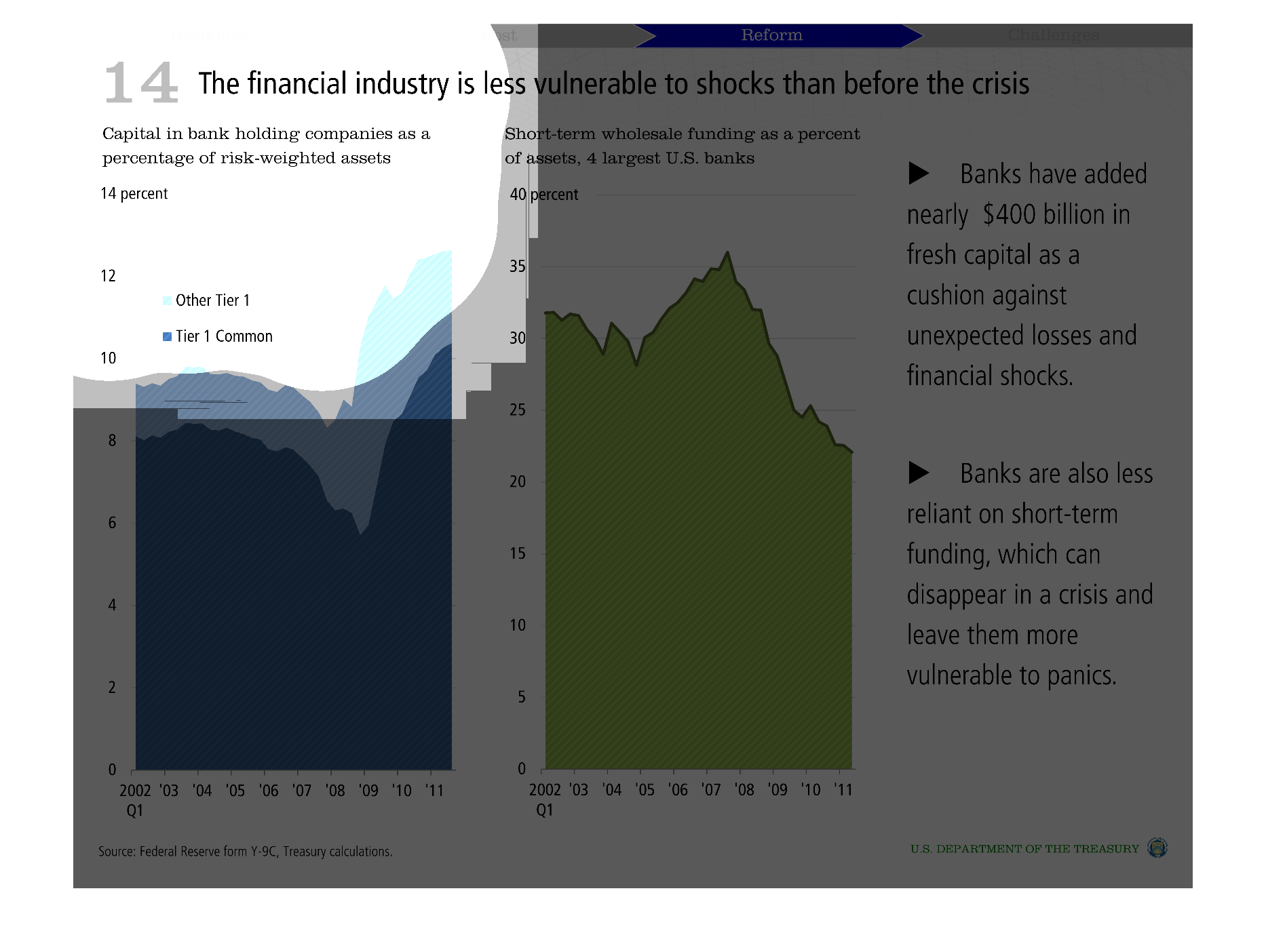
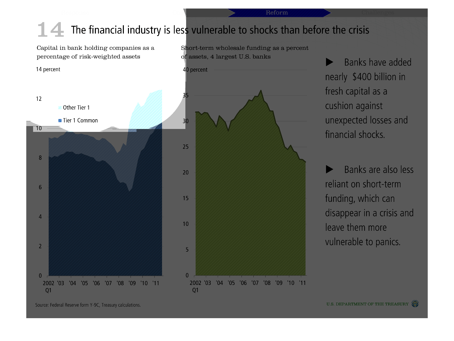
The data in graph suggests  that the finical industry may be less vulnerable to shocks post-crisis',
by comparing data from 2002-2011. This stability may be due to banks depending less on ephemeral
funding sources and due to the increase in fresh-capitol added, which can act a cushion during
times of financial crisis.
Warning: Image is too big to fit on screen; displaying at 50%
Warning: Image is too big to fit on screen; displaying at 50%

The charts are about how the financial industry is less susceptible to shocks after the recent
crisis. It explains that banks have added monetary cushions against losses and are less reliant
on short-term funding.
Warning: Image is too big to fit on screen; displaying at 50%
Warning: Image is too big to fit on screen; displaying at 50%
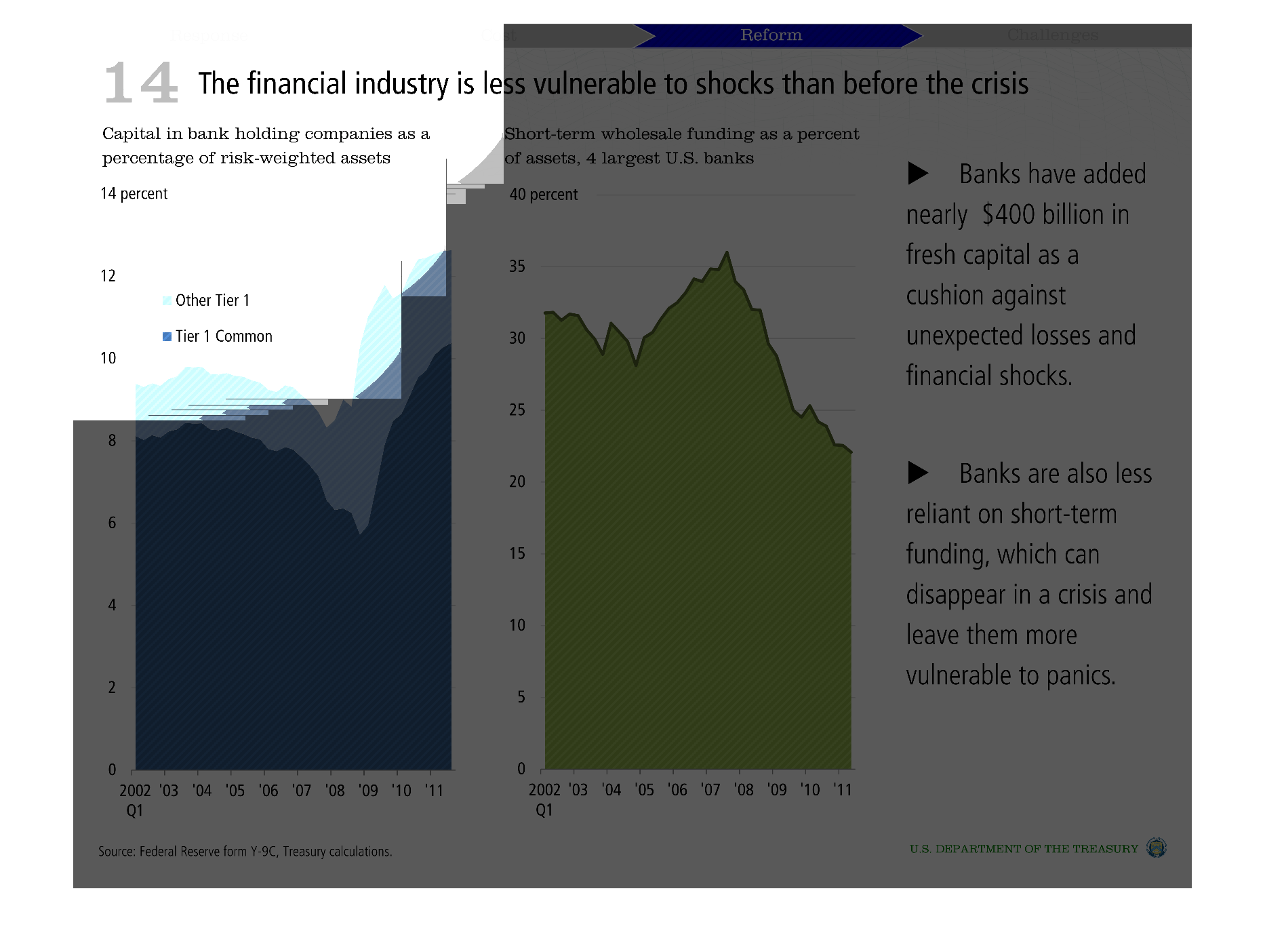
This image shows or depicts in statistical formats the relationship of how the financial industry
is less vulnerable to shocks than before the crisis.
Warning: Image is too big to fit on screen; displaying at 50%
Warning: Image is too big to fit on screen; displaying at 50%

This graphic shows the financial industry is less vulnerable to shocks than before the crisis,
explaining that banks have billions of dollars in cushion to against unexpected losses.
Warning: Image is too big to fit on screen; displaying at 50%
Warning: Image is too big to fit on screen; displaying at 50%
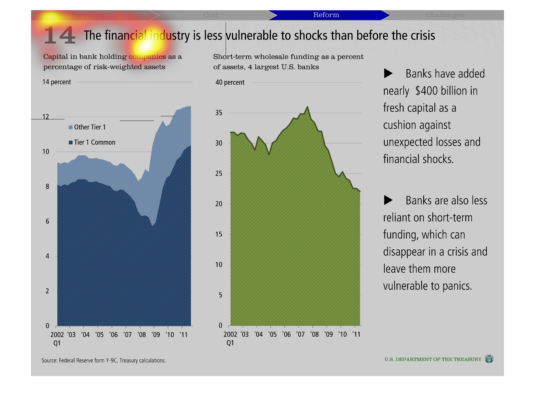
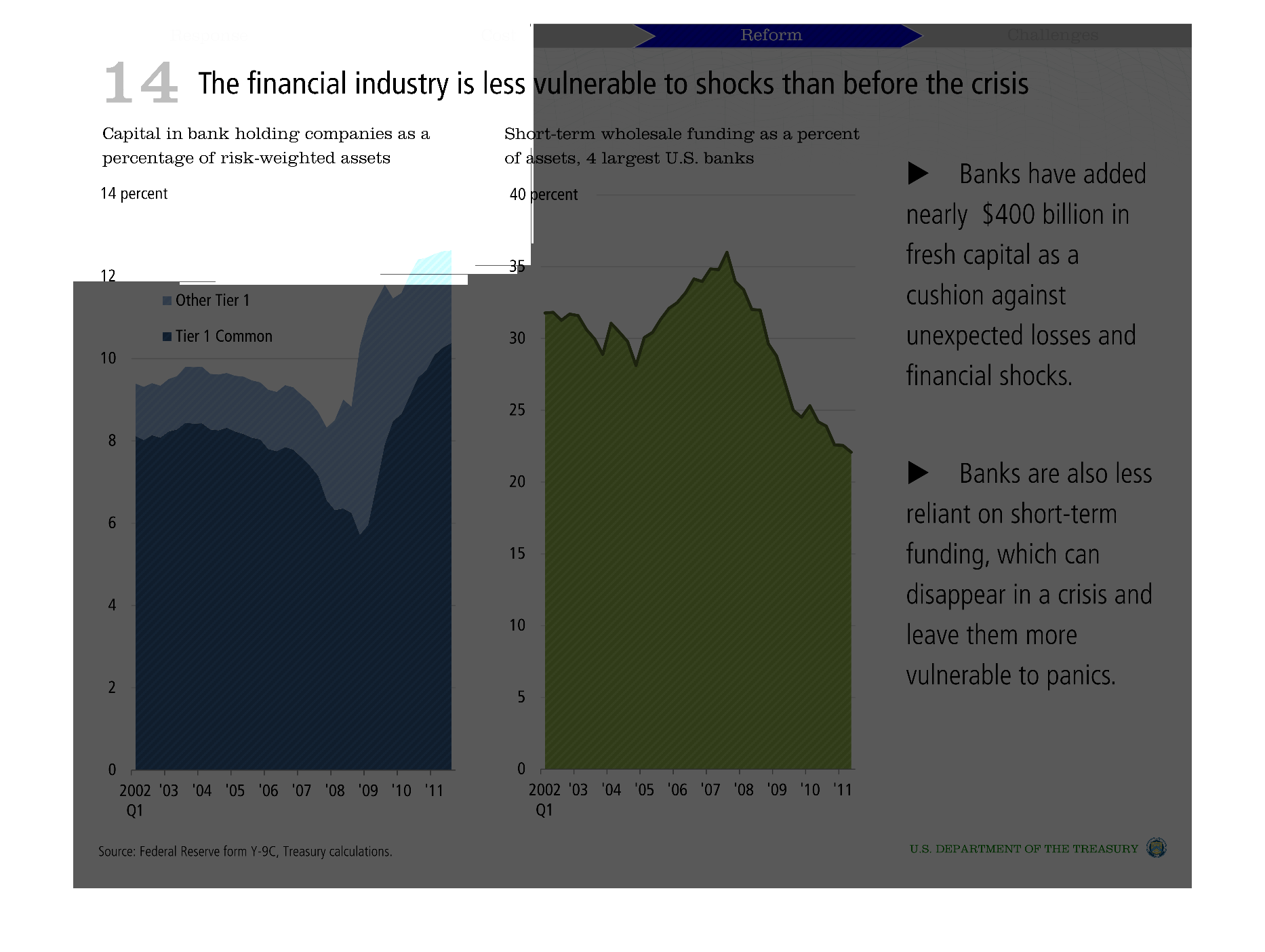
There are two graphs that depict how banks in the US are more able to withstand a turbulent
economy than they were previously.  Tier 1 capital ratios were approximately 8% until they
reached a low with the financial crisis in 2008, and are now at new highs.  Short-term wholesale
funding is also down as a percentage of total deposits and total assets.  There is a better
reliance on core deposits now.
Warning: Image is too big to fit on screen; displaying at 50%
Warning: Image is too big to fit on screen; displaying at 50%
This chart shows how capital influences banks an d the economy. It shows how the bailout influenced
the bank . It appears that the banks tend to do better with more capital
Warning: Image is too big to fit on screen; displaying at 50%
Warning: Image is too big to fit on screen; displaying at 50%
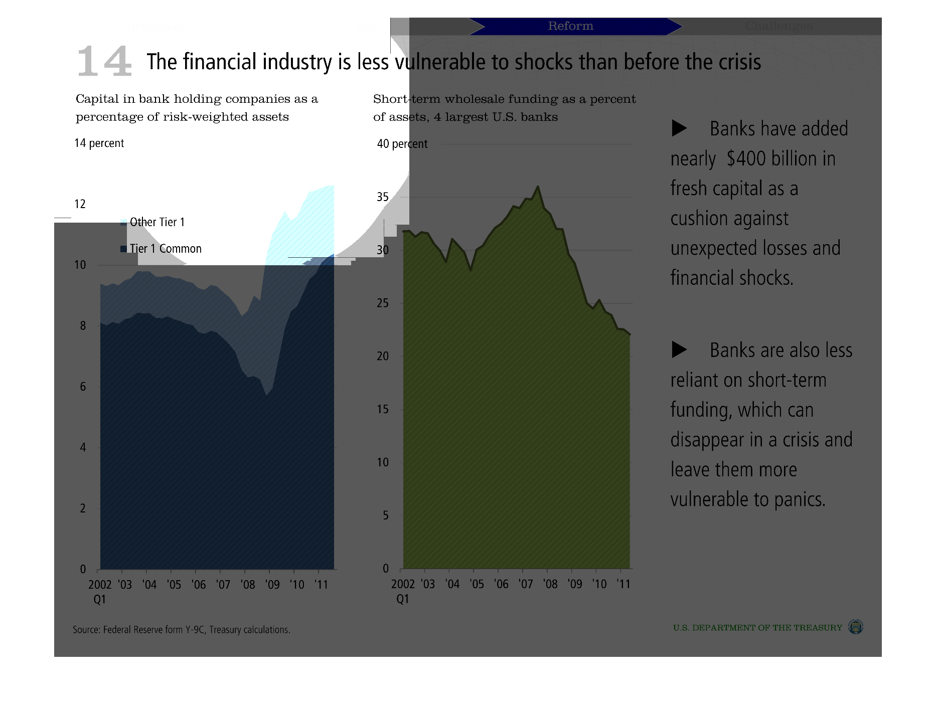
the finiancial industry is less vulnerable than before the crisis  Banks have added 400 mil
in capital   banks less reliant on short term funding  graphs showing supporting data
Warning: Image is too big to fit on screen; displaying at 50%
Warning: Image is too big to fit on screen; displaying at 50%

Given changes in capital structure the chart postulates that the financial industry is less
vulnerable to shocks than before the financial crisis in the mid 2000s. Two different charts
are shown - one for Tier 1 capital, the other for short term funding.  The bullets on the
side further support the charts with detail.
Warning: Image is too big to fit on screen; displaying at 50%
Warning: Image is too big to fit on screen; displaying at 50%
This chart describes the financial industry is less vulnerable to shocks than before the crisis.
The chart states that banks have added nearly $400 billion in fresh capital.
Warning: Image is too big to fit on screen; displaying at 50%
Warning: Image is too big to fit on screen; displaying at 50%
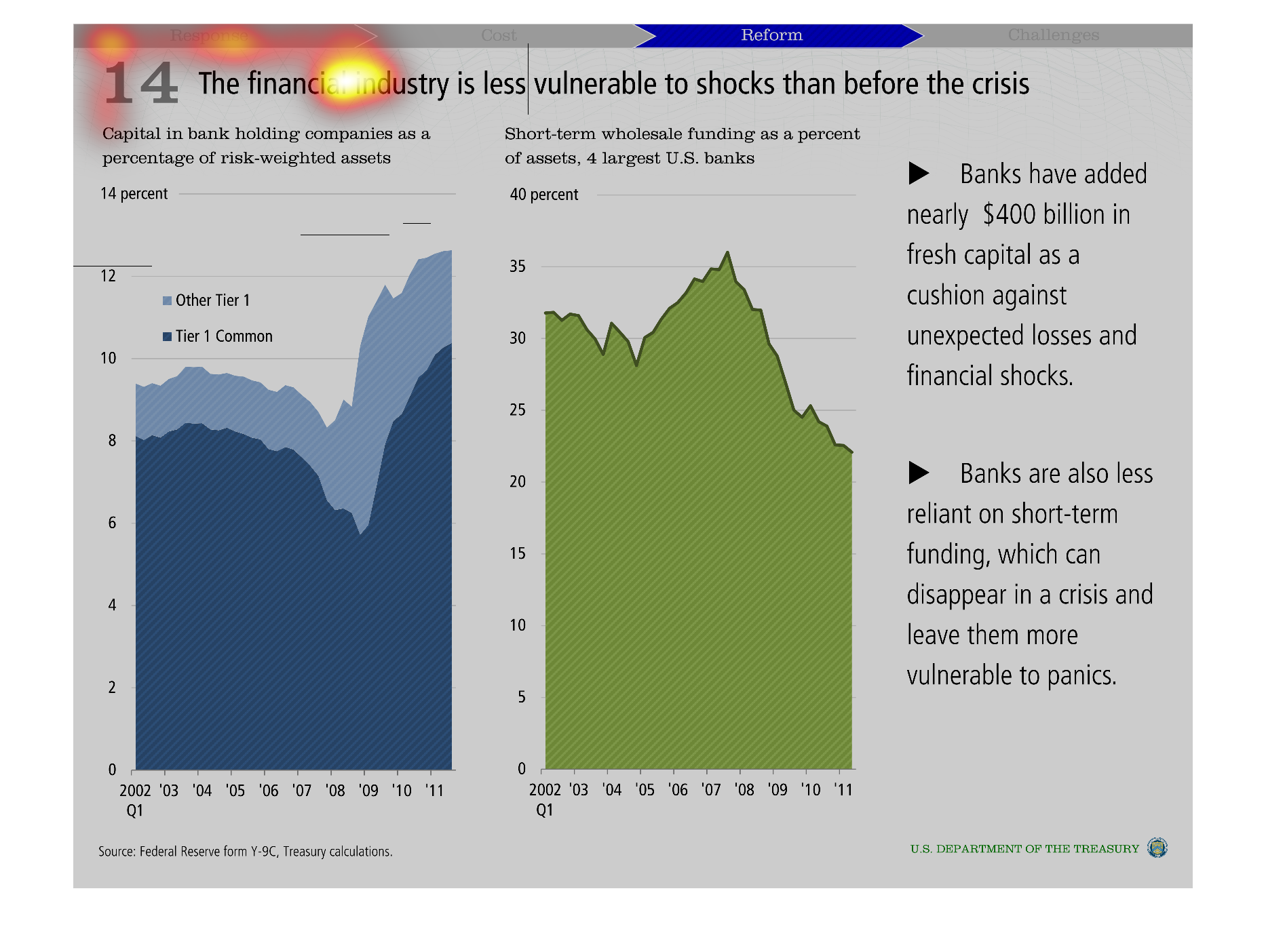
This graph is intended to show the shock absorption capability of banks, both before and after
the financial crisis.  The author's determination is that this capability was better before
the crisis.
Warning: Image is too big to fit on screen; displaying at 50%
Warning: Image is too big to fit on screen; displaying at 50%
This chart shows the "Financial industry is less vulnerable to shock than before the crisis".
It states banks now have a cushion of $400 billion against shock.
Warning: Image is too big to fit on screen; displaying at 50%
Warning: Image is too big to fit on screen; displaying at 50%

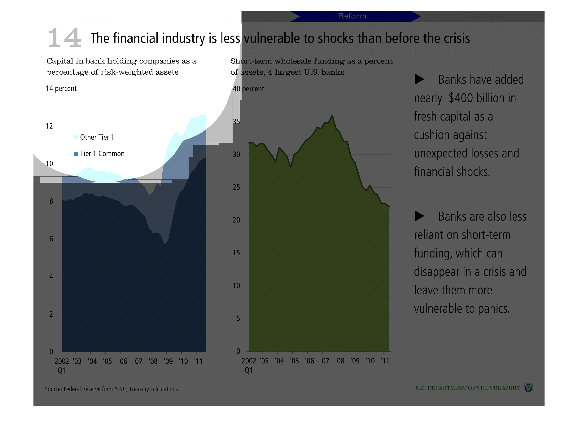
Banks are using more long term capital to protect against financial issues, instead of relying
on short term capital. The banking industry is now more prepared for financial issues than
it was previously because it changed it's funding arrangement.
Warning: Image is too big to fit on screen; displaying at 50%
Warning: Image is too big to fit on screen; displaying at 50%
The graph is trying to illustrate that after the world economic crisis hit, a lot of business
had to make adjustment to their day to day operations that now safeguard them from a future
collapse.
Warning: Image is too big to fit on screen; displaying at 50%
Warning: Image is too big to fit on screen; displaying at 50%
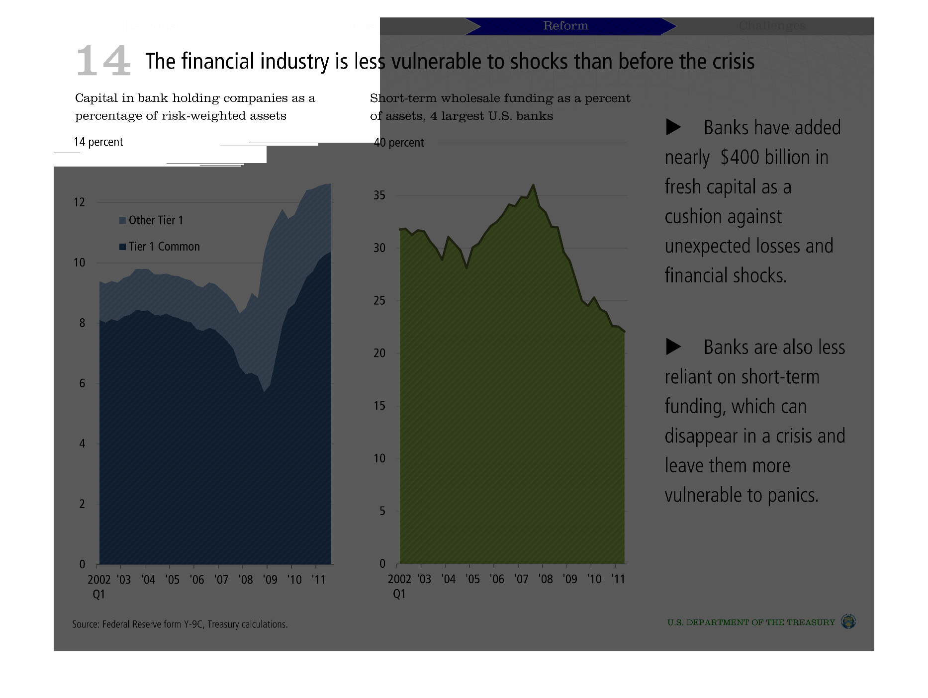
This chart displays the Financial Industry's stability - different tiered banks.  Fresh capital
added was marked at $400.  Banks are more vulnerable now than before the recent crisis in
2008.
Warning: Image is too big to fit on screen; displaying at 50%
Warning: Image is too big to fit on screen; displaying at 50%