Warning: Image is too big to fit on screen; displaying at 50%
Two graphs showing the unemployment rates also indicating that the economy has yet to recover
from the recession. The graph at the bottom shows the potential growth that has yet to happen
because of the unemployment rate
Warning: Image is too big to fit on screen; displaying at 50%
Warning: Image is too big to fit on screen; displaying at 50%
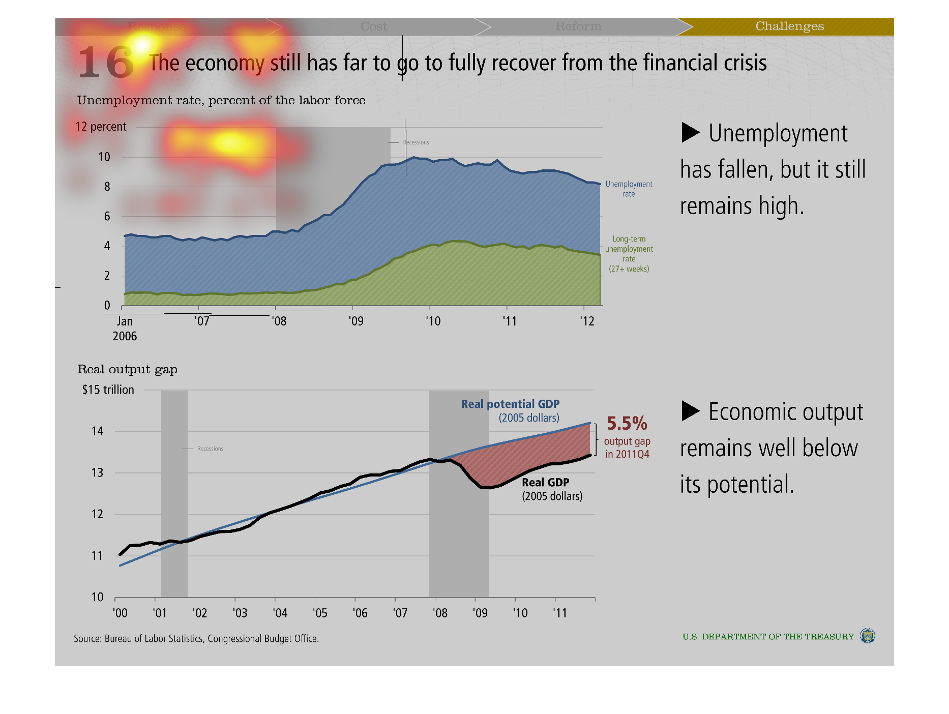
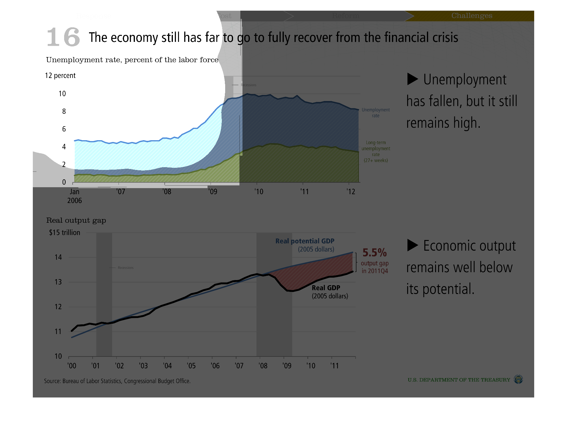
The graph describes 2 data points that highlights the economy still has a way to go. Including
that unemployment is still much higher than it was prior to the economic downturn. Also that
productivity has not returned to the projected increases as in previous years.
Warning: Image is too big to fit on screen; displaying at 50%
Warning: Image is too big to fit on screen; displaying at 50%
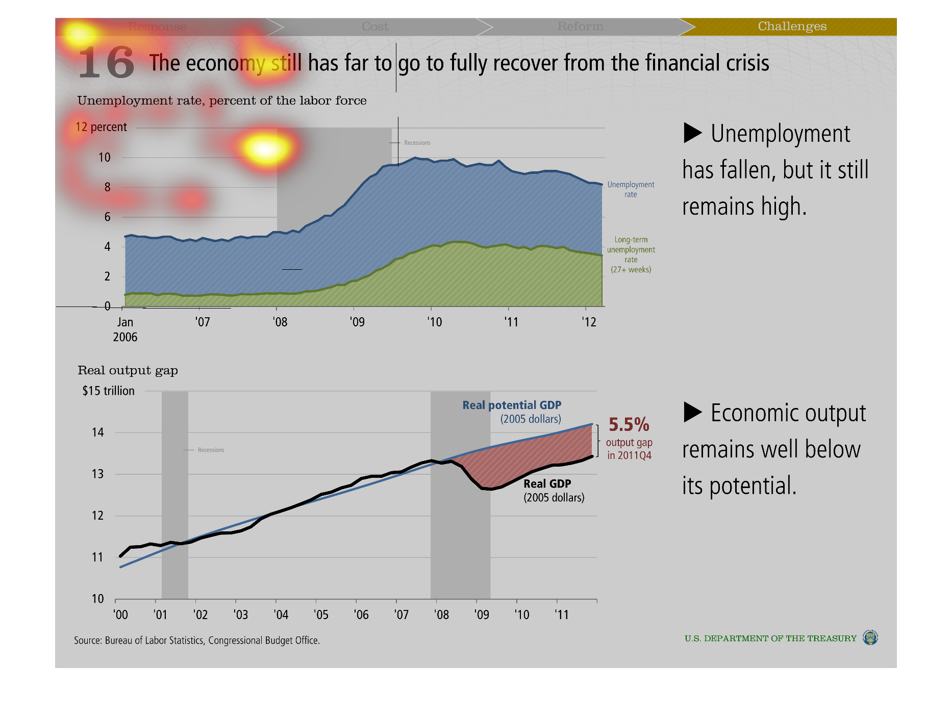
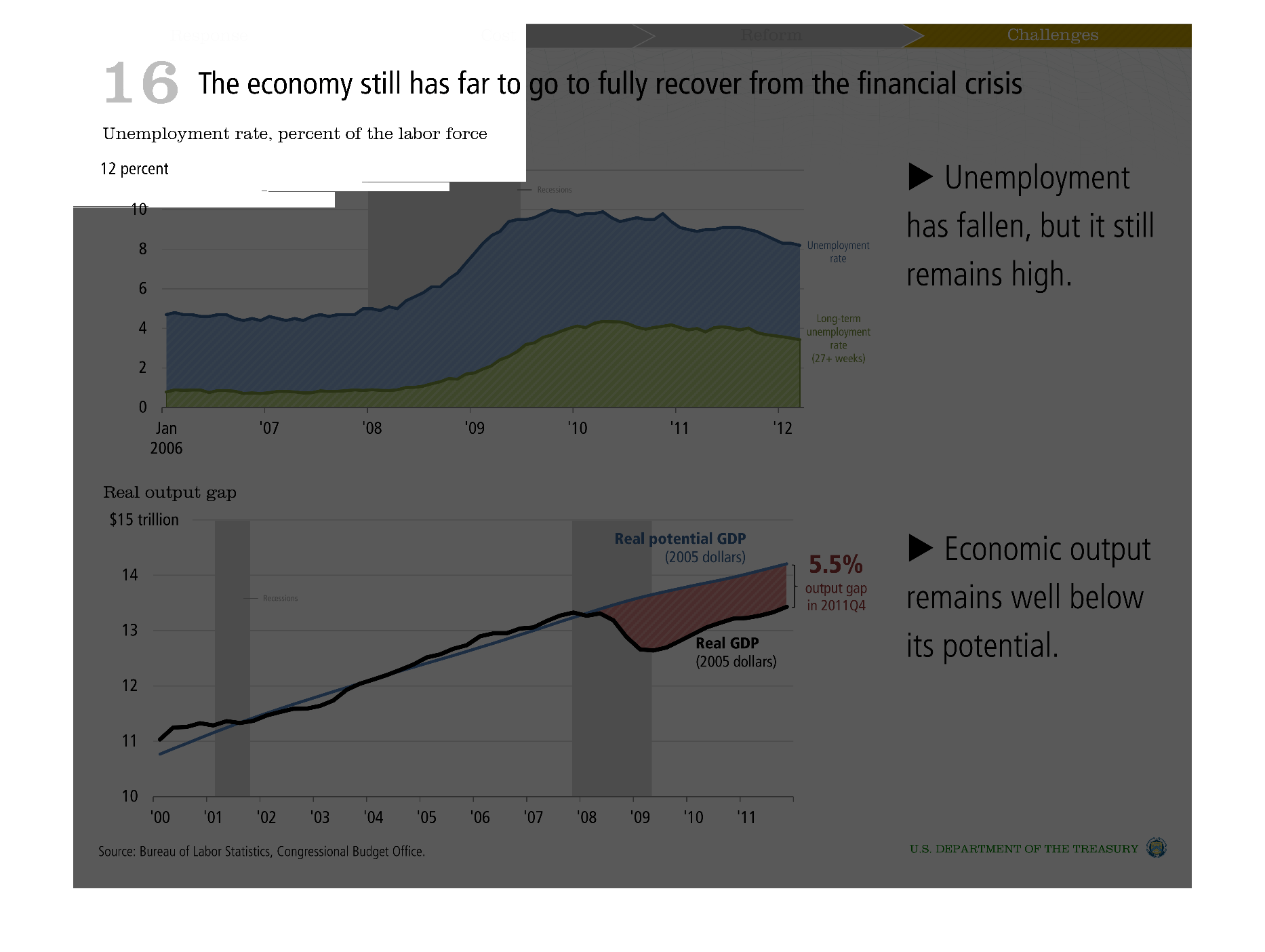
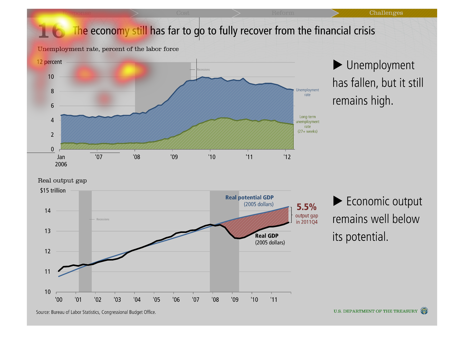
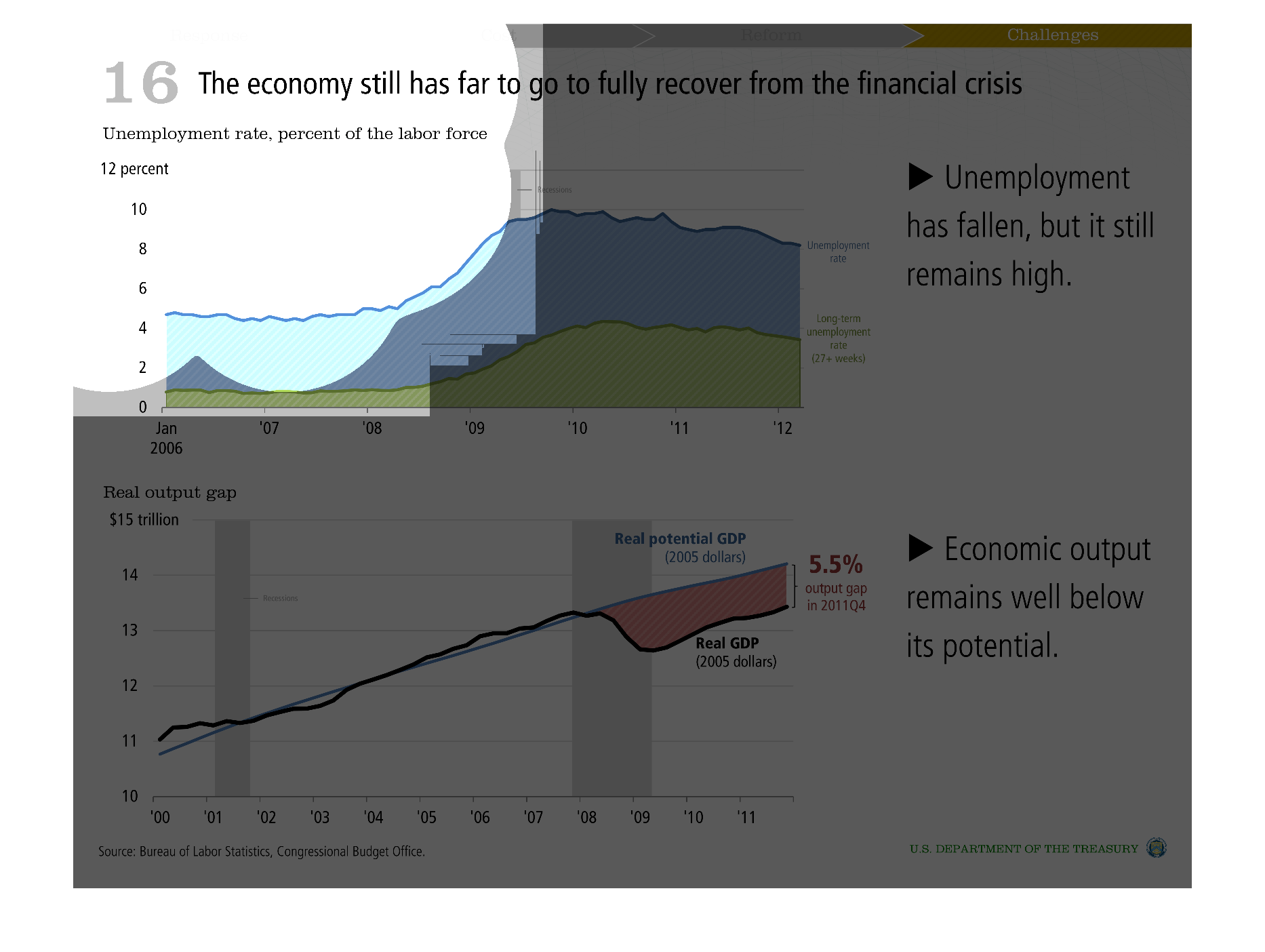
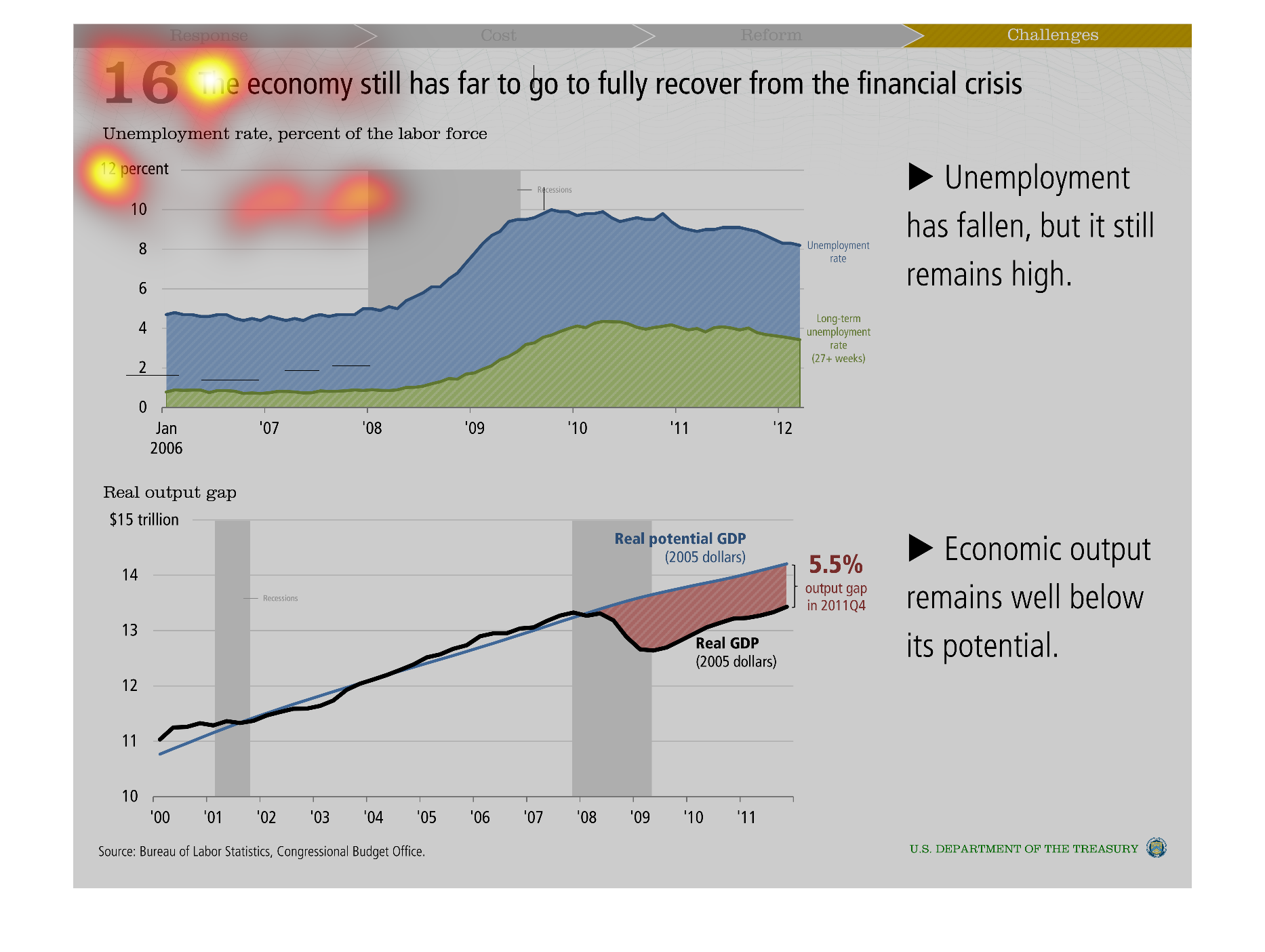
The first graph is showing the unemployment rate percent of the labor force from January 2006
to 2012 where it started rising being 2008 and 2009. It peaked between 2010 and 2011 and fell
and a small rate and is higher in 2012 than in 2009.  The second graph show economic output
compared to potential output from 2000 to 2011.  From 2000 to 2008 output was pretty close
to potential.  Between 2008 and 2009 output fell below potential with a gap with the largest
gap in 2009 and a gap of 5.5% in quarter four of 2011.
Warning: Image is too big to fit on screen; displaying at 50%
Warning: Image is too big to fit on screen; displaying at 50%
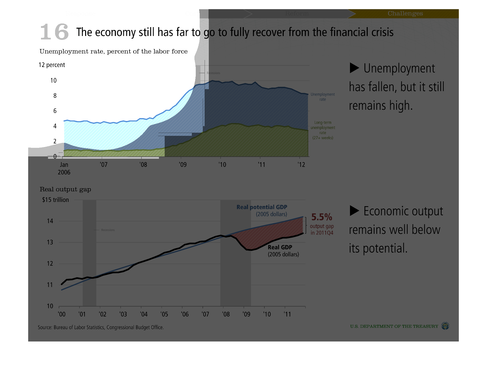
These graph shows the unemployment rate as a percentage of the labor force for 2006-2012 on
the top and the real outpost gap for 2000-2011 on the bottom.
Warning: Image is too big to fit on screen; displaying at 50%
Warning: Image is too big to fit on screen; displaying at 50%
These are two graphs showing that we still have a ways to come to get out of the financial
crisis. THe first graph shows unemployment rates improving. The second shows the economic
output. Both are better but not ideal
Warning: Image is too big to fit on screen; displaying at 50%
Warning: Image is too big to fit on screen; displaying at 50%
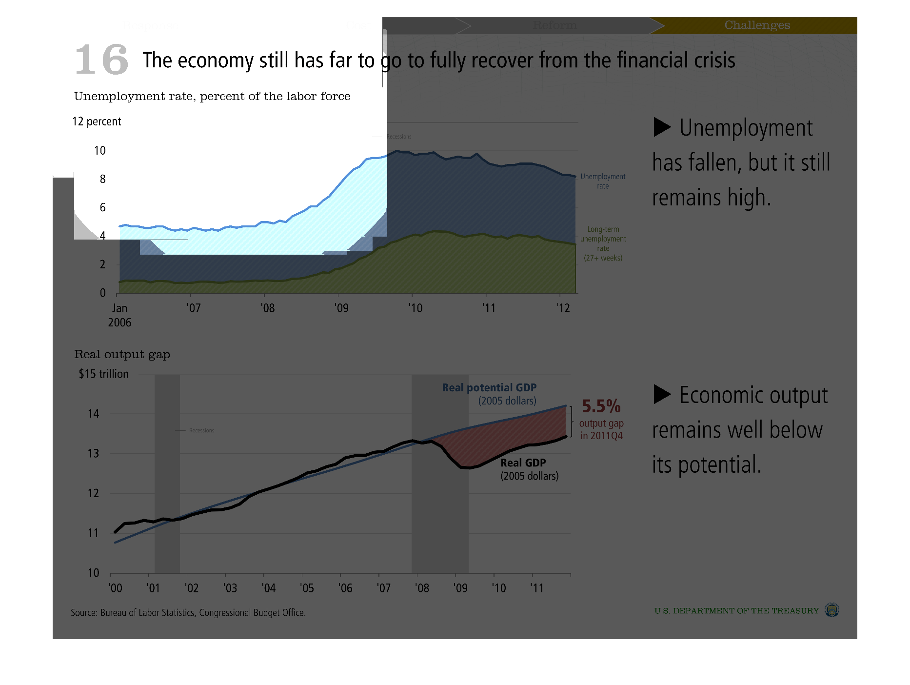
This is a series of charts and graphs depicting how far the economy has yet to fully recover
from the financial crises in terms of unemployment and economic output.
Warning: Image is too big to fit on screen; displaying at 50%
Warning: Image is too big to fit on screen; displaying at 50%
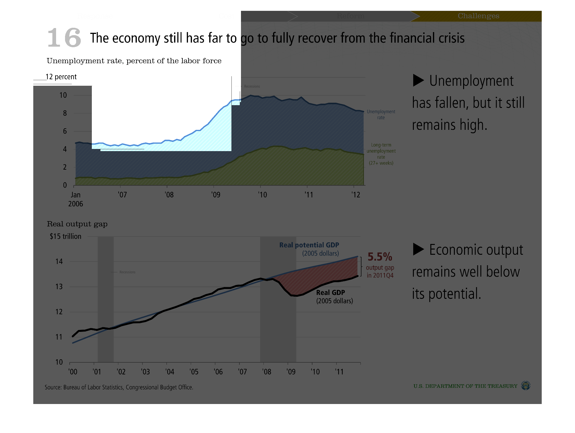
This is a set of graphs that describe the negative things about the current economic situation.
One graph is of real output in GPD and the other is of unemployment. There is a bell curve
shape to both graphs.
Warning: Image is too big to fit on screen; displaying at 50%
Warning: Image is too big to fit on screen; displaying at 50%
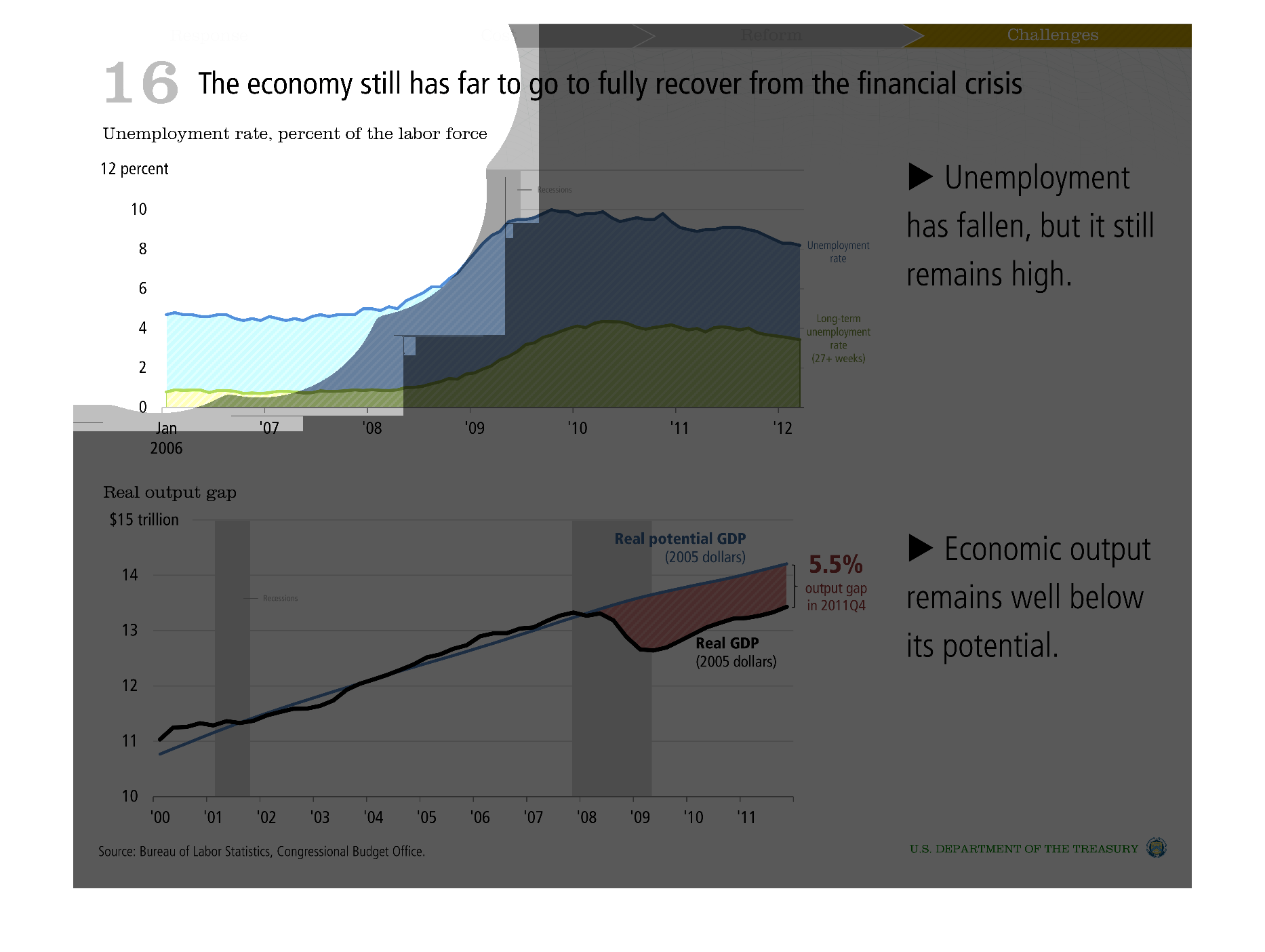
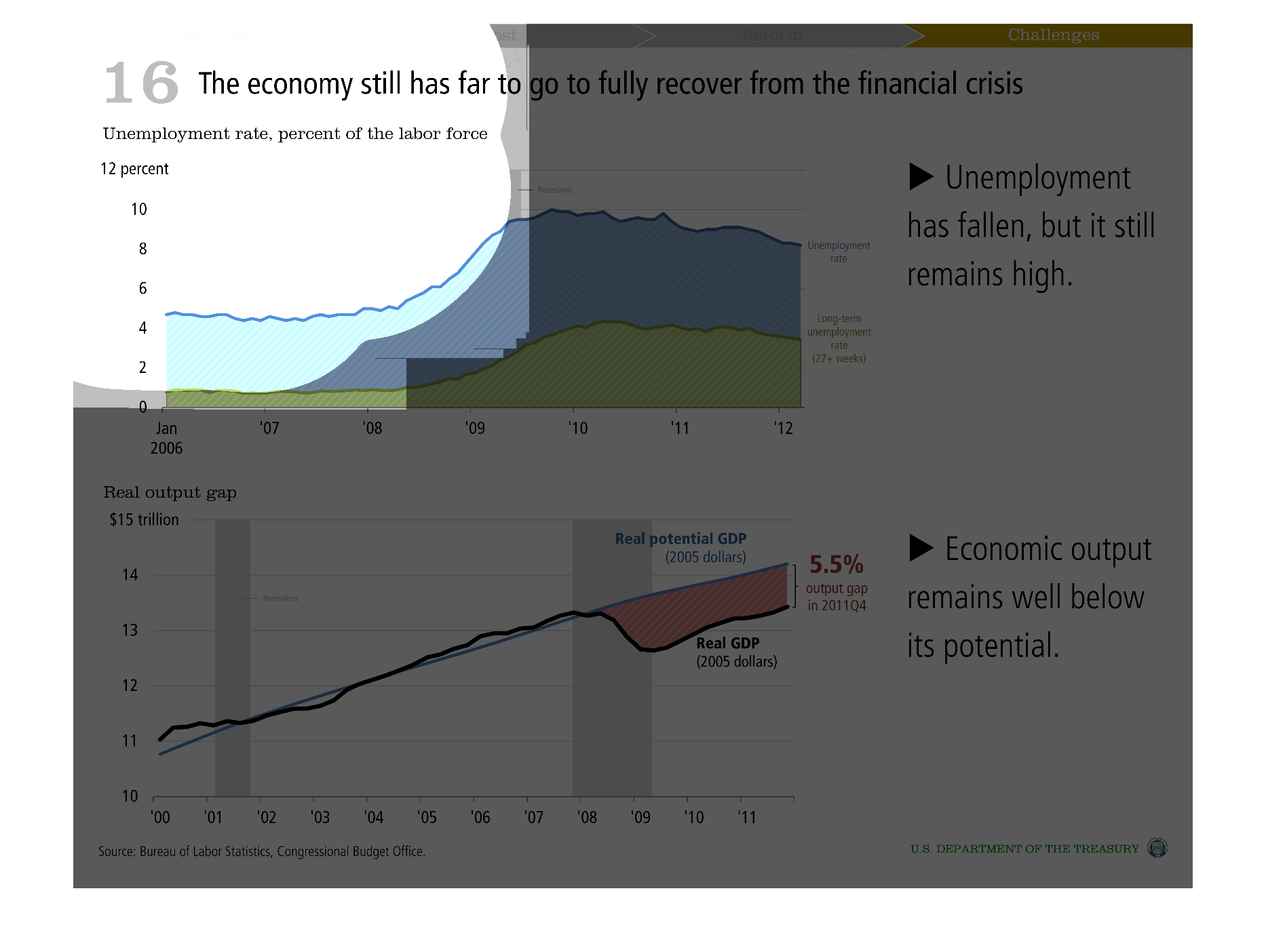
This has multiple charts.  The first chart shows the rising unemployment rate from 2006 to
2012.  While unemployment has gone down recently, it still hasn't reached it's former levels.
 The second chart shows that economic output could be higher but it is still lower than it
should be.
Warning: Image is too big to fit on screen; displaying at 50%
Warning: Image is too big to fit on screen; displaying at 50%
This is a graph comparison that is showing the recovery of the economy from the financial
crisis. Two graphs are provided. The bottom graph is providing information from the department
of labor. It is statistics data.   The first is showing the unemployment rate. Jobs have increased
over the years pumping money back into the economy.
Warning: Image is too big to fit on screen; displaying at 50%
Warning: Image is too big to fit on screen; displaying at 50%
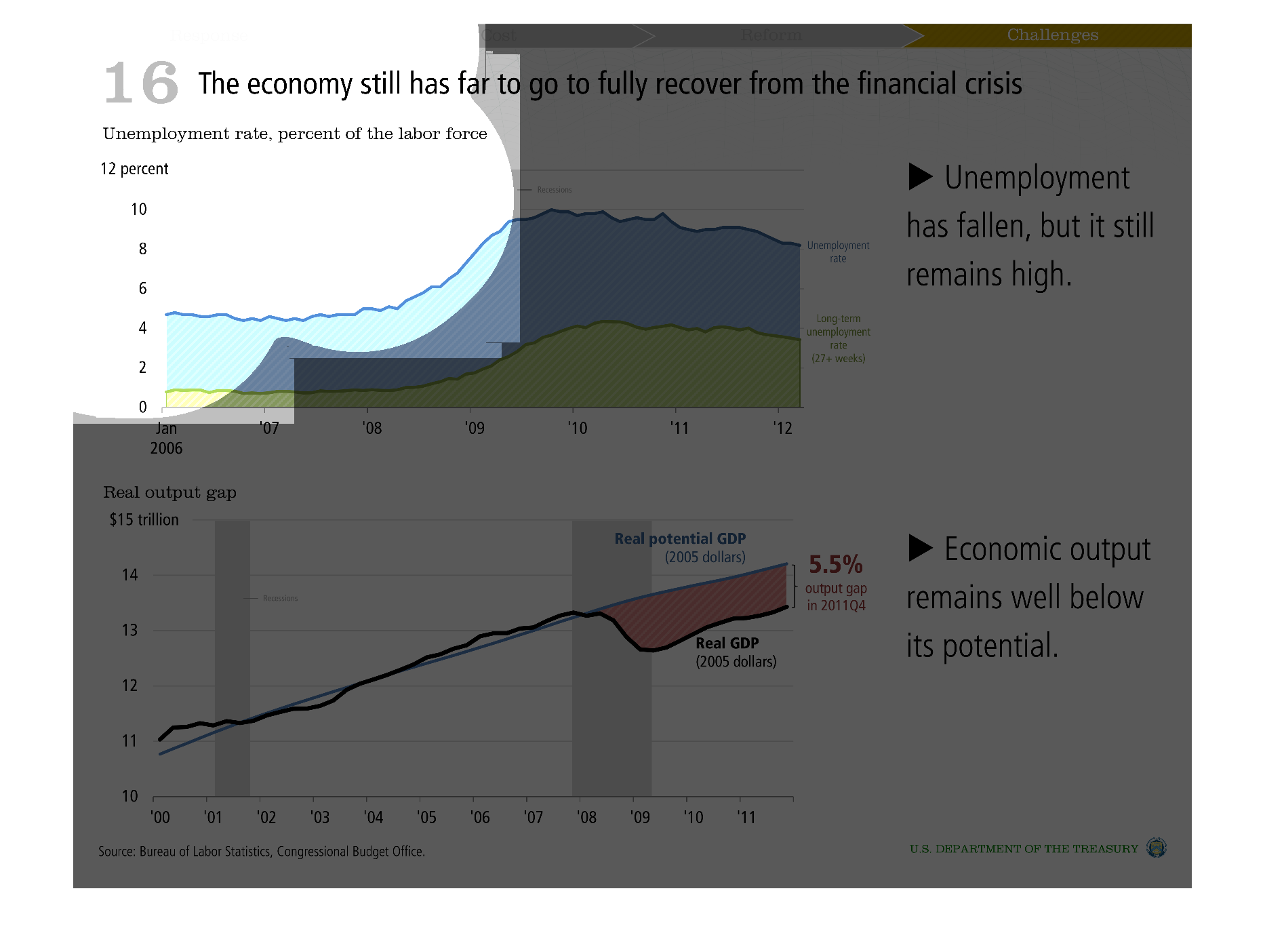
This image shows in both bar graph and line formats the relationship of the economy has far
to go in order to recover from the financial crisis. Unemployment rate, percent of the labor
force.
Warning: Image is too big to fit on screen; displaying at 50%
Warning: Image is too big to fit on screen; displaying at 50%
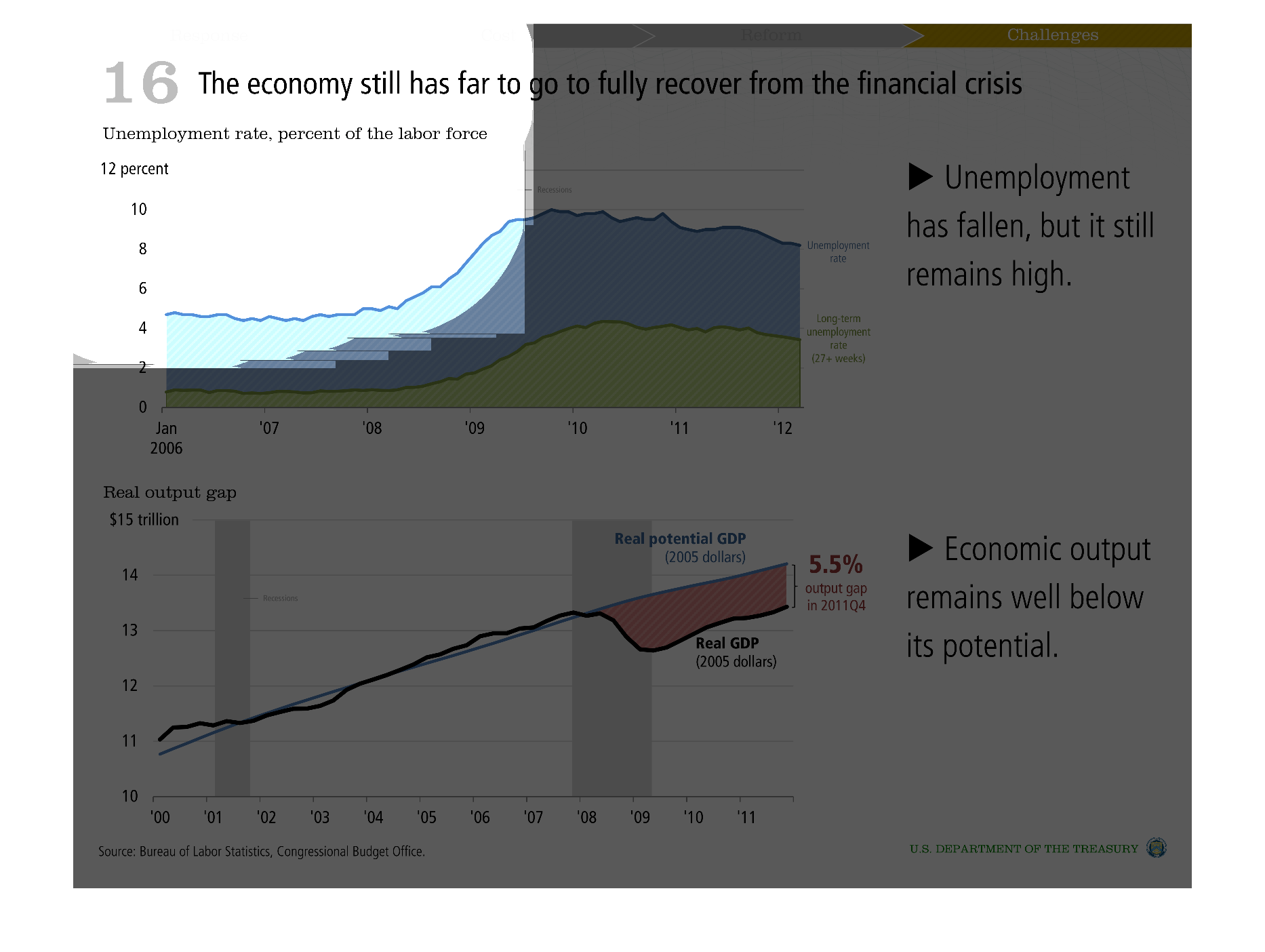
This chart describes that the economy still has far to go to fully recover from the financial
crisis. It specifically talks about the unemployment rate as a percentage of the labor force.
Warning: Image is too big to fit on screen; displaying at 50%
Warning: Image is too big to fit on screen; displaying at 50%
There are two graphs that show the economic impact of the financial crisis in 2008. The first
graph shows the change in unemployment from 2006 to 2012 where there is a large jump in 2008.
The second graph shows economic output from 2000 to 2011 with a dip at 2008.
Warning: Image is too big to fit on screen; displaying at 50%
Warning: Image is too big to fit on screen; displaying at 50%
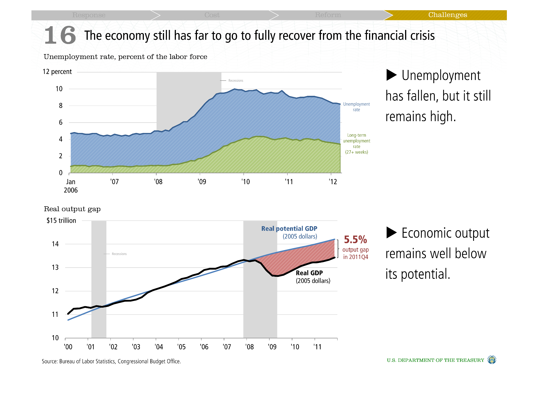
The graphs are about how the economy is recovering after the financial crisis. One shows the
unemployment rate between January 2006 and 2012. The rate peaked in the middle of 2009 at
around 10 % and has slowly been declining ever since. The second graph displays GDP output
and how it is below the potential.
Warning: Image is too big to fit on screen; displaying at 50%
Warning: Image is too big to fit on screen; displaying at 50%
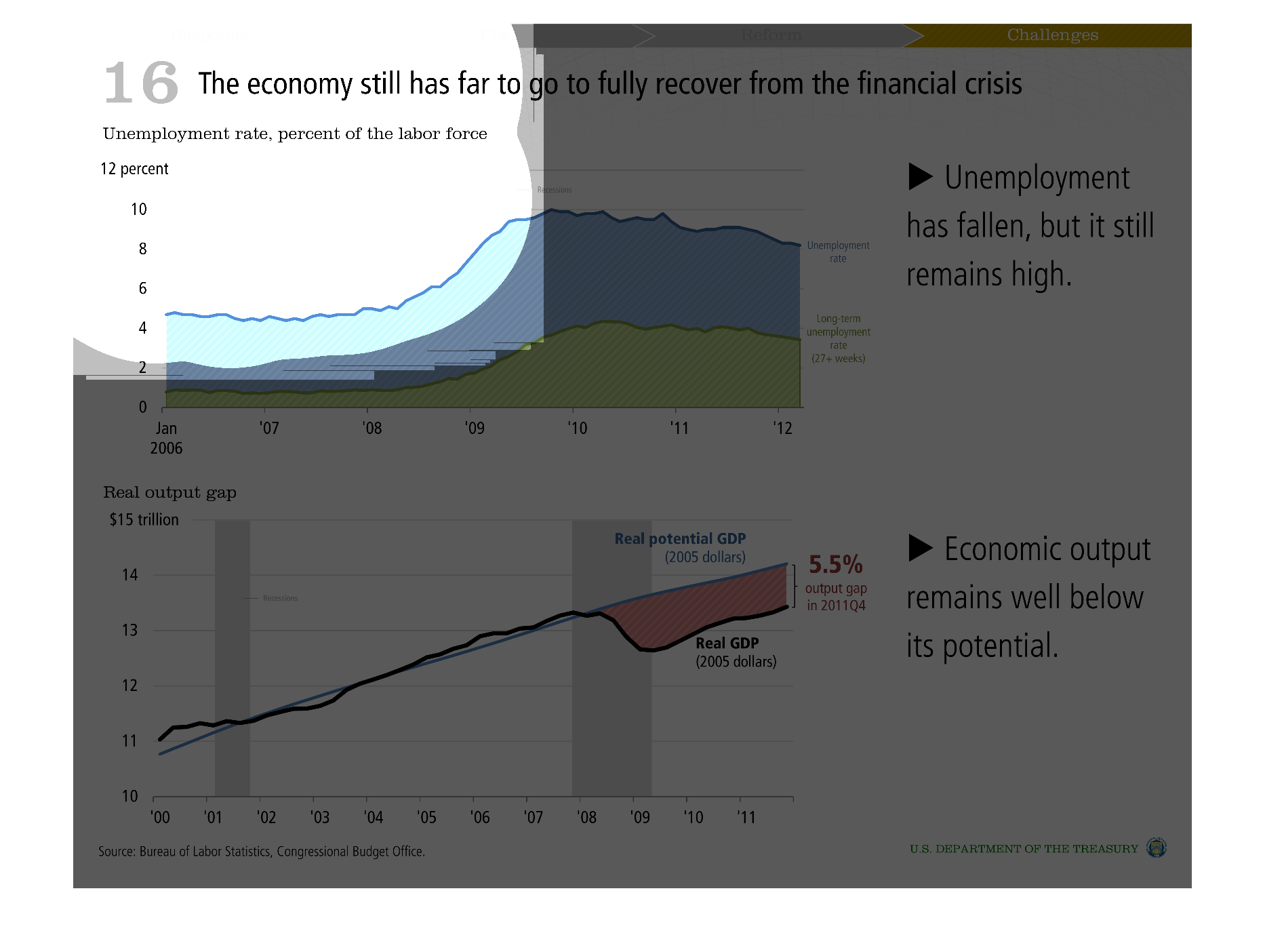
This is a chart saying the economy has a long way to go to fully recover from the crisis from
January of 2006, to 2012. It states unemployment has fallen, but is still high, and economic
output is below normal.
Warning: Image is too big to fit on screen; displaying at 50%
Warning: Image is too big to fit on screen; displaying at 50%