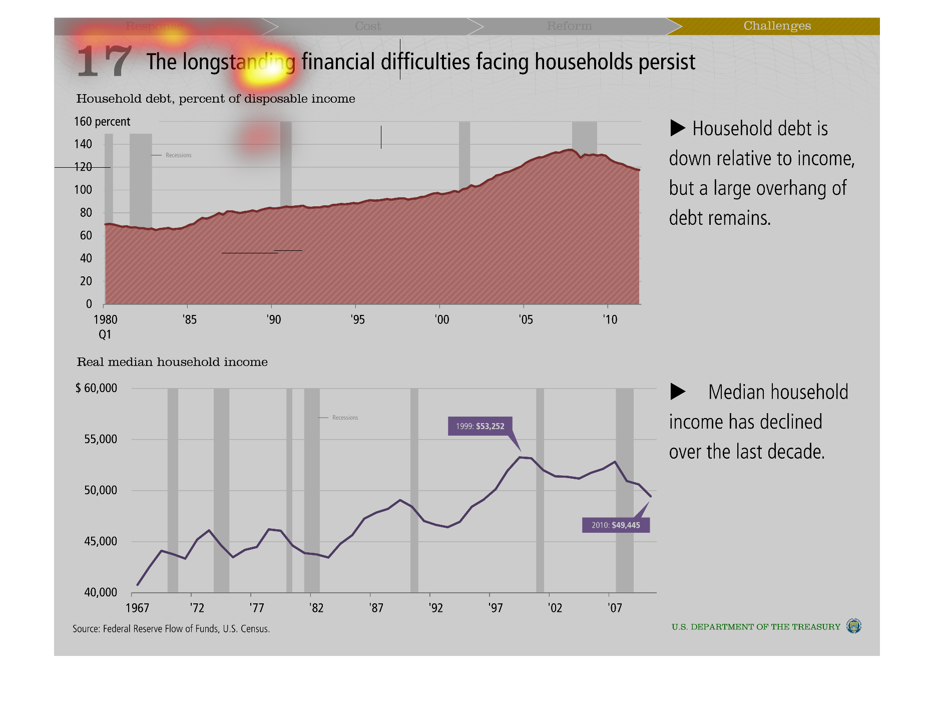
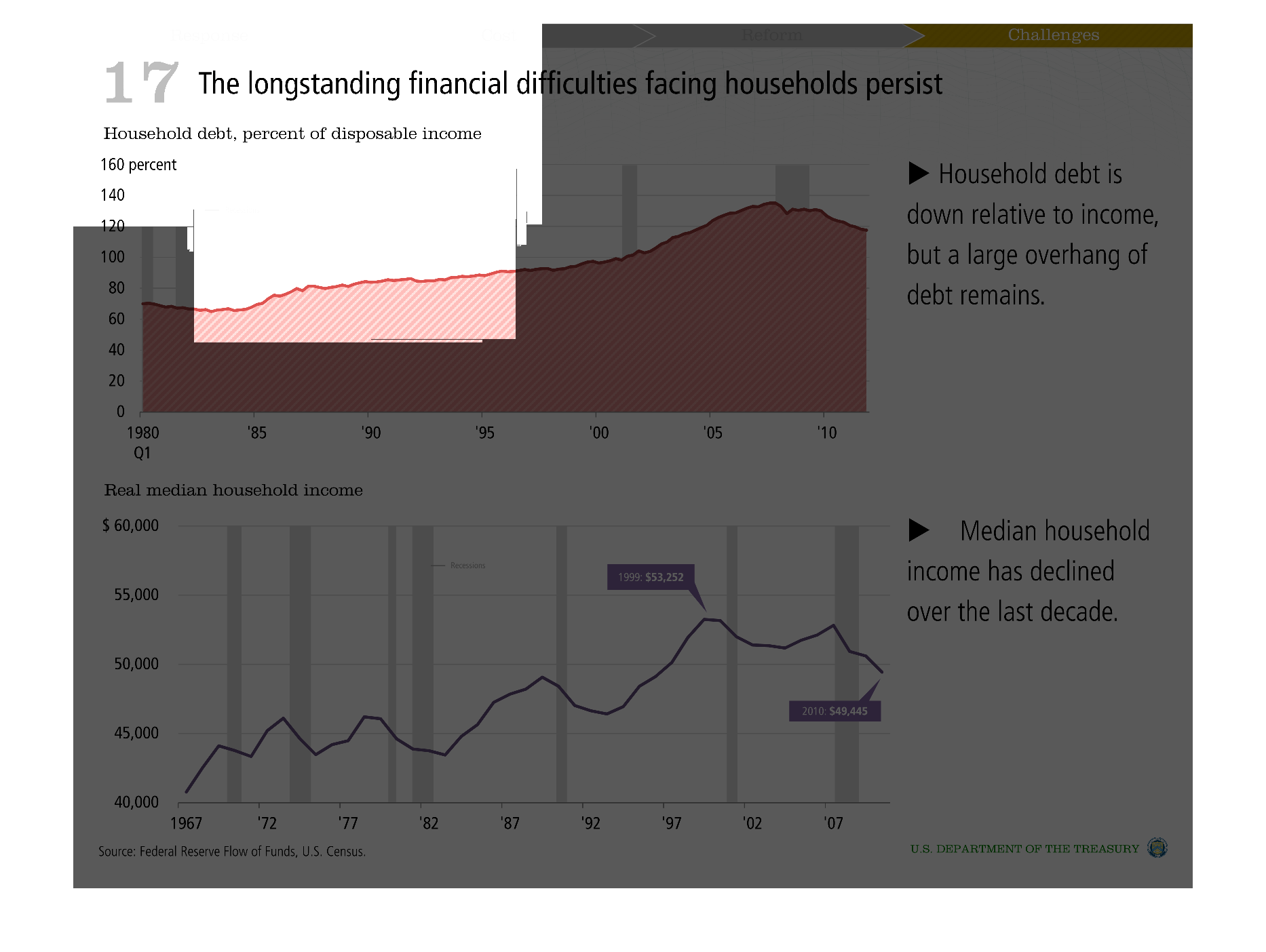
Warning: Image is too big to fit on screen; displaying at 50%
Graph indicating the growth and trends of personal debt over a period of years. There is also
a chart pertaining to household income throughout the years
Warning: Image is too big to fit on screen; displaying at 50%
Warning: Image is too big to fit on screen; displaying at 50%
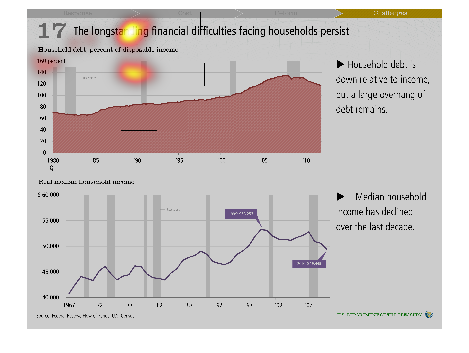
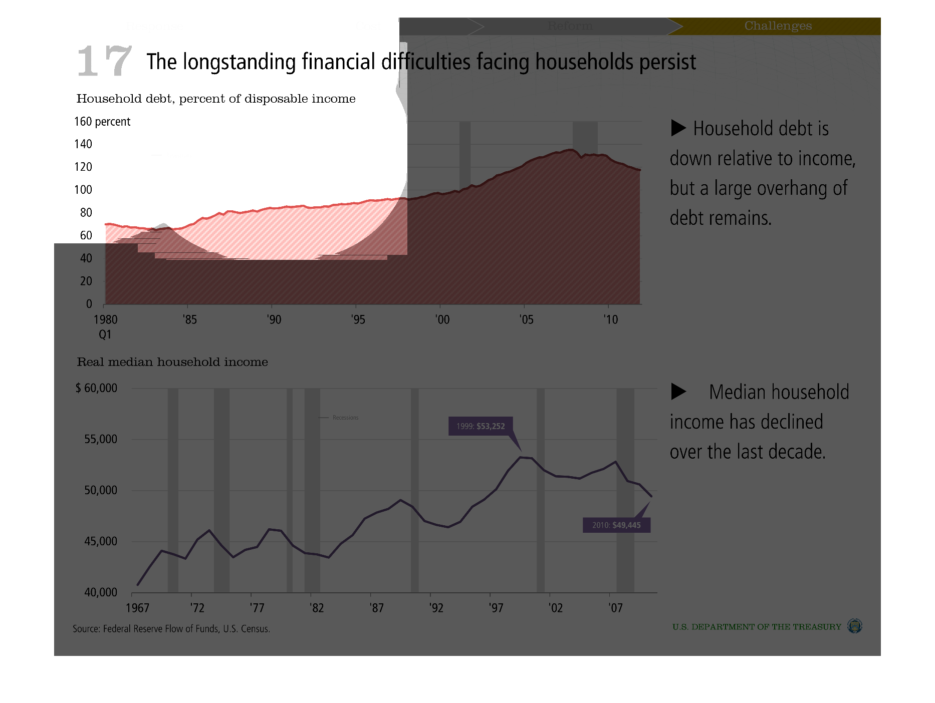
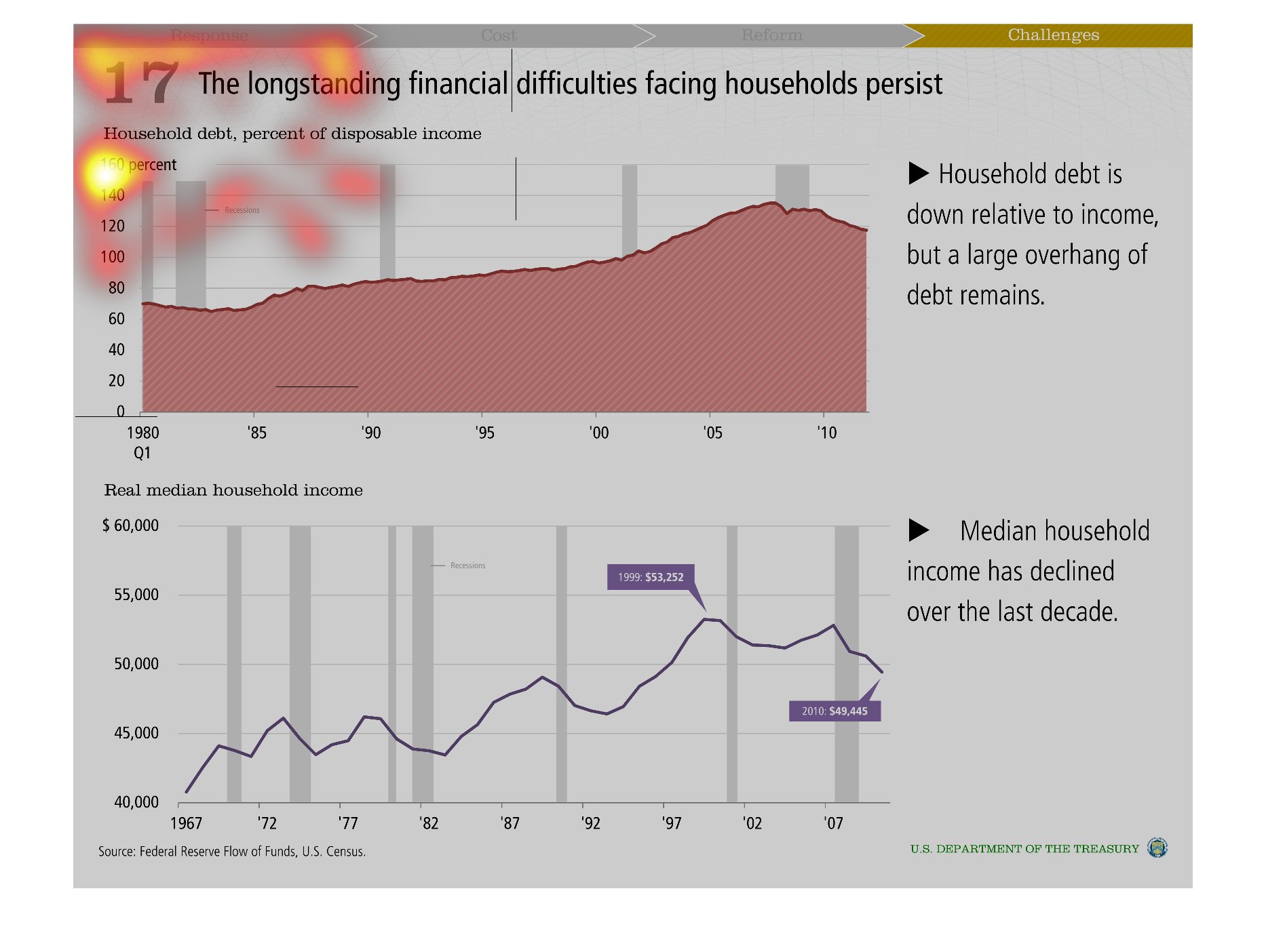
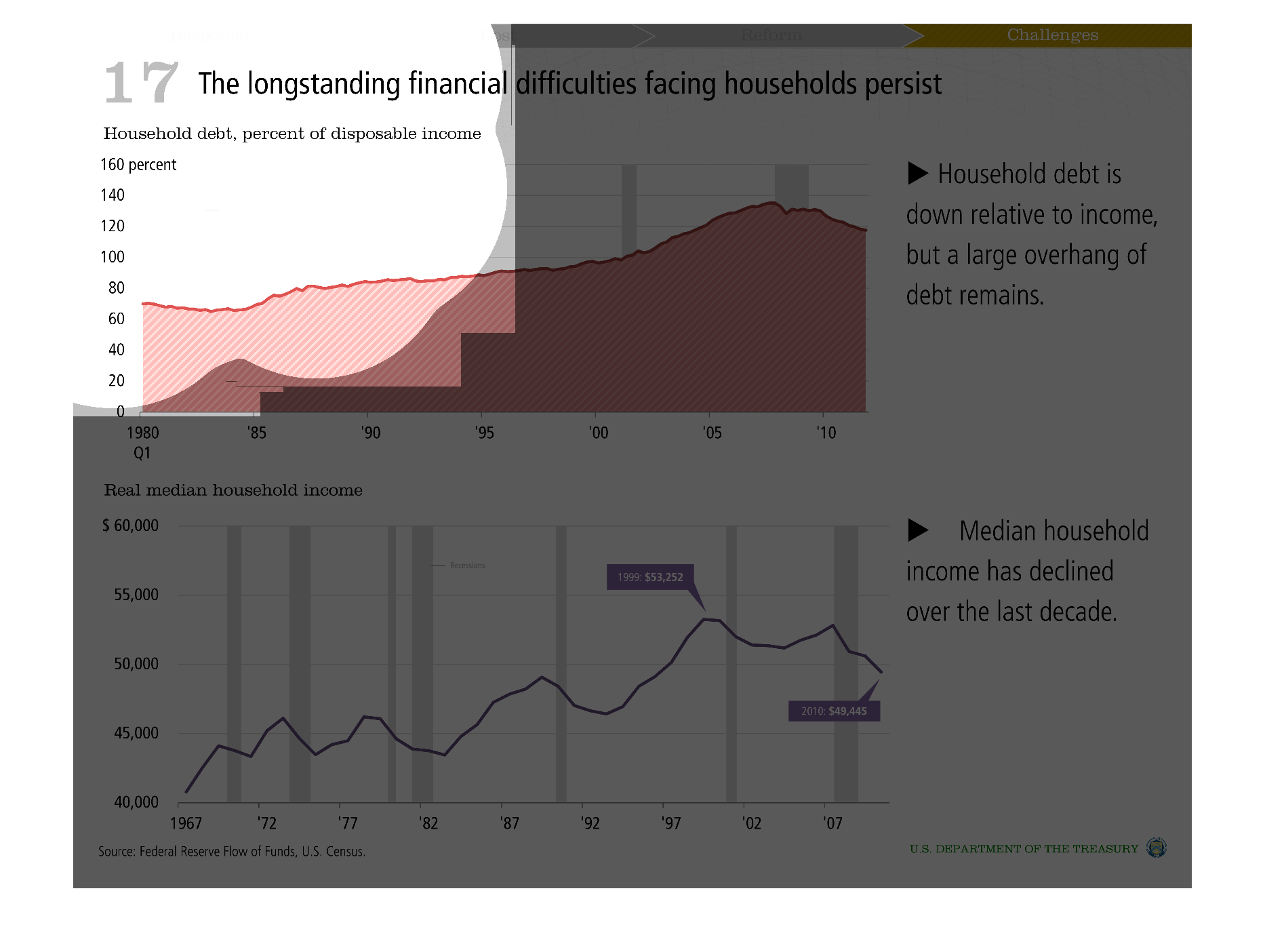
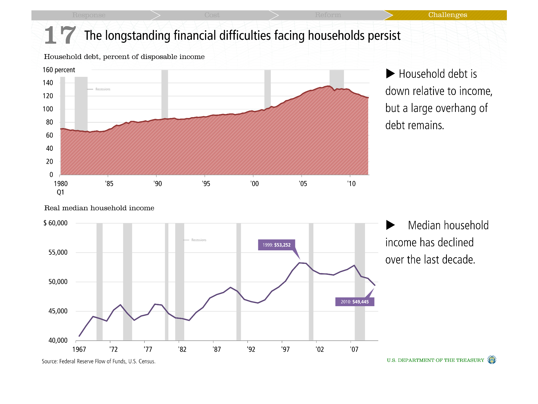
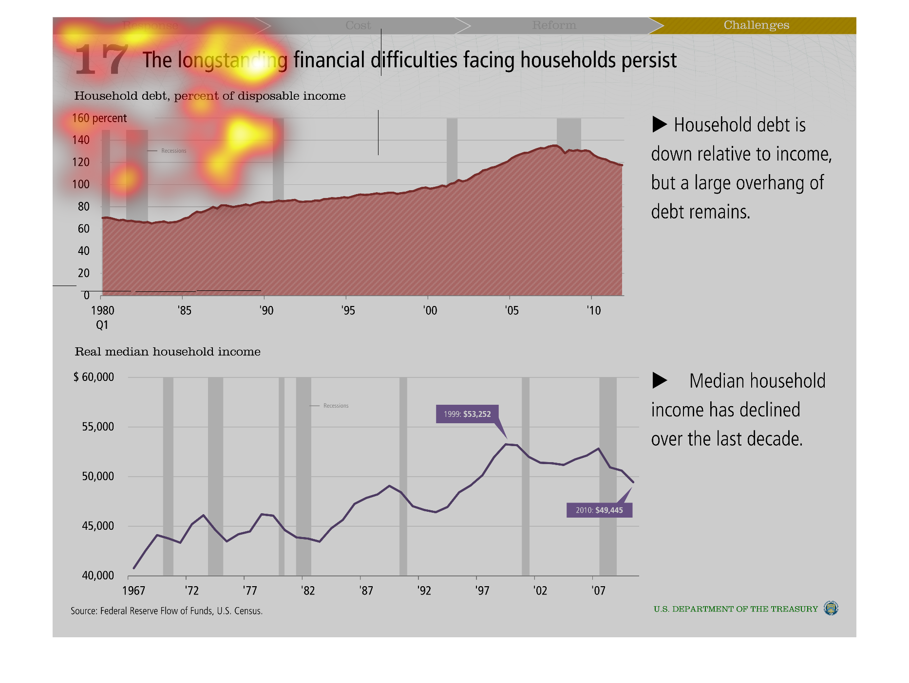
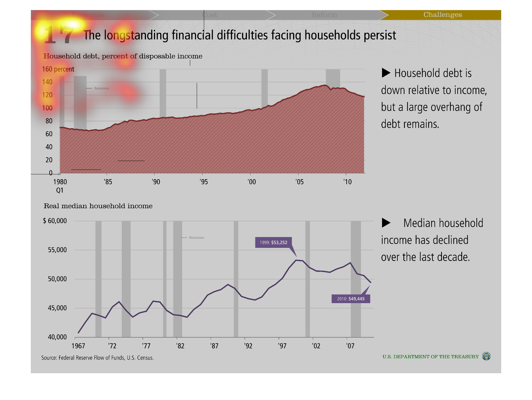
This is a chart showing the financial difficulties still facing households in America. It
shows how debt has decreased per household, but the amount is still very high.  It also shows
that the median income of households has decreased for the past decade.
Warning: Image is too big to fit on screen; displaying at 50%
Warning: Image is too big to fit on screen; displaying at 50%
This image shows the longstanding financial difficulties facing households. It shows household
debt and percent of disposable income. It shows that household debt is down relative to income.
Warning: Image is too big to fit on screen; displaying at 50%
Warning: Image is too big to fit on screen; displaying at 50%

This chart shows the longstanding financial difficulties facing households persist. It is
for household debt percentage of disposable income. It is very interesting.
Warning: Image is too big to fit on screen; displaying at 50%
Warning: Image is too big to fit on screen; displaying at 50%
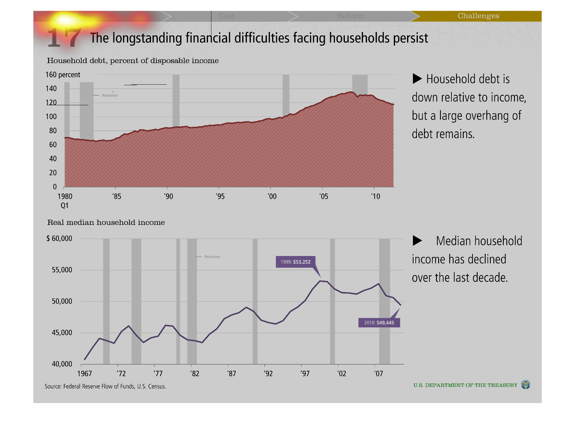
These graphs show that the long-standing problems facing households still persist. The first
graph shows that debt is down compared to income, but a large debt overhang still remains.
The second graph shows that median household income has declined over the last 10 years.
Warning: Image is too big to fit on screen; displaying at 50%
Warning: Image is too big to fit on screen; displaying at 50%
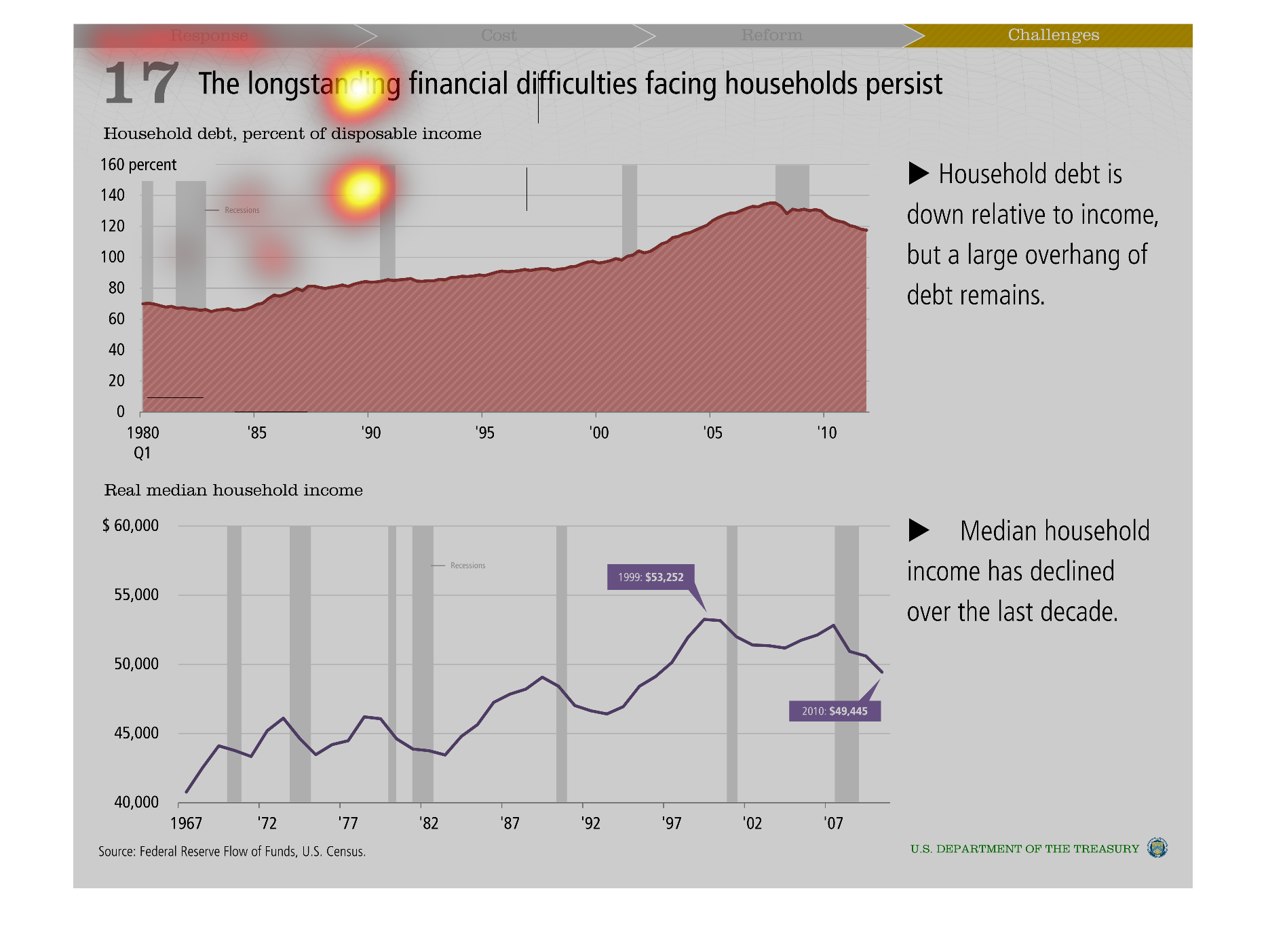
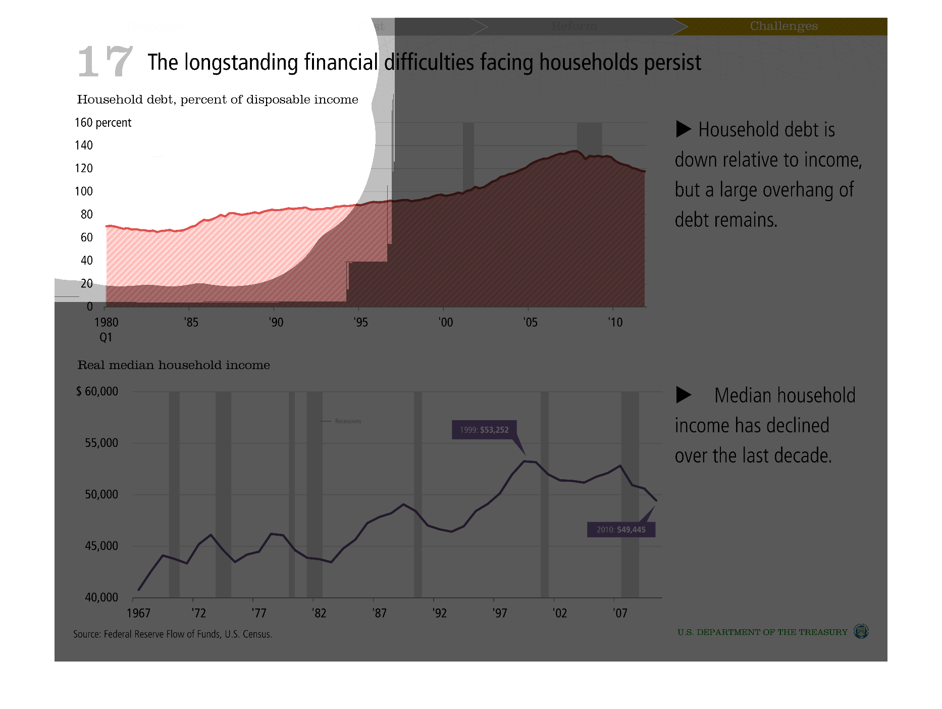
This is a series of charts and graphs depicting how the longstanding financial difficulties
facing households continue to persist fro  the years 1980 to 2010.
Warning: Image is too big to fit on screen; displaying at 50%
Warning: Image is too big to fit on screen; displaying at 50%
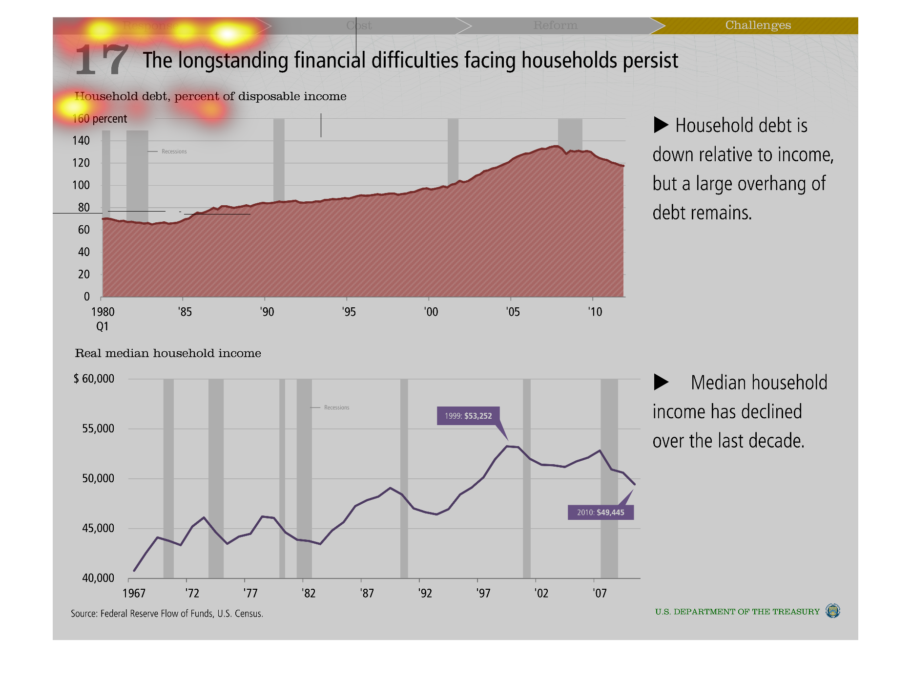
A graph showing financial difficulties. Shows how much debt a person has in relation to income.
Graphs are both line graphs. One is a pinkish color and the other is a purple color.
Warning: Image is too big to fit on screen; displaying at 50%
Warning: Image is too big to fit on screen; displaying at 50%
There are two halves to this image.  The upper half is a graph depicting household debt relative
to disposable income.  The ratio was increasing until roughly 2007 when it began decreasing
again.  The lower graph shows median household income, which has decline in the last decade.
Warning: Image is too big to fit on screen; displaying at 50%
Warning: Image is too big to fit on screen; displaying at 50%
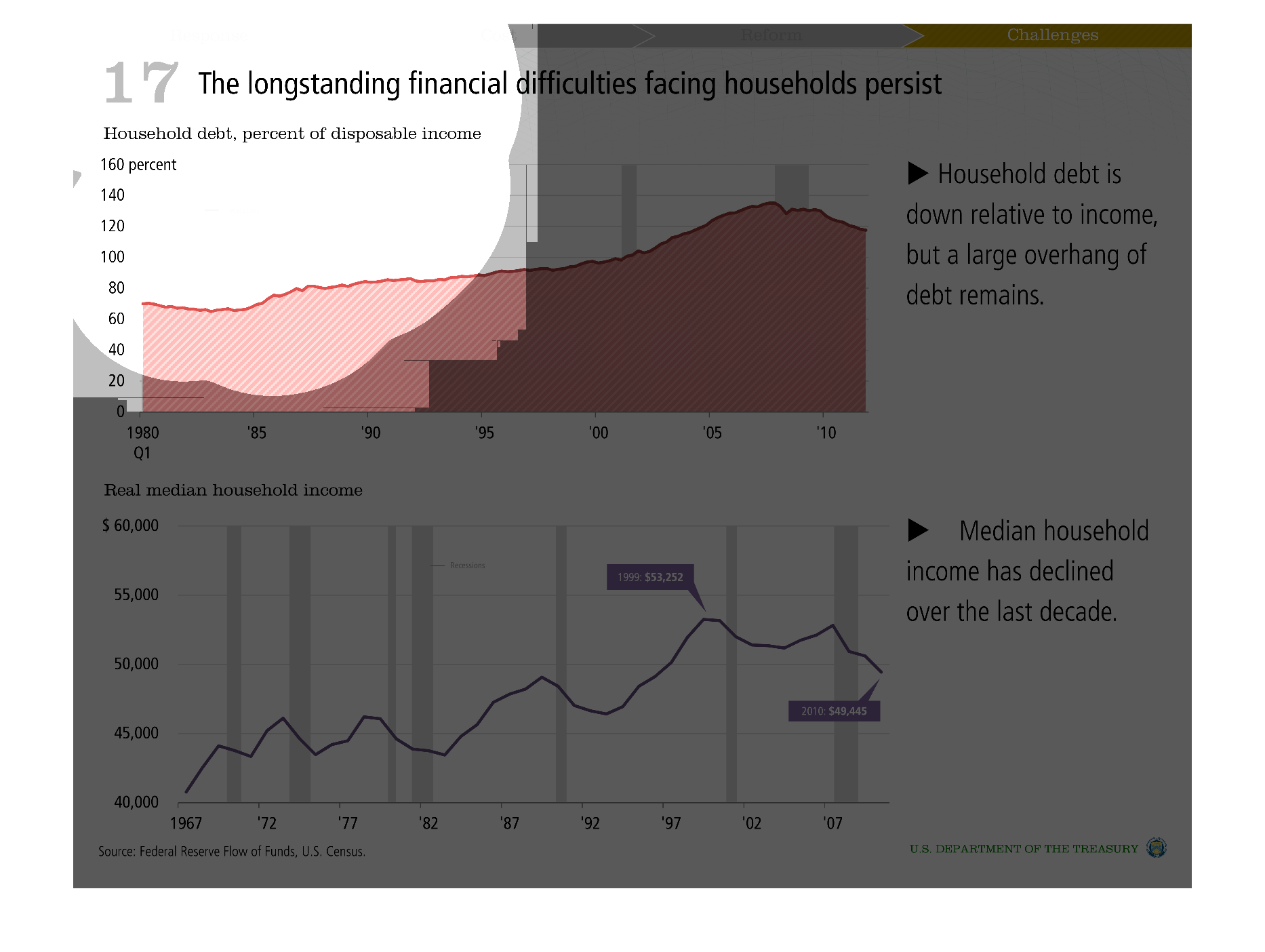
This chart describes the longstanding financial difficulties facing households persist. Specifically
household debt, and percentage of disposable income.
Warning: Image is too big to fit on screen; displaying at 50%
Warning: Image is too big to fit on screen; displaying at 50%
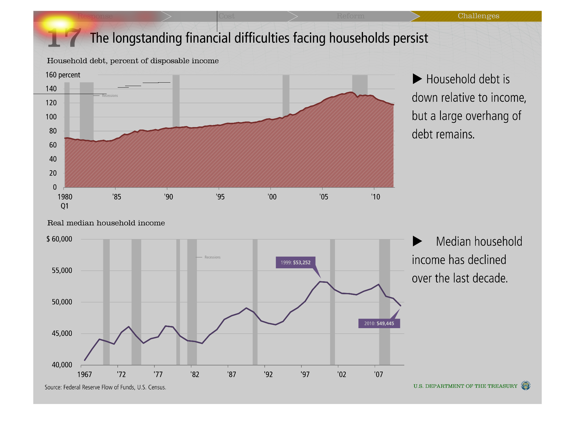
This image shows or depicts in 2 different statistical formats the longstanding financial
difficulties that face households across the US over the last decade or so.
Warning: Image is too big to fit on screen; displaying at 50%
Warning: Image is too big to fit on screen; displaying at 50%
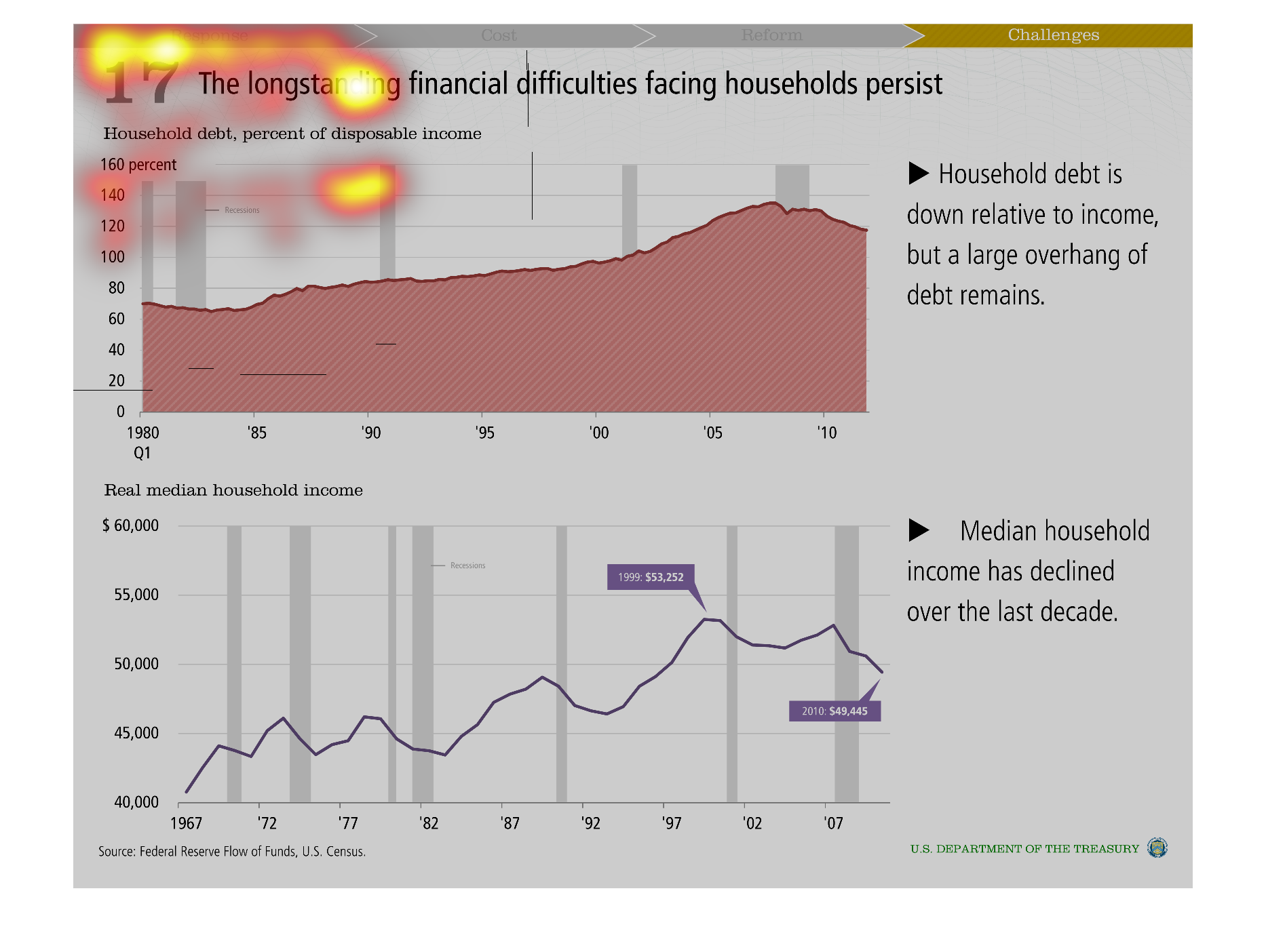
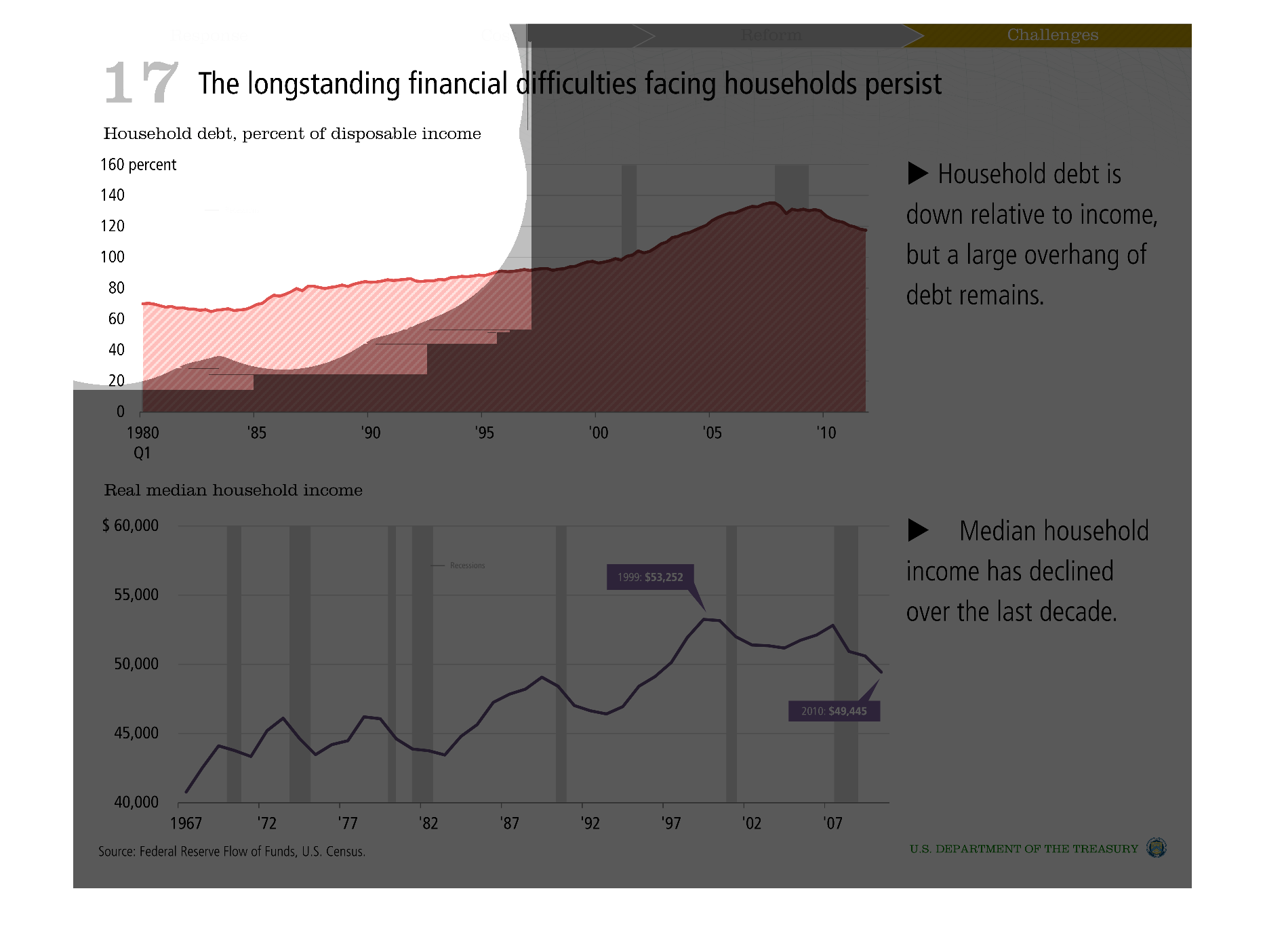
This graph illustrates household debt as a percent of disposable income on the top and real
median household income on the bottom from the 1970s to the year 2007.
Warning: Image is too big to fit on screen; displaying at 50%
Warning: Image is too big to fit on screen; displaying at 50%
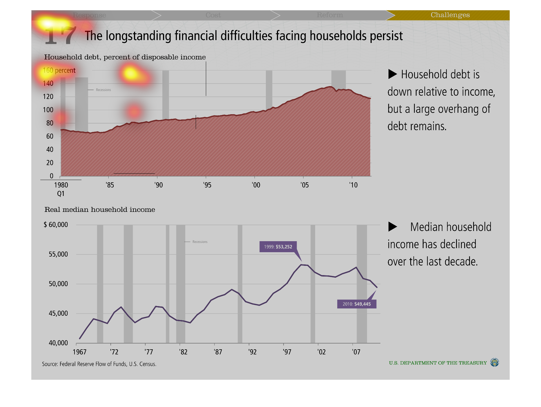
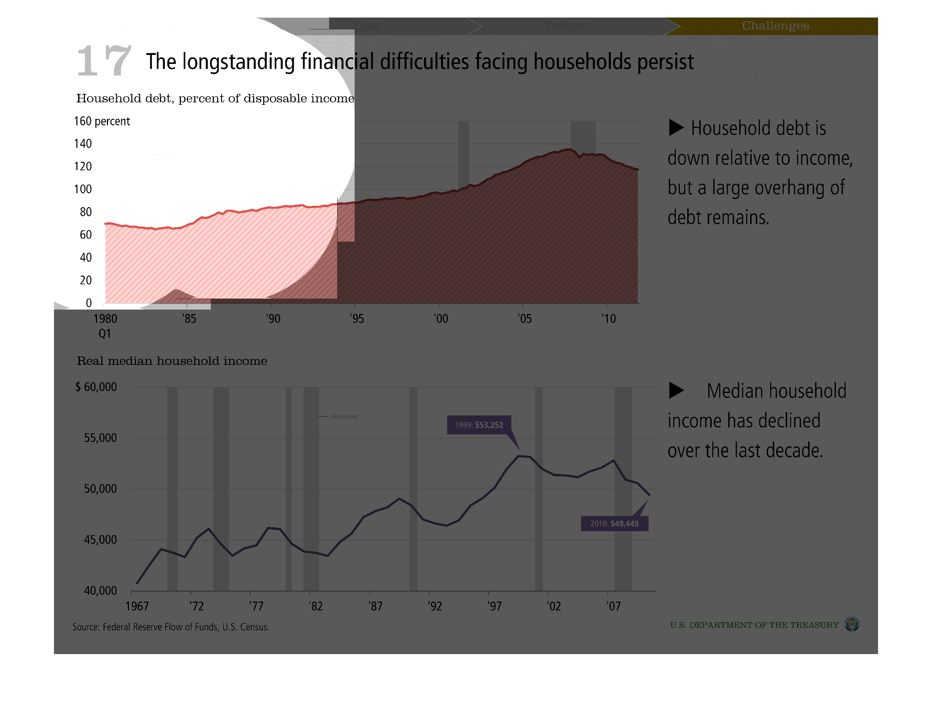
This chart states the financial problem four households persists. The chart shows debt as
a % of income is rising from 70% in 1980 to over 120% in 2010. It also shows the real income
has dipped as well.
Warning: Image is too big to fit on screen; displaying at 50%
Warning: Image is too big to fit on screen; displaying at 50%
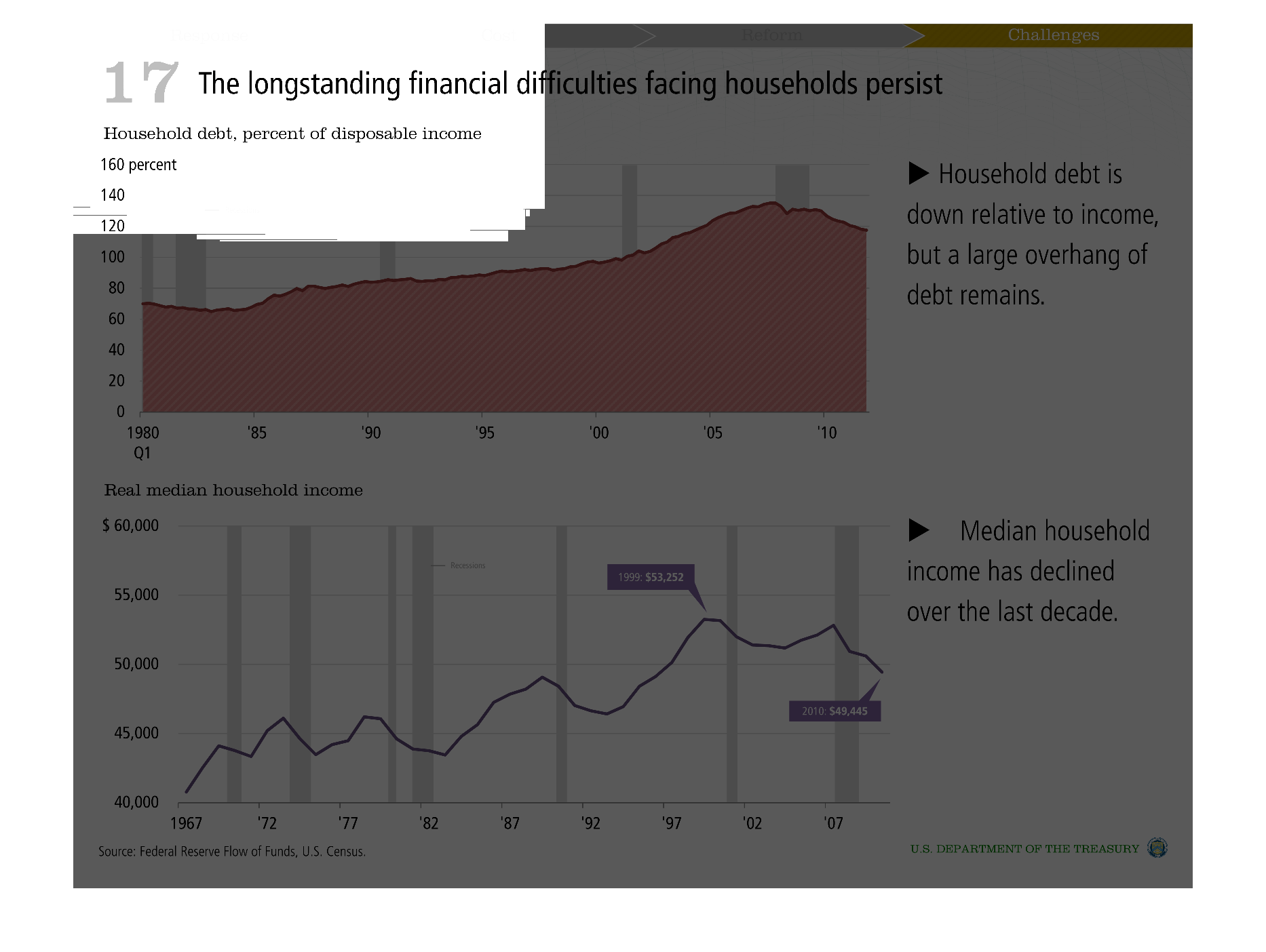
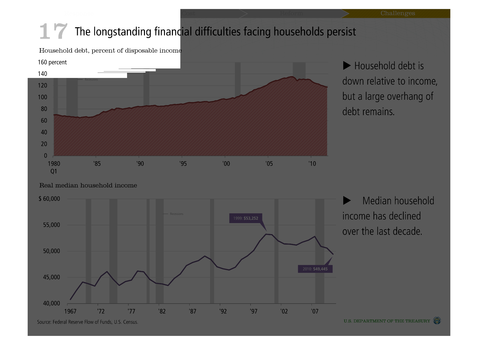
The Longstanding Financial Difficulties facing households persist. Debt is down relative to
income, although overhanging debt remains, median household income has declined over the last
decade.
Warning: Image is too big to fit on screen; displaying at 50%
Warning: Image is too big to fit on screen; displaying at 50%
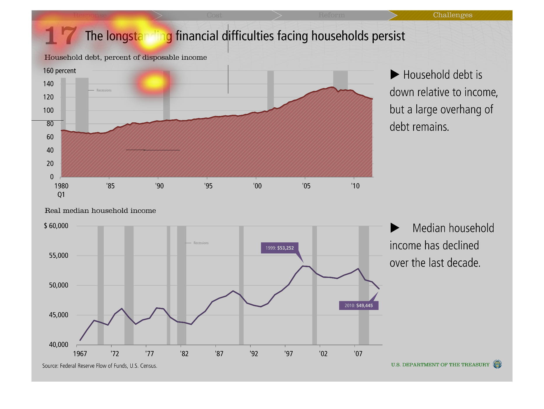
This graph shows the longstanding financial difficulties facing household persist. It further
shows household debt, and percent disposal income. The time frame is from 1967 to 2007. Medium
household income has declined over the last decade.
Warning: Image is too big to fit on screen; displaying at 50%
Warning: Image is too big to fit on screen; displaying at 50%
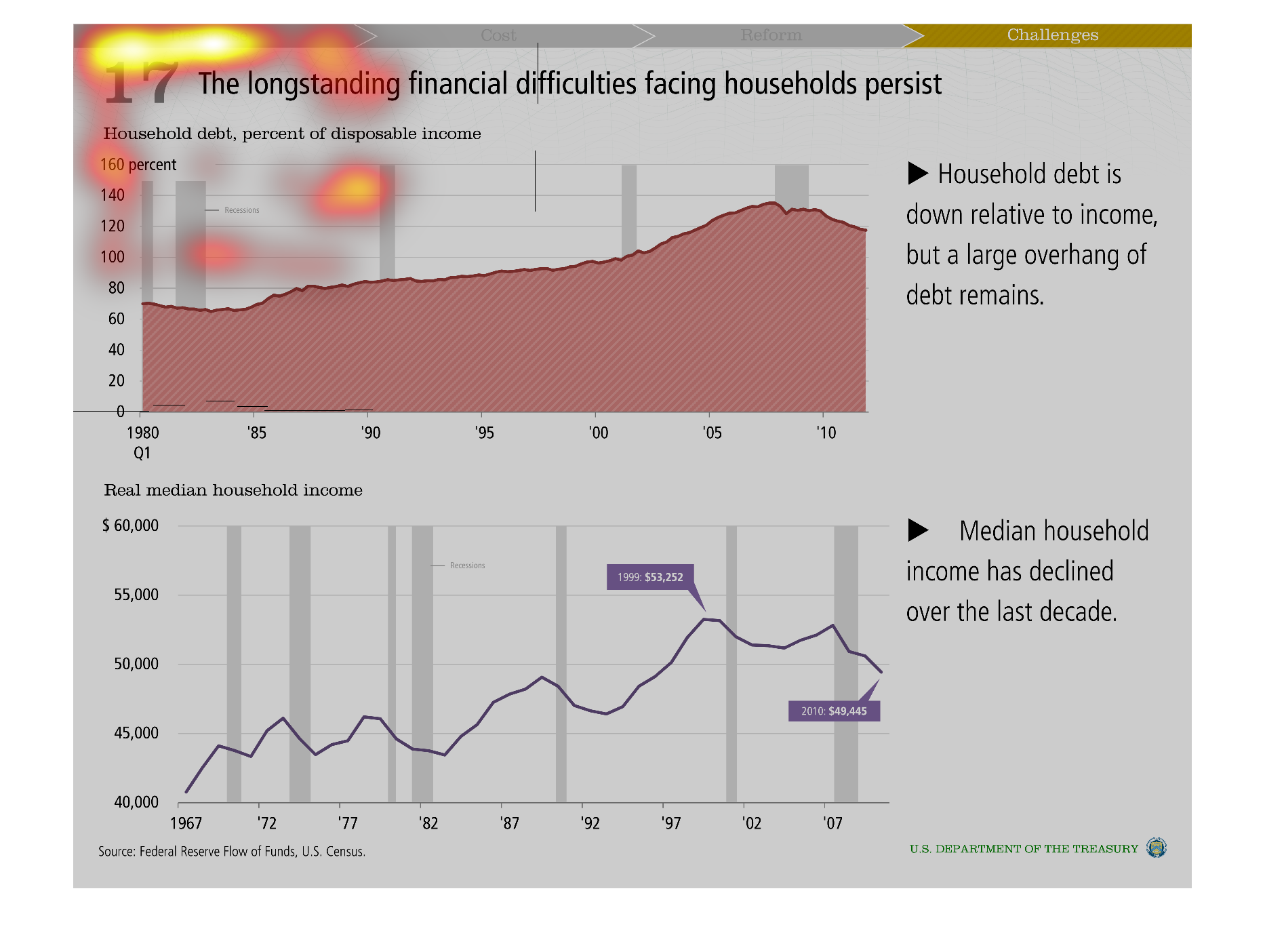

These charts show household debt, as a percentage of income. It tracks from 1980 to 2010,
and there is a chart below showing median incomes in relation.
Warning: Image is too big to fit on screen; displaying at 50%
Warning: Image is too big to fit on screen; displaying at 50%