Warning: Image is too big to fit on screen; displaying at 50%
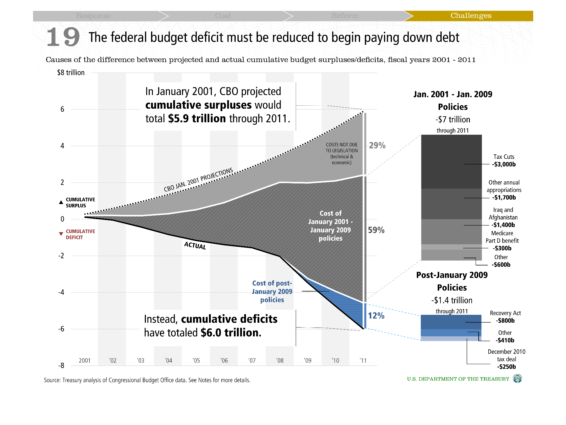
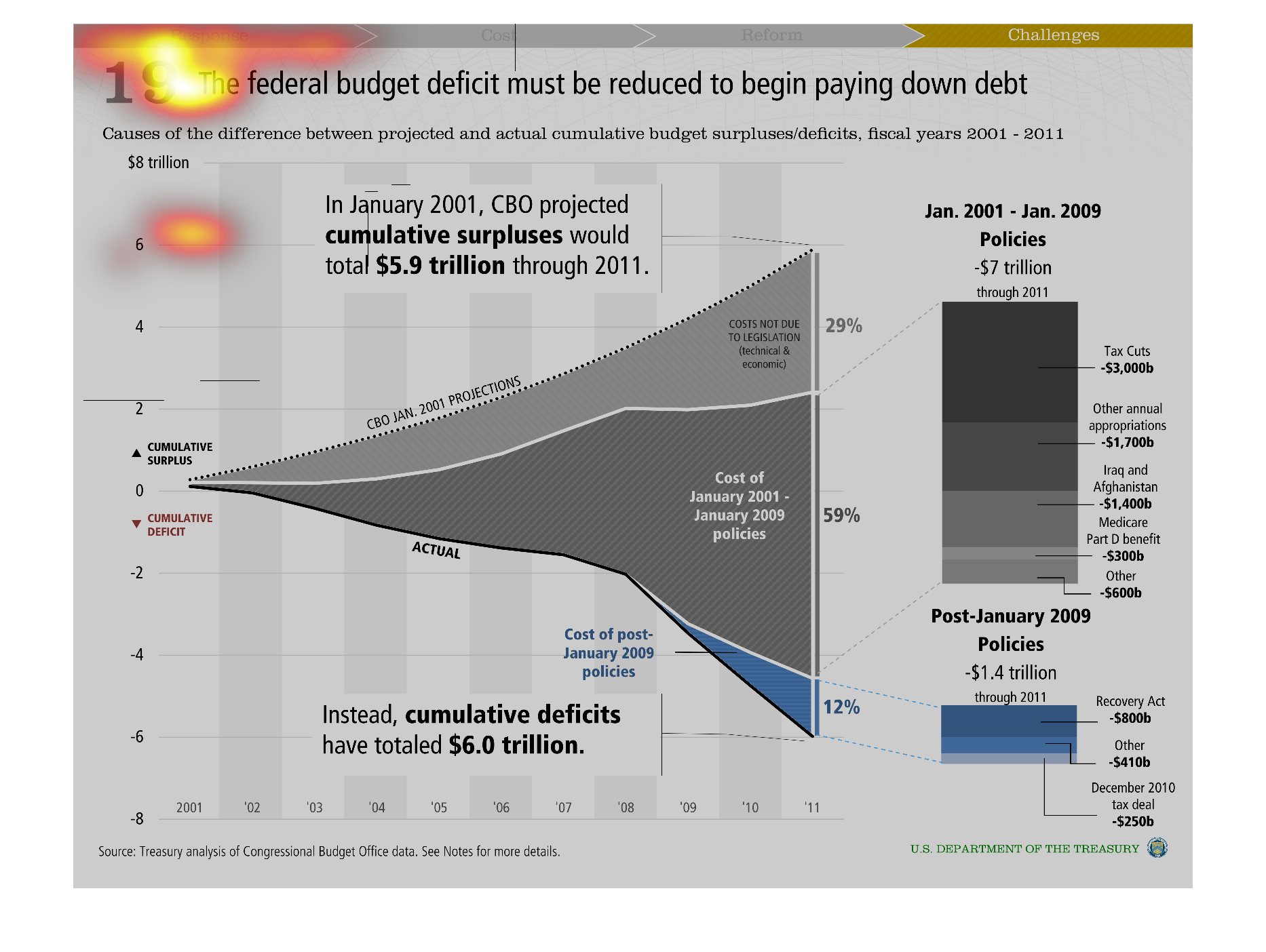
This is a line graph mapping out the causes of the difference between projected and actual
cumulative budget surplus/defecits for the fiscal years of 2001-2011
Warning: Image is too big to fit on screen; displaying at 50%
Warning: Image is too big to fit on screen; displaying at 50%

This graphic SHOWS THE FEDERAL DEBT OVER TIME. BASED ON 2001 PROJECTIONS, THE DEBT WAS PROJECTED
TO RESULT IN A SURPLUS THROUGH 2009, HOWEVER, DUE TO POLICIES ENACTED AFTER 2001, THERE WAS
INSTEAD A DEBT IN 2009.
Warning: Image is too big to fit on screen; displaying at 50%
Warning: Image is too big to fit on screen; displaying at 50%


Affect of certain policies on federal budget deficit. The policies are divided into two time
periods: Jan 2001-Jan 2009 and post-Jan 2009. Each time period is represented by a color.
Each color is further divided up into categories of spending, represented by shading of the
colors.
Warning: Image is too big to fit on screen; displaying at 50%
Warning: Image is too big to fit on screen; displaying at 50%
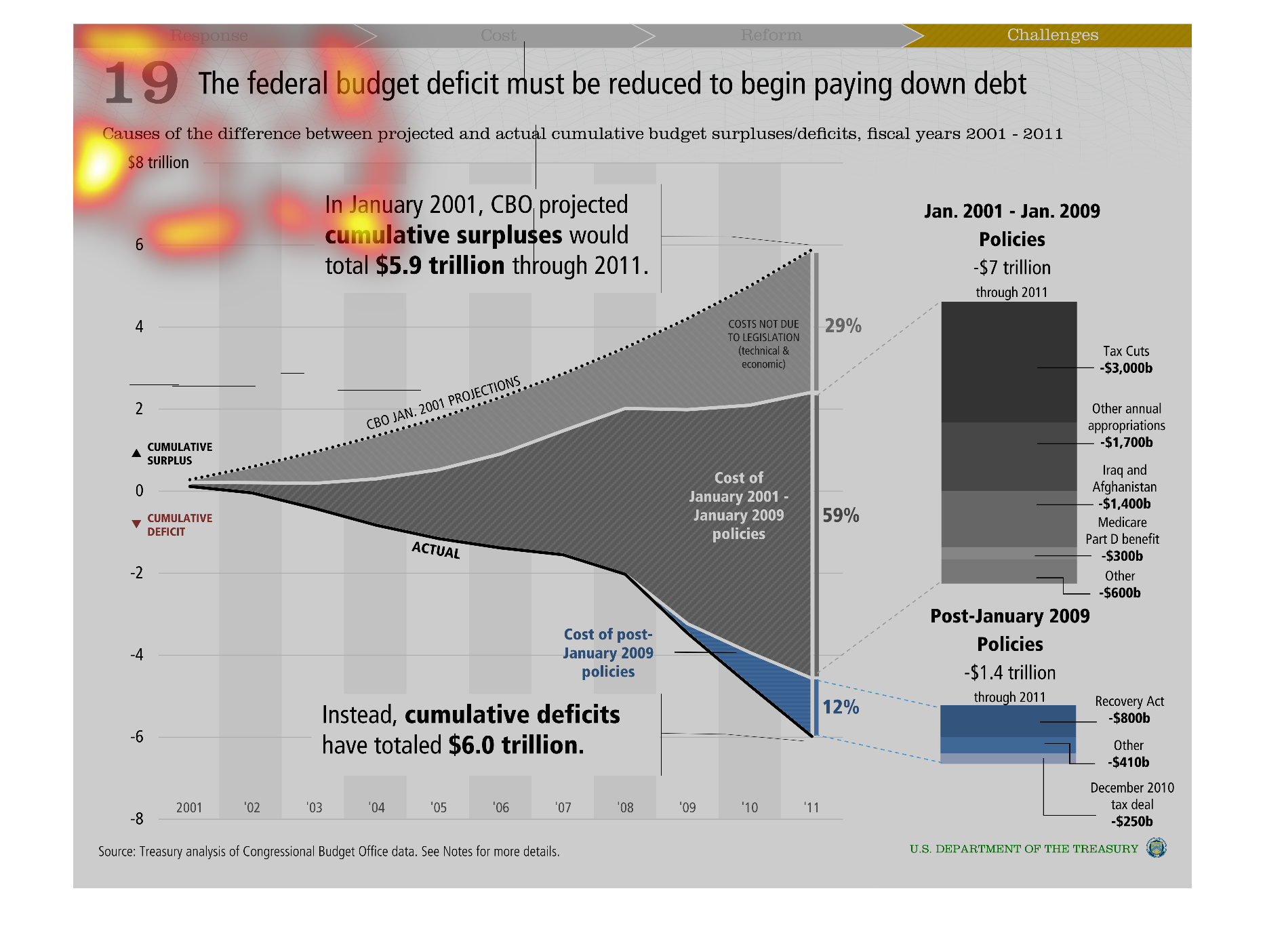

This is a graph that shows the negative effects of the federal budget deficit. it shows the
causes of the budget deficit. This graph shows the policies between 2001 and 2009 that caused
the deficit.
Warning: Image is too big to fit on screen; displaying at 50%
Warning: Image is too big to fit on screen; displaying at 50%

An infographic about the federal budget deficit. Implies that the federal budget deficits
must be reduced to begin paying down debt. Shows projections and figures
Warning: Image is too big to fit on screen; displaying at 50%
Warning: Image is too big to fit on screen; displaying at 50%

the federal budget deficit must be reduced to begin paying down debt. In January of 2010 cumulative
surpluses were projected at 5.9 trillion through 2011, instead deficits have totaled 6 trillion
Warning: Image is too big to fit on screen; displaying at 50%
Warning: Image is too big to fit on screen; displaying at 50%

This chart shows the federal budget deficit must be reduced to begin paying down debt. It
shows the causes of the difference between projected and actual cumulative budget surpluses/deficits,
fiscal years of 2001-2011.
Warning: Image is too big to fit on screen; displaying at 50%
Warning: Image is too big to fit on screen; displaying at 50%
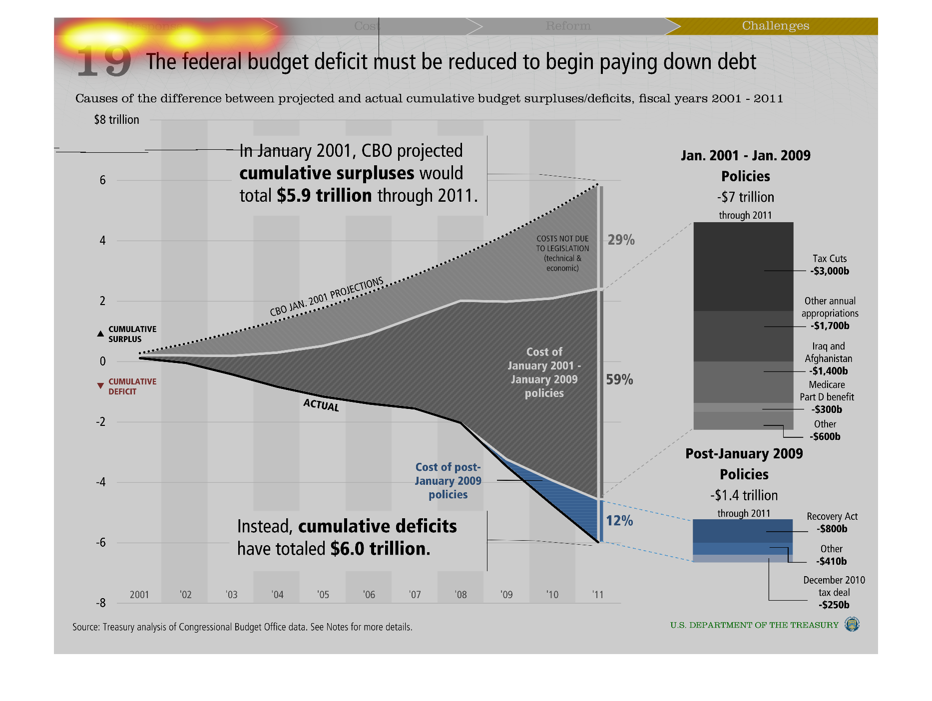
This is a series of charts and graphs depicting how the federal budget deficit must be reduced
in order for the overall national debt to begin being paid down.
Warning: Image is too big to fit on screen; displaying at 50%
Warning: Image is too big to fit on screen; displaying at 50%
This chart describes the federal budget deficit must be reduced to begin paying down debt.
Specifically causes of the difference between projected and actual cumulative budget surpluses
deficits.
Warning: Image is too big to fit on screen; displaying at 50%
Warning: Image is too big to fit on screen; displaying at 50%
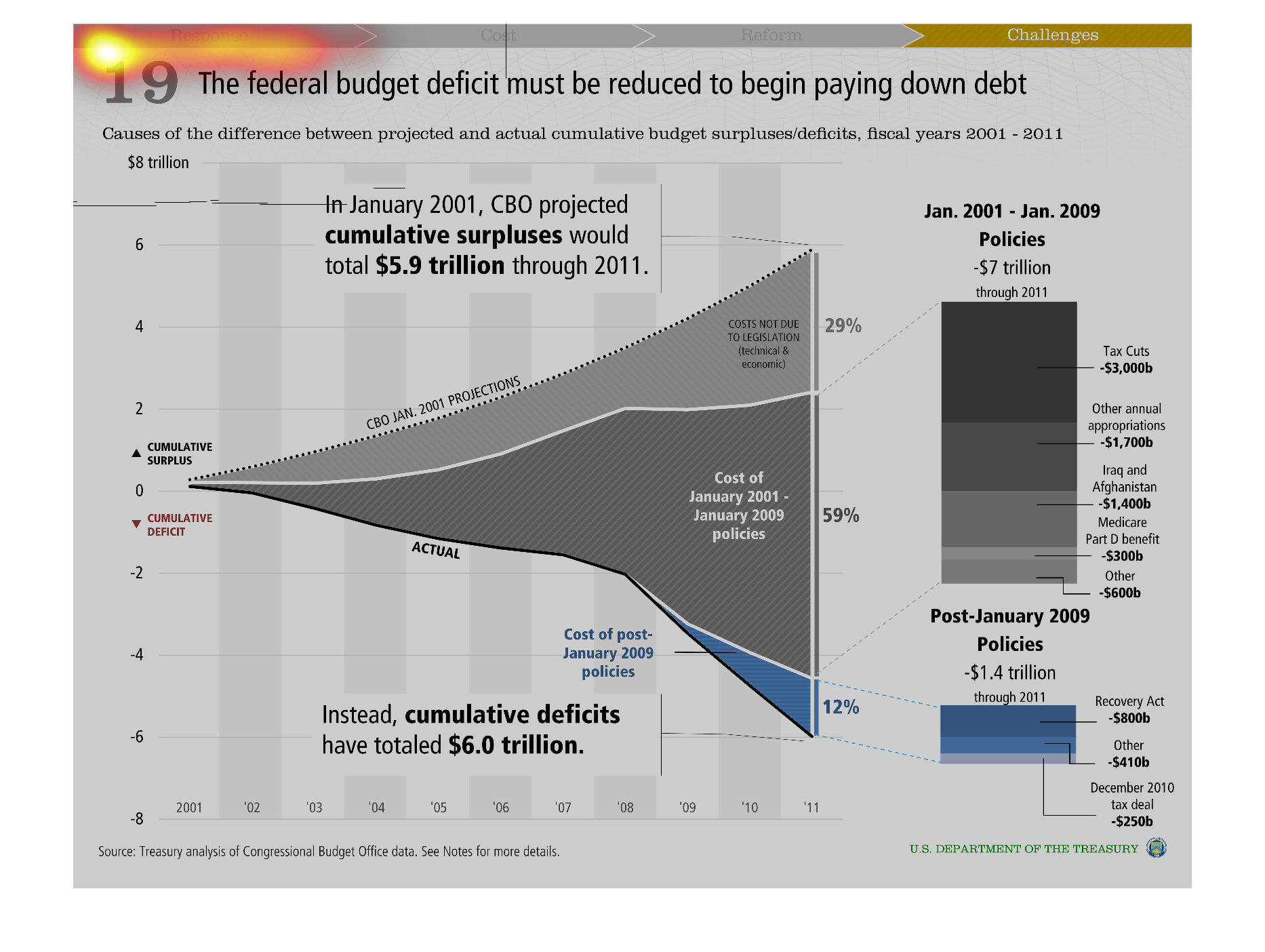

The federal budget won't be reduced by paying down the debt.  This has a graph with the budget
deficit dollars and figures for various policies and dates.
Warning: Image is too big to fit on screen; displaying at 50%
Warning: Image is too big to fit on screen; displaying at 50%
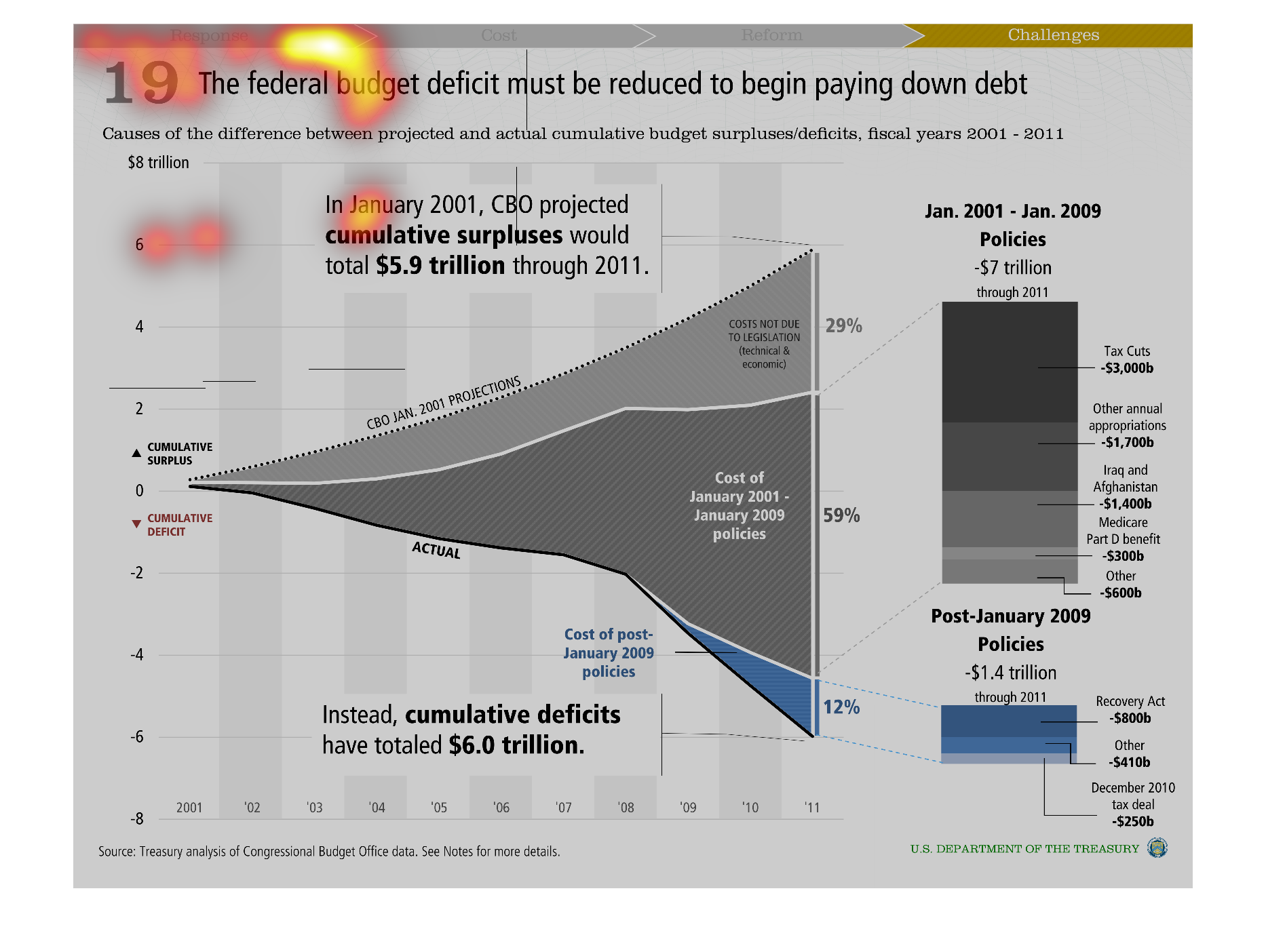
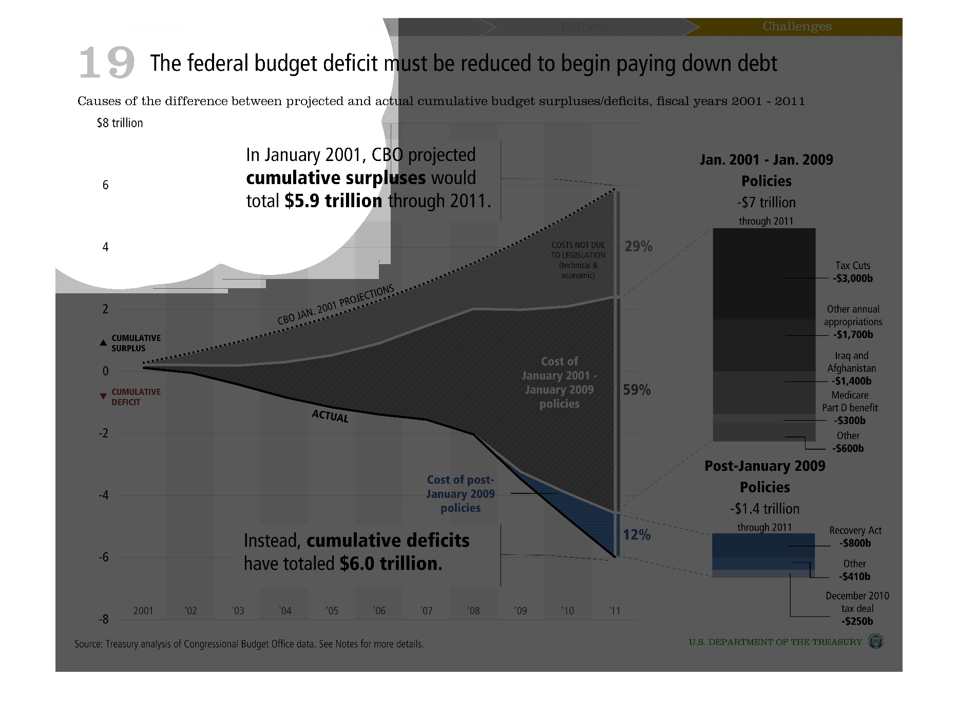
This graph has a clear point: the federal budget deficit must be reduced to start paying back
the nation's debt. It shows that from 2001 through January 2009 the country spent $7 trillion
on its policies. Post 2009 we've spent another $1.4 million on policies. In January 2001,
CBO projected cumulative surpluses of $5.9 trillion in the following ten years. Instead, the
country has had deficits of $6 trillion.
Warning: Image is too big to fit on screen; displaying at 50%
Warning: Image is too big to fit on screen; displaying at 50%
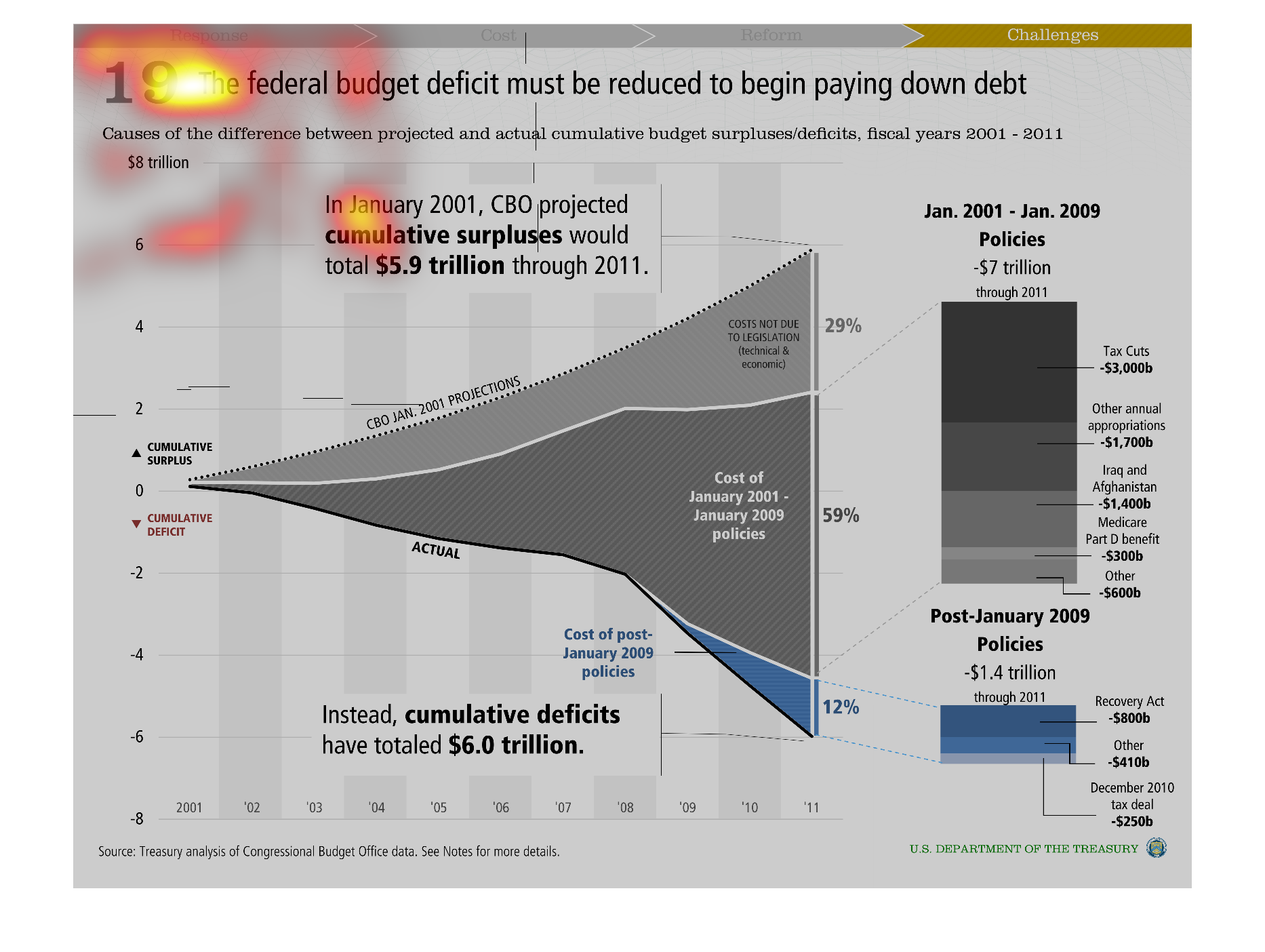
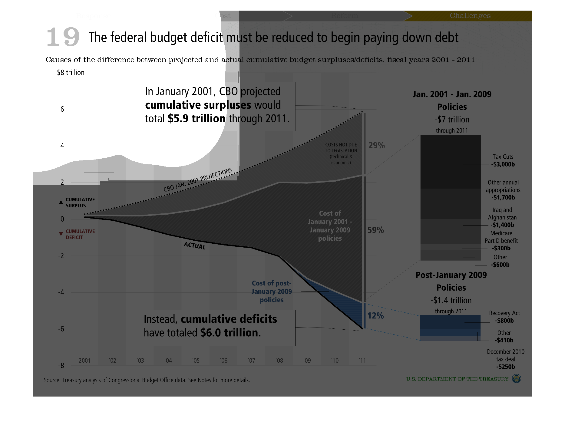
This image shows or depicts in statistical bar graph format the federal budget deficit must
be reduced to begin paying down the national debt. Years covered are 2001-2011.
Warning: Image is too big to fit on screen; displaying at 50%
Warning: Image is too big to fit on screen; displaying at 50%
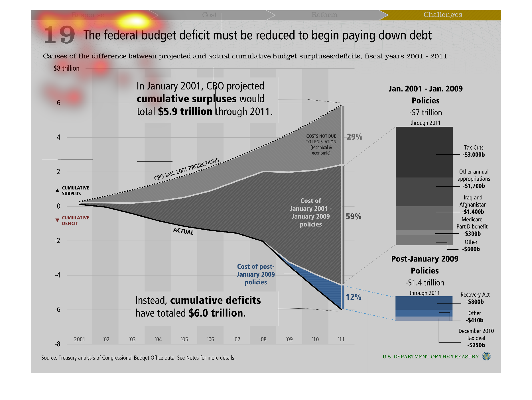
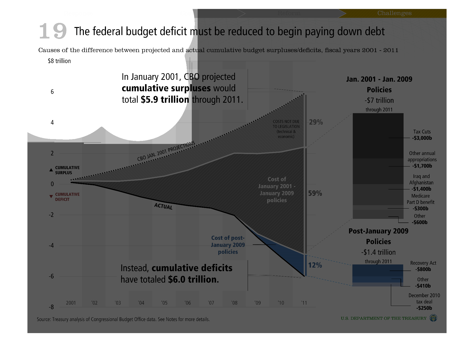
This chart describes the relation between the federal budget deficit and the effect it has
on the country's ability to pay down the current outstanding debt,
Warning: Image is too big to fit on screen; displaying at 50%
Warning: Image is too big to fit on screen; displaying at 50%

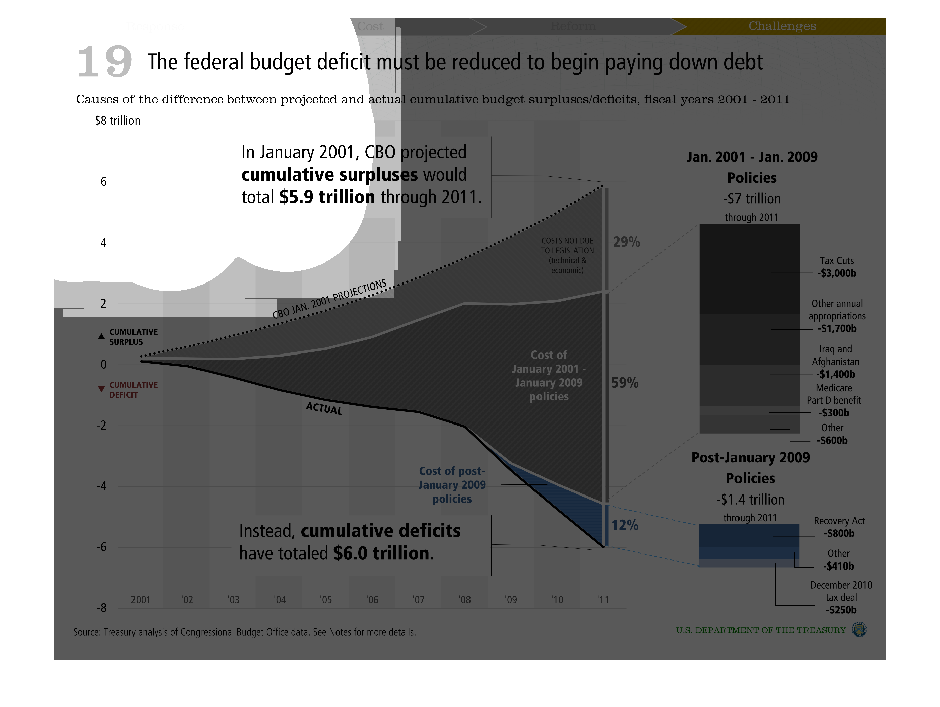
This chart shows the causes of the difference between projected and actual cumulative budget
surpluses/deficits between the fiscal years 2001 and 2011.
Warning: Image is too big to fit on screen; displaying at 50%
Warning: Image is too big to fit on screen; displaying at 50%
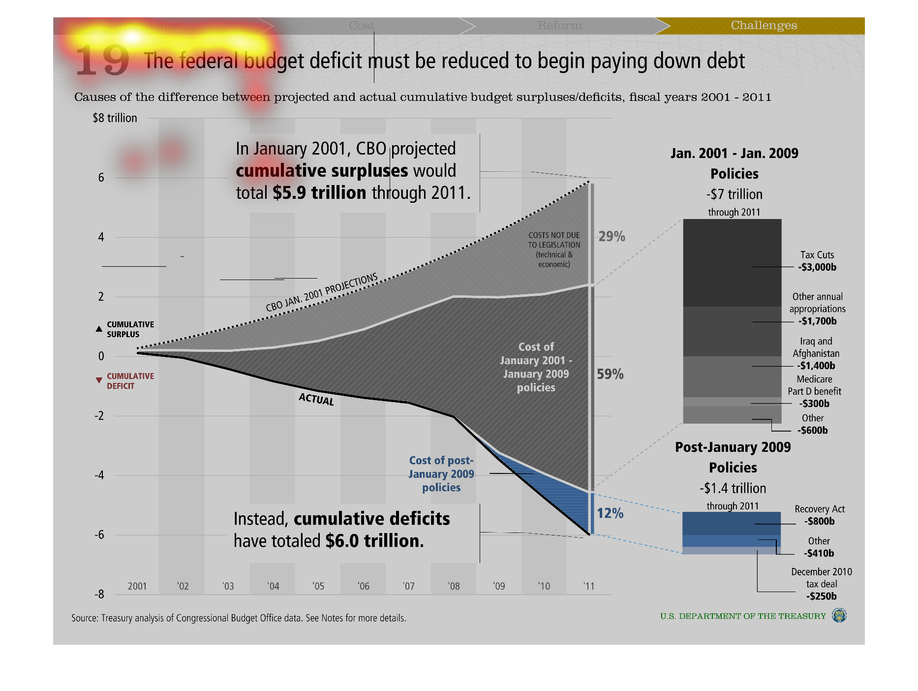
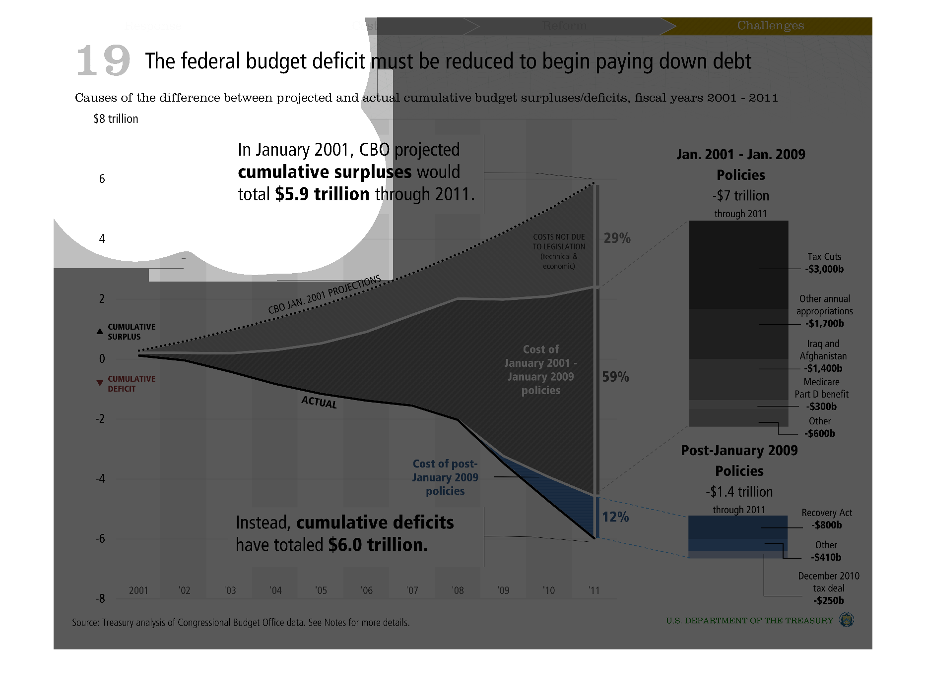
This chart states the federal budget deficit must be reduced to pay down debt. It stated in
January the cumulative surplus was projected as $5.9 trillion, but we ended up with a cumulative
$6.0 trillion deficit.
Warning: Image is too big to fit on screen; displaying at 50%
Warning: Image is too big to fit on screen; displaying at 50%