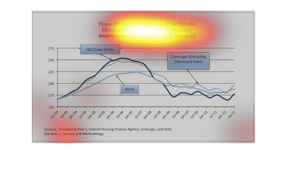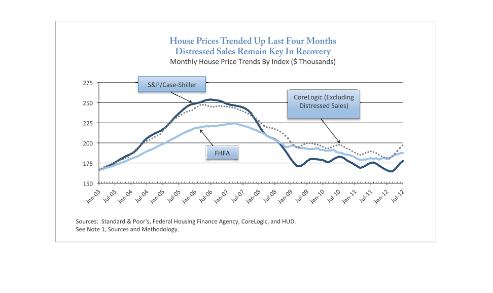
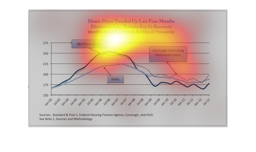
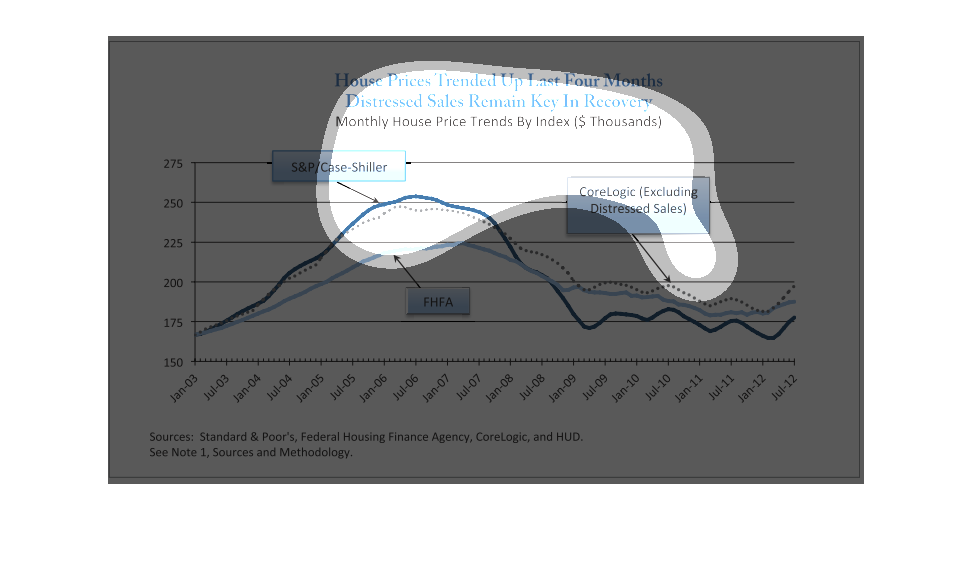
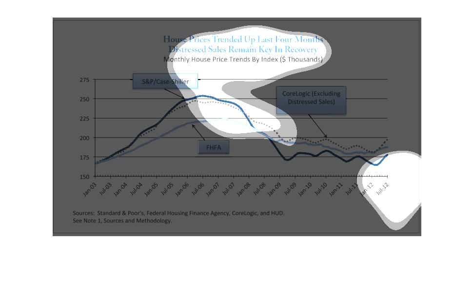
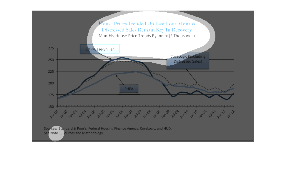
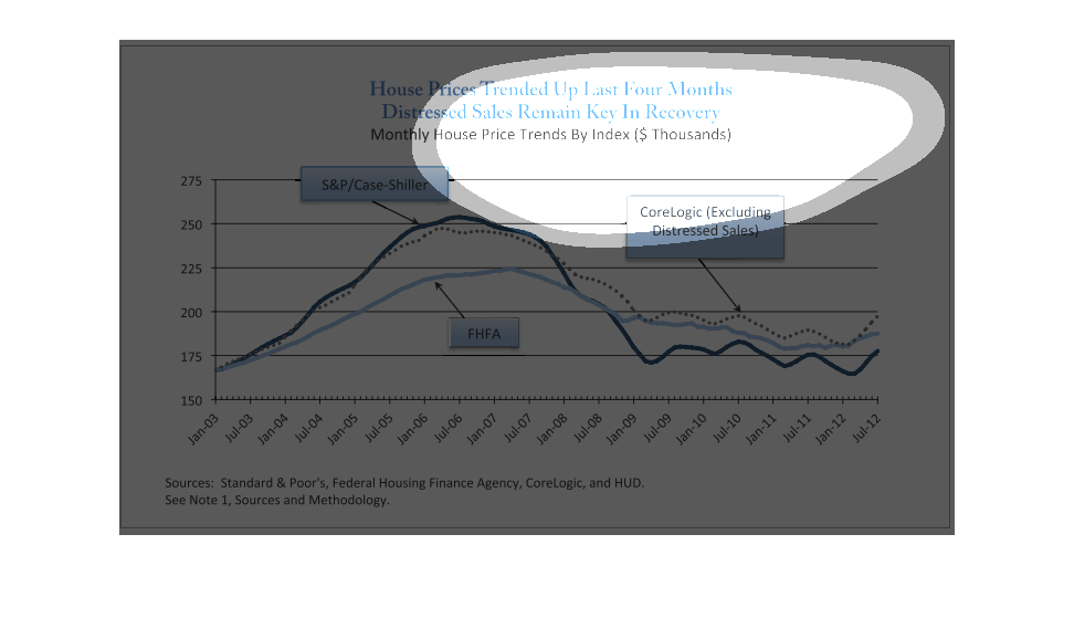
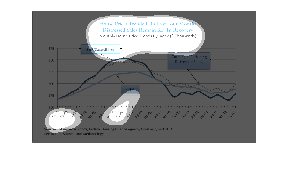
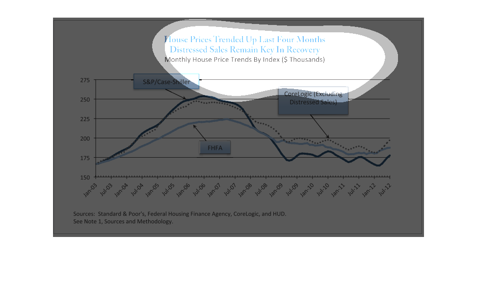
The top of the graph read, 'House prices trend up last four months, Distressed sales remain
key in recovery'. The information here displays monthly house price trends by three indexes;
 S&P/Case-Shiller, FHFA, and Core Logic.
This image depicts the house price trends in the last four months. It seems that prices seemed
not to fluctuate too much, spiking at early June and then falling afterwards and remaining
steady.
This chart appears to show housing prices over the last several years (Jan, 2003 thru July,
2012).   Three different measuers of house prices are shown, they correlate very well.  Near
the end (starting in 20012), it show that housing prices are starting to rise again.
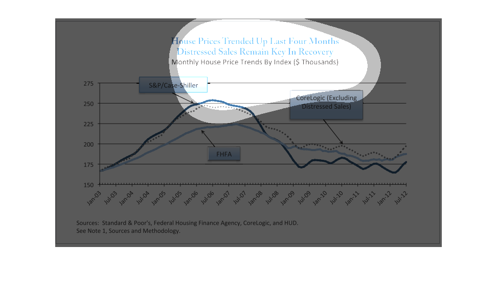
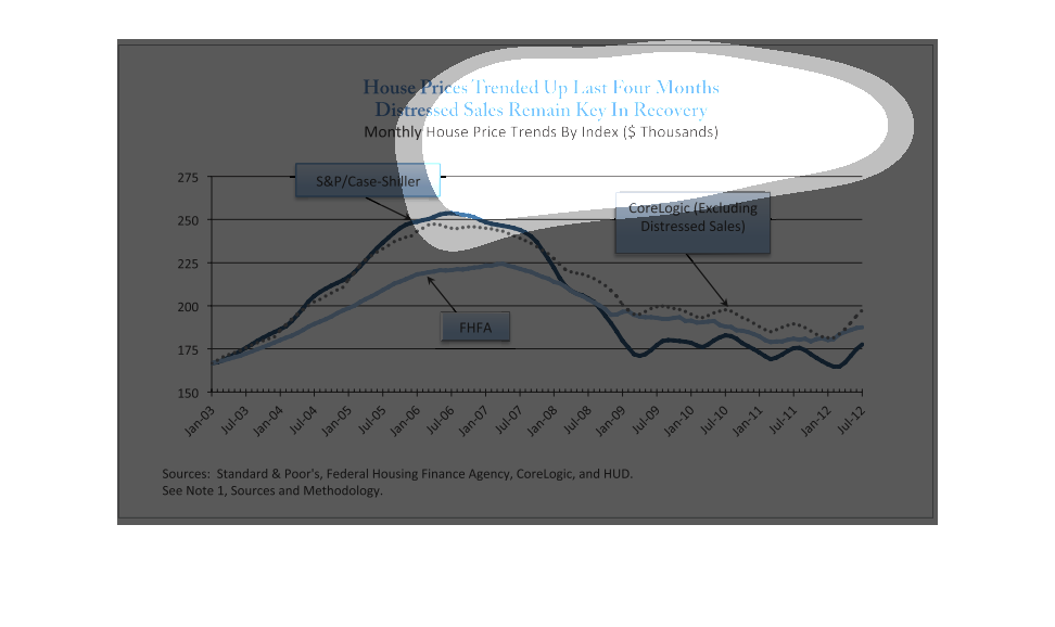
A graph infographic of Monthly housing prices. It shows House Prices trended upward the last
four months and distressed sales remain key in economic recovery
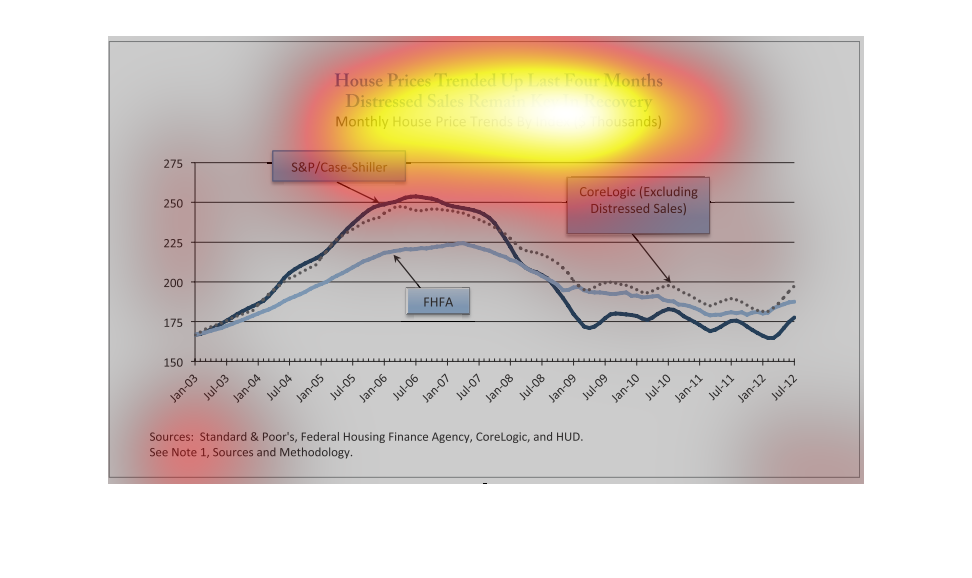
House prices are getting more expensive, and distressed sales remain key in recovery. The
graph shows from Jan 3 to July 12.  I didn't really understand what this was showing.
This image shows a line diagram of the average home pricing trends in the last four months.
The diagram is well structured & professional with colors ranging from gray to blue.
This chart is for House prices trended up last four months, distressed sales remain key in
recovery. It is for monthly house price trends by index. This chart was interesting.
This graph shows house prices trending up last four months, distressed sales remain key in
recovery, with monthly house price trends beginning in 2008 compared to the S&P, FHA, and
CoreLogic distressed sales.
This is a chart depicting the role of distressed house sales play in the recovery of the overall
housing market from the time period of January 2003 to January 2012.
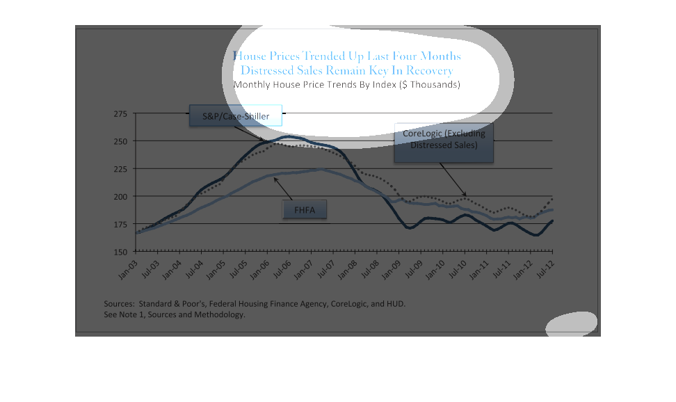
The chart shows housing trends from 2001 to 2012 and was designed to highlight house prices
trending up in the past four months.  The x axis displays the year and the y axis displays
the price in thousands.
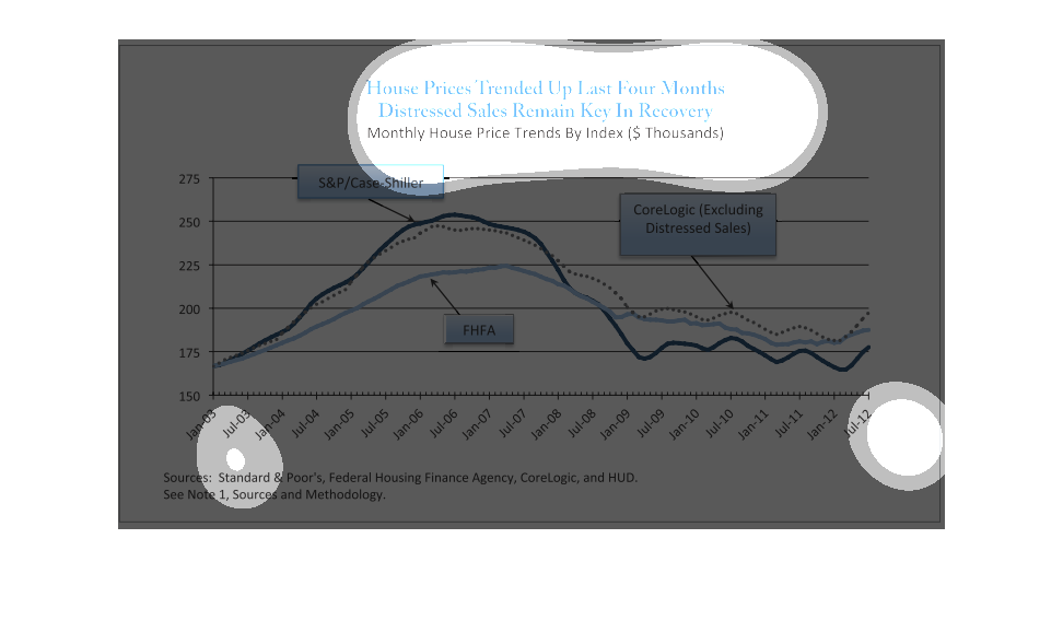
This graph shows the monthly house price trends by index from January 2003 to July 2012. There
is an upward trend that peeks in 2006, and then falls back down to 2003 levels with in a few
years.
This chart states house prices have trended upward for the last four months and that distressed
sales were key in the recovery. The chart runs from Jan of 03 to Jul of 12.
The following chart shows that house prices remained stable and actually increased over a
four month period. And shows that the key to this recovery was the stabilization of this data
was because of stabilization is distressed homes.
This chart describes how house prices trended up the last four months, and distressed sales
remain key in recovery. Categories on the chart include S&P/Case-Shiller.
This graph shows "House Prices Trended Up Last Four Months Distressed Sales Remain Key In
 Recovery."  This graph shows home sales starting in January 2003 to July 2012.